こんにちは。Anagraftの伊藤です。
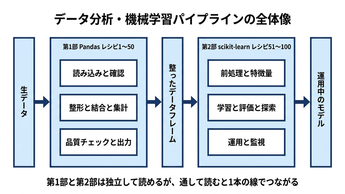
本コラムは、Pythonによるデータ分析と機械学習の実務で必ず登場する100のレシピを、コピーしてすぐ使えるコード付きで1本にまとめたものです。前半の第1部では、データの読み込み・整形・集計を担うPandasのレシピを50個、後半の第2部では、前処理からモデル構築・評価・チューニングまでを担うscikit-learnのレシピを50個収録しました。「生データを受け取ってから、機械学習モデルを運用に載せるまで」の一連の流れを、この1ページで通しでカバーする構成です。
データ分析の実務は、その時間の大半がモデリングではなく、データの整形と前処理に費やされます。欠損値をどう扱うか、複数のテーブルをどう結合するか、カテゴリ変数をどうエンコードするか。こうした処理の引き出しの多さが、分析者の生産性をほぼ決めてしまいます。一方で、これらのノウハウは断片的な記事やQ&Aサイトに散らばっており、必要になるたびに検索して書き方を思い出す、という時間の使い方になりがちです。実務で本当に使う形だけを厳選した道具箱を1つにまとめる、というのが本コラムの狙いです。
Pandasとscikit-learnを別々のコラムにせず1本にまとめたのは、実務ではこの2つが常にセットで動くからです。Pandasで整えたデータフレームをscikit-learnに渡し、モデルの予測結果をまたPandasで集計して評価する。この往復が分析実務の日常であるため、レシピもつながった一連の流れとして引ける形に組み立てました。
掲載しているコードは、すべて実際に実行して出力を確認したものです。想像で書いた出力例は載せていません。動作を確認した環境は Python 3.14.3 / pandas 3.0.5 / NumPy 2.5.2 / scikit-learn 1.9.0 / matplotlib 3.11.1 / seaborn 0.13.2 / statsmodels 0.14.6 で、バージョンによって挙動が変わる箇所には本文で断りを入れました。
想定している読者は、次のような方々です。
- データ分析の実務で、前処理や集計のコードを検索しながら書いているアナリスト・データサイエンティストの方
- Pythonの基礎を学び終えて、実務レベルのデータハンドリングと機械学習を一気に身につけたい方
- 機械学習モデルのPoCを、正しい検証の作法(データ分割・交差検証・評価指標)で進めたいエンジニア・企画職の方
- 生成AIにコードを書かせる際の、正確な語彙と定石を持っておきたい方
構成は次のとおりです。第1部(Pandas)はデータ処理の工程順、第2部(scikit-learn)は機械学習プロジェクトの工程順にレシピを並べ、通し番号を振りました。各レシピは「何に使うか」の短い説明と、そのまま動くコードのセットになっています。順に読んで一連の流れをたどる読み方も、いま詰まっている工程を番号から引く読み方も、どちらも想定しています。

目次
- 序章 データ分析の実務は「前処理8割」
- 全体の地図
- 第1部 Pandas編:データ処理の定石(レシピ1〜50)
- セットアップ
- データ読み込みと基本情報確認
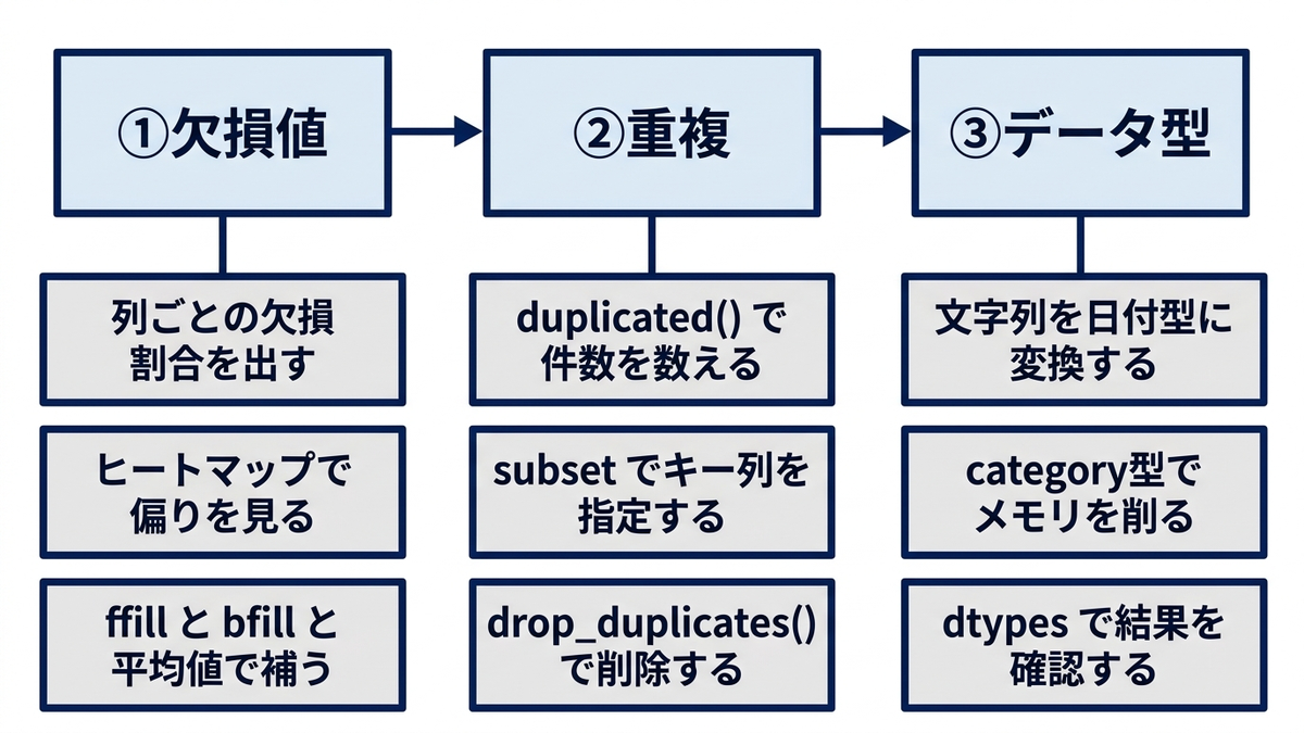
- データクレンジング:欠損値・重複・データ型
- フィルタリングと条件抽出
- ソート・集計・グループ化・ピボット
- データの結合
- 列作成と文字列処理
- 日付・時系列とデータ品質(外れ値)処理
- 統計的前処理と分析
- サンプリングとデータ分割
- 高度な集計とウィンドウ関数
- データ結合の応用・変形・検索
- 運用のためのデータ最適化
- 第2部 scikit-learn編:機械学習の実務手順(レシピ51〜100)
- セットアップ
- データ前処理とデータ分割
- 分類アルゴリズム
- 回帰アルゴリズム
- クラスタリング
- 次元削減
- モデル評価とハイパーパラメータ探索
- 実務でよく使う周辺テクニック集
- 高度な機械学習テクニック
- モデル運用とMLOps
- 終章 レシピを実務の成果につなげるために
- 本コラムで紹介した書籍一覧
- 参考情報
序章 データ分析の実務は「前処理8割」
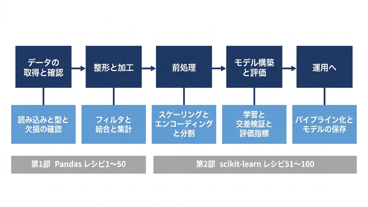
データ分析・機械学習の実務は、おおよそ次の工程で進みます。
| 工程 | 主な作業 | 本コラムでの場所 |
|---|---|---|
| データの取得・確認 | 読み込み、型の確認、欠損・重複のチェック | 第1部 前半 |
| 整形・加工 | フィルタリング、結合、集計、特徴量の作成 | 第1部 中盤〜後半 |
| 前処理 | スケーリング、エンコーディング、分割 | 第2部 前半 |
| モデル構築・評価 | 学習、交差検証、評価指標、チューニング | 第2部 中盤〜後半 |
| 運用へ | パイプライン化、モデルの保存 | 第2部 終盤 |
「前処理8割」という言葉があるとおり、モデルの精度は使うアルゴリズムよりも、データをどれだけ丁寧に整えたかで決まることが多いものです。第1部のPandasのレシピが本コラムの半分を占めているのは、実務の時間配分をそのまま反映した結果でもあります。
表の「前処理」の行は第2部を指していますが、スケーリングとエンコーディングは第1部の「統計的前処理と分析」章(レシピ30〜31)にも出てきます。両者は重複ではなく役割が違います。第1部で扱うのはデータの姿を把握するための前処理で、データ全体を使って変換し、その結果を人が読んで判断することが目的です。第2部(レシピ51以降)で扱うのは学習パイプラインに載せる前処理で、変換の基準を訓練データだけで決め、検証やテストのデータの情報が学習側に漏れる(リーク)のを防ぐ手順まで含みます。同じ関数を使っていても目的と手順が違うため、両方に置いています。
また、第2部では単にモデルを学習させるだけでなく、データの分割や交差検証、評価指標の選び方といった「検証の作法」のレシピを重視しています。ここを誤ると、PoCでは高精度に見えたモデルが本番で使い物にならない、という典型的な失敗につながるからです。
Anagraftでは、AIプロジェクトの構想・課題設計から、データ分析・機械学習モデルの開発、AI人材の育成まで一貫したご支援を行っています。会社概要・ご支援内容の詳細は、以下の資料からご覧いただけます。

この章を深めたい方への参考書籍
- 本橋智光・橋本秀太郎『改訂新版 前処理大全』(技術評論社):本章の工程表のうち、取得から整形までを体系立てて扱った一冊です。抽出・集約・結合・整形という章立てが「前処理8割」の中身そのものにあたり、自分の手順が定石から外れていないかを工程単位で照らせます。
- 寺田学・辻真吾・鈴木たかのり・福島真太朗『Pythonによるあたらしいデータ分析の教科書 第3版』(翔泳社):環境構築からNumPy・pandas・Matplotlib・scikit-learnまでを一冊で通す教科書です。本コラムが前提にしている道具立ての全体像を、先に押さえておきたい方に向いています。
全体の地図
本コラムの章立てと、それぞれが扱うレシピ番号の対応です。詰まっている工程から逆に引くときは、この表を目次として使ってください。
| 部 | 章 | レシピ番号 | この章で分かること |
|---|---|---|---|
| 第1部 Pandas | セットアップ | 準備 | ライブラリの導入と、以降のレシピで共通して使うサンプルデータの作り方 |
| データ読み込みと基本情報確認 | 1〜2 | 文字コードを外さない読み込みと、最初に必ず見る形状・型・欠損 | |
| データクレンジング:欠損値・重複・データ型 | 3〜6 | 欠損・重複・型の3点を、どの順でどう片付けるか | |
| フィルタリングと条件抽出 | 7〜10 | 条件が増えたときに読みやすさと速度を落とさない書き方 | |
| ソート・集計・グループ化・ピボット | 11〜17 | 集計の中心となるgroupbyとpivot_tableの使い分け | |
| データの結合 | 18〜20 | 結合の種類を取り違えたときに、行が増えるのか消えるのか | |
| 列作成と文字列処理 | 21〜23 | 表記ゆれの整理と、正規表現による抽出 | |
| 日付・時系列とデータ品質(外れ値)処理 | 24〜29 | 日付の扱い、外れ値の検出と処理、リサンプリングと移動統計 | |
| 統計的前処理と分析 | 30〜34 | スケーリング、エンコーディング、相関、分位、季節性分解 | |
| サンプリングとデータ分割 | 35〜36 | 代表性を保ったサンプリングと、分割方法の選び分け | |
| 高度な集計とウィンドウ関数 | 37〜40 | 順位・累積・前期比較を、ループを書かずに出す | |
| データ結合の応用・変形・検索 | 41〜44 | joinの使い分け、ワイドとロングの往復、条件付きの列作成と検索 | |
| 運用のためのデータ最適化 | 45〜50 | 型の最適化、階層インデックス、品質チェック、高速化、出力形式 | |
| 第2部 scikit-learn | セットアップ | 準備 | 再現性の確保と、3種類の合成データセットの用意 |
| データ前処理とデータ分割 | 51〜55 | 補完・スケーリング・エンコーディング・特徴量選択・分割 | |
| 分類アルゴリズム | 56〜59 | ロジスティック回帰・決定木・ランダムフォレスト・SVMの性格の違い | |
| 回帰アルゴリズム | 60〜61 | 線形回帰と多項式回帰、次数を上げたときに何が起きるか | |
| クラスタリング | 62〜64 | k-means・階層・DBSCANの前提と、クラスタ数の決め方 | |
| 次元削減 | 65〜66 | PCAの累積寄与率と、t-SNEの読み方の注意 | |
| モデル評価とハイパーパラメータ探索 | 67〜68 | 交差検証の組み方と、グリッドサーチとランダムサーチの使い分け | |
| 実務でよく使う周辺テクニック集 | 69〜80 | パイプライン・多クラス・不均衡・アンサンブル・保存・異常検知・キャリブレーション | |
| 高度な機械学習テクニック | 81〜90 | 学習曲線、ロバスト回帰、オンライン学習、部分依存プロット | |
| モデル運用とMLOps | 91〜100 | バッチ・API・ドリフト検出・バージョン管理・再学習の仕組み |
第1部と第2部は独立して読めます。工程の流れとしては、第1部で整えたデータフレームを第2部の前処理が受け取る形を想定していますが、コードとしてはつながっていません。レシピ51以降が扱うのは、第2部のセットアップで新たに作る機械学習向けの3種類の合成データです。df_salesという変数名も第2部で作り直すため、第1部の365行の日次売上データとは中身が別物になります。両方を通して読むと、生データの整形から機械学習モデルの運用までの工程が一通りたどれます。
第1部 Pandas編:データ処理の定石(レシピ1〜50)
第1部は、データの読み込みから整形・集計までを担うPandasです。欠損値・重複の処理、フィルタリング、グループ集計、結合、時系列処理、文字列処理など、分析実務の8割を占めるデータハンドリングの50レシピを収録しています。
セットアップ
コードを動かすには、Pythonが入った環境と、コードを実行する場所の2つが必要です。実行する場所は主に3つあります。1つ目はJupyter NotebookやJupyterLabで、コードをセル単位に区切って上から順に実行でき、表やグラフがその場に表示されます。2つ目はVS Codeで、Python拡張機能を入れるとノートブック形式でもスクリプト形式でも書けます。3つ目はGoogle Colaboratoryで、ブラウザだけで動くため手元へのインストールが要りません。まず動かして結果を見たい段階であればGoogle Colaboratory、業務データを手元に置いたまま扱うのであればJupyter NotebookかVS Codeが向いています。
本コラムのコードは、1つのノートブック(またはスクリプト)で上から順に実行することを前提にしています。前のレシピで作った変数を後のレシピが使う箇所があるためです。特定のレシピだけを単独で動かす場合は、そのレシピの本文かコードコメントで断っている元のレシピを先に実行してください。
Pythonそのものの導入手順や、仮想環境とパッケージ管理の考え方は本コラムでは扱いません。別途公開しているコラム「データサイエンスを始めるためのPython入門と開発環境」がこの主題を詳しく扱っているので、環境づくりから始める場合はそちらを参照してください。
まずは必要なライブラリをインポートし、以降のレシピで共通して使うサンプルデータを準備します。売上データ(df_sales)とユーザーログデータ(df_users)の2つのデータフレームを用意し、これらを使って各レシピを解説していきます。
はじめに、第1部で直接使うライブラリをまとめて導入します。データフレーム操作のpandasと数値計算のNumPy、作図のmatplotlibとseaborn、統計量の算出に使うSciPy、標準化やデータ分割で使うscikit-learn、季節性分解で使うstatsmodels、Excelへの書き出しで使うopenpyxl、そしてグラフの日本語表示に使うmatplotlib-fontjaです。日本語表示のライブラリとしてはjapanize-matplotlibが長く使われてきましたが、更新が2020年で止まっており、Python 3.12以降の環境では標準ライブラリからdistutilsが外れた影響で読み込みに失敗します。後継として維持されているmatplotlib-fontjaを使ってください。
下のpip installは、ライブラリを導入するコマンドです。ターミナル(WindowsのコマンドプロンプトやPowerShell、macOSのターミナル)で実行するときは、下の1行をそのまま打ちます。Jupyter NotebookやGoogle Colaboratoryのセルで実行するときは、行頭に半角の感嘆符を付けて!pip installで始まる形にします。導入は環境ごとに最初の1回だけで済みます。Google Colaboratoryにはpandasやscikit-learnなど主要なライブラリが最初から入っているため、不足しているものだけを入れれば足ります。
pip install pandas numpy matplotlib seaborn scipy scikit-learn statsmodels openpyxl matplotlib-fontja
import pandas as pd
import numpy as np
import matplotlib.pyplot as plt
import seaborn as sns
from datetime import datetime, timedelta
import warnings
warnings.filterwarnings('ignore')

# 日本語フォントの設定(import するだけで matplotlib 全体に適用される)
import matplotlib_fontja

# 等幅フォントで日本語を描くときは、日本語グリフを持つフォントを先頭に置く
plt.rcParams['font.monospace'] = ['MS Gothic'] + plt.rcParams['font.monospace']

# サンプルデータの作成
np.random.seed(42)

# 売上データ
sales_data = {
    'date': pd.date_range('2023-01-01', periods=365, freq='D'),
    'product': np.random.choice(['商品A', '商品B', '商品C', '商品D'], 365),
    'sales_amount': np.random.randint(1000, 50000, 365),
    'customer_id': np.random.randint(1000, 9999, 365),
    'region': np.random.choice(['東京', '大阪', '名古屋', '福岡'], 365),
    'channel': np.random.choice(['オンライン', '店舗', '電話'], 365)
}

# ユーザーログデータ
user_data = {
    'user_id': range(1, 1001),
    'age': np.random.randint(20, 70, 1000),
    'gender': np.random.choice(['男性', '女性'], 1000),
    'registration_date': pd.date_range('2022-01-01', periods=1000, freq='6h'),
    'last_login': pd.date_range('2023-10-01', periods=1000, freq='3h'),
    'total_purchases': np.random.randint(0, 20, 1000)
}

# DataFrameの作成
df_sales = pd.DataFrame(sales_data)
df_users = pd.DataFrame(user_data)

print("データ準備完了!")
なお、date_rangeの時間単位の頻度指定は、以前は大文字(freq=’6H’など)が使われていましたが、現行のpandasでは小文字表記(’6h’)が標準です。古いコードを見かけたときは読み替えてください。
データ読み込みと基本情報確認
1. CSVファイルの読み込み(エンコーディング対応)
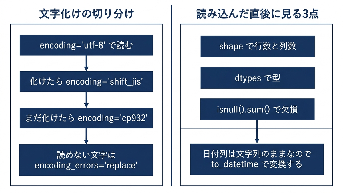
日本語を含むCSVファイルは、エンコーディングの指定を誤ると文字化けや読み込みエラーの原因になります。データの提供元によってUTF-8とShift-JISが混在することも多いため、両方に対応できるようにしておくと安心です。ここでは手元で試せるように、先ほど作ったdf_salesを一度CSVに書き出してから読み直しています。
# 試せるように、サンプルデータをCSVとして書き出しておく
df_sales.to_csv('sales_data.csv', index=False, encoding='utf-8')

# 日本語データを含むCSVの正しい読み込み方
df = pd.read_csv('sales_data.csv', encoding='utf-8')
# Shift-JISの場合
# df = pd.read_csv('sales_data.csv', encoding='shift_jis')

# 日付列は読み込み時点では文字列なので、必要なら明示的に変換する
df['date'] = pd.to_datetime(df['date'])

print(df.head(3))
print('読み込んだ行数:', len(df))
        date product  sales_amount  customer_id region channel
0 2023-01-01     商品C         22918         7541    名古屋      店舗
1 2023-01-02     商品D         21445         5729    名古屋      電話
2 2023-01-03     商品A         31306         8330    名古屋   オンライン
読み込んだ行数: 365
読み込み時にエンコーディングを指定しても文字化けが直らないときは、encoding=’cp932’(Windows版Shift-JISの拡張)を試してください。UnicodeDecodeErrorが出る場合は、encoding_errors=’replace’を付けると読めない文字を置き換えて読み進められるため、どの行が壊れているかの特定に使えます。
2. データの基本情報確認
データを読み込んだら、まずshape・dtypes・isnull().sum()で全体像を把握します。データ形状やデータ型、欠損状況をひと目で確認できるため、分析の最初のステップとして欠かせない処理です。
# データの概要確認
print("データ形状:", df_sales.shape)
print("\nデータ型情報:")
print(df_sales.dtypes)
print("\n欠損値情報:")
print(df_sales.isnull().sum())
データ形状: (365, 6)

データ型情報:
date            datetime64[us]
product                    str
sales_amount             int32
customer_id              int32
region                     str
channel                    str
dtype: object

欠損値情報:
date            0
product         0
sales_amount    0
customer_id     0
region          0
channel         0
dtype: int64
この章を深めたい方への参考書籍
- Wes McKinney『Pythonによるデータ分析入門 第3版』(オライリー・ジャパン):第6章「データの読み込み、書き出しとファイル形式」が本章に対応します。read_csvがどこまで指定できるのか、区切り文字や欠損値の表現、型の推論まで含めて確認でき、文字化け以外の読み込み事故を先回りして潰せます。
- 下山輝昌・松田雄馬・三木孝行『Python実践データ分析100本ノック 第3版』(秀和システム新社):整っていないデータを読み込むところから始まる演習書です。本章の確認手順を、表記ゆれや型崩れのある実務データに対して繰り返し試せます。
データクレンジング:欠損値・重複・データ型
3. 欠損値の確認と可視化
欠損値がどの列にどれくらいあるかを割合で把握し、ヒートマップで可視化すると、欠損のパターン(ランダムに発生しているのか、特定の期間や条件に偏っているのか)が見えてきます。前処理方針を決める際の重要な判断材料になります。
# 欠損値の詳細確認(サンプルで欠損値を追加)
df_with_missing = df_sales.copy()
df_with_missing.loc[50:60, 'sales_amount'] = np.nan
df_with_missing.loc[100:105, 'region'] = np.nan

# 欠損値の割合
missing_ratio = df_with_missing.isnull().sum() / len(df_with_missing) * 100
print("欠損値割合:")
print(missing_ratio)

# 欠損値のヒートマップ
plt.figure(figsize=(10, 6))
sns.heatmap(df_with_missing.isnull(), cbar=True, yticklabels=False)
plt.title('欠損値の分布')
plt.show()
欠損値割合:
date            0.000000
product         0.000000
sales_amount    3.013699
customer_id     0.000000
region          1.643836
channel         0.000000
dtype: float64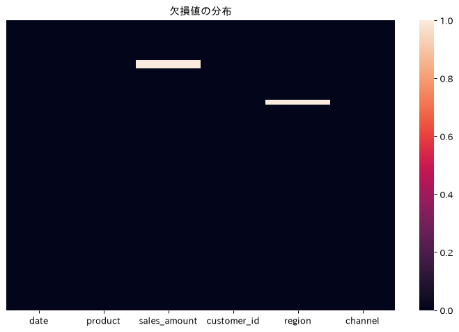
4. 欠損値の補完(前方補完・後方補完)
時系列データや連続値データでは、前後の値を使って欠損を補完する方法がよく使われます。前方補完(ffill)、後方補完(bfill)、平均値補完のいずれを選ぶかは、データの性質や業務ロジックに応じて判断します。
# レシピ3で作った、欠損値を意図的に足したdf_with_missingをそのまま使う

# 前方補完
df_forward = df_with_missing.ffill()

# 後方補完
df_backward = df_with_missing.bfill()

# 平均値補完(数値データのみ)
df_mean = df_with_missing.fillna(df_with_missing.select_dtypes(include=[np.number]).mean())

print("補完後の欠損値数:")
print("前方補完:", df_forward.isnull().sum().sum())
print("後方補完:", df_backward.isnull().sum().sum())
print("平均値補完:", df_mean.isnull().sum().sum())
補完後の欠損値数:
前方補完: 0
後方補完: 0
平均値補完: 6
3つのうち平均値補完だけ欠損が6件残ります。平均値を計算できるのは数値列だけなので、sales_amountに空けた11件は埋まりますが、文字列であるregionの6件はそのまま残るためです。数値列と文字列列が混在するデータでは、列の型ごとに補完方法を決める必要があります。
補足ですが、以前はfillna(method=’ffill’)という書き方が使われていましたが、現行のpandasではmethod引数が削除されており動作しません。上記のようにdf.ffill()やdf.bfill()を直接呼び出す書き方を使ってください。
5. 重複データの検出と削除
複数のシステムやファイルから集めたデータには、重複行が紛れ込んでいることがあります。duplicated()で重複を検出し、drop_duplicates()で削除する処理は、データ統合作業では必ずと言っていいほど必要になります。ただし、ここまで使ってきたdf_salesは1日1行で作ってあるため重複が1件もなく、そのまま実行しても検出結果も削除結果も0件のままで、処理が効いているのか分かりません。df_salesは後続のレシピでも使うので壊さずに残し、同じ行を意図的に足した検査用のデータフレームを別に用意して確認します。
# df_salesは1日1行なので重複が無い。検出と削除の動きが見えるように、
# 同じ行を意図的に足した検査用データを作る(df_sales自体は変更しない)
df_dup = pd.concat([df_sales, df_sales.iloc[[10, 10, 200]]], ignore_index=True)
print(f"検査対象の行数: {len(df_dup)}")

# 重複データの検出(全列が一致する行)
duplicates = df_dup[df_dup.duplicated()]
print(f"重複行数: {len(duplicates)}")

# 特定列での重複確認(同じ顧客IDが複数回現れる行)
customer_duplicates = df_dup[df_dup.duplicated(subset=['customer_id'])]
print(f"顧客IDの重複行数: {len(customer_duplicates)}")

# 重複削除
df_unique = df_dup.drop_duplicates()
df_unique_customer = df_dup.drop_duplicates(subset=['customer_id'])

print(f"重複削除後のデータ数: {len(df_unique)}")
print(f"顧客IDで一意にした後のデータ数: {len(df_unique_customer)}")
検査対象の行数: 368
重複行数: 3
顧客IDの重複行数: 18
重複削除後のデータ数: 365
顧客IDで一意にした後のデータ数: 350
3行を足した368行に対して、全列が一致する重複が3行、顧客IDだけで見た重複が18行検出されます。drop_duplicates()は前者を落として365行に戻し、subsetに顧客IDを渡した場合は同じ顧客の2回目以降も落として350行になります。どの列の組み合わせを「同じ行」とみなすかで結果が変わるので、subsetの指定は業務ルールに合わせて決める必要があります。
6. データ型の変換
文字列を日付型に変換したり、カテゴリ数が少ない列をcategory型にしたりすることで、値の意味を保ったままメモリ使用量を削減できます。特にcategory型への変換は、大量データを扱う際のメモリ効率化に効果的です。下のコードは最後に変換前後のメモリ使用量を印字するので、効果を数値で確認できます。この365行のサンプルでもproduct列は5,607バイトから558バイトへ減ります(実際の値はpandasのバージョンや文字列の内部表現によって変わります)。
# 文字列を日付型に変換
df_sales['date_str'] = df_sales['date'].astype(str)
df_sales['date_converted'] = pd.to_datetime(df_sales['date_str'])

# カテゴリ型への変換(メモリ効率化)
df_sales['product_cat'] = df_sales['product'].astype('category')
df_sales['region_cat'] = df_sales['region'].astype('category')

# 数値型の変換
df_sales['sales_amount_float'] = df_sales['sales_amount'].astype(float)

print("変換後のデータ型:")
print(df_sales.dtypes)
print(f"\nメモリ使用量削減: {df_sales['product'].memory_usage(deep=True)} -> {df_sales['product_cat'].memory_usage(deep=True)} bytes")
変換後のデータ型:
date                  datetime64[us]
product                          str
sales_amount                   int32
customer_id                    int32
region                           str
channel                          str
date_str                         str
date_converted        datetime64[us]
product_cat                 category
region_cat                  category
sales_amount_float           float64
dtype: object

メモリ使用量削減: 5607 -> 558 bytes
この章を深めたい方への参考書籍
- 本橋智光・橋本秀太郎『改訂新版 前処理大全』(技術評論社):欠損・重複・型の扱いを、その場しのぎではなく手順として整理できます。本章で選んだ補完方法が後工程の集計やモデルにどう波及するかまで踏み込んで考えたいときに効きます。
- Wes McKinney『Pythonによるデータ分析入門 第3版』(オライリー・ジャパン):第7章「データのクリーニングと前処理」で、欠損値の内部表現やcategory型の設計思想を確認できます。型を変えるとメモリと計算結果がどう変わるのかが理解できます。
フィルタリングと条件抽出
7. 条件抽出(単一条件)
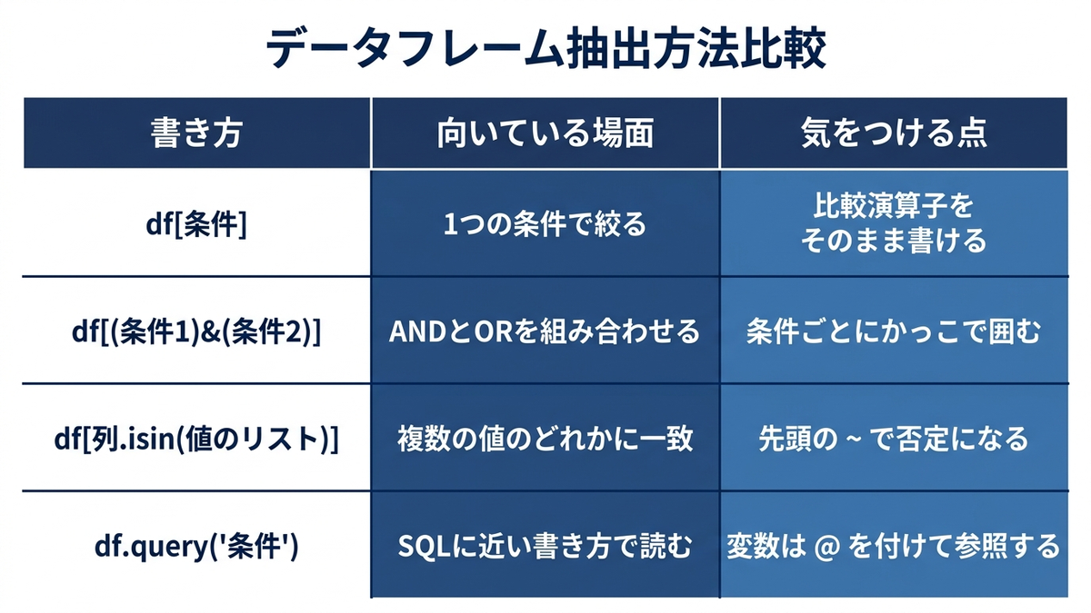
ブールインデックスを使った条件抽出は、pandasで最も基本的かつ頻繁に使う処理です。ブールインデックスとは、行数と同じ長さの真偽値(TrueとFalse)の並びをデータフレームに渡して、Trueの行だけを取り出す仕組みのことです。下のコードのdf_sales[‘sales_amount’] >= 30000は、行ごとに条件を満たすかどうかを判定した真偽値の並びを返します。これを角かっこの中に渡すと、Trueだった行だけが残ります。金額の閾値や特定商品、日付範囲での絞り込みなど、あらゆる分析の出発点になります。
# 売上金額が30,000円以上のデータ
high_sales = df_sales[df_sales['sales_amount'] >= 30000]
print(f"高額売上件数: {len(high_sales)}")

# 特定商品の抽出
product_a = df_sales[df_sales['product'] == '商品A']
print(f"商品Aの売上件数: {len(product_a)}")

# 日付範囲での抽出
recent_sales = df_sales[df_sales['date'] >= '2023-07-01']
print(f"2023年7月以降の売上件数: {len(recent_sales)}")
高額売上件数: 145
商品Aの売上件数: 87
2023年7月以降の売上件数: 184
8. 条件抽出(複数条件・AND/OR)
複数の条件を組み合わせる場合は、&演算子(AND)と|演算子(OR)を使います。各条件をかっこで囲む必要がある点に注意が必要ですが、顧客セグメントの抽出や詳細な条件でのデータ抽出に幅広く使われます。
# AND条件:商品Aかつ売上30,000円以上
condition_and = df_sales[(df_sales['product'] == '商品A') & (df_sales['sales_amount'] >= 30000)]
print(f"商品A・高額売上: {len(condition_and)}")

# OR条件:東京または大阪
condition_or = df_sales[(df_sales['region'] == '東京') | (df_sales['region'] == '大阪')]
print(f"東京・大阪の売上: {len(condition_or)}")

# 複雑な条件:商品AまたはBで、かつオンライン販売
complex_condition = df_sales[
    ((df_sales['product'] == '商品A') | (df_sales['product'] == '商品B')) &
    (df_sales['channel'] == 'オンライン')
]
print(f"商品A・Bのオンライン売上: {len(complex_condition)}")
商品A・高額売上: 32
東京・大阪の売上: 175
商品A・Bのオンライン売上: 64
9. isin()を使った効率的な条件抽出
複数の値のいずれかに一致する行を抽出したい場合、OR条件を並べるよりisin()を使う方が簡潔で読みやすく、処理も高速です。否定条件(NOT IN)にしたい場合は、先頭に~を付けます。
# 複数の商品を一度に抽出
target_products = ['商品A', '商品B']
selected_products = df_sales[df_sales['product'].isin(target_products)]
print(f"指定商品の売上件数: {len(selected_products)}")

# 複数地域の抽出
major_cities = ['東京', '大阪']
major_cities_sales = df_sales[df_sales['region'].isin(major_cities)]
print(f"主要都市の売上件数: {len(major_cities_sales)}")

# 否定条件(NOT IN)
non_target_products = df_sales[~df_sales['product'].isin(['商品D'])]
print(f"商品D以外の売上件数: {len(non_target_products)}")
指定商品の売上件数: 167
主要都市の売上件数: 175
商品D以外の売上件数: 263
10. query()メソッドでの直感的な条件指定
query()を使うと、SQLのWHERE句に近い感覚で条件を記述できます。変数を条件に含めたい場合は@を付けて参照します。SQLに慣れている方とのコミュニケーションや、複雑な条件を見通しよく書きたい場合に便利です。
# 直感的な条件記述
high_sales_query = df_sales.query('sales_amount >= 30000')
print(f"query使用 - 高額売上: {len(high_sales_query)}")

# 複数条件
complex_query = df_sales.query('product == "商品A" and region in ["東京", "大阪"]')
print(f"query使用 - 商品A・主要都市: {len(complex_query)}")

# 変数を使った条件
threshold = 25000
variable_query = df_sales.query('sales_amount >= @threshold')
print(f"query使用 - 閾値以上: {len(variable_query)}")
query使用 - 高額売上: 145
query使用 - 商品A・主要都市: 37
query使用 - 閾値以上: 180
この章を深めたい方への参考書籍
- Wes McKinney『Pythonによるデータ分析入門 第3版』(オライリー・ジャパン):第5章のpandas入門で、locとilocの使い分けやブールインデクスの仕組みが根本から説明されています。本章の抽出が意図しない行数を返したときに、原因を切り分けられるようになります。
- Jake VanderPlas『Pythonデータサイエンスハンドブック 第2版』(オライリー・ジャパン):Ⅱ部の比較演算とマスクの章を読むと、pandasの条件抽出がその下のNumPyで何をしているかが見えます。条件が増えたときにquery()とブールインデクスのどちらを選ぶかの判断材料になります。
ソート・集計・グループ化・ピボット
11. ソート(単一列・複数列)
sort_values()による並べ替えは、売上ランキングの作成や優良顧客の特定など、レポート作成のほぼすべての場面で登場します。複数列でのソートでは、列ごとに昇順・降順を指定できます。
# 売上金額の降順ソート
sales_desc = df_sales.sort_values('sales_amount', ascending=False)
print("売上TOP3:")
print(sales_desc[['date', 'product', 'sales_amount']].head(3))

# 複数列でのソート
multi_sort = df_sales.sort_values(['region', 'sales_amount'], ascending=[True, False])
print("\n地域別・売上降順TOP5:")
print(multi_sort[['region', 'product', 'sales_amount']].head(5))

# インデックスのリセット
sorted_reset = sales_desc.reset_index(drop=True)
売上TOP3:
          date product  sales_amount
313 2023-11-10     商品C         49816
167 2023-06-17     商品C         49747
71  2023-03-13     商品B         49404

地域別・売上降順TOP5:
    region product  sales_amount
14     名古屋     商品D         48357
328    名古屋     商品D         48320
312    名古屋     商品D         48295
335    名古屋     商品D         47959
42     名古屋     商品B         47760
12. グループ化と集計(基本)
groupby().agg()は、商品別・地域別といった軸で売上を集計する際の基本パターンです。count、sum、mean、median、stdなど複数の統計量を一度に計算できるため、業績レポートの土台になります。
# 商品別の売上集計
product_sales = df_sales.groupby('product')['sales_amount'].agg([
    'count', 'sum', 'mean', 'median', 'std'
]).round(2)
print("商品別売上統計:")
print(product_sales)

# 地域別の売上
region_sales = df_sales.groupby('region')['sales_amount'].sum().sort_values(ascending=False)
print("\n地域別総売上:")
print(region_sales)
商品別売上統計:
         count      sum      mean   median       std
product
商品A         87  2114519  24304.82  24355.0  13808.48
商品B         80  2049600  25620.00  27643.5  15110.01
商品C         96  2253286  23471.73  22481.5  13927.65
商品D        102  2684734  26320.92  27723.5  14858.20

地域別総売上:
region
名古屋    2600309
大阪     2217412
東京     2176747
福岡     2107671
Name: sales_amount, dtype: int32
13. 複数列でのグループ化
複数のキーでグループ化すれば、商品×地域、チャネル×商品といったクロス集計が可能になります。集計対象の列ごとに異なる集計関数を指定することもでき、多次元での業績分析に役立ちます。
# 商品・地域別の売上分析
product_region = df_sales.groupby(['product', 'region'])['sales_amount'].agg([
    'count', 'mean', 'sum'
]).round(2)
print("商品・地域別売上:")
print(product_region.head(10))

# チャネル・商品別の分析
channel_product = df_sales.groupby(['channel', 'product']).agg({
    'sales_amount': ['sum', 'mean', 'count'],
    'customer_id': 'nunique'  # ユニーク顧客数
}).round(2)
print("\nチャネル・商品別詳細:")
print(channel_product.head())
商品・地域別売上:
                count      mean     sum
product region
商品A     名古屋        31  25623.87  794340
        大阪         13  28131.85  365714
        東京         24  26622.08  638930
        福岡         19  16607.11  315535
商品B     名古屋        20  30602.00  612040
        大阪         25  25861.72  646543
        東京         14  23963.86  335494
        福岡         21  21691.57  455523
商品C     名古屋        30  19092.00  572760
        大阪         22  26563.95  584407

チャネル・商品別詳細:
                sales_amount                 customer_id
                         sum      mean count     nunique
channel product
オンライン   商品A           855088  23110.49    37          37
        商品B           745132  27597.48    27          27
        商品C           786025  23118.38    34          34
        商品D           855514  23122.00    37          37
店舗      商品A           607866  27630.27    22          22
なお、このサンプルデータは顧客IDを1件ずつランダムに振っているため、チャネルと商品で切った12グループのすべてでnuniqueの値がcountと一致します。実データでこの2つが食い違うときは、同じ顧客が同じ区分で複数回購入していることを意味するので、購入件数を見ているのか顧客数を見ているのかを取り違えないようにしてください。
14. カスタム集計関数の適用
標準の集計関数だけでは足りない独自の指標(変動係数や売上範囲など)を計算したい場合は、Seriesを返す関数を自作してgroupby().apply()に渡します。特有の分析指標をまとめて算出したいときに便利です。
# カスタム統計関数
def sales_stats(series):
    return pd.Series({
        '総売上': series.sum(),
        '平均売上': series.mean(),
        '売上中央値': series.median(),
        '最高売上': series.max(),
        '最低売上': series.min(),
        '売上範囲': series.max() - series.min(),
        '変動係数': series.std() / series.mean()
    })

# カスタム関数の適用
custom_stats = df_sales.groupby('product')['sales_amount'].apply(sales_stats).round(2)
print("商品別カスタム統計:")
print(custom_stats)
商品別カスタム統計:
product
商品A      総売上      2114519.00
         平均売上       24304.82
         売上中央値      24355.00
         最高売上       49354.00
         最低売上        1190.00
         売上範囲       48164.00
         変動係数           0.57
商品B      総売上      2049600.00
         平均売上       25620.00
         売上中央値      27643.50
         最高売上       49404.00
         最低売上        1301.00
         売上範囲       48103.00
         変動係数           0.59
商品C      総売上      2253286.00
         平均売上       23471.73
         売上中央値      22481.50
         最高売上       49816.00
         最低売上        1412.00
         売上範囲       48404.00
         変動係数           0.59
商品D      総売上      2684734.00
         平均売上       26320.92
         売上中央値      27723.50
         最高売上       49096.00
         最低売上        1851.00
         売上範囲       47245.00
         変動係数           0.56
Name: sales_amount, dtype: float64
groupby()にSeriesを返す関数を渡すと、結果は商品名と指標名の2階層インデックスを持つSeriesとして返ります。印字すると縦に長く並ぶので、商品を行・指標を列にした表で見たいときはunstack()を付けてください。
15. 時系列データの月次集計と曜日別集計
dt.to_period(‘M’)で年月単位に変換してからgroupbyすると、月次の売上推移が簡単に集計できます。dt.day_name()と組み合わせれば、曜日別の売上パターン分析もできます。季節性分析や週次・月次レポートの基本です。なお、day_name()が返すのは曜日名の文字列なので、groupbyの結果はFriday、Monday、Saturdayというアルファベット順に並びます。月曜から日曜の順で見たいときは、reindexに曜日名のリストを渡して並べ替えてください。
# 月次売上の集計
df_sales['year_month'] = df_sales['date'].dt.to_period('M')
monthly_sales = df_sales.groupby('year_month')['sales_amount'].sum()
print("月次売上推移:")
print(monthly_sales.head())

# 曜日別の売上パターン
df_sales['weekday'] = df_sales['date'].dt.day_name()
weekday_sales = df_sales.groupby('weekday')['sales_amount'].mean().round(2)
print("\n曜日別平均売上:")
print(weekday_sales)

# 時系列プロット
plt.figure(figsize=(12, 6))
monthly_sales.plot(kind='line', marker='o')
plt.title('月次売上推移')
plt.xlabel('月')
plt.ylabel('売上金額')
plt.grid(True)
plt.show()
月次売上推移:
year_month
2023-01    771866
2023-02    741681
2023-03    871354
2023-04    692046
2023-05    728795
Freq: M, Name: sales_amount, dtype: int32

曜日別平均売上:
weekday
Friday       25920.48
Monday       24046.46
Saturday     25847.23
Sunday       22950.70
Thursday     24444.96
Tuesday      25540.02
Wednesday    25849.92
Name: sales_amount, dtype: float64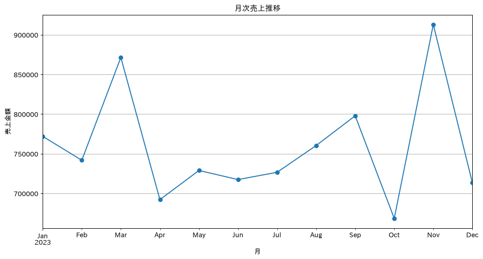
16. ピボットテーブル(基本)
pivot_table()を使うと、エクセルのピボットテーブルのような集計表をコードで再現できます。indexとcolumnsで軸を指定し、aggfuncで集計方法を指定するだけで、見やすいクロス集計表が作成できます。
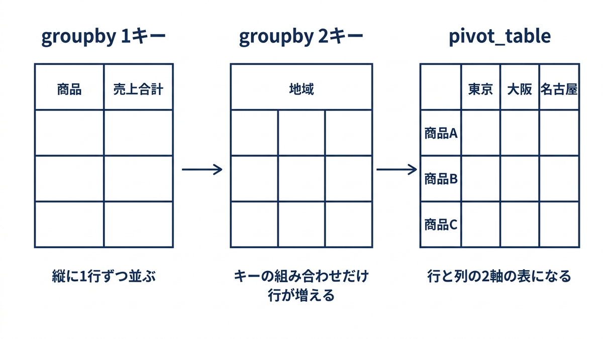
# 商品×地域のクロス集計
pivot_basic = df_sales.pivot_table(
    values='sales_amount',
    index='product',
    columns='region',
    aggfunc='sum',
    fill_value=0
)
print("商品×地域 売上マトリクス:")
print(pivot_basic)

# 複数の値での集計
pivot_multi = df_sales.pivot_table(
    values='sales_amount',
    index='product',
    columns='channel',
    aggfunc=['sum', 'mean', 'count'],
    fill_value=0
)
print("\n商品×チャネル 複合指標:")
print(pivot_multi)
商品×地域 売上マトリクス:
region      名古屋      大阪      東京      福岡
product
商品A      794340  365714  638930  315535
商品B      612040  646543  335494  455523
商品C      572760  584407  622493  473626
商品D      621169  620748  579830  862987

商品×チャネル 複合指標:
            sum                           mean  ...               count
channel   オンライン       店舗      電話         オンライン  ...            電話 オンライン  店舗  電話
product                                         ...
商品A      855088   607866  651565  23110.486486  ...  23270.178571    37  22  28
商品B      745132   514848  789620  27597.481481  ...  29245.185185    27  26  27
商品C      786025   686363  780898  23118.382353  ...  23663.575758    34  29  33
商品D      855514  1154896  674324  23122.000000  ...  26972.960000    37  40  25

[4 rows x 9 columns]
2つ目のpivot_multiは列が9本になるため、pandasの既定の表示幅では中央の列が省略記号に置き換わって印字されます。全列を確認したいときは、pd.set_option(‘display.max_columns’, None) と pd.set_option(‘display.width’, 200) を先に実行してください。表示設定を変えるだけで、集計結果そのものは変わりません。
17. ピボットテーブル(高度な集計)
複数のインデックスや複数の値を同時に指定したり、margins=Trueで合計行・列を追加したりすることで、より詳細な集計表が作れます。構成比の計算と組み合わせれば、市場シェアや地域別の売上構成の分析にも応用できます。
# 複数インデックス・複数値での高度なピボット
advanced_pivot = df_sales.pivot_table(
    values=['sales_amount', 'customer_id'],
    index=['product', 'region'],
    columns='channel',
    aggfunc={'sales_amount': 'sum', 'customer_id': 'nunique'},
    margins=True,  # 合計行・列を追加
    fill_value=0
)
print("高度なピボットテーブル:")
print(advanced_pivot)

# パーセント構成比の計算
pivot_pct = df_sales.pivot_table(
    values='sales_amount',
    index='product',
    columns='region',
    aggfunc='sum',
    fill_value=0
)
pivot_pct_ratio = pivot_pct.div(pivot_pct.sum(axis=1), axis=0) * 100
print("\n地域別構成比(%):")
print(pivot_pct_ratio.round(1))
高度なピボットテーブル:
               customer_id            ... sales_amount
channel              オンライン   店舗   電話  ...           店舗       電話      All
product region                        ...
商品A     名古屋             11   10   10  ...       364655   179497   794340
        大阪               6    2    5  ...        30197   145491   365714
        東京              11    6    7  ...       127039   239651   638930
        福岡               9    4    6  ...        85975    86926   315535
商品B     名古屋              7    8    5  ...       234588   124773   612040
        大阪              12    6    7  ...        91377   176850   646543
        東京               4    6    4  ...       114839   141536   335494
        福岡               4    6   11  ...        74044   346461   455523
商品C     名古屋             14    6   10  ...        76430   176022   572760
        大阪               5    8    9  ...       187976   303620   584407
        東京               8    6   11  ...       148474   245197   622493
        福岡               7    9    3  ...       273483    56059   473626
商品D     名古屋              5   10    8  ...       270311   205911   621169
(出力は以降も続きます。ここでは冒頭のみ載せました)
advanced_pivotも列が8本あるため、既定の表示幅では一部が省略されます。レシピ16と同じくdisplay.max_columnsを広げて確認してください。また構成比のほうは行方向に割っているので、各商品の売上が4地域にどう分かれるかを示します。商品Aは名古屋37.6%、東京30.2%、大阪17.3%、福岡14.9%で、行の合計が100%になります。地域ごとに商品のシェアを見たいときは、割る方向を入れ替えてください。
この章を深めたい方への参考書籍
- Wes McKinney『Pythonによるデータ分析入門 第3版』(オライリー・ジャパン):第10章「データの集約とグループ操作」が本章に対応します。groupbyが分割・適用・結合の3段階で動いていることを押さえると、aggとtransformとapplyの選び分けで迷わなくなります。
- 本橋智光・橋本秀太郎『改訂新版 前処理大全』(技術評論社):集約と整形をSQLとpandasとPolarsで並べて示すため、SQLで書き慣れた集計をpandasに翻訳するときの対応関係がつかめます。
データの結合
18. データの結合(merge)基本
merge()は、SQLのJOINに相当する処理です。売上データと顧客マスタのように、複数のテーブルを共通のキーで結合する処理は、統合的な分析を行ううえで欠かせません。inner・leftなどjoin方式の使い分けも重要です。
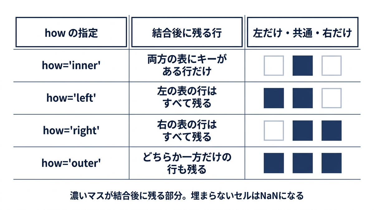
この例では365件の売上データに対して、顧客マスタは5件だけ用意しています。内部結合では両方に存在するIDの4件だけが残り、左結合では売上側の365件がすべて残って、マスタに無い361件のcustomer_nameがNaNになります。件数を減らしたくない集計では左結合を選び、マスタで定義された顧客に絞りたいときは内部結合を選びます。結合のあとに行数とNaNの数を必ず確認してください。
# 顧客マスタデータの作成
# 売上データに実在する顧客IDでマスタを作る。
# 架空のIDだけでマスタを組むと内部結合の結果が0件になり、join方式の違いを確認できない
master_ids = df_sales['customer_id'].head(4).tolist()
customer_master = pd.DataFrame({
    'customer_id': master_ids + [9999],  # 最後の1件はマスタにだけある未取引の顧客
    'customer_name': ['田中商店', 'サトウ企画', '鈴木工業', 'ハヤシ物産', 'ワタナベ商事'],
    'customer_type': ['法人', '個人', '法人', '法人', '個人']
})

# 内部結合(INNER JOIN): 両方にあるキーの行だけが残る
merged_inner = df_sales.merge(customer_master, on='customer_id', how='inner')
print(f"内部結合後のデータ数: {len(merged_inner)}")
print(merged_inner[['date', 'product', 'sales_amount', 'customer_name']].head(3))

# 左結合(LEFT JOIN): 左側の行はすべて残り、一致しないものはNaNになる
merged_left = df_sales.merge(customer_master, on='customer_id', how='left')
print(f"左結合後のデータ数: {len(merged_left)}")
print(f"うちマスタと一致しなかった行: {merged_left['customer_name'].isna().sum()}")
内部結合後のデータ数: 4
        date product  sales_amount customer_name
0 2023-01-01     商品C         22918          田中商店
1 2023-01-02     商品D         21445         サトウ企画
2 2023-01-03     商品A         31306          鈴木工業
左結合後のデータ数: 365
うちマスタと一致しなかった行: 361
19. データの結合(merge)複数キー
商品と地域の組み合わせで仕入単価が決まるマスタのように、結合のキーが2列以上になることがあります。その場合はon=[‘product’, ‘region’]のようにリストで渡します。
ここで気をつけたいのは行数です。キーを1列しか指定しないと、対応する組み合わせの数だけ行が複製されます。下のコードでは、productだけで結合した結果が365行から1460行(地域4件ぶん)に増えることを実際に印字して確かめています。結合のあとは必ず行数と結合率を確認してください。
# 商品マスタデータ(キーは product の1列)
product_master = pd.DataFrame({
    'product': ['商品A', '商品B', '商品C', '商品D'],
    'category': ['家電', '家電', '食品', '食品']
})

# 仕入単価マスタ(同じ商品でも地域で単価が違うので、キーが product と region の2列になる)
cost_master = pd.DataFrame(
    [(p, r, int(base * adj))
     for p, base in [('商品A', 15000), ('商品B', 20000), ('商品C', 5000), ('商品D', 8000)]
     for r, adj in [('東京', 1.00), ('大阪', 0.95), ('名古屋', 0.92), ('福岡', 0.90)]],
    columns=['product', 'region', 'unit_cost'])

# 地域マスタデータ(キーは region の1列)
region_master = pd.DataFrame({
    'region': ['東京', '大阪', '名古屋', '福岡'],
    'region_code': ['TYO', 'OSA', 'NGO', 'FUK'],
    'tax_rate': [0.10, 0.10, 0.10, 0.08]
})

# 複数キーでの結合は on にリストを渡す
enriched_sales = (df_sales
                  .merge(cost_master, on=['product', 'region'], how='left')
                  .merge(product_master, on='product', how='left')
                  .merge(region_master, on='region', how='left'))

print(f"元データ: {len(df_sales)}行 → 結合後: {len(enriched_sales)}行")
print(f"仕入単価の結合率: {enriched_sales['unit_cost'].notna().mean() * 100:.1f}%")

# キーを1列しか指定しないと、対応する組み合わせの数だけ行が複製される
wrong_merge = df_sales.merge(cost_master, on='product', how='left')
print(f"productだけで結合した場合: {len(wrong_merge)}行")

# 利益計算の追加
enriched_sales['profit'] = enriched_sales['sales_amount'] - enriched_sales['unit_cost']
enriched_sales['tax_amount'] = enriched_sales['sales_amount'] * enriched_sales['tax_rate']

print("\n結合・計算後のデータ:")
print(enriched_sales[['product', 'region', 'category', 'unit_cost',
                      'sales_amount', 'profit', 'tax_amount']].head())
元データ: 365行 → 結合後: 365行
仕入単価の結合率: 100.0%
productだけで結合した場合: 1460行

結合・計算後のデータ:
  product region category  unit_cost  sales_amount  profit  tax_amount
0     商品C    名古屋       食品       4600         22918   18318      2291.8
1     商品D    名古屋       食品       7360         21445   14085      2144.5
2     商品A    名古屋       家電      13800         31306   17506      3130.6
3     商品C     東京       食品       5000         17646   12646      1764.6
4     商品C     東京       食品       5000         47843   42843      4784.3
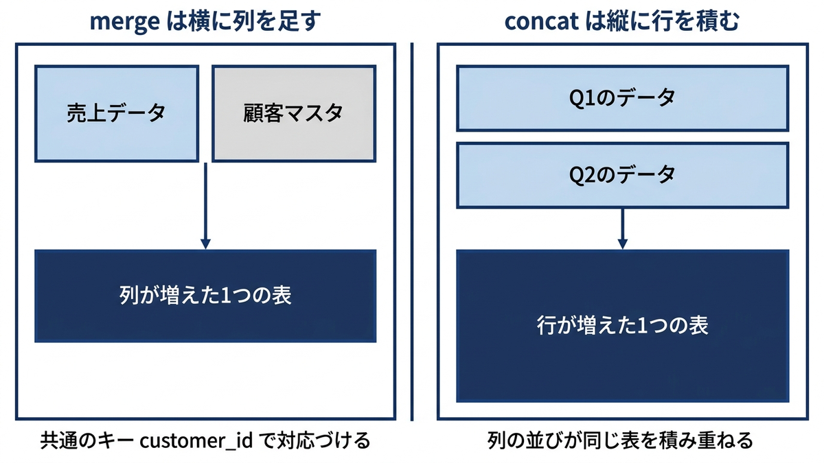
20. データの縦結合(concat)
concat()は、複数のデータフレームを縦方向に積み重ねて1つにまとめる処理です。四半期ごとに分かれたファイルの統合や、複数店舗・複数部門のデータをまとめる作業でよく使われます。
# 複数期間のデータを統合
sales_q1 = df_sales[df_sales['date'].dt.quarter == 1].copy()
sales_q2 = df_sales[df_sales['date'].dt.quarter == 2].copy()

# 期間ラベルの追加
sales_q1['quarter'] = 'Q1'
sales_q2['quarter'] = 'Q2'

# 縦結合
combined_quarters = pd.concat([sales_q1, sales_q2], ignore_index=True)
print(f"結合後のデータ数: {len(combined_quarters)}")

# 複数DataFrameの一括結合
quarter_list = []
for q in range(1, 5):
    quarter_data = df_sales[df_sales['date'].dt.quarter == q].copy()
    quarter_data['quarter'] = f'Q{q}'
    quarter_list.append(quarter_data)

all_quarters = pd.concat(quarter_list, ignore_index=True)
print(f"全四半期結合後: {len(all_quarters)}")
この章を深めたい方への参考書籍
- 本橋智光・橋本秀太郎『改訂新版 前処理大全』(技術評論社):結合を独立した章として扱い、マスタとの突き合わせで行数が意図せず増減する典型的な失敗の避け方が整理されています。本章のmergeを業務データで安全に使うための勘所が得られます。
- Wes McKinney『Pythonによるデータ分析入門 第3版』(オライリー・ジャパン):第8章「データラングリング:連結、結合、変形」で、mergeとjoinとconcatの違いが内部動作から説明されています。どれを使うべきか迷う場面の判断基準になります。
列作成と文字列処理
21. 新しい列の作成と計算
既存の列を使った四則演算や、apply()にラムダ式を渡して条件分岐させることで、税込金額の計算や売上区分・顧客セグメントといった分析用の指標を動的に作成できます。
# 基本的な計算列
df_calc = df_sales.copy()
df_calc['tax'] = df_calc['sales_amount'] * 0.1
df_calc['total_amount'] = df_calc['sales_amount'] + df_calc['tax']

# 条件に基づく列の作成
df_calc['sales_category'] = df_calc['sales_amount'].apply(
    lambda x: '高額' if x >= 30000 else '中額' if x >= 15000 else '少額'
)

# 複数条件での列作成
df_calc['customer_segment'] = df_calc.apply(
    lambda row: 'VIP' if row['sales_amount'] >= 40000 and row['channel'] == 'オンライン'
    else 'Premium' if row['sales_amount'] >= 25000
    else 'Standard', axis=1
)

print("計算列追加後:")
print(df_calc[['sales_amount', 'tax', 'total_amount', 'sales_category', 'customer_segment']].head())
計算列追加後:
   sales_amount     tax  total_amount sales_category customer_segment
0         22918  2291.8       25209.8             中額         Standard
1         21445  2144.5       23589.5             中額         Standard
2         31306  3130.6       34436.6             高額          Premium
3         17646  1764.6       19410.6             中額         Standard
4         47843  4784.3       52627.3             高額              VIP
22. 文字列操作(基本)
.str アクセサを使うことで、文字列の長さ取得、置換、分割、部分文字列の抽出などをベクトル化された形で処理できます。顧客名の正規化やメールドメインの分析、電話番号の地域コード抽出など、テキストの前処理で頻繁に使います。
なお、str[:3]は先頭から3文字を機械的に切り出すため、市外局番が2桁の「03-1234-5678」では「03-」とハイフンまで含まれます。桁数がそろわない項目は、同じレシピで使っているstr.split()のように区切り文字で分ける方が安全です。
# サンプル文字列データの作成
string_data = pd.DataFrame({
    'customer_name': ['田中太郎株式会社', 'サトウ 花子', '鈴木一郎(有)', 'ハヤシ商店', 'ワタナベ・エンタープライズ'],
    'email': ['tanaka@example.com', 'sato.hanako@test.jp', 'suzuki@company.co.jp', 'hayashi@shop.com', 'watanabe@ent.jp'],
    'phone': ['03-1234-5678', '090-8765-4321', '06-9876-5432', '092-1111-2222', '011-3333-4444']
})

# 文字列の長さ
string_data['name_length'] = string_data['customer_name'].str.len()

# 文字列の置換
string_data['clean_name'] = string_data['customer_name'].str.replace('株式会社|(有)|・', '', regex=True)

# 文字列の分割
string_data['domain'] = string_data['email'].str.split('@').str[1]

# 部分文字列の抽出
string_data['area_code'] = string_data['phone'].str[:3]

# 列が多いと表示が省略されるので、確認したい列を分けて印字する
print("長さと置換の結果:")
print(string_data[['customer_name', 'name_length', 'clean_name']])

print("\n分割と部分文字列の結果:")
print(string_data[['email', 'domain', 'phone', 'area_code']])
長さと置換の結果:
   customer_name  name_length    clean_name
0       田中太郎株式会社            8          田中太郎
1         サトウ 花子            6        サトウ 花子
2        鈴木一郎(有)            7          鈴木一郎
3          ハヤシ商店            5         ハヤシ商店
4  ワタナベ・エンタープライズ           13  ワタナベエンタープライズ

分割と部分文字列の結果:
                  email         domain          phone area_code
0    tanaka@example.com    example.com   03-1234-5678       03-
1   sato.hanako@test.jp        test.jp  090-8765-4321       090
2  suzuki@company.co.jp  company.co.jp   06-9876-5432       06-
3      hayashi@shop.com       shop.com  092-1111-2222       092
4       watanabe@ent.jp         ent.jp  011-3333-4444       011
23. 文字列操作(正規表現)
str.extract()やstr.extractall()を使えば、正規表現によるパターンマッチングで商品コードの分類番号を取り出したり、説明文中の注記部分だけを抜き出したりできます。商品コード解析やログ解析、フリーテキストからの構造化データ抽出に有効です。
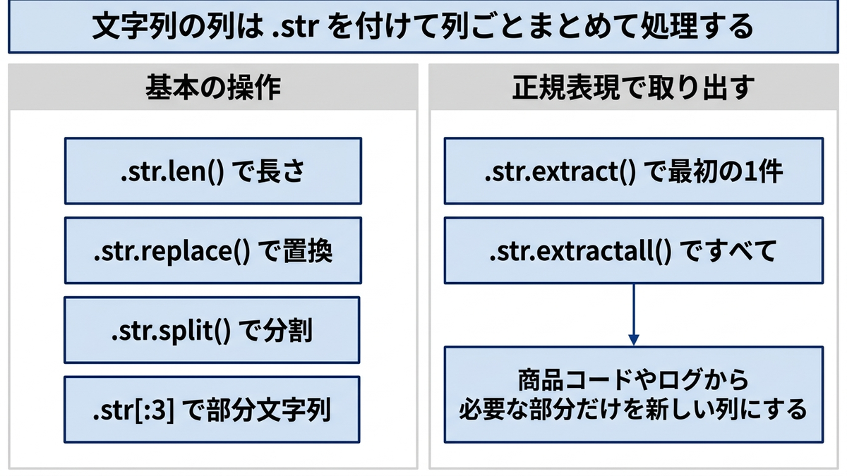
ここで書いている注記のパターンは()と[]だけなので、★や※で囲まれた「商品C★特価★」「商品D※在庫限り※」の2行はNaNになります。パターンに当たらない行はNaNで残る、というのがstr.extract()の挙動です。実データでは記号の種類を先に洗い出し、当たらなかった行を必ず数えてください。
# より複雑な文字列データ
complex_string = pd.DataFrame({
    'product_code': ['PRD-001-A', 'PRD-002-B', 'SVC-003-C', 'PRD-004-D'],
    'description': ['商品A(新発売)', '商品B[限定版]', '商品C★特価★', '商品D※在庫限り※'],
    'mixed_text': ['ABC123def456', 'XYZ789ghi012', 'LMN345jkl678', 'PQR901mno234']
})

# 正規表現でのパターン抽出
# パターンは raw string(先頭のr)で書く。通常の文字列だと \d がエスケープ扱いになり
# Python 3.12以降はSyntaxWarningが出る
complex_string['code_type'] = complex_string['product_code'].str.extract(r'([A-Z]{3})')
complex_string['code_number'] = complex_string['product_code'].str.extract(r'(\d{3})')

# 括弧内の文字抽出
complex_string['note'] = complex_string['description'].str.extract(r'([(\[].*?[)\]])')

# 数字のみ抽出
complex_string['numbers'] = complex_string['mixed_text'].str.extractall(r'(\d+)').groupby(level=0)[0].apply(list)

# 列が多いと表示が省略されるので、確認したい列を分けて印字する
print("商品コードの分解:")
print(complex_string[['product_code', 'code_type', 'code_number']])

print("\n注記の抽出:")
print(complex_string[['description', 'note']])

print("\n数字の抽出:")
print(complex_string[['mixed_text', 'numbers']])
商品コードの分解:
  product_code code_type code_number
0    PRD-001-A       PRD         001
1    PRD-002-B       PRD         002
2    SVC-003-C       SVC         003
3    PRD-004-D       PRD         004

注記の抽出:
  description   note
0    商品A(新発売)  (新発売)
1    商品B[限定版]  [限定版]
2     商品C★特価★    NaN
3   商品D※在庫限り※    NaN

数字の抽出:
     mixed_text     numbers
0  ABC123def456  [123, 456]
1  XYZ789ghi012  [789, 012]
2  LMN345jkl678  [345, 678]
3  PQR901mno234  [901, 234]
この章を深めたい方への参考書籍
- Wes McKinney『Pythonによるデータ分析入門 第3版』(オライリー・ジャパン):文字列操作と正規表現の解説があり、本章のextractやreplaceをより込み入ったパターンへ広げられます。テキストの前処理を行単位のループで書かずに済ませる発想が身につきます。
- 本橋智光・橋本秀太郎『改訂新版 前処理大全』(技術評論社):文字列とカテゴリを扱う章があり、表記ゆれの正規化や区分の切り出しを前処理の一工程として設計する考え方を確認できます。
日付・時系列とデータ品質(外れ値)処理
24. 日付・時刻操作(基本)
.dt アクセサを使うと、年・月・日・曜日・週末フラグ・四半期・週番号などを日付列から一括で取り出せます。季節性分析や曜日別パフォーマンス分析といった、時系列分析の土台になる処理です。
週番号だけは読み方に注意が要ります。isocalendar().weekが返すのはISO週番号で、週は月曜始まり、年の第1週はその年の最初の木曜日を含む週と決まっています。そのため実測では2023年1月1日(日曜)の週番号が52になり、前年の最終週として扱われます。年またぎの集計を週単位で行うときは、年と週番号を組にして使ってください。
# 日付情報の抽出
df_date = df_sales.copy()
df_date['year'] = df_date['date'].dt.year
df_date['month'] = df_date['date'].dt.month
df_date['day'] = df_date['date'].dt.day
df_date['weekday'] = df_date['date'].dt.day_name()
df_date['is_weekend'] = df_date['date'].dt.weekday >= 5

# 四半期・週番号
df_date['quarter'] = df_date['date'].dt.quarter
df_date['week_of_year'] = df_date['date'].dt.isocalendar().week

# 月初・月末
df_date['month_start'] = df_date['date'].dt.to_period('M').dt.start_time
df_date['month_end'] = df_date['date'].dt.to_period('M').dt.end_time

print("日付処理結果:")
print(df_date[['date', 'year', 'month', 'weekday', 'is_weekend', 'quarter']].head())

print("\n週番号と月初・月末:")
print(df_date[['date', 'day', 'week_of_year', 'month_start', 'month_end']].head())

# 週末売上の分析
weekend_analysis = df_date.groupby('is_weekend')['sales_amount'].agg(['count', 'mean']).round(2)
print("\n週末vs平日売上:")
print(weekend_analysis)
日付処理結果:
        date  year  month    weekday  is_weekend  quarter
0 2023-01-01  2023      1     Sunday        True        1
1 2023-01-02  2023      1     Monday       False        1
2 2023-01-03  2023      1    Tuesday       False        1
3 2023-01-04  2023      1  Wednesday       False        1
4 2023-01-05  2023      1   Thursday       False        1

週番号と月初・月末:
        date  day  week_of_year month_start                  month_end
0 2023-01-01    1            52  2023-01-01 2023-01-31 23:59:59.999999
1 2023-01-02    2             1  2023-01-01 2023-01-31 23:59:59.999999
2 2023-01-03    3             1  2023-01-01 2023-01-31 23:59:59.999999
3 2023-01-04    4             1  2023-01-01 2023-01-31 23:59:59.999999
4 2023-01-05    5             1  2023-01-01 2023-01-31 23:59:59.999999

週末vs平日売上:
            count      mean
is_weekend
False         260  25160.37
True          105  24385.17
25. 日付・時刻操作(期間計算)
基準日からの経過日数や営業日数の計算、累積売上、移動平均といった処理は、業績の進捗管理やトレンド把握に直結します。特にrolling()による移動平均は、日々の変動をならして傾向を見るために広く使われます。
# レシピ24で作った、年・月・曜日などの列を足したdf_dateをそのまま使う

# 基準日からの経過日数
base_date = pd.to_datetime('2023-01-01')
df_date['days_from_start'] = (df_date['date'] - base_date).dt.days

# 営業日計算(土日を除く)
df_date['business_days_from_start'] = df_date['date'].apply(
    lambda x: len(pd.bdate_range(base_date, x))
)

# 年初来売上の累積計算
df_date_sorted = df_date.sort_values('date')
df_date_sorted['cumulative_sales'] = df_date_sorted['sales_amount'].cumsum()

# 移動平均(7日間)
df_date_sorted['sales_ma7'] = df_date_sorted['sales_amount'].rolling(window=7).mean()

# 列数が多いと表示が省略されるので、経過日数と累積系を分けて印字する
print("経過日数と営業日数:")
print(df_date_sorted[['date', 'days_from_start', 'business_days_from_start']].head(10))

print("\n累積売上と7日移動平均:")
print(df_date_sorted[['date', 'sales_amount', 'cumulative_sales', 'sales_ma7']].head(10))

# 累積売上の可視化
plt.figure(figsize=(12, 6))
plt.plot(df_date_sorted['date'], df_date_sorted['cumulative_sales'])
plt.title('年初来累積売上')
plt.xlabel('日付')
plt.ylabel('累積売上')
plt.xticks(rotation=45)
plt.grid(True)
plt.show()
経過日数と営業日数:
        date  days_from_start  business_days_from_start
0 2023-01-01                0                         0
1 2023-01-02                1                         1
2 2023-01-03                2                         2
3 2023-01-04                3                         3
4 2023-01-05                4                         4
5 2023-01-06                5                         5
6 2023-01-07                6                         5
7 2023-01-08                7                         5
8 2023-01-09                8                         6
9 2023-01-10                9                         7

累積売上と7日移動平均:
        date  sales_amount  cumulative_sales     sales_ma7
0 2023-01-01         22918             22918           NaN
1 2023-01-02         21445             44363           NaN
2 2023-01-03         31306             75669           NaN
3 2023-01-04         17646             93315           NaN
4 2023-01-05         47843            141158           NaN
5 2023-01-06         32065            173223           NaN
6 2023-01-07         26199            199422  28488.857143
7 2023-01-08         42976            242398  31354.285714
(出力は以降も続きます。ここでは冒頭のみ載せました)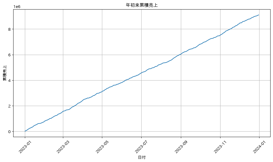
26. 外れ値の検出(統計的手法)
IQR法(四分位範囲を使う方法)とZ-score法は、外れ値検出の代表的な2つのアプローチです。どちらも実装は数行で済みますが、データの分布によって適した手法が異なるため、両方を試して比較するのがおすすめです。
ここで使っているサンプルデータの売上は1000〜50000の一様乱数で、そのままでは外れ値が1件もありません。両方の手法とも検出数が0件になり、比較しようがないのです。そこで、極端な取引を5件足したコピーを作ってから検出しています。
このデータでは両方の手法が5件とも検出します。ただし、使っている境界の高さはまったく違います。IQR法の上限が77,330であるのに対して、Z-score法の上限は平均と標準偏差から109,442になります。外れ値そのものが標準偏差を押し上げるため、Z-score法の基準は甘くなるのです。たとえば9万円の取引はIQR法なら外れ値ですが、Z-score法では通常の値と判定されます。
この差は外れ値の件数が増えるほど広がります。コードの後半では、12万円の取引を5件・20件・40件・60件と混ぜて検出数を測っています。5件と20件では両者とも全件を検出しますが、40件を混ぜた時点でIQR法が40件を検出する一方、Z-score法は0件になります。外れ値が増えるほど標準偏差が膨らみ、外れ値そのものが基準を押し上げるためで、マスキングと呼ばれる現象です。IQR法は中央値と四分位数しか使わないので、この影響を受けません。
もう1点、IQR法の下限は実測でマイナスになります。売上のように0以上の値しか取らないデータでは、下限側の外れ値は原理的に検出されません。境界の値そのものを印字して、その値が業務上ありうる範囲かどうかを毎回見てください。
# df_salesの売上は1000〜50000の一様乱数なので、そのままでは外れ値が1件も無い。
# 検出手法の違いを見るために、極端な取引を5件足したコピーを作る
extreme_rows = pd.DataFrame({
    'date': pd.to_datetime(['2023-03-15', '2023-06-02', '2023-08-21',
                            '2023-10-09', '2023-11-30']),
    'product': ['商品A', '商品B', '商品A', '商品C', '商品D'],
    'sales_amount': [182000, 240000, 165000, 305000, 208000],
    'customer_id': [1234, 2345, 3456, 4567, 5678],
    'region': ['東京', '大阪', '東京', '名古屋', '福岡'],
    'channel': ['オンライン', '店舗', 'オンライン', '電話', '店舗'],
})
base_cols = ['date', 'product', 'sales_amount', 'customer_id', 'region', 'channel']
df_with_outliers = pd.concat([df_sales[base_cols], extreme_rows], ignore_index=True)
print(f"検証用データ: {len(df_with_outliers)}件(うち極端な値 {len(extreme_rows)}件)")

# IQR法による外れ値検出
Q1 = df_with_outliers['sales_amount'].quantile(0.25)
Q3 = df_with_outliers['sales_amount'].quantile(0.75)
IQR = Q3 - Q1

lower_bound = Q1 - 1.5 * IQR
upper_bound = Q3 + 1.5 * IQR

outliers_iqr = df_with_outliers[(df_with_outliers['sales_amount'] < lower_bound) |
                                (df_with_outliers['sales_amount'] > upper_bound)]
print(f"IQR法の下限・上限: {lower_bound:,.0f} / {upper_bound:,.0f}")
print(f"IQR法による外れ値数: {len(outliers_iqr)}")

# Z-score法
from scipy import stats
z_scores = np.abs(stats.zscore(df_with_outliers['sales_amount']))
outliers_zscore = df_with_outliers[z_scores > 3]
mu = df_with_outliers['sales_amount'].mean()
sd = df_with_outliers['sales_amount'].std(ddof=0)
print(f"Z-score法の上限  : {mu + 3 * sd:,.0f}"
      f"(平均 {mu:,.0f} + 3 × 標準偏差 {sd:,.0f})")
print(f"Z-score法による外れ値数: {len(outliers_zscore)}")

# 極端な値の件数を増やすと標準偏差が膨らみ、Z-score法の閾値が押し上げられて検出数が落ちる
print("\n極端な値(12万円)を混ぜる件数を変えたときの検出数:")
for k in (5, 20, 40, 60):
    trial = pd.concat([df_sales['sales_amount'], pd.Series([120000] * k)],
                      ignore_index=True)
    q1, q3 = trial.quantile(0.25), trial.quantile(0.75)
    n_iqr = int((trial > q3 + 1.5 * (q3 - q1)).sum())
    n_z = int((np.abs(stats.zscore(trial)) > 3).sum())
    print(f"  {k:2d}件混入 → IQR法 {n_iqr:2d}件 / Z-score法 {n_z:2d}件")

# 外れ値の可視化
plt.figure(figsize=(12, 5))

plt.subplot(1, 2, 1)
plt.boxplot(df_with_outliers['sales_amount'])
plt.title('売上金額の箱ひげ図')
plt.ylabel('売上金額')

plt.subplot(1, 2, 2)
plt.hist(df_with_outliers['sales_amount'], bins=60, alpha=0.7)
plt.axvline(upper_bound, color='r', linestyle='--', label='IQR法の上限')
plt.axvline(mu + 3 * sd, color='g', linestyle=':', label='Z-score法の上限')
plt.title('売上金額の分布と外れ値境界')
plt.xlabel('売上金額')
plt.ylabel('頻度')
plt.legend()
plt.tight_layout()
plt.show()
検証用データ: 370件(うち極端な値 5件)
IQR法の下限・上限: -26,938 / 77,330
IQR法による外れ値数: 5
Z-score法の上限  : 109,442(平均 27,573 + 3 × 標準偏差 27,290)
Z-score法による外れ値数: 5

極端な値(12万円)を混ぜる件数を変えたときの検出数:
   5件混入 → IQR法  5件 / Z-score法  5件
  20件混入 → IQR法 20件 / Z-score法 20件
  40件混入 → IQR法 40件 / Z-score法  0件
  60件混入 → IQR法 60件 / Z-score法  0件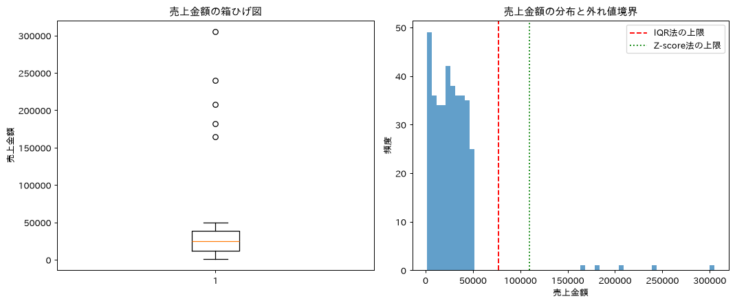
27. 外れ値の処理(除去・変換)
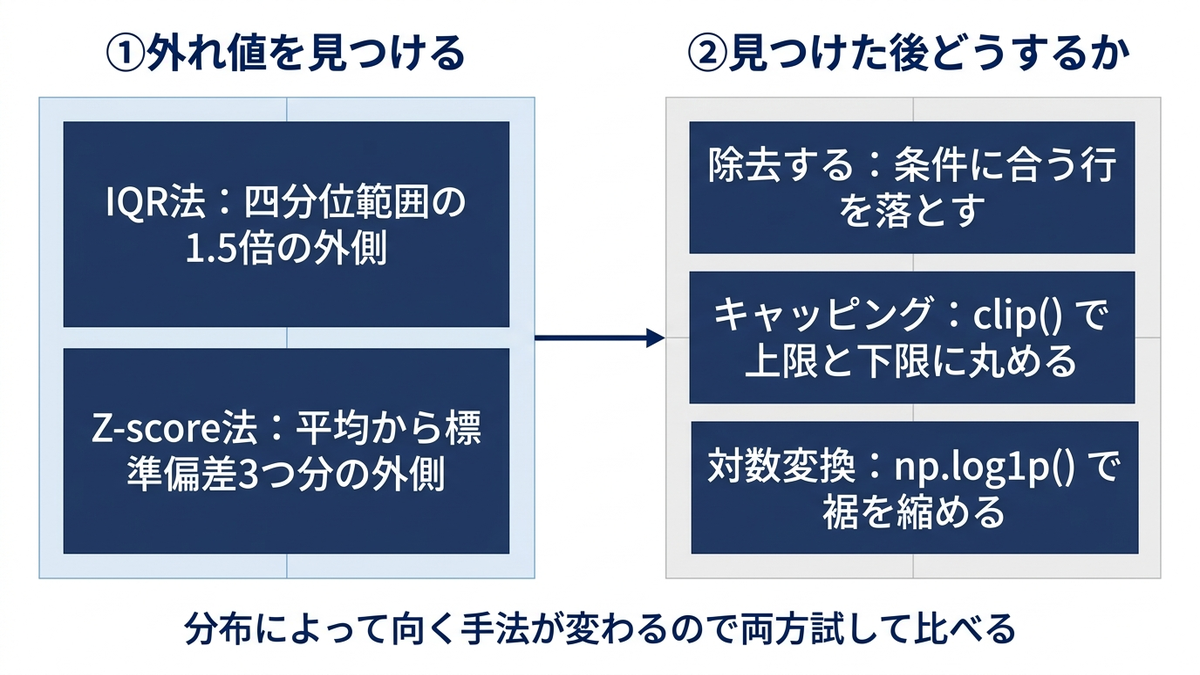
外れ値を検出した後は、単純に除去する、clip()で上限・下限に丸め込む(キャッピング)、対数変換で分布を緩やかにする、といった選択肢があります。どれを選ぶかで、そのあとの平均値やモデルの学習結果が変わります。
3つの違いは、実測の歪度(分布の裾がどちらに長いかを表す値)を並べるとはっきりします。外れ値を5件含む元データの歪度は5.676で、右裾が大きく伸びた状態です。外れ値を除去すると0.019、キャッピングでは0.399まで下がります。対数変換は-0.864で、今度は左裾が長い分布に変わります。
件数の扱いも違います。除去は370件から365件へ5件減りますが、キャッピングと対数変換は370件のままです。キャッピングは最大値を305,000から77,330(IQR法の上限)に丸めるので、件数を保ったまま平均や標準偏差への影響だけを抑えられます。ただし、外れ値そのものが分析対象の場合(不正検知など)は、除去もキャッピングも見たい情報を消してしまう点に注意してください。
なお、これらの処理が機械学習モデルの精度向上につながるかどうかは、データと手法によって変わります。ここでは分布の形が変わることまでを確認しており、精度への影響は実際に学習させて比べる必要があります。
# レシピ26で作った、外れ値を含むデータをそのまま使う
# 外れ値の無いデータで処理しても、処理前と処理後がまったく同じ表になって何も分からない

# 外れ値の除去
df_no_outliers = df_with_outliers[(df_with_outliers['sales_amount'] >= lower_bound) &
                                  (df_with_outliers['sales_amount'] <= upper_bound)]
print(f"元のデータ数: {len(df_with_outliers)} → 外れ値除去後: {len(df_no_outliers)}")

# 外れ値のキャッピング(上限・下限での置き換え)
df_capped = df_with_outliers.copy()
df_capped['sales_amount_capped'] = df_capped['sales_amount'].clip(lower=lower_bound, upper=upper_bound)

# ログ変換(右裾の長い分布に対して)
df_capped['sales_amount_log'] = np.log1p(df_capped['sales_amount'])

# 統計比較
print("\n外れ値処理前後の統計:")
comparison = pd.DataFrame({
    '元データ': df_with_outliers['sales_amount'].describe(),
    '外れ値除去': df_no_outliers['sales_amount'].describe(),
    'キャッピング': df_capped['sales_amount_capped'].describe()
}).round(2)
print(comparison)

# 歪度(右裾の長さ)でも比べる。外れ値処理はこの値を下げるために行う
print("\n歪度の比較:")
print(f"  元データ    : {df_with_outliers['sales_amount'].skew():.3f}")
print(f"  外れ値除去  : {df_no_outliers['sales_amount'].skew():.3f}")
print(f"  キャッピング: {df_capped['sales_amount_capped'].skew():.3f}")
print(f"  対数変換    : {df_capped['sales_amount_log'].skew():.3f}")
元のデータ数: 370 → 外れ値除去後: 365

外れ値処理前後の統計:
            元データ     外れ値除去    キャッピング
count     370.00    365.00    370.00
mean    27573.35  24937.37  25645.38
std     27326.58  14414.74  15545.48
min      1190.00   1190.00   1190.00
25%     12162.75  12093.00  12162.75
50%     24998.00  24548.00  24998.00
75%     38229.75  37212.00  38229.75
max    305000.00  49816.00  77330.25

歪度の比較:
  元データ    : 5.676
  外れ値除去  : 0.019
  キャッピング: 0.399
  対数変換    : -0.864
28. データのリサンプリング(時系列)
日付をインデックスに設定してresample()を使うと、日次データを週次・月次・四半期次といった任意の時間粒度に集約できます。定期レポートの作成や、異なる粒度でのトレンド分析に必須の処理です。なお、下のコードで作るmonthly_salesは、レシピ15で同じ名前を使った変数(year_month別の売上合計のSeries)を上書きします。ここでのmonthly_salesはresampleで作った複数列のデータフレームで中身が別物なので、レシピ15の結果も残しておきたいときは別の名前を付けてください。
# 日次データを週次・月次に集約
df_time = df_sales.set_index('date')

# 週次集約
weekly_sales = df_time.resample('W')['sales_amount'].agg(['sum', 'mean', 'count']).round(2)
print("週次売上統計:")
print(weekly_sales.head())

# 月次集約
monthly_sales = df_time.resample('ME').agg({
    'sales_amount': ['sum', 'mean', 'count'],
    'customer_id': 'nunique'
}).round(2)
print("\n月次詳細統計:")
print(monthly_sales.head())

# 四半期集約
quarterly_sales = df_time.resample('QE').agg({
    'sales_amount': 'sum',
    'customer_id': 'nunique'
})
quarterly_sales.columns = ['総売上', 'ユニーク顧客数']
print("\n四半期統計:")
print(quarterly_sales)

# リサンプリング結果の可視化
fig, axes = plt.subplots(2, 1, figsize=(12, 10))

weekly_sales['sum'].plot(ax=axes[0], title='週次売上推移', marker='o')
monthly_sales[('sales_amount', 'sum')].plot(ax=axes[1], title='月次売上推移', marker='s', color='orange')

plt.tight_layout()
plt.show()
週次売上統計:
               sum      mean  count
date
2023-01-01   22918  22918.00      1
2023-01-08  219480  31354.29      7
2023-01-15  200355  28622.14      7
2023-01-22  173154  24736.29      7
2023-01-29  106015  15145.00      7

月次詳細統計:
           sales_amount                 customer_id
                    sum      mean count     nunique
date
2023-01-31       771866  24898.90    31          31
2023-02-28       741681  26488.61    28          28
2023-03-31       871354  28108.19    31          31
2023-04-30       692046  23068.20    30          30
2023-05-31       728795  23509.52    31          31

四半期統計:
                総売上  ユニーク顧客数
date
2023-03-31  2384901       89
2023-06-30  2138174       91
2023-09-30  2284497       91
2023-12-31  2294567       92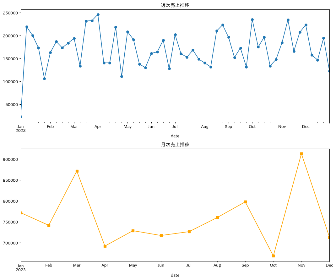
月次・四半期のリサンプリングは、以前はresample(‘M’)やresample(‘Q’)という表記でしたが、現行のpandasでは月末は’ME’、四半期末は’QE’という表記が標準です。本コラムのコードもこの表記に統一しています。
29. ローリング計算(移動統計)
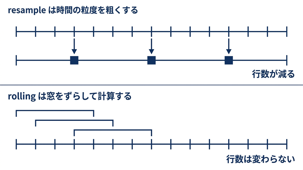
rolling()を使うと、移動平均だけでなく移動合計・移動標準偏差・移動最大最小など、様々な移動統計を計算できます。移動平均と標準偏差を組み合わせたボラティリティ指標は、トレンド分析や予測モデルの特徴量作成でよく使われます。
# 時系列データの準備
df_time_sorted = df_sales.sort_values('date').set_index('date')

# 移動平均
df_time_sorted['sales_ma7'] = df_time_sorted['sales_amount'].rolling(window=7).mean()
df_time_sorted['sales_ma30'] = df_time_sorted['sales_amount'].rolling(window=30).mean()

# 移動合計
df_time_sorted['sales_sum7'] = df_time_sorted['sales_amount'].rolling(window=7).sum()

# 移動標準偏差
df_time_sorted['sales_std7'] = df_time_sorted['sales_amount'].rolling(window=7).std()

# ボラティリティ指標
df_time_sorted['cv_7'] = df_time_sorted['sales_std7'] / df_time_sorted['sales_ma7']

# 移動最大・最小
df_time_sorted['sales_max7'] = df_time_sorted['sales_amount'].rolling(window=7).max()
df_time_sorted['sales_min7'] = df_time_sorted['sales_amount'].rolling(window=7).min()

print("ローリング統計結果:")
print(df_time_sorted[['sales_amount', 'sales_ma7', 'sales_ma30', 'sales_std7', 'cv_7']].tail(10))

print("\n移動合計と移動最大・最小:")
print(df_time_sorted[['sales_amount', 'sales_sum7', 'sales_max7', 'sales_min7']].tail(10))

# 移動平均の可視化
plt.figure(figsize=(15, 8))
plt.plot(df_time_sorted.index, df_time_sorted['sales_amount'], alpha=0.3, label='日次売上')
plt.plot(df_time_sorted.index, df_time_sorted['sales_ma7'], label='7日移動平均')
plt.plot(df_time_sorted.index, df_time_sorted['sales_ma30'], label='30日移動平均')
plt.title('売上トレンドと移動平均')
plt.xlabel('日付')
plt.ylabel('売上金額')
plt.legend()
plt.grid(True)
plt.show()
ローリング統計結果:
            sales_amount     sales_ma7    sales_ma30    sales_std7      cv_7
date
2023-12-22         12130  20831.000000  25357.100000  12068.178791  0.579337
2023-12-23         22972  23186.142857  25901.366667  10277.999212  0.443282
2023-12-24         41419  27769.571429  25805.800000  10225.391645  0.368223
2023-12-25          2167  24884.285714  24267.366667  14114.703630  0.567214
2023-12-26         28192  23446.142857  25076.633333  12993.135103  0.554169
2023-12-27          2062  20229.857143  24400.300000  15256.271338  0.754146
2023-12-28         19540  18354.571429  23473.233333  14246.048550  0.776158
2023-12-29         25244  20228.000000  22784.300000  14153.033774  0.699675
2023-12-30         22545  20167.000000  23022.566667  14140.150259  0.701153
2023-12-31         22689  17491.285714  22360.366667  10834.050854  0.619397

移動合計と移動最大・最小:
            sales_amount  sales_sum7  sales_max7  sales_min7
date
2023-12-22         12130    145817.0     38259.0      6486.0
2023-12-23         22972    162303.0     38259.0      9335.0
(出力は以降も続きます。ここでは冒頭のみ載せました)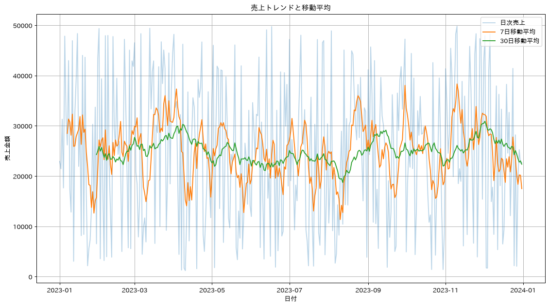
この章を深めたい方への参考書籍
- Wes McKinney『Pythonによるデータ分析入門 第3版』(オライリー・ジャパン):第11章「時系列データ」で、頻度指定やタイムゾーン、resampleとrollingの考え方が体系的に説明されています。本章のリサンプリングと移動統計を、期末や営業日といった業務のカレンダーに合わせて組み直せます。
- 井手剛・杉山将『異常検知と変化検知』(講談社):本章のIQR法やZ-score法を、確率分布に基づく異常度という共通の枠組みで捉え直せます。閾値をなぜその値に置くのかに根拠を持たせたいときの土台になります。
統計的前処理と分析
30. データの標準化・正規化
scikit-learnのStandardScaler、MinMaxScaler、RobustScalerは、pandasのデータフレームと組み合わせて使うことが多い前処理です。単位の異なる変数を比較したり、クラスタ分析や主成分分析の前処理として使ったりします。外れ値に強いのはRobustScalerです。
3つとも一次変換なので、ヒストグラムの形そのものは変わりません。4つの図が同じ形に見えるのはそのためで、変わるのは横軸の目盛りだけです。違いは中心と幅の決め方にあります。StandardScalerは平均と標準偏差、MinMaxScalerは最小値と最大値、RobustScalerは中央値と四分位範囲を使います。
この違いが効いてくるのは外れ値があるときです。コードの後半では、レシピ26で作った極端な値を5件含むデータで3つを比べ、通常の365件がどの範囲に収まるかを測っています。実測では、RobustScalerの範囲は外れ値が無いとき-0.930〜+1.006で、極端な値を5件加えても-0.913〜+0.952とほとんど変わりません。一方でStandardScalerは-1.650〜+1.728から-0.967〜+0.815へ、MinMaxScalerは0.000〜1.000から+0.000〜+0.160へと大きく縮みます。標準偏差や最大値が外れ値に引っ張られ、通常の365件が狭い範囲に押し込まれてしまうためです。なお、ここでの標準化はデータの姿を把握するための前処理なので、データ全体を使って基準を決めています。モデル学習のパイプラインに組み込む前処理は第2部(レシピ51以降)で改めて扱い、そちらでは変換の基準を訓練データだけで決めて、検証やテストのデータの情報が学習側に漏れるのを防ぎます。
from sklearn.preprocessing import StandardScaler, MinMaxScaler, RobustScaler

# 数値データの抽出
numeric_data = df_sales[['sales_amount', 'customer_id']].copy()

# Z-score標準化
scaler_standard = StandardScaler()
numeric_data['sales_standardized'] = scaler_standard.fit_transform(numeric_data[['sales_amount']])

# Min-Max正規化(0-1スケール)
scaler_minmax = MinMaxScaler()
numeric_data['sales_normalized'] = scaler_minmax.fit_transform(numeric_data[['sales_amount']])

# ロバスト標準化(外れ値に強い)
scaler_robust = RobustScaler()
numeric_data['sales_robust'] = scaler_robust.fit_transform(numeric_data[['sales_amount']])

# 結果の比較
print("標準化・正規化結果の統計:")
comparison_stats = numeric_data[['sales_amount', 'sales_standardized', 'sales_normalized', 'sales_robust']].describe().round(3)
print(comparison_stats)

# 外れ値があるとどう変わるか(レシピ26で作った、極端な値を5件含むデータで比べる)
ext = df_with_outliers[['sales_amount']]
n_normal = len(df_sales)  # 極端な値を足す前の件数
print("\n外れ値を含むデータでの比較(通常の365件がどの範囲に収まるか):")
for name, scaler in [('StandardScaler', StandardScaler()),
                     ('MinMaxScaler', MinMaxScaler()),
                     ('RobustScaler', RobustScaler())]:
    scaled = scaler.fit_transform(ext).ravel()[:n_normal]
    print(f"  {name:15s} {scaled.min():+.3f} 〜 {scaled.max():+.3f}")

# 分布の可視化
fig, axes = plt.subplots(2, 2, figsize=(12, 10))
axes = axes.ravel()

for ax, col, label in zip(
        axes,
        ['sales_amount', 'sales_standardized', 'sales_normalized', 'sales_robust'],
        ['元データ', '標準化', '正規化', 'ロバスト標準化']):
    numeric_data[col].hist(bins=30, ax=ax)
    ax.set_title(label)

plt.tight_layout()
plt.show()
標準化・正規化結果の統計:
       sales_amount  sales_standardized  sales_normalized  sales_robust
count       365.000             365.000           365.000       365.000
mean      24937.367               0.000             0.488         0.016
std       14414.738               1.001             0.296         0.574
min        1190.000              -1.650             0.000        -0.930
25%       12093.000              -0.892             0.224        -0.496
50%       24548.000              -0.027             0.480         0.000
75%       37212.000               0.853             0.741         0.504
max       49816.000               1.728             1.000         1.006

外れ値を含むデータでの比較(通常の365件がどの範囲に収まるか):
  StandardScaler  -0.967 〜 +0.815
  MinMaxScaler    +0.000 〜 +0.160
  RobustScaler    -0.913 〜 +0.952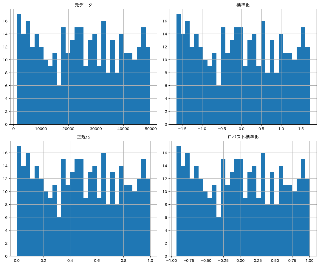
31. カテゴリカルデータのエンコーディング
機械学習モデルにカテゴリ変数を渡す際は、Label Encoding、One-Hot Encoding、Frequency Encodingといった手法で数値化する必要があります。カテゴリ数や変数の性質によって適した手法が異なるため、使い分けが重要です。
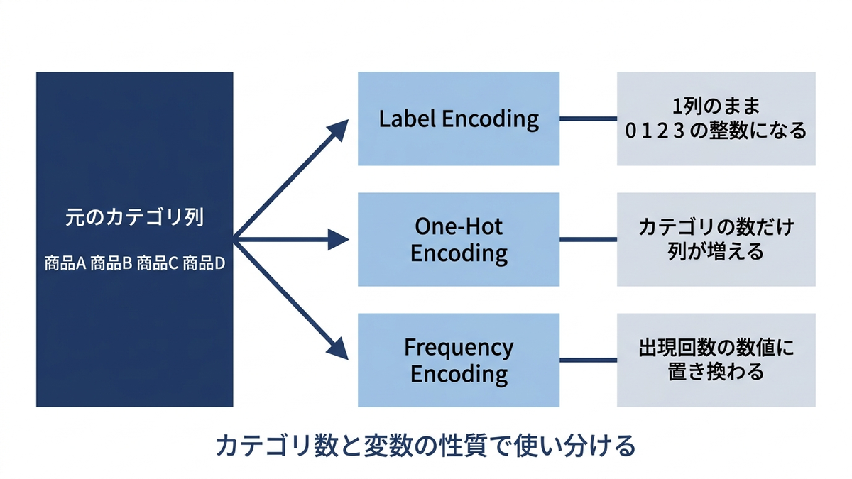
選ぶ基準は、実行結果を並べると整理できます。Label Encodingは1列のまま数値に置き換えますが、実測では商品Aが0、商品Bが1、商品Cが2、商品Dが3と、名前順に並べただけの数値が入ります。商品Dが商品Aの3倍という意味はどこにもないので、数値の大小をそのまま意味として扱う線形回帰やロジスティック回帰、k近傍法には向きません。一方、決定木やランダムフォレストのように値を境目で区切って判断するモデルでは、この順序が結果に与える影響は小さくなります。S・M・Lや松竹梅のようにもともと順序があるカテゴリであれば、Label Encodingがそのまま素直な表現になります。
One-Hot Encodingはカテゴリごとに0と1の列を作るので、順序という余計な情報が入りません。代わりに列が増えます。実測では、商品・地域・チャネルの3列が、商品の4列・地域の4列・チャネルの3列で合わせて11列になりました。カテゴリ数が数十から数百に及ぶ列(顧客ID、郵便番号、商品コードなど)にそのまま当てると列数が膨れ上がるため、その場合は1列に収まる手法を検討します。Frequency Encodingは出現頻度に置き換える手法で、実測では商品Aが87、商品Bが80、商品Cが96、商品Dが102と、件数という実際の意味を持った数値になります。ただし出現回数が同じカテゴリは同じ値になり区別できなくなる点には注意が必要です。目的変数の平均値を使うTarget Encodingを含めた比較は、第2部のレシピ53で扱います。
# One-Hot Encoding は pandas の get_dummies() で行うため、
# scikit-learn からは LabelEncoder だけを読み込む
from sklearn.preprocessing import LabelEncoder

# カテゴリカルデータの準備
categorical_data = df_sales[['product', 'region', 'channel']].copy()

# Label Encoding
le = LabelEncoder()
categorical_data['product_encoded'] = le.fit_transform(categorical_data['product'])

# One-Hot Encoding
product_onehot = pd.get_dummies(categorical_data['product'], prefix='product')
region_onehot = pd.get_dummies(categorical_data['region'], prefix='region')
channel_onehot = pd.get_dummies(categorical_data['channel'], prefix='channel')

# One-Hot結果の結合
encoded_data = pd.concat([categorical_data, product_onehot, region_onehot, channel_onehot], axis=1)

print("エンコーディング結果:")
print("Label Encoding:")
print(categorical_data[['product', 'product_encoded']].head())

print("\nOne-Hot Encoding (商品):")
print(product_onehot.head())

# Frequency Encoding(出現頻度でエンコード)
product_freq = categorical_data['product'].value_counts().to_dict()
categorical_data['product_freq_encoded'] = categorical_data['product'].map(product_freq)

print("\nFrequency Encoding:")
print(categorical_data[['product', 'product_freq_encoded']].head())
エンコーディング結果:
Label Encoding:
  product  product_encoded
0     商品C                2
1     商品D                3
2     商品A                0
3     商品C                2
4     商品C                2

One-Hot Encoding (商品):
   product_商品A  product_商品B  product_商品C  product_商品D
0        False        False         True        False
1        False        False        False         True
2         True        False        False        False
3        False        False         True        False
4        False        False         True        False

Frequency Encoding:
  product  product_freq_encoded
0     商品C                    96
1     商品D                   102
2     商品A                    87
3     商品C                    96
4     商品C                    96
32. クロス集計と相関分析
pd.crosstab()はグループ化・集計をより簡単な記法で行える関数で、カイ二乗検定と組み合わせれば変数間に統計的な関連があるかを検証できます。数値変数についてはcorr()とヒートマップで相関関係を俯瞰できます。
p値は、「商品と地域には関係がない」と仮定したときに、手元のデータほど偏った表がたまたま現れる確率です。この値が小さいほど「関係がない」という仮定が苦しくなるため、実務では0.05(有意水準5%)を境界に置き、これを下回ったら関連ありと判定する慣習が広く使われています。0.05という数字そのものに理論的な根拠があるわけではなく、分野によっては0.01を使うこともあります。
カイ二乗検定の実測はp値0.229で、0.05を大きく上回るため、商品と地域に統計的な関連は見られません。サンプルデータの商品と地域をそれぞれ独立の一様乱数で作っているので、想定どおりの結果です。検定は関連があることを示すためだけでなく、思いついた関連が実は無いと確認するためにも使います。
相関行列に使っているenriched_salesは、レシピ19でdf_salesに仕入単価(unit_cost)と商品カテゴリ、地域コード、税率(tax_rate)を結合し、そこから利益(profit)と税額(tax_amount)を計算して足したデータフレームです。このレシピだけを単独で動かすときは、先にレシピ19のコードを実行してください。
相関行列では、売上金額と利益が0.935、売上金額と税額が0.985と強く出ます。利益は売上から仕入単価を引いた値、税額は売上に税率を掛けた値なので、当然の結果です。仕入単価と利益は-0.333で、仕入が高いほど利益が減る関係が現れています。このように、計算で作った列どうしの相関は必ず高くなります。相関行列を読むときは、まずその2つが別々に測られた値かどうかを確認してください。
# クロス集計表の作成
crosstab = pd.crosstab(df_sales['product'], df_sales['region'], margins=True)
print("商品×地域クロス集計:")
print(crosstab)

# 比率でのクロス集計
crosstab_pct = pd.crosstab(df_sales['product'], df_sales['region'], normalize='index') * 100
print("\n商品別地域構成比(%):")
print(crosstab_pct.round(1))

# カイ二乗検定
from scipy.stats import chi2_contingency
chi2, p_value, dof, expected = chi2_contingency(crosstab.iloc[:-1, :-1])  # marginを除く
print(f"\nカイ二乗統計量: {chi2:.3f}")
print(f"p値: {p_value:.3f}")
print(f"商品と地域に関連性があるか: {'Yes' if p_value < 0.05 else 'No'}")

# 数値変数の相関分析
# レシピ19で作ったenriched_sales(df_salesに仕入単価・税率・利益・税額を足したもの)を使う。
# このレシピだけを動かすときは、先にレシピ19のコードを実行しておくこと。
# df_salesにはレシピ6で作ったsales_amount_float(sales_amountの型違い)が残っており、
# そのままcorr()を取ると同じ列どうしで1.00が並ぶだけなので、意味のある列に絞る
corr_source = enriched_sales[['sales_amount', 'unit_cost', 'profit', 'tax_rate', 'tax_amount']]
correlation_matrix = corr_source.corr()

print("\n相関行列:")
print(correlation_matrix.round(3))

# ヒートマップでの可視化
plt.figure(figsize=(10, 8))
sns.heatmap(correlation_matrix, annot=True, cmap='coolwarm', center=0)
plt.title('変数間の相関関係')
plt.show()
商品×地域クロス集計:
region   名古屋  大阪  東京  福岡  All
product
商品A       31  13  24  19   87
商品B       20  25  14  21   80
商品C       30  22  25  19   96
商品D       23  26  26  27  102
All      104  86  89  86  365

商品別地域構成比(%):
region    名古屋    大阪    東京    福岡
product
商品A      35.6  14.9  27.6  21.8
商品B      25.0  31.2  17.5  26.2
商品C      31.2  22.9  26.0  19.8
商品D      22.5  25.5  25.5  26.5

カイ二乗統計量: 11.728
p値: 0.229
商品と地域に関連性があるか: No

相関行列:
              sales_amount  unit_cost  profit  tax_rate  tax_amount
sales_amount         1.000      0.024   0.935     0.017       0.985
unit_cost            0.024      1.000  -0.333     0.020       0.040
profit               0.935     -0.333   1.000     0.008       0.915
tax_rate             0.017      0.020   0.008     1.000       0.166
tax_amount           0.985      0.040   0.915     0.166       1.000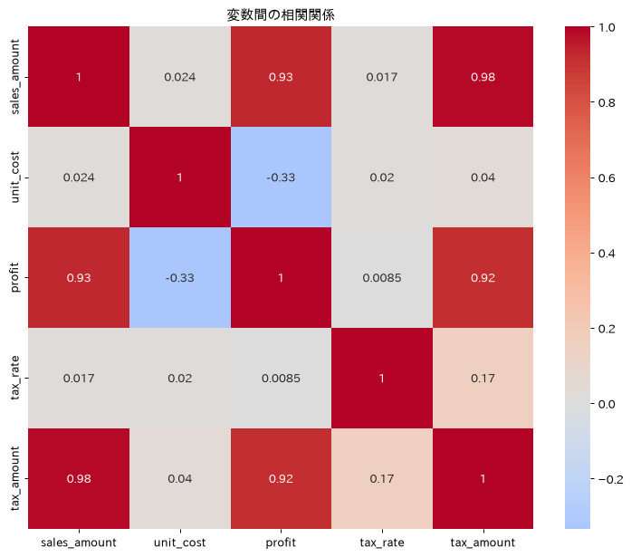
33. 分位数・パーセンタイル分析
quantile()やqcut()を使えば、売上を10分位(デシル)に分けたり、上位20%の顧客が売上の何%を占めるかというパレート分析(いわゆる80対20の法則)を行ったりできます。優良顧客の特定やABC分析に活用できる手法です。なお、ここで使っているサンプルデータは売上を一様乱数で作っているため、上位20%の寄与率は37%程度にとどまり、80対20にはなりません。パレートの法則は自然法則ではなく、実データで偏りが強いときに近似的に成り立つ経験則です。自社のデータが実際にどの程度偏っているかは、この手順で毎回測ってください。
# 基本的な分位数
quantiles = df_sales['sales_amount'].quantile([0.1, 0.25, 0.5, 0.75, 0.9])
print("売上金額の分位数:")
print(quantiles)

# カスタム分位数での顧客セグメント作成
df_sales['sales_decile'] = pd.qcut(df_sales['sales_amount'],
                                   q=10,
                                   labels=[f'D{i}' for i in range(1, 11)])

# 分位数別の統計
decile_stats = df_sales.groupby('sales_decile')['sales_amount'].agg([
    'count', 'min', 'max', 'mean'
]).round(2)
print("\n売上デシル分析:")
print(decile_stats)

# パレート分析(80-20の法則)
# 顧客単位の話なので、まず顧客IDで合計してから並べ替える
customer_sales = (df_sales.groupby('customer_id')['sales_amount'].sum()
                  .sort_values(ascending=False).to_frame('sales_amount'))
customer_sales['cumulative_sales'] = customer_sales['sales_amount'].cumsum()
customer_sales['cumulative_pct'] = (customer_sales['cumulative_sales'] /
                                    customer_sales['sales_amount'].sum()) * 100
customer_sales['customer_pct'] = (np.arange(1, len(customer_sales) + 1) /
                                  len(customer_sales)) * 100

# 上位20%の顧客が売上の何%を占めるか
top_20_pct_sales = customer_sales[customer_sales['customer_pct'] <= 20]['cumulative_pct'].iloc[-1]
print(f"\n顧客数: {len(customer_sales)}")
print(f"上位20%顧客の売上寄与率: {top_20_pct_sales:.1f}%")

# パレート図の作成
plt.figure(figsize=(12, 6))
plt.plot(customer_sales['customer_pct'], customer_sales['cumulative_pct'], 'b-', linewidth=2)
plt.axhline(y=80, color='r', linestyle='--', label='80%ライン')
plt.axvline(x=20, color='r', linestyle='--', label='20%ライン')
plt.xlabel('顧客累積割合(%)')
plt.ylabel('売上累積割合(%)')
plt.title('パレート分析:顧客別売上寄与')
plt.grid(True, alpha=0.3)
plt.legend()
plt.show()
売上金額の分位数:
0.10     5065.2
0.25    12093.0
0.50    24548.0
0.75    37212.0
0.90    45079.2
Name: sales_amount, dtype: float64

売上デシル分析:
              count    min    max      mean
sales_decile
D1               37   1190   5014   3064.49
D2               36   5142   9208   7105.94
D3               37   9308  14923  12066.00
D4               36  15069  20508  17907.78
D5               37  20531  24548  22580.84
D6               36  24576  29761  27305.11
D7               36  29940  34496  32024.28
D8               37  34621  39649  37430.70
D9               36  39754  45078  42476.17
D10              37  45080  49816  47470.00

顧客数: 350
上位20%顧客の売上寄与率: 37.4%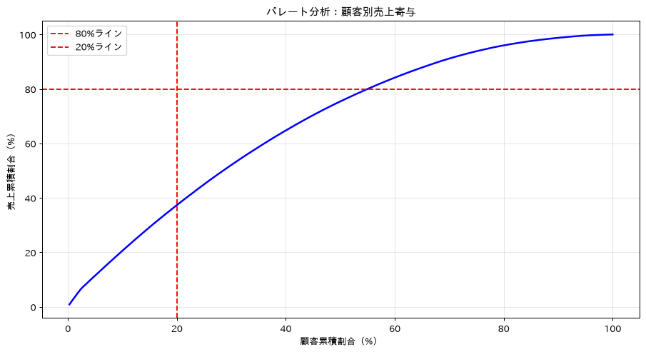
34. 時系列データの季節性分解
statsmodelsのseasonal_decompose()を使うと、時系列データをトレンド・季節性・残差の3成分に分解できます。売上のピーク月・ボトム月を数値で確認できるため、売上予測や在庫計画、季節に応じたマーケティング戦略の検討に役立ちます。なお、period=12(12か月周期)で分解するには最低でも2周期分、つまり24か月以上の月次データが必要になるため、ここでは3年分の日次データを生成してから月次に集約しています。
出力を読むときに1つ注意点があります。ここでは月次の合計値に集約しているため、日数の少ない2月は合計が小さく出ます。実測でも2月の季節性は+40641と、1月の+100491や3月の+329689に比べて落ち込みます。これは季節要因ではなく日数の差です。月ごとの日数の影響を消したいときは、sum()ではなくmean()で集約するか、1日あたりの売上に直してから分解してください。
from statsmodels.tsa.seasonal import seasonal_decompose
import matplotlib.pyplot as plt

# 3年分の日次売上データを作成(period=12の分解には2周期=24か月以上が必要)
dates_3y = pd.date_range('2021-01-01', periods=365*3, freq='D')
seasonal_effect = 10000 * np.sin(2 * np.pi * dates_3y.dayofyear / 365)
trend_effect = np.linspace(0, 20000, len(dates_3y))
noise = np.random.normal(0, 3000, len(dates_3y))
df_ts3y = pd.DataFrame({
    'date': dates_3y,
    'sales_amount': 50000 + seasonal_effect + trend_effect + noise
})

# 月次データの作成(36か月分)
monthly_ts = df_ts3y.set_index('date').resample('ME')['sales_amount'].sum()

# 季節性分解
decomposition = seasonal_decompose(monthly_ts, model='additive', period=12)

# 結果の可視化
fig, axes = plt.subplots(4, 1, figsize=(15, 12))

decomposition.observed.plot(ax=axes[0], title='元データ')
decomposition.trend.plot(ax=axes[1], title='トレンド')
decomposition.seasonal.plot(ax=axes[2], title='季節性')
decomposition.resid.plot(ax=axes[3], title='残差')

plt.tight_layout()
plt.show()

# 季節性の特徴を数値で確認
seasonal_pattern = decomposition.seasonal.iloc[:12]  # 1年分のパターン
print("月別季節性パターン:")
for i, (month, value) in enumerate(seasonal_pattern.items(), 1):
    print(f"{i}月: {value:+.0f}")

# 最も売上が高い月と低い月
peak_month = seasonal_pattern.idxmax().month
trough_month = seasonal_pattern.idxmin().month
print(f"\n売上ピーク月: {peak_month}月")
print(f"売上ボトム月: {trough_month}月")
月別季節性パターン:
1月: +100491
2月: +40641
3月: +329689
4月: +272645
5月: +247306
6月: +59803
7月: -21744
8月: -201476
9月: -306381
10月: -225245
11月: -237138
12月: -58590

売上ピーク月: 3月
売上ボトム月: 9月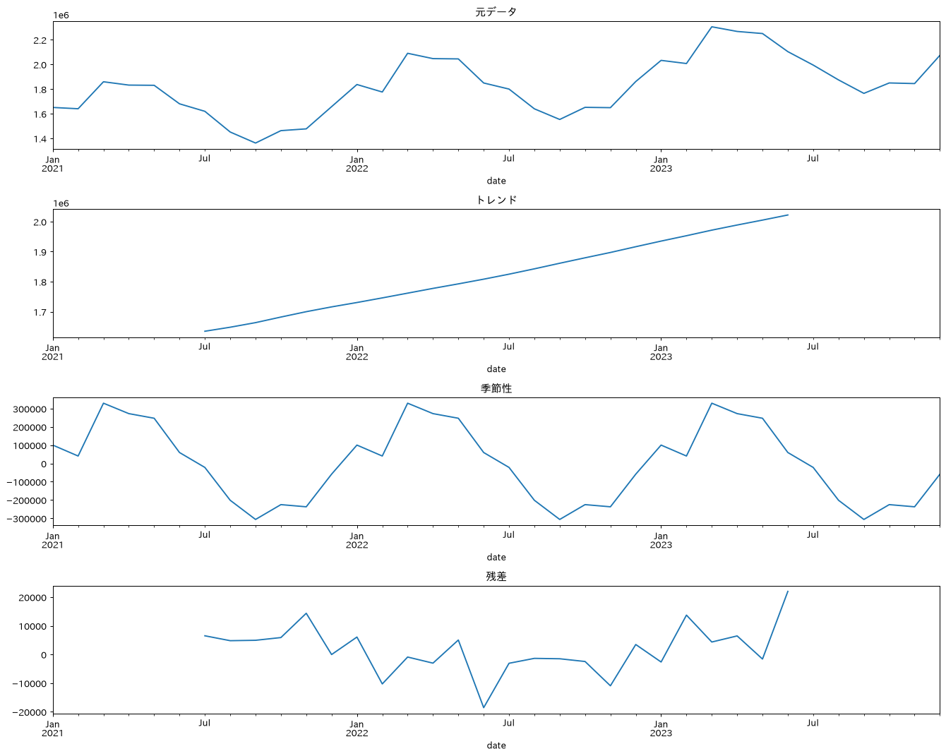
この章を深めたい方への参考書籍
- 本橋智光・橋本秀太郎『改訂新版 前処理大全』(技術評論社):数値・カテゴリ・日時の前処理をそれぞれ独立した章で扱い、スケーリングやエンコーディングをどの場面でどう選ぶかが整理されています。本章で並べた手法に選択の基準を与えられます。
- 寺田学・辻真吾・鈴木たかのり・福島真太朗『Pythonによるあたらしいデータ分析の教科書 第3版』(翔泳社):数学の基礎とscikit-learnによる実装を続けて扱う構成のため、本章のカイ二乗検定や相関係数、標準化が何を計算しているのかを数式の側から補強できます。
サンプリングとデータ分割
35. データのサンプリング
sample()を使ったランダムサンプリングは、大量データの処理速度向上やモデル学習用データセットの作成、データ探索の効率化に役立ちます。あわせてgroupby().sample()で商品ごとに25件ずつ抜く例も示しますが、これは各層の件数をそろえる均等配分であり、元データの構成比(レシピ36の出力にあるとおり商品D 0.279、商品C 0.263、商品A 0.238、商品B 0.219)は保たれません。構成比のほうを保ちたい場合は、レシピ36のstratify指定のような比例配分を使います。抽出したら代表性を確かめます。ここでは元データの平均24937.37円に対してランダムサンプルの平均が24205.67円、差異は731.70円でした。
# ランダムサンプリング
random_sample = df_sales.sample(n=100, random_state=42)
print(f"ランダムサンプル数: {len(random_sample)}")

# 割合でのサンプリング
pct_sample = df_sales.sample(frac=0.1, random_state=42)  # 10%をサンプル
print(f"10%サンプル数: {len(pct_sample)}")

# 層化サンプリング(各商品から均等に25件)
# groupby().sample() を使う。groupby().apply() は pandas 2.2 で include_groups
# (既定True)が追加され、pandas 3.0 で既定がFalseに変わってグループ化列を渡さなくなった。
# そのため apply では後段で 'product' を参照できない
stratified_sample = (df_sales.groupby('product', group_keys=False)
                     .sample(n=25, random_state=42)
                     .reset_index(drop=True))
print(f"層化サンプル数: {len(stratified_sample)}")
print("商品別サンプル数:")
print(stratified_sample['product'].value_counts())

# 時系列での系統サンプリング
systematic_sample = df_sales.iloc[::10, :]  # 10件に1件
print(f"系統サンプル数: {len(systematic_sample)}")

# 条件付きサンプリング
high_sales_sample = df_sales[df_sales['sales_amount'] >= 30000].sample(n=50, random_state=42)
print(f"高額売上サンプル数: {len(high_sales_sample)}")

# サンプルの代表性確認
original_mean = df_sales['sales_amount'].mean()
sample_mean = random_sample['sales_amount'].mean()
print(f"\n元データ平均: {original_mean:.2f}")
print(f"サンプル平均: {sample_mean:.2f}")
print(f"差異: {abs(original_mean - sample_mean):.2f}")
ランダムサンプル数: 100
10%サンプル数: 36
層化サンプル数: 100
商品別サンプル数:
product
商品A    25
商品B    25
商品C    25
商品D    25
Name: count, dtype: int64
系統サンプル数: 37
高額売上サンプル数: 50

元データ平均: 24937.37
サンプル平均: 24205.67
差異: 731.70
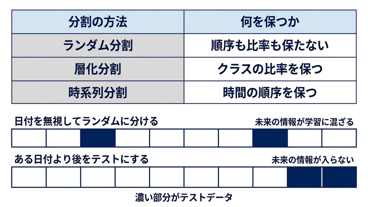
36. データの分割(train/test split)
scikit-learnのtrain_test_split()は機械学習モデルの評価に欠かせない処理ですが、時系列データの場合は時間順を保った分割、分類問題では層化分割(クラス比率を保った分割)を使うなど、データの性質に応じた分割方法の選択が重要です。下のコードでは、元データの商品構成比が商品D 0.279、商品C 0.263、商品A 0.238、商品B 0.219であるのに対して、stratifyを指定した学習データが0.281、0.264、0.236、0.219となり、比率が保たれていることを確認しています。
from sklearn.model_selection import train_test_split

# 特徴量とターゲットの準備(売上予測の例)
features = pd.get_dummies(df_sales[['product', 'region', 'channel']])
features['customer_id'] = df_sales['customer_id']
target = df_sales['sales_amount']

# 基本的な分割
X_train, X_test, y_train, y_test = train_test_split(
    features, target, test_size=0.2, random_state=42
)

print(f"学習データ数: {len(X_train)}")
print(f"テストデータ数: {len(X_test)}")

# 時系列データの分割(時間順を保持)
df_sorted = df_sales.sort_values('date')
split_date = '2023-10-01'
train_data = df_sorted[df_sorted['date'] < split_date]
test_data = df_sorted[df_sorted['date'] >= split_date]

print(f"\n時系列分割:")
print(f"学習期間: {train_data['date'].min()} - {train_data['date'].max()}")
print(f"テスト期間: {test_data['date'].min()} - {test_data['date'].max()}")
print(f"学習データ数: {len(train_data)}")
print(f"テストデータ数: {len(test_data)}")

# 層化分割(商品別比率を保持)
X_train_strat, X_test_strat, y_train_strat, y_test_strat = train_test_split(
    features, target, test_size=0.2,
    stratify=df_sales['product'], random_state=42
)

# 分割結果の確認
print("\n元データの商品構成比:")
print(df_sales['product'].value_counts(normalize=True).round(3))
print("\n層化サンプル学習データの商品構成比:")
# X_train_strat.index は df_sales のインデックスラベルなので .loc で引く。
# .iloc は位置指定なので、インデックスが0始まりの連番でないと黙ってずれる
train_products = df_sales.loc[X_train_strat.index, 'product']
print(train_products.value_counts(normalize=True).round(3))
学習データ数: 292
テストデータ数: 73

時系列分割:
学習期間: 2023-01-01 00:00:00 - 2023-09-30 00:00:00
テスト期間: 2023-10-01 00:00:00 - 2023-12-31 00:00:00
学習データ数: 273
テストデータ数: 92

元データの商品構成比:
product
商品D    0.279
商品C    0.263
商品A    0.238
商品B    0.219
Name: proportion, dtype: float64

層化サンプル学習データの商品構成比:
product
商品D    0.281
商品C    0.264
商品A    0.236
商品B    0.219
Name: proportion, dtype: float64
この章を深めたい方への参考書籍
- Andreas C. Muller・Sarah Guido『Pythonではじめる機械学習』(オライリー・ジャパン):5.1節の交差検証で、単純な分割から層化分割、交差検証までの考え方が段階的に説明されています。本章で分割方法を選び分ける理由が腑に落ちます。
- 門脇大輔・阪田隆司・保坂桂佑・平松雄司『Kaggleで勝つデータ分析の技術』(技術評論社):第5章「モデルの評価」でバリデーション設計を扱い、時系列やグループ構造のあるデータで分割を誤ると精度をどう見誤るかが具体的に整理されています。
高度な集計とウィンドウ関数
37. データの集約(aggregate)詳細操作
agg()に複数の集約関数を辞書やリストで渡すことで、1回の呼び出しで多角的な集計ができます。カスタム関数と組み合わせたり、条件付き集約(特定条件に合う行の割合など)を行ったりすることで、複雑なビジネス指標も算出できます。
# 複数の集約関数を一度に適用
agg_functions = {
    'sales_amount': ['sum', 'mean', 'median', 'std', 'min', 'max', 'count'],
    'customer_id': ['nunique', 'count']
}

product_agg = df_sales.groupby('product').agg(agg_functions).round(2)
print("商品別詳細集計:")
# 既定の表示幅では9列のうち6列が省略されるので to_string() で全部出す
print(product_agg.to_string())

# カスタム集約関数
def sales_metrics(series):
    return pd.Series({
        'total': series.sum(),
        'average': series.mean(),
        'top_10_pct': series.quantile(0.9),
        'cv': series.std() / series.mean(),  # 変動係数
        'range': series.max() - series.min()
    })

# apply に Series を返す関数を渡すと、結果は地域と指標名が積み上がった縦長のSeriesになる。
# unstack() で地域を行、指標を列にした表へ直す
custom_agg = df_sales.groupby('region')['sales_amount'].apply(sales_metrics).unstack().round(2)
print("\n地域別カスタム指標:")
print(custom_agg)

# 複数列での複雑な集約
multi_agg = df_sales.groupby(['product', 'region']).agg({
    'sales_amount': ['sum', 'mean', 'count'],
    'customer_id': 'nunique',
    'date': ['min', 'max']  # 販売開始・終了日
})

# カラム名の整理
multi_agg.columns = ['_'.join(col).strip() for col in multi_agg.columns.values]
print("\n商品・地域別複合集計:")
print(multi_agg.head())

# 条件付き集約
conditional_agg = df_sales.groupby('product').apply(
    lambda x: pd.Series({
        '高額売上件数': len(x[x['sales_amount'] >= 30000]),
        '高額売上率': len(x[x['sales_amount'] >= 30000]) / len(x),
        'オンライン売上率': len(x[x['channel'] == 'オンライン']) / len(x)
    })
).round(3)

print("\n商品別条件付き集計:")
print(conditional_agg)
商品別詳細集計:
        sales_amount                                                 customer_id
                 sum      mean   median       std   min    max count     nunique count
product
商品A          2114519  24304.82  24355.0  13808.48  1190  49354    87          86    87
商品B          2049600  25620.00  27643.5  15110.01  1301  49404    80          79    80
商品C          2253286  23471.73  22481.5  13927.65  1412  49816    96          95    96
商品D          2684734  26320.92  27723.5  14858.20  1851  49096   102         102   102

地域別カスタム指標:
            total   average  top_10_pct    cv    range
region
名古屋     2600309.0  25002.97     43442.2  0.57  46940.0
大阪      2217412.0  25783.86     46163.5  0.59  48032.0
東京      2176747.0  24457.83     45953.8  0.59  47705.0
福岡      2107671.0  24507.80     42197.0  0.58  47906.0

商品・地域別複合集計:
                sales_amount_sum  sales_amount_mean  ...   date_min   date_max
product region                                       ...
(出力は以降も続きます。ここでは冒頭のみ載せました)
38. ウィンドウ関数(rank, dense_rank)
rank()は、全体順位・グループ内順位・パーセンタイル順位など、様々な形でのランキングを計算できます。method=’dense’を指定すると同順位が続いても順位番号が飛びません。このデータで売上8400円が2件並ぶところを見ると、denseでは298位が2件続いてその次が299位になるのに対し、method=’min’では299位が2件続いてその次が301位になります。売上ランキングの作成や、商品別の上位案件の抽出に使いやすい形です。
# 売上ランキングの計算
df_rank = df_sales.copy()

# 全体での順位
df_rank['sales_rank'] = df_rank['sales_amount'].rank(method='dense', ascending=False)

# 商品別での順位
df_rank['sales_rank_by_product'] = df_rank.groupby('product')['sales_amount'].rank(method='dense', ascending=False)

# 地域別での順位
df_rank['sales_rank_by_region'] = df_rank.groupby('region')['sales_amount'].rank(method='dense', ascending=False)

# パーセンタイル順位
df_rank['sales_pct_rank'] = df_rank['sales_amount'].rank(pct=True)

# method='dense' の効き方は、同じ金額が並ぶところでないと見えない。
# 比較用に method='min' も出して、同順位の次がどの番号になるかを確かめる
df_rank['sales_rank_min'] = df_rank['sales_amount'].rank(method='min', ascending=False)
value_counts = df_rank['sales_amount'].value_counts()
tie_value = value_counts[value_counts > 1].index[0]
tie_around = df_rank[df_rank['sales_amount'].between(tie_value - 200, tie_value + 200)]
print("同順位まわりの順位(dense と min の比較):")
print(tie_around.sort_values('sales_amount', ascending=False)[
    ['product', 'sales_amount', 'sales_rank', 'sales_rank_min']])

print("\nランキング結果(TOP10):")
top_sales = df_rank.nsmallest(10, 'sales_rank')[['date', 'product', 'region', 'sales_amount', 'sales_rank', 'sales_rank_by_product']]
print(top_sales)

# 各商品のTOP3売上
print("\n商品別TOP3:")
for product in df_sales['product'].unique():
    product_top3 = df_rank[df_rank['product'] == product].nsmallest(3, 'sales_rank_by_product')
    print(f"\n{product}:")
    print(product_top3[['date', 'sales_amount', 'sales_rank_by_product', 'region']])

# 四分位ランク
df_rank['quartile'] = pd.qcut(df_rank['sales_amount'], 4, labels=['Q1', 'Q2', 'Q3', 'Q4'])
quartile_summary = df_rank.groupby('quartile')['sales_amount'].agg(['min', 'max', 'count'])
print("\n売上四分位分析:")
print(quartile_summary)
同順位まわりの順位(dense と min の比較):
    product  sales_amount  sales_rank  sales_rank_min
303     商品B          8543       296.0           297.0
113     商品B          8455       297.0           298.0
19      商品C          8400       298.0           299.0
342     商品C          8400       298.0           299.0
321     商品A          8357       299.0           301.0
220     商品C          8253       300.0           302.0

ランキング結果(TOP10):
          date product region  sales_amount  sales_rank  sales_rank_by_product
313 2023-11-10     商品C     大阪         49816         1.0                    1.0
167 2023-06-17     商品C     大阪         49747         2.0                    2.0
71  2023-03-13     商品B     東京         49404         3.0                    1.0
31  2023-02-01     商品A     大阪         49354         4.0                    1.0
163 2023-06-13     商品D     福岡         49096         5.0                    1.0
214 2023-08-03     商品C     東京         48893         6.0                    3.0
14  2023-01-15     商品D    名古屋         48357         7.0                    2.0
64  2023-03-06     商品C     東京         48333         8.0                    4.0
(出力は以降も続きます。ここでは冒頭のみ載せました)
39. 累積計算(cumsum, cumprod, cummax)
cumsum()による累積売上の計算は、目標達成率の可視化や進捗管理でよく使われます。ここでは年間目標を900万円に置いたので、年末時点の累積売上9102139円に対して達成率は101.13%になります。目標額が実際の売上規模とかけ離れていると、グラフ上で累積線が軸の下に張りついて進捗が読めなくなるため、目標は売上規模に見合う値を置きます。groupby()と組み合わせれば商品別の累積、月初来・四半期初来の累積といった、期間区切りでリセットされる累積計算も実現できます。足し算ではなく掛け算で積み上げたいときはcumprod()を使い、月次の前月比を掛け合わせて1月を1とした累積倍率を出す例も添えました。
# 時系列順での累積計算
df_cumulative = df_sales.sort_values('date').copy()

# 累積売上
df_cumulative['cumulative_sales'] = df_cumulative['sales_amount'].cumsum()

# 累積顧客数(ユニーク)
df_cumulative['cumulative_customers'] = df_cumulative['customer_id'].expanding().apply(lambda x: x.nunique())

# 累積最大売上
df_cumulative['cumulative_max'] = df_cumulative['sales_amount'].cummax()

# 商品別累積売上
df_cumulative['cumulative_sales_by_product'] = df_cumulative.groupby('product')['sales_amount'].cumsum()

# 売上達成率の計算(目標900万円)
# 目標額を実際の売上規模とかけ離れた値にすると、グラフで累積線が軸の下に張りついて
# 進捗が読めなくなる。この年の売上規模(約910万円)に見合う目標を置く
target_sales = 9000000
df_cumulative['achievement_rate'] = (df_cumulative['cumulative_sales'] / target_sales * 100).round(2)

print("累積計算結果(最新10日分):")
result_cols = ['date', 'sales_amount', 'cumulative_sales', 'cumulative_customers',
               'cumulative_max', 'achievement_rate']
# 既定の表示幅では中間の列が省略されるので to_string() を使う
print(df_cumulative[result_cols].tail(10).to_string(index=False))

# 月初来売上(月が変わるとリセット)
df_cumulative['year_month'] = df_cumulative['date'].dt.to_period('M')
df_cumulative['month_to_date_sales'] = df_cumulative.groupby('year_month')['sales_amount'].cumsum()

# 四半期初来売上
df_cumulative['quarter'] = df_cumulative['date'].dt.to_period('Q')
df_cumulative['quarter_to_date_sales'] = df_cumulative.groupby('quarter')['sales_amount'].cumsum()

print("\n期間累積売上(最新5日分):")
period_cols = ['date', 'sales_amount', 'month_to_date_sales', 'quarter_to_date_sales']
print(df_cumulative[period_cols].tail(5).to_string(index=False))

# cumsum は足し算、cumprod は掛け算で積み上げる。
# 月次の前月比を掛け合わせると、各月が1月の何倍かを示す累積倍率になる
monthly_total = df_cumulative.groupby('year_month')['sales_amount'].sum()
monthly_ratio = (monthly_total / monthly_total.shift(1)).fillna(1)
print("\n1月を1とした累積倍率(cumprod):")
print(monthly_ratio.cumprod().round(3))

# 累積売上の可視化
plt.figure(figsize=(15, 8))
plt.plot(df_cumulative['date'], df_cumulative['cumulative_sales'], linewidth=2, label='累積売上')
plt.axhline(y=target_sales, color='r', linestyle='--', label='目標売上')
plt.title('年初来累積売上推移')
plt.xlabel('日付')
plt.ylabel('累積売上金額')
plt.legend()
plt.grid(True, alpha=0.3)
plt.show()
累積計算結果(最新10日分):
      date  sales_amount  cumulative_sales  cumulative_customers  cumulative_max  achievement_rate
2023-12-22         12130           8915309                 341.0           49816             99.06
2023-12-23         22972           8938281                 342.0           49816             99.31
2023-12-24         41419           8979700                 343.0           49816             99.77
2023-12-25          2167           8981867                 344.0           49816             99.80
2023-12-26         28192           9010059                 345.0           49816            100.11
2023-12-27          2062           9012121                 346.0           49816            100.13
2023-12-28         19540           9031661                 347.0           49816            100.35
2023-12-29         25244           9056905                 348.0           49816            100.63
2023-12-30         22545           9079450                 349.0           49816            100.88
2023-12-31         22689           9102139                 350.0           49816            101.13

期間累積売上(最新5日分):
      date  sales_amount  month_to_date_sales  quarter_to_date_sales
(出力は以降も続きます。ここでは冒頭のみ載せました)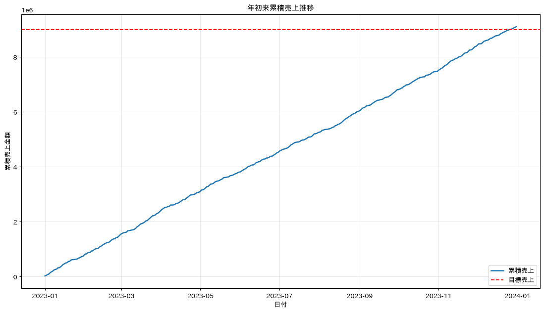
40. shift()を使った前期比較・成長率計算
shift()で1行前・7行前の値を取得できるため、前日比・前週比・前月比といった成長率を簡単に計算できます。groupbyと組み合わせれば、商品別の前月比成長率のような分析も可能です。業績の前期比較やトレンド把握に必須の処理です。
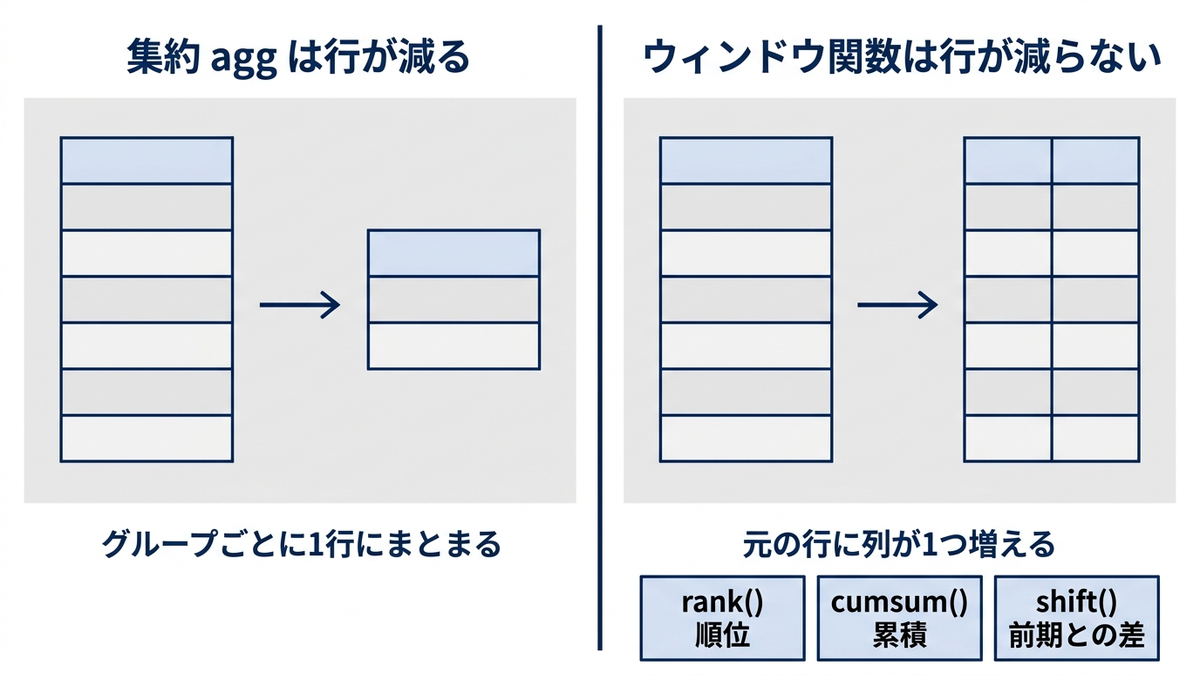
# 時系列順でのソート
df_growth = df_sales.sort_values('date').copy()

# 前日比較
df_growth['sales_prev_day'] = df_growth['sales_amount'].shift(1)
df_growth['sales_growth_day'] = ((df_growth['sales_amount'] / df_growth['sales_prev_day']) - 1) * 100

# 7日前との比較
df_growth['sales_prev_week'] = df_growth['sales_amount'].shift(7)
df_growth['sales_growth_week'] = ((df_growth['sales_amount'] / df_growth['sales_prev_week']) - 1) * 100

# 月次データでの前月比
monthly_data = df_growth.set_index('date').resample('ME')['sales_amount'].sum().reset_index()
monthly_data['sales_prev_month'] = monthly_data['sales_amount'].shift(1)
monthly_data['mom_growth'] = ((monthly_data['sales_amount'] / monthly_data['sales_prev_month']) - 1) * 100

print("前期比較分析:")
print("日次成長率(最新10日):")
growth_cols = ['date', 'sales_amount', 'sales_prev_day', 'sales_growth_day',
               'sales_growth_week']
print(df_growth[growth_cols].tail(10).round(2).to_string(index=False))

print("\n月次成長率:")
print(monthly_data[['date', 'sales_amount', 'mom_growth']].round(2))

# 商品別の前期比較
product_monthly = df_growth.set_index('date').groupby('product').resample('ME')['sales_amount'].sum().reset_index()
product_monthly['prev_month_sales'] = product_monthly.groupby('product')['sales_amount'].shift(1)
product_monthly['product_mom_growth'] = ((product_monthly['sales_amount'] / product_monthly['prev_month_sales']) - 1) * 100

print("\n商品別月次成長率(最新月):")
latest_month = product_monthly['date'].max()
latest_growth = product_monthly[product_monthly['date'] == latest_month]
print(latest_growth[['product', 'sales_amount', 'product_mom_growth']].round(2))
前期比較分析:
日次成長率(最新10日):
      date  sales_amount  sales_prev_day  sales_growth_day  sales_growth_week
2023-12-22         12130         32667.0            -62.87             -63.58
2023-12-23         22972         12130.0             89.38             254.18
2023-12-24         41419         22972.0             80.30             343.70
2023-12-25          2167         41419.0            -94.77             -90.31
2023-12-26         28192          2167.0           1200.97             -26.31
2023-12-27          2062         28192.0            -92.69             -91.61
2023-12-28         19540          2062.0            847.62             -40.18
2023-12-29         25244         19540.0             29.19             108.11
2023-12-30         22545         25244.0            -10.69              -1.86
2023-12-31         22689         22545.0              0.64             -45.22

月次成長率:
         date  sales_amount  mom_growth
0  2023-01-31        771866         NaN
1  2023-02-28        741681       -3.91
2  2023-03-31        871354       17.48
3  2023-04-30        692046      -20.58
4  2023-05-31        728795        5.31
5  2023-06-30        717333       -1.57
(出力は以降も続きます。ここでは冒頭のみ載せました)
この章を深めたい方への参考書籍
- Wes McKinney『Pythonによるデータ分析入門 第3版』(オライリー・ジャパン):第10章のグループ操作で、transformやapplyによるグループ内計算のパターンを確認できます。本章の順位・累積・前期比較を、より複雑な集計へ組み替える足がかりになります。
- 本橋智光・橋本秀太郎『改訂新版 前処理大全』(技術評論社):ウィンドウ関数を独立した章として扱い、同じ処理をSQLとpandasとPolarsで書き比べられます。SQLのウィンドウ関数に慣れた方が、pandasでの等価な書き方を確かめるのに向いています。
データ結合の応用・変形・検索
41. データフレームの結合(join)詳細
売上データ側にあってマスタ側に無いキーは、how=’left’で結合するとその行がNaNになります。ここでは商品マスタから商品D、地域マスタから福岡を落としてあるため、商品マスタ結合率は72.1%、地域マスタ結合率は76.4%にとどまります。逆にマスタ側にだけある商品Eと札幌は、左結合では取り込まれないので結合率には影響しません。結合率を確認しつつ、結合後の指標計算(価格効率や目標達成率など)まで一気通貫で行う例です。
# より複雑な結合シナリオ
# 商品詳細マスタ
# 商品Dはマスタ未登録(左結合するとこの行がNaNになる)。
# 商品Eは逆にマスタにだけあり、売上データには出てこない
product_detail = pd.DataFrame({
    'product': ['商品A', '商品B', '商品C', '商品E'],
    'category': ['家電', '家電', '食品', '家電'],
    'launch_date': ['2022-01-01', '2022-03-01', '2022-02-01', '2023-01-01'],
    'unit_price': [25000, 30000, 8000, 35000],
    'supplier': ['サプライヤーA', 'サプライヤーB', 'サプライヤーA', 'サプライヤーB']
})

# 地域詳細マスタ
# 福岡はマスタ未登録。札幌は逆にマスタにだけある
region_detail = pd.DataFrame({
    'region': ['東京', '大阪', '名古屋', '札幌'],
    'region_manager': ['田中', '佐藤', '鈴木', '山田'],
    'target_sales': [50000000, 40000000, 30000000, 20000000]
})

# 複数テーブルとの結合
enriched_sales = df_sales.merge(product_detail, on='product', how='left') \
                         .merge(region_detail, on='region', how='left')

print("結合後のデータ構造:")
print(enriched_sales.columns.tolist())
print(f"結合後データ数: {len(enriched_sales)}")

# 結合結果の確認
print("\nマスタ結合状況:")
print("商品マスタ結合率:", (enriched_sales['category'].notna().sum() / len(enriched_sales) * 100).round(1), "%")
print("地域マスタ結合率:", (enriched_sales['region_manager'].notna().sum() / len(enriched_sales) * 100).round(1), "%")
print("マスタに無かった商品:", sorted(enriched_sales.loc[enriched_sales['category'].isna(), 'product'].unique().tolist()))
print("マスタに無かった地域:", sorted(enriched_sales.loc[enriched_sales['region_manager'].isna(), 'region'].unique().tolist()))

# 売上効率の計算
enriched_sales['price_efficiency'] = enriched_sales['sales_amount'] / enriched_sales['unit_price']
enriched_sales['target_achievement'] = enriched_sales.groupby('region')['sales_amount'].transform('sum') / enriched_sales['target_sales']

print("\n結合後の分析例:")
efficiency_analysis = enriched_sales.groupby(['category', 'supplier']).agg({
    'sales_amount': 'sum',
    'price_efficiency': 'mean',
    'target_achievement': 'first'
}).round(2)
print(efficiency_analysis)
結合後のデータ構造:
['date', 'product', 'sales_amount', 'customer_id', 'region', 'channel', 'date_str', 'date_converted', 'product_cat', 'region_cat', 'sales_amount_float', 'year_month', 'weekday', 'sales_decile', 'category', 'launch_date', 'unit_price', 'supplier', 'region_manager', 'target_sales']
結合後データ数: 365

マスタ結合状況:
商品マスタ結合率: 72.1 %
地域マスタ結合率: 76.4 %
マスタに無かった商品: ['商品D']
マスタに無かった地域: ['福岡']

結合後の分析例:
                   sales_amount  price_efficiency  target_achievement
category supplier
家電       サプライヤーA        2114519              0.97                0.09
         サプライヤーB        2049600              0.85                0.06
食品       サプライヤーA        2253286              2.93                0.09
42. データの変形(melt, pivot)
pivot_table()で作ったワイド形式のデータをmelt()でロング形式に戻す処理は、可視化ツールへのデータ受け渡しや、複数の指標をまとめて分析したい場合によく使われます。列名を分割して指標と地域を別々の列に整理する応用例も紹介します。
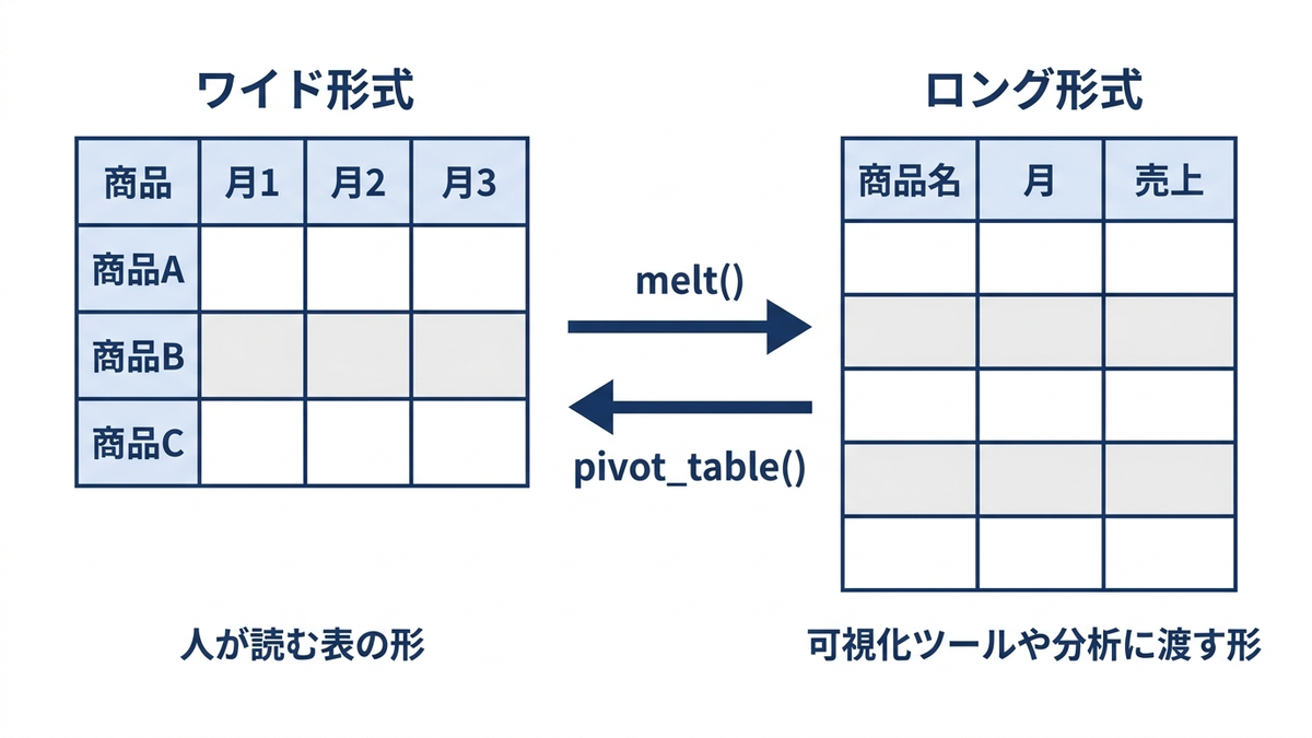
# ワイド形式からロング形式への変換(melt)
# 月別売上データを作成
monthly_pivot = df_sales.pivot_table(
    values='sales_amount',
    index='product',
    columns=df_sales['date'].dt.month,
    aggfunc='sum',
    fill_value=0
)
monthly_pivot.columns = [f'月{col}' for col in monthly_pivot.columns]

print("ワイド形式(月別売上):")
print(monthly_pivot.head())

# meltでロング形式に変換
melted_data = monthly_pivot.reset_index().melt(
    id_vars='product',
    var_name='月',
    value_name='売上'
)

print("\nロング形式(melt後):")
print(melted_data.head(10))

# より複雑なmelt
# 複数の指標をまとめてmelt
multi_metric_pivot = df_sales.pivot_table(
    values=['sales_amount', 'customer_id'],
    index='product',
    columns='region',
    aggfunc={'sales_amount': 'sum', 'customer_id': 'nunique'},
    fill_value=0
)

# カラム名の整理
multi_metric_pivot.columns = ['_'.join(map(str, col)) for col in multi_metric_pivot.columns]
multi_metric_pivot = multi_metric_pivot.reset_index()

print("\n複合指標ピボット:")
print(multi_metric_pivot.head())

# meltで分析しやすい形に変換
melted_multi = multi_metric_pivot.melt(
    id_vars='product',
    var_name='指標_地域',
    value_name='値'
)

# 指標と地域を分離
# 指標名自体に '_' が入る(sales_amount)ので、右から1回だけ切る rsplit を使う。
# split だと3列に割れて「Columns must be same length as key」になる
melted_multi[['指標', '地域']] = melted_multi['指標_地域'].str.rsplit('_', n=1, expand=True)
melted_multi = melted_multi.drop('指標_地域', axis=1)

print("\n分析用ロング形式:")
print(melted_multi.head(10))
ワイド形式(月別売上):
             月1      月2      月3      月4  ...      月9     月10     月11     月12
product                                  ...
商品A      181969  147404  221272   31989  ...  279619  239337  151398  109302
商品B      115987  179098  242723  281791  ...  139051  209547  249575  113538
商品C      235970  172009  204867   93347  ...  196464   86910  196443  174087
商品D      237940  243170  202492  284919  ...  182645  132557  315434  316439

[4 rows x 12 columns]

ロング形式(melt後):
  product   月      売上
0     商品A  月1  181969
1     商品B  月1  115987
2     商品C  月1  235970
3     商品D  月1  237940
4     商品A  月2  147404
5     商品B  月2  179098
6     商品C  月2  172009
7     商品D  月2  243170
8     商品A  月3  221272
9     商品B  月3  242723

複合指標ピボット:
  product  customer_id_名古屋  ...  sales_amount_東京  sales_amount_福岡
0     商品A               30  ...           638930           315535
1     商品B               20  ...           335494           455523
2     商品C               30  ...           622493           473626
3     商品D               23  ...           579830           862987

[4 rows x 9 columns]

分析用ロング形式:
  product   値           指標   地域
0     商品A  30  customer_id  名古屋
(出力は以降も続きます。ここでは冒頭のみ載せました)
43. 複雑な条件での新しい列作成(np.where, np.select)
2択の条件分岐にはnp.where()、3つ以上の条件分岐にはnp.select()が便利です。apply()にラムダ式を書くよりも高速に処理できるため、大量データに対する条件分岐処理では積極的に使いたい手法です。
import numpy as np

# 複数条件での分類
df_segment = df_sales.copy()

# np.whereでの二択分類
df_segment['is_high_value'] = np.where(df_segment['sales_amount'] >= 30000, '高額', '通常')

# 複数条件での分類
conditions = [
    (df_segment['sales_amount'] >= 40000),
    (df_segment['sales_amount'] >= 25000) & (df_segment['sales_amount'] < 40000),
    (df_segment['sales_amount'] >= 15000) & (df_segment['sales_amount'] < 25000),
    (df_segment['sales_amount'] < 15000)
]

choices = ['プレミアム', 'スタンダード', 'ベーシック', 'エコノミー']

df_segment['customer_tier'] = np.select(conditions, choices, default='未分類')

# より複雑な条件(チャネルと売上の組み合わせ)
complex_conditions = [
    (df_segment['sales_amount'] >= 30000) & (df_segment['channel'] == 'オンライン'),
    (df_segment['sales_amount'] >= 30000) & (df_segment['channel'] != 'オンライン'),
    (df_segment['sales_amount'] >= 15000) & (df_segment['channel'] == 'オンライン'),
    (df_segment['sales_amount'] >= 15000) & (df_segment['channel'] != 'オンライン'),
]

complex_choices = ['デジタルVIP', 'オフラインVIP', 'デジタル標準', 'オフライン標準']

df_segment['detailed_segment'] = np.select(complex_conditions, complex_choices, default='その他')

print("セグメント分類結果:")
print(df_segment['customer_tier'].value_counts())
print("\n詳細セグメント分類:")
print(df_segment['detailed_segment'].value_counts())

# セグメント別分析
segment_analysis = df_segment.groupby(['customer_tier', 'channel']).agg({
    'sales_amount': ['count', 'mean', 'sum'],
    'customer_id': 'nunique'
}).round(2)

print("\nセグメント別詳細分析:")
print(segment_analysis)

# 地域×セグメントの分布
segment_region = pd.crosstab(df_segment['customer_tier'], df_segment['region'], margins=True)
print("\nセグメント×地域クロス集計:")
print(segment_region)
セグメント分類結果:
customer_tier
エコノミー     110
スタンダード    109
ベーシック      75
プレミアム      71
Name: count, dtype: int64

詳細セグメント分類:
detailed_segment
その他         110
オフラインVIP     95
オフライン標準      71
デジタルVIP      50
デジタル標準       39
Name: count, dtype: int64

セグメント別詳細分析:
                      sales_amount                    customer_id
                             count      mean      sum     nunique
customer_tier channel
エコノミー         オンライン             46   7823.39   359876          45
              店舗                32   6346.62   203092          31
              電話                32   7896.06   252674          32
スタンダード        オンライン             34  32072.26  1090457          34
              店舗                39  32909.87  1283485          39
              電話                36  32690.06  1176842          36
プレミアム         オンライン             27  44969.93  1214188          27
              店舗                22  45153.00   993366          22
              電話                22  45384.91   998468          22
ベーシック         オンライン             28  20615.64   577238          28
              店舗                24  20167.92   484030          24
(出力は以降も続きます。ここでは冒頭のみ載せました)
44. データの検索・フィルタリング(contains, startswith, endswith)
str.contains()、str.startswith()、str.endswith()は、顧客名や商品名の部分一致検索に使います。正規表現と組み合わせれば「商店または工業で終わる」といった条件も表現できます。ただし判定に使うだけなら(?:商店|工業)$のようにキャプチャしない書き方にします。丸括弧でくくると、グループを取りたいならstr.extract()を使うようにという警告が出ます。na=Falseの指定を忘れずに欠損値でのエラーを防ぎます。caseオプションは英字にしか効かないため、日本語だけの語で試してもcase=Trueとの差は出ません。ここでは顧客名に英字のSystemを混ぜ、case=Falseで73件、case=Trueで0件になることを確かめています。
# 文字列検索用のサンプルデータ拡張
search_data = df_sales.copy()
search_data['customer_name'] = [
    f"{'株式会社' if i % 3 == 0 else ''}{'田中' if i % 4 == 0 else '佐藤' if i % 4 == 1 else '鈴木' if i % 4 == 2 else '高橋'}{'商店' if i % 5 == 0 else '工業' if i % 5 == 1 else '企画' if i % 5 == 2 else 'System' if i % 5 == 3 else '物産'}"
    for i in range(len(df_sales))
]

# 部分一致検索
tanaka_customers = search_data[search_data['customer_name'].str.contains('田中', na=False)]
print(f"田中を含む顧客: {len(tanaka_customers)}件")

# 前方一致検索
corp_customers = search_data[search_data['customer_name'].str.startswith('株式会社', na=False)]
print(f"株式会社で始まる顧客: {len(corp_customers)}件")

# 後方一致検索
shop_customers = search_data[search_data['customer_name'].str.endswith('商店', na=False)]
print(f"商店で終わる顧客: {len(shop_customers)}件")

# 複数キーワードでの検索(OR条件)
keywords = ['田中', '佐藤', '株式会社']
multi_search = search_data[search_data['customer_name'].str.contains('|'.join(keywords), na=False)]
print(f"複数キーワード検索結果: {len(multi_search)}件")

# 正規表現での高度な検索
# 「商店」または「工業」で終わる顧客。
# (商店|工業) と書くと「グループを取りたいなら str.extract を使え」という警告が出るので、
# 判定に使うだけならキャプチャしない (?: ) を使う
pattern_customers = search_data[search_data['customer_name'].str.contains(r'(?:商店|工業)$', na=False)]
print(f"正規表現検索結果: {len(pattern_customers)}件")

# 検索結果の分析
print("\n検索結果別の売上分析:")
search_results = {
    '田中系': tanaka_customers['sales_amount'].sum(),
    '株式会社': corp_customers['sales_amount'].sum(),
    '商店': shop_customers['sales_amount'].sum()
}

for category, sales in search_results.items():
    print(f"{category}: {sales:,}円")

# 大文字小文字を無視した検索。
# case は英字にしか効かないので、日本語だけの語で試しても case=True との差は出ない
case_insensitive = search_data[search_data['customer_name'].str.contains('system', case=False, na=False)]
case_sensitive = search_data[search_data['customer_name'].str.contains('system', case=True, na=False)]
print(f"\n大小文字を無視した検索(case=False): {len(case_insensitive)}件")
print(f"大小文字を区別した検索(case=True): {len(case_sensitive)}件")
田中を含む顧客: 92件
株式会社で始まる顧客: 122件
商店で終わる顧客: 73件
複数キーワード検索結果: 244件
正規表現検索結果: 146件

検索結果別の売上分析:
田中系: 2,299,699円
株式会社: 3,019,983円
商店: 1,634,712円

大小文字を無視した検索(case=False): 73件
大小文字を区別した検索(case=True): 0件
この章を深めたい方への参考書籍
- Wes McKinney『Pythonによるデータ分析入門 第3版』(オライリー・ジャパン):第8章でmeltとpivotによるワイド形式とロング形式の往復が説明されています。本章の変形処理を、可視化ツールや他システムへの受け渡し先に合わせて設計できます。
- 下山輝昌・松田雄馬・三木孝行『Python実践データ分析100本ノック 第3版』(秀和システム新社):複数のテーブルを突き合わせて分析対象を組み立てる演習が続く構成です。本章の結合率の確認や部分一致検索を、実務に近いデータで反復して身につけられます。
運用のためのデータ最適化
45. データ型の最適化とメモリ使用量削減
カテゴリ数が少ない文字列列をcategory型に、数値列の値の範囲に応じてより小さい整数型(int16など)に変換することで、メモリ使用量を削減できます。このサンプルは365行と小さいため0.04MBから0.03MBへ、削減率にして36.4%にとどまりますが、削減幅は行数に比例して効いてきます。大量データを扱う際の処理速度向上やサーバーリソースの節約に直結する技術です。
# メモリ使用量の確認
def check_memory_usage(df, name):
    memory_mb = df.memory_usage(deep=True).sum() / 1024 / 1024
    print(f"{name}: {memory_mb:.2f} MB")
    return memory_mb

# 元データのメモリ使用量
original_memory = check_memory_usage(df_sales, "元データ")

# 最適化版の作成
df_optimized = df_sales.copy()

# カテゴリカルデータの最適化
categorical_columns = ['product', 'region', 'channel']
for col in categorical_columns:
    df_optimized[col] = df_optimized[col].astype('category')

# 数値データの最適化
# customer_idは範囲を確認してより小さい整数型に
print(f"customer_id 範囲: {df_optimized['customer_id'].min()} - {df_optimized['customer_id'].max()}")
df_optimized['customer_id'] = df_optimized['customer_id'].astype('int16')

# sales_amountも範囲確認
print(f"sales_amount 範囲: {df_optimized['sales_amount'].min()} - {df_optimized['sales_amount'].max()}")
if df_optimized['sales_amount'].max() < 2147483647: # int32の上限
    df_optimized['sales_amount'] = df_optimized['sales_amount'].astype('int32')

# 最適化後のメモリ使用量
optimized_memory = check_memory_usage(df_optimized, "最適化後")

print(f"\nメモリ削減率: {((original_memory - optimized_memory) / original_memory * 100):.1f}%")

# データ型の比較
print("\nデータ型比較:")
comparison = pd.DataFrame({
    '元のデータ型': df_sales.dtypes,
    '最適化後': df_optimized.dtypes,
    '元メモリ(MB)': [df_sales[col].memory_usage(deep=True) / 1024 / 1024 for col in df_sales.columns],
    '最適化後メモリ(MB)': [df_optimized[col].memory_usage(deep=True) / 1024 / 1024 for col in df_optimized.columns]
}).round(3)
print(comparison)

# カテゴリカルデータの詳細
print("\nカテゴリカル変数の情報:")
for col in categorical_columns:
    n_categories = len(df_optimized[col].cat.categories)
    print(f"{col}: {n_categories}カテゴリ")
    print(f"カテゴリ: {list(df_optimized[col].cat.categories)}")
元データ: 0.04 MB
customer_id 範囲: 1005 - 9989
sales_amount 範囲: 1190 - 49816
最適化後: 0.03 MB

メモリ削減率: 36.4%

データ型比較:
                            元のデータ型            最適化後  元メモリ(MB)  最適化後メモリ(MB)
date                datetime64[us]  datetime64[us]     0.003        0.003
product                        str        category     0.005        0.001
sales_amount                 int32           int32     0.002        0.002
customer_id                  int32           int16     0.002        0.001
region                         str        category     0.005        0.001
channel                        str        category     0.006        0.001
date_str                       str             str     0.006        0.006
date_converted      datetime64[us]  datetime64[us]     0.003        0.003
product_cat               category        category     0.001        0.001
region_cat                category        category     0.001        0.001
sales_amount_float         float64         float64     0.003        0.003
year_month               period[M]       period[M]     0.003        0.003
weekday                        str             str     0.005        0.005
(出力は以降も続きます。ここでは冒頭のみ載せました)
46. MultiIndex(階層インデックス)の活用
複数の列をインデックスに設定するMultiIndexは、商品・地域・時期といった多次元データの管理に向いています。特定レベルでの集計や、xs()を使ったクロスセクション(特定条件での断面データの抽出)など、階層構造ならではの操作ができます。ただしレベルをまたいで足し上げてよいのは合計と件数だけです。平均を足しても意味のある値にはならず、nunique()を足すと延べ数になります。実際、商品Aのユニーク顧客数は86人ですが、地域と月に分けたあとのnunique()を足すと87になります。
# MultiIndexデータの作成
multi_index_data = df_sales.set_index(['product', 'region', 'date'])
print("MultiIndex構造:")
print(multi_index_data.index.names)
print(f"インデックスレベル数: {multi_index_data.index.nlevels}")

# MultiIndexでの集計
multi_agg = df_sales.groupby(['product', 'region', df_sales['date'].dt.month]).agg({
    'sales_amount': ['sum', 'mean', 'count'],
    'customer_id': 'nunique'
})

# 階層インデックスの操作
print("\n階層別集計結果:")
print(multi_agg.head(10))

# 特定レベルでの集計
# 足し上げて意味があるのは合計と件数だけ。平均を足すと意味のない値になり、
# nunique を足すと延べ数になって全体のユニーク数とは一致しない
addable = [('sales_amount', 'sum'), ('sales_amount', 'count')]
level1_sum = multi_agg[addable].groupby(level=0).sum()  # 商品レベル
level2_sum = multi_agg[addable].groupby(level=1).sum()  # 地域レベル

print("\n商品レベル集計:")
print(level1_sum)
print("\n地域レベル集計:")
print(level2_sum)

# 足してはいけない例。nunique の合計は延べ人数で、全体のユニーク顧客数とは一致しない
print("\nnuniqueを足した場合と、正しいユニーク顧客数:")
print(pd.DataFrame({
    'nuniqueの合計': multi_agg[('customer_id', 'nunique')].groupby(level=0).sum(),
    '正しいユニーク顧客数': df_sales.groupby('product')['customer_id'].nunique(),
}))

# インデックスのスワッピング
swapped = multi_agg.swaplevel(0, 1).sort_index()
print("\nレベルスワップ後:")
print(swapped.head())

# インデックスのリセット
flattened = multi_agg.reset_index()
print("\nフラット化後:")
print(flattened.head())

# 階層インデックスでの選択
print("\n商品A・東京の全データ:")
if ('商品A', '東京') in multi_agg.index:
    print(multi_agg.loc[('商品A', '東京')])

# 部分選択
print("\n商品Aの全地域データ:")
product_a_data = multi_agg.loc['商品A']
print(product_a_data.head())

# クロスセクション(xs)
print("\n東京地域の全商品(レベル1選択):")
tokyo_data = multi_agg.xs('東京', level='region')
print(tokyo_data.head())
MultiIndex構造:
['product', 'region', 'date']
インデックスレベル数: 3

階層別集計結果:
                    sales_amount                     customer_id
                             sum          mean count     nunique
product region date
商品A     名古屋    1          112365  28091.250000     4           4
               2           42914  42914.000000     1           1
               3           58292  29146.000000     2           2
               5          129402  32350.500000     4           4
               6           54603  18201.000000     3           3
               7           52795  17598.333333     3           3
               9          125421  31355.250000     4           4
               10         141571  23595.166667     6           6
               11          55709  27854.500000     2           2
               12          21268  10634.000000     2           2

商品レベル集計:
        sales_amount
                 sum count
product
商品A          2114519    87
商品B          2049600    80
商品C          2253286    96
商品D          2684734   102

地域レベル集計:
       sales_amount
                sum count
region
(出力は以降も続きます。ここでは冒頭のみ載せました)
47. データのバリデーションと品質チェック
受け取ったデータをそのまま分析に使う前に、レコード数・欠損値率・重複率・外れ値件数などをまとめた品質レポートを作成する習慣をつけておくと、前処理計画の策定やデータ提供元への品質確認がスムーズになります。負の売上や未来日付といった明らかにおかしい値のチェックも重要です。ただしここで使っているサンプルデータは生成した直後で汚れがないため、どのチェックも0件で返ります。それではチェックが働いているかどうか分からないので、欠損・重複・負の売上・未来日付・極端な外れ値をわざと混ぜたコピーを作り、同じ関数がそれらを拾えることまで確認します。なおIQRによる外れ値判定は連続量に対する検査なので、顧客IDのような識別子の数値列に当てても意味のある結果にはなりません。
# データ品質チェック関数の定義
def data_quality_report(df):
    report = {}

    # 基本情報
    report['総レコード数'] = len(df)
    report['総カラム数'] = len(df.columns)

    # 欠損値情報
    missing_info = df.isnull().sum()
    report['欠損値あり列数'] = (missing_info > 0).sum()
    report['欠損値総数'] = missing_info.sum()
    report['欠損値率'] = (missing_info.sum() / (len(df) * len(df.columns)) * 100).round(2)

    # 重複情報
    report['重複行数'] = df.duplicated().sum()
    report['重複率'] = (df.duplicated().sum() / len(df) * 100).round(2)

    # 数値データの異常値
    numeric_cols = df.select_dtypes(include=[np.number]).columns
    outliers_info = {}
    for col in numeric_cols:
        Q1 = df[col].quantile(0.25)
        Q3 = df[col].quantile(0.75)
        IQR = Q3 - Q1
        lower_bound = Q1 - 1.5 * IQR
        upper_bound = Q3 + 1.5 * IQR
        outliers = ((df[col] < lower_bound) | (df[col] > upper_bound)).sum()
        outliers_info[col] = outliers

    report['外れ値情報'] = outliers_info

    return report

# データ品質レポートの実行
quality_report = data_quality_report(df_sales)
print("データ品質レポート:")
for key, value in quality_report.items():
    if key != '外れ値情報':
        print(f"{key}: {value}")
    else:
        print(f"{key}:")
        for col, count in value.items():
            print(f"{col}: {count}件")

# 具体的なバリデーション
print("\n具体的なバリデーション:")

# 売上金額の妥当性チェック
negative_sales = df_sales[df_sales['sales_amount'] < 0]
print(f"負の売上データ: {len(negative_sales)}件")

zero_sales = df_sales[df_sales['sales_amount'] == 0]
print(f"売上0円のデータ: {len(zero_sales)}件")

# 日付の妥当性チェック
future_dates = df_sales[df_sales['date'] > pd.Timestamp.now()]
print(f"未来日付のデータ: {len(future_dates)}件")

# 顧客IDの形式チェック
invalid_customer_ids = df_sales[(df_sales['customer_id'] < 1000) | (df_sales['customer_id'] > 9999)]
print(f"無効な顧客ID(4桁以外): {len(invalid_customer_ids)}件")

# カテゴリカルデータの妥当性
# unique() は配列を返すので、そのまま print すると型名まで出る。tolist() で値だけにする
print(f"\n商品カテゴリ: {df_sales['product'].unique().tolist()}")
print(f"地域カテゴリ: {df_sales['region'].unique().tolist()}")
print(f"チャネルカテゴリ: {df_sales['channel'].unique().tolist()}")

# ここまでのサンプルデータは生成した直後なので、どのチェックも0件で返る。
# チェックが本当に働くのかは、壊したデータを通してみないと分からない
df_dirty = df_sales.copy()
df_dirty['sales_amount'] = df_dirty['sales_amount'].astype('float64')
df_dirty.loc[0:9, 'sales_amount'] = np.nan               # 欠損10件
df_dirty.loc[10:14, 'region'] = None                     # 欠損5件
df_dirty.loc[20, 'sales_amount'] = -5000                 # 負の売上
df_dirty.loc[21, 'date'] = pd.Timestamp('2099-01-01')    # 未来日付
df_dirty.loc[22, 'sales_amount'] = 5000000               # 極端な外れ値
df_dirty = pd.concat([df_dirty, df_dirty.iloc[:3]], ignore_index=True)  # 重複3行

print("\n異常を混ぜたコピーでの品質レポート:")
dirty_report = data_quality_report(df_dirty)
for key, value in dirty_report.items():
    if key != '外れ値情報':
        print(f"{key}: {value}")
    else:
        print(f"{key}:")
        for col, count in value.items():
            print(f"{col}: {count}件")
print(f"負の売上データ: {len(df_dirty[df_dirty['sales_amount'] < 0])}件")
print(f"未来日付のデータ: {len(df_dirty[df_dirty['date'] > pd.Timestamp.now()])}件")

# データ分布の可視化
plt.figure(figsize=(15, 10))

plt.subplot(2, 3, 1)
df_sales['sales_amount'].hist(bins=50)
plt.title('売上金額分布')

plt.subplot(2, 3, 2)
df_sales['product'].value_counts().plot(kind='bar')
plt.title('商品別件数')
plt.xticks(rotation=45)

plt.subplot(2, 3, 3)
df_sales['region'].value_counts().plot(kind='bar')
plt.title('地域別件数')
plt.xticks(rotation=45)

plt.subplot(2, 3, 4)
df_sales['channel'].value_counts().plot(kind='bar')
plt.title('チャネル別件数')
plt.xticks(rotation=45)

plt.subplot(2, 3, 5)
df_sales.set_index('date')['sales_amount'].resample('ME').sum().plot()
plt.title('月次売上推移')

plt.subplot(2, 3, 6)
# df_sales は欠損ゼロなのでバーが1本も立たない。異常を混ぜたコピーのほうを描く
missing_data = pd.DataFrame({
    'Missing Count': df_dirty.isnull().sum(),
    'Missing Percentage': (df_dirty.isnull().sum() / len(df_dirty)) * 100
})
missing_data['Missing Percentage'].plot(kind='bar')
plt.title('欠損値率(異常を混ぜたコピー)')
plt.xticks(rotation=90)

plt.tight_layout()
plt.show()
データ品質レポート:
総レコード数: 365
総カラム数: 14
欠損値あり列数: 0
欠損値総数: 0
欠損値率: 0.0
重複行数: 0
重複率: 0.0
外れ値情報:
sales_amount: 0件
customer_id: 0件
sales_amount_float: 0件

具体的なバリデーション:
負の売上データ: 0件
売上0円のデータ: 0件
未来日付のデータ: 0件
無効な顧客ID(4桁以外): 0件

商品カテゴリ: ['商品C', '商品D', '商品A', '商品B']
地域カテゴリ: ['名古屋', '東京', '大阪', '福岡']
チャネルカテゴリ: ['店舗', '電話', 'オンライン']

異常を混ぜたコピーでの品質レポート:
総レコード数: 368
総カラム数: 14
欠損値あり列数: 2
欠損値総数: 18
欠損値率: 0.35
重複行数: 3
重複率: 0.82
外れ値情報:
sales_amount: 1件
customer_id: 0件
sales_amount_float: 0件
負の売上データ: 1件
未来日付のデータ: 1件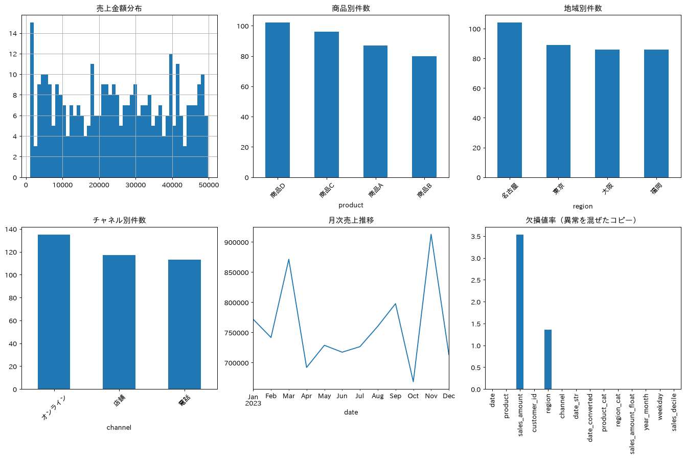
48. パフォーマンス最適化(vectorization)
iterrows()を使った行ごとのループ処理は直感的ですが低速です。apply()に置き換えるだけでも大きく縮み、np.select()やnp.where()を使ったベクトル化処理はさらに速くなります。ただし何倍速いかは実行のたびに変わります。同じコードを3回測ったところ、ベクトル化のループ比は29倍から128倍まで振れました。倍率そのものではなく、ループよりapply()、apply()よりベクトル化という順序のほうを覚えてください。大量データを扱う際は、ループを避けベクトル化を意識するだけで処理時間が大きく変わります。
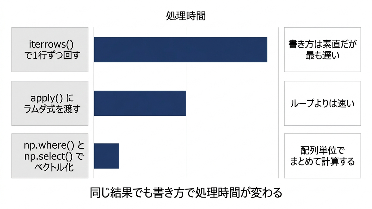
import time

# 大量データでのパフォーマンス比較用データ作成
large_df = pd.concat([df_sales] * 100, ignore_index=True)  # 100倍に拡大
print(f"大量データサイズ: {len(large_df):,}行")

# 1. ループ処理(非効率)
def calculate_with_loop(df):
    start_time = time.time()
    result = []
    for idx, row in df.iterrows():
        if row['sales_amount'] >= 30000:
            category = 'High'
        elif row['sales_amount'] >= 15000:
            category = 'Medium'
        else:
            category = 'Low'
        result.append(category)
    end_time = time.time()
    return result, end_time - start_time

# 2. Apply処理(中程度の効率)
def calculate_with_apply(df):
    start_time = time.time()
    result = df['sales_amount'].apply(
        lambda x: 'High' if x >= 30000 else 'Medium' if x >= 15000 else 'Low'
    )
    end_time = time.time()
    return result, end_time - start_time

# 3. Vectorized処理(高効率)
def calculate_vectorized(df):
    start_time = time.time()
    conditions = [
        (df['sales_amount'] >= 30000),
        (df['sales_amount'] >= 15000),
    ]
    choices = ['High', 'Medium']
    result = np.select(conditions, choices, default='Low')
    end_time = time.time()
    return result, end_time - start_time

# 小さなサンプルで実行(ループは時間がかかりすぎるため)
sample_df = large_df.sample(1000, random_state=42)

print("パフォーマンス比較(1,000行サンプル):")

# ループ処理
loop_result, loop_time = calculate_with_loop(sample_df)
print(f"ループ処理: {loop_time:.4f}秒")

# Apply処理
apply_result, apply_time = calculate_with_apply(sample_df)
print(f"Apply処理: {apply_time:.4f}秒")

# Vectorized処理
vector_result, vector_time = calculate_vectorized(sample_df)
print(f"Vectorized処理: {vector_time:.4f}秒")

# 速度比較
print(f"\nVectorized vs Apply: {apply_time/vector_time:.1f}倍高速")
print(f"Vectorized vs Loop: {loop_time/vector_time:.1f}倍高速")

# より複雑な計算での比較
def complex_calculation_apply(df):
    start_time = time.time()
    result = df.apply(lambda row:
        row['sales_amount'] * 1.1 if row['channel'] == 'オンライン'
        else row['sales_amount'] * 0.95 if row['region'] == '東京'
        else row['sales_amount'], axis=1)
    end_time = time.time()
    return result, end_time - start_time

def complex_calculation_vectorized(df):
    start_time = time.time()
    result = df['sales_amount'].copy()
    result = np.where(df['channel'] == 'オンライン', result * 1.1, result)
    result = np.where((df['channel'] != 'オンライン') & (df['region'] == '東京'), result * 0.95, result)
    end_time = time.time()
    return result, end_time - start_time

print("\n複雑な計算でのパフォーマンス比較:")
complex_apply_result, complex_apply_time = complex_calculation_apply(large_df)
print(f"複雑Apply処理: {complex_apply_time:.4f}秒")

complex_vector_result, complex_vector_time = complex_calculation_vectorized(large_df)
print(f"複雑Vectorized処理: {complex_vector_time:.4f}秒")

print(f"複雑計算での速度向上: {complex_apply_time/complex_vector_time:.1f}倍")
大量データサイズ: 36,500行
パフォーマンス比較(1,000行サンプル):
ループ処理: 0.0181秒
Apply処理: 0.0004秒
Vectorized処理: 0.0002秒

Vectorized vs Apply: 2.0倍高速
Vectorized vs Loop: 85.6倍高速

複雑な計算でのパフォーマンス比較:
複雑Apply処理: 0.2219秒
複雑Vectorized処理: 0.0023秒
複雑計算での速度向上: 96.8倍
49. データのエクスポート(CSV, Excel, JSON)
分析結果は、用途に応じてCSV、複数シートのExcel、階層構造を保てるJSON、高速で圧縮率の高いParquetなど、適切な形式で出力します。圧縮率を見るときは中身をそろえないと比較になりません。集計後の16行を書いたsales_analysis_results.csvは1.1KBですが、これは元データ365行を書いたsales_data.parquetの24.1KBより小さくて当たり前です。同じdf_salesで並べるとCSVが40.7KB、Parquetが24.1KBとなり、Parquet側が小さくなります。報告書の作成や他システムとの連携、分析結果の共有・バックアップに欠かせない処理です。
# 分析結果のまとめ
analysis_results = df_sales.groupby(['product', 'region']).agg({
    'sales_amount': ['sum', 'mean', 'count'],
    'customer_id': 'nunique',
    'date': ['min', 'max']
}).round(2)

# カラム名の整理
analysis_results.columns = ['総売上', '平均売上', '取引回数', 'ユニーク顧客数', '初回取引日', '最終取引日']
analysis_results = analysis_results.reset_index()

# CSV出力(日本語対応)
print("1. CSV出力")
analysis_results.to_csv('sales_analysis_results.csv',
                       index=False,
                       encoding='utf-8-sig')  # Excelで文字化けしないように
print("sales_analysis_results.csv 出力完了")

# Excel出力(複数シート)
print("\n2. Excel出力(複数シート)")
with pd.ExcelWriter('sales_report.xlsx', engine='openpyxl') as writer:
    # 分析結果シート
    analysis_results.to_excel(writer, sheet_name='分析結果', index=False)

    # 商品別詳細シート
    product_detail = df_sales.groupby('product').agg({
        'sales_amount': ['sum', 'mean', 'std', 'min', 'max'],
        'customer_id': 'nunique'
    }).round(2)
    product_detail.to_excel(writer, sheet_name='商品別詳細')

    # 月次推移シート
    monthly_trend = df_sales.set_index('date').resample('ME').agg({
        'sales_amount': 'sum',
        'customer_id': 'nunique'
    })
    monthly_trend.to_excel(writer, sheet_name='月次推移')

    # 生データ(サンプル)
    df_sales.head(1000).to_excel(writer, sheet_name='生データサンプル', index=False)

print("sales_report.xlsx 出力完了(4シート)")

# JSON出力(API連携用)
print("\n3. JSON出力")
# 階層構造でのJSON
json_data = {}
for product in df_sales['product'].unique():
    product_data = df_sales[df_sales['product'] == product]
    json_data[product] = {
        'summary': {
            'total_sales': int(product_data['sales_amount'].sum()),
            'avg_sales': round(float(product_data['sales_amount'].mean()), 2),
            'transaction_count': int(len(product_data)),
            'unique_customers': int(product_data['customer_id'].nunique())
        },
        'by_region': {}
    }

    for region in product_data['region'].unique():
        region_data = product_data[product_data['region'] == region]
        json_data[product]['by_region'][region] = {
            'sales': int(region_data['sales_amount'].sum()),
            'transactions': int(len(region_data))
        }

# JSON保存
import json
with open('sales_data.json', 'w', encoding='utf-8') as f:
    json.dump(json_data, f, ensure_ascii=False, indent=2)

print("sales_data.json 出力完了")

# Parquet出力(高速・圧縮)
print("\n4. Parquet出力(高速・圧縮)")
df_sales.to_parquet('sales_data.parquet', compression='snappy')
print("sales_data.parquet 出力完了")

# 圧縮率を見るには中身をそろえないと比較にならない。
# sales_analysis_results.csv は集計後の16行なので、元データ365行の Parquet と並べても
# 大小に意味がない。同じ df_sales を CSV にも書き出して比べる
df_sales.to_csv('sales_data.csv', index=False, encoding='utf-8-sig')

# 出力ファイルサイズ比較
import os
files_to_check = ['sales_analysis_results.csv', 'sales_report.xlsx', 'sales_data.json',
                  'sales_data.csv', 'sales_data.parquet']
print("\nファイルサイズ比較:")
for file in files_to_check:
    if os.path.exists(file):
        size_kb = os.path.getsize(file) / 1024
        print(f"{file}: {size_kb:.1f} KB")

# データベース出力(SQLite)
print("\n5. SQLite出力")
import sqlite3

# sqlite3 は category 型や Interval 型をそのまま書き込めないので、
# 書き出す前に文字列へ落としておく(ここを飛ばすと DatabaseError になる)
def to_sqlite_safe(df):
    out = df.copy()
    for col in out.columns:
        if not (pd.api.types.is_numeric_dtype(out[col])
                or pd.api.types.is_datetime64_any_dtype(out[col])):
            out[col] = out[col].astype(str)
    return out

conn = sqlite3.connect('sales_database.db')
to_sqlite_safe(df_sales).to_sql('sales_data', conn, if_exists='replace', index=False)
to_sqlite_safe(analysis_results).to_sql('analysis_results', conn, if_exists='replace', index=False)
conn.close()
print("sales_database.db 出力完了(2テーブル)")
1. CSV出力
sales_analysis_results.csv 出力完了

2. Excel出力(複数シート)
sales_report.xlsx 出力完了(4シート)

3. JSON出力
sales_data.json 出力完了

4. Parquet出力(高速・圧縮)
sales_data.parquet 出力完了

ファイルサイズ比較:
sales_analysis_results.csv: 1.1 KB
sales_report.xlsx: 31.6 KB
sales_data.json: 2.1 KB
sales_data.csv: 40.7 KB
sales_data.parquet: 24.1 KB

5. SQLite出力
sales_database.db 出力完了(2テーブル)
50. 高度な集計とウィンドウ関数の組み合わせ
累積売上・移動平均・ランキング・変化率・パーセンタイルといった複数のウィンドウ関数をgroupby()と組み合わせて一度に計算すると、商品別のパフォーマンスサマリーやトレンド分析用のダッシュボード指標をまとめて作成できます。読み方には3つ注意が要ります。1つ目はrolling(window=7)が数えるのが日数ではなく行数だという点で、この4商品では直近7件がおおむね20日から25日ぶんに相当します。2つ目はグループ内順位から作った指標で、平均パーセンタイルは定義上どの商品も0.5付近になり、1位の回数もどの商品も1回になるため、商品間の比較には使えません。3つ目は変化率の単純平均で、50%の下落と100%の上昇が打ち消し合わないぶん必ず上振れします。ここでも4商品とも90%以上になりますが、これを成長率として読むと判断を誤ります。線形回帰の傾きによるトレンド判定も符号だけを見てはいけません。符号では商品Bと商品Dが上昇、商品Aと商品Cが下降になりますが、傾きが0でないと言えるかを検定すると4商品ともp値が0.20以上で、上昇とも下降とも言えない横ばいでした。
# 売上データに各種ウィンドウ関数を適用
df_window = df_sales.sort_values(['product', 'date']).copy()

# 商品別の累積売上
df_window['cumsum_by_product'] = df_window.groupby('product')['sales_amount'].cumsum()

# 商品別の移動平均(直近7件)
# window=7 が数えるのは行数であって日数ではない。商品は毎日売れているわけではなく、
# この4商品では直近7件がおおむね20日から25日ぶんに相当する。
# また .values を代入すると行順が一致している前提になるので、transform で索引をそろえる
df_window['ma7_by_product'] = df_window.groupby('product')['sales_amount'].transform(
    lambda s: s.rolling(window=7, min_periods=1).mean())

# 商品別ランキング
df_window['rank_in_product'] = df_window.groupby('product')['sales_amount'].rank(method='dense', ascending=False)

# 前回売上からの変化
df_window['prev_sales'] = df_window.groupby('product')['sales_amount'].shift(1)
df_window['sales_change'] = df_window['sales_amount'] - df_window['prev_sales']
df_window['sales_change_pct'] = ((df_window['sales_amount'] / df_window['prev_sales']) - 1) * 100

# パーセンタイル計算(商品内での相対位置)
df_window['percentile_in_product'] = df_window.groupby('product')['sales_amount'].rank(pct=True)

# 各商品の最高売上との比較
df_window['max_sales_in_product'] = df_window.groupby('product')['sales_amount'].transform('max')
df_window['pct_of_max'] = (df_window['sales_amount'] / df_window['max_sales_in_product']) * 100

# 商品別の売上範囲での正規化
df_window['min_sales_in_product'] = df_window.groupby('product')['sales_amount'].transform('min')
df_window['normalized_sales'] = ((df_window['sales_amount'] - df_window['min_sales_in_product']) /
                                (df_window['max_sales_in_product'] - df_window['min_sales_in_product']))

print("高度なウィンドウ関数適用結果:")
window_cols = ['product', 'date', 'sales_amount', 'cumsum_by_product', 'ma7_by_product',
               'rank_in_product', 'sales_change_pct', 'percentile_in_product', 'pct_of_max']
# 既定の表示幅では、この節の主役である累積・移動平均・順位・変化率がすべて省略される
print(df_window[window_cols].head(15).round(2).to_string(index=False))

# 商品別パフォーマンスサマリー
performance_summary = df_window.groupby('product').agg({
    'sales_amount': ['count', 'sum', 'mean', 'std'],
    'sales_change_pct': ['mean', 'std'],
    'rank_in_product': lambda x: (x == 1).sum(),  # 1位の回数
    'percentile_in_product': 'mean'
}).round(2)

# 「平均成長率」と呼ぶと誤解される。50%の下落と100%の上昇が打ち消し合わないため、
# 変化率の単純平均は必ず上振れする。名前のうえでも成長率と切り分けておく
performance_summary.columns = ['取引回数', '総売上', '平均売上', '売上標準偏差',
                              '平均変化率', '変化率の標準偏差', '1位回数', '平均パーセンタイル']
performance_summary = performance_summary.reset_index()

print("\n商品別パフォーマンスサマリー:")
print(performance_summary)

# 高度な分析:トレンド分析
import statsmodels.api as sm

trend_analysis = []
for product in df_window['product'].unique():
    product_data = df_window[df_window['product'] == product].sort_values('date')

    # 線形回帰での傾向
    x = range(len(product_data))
    y = product_data['sales_amount'].values

    if len(x) > 1:
        slope = np.polyfit(x, y, 1)[0]

        # 符号だけで判定すると、傾きがほぼ0でも必ず上昇か下降に振り分けられ、
        # 浮動小数点の傾きが厳密に0になることはないので横ばいには決してならない。
        # 傾きが0でないと言えるかをp値で確かめ、言えないものは横ばいとする
        fit = sm.OLS(y, sm.add_constant(np.asarray(x, dtype=float))).fit()
        p_value = fit.pvalues[1]
        trend = '横ばい' if p_value >= 0.05 else ('上昇' if slope > 0 else '下降')

        trend_analysis.append({
            'product': product,
            'slope': slope,
            'p値': p_value,
            '符号だけの判定': '上昇' if slope > 0 else '下降',
            'trend': trend,
            'volatility': product_data['sales_amount'].std(),
            'consistency': 1 / (product_data['sales_change_pct'].abs().mean() + 1)  # 一貫性指標
        })

trend_df = pd.DataFrame(trend_analysis)
print("\nトレンド分析結果:")
print(trend_df.round(2))

# 可視化:商品別売上推移と移動平均
plt.figure(figsize=(15, 10))
for i, product in enumerate(df_window['product'].unique()):
    plt.subplot(2, 2, i+1)
    product_data = df_window[df_window['product'] == product]
    plt.plot(product_data['date'], product_data['sales_amount'], alpha=0.3, label='実売上')
    plt.plot(product_data['date'], product_data['ma7_by_product'], label='直近7件の移動平均')
    plt.title(f'{product} 売上推移')
    plt.xlabel('日付')
    plt.ylabel('売上金額')
    plt.legend()
    plt.xticks(rotation=45)

plt.tight_layout()
plt.show()
高度なウィンドウ関数適用結果:
product       date  sales_amount  cumsum_by_product  ma7_by_product  rank_in_product  sales_change_pct  percentile_in_product  pct_of_max
    商品A 2023-01-03         31306              31306        31306.00             29.0               NaN                   0.68       63.43
    商品A 2023-01-07         26199              57505        28752.50             40.0            -16.31                   0.55       53.08
    商品A 2023-01-08         42976             100481        33493.67              9.0             64.04                   0.91       87.08
    商品A 2023-01-16         21932             122413        30603.25             50.0            -48.97                   0.44       44.44
    商品A 2023-01-22         16151             138564        27712.80             60.0            -26.36                   0.32       32.72
    商品A 2023-01-31         43405             181969        30328.17              8.0            168.74                   0.92       87.95
    商品A 2023-02-01         49354             231323        33046.14              1.0             13.71                   1.00      100.00
(出力は以降も続きます。ここでは冒頭のみ載せました)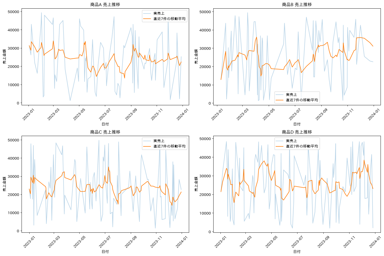
この章を深めたい方への参考書籍
- Micha Gorelick・Ian Ozsvald『ハイパフォーマンスPython 第2版』(オライリー・ジャパン):第2章でプロファイリングによるボトルネックの特定、第11章でRAM使用量の削減を扱います。本章のメモリ最適化とベクトル化を、勘ではなく計測に基づいて進められるようになります。
- 吉田拓真・尾原颯『現場で使える!NumPyデータ処理入門 第2版』(翔泳社):pandasの下で動くNumPyの配列構造とブロードキャストをChapter1から積み上げて解説します。本章のベクトル化がなぜループより速いのかを、配列の側から理解できます。
第2部 scikit-learn編:機械学習の実務手順(レシピ51〜100)
第2部は、機械学習の標準ライブラリscikit-learnです。前処理・特徴量エンジニアリングから、分類・回帰・クラスタリング、交差検証と評価指標、ハイパーパラメータ探索、パイプライン化とモデル保存まで、プロジェクトの工程順に50レシピを収録しています。
セットアップ
本記事のレシピを実行するための環境構築です。scikit-learnやpandasなどの主要ライブラリは現行の安定版を前提とし、乱数シードを固定することで再現性を確保します。後続のレシピで使うcategory_encodersとstatsmodelsもここでまとめてインストールしておきます。グラフに日本語のラベルを描くので、第1部と同じくmatplotlib-fontjaも入れておきます。
必要ライブラリのインストール
pip install scikit-learn pandas numpy matplotlib seaborn category_encoders statsmodels matplotlib-fontja
# 基本ライブラリの読み込み
import numpy as np
import pandas as pd
import matplotlib.pyplot as plt
import seaborn as sns
import sklearn
from sklearn.model_selection import train_test_split, cross_val_score, GridSearchCV
from sklearn.preprocessing import StandardScaler, LabelEncoder, OneHotEncoder
from sklearn.metrics import accuracy_score, precision_score, recall_score, f1_score
from sklearn.metrics import mean_squared_error, r2_score, mean_absolute_error
import warnings
from datetime import datetime

# 日本語フォント設定
import matplotlib_fontja
sns.set_style("whitegrid")
# seaborn のスタイル適用でフォント設定が上書きされるため、あとから戻す
matplotlib_fontja.japanize()

# 警告非表示とランダムシード固定
warnings.filterwarnings('ignore')
np.random.seed(42)

# 表示設定の最適化
plt.rcParams['figure.figsize'] = (12, 8)
plt.rcParams['font.size'] = 10

print("scikit-learn実務環境の構築が完了しました")
print(f"scikit-learn version: {sklearn.__version__}")
print(f"pandas version: {pd.__version__}")
print(f"numpy version: {np.__version__}")
scikit-learn実務環境の構築が完了しました
scikit-learn version: 1.9.0
pandas version: 3.0.5
numpy version: 2.5.2
続いて、以降のレシピで共通して利用する3種類の合成データセット(顧客離脱予測、売上予測、顧客セグメンテーション)を準備します。実データを想定した特徴量名を付与しているため、実務での置き換えイメージがつかみやすくなっています。ここで作るのは第1部とは別のデータです。とくにdf_salesは第1部でも使った変数名ですが、第2部ではmake_regressionで作った1500行の回帰用データに定義し直されます。第1部のdf_sales(date、product、sales_amount、customer_id、region、channelを持つ365行の日次売上)はこのセルの実行で上書きされ、以降は参照できません。レシピ51から後に出てくるdf_salesは、すべて第2部で作り直したほうを指します。
実務サンプルデータの準備
# 実務レベルの総合データセット生成
from sklearn.datasets import make_classification, make_regression, make_blobs

# 1. 顧客離脱予測用データセット
X_churn, y_churn = make_classification(
    n_samples=2000,
    n_features=10,
    n_informative=8,
    n_redundant=2,
    n_clusters_per_class=1,
    random_state=42
)

churn_features = ['age', 'tenure', 'monthly_charges', 'total_charges',
                 'service_calls', 'satisfaction_score', 'contract_length',
                 'payment_method', 'data_usage', 'premium_support']

df_churn = pd.DataFrame(X_churn, columns=churn_features)
df_churn['churn'] = y_churn
df_churn['customer_id'] = range(1, len(df_churn) + 1)

# 2. 売上予測用データセット
X_sales, y_sales = make_regression(
    n_samples=1500,
    n_features=8,
    noise=50,
    random_state=42
)

sales_features = ['advertising_spend', 'seasonality', 'competitor_price',
                 'product_quality', 'market_trend', 'promotion_intensity',
                 'distribution_channels', 'economic_index']

df_sales = pd.DataFrame(X_sales, columns=sales_features)
df_sales['revenue'] = y_sales * 10000 + 9000000  # スケール調整(売上が負にならないようオフセットする)
df_sales['month'] = pd.date_range('2023-01-01', periods=len(df_sales), freq='D')

# 3. 顧客セグメンテーション用データセット
X_segment, y_segment = make_blobs(
    n_samples=1000,
    centers=4,
    n_features=6,
    random_state=42,
    cluster_std=1.5
)

segment_features = ['annual_spend', 'purchase_frequency', 'avg_order_value',
                   'brand_loyalty', 'price_sensitivity', 'digital_engagement']

df_segment = pd.DataFrame(X_segment, columns=segment_features)

# make_blobs の座標はおよそ -14 から +14 の値なので、そのままだと「年間支出がマイナス」に
# なってしまう。列ごとに業務で使う単位へ線形変換しておく。
# クラスタリングの前に標準化するため、この変換で分析結果そのものは変わらない
segment_scale = {
    'annual_spend': (30000, 600000),   # 年間支出(円)
    'purchase_frequency': (1.5, 24),   # 年間購買回数
    'avg_order_value': (2000, 30000),  # 平均注文単価(円)
    'brand_loyalty': (4, 55),          # ブランド選好スコア
    'price_sensitivity': (4, 60),      # 価格感応度スコア
    'digital_engagement': (3, 45)      # デジタル接触スコア
}
for col, (col_scale, col_offset) in segment_scale.items():
    df_segment[col] = df_segment[col] * col_scale + col_offset

df_segment['customer_segment'] = y_segment
df_segment['customer_id'] = range(1, len(df_segment) + 1)

print("実務サンプルデータセットの準備が完了しました")
print(f"顧客離脱データ: {len(df_churn):,}件")
print(f"売上データ: {len(df_sales):,}件")
print(f"セグメントデータ: {len(df_segment):,}件")
print("これらのデータセットを使用して実務レベルの機械学習を実践します")
実務サンプルデータセットの準備が完了しました
顧客離脱データ: 2,000件
売上データ: 1,500件
セグメントデータ: 1,000件
これらのデータセットを使用して実務レベルの機械学習を実践します
データ前処理とデータ分割
51. データ前処理(欠損値処理)
平均値・中央値・最頻値・KNNによる補完を比較し、欠損の入り方とデータ分布に応じて、補完した値が真の値からどれだけずれるかが変わることを確認します。KNNはk近傍法のことで、他の特徴量が似ている行を近い順に何件か探し、その行が持つ値の平均で欠けた値を埋める手法です。
# 実務での欠損値処理戦略
from sklearn.impute import SimpleImputer, KNNImputer

# 欠損値を意図的に導入する
# 実務の欠損は無作為とは限らない。ここでは monthly_charges が大きい顧客ほど
# 未記入になりやすい状況(欠損が値そのものに依存するパターン)を作る
df_missing = df_churn.copy()
missing_weights = df_missing['monthly_charges'].rank(pct=True).values ** 3
missing_weights = missing_weights / missing_weights.sum()
missing_indices = np.random.choice(df_missing.index, 200, replace=False, p=missing_weights)
missing_pos = df_missing.index.get_indexer(missing_indices)
true_values = df_churn.loc[missing_indices, 'monthly_charges'].values
df_missing.loc[missing_indices, 'monthly_charges'] = np.nan

# 複数の欠損値処理手法を比較
imputers = {
    'mean': SimpleImputer(strategy='mean'),
    'median': SimpleImputer(strategy='median'),
    'mode': SimpleImputer(strategy='most_frequent'),
    'knn': KNNImputer(n_neighbors=5)
}

target_col = 'monthly_charges'
target_pos = churn_features.index(target_col)

results = {}
impute_rmse = {}
for name, imputer in imputers.items():
    if name == 'knn':
        # KNNは他の特徴量との近さを使って補う。対象の1列だけを渡すと近傍を測る
        # 材料が無くなり、平均値補完とまったく同じ結果に退化してしまう
        imputed_data = imputer.fit_transform(df_missing[churn_features])[:, target_pos]
    else:
        imputed_data = imputer.fit_transform(df_missing[[target_col]]).flatten()
    results[name] = imputed_data
    impute_rmse[name] = np.sqrt(np.mean((imputed_data[missing_pos] - true_values) ** 2))

# 結果比較の可視化
fig, axes = plt.subplots(2, 2, figsize=(15, 10))
axes = axes.ravel()

for i, (name, data) in enumerate(results.items()):
    axes[i].hist(data, bins=30, alpha=0.7, label=f'{name} imputation')
    axes[i].hist(df_churn['monthly_charges'], bins=30, alpha=0.5, label='original')
    axes[i].set_title(f'{name.upper()}補完法(真値とのRMSE {impute_rmse[name]:.2f})',
                      fontweight='bold')
    axes[i].legend()

plt.tight_layout()
plt.show()

# 補完精度の比較(欠損させる前の真の値と突き合わせる)
print("欠損値補完の比較")
print("=" * 40)
print(f"欠損した200件の真の平均: {true_values.mean():.3f}")
print(f"列全体の平均: {df_churn[target_col].mean():.3f}")
for name in results:
    filled = results[name][missing_pos]
    print(f"{name}: 補完値の平均 {filled.mean():>7.3f} / 真の値とのRMSE {impute_rmse[name]:.3f}")
欠損値補完の比較
========================================
欠損した200件の真の平均: 2.089
列全体の平均: -0.052
mean: 補完値の平均  -0.290 / 真の値とのRMSE 2.837
median: 補完値の平均  -0.310 / 真の値とのRMSE 2.854
mode: 補完値の平均  -6.612 / 真の値とのRMSE 8.837
knn: 補完値の平均   1.062 / 真の値とのRMSE 1.550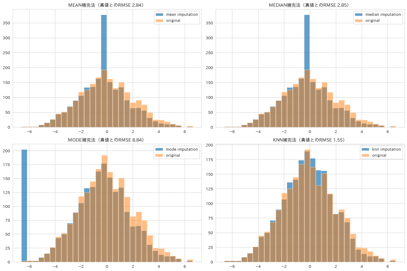
52. 特徴量スケーリング
StandardScaler、MinMaxScaler、RobustScaler、MaxAbsScalerの4手法を比較し、距離ベースのアルゴリズムや外れ値の多いデータでスケーリング手法がどう結果に影響するかを見ていきます。
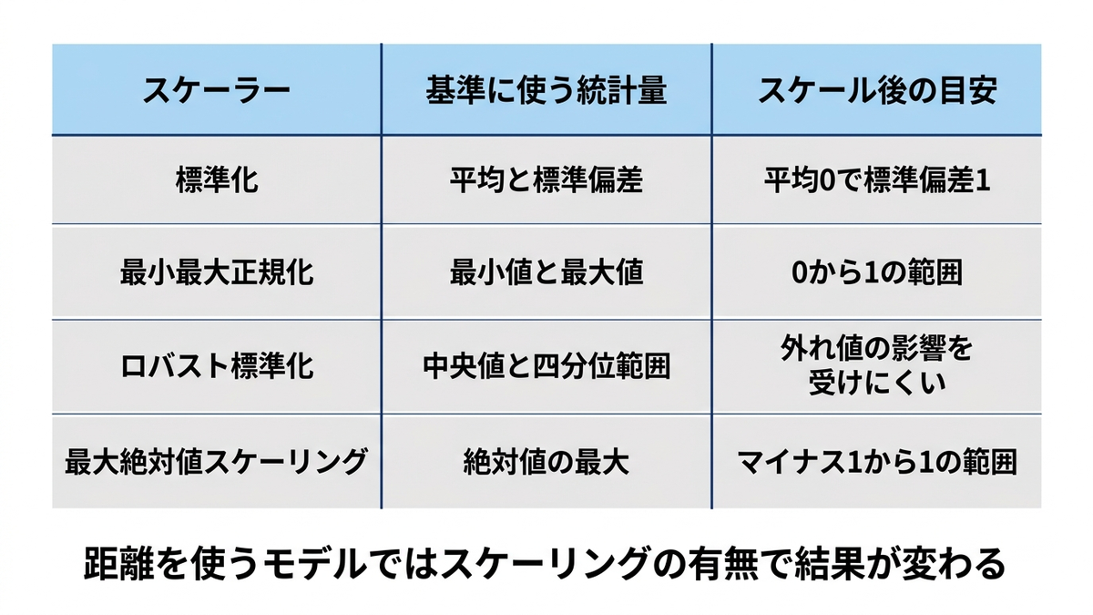
# 複数のスケーリング手法を比較
from sklearn.preprocessing import StandardScaler, MinMaxScaler, RobustScaler, MaxAbsScaler
from sklearn.neighbors import KNeighborsClassifier

# 元データ
# 実務データを模して、列ごとの桁の違いと、記録ミスによる外れ値を持たせる
X_original = df_churn[['age', 'tenure', 'monthly_charges', 'total_charges']].values.copy()
X_original[:, 3] = X_original[:, 3] * 1000 + 50000  # total_charges は累計額なので桁が大きい
X_original[:20, 2] = X_original[:20, 2] + 60        # 20件だけ年額を月額欄に入力した想定

scalers = {
    'Standard': StandardScaler(),
    'MinMax': MinMaxScaler(),
    'Robust': RobustScaler(),
    'MaxAbs': MaxAbsScaler()
}

fig, axes = plt.subplots(2, 3, figsize=(18, 10))
axes = axes.ravel()

# 元データの分布(列ごとに桁が違うので対数目盛で表示する)
axes[0].boxplot(X_original, tick_labels=['age', 'tenure', 'charges', 'total'])
axes[0].set_yscale('symlog')
axes[0].set_title('元データ(縦軸は対数目盛)', fontweight='bold')
axes[0].set_ylabel('値')

# 各スケーラーの結果
# 外れ値20件が縦軸を引き伸ばすので、箱の高さだけでは手法の差が読めない。
# 通常データ(外れ値を除いた charges 列)の四分位範囲を見出しに入れる
for i, (name, scaler) in enumerate(scalers.items()):
    X_scaled = scaler.fit_transform(X_original)
    axes[i+1].boxplot(X_scaled, tick_labels=['age', 'tenure', 'charges', 'total'])
    body_iqr = np.percentile(X_scaled[20:, 2], 75) - np.percentile(X_scaled[20:, 2], 25)
    axes[i+1].set_title(f'{name}スケーリング(chargesの通常データの四分位範囲 {body_iqr:.3f})',
                        fontweight='bold', fontsize=10)
    axes[i+1].set_ylabel('スケール済み値')

# 統計情報の表示
stats_comparison = pd.DataFrame()
for name, scaler in scalers.items():
    X_scaled = scaler.fit_transform(X_original)
    stats_comparison[name] = [X_scaled.mean(), X_scaled.std(), X_scaled.min(), X_scaled.max()]

stats_comparison.index = ['平均', '標準偏差', '最小値', '最大値']
axes[5].axis('off')
axes[5].table(cellText=np.round(stats_comparison.values, 3),
              rowLabels=stats_comparison.index,
              colLabels=stats_comparison.columns,
              loc='center')
axes[5].set_title('スケーリング統計比較', fontweight='bold')

plt.tight_layout()
plt.show()

# 外れ値の影響を数値で確認する(外れ値20件を除いた charges 列の四分位範囲)
print("外れ値がスケーリングに与える影響")
print("=" * 40)
for name, scaler in scalers.items():
    X_scaled = scaler.fit_transform(X_original)
    body = X_scaled[20:, 2]
    iqr = np.percentile(body, 75) - np.percentile(body, 25)
    print(f"{name}: 通常データの四分位範囲 {iqr:.3f}")

# 距離ベースのアルゴリズムでスケーリングの効果を確認する
X_tr_sc, X_te_sc, y_tr_sc, y_te_sc = train_test_split(
    X_original, y_churn, test_size=0.2, random_state=42, stratify=y_churn
)

knn_raw = KNeighborsClassifier(n_neighbors=5).fit(X_tr_sc, y_tr_sc)
print(f"\nk近傍法の正解率(スケーリングなし): {knn_raw.score(X_te_sc, y_te_sc):.3f}")
for name, scaler in scalers.items():
    scaler.fit(X_tr_sc)
    knn_scaled = KNeighborsClassifier(n_neighbors=5).fit(scaler.transform(X_tr_sc), y_tr_sc)
    print(f"k近傍法の正解率({name}): {knn_scaled.score(scaler.transform(X_te_sc), y_te_sc):.3f}")
外れ値がスケーリングに与える影響
========================================
Standard: 通常データの四分位範囲 0.446
MinMax: 通常データの四分位範囲 0.041
Robust: 通常データの四分位範囲 0.986
MaxAbs: 通常データの四分位範囲 0.045

k近傍法の正解率(スケーリングなし): 0.720
k近傍法の正解率(Standard): 0.865
k近傍法の正解率(MinMax): 0.858
k近傍法の正解率(Robust): 0.855
k近傍法の正解率(MaxAbs): 0.828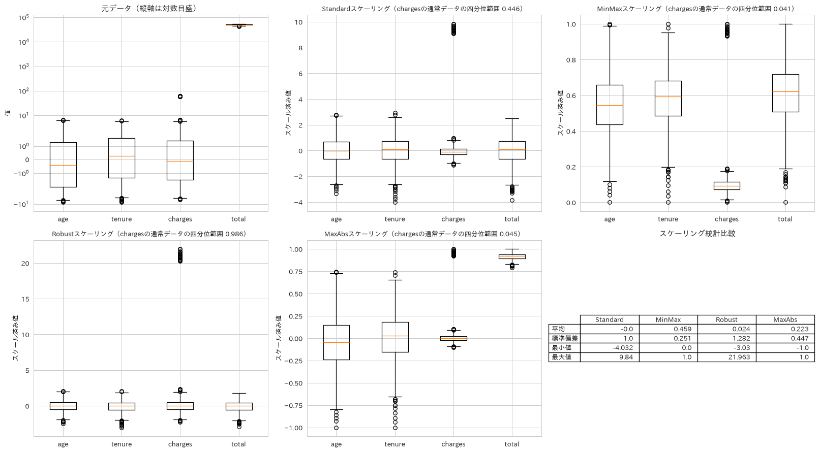
53. カテゴリ変数エンコーディング
Label Encoding、One-Hot Encoding、Target Encodingを比較し、カテゴリ数(カーディナリティ)や予測タスクの性質に応じた使い分けを整理します。
# カテゴリ変数の効果的エンコーディング手法
from sklearn.preprocessing import LabelEncoder, OneHotEncoder
from category_encoders import TargetEncoder

# サンプルカテゴリデータ作成
df_category = pd.DataFrame({
    'city': np.random.choice(['Tokyo', 'Osaka', 'Nagoya', 'Fukuoka'], 1000),
    'education': np.random.choice(['High School', 'Bachelor', 'Master', 'PhD'], 1000),
    'occupation': np.random.choice(['Engineer', 'Sales', 'Manager', 'Analyst', 'Other'], 1000)
})
# ターゲット変数(収入)
df_category['income'] = (
    (df_category['education'] == 'PhD') * 20000 +
    (df_category['education'] == 'Master') * 15000 +
    (df_category['education'] == 'Bachelor') * 10000 +
    (df_category['occupation'] == 'Manager') * 12000 +
    np.random.normal(50000, 10000, 1000)
)

# エンコーディング手法の比較
encoders_results = {}

# 1. Label Encoding
le = LabelEncoder()
df_label = df_category.copy()
for col in ['city', 'education', 'occupation']:
    df_label[f'{col}_label'] = le.fit_transform(df_category[col])
encoders_results['Label'] = df_label[['city_label', 'education_label', 'occupation_label']]

# 2. One-Hot Encoding
df_onehot = pd.get_dummies(df_category[['city', 'education', 'occupation']], prefix=['city', 'edu', 'occ'])
encoders_results['OneHot'] = df_onehot

# 3. Target Encoding
te = TargetEncoder()
df_target = df_category[['city', 'education', 'occupation']].copy()
df_target_encoded = te.fit_transform(df_target, df_category['income'])
encoders_results['Target'] = df_target_encoded

# 結果の可視化
fig, axes = plt.subplots(2, 2, figsize=(16, 12))
axes = axes.ravel()

# 元データの分布
df_category['education'].value_counts().plot(kind='bar', ax=axes[0])
axes[0].set_title('元データ(Education)', fontweight='bold')
axes[0].set_ylabel('頻度')

# Label Encoding結果
axes[1].scatter(df_label['education_label'], df_category['income'], alpha=0.6)
axes[1].set_title('Label Encoding', fontweight='bold')
axes[1].set_xlabel('Encoded Education')
axes[1].set_ylabel('Income')

# Target Encoding結果
axes[2].scatter(df_target_encoded['education'], df_category['income'], alpha=0.6)
axes[2].set_title('Target Encoding', fontweight='bold')
axes[2].set_xlabel('Target Encoded Education')
axes[2].set_ylabel('Income')

# One-Hot Encoding次元数比較
dimensions = {
    # ターゲット変数の income は特徴量ではないので数えない
    'Original': df_category[['city', 'education', 'occupation']].shape[1],
    'Label': len(encoders_results['Label'].columns),
    'OneHot': len(encoders_results['OneHot'].columns),
    'Target': len(encoders_results['Target'].columns)
}

axes[3].bar(dimensions.keys(), dimensions.values())
axes[3].set_title('エンコーディング後の次元数', fontweight='bold')
axes[3].set_ylabel('特徴量数')

plt.tight_layout()
plt.show()

print(f"元データ次元: {dimensions['Original']}")
print(f"One-Hot後次元: {dimensions['OneHot']}")
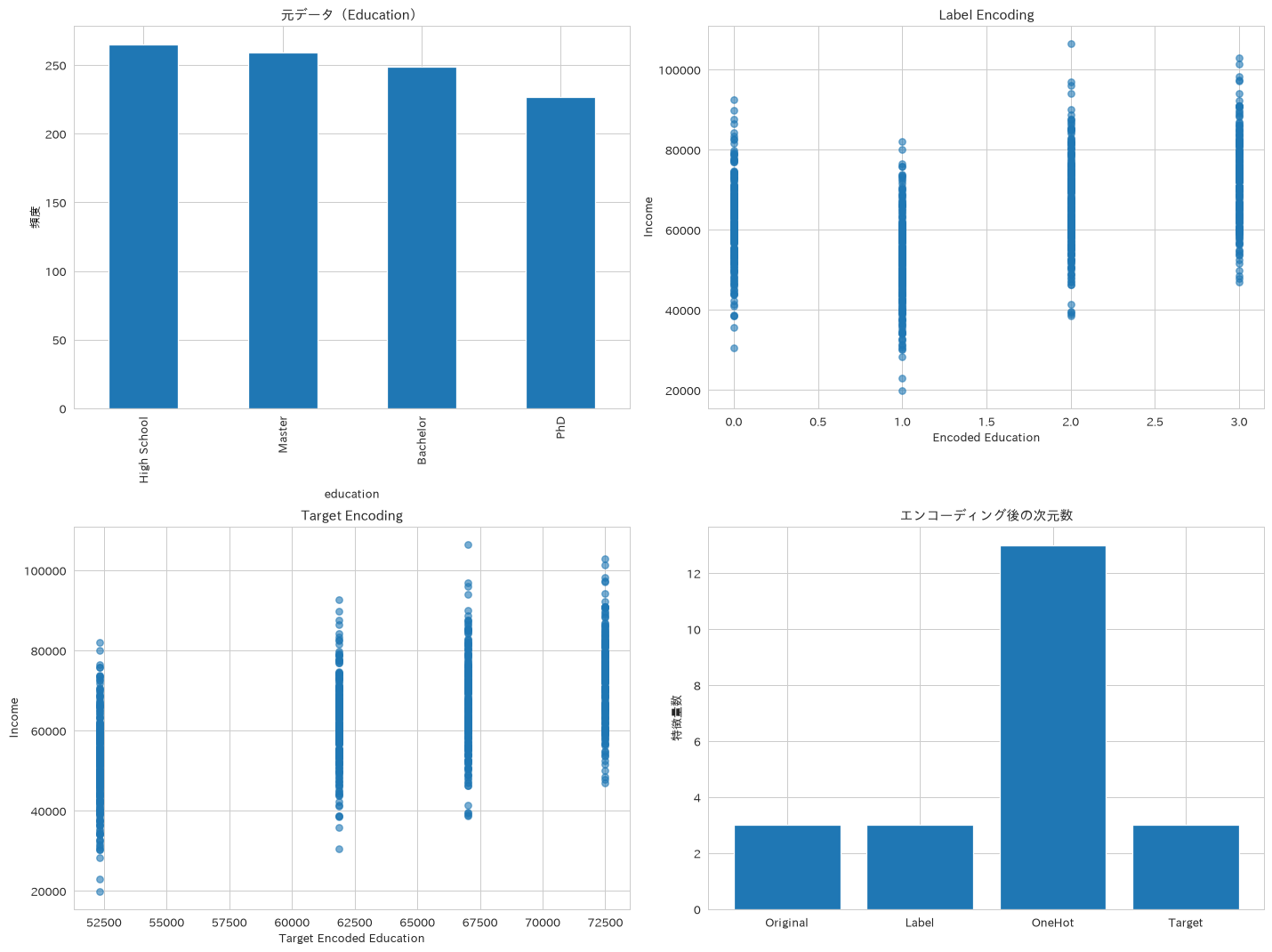
54. 特徴量選択
F統計量、相互情報量、RFE(再帰的特徴量削減)という異なる観点の特徴量選択手法を比較し、複数手法を突き合わせることで頑健な特徴量選定を行います。
# 統計的特徴量選択手法の比較
from sklearn.feature_selection import SelectKBest, f_classif, mutual_info_classif, RFE
from sklearn.ensemble import RandomForestClassifier

# 特徴量選択のためのデータ準備
X_features = df_churn.drop(['churn', 'customer_id'], axis=1)
y_target = df_churn['churn']

# 複数の特徴量選択手法
selectors = {
    'F統計': SelectKBest(score_func=f_classif, k=5),
    '相互情報量': SelectKBest(score_func=mutual_info_classif, k=5),
    # 乱数を使う推定器には個別に random_state を渡す。
    # 渡さないと実行のたびに選択順位が変わり、セットアップで書いた再現性が崩れる
    'RFE': RFE(estimator=RandomForestClassifier(n_estimators=100, random_state=42),
               n_features_to_select=5)
}

results = {}
feature_names = X_features.columns

fig, axes = plt.subplots(2, 2, figsize=(16, 12))
axes = axes.ravel()

# 各選択手法の実行と可視化
for i, (name, selector) in enumerate(selectors.items()):
    X_selected = selector.fit_transform(X_features, y_target)
    results[name] = X_selected

    if hasattr(selector, 'scores_'):
        scores = selector.scores_
        score_label = '重要度スコア'
    elif hasattr(selector, 'ranking_'):
        # RFEが返すのは重要度ではなく選択順位なので、軸ラベルも順位に合わせる
        scores = 1 / selector.ranking_
        score_label = '選択順位の逆数(1.0が選択された特徴量)'
    else:
        scores = [1] * len(feature_names)
        score_label = '重要度スコア'

    # スコアの可視化
    score_df = pd.DataFrame({'feature': feature_names, 'score': scores})
    score_df = score_df.sort_values('score', ascending=True)

    axes[i].barh(score_df['feature'], score_df['score'])
    axes[i].set_title(f'{name}による特徴量重要度', fontweight='bold')
    axes[i].set_xlabel(score_label)

# 特徴量選択結果の比較テーブル
selected_features = {}
for name, selector in selectors.items():
    if hasattr(selector, 'get_support'):
        selected_idx = selector.get_support()
        selected_features[name] = feature_names[selected_idx].tolist()

# 比較表の作成
max_len = max(len(features) for features in selected_features.values())
comparison_table = pd.DataFrame({
    name: features + [''] * (max_len - len(features))
    for name, features in selected_features.items()
})

axes[3].axis('off')
table = axes[3].table(cellText=comparison_table.values,
                      colLabels=comparison_table.columns,
                      loc='center',
                      cellLoc='left')
table.auto_set_font_size(False)
table.set_fontsize(9)
table.scale(1.2, 2)
axes[3].set_title('選択された特徴量比較', fontweight='bold')

plt.tight_layout()
plt.show()
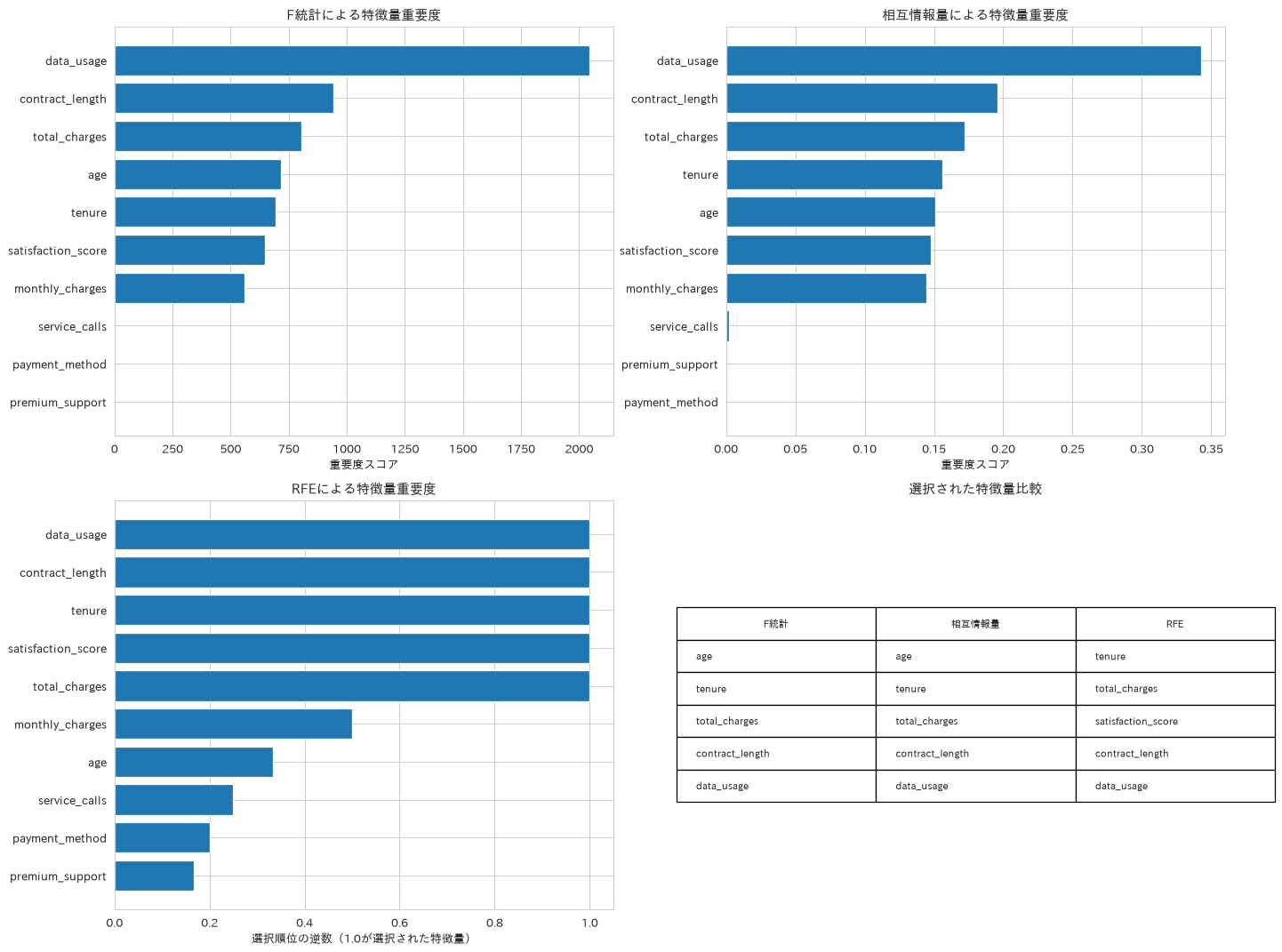
55. 訓練・テストデータ分割
基本のtrain_test_split、クラス比率を保つ層化分割、時系列データ向けのTimeSeriesSplitを使い分け、データの性質に合った検証設計の考え方を示します。
# 戦略的データ分割手法
from sklearn.model_selection import train_test_split, StratifiedShuffleSplit
from sklearn.model_selection import TimeSeriesSplit, GroupShuffleSplit

# 1. 基本的な分割
X = df_churn.drop(['churn', 'customer_id'], axis=1)
y = df_churn['churn']

X_train, X_test, y_train, y_test = train_test_split(
    X, y, test_size=0.2, random_state=42, stratify=y
)

# 2. 層化分割:クラス比率を保ったまま分割する(不均衡下での効きはレシピ73で扱う)
sss = StratifiedShuffleSplit(n_splits=5, test_size=0.2, random_state=42)

# 3. 時系列データの分割(売上データを使用)
X_ts = df_sales.drop(['revenue', 'month'], axis=1)
y_ts = df_sales['revenue']
tscv = TimeSeriesSplit(n_splits=5)

# 分割結果の可視化
fig, axes = plt.subplots(2, 3, figsize=(18, 12))

# クラス分布の比較
axes[0, 0].pie(y_train.value_counts(), labels=['No Churn', 'Churn'], autopct='%1.1f%%')
axes[0, 0].set_title('訓練データのクラス分布', fontweight='bold')

axes[0, 1].pie(y_test.value_counts(), labels=['No Churn', 'Churn'], autopct='%1.1f%%')
axes[0, 1].set_title('テストデータのクラス分布', fontweight='bold')

# 特徴量分布の比較
feature = 'monthly_charges'
axes[0, 2].hist(X_train[feature], bins=30, alpha=0.7, label='Train', density=True)
axes[0, 2].hist(X_test[feature], bins=30, alpha=0.7, label='Test', density=True)
axes[0, 2].set_title(f'{feature}の分布比較', fontweight='bold')
axes[0, 2].legend()

# 時系列分割の可視化
for i, (train_idx, test_idx) in enumerate(tscv.split(X_ts)):
    axes[1, 0].plot(train_idx, [i] * len(train_idx), 'bo', markersize=1, label='Train' if i == 0 else "")
    axes[1, 0].plot(test_idx, [i] * len(test_idx), 'ro', markersize=1, label='Test' if i == 0 else "")

axes[1, 0].set_title('時系列交差検証分割', fontweight='bold')
axes[1, 0].set_xlabel('データポイント')
axes[1, 0].set_ylabel('分割回数')
axes[1, 0].legend()

# 分割統計情報
split_stats = pd.DataFrame({
    '分割手法': ['基本分割', '層化分割', '時系列分割'],
    '訓練サイズ': [len(X_train), len(X_train), 'Variable'],
    'テストサイズ': [len(X_test), len(X_test), 'Variable'],
    '特徴': ['ランダム', 'クラス比率保持', '時間順序保持']
})

axes[1, 1].axis('off')
table = axes[1, 1].table(cellText=split_stats.values,
                         colLabels=split_stats.columns,
                         loc='center')
table.auto_set_font_size(False)
table.set_fontsize(10)
table.scale(1.2, 2)
axes[1, 1].set_title('データ分割手法比較', fontweight='bold')

# 層化分割の効果(層化しないランダム分割と並べて初めて差が見える)
from sklearn.model_selection import ShuffleSplit

stratified_results = []
for train_idx, test_idx in sss.split(X, y):
    y_train_strat = y.iloc[train_idx]
    y_test_strat = y.iloc[test_idx]
    train_ratio = y_train_strat.sum() / len(y_train_strat)
    test_ratio = y_test_strat.sum() / len(y_test_strat)
    stratified_results.append([train_ratio, test_ratio])

random_split = ShuffleSplit(n_splits=5, test_size=0.2, random_state=42)
random_results = []
for train_idx, test_idx in random_split.split(X, y):
    random_results.append([y.iloc[train_idx].sum() / len(train_idx),
                           y.iloc[test_idx].sum() / len(test_idx)])

stratified_results = np.array(stratified_results)
random_results = np.array(random_results)

axes[1, 2].boxplot([stratified_results[:, 1], random_results[:, 1]],
                   tick_labels=['層化分割', 'ランダム分割'])
axes[1, 2].axhline(y=y.mean(), color='red', linestyle='--',
                   label=f'母集団の正例比率 {y.mean():.3f}')
axes[1, 2].set_title('テストデータの正例比率のばらつき(5分割)', fontweight='bold')
axes[1, 2].legend()
axes[1, 2].set_ylabel('正例比率')

plt.tight_layout()
plt.show()

print(f"訓練データサイズ: {len(X_train):,}")
print(f"テストデータサイズ: {len(X_test):,}")
print(f"クラス比率 - 訓練: {y_train.sum()/len(y_train):.3f}, テスト: {y_test.sum()/len(y_test):.3f}")
print(f"テスト正例比率の標準偏差 - 層化分割: {stratified_results[:, 1].std():.5f}, ランダム分割: {random_results[:, 1].std():.5f}")
訓練データサイズ: 1,600
テストデータサイズ: 400
クラス比率 - 訓練: 0.497, テスト: 0.497
テスト正例比率の標準偏差 - 層化分割: 0.00000, ランダム分割: 0.01037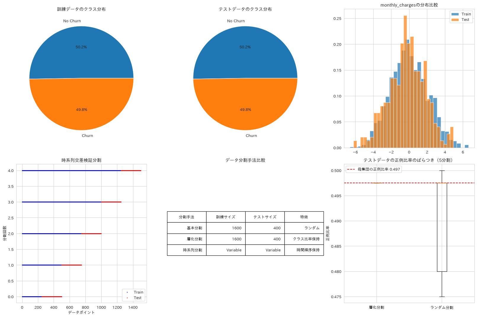
この章を深めたい方への参考書籍
- Andreas C. Muller・Sarah Guido『Pythonではじめる機械学習』(オライリー・ジャパン):3.3節の前処理とスケール変換で、スケーラーを訓練データだけで学習させる理由が図とともに説明されています。本章の前処理を、リークを起こさない手順として組み直せます。
- 門脇大輔・阪田隆司・保坂桂佑・平松雄司『Kaggleで勝つデータ分析の技術』(技術評論社):第3章「特徴量の作成」で、Target Encodingを交差検証の内側で計算しなければならない理由まで踏み込んでいます。本章のエンコーディングを実務で安全に使うために押さえておきたい内容です。
分類アルゴリズム
56. ロジスティック回帰
混同行列やROC曲線、回帰係数による特徴量重要度を可視化し、解釈性が重視される場面でのベースラインモデルとしての位置づけを解説します。なお係数の大小をそのまま重要度として比べるには、あらかじめ特徴量のスケールを揃えておく必要があります。ここで使うデータは各特徴量のスケールがほぼ揃っています。
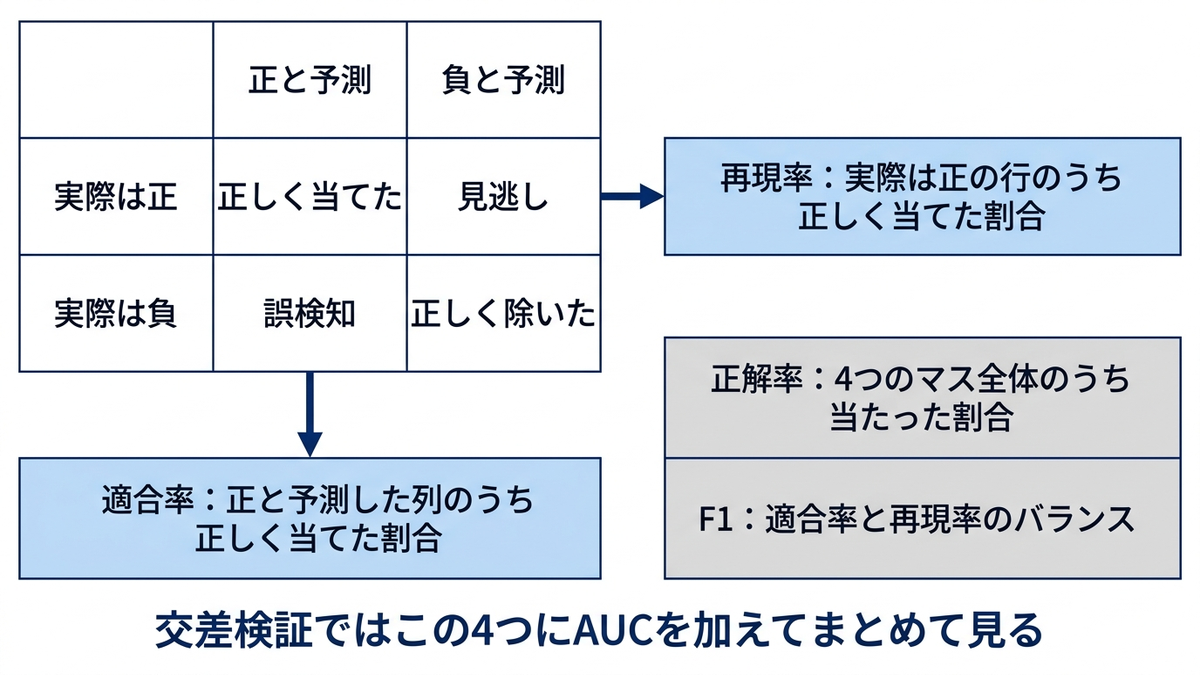
# ロジスティック回帰による分類
from sklearn.linear_model import LogisticRegression
from sklearn.metrics import classification_report, confusion_matrix
from sklearn.metrics import roc_curve, auc

# モデル訓練
lr_model = LogisticRegression(random_state=42, max_iter=1000)
lr_model.fit(X_train, y_train)

# 予測実行
y_pred = lr_model.predict(X_test)
y_pred_proba = lr_model.predict_proba(X_test)[:, 1]

# 評価指標の計算
accuracy = accuracy_score(y_test, y_pred)
precision = precision_score(y_test, y_pred)
recall = recall_score(y_test, y_pred)
f1 = f1_score(y_test, y_pred)

# ROC曲線の計算
fpr, tpr, thresholds = roc_curve(y_test, y_pred_proba)
roc_auc = auc(fpr, tpr)

# 結果可視化
fig, axes = plt.subplots(2, 2, figsize=(15, 12))

# 1. 混同行列
cm = confusion_matrix(y_test, y_pred)
sns.heatmap(cm, annot=True, fmt='d', cmap='Blues', ax=axes[0, 0])
axes[0, 0].set_title('混同行列', fontweight='bold')
axes[0, 0].set_ylabel('実際のクラス')
axes[0, 0].set_xlabel('予測クラス')

# 2. ROC曲線
axes[0, 1].plot(fpr, tpr, color='darkorange', lw=2,
                label=f'ROC curve (AUC = {roc_auc:.3f})')
axes[0, 1].plot([0, 1], [0, 1], color='navy', lw=2, linestyle='--')
axes[0, 1].set_xlim([0.0, 1.0])
axes[0, 1].set_ylim([0.0, 1.05])
axes[0, 1].set_xlabel('False Positive Rate')
axes[0, 1].set_ylabel('True Positive Rate')
axes[0, 1].set_title('ROC曲線', fontweight='bold')
axes[0, 1].legend()

# 3. 特徴量重要度(回帰係数)
feature_importance = pd.DataFrame({
    'feature': X_train.columns,
    'coefficient': lr_model.coef_[0]
})
feature_importance = feature_importance.reindex(
    feature_importance.coefficient.abs().sort_values(ascending=False).index
)

axes[1, 0].barh(feature_importance['feature'], feature_importance['coefficient'])
axes[1, 0].set_title('特徴量重要度(回帰係数)', fontweight='bold')
axes[1, 0].set_xlabel('係数値')

# 4. 予測確率分布
axes[1, 1].hist(y_pred_proba[y_test == 0], bins=30, alpha=0.7, label='No Churn', density=True)
axes[1, 1].hist(y_pred_proba[y_test == 1], bins=30, alpha=0.7, label='Churn', density=True)
axes[1, 1].set_title('予測確率分布', fontweight='bold')
axes[1, 1].set_xlabel('予測確率')
axes[1, 1].set_ylabel('密度')
# 既定位置だと中間の低い山に凡例がかぶるので、空いている上中央に置く
axes[1, 1].legend(loc='upper center')

plt.tight_layout()
plt.show()

# パフォーマンスサマリー
print("ロジスティック回帰 性能評価")
print("=" * 40)
print(f"正解率 (Accuracy): {accuracy:.3f}")
print(f"適合率 (Precision): {precision:.3f}")
print(f"再現率 (Recall): {recall:.3f}")
print(f"F1スコア: {f1:.3f}")
print(f"AUC: {roc_auc:.3f}")
print("\n分類レポート:")
print(classification_report(y_test, y_pred))
ロジスティック回帰 性能評価
========================================
正解率 (Accuracy): 0.965
適合率 (Precision): 0.974
再現率 (Recall): 0.955
F1スコア: 0.964
AUC: 0.988

分類レポート:
              precision    recall  f1-score   support

           0       0.96      0.98      0.97       201
           1       0.97      0.95      0.96       199

    accuracy                           0.96       400
   macro avg       0.97      0.96      0.96       400
weighted avg       0.97      0.96      0.96       400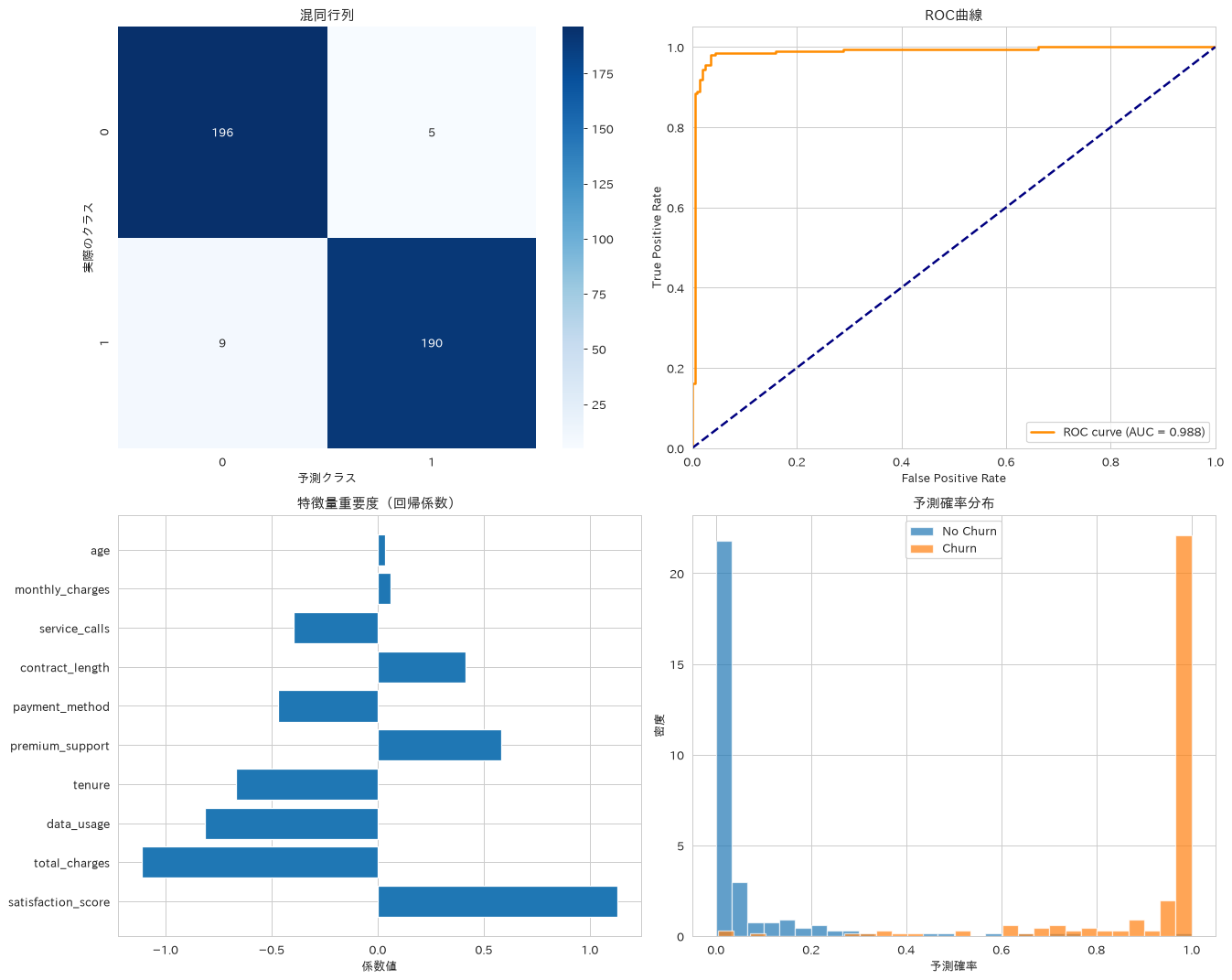
57. 決定木分類
木の深さや剪定パラメータを変えて複数モデルを比較し、決定ルールをテキストとして出力することで、ビジネスルール抽出や説明可能なモデル構築に活用する方法を紹介します。出力されるルールには、左右の枝が同じクラスに行き着く分岐も混じります。ルールとして使うときは、そうした枝はひとつにまとめて読みます。
# 決定木による分類と可視化
from sklearn.tree import DecisionTreeClassifier, export_text, plot_tree

# モデル訓練(複数の設定で比較)
dt_configs = {
    '浅い木': DecisionTreeClassifier(max_depth=3, random_state=42),
    '深い木': DecisionTreeClassifier(max_depth=10, random_state=42),
    '剪定木': DecisionTreeClassifier(max_depth=5, min_samples_split=50,
                                   min_samples_leaf=20, random_state=42)
}

dt_results = {}
for name, model in dt_configs.items():
    model.fit(X_train, y_train)
    y_pred = model.predict(X_test)
    accuracy = accuracy_score(y_test, y_pred)
    dt_results[name] = {
        'model': model,
        'accuracy': accuracy,
        'predictions': y_pred
    }

# 決定木の可視化(浅い木)
# サブプロットに詰め込むとノードの文字が潰れるため、単独の図として大きく描く
plt.figure(figsize=(20, 10))
plot_tree(dt_results['浅い木']['model'],
          feature_names=X_train.columns,
          class_names=['No Churn', 'Churn'],
          filled=True,
          fontsize=10,
          max_depth=2)
plt.title('浅い決定木 (depth=3、根から3階層まで表示)', fontweight='bold', fontsize=14)
plt.show()

# 結果可視化
fig, axes = plt.subplots(2, 3, figsize=(20, 12))

# 特徴量重要度比較
for i, (name, result) in enumerate(dt_results.items()):
    model = result['model']
    importance_df = pd.DataFrame({
        'feature': X_train.columns,
        'importance': model.feature_importances_
    }).sort_values('importance', ascending=False).head(8)

    ax = axes[0, i]
    ax.barh(importance_df['feature'], importance_df['importance'])
    ax.set_title(f'{name} - 特徴量重要度', fontweight='bold')
    ax.set_xlabel('重要度')

# 性能比較
performance_df = pd.DataFrame({
    'Model': list(dt_results.keys()),
    'Accuracy': [result['accuracy'] for result in dt_results.values()],
    'Tree_Depth': [model.get_depth() for model in [result['model'] for result in dt_results.values()]],
    'Leaf_Nodes': [model.get_n_leaves() for model in [result['model'] for result in dt_results.values()]]
})

axes[1, 0].bar(performance_df['Model'], performance_df['Accuracy'])
# 0起点だと3本が同じ高さに見えるので、実測のレンジに合わせる
axes[1, 0].set_ylim(0.88, 0.93)
axes[1, 0].set_title('モデル性能比較', fontweight='bold')
axes[1, 0].set_ylabel('正解率')
axes[1, 0].tick_params(axis='x', rotation=45)

# 複雑性 vs 性能
axes[1, 1].scatter(performance_df['Leaf_Nodes'], performance_df['Accuracy'], s=100)
for i, txt in enumerate(performance_df['Model']):
    axes[1, 1].annotate(txt, (performance_df['Leaf_Nodes'].iloc[i],
                              performance_df['Accuracy'].iloc[i]),
                        xytext=(-45, 8), textcoords='offset points')
axes[1, 1].margins(x=0.2)
axes[1, 1].set_title('複雑性 vs 性能', fontweight='bold')
axes[1, 1].set_xlabel('リーフノード数')
axes[1, 1].set_ylabel('正解率')

# 3モデルの構造と性能の一覧
axes[1, 2].axis('off')
tree_table = axes[1, 2].table(cellText=performance_df.round(3).values,
                              colLabels=['モデル', '正解率', '木の深さ', 'リーフ数'],
                              loc='center')
tree_table.auto_set_font_size(False)
tree_table.set_fontsize(10)
tree_table.scale(1.1, 2)
axes[1, 2].set_title('決定木の構造と性能', fontweight='bold')

plt.tight_layout()
plt.show()

# 決定ルールのテキスト出力
print("決定木ルール(浅い木)")
print("=" * 50)
tree_rules = export_text(dt_results['浅い木']['model'],
                        feature_names=list(X_train.columns))
print(tree_rules[:1000] + "...")  # 最初の1000文字のみ表示

print(f"\n性能サマリー")
for name, result in dt_results.items():
    print(f"{name}: 正解率 {result['accuracy']:.3f}")
決定木ルール(浅い木)
==================================================
|--- data_usage <= 2.06
|   |--- satisfaction_score <= -1.78
|   |   |--- tenure <= -1.88
|   |   |   |--- class: 0
|   |   |--- tenure >  -1.88
|   |   |   |--- class: 0
|   |--- satisfaction_score >  -1.78
|   |   |--- total_charges <= 0.33
|   |   |   |--- class: 1
|   |   |--- total_charges >  0.33
|   |   |   |--- class: 1
|--- data_usage >  2.06
|   |--- monthly_charges <= 2.32
|   |   |--- total_charges <= -1.92
|   |   |   |--- class: 1
|   |   |--- total_charges >  -1.92
|   |   |   |--- class: 0
|   |--- monthly_charges >  2.32
|   |   |--- satisfaction_score <= -1.69
|   |   |   |--- class: 0
|   |   |--- satisfaction_score >  -1.69
|   |   |   |--- class: 1
...

性能サマリー
浅い木: 正解率 0.900
深い木: 正解率 0.912
剪定木: 正解率 0.917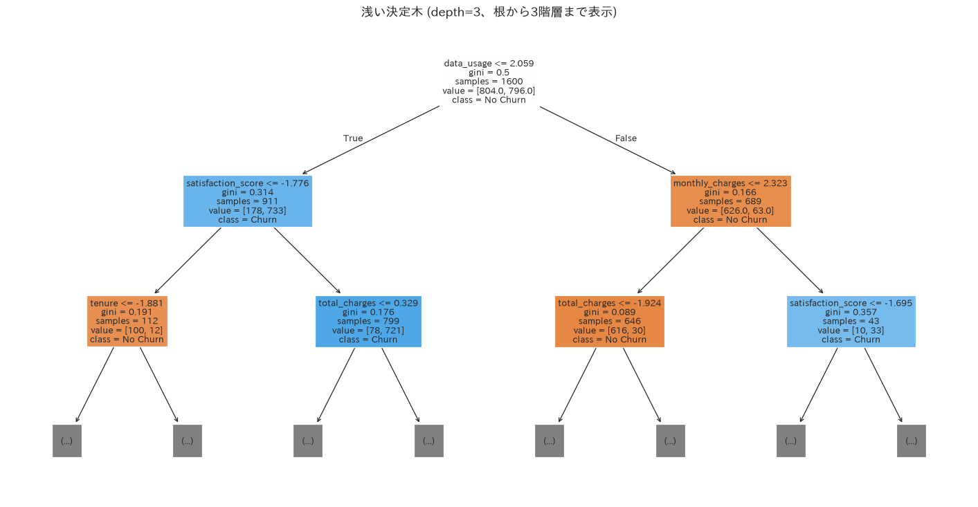
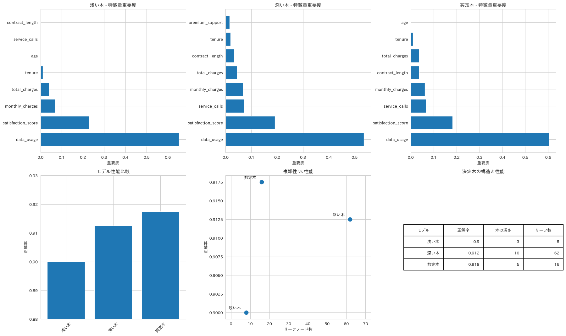
58. ランダムフォレスト
GridSearchCVによるハイパーパラメータ最適化と、Gini重要度・パーミューテーション重要度という2種類の特徴量重要度を組み合わせます。多数の決定木の予測を平均することで、1本の木が学習データの偶然に左右されるぶんを打ち消すことを狙う手法です。ここで確かめるのは単一分割での正解率(レシピ57の決定木は0.900から0.917)と特徴量重要度までで、ばらつきが実際に小さくなったかを見るには、乱数シードを変えた複数回の実行や交差検証でスコアの散らばりを比べる必要があります。
# ランダムフォレスト(アンサンブル手法)
from sklearn.ensemble import RandomForestClassifier
from sklearn.inspection import permutation_importance

# ハイパーパラメータチューニング
from sklearn.model_selection import GridSearchCV

# グリッドサーチによる最適化
param_grid = {
    'n_estimators': [50, 100, 200],
    'max_depth': [5, 10, None],
    'min_samples_split': [2, 5, 10],
    'min_samples_leaf': [1, 2, 4]
}

rf_grid = GridSearchCV(
    RandomForestClassifier(random_state=42),
    param_grid,
    cv=5,
    scoring='accuracy',
    n_jobs=-1,
    verbose=0
)

rf_grid.fit(X_train, y_train)

# 最適モデルでの予測
best_rf = rf_grid.best_estimator_
rf_pred = best_rf.predict(X_test)
rf_pred_proba = best_rf.predict_proba(X_test)[:, 1]

# パーミューテーション重要度の計算
perm_importance = permutation_importance(best_rf, X_test, y_test,
                                       n_repeats=10, random_state=42)

# 結果可視化
fig, axes = plt.subplots(2, 3, figsize=(18, 12))

# 1. 特徴量重要度比較(Gini vs Permutation)
feature_names = X_train.columns
gini_importance = best_rf.feature_importances_
perm_importance_mean = perm_importance.importances_mean

importance_df = pd.DataFrame({
    'feature': feature_names,
    'gini_importance': gini_importance,
    'perm_importance': perm_importance_mean
}).sort_values('gini_importance', ascending=False)

axes[0, 0].barh(importance_df['feature'], importance_df['gini_importance'], alpha=0.7)
axes[0, 0].set_title('Gini重要度', fontweight='bold')
axes[0, 0].set_xlabel('重要度')

axes[0, 1].barh(importance_df['feature'], importance_df['perm_importance'], alpha=0.7)
axes[0, 1].set_title('パーミューテーション重要度', fontweight='bold')
axes[0, 1].set_xlabel('重要度')

# 2. 重要度の相関
axes[0, 2].scatter(importance_df['gini_importance'], importance_df['perm_importance'])
axes[0, 2].set_xlabel('Gini重要度')
axes[0, 2].set_ylabel('パーミューテーション重要度')
axes[0, 2].set_title('重要度指標の相関', fontweight='bold')

# 相関係数を計算
correlation = np.corrcoef(importance_df['gini_importance'],
                         importance_df['perm_importance'])[0, 1]
axes[0, 2].text(0.05, 0.95, f'相関: {correlation:.3f}',
                transform=axes[0, 2].transAxes,
                bbox=dict(boxstyle='round', facecolor='wheat', alpha=0.5))

# 3. アンサンブル効果の可視化
n_estimators_range = range(10, 201, 20)
train_scores = []
test_scores = []

for n_est in n_estimators_range:
    rf_temp = RandomForestClassifier(n_estimators=n_est, random_state=42)
    rf_temp.fit(X_train, y_train)

    train_score = rf_temp.score(X_train, y_train)
    test_score = rf_temp.score(X_test, y_test)

    train_scores.append(train_score)
    test_scores.append(test_score)

axes[1, 0].plot(n_estimators_range, train_scores, label='訓練スコア', marker='o')
axes[1, 0].plot(n_estimators_range, test_scores, label='テストスコア', marker='s')
axes[1, 0].set_xlabel('決定木の数')
axes[1, 0].set_ylabel('正解率')
axes[1, 0].set_title('アンサンブル効果', fontweight='bold')
axes[1, 0].legend()
axes[1, 0].grid(True, alpha=0.3)

# 4. 予測確率の信頼度
axes[1, 1].hist(rf_pred_proba, bins=30, alpha=0.7, edgecolor='black')
axes[1, 1].set_xlabel('予測確率')
axes[1, 1].set_ylabel('頻度')
axes[1, 1].set_title('予測確率分布', fontweight='bold')

# 5. グリッドサーチ結果
cv_results = pd.DataFrame(rf_grid.cv_results_)
axes[1, 2].plot(cv_results['mean_test_score'], marker='o')
axes[1, 2].set_xlabel('パラメータ組み合わせ')
axes[1, 2].set_ylabel('交差検証スコア')
axes[1, 2].set_title('ハイパーパラメータ最適化', fontweight='bold')

plt.tight_layout()
plt.show()

# 結果サマリー
rf_accuracy = accuracy_score(y_test, rf_pred)
rf_f1 = f1_score(y_test, rf_pred)

print("ランダムフォレスト 性能評価")
print("=" * 40)
print(f"最適パラメータ: {rf_grid.best_params_}")
print(f"正解率: {rf_accuracy:.3f}")
print(f"F1スコア: {rf_f1:.3f}")
print(f"使用決定木数: {best_rf.n_estimators}")
print(f"特徴量数: {X_train.shape[1]}")

print("\nTop 5 重要特徴量:")
top_features = importance_df.head()
for i, row in top_features.iterrows():
    print(f"{row['feature']}: {row['gini_importance']:.3f}")
ランダムフォレスト 性能評価
========================================
最適パラメータ: {'max_depth': 10, 'min_samples_leaf': 1, 'min_samples_split': 10, 'n_estimators': 100}
正解率: 0.963
F1スコア: 0.962
使用決定木数: 100
特徴量数: 10

Top 5 重要特徴量:
data_usage: 0.272
total_charges: 0.151
contract_length: 0.132
satisfaction_score: 0.121
tenure: 0.105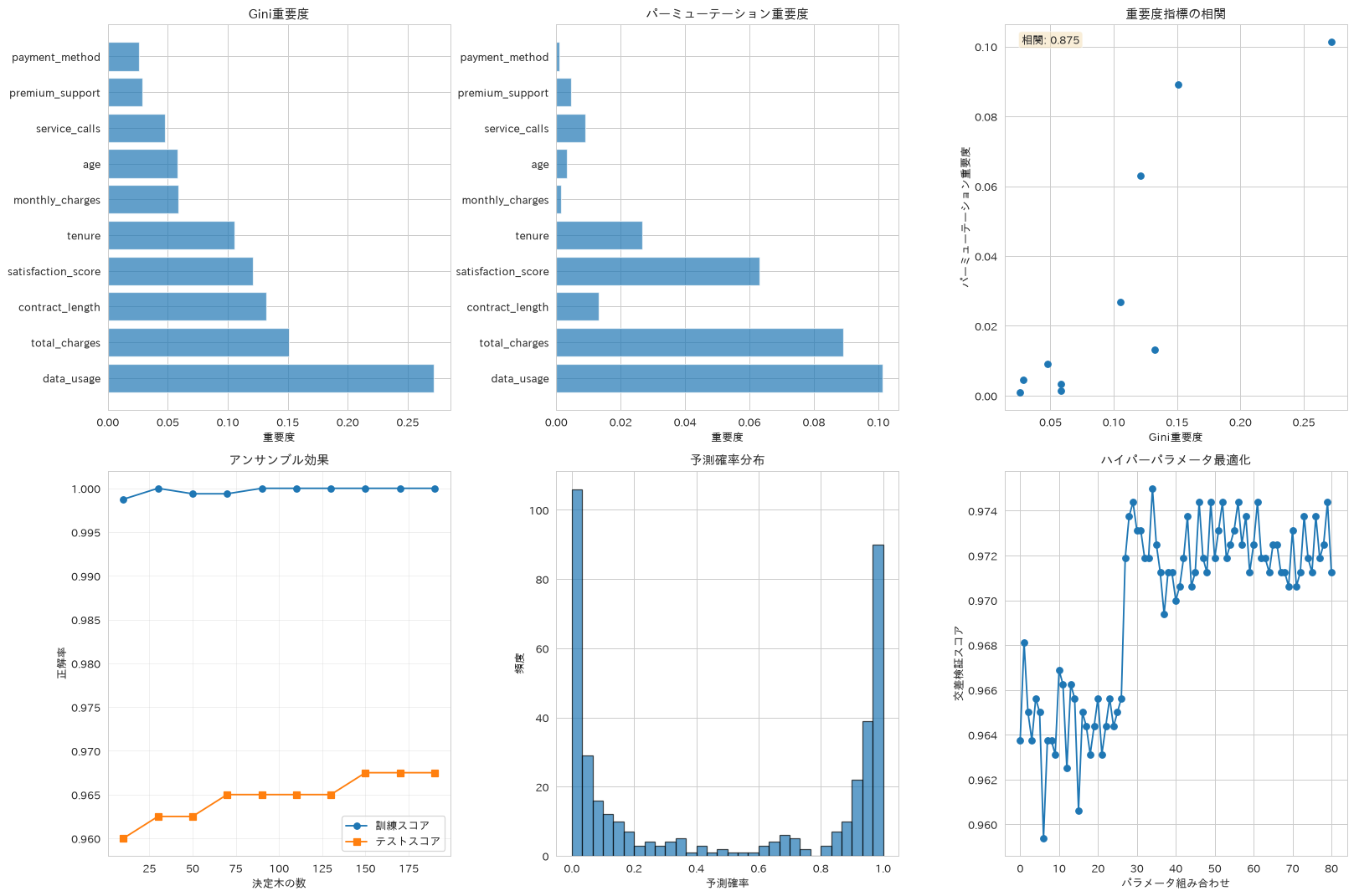
59. サポートベクターマシン(SVM)
線形・RBF・多項式・シグモイドの4カーネルを比較したうえで、RBFカーネルについてグリッドサーチでCとgammaを最適化します。非線形な境界を引ける代表的な分類手法で、特徴量の尺度に敏感なため標準化が前提になります。
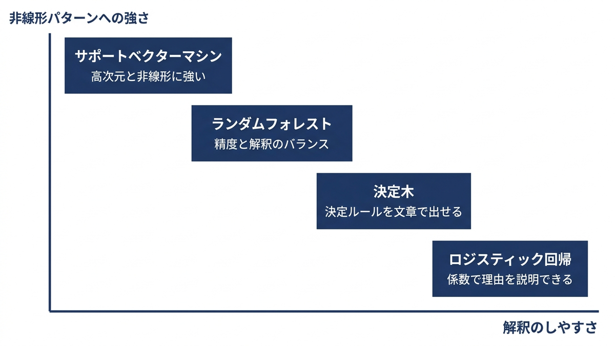
# SVM(サポートベクターマシン)による分類
from sklearn.svm import SVC
from sklearn.preprocessing import StandardScaler

# データの標準化(SVMに必須)
scaler = StandardScaler()
X_train_scaled = scaler.fit_transform(X_train)
X_test_scaled = scaler.transform(X_test)

# 複数のカーネルでSVMを比較
# SVC の probability=True は scikit-learn 1.9 で非推奨になり、1.11 で削除される。
# 確率が必要なときは CalibratedClassifierCV で包むのが公式の推奨。
from sklearn.calibration import CalibratedClassifierCV

svm_kernels = {
    'Linear': CalibratedClassifierCV(SVC(kernel='linear', random_state=42), ensemble=False),
    'RBF': CalibratedClassifierCV(SVC(kernel='rbf', random_state=42), ensemble=False),
    'Polynomial': CalibratedClassifierCV(SVC(kernel='poly', degree=3, random_state=42), ensemble=False),
    'Sigmoid': CalibratedClassifierCV(SVC(kernel='sigmoid', random_state=42), ensemble=False)
}

svm_results = {}
for name, model in svm_kernels.items():
    # モデル訓練
    model.fit(X_train_scaled, y_train)

    # 予測
    pred = model.predict(X_test_scaled)
    pred_proba = model.predict_proba(X_test_scaled)[:, 1]

    # 評価
    accuracy = accuracy_score(y_test, pred)
    f1 = f1_score(y_test, pred)

    svm_results[name] = {
        'model': model,
        'accuracy': accuracy,
        'f1': f1,
        'predictions': pred,
        'probabilities': pred_proba
    }

# 結果可視化
fig, axes = plt.subplots(2, 3, figsize=(18, 12))

# 1. 性能比較
kernels = list(svm_results.keys())
accuracies = [result['accuracy'] for result in svm_results.values()]
f1_scores = [result['f1'] for result in svm_results.values()]

x_pos = np.arange(len(kernels))
width = 0.35

axes[0, 0].bar(x_pos - width/2, accuracies, width, label='Accuracy', alpha=0.8)
axes[0, 0].bar(x_pos + width/2, f1_scores, width, label='F1 Score', alpha=0.8)
axes[0, 0].set_xlabel('カーネル')
axes[0, 0].set_ylabel('スコア')
axes[0, 0].set_title('カーネル別性能比較', fontweight='bold')
axes[0, 0].set_xticks(x_pos)
axes[0, 0].set_xticklabels(kernels)
axes[0, 0].legend()

# 2. ROC曲線比較
for name, result in svm_results.items():
    fpr, tpr, _ = roc_curve(y_test, result['probabilities'])
    auc_score = auc(fpr, tpr)
    axes[0, 1].plot(fpr, tpr, label=f'{name} (AUC = {auc_score:.3f})')

axes[0, 1].plot([0, 1], [0, 1], 'k--', alpha=0.5)
axes[0, 1].set_xlabel('False Positive Rate')
axes[0, 1].set_ylabel('True Positive Rate')
axes[0, 1].set_title('ROC曲線比較', fontweight='bold')
axes[0, 1].legend()

# 3. 予測確率分布(RBFカーネル)
rbf_proba = svm_results['RBF']['probabilities']
axes[0, 2].hist(rbf_proba[y_test == 0], bins=30, alpha=0.7, label='No Churn', density=True)
axes[0, 2].hist(rbf_proba[y_test == 1], bins=30, alpha=0.7, label='Churn', density=True)
axes[0, 2].set_xlabel('予測確率')
axes[0, 2].set_ylabel('密度')
axes[0, 2].set_title('RBF予測確率分布', fontweight='bold')
axes[0, 2].legend()

# 4. ハイパーパラメータの影響(RBFカーネル)
C_range = [0.1, 1, 10, 100]
gamma_range = [0.001, 0.01, 0.1, 1]

# グリッドサーチでC(正則化)とgamma(カーネル係数)を最適化
param_grid = {'C': C_range, 'gamma': gamma_range}
grid_search = GridSearchCV(SVC(kernel='rbf', random_state=42),
                          param_grid, cv=3, scoring='accuracy')
grid_search.fit(X_train_scaled, y_train)

# ヒートマップで結果表示
results_matrix = np.zeros((len(C_range), len(gamma_range)))
for i, C in enumerate(C_range):
    for j, gamma in enumerate(gamma_range):
        idx = (grid_search.cv_results_['param_C'] == C) & \
              (grid_search.cv_results_['param_gamma'] == gamma)
        results_matrix[i, j] = grid_search.cv_results_['mean_test_score'][idx][0]

im = axes[1, 0].imshow(results_matrix, cmap='viridis')
axes[1, 0].set_xticks(range(len(gamma_range)))
axes[1, 0].set_yticks(range(len(C_range)))
axes[1, 0].set_xticklabels(gamma_range)
axes[1, 0].set_yticklabels(C_range)
axes[1, 0].set_xlabel('Gamma')
axes[1, 0].set_ylabel('C')
axes[1, 0].set_title('RBF パラメータ最適化', fontweight='bold')
plt.colorbar(im, ax=axes[1, 0])

# 5. サポートベクター可視化(2次元で近似)
from sklearn.decomposition import PCA

# 2次元に次元削減してサポートベクターを可視化
pca = PCA(n_components=2)
X_train_2d = pca.fit_transform(X_train_scaled)
X_test_2d = pca.transform(X_test_scaled)

# 2次元データでSVM訓練
svm_2d = SVC(kernel='rbf', C=grid_search.best_params_['C'],
             gamma=grid_search.best_params_['gamma'])
svm_2d.fit(X_train_2d, y_train)

# プロット
colors = ['red', 'blue']
for i, color in enumerate(colors):
    idx = (y_train == i)
    axes[1, 1].scatter(X_train_2d[idx, 0], X_train_2d[idx, 1],
                      c=color, alpha=0.6, s=50,
                      label=f'Class {i}')

# サポートベクターをハイライト(数が多いので小さく細く描き、下の散布図を潰さない)
support_vectors_2d = X_train_2d[svm_2d.support_]
axes[1, 1].scatter(support_vectors_2d[:, 0], support_vectors_2d[:, 1],
                  s=30, facecolors='none', edgecolors='black',
                  linewidth=0.8, label=f'Support Vectors (n={len(support_vectors_2d)})')

axes[1, 1].set_xlabel('第1主成分')
axes[1, 1].set_ylabel('第2主成分')
axes[1, 1].set_title('サポートベクター(2D投影)', fontweight='bold')
axes[1, 1].legend()

# 6. 計算時間比較
import time
training_times = {}

for name, model in svm_kernels.items():
    start_time = time.time()
    model.fit(X_train_scaled, y_train)
    end_time = time.time()
    training_times[name] = end_time - start_time

axes[1, 2].bar(training_times.keys(), training_times.values())
axes[1, 2].set_ylabel('訓練時間 (秒)')
axes[1, 2].set_title('カーネル別計算時間', fontweight='bold')
axes[1, 2].tick_params(axis='x', rotation=45)

plt.tight_layout()
plt.show()

# 結果サマリー
best_kernel = max(svm_results.items(), key=lambda x: x[1]['accuracy'])
print("SVM 性能評価")
print("=" * 40)
print(f"最高性能カーネル: {best_kernel[0]}")
print(f"最高正解率: {best_kernel[1]['accuracy']:.3f}")
print(f"最高F1スコア: {best_kernel[1]['f1']:.3f}")
print(f"最適パラメータ: {grid_search.best_params_}")
print(f"サポートベクター数(2D可視化用に再学習したモデルの値): {svm_2d.n_support_}")

print("\nカーネル別性能:")
for name, result in svm_results.items():
    print(f"{name}: Accuracy {result['accuracy']:.3f}, F1 {result['f1']:.3f}")
SVM 性能評価
========================================
最高性能カーネル: RBF
最高正解率: 0.980
最高F1スコア: 0.980
最適パラメータ: {'C': 10, 'gamma': 0.1}
サポートベクター数(2D可視化用に再学習したモデルの値): [228 234]

カーネル別性能:
Linear: Accuracy 0.960, F1 0.959
RBF: Accuracy 0.980, F1 0.980
Polynomial: Accuracy 0.968, F1 0.967
Sigmoid: Accuracy 0.885, F1 0.881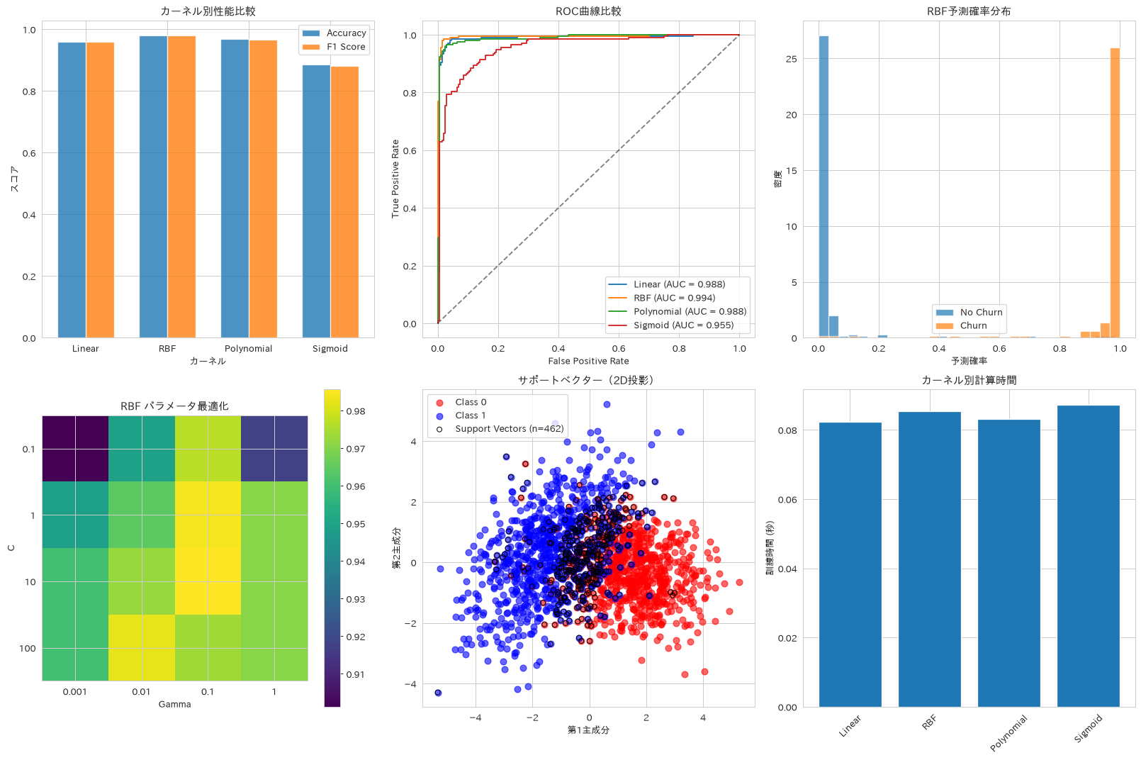
この章を深めたい方への参考書籍
- Andreas C. Muller・Sarah Guido『Pythonではじめる機械学習』(オライリー・ジャパン):2.3節の教師あり機械学習アルゴリズムで、線形モデル・決定木・決定木のアンサンブル法・カーネル法を用いたサポートベクタマシンが同じデータで順に比較されています。本章の4手法の得手不得手を見比べられます。
- 平井有三『はじめてのパターン認識』(森北出版):ベイズの識別規則から線形識別関数、サポートベクトルマシンまでを数式で追える教科書です。本章で調整したCやgammaが、最適化問題のどこに効いているのかを確認できます。
回帰アルゴリズム
60. 線形回帰
線形回帰による売上予測を通じて、決定係数(R²)や平均二乗誤差など回帰特有の評価指標の見方を確認します。Ridge・Lasso・ElasticNetを並べ、正則化の強さが誤差にどう出るかもあわせて見ます。非線形性への拡張はレシピ61で扱います。
# 線形回帰による売上予測
from sklearn.linear_model import LinearRegression
from sklearn.metrics import mean_squared_error, r2_score, mean_absolute_error

# 売上データの準備
X_sales = df_sales.drop(['revenue', 'month'], axis=1)
y_sales = df_sales['revenue']

# 訓練・テスト分割
X_train_sales, X_test_sales, y_train_sales, y_test_sales = train_test_split(
    X_sales, y_sales, test_size=0.2, random_state=42
)

# データ標準化
scaler_sales = StandardScaler()
X_train_sales_scaled = scaler_sales.fit_transform(X_train_sales)
X_test_sales_scaled = scaler_sales.transform(X_test_sales)

# 複数の線形回帰手法を比較
from sklearn.linear_model import Ridge, Lasso, ElasticNet

models = {
    'Linear': LinearRegression(),
    'Ridge': Ridge(alpha=1.0),
    'Lasso': Lasso(alpha=1.0),
    'ElasticNet': ElasticNet(alpha=1.0, l1_ratio=0.5)
}

results = {}
for name, model in models.items():
    # モデル訓練
    model.fit(X_train_sales_scaled, y_train_sales)

    # 予測
    y_pred_train = model.predict(X_train_sales_scaled)
    y_pred_test = model.predict(X_test_sales_scaled)

    # 評価指標
    train_r2 = r2_score(y_train_sales, y_pred_train)
    test_r2 = r2_score(y_test_sales, y_pred_test)
    test_mse = mean_squared_error(y_test_sales, y_pred_test)
    test_mae = mean_absolute_error(y_test_sales, y_pred_test)

    results[name] = {
        'model': model,
        'train_r2': train_r2,
        'test_r2': test_r2,
        'mse': test_mse,
        'mae': test_mae,
        'predictions': y_pred_test
    }

# 結果可視化
fig, axes = plt.subplots(2, 3, figsize=(18, 12))

# 1. 性能比較
metrics = ['train_r2', 'test_r2', 'mse']
metric_titles = {'train_r2': '訓練データのR²', 'test_r2': 'テストデータのR²',
                 'mse': '平均二乗誤差(テストデータ)'}
model_names = list(results.keys())

for i, metric in enumerate(metrics):
    values = [results[name][metric] for name in model_names]
    ax = axes[0, i]
    ax.bar(model_names, values)
    ax.set_title(metric_titles[metric], fontweight='bold')
    ax.set_ylabel('R² Score' if metric.endswith('r2') else 'MSE')

# 2. 予測 vs 実測プロット
for i, (name, result) in enumerate(results.items()):
    if i < 2:
        ax = axes[1, i]
        ax.scatter(y_test_sales, result['predictions'], alpha=0.6)
        ax.plot([y_test_sales.min(), y_test_sales.max()],
               [y_test_sales.min(), y_test_sales.max()], 'r--', lw=2)
        ax.set_xlabel('実際の売上')
        ax.set_ylabel('予測売上')
        ax.set_title(f'{name}: 予測 vs 実測', fontweight='bold')

        # R²スコアを表示
        ax.text(0.05, 0.95, f'R² = {result["test_r2"]:.3f}',
               transform=ax.transAxes,
               bbox=dict(boxstyle='round', facecolor='wheat', alpha=0.5))

# 3. 残差分析
best_model = max(results.items(), key=lambda x: x[1]['test_r2'])
residuals = y_test_sales - best_model[1]['predictions']

axes[1, 2].scatter(best_model[1]['predictions'], residuals, alpha=0.6)
axes[1, 2].axhline(y=0, color='r', linestyle='--')
axes[1, 2].set_xlabel('予測値')
axes[1, 2].set_ylabel('残差')
axes[1, 2].set_title(f'{best_model[0]}: 残差プロット', fontweight='bold')

plt.tight_layout()
plt.show()

# 特徴量係数の比較(正則化の効果)
fig, axes = plt.subplots(2, 2, figsize=(16, 10))
axes = axes.ravel()

feature_names = X_sales.columns
# 4枚の横軸を揃える。パネルごとに目盛りが変わると、係数を縮める正則化の効果が
# 棒の長さに出ず、ElasticNetの係数もLinearと同じ長さに見えてしまう
coef_all = [r['model'].coef_ for r in results.values() if hasattr(r['model'], 'coef_')]
coef_lo = min(c.min() for c in coef_all)
coef_hi = max(c.max() for c in coef_all)
coef_pad = (coef_hi - coef_lo) * 0.05
for i, (name, result) in enumerate(results.items()):
    if hasattr(result['model'], 'coef_'):
        coef_df = pd.DataFrame({
            'feature': feature_names,
            'coefficient': result['model'].coef_
        }).sort_values('coefficient', key=abs, ascending=False)

        axes[i].barh(coef_df['feature'], coef_df['coefficient'])
        axes[i].set_xlim(min(coef_lo - coef_pad, 0), coef_hi + coef_pad)
        axes[i].set_title(f'{name}: 特徴量係数', fontweight='bold')
        axes[i].set_xlabel('係数値')

plt.tight_layout()
plt.show()

# ハイパーパラメータチューニング(Ridge回帰)
# alphaの選択にテストデータを使うと、選ぶのに使ったデータで最終評価することになり、
# 成績が甘く出る(レシピ55・67で扱うリークと同じ形)。選択は訓練データの交差検証で行う
from sklearn.model_selection import cross_val_score

alpha_range = np.logspace(-4, 4, 50)
train_scores = []
val_scores = []

for alpha in alpha_range:
    ridge = Ridge(alpha=alpha)
    ridge.fit(X_train_sales_scaled, y_train_sales)

    train_score = ridge.score(X_train_sales_scaled, y_train_sales)
    val_score = cross_val_score(ridge, X_train_sales_scaled, y_train_sales,
                                cv=5, scoring='r2').mean()

    train_scores.append(train_score)
    val_scores.append(val_score)

plt.figure(figsize=(10, 6))
# 2本がほぼ重なるので、訓練側を太い破線にして下敷きにする
plt.plot(alpha_range, train_scores, '--', label='訓練スコア', marker='o',
         linewidth=3, alpha=0.6)
plt.plot(alpha_range, val_scores, label='検証スコア(訓練データの5分割交差検証)', marker='s')
plt.xlabel('Alpha (正則化強度)')
plt.ylabel('R² Score')
plt.title('Ridge回帰: 正則化パラメータ最適化', fontweight='bold')
plt.xscale('log')
plt.legend()
plt.grid(True, alpha=0.3)
plt.show()

# 最適alphaの特定(交差検証スコアが最大のもの)
optimal_alpha = alpha_range[np.argmax(val_scores)]

# 選んだあとで、テストデータでの成績を1度だけ測る
ridge_selected = Ridge(alpha=optimal_alpha).fit(X_train_sales_scaled, y_train_sales)
optimal_alpha_test_r2 = ridge_selected.score(X_test_sales_scaled, y_test_sales)

# 結果サマリー
print("線形回帰 性能評価")
print("=" * 40)
for name, result in results.items():
    print(f"{name}:")
    print(f"R² Score: {result['test_r2']:.3f}")
    print(f"MAE: {result['mae']:,.0f}")
    print(f"MSE: {result['mse']:,.0f}")
    print()

print(f"最高性能モデル: {best_model[0]}")
print(f"最適Ridge Alpha: {optimal_alpha:.4f}(訓練データの交差検証で選択)")
print(f"そのalphaでのテストR²: {optimal_alpha_test_r2:.3f}")
線形回帰 性能評価
========================================
Linear:
R² Score: 0.926
MAE: 400,446
MSE: 246,434,691,767

Ridge:
R² Score: 0.926
MAE: 400,441
MSE: 246,391,854,530

Lasso:
R² Score: 0.926
MAE: 400,446
MSE: 246,434,675,938

ElasticNet:
R² Score: 0.818
MAE: 629,192
MSE: 607,703,988,990

最高性能モデル: Ridge
最適Ridge Alpha: 1.7575(訓練データの交差検証で選択)
そのalphaでのテストR²: 0.926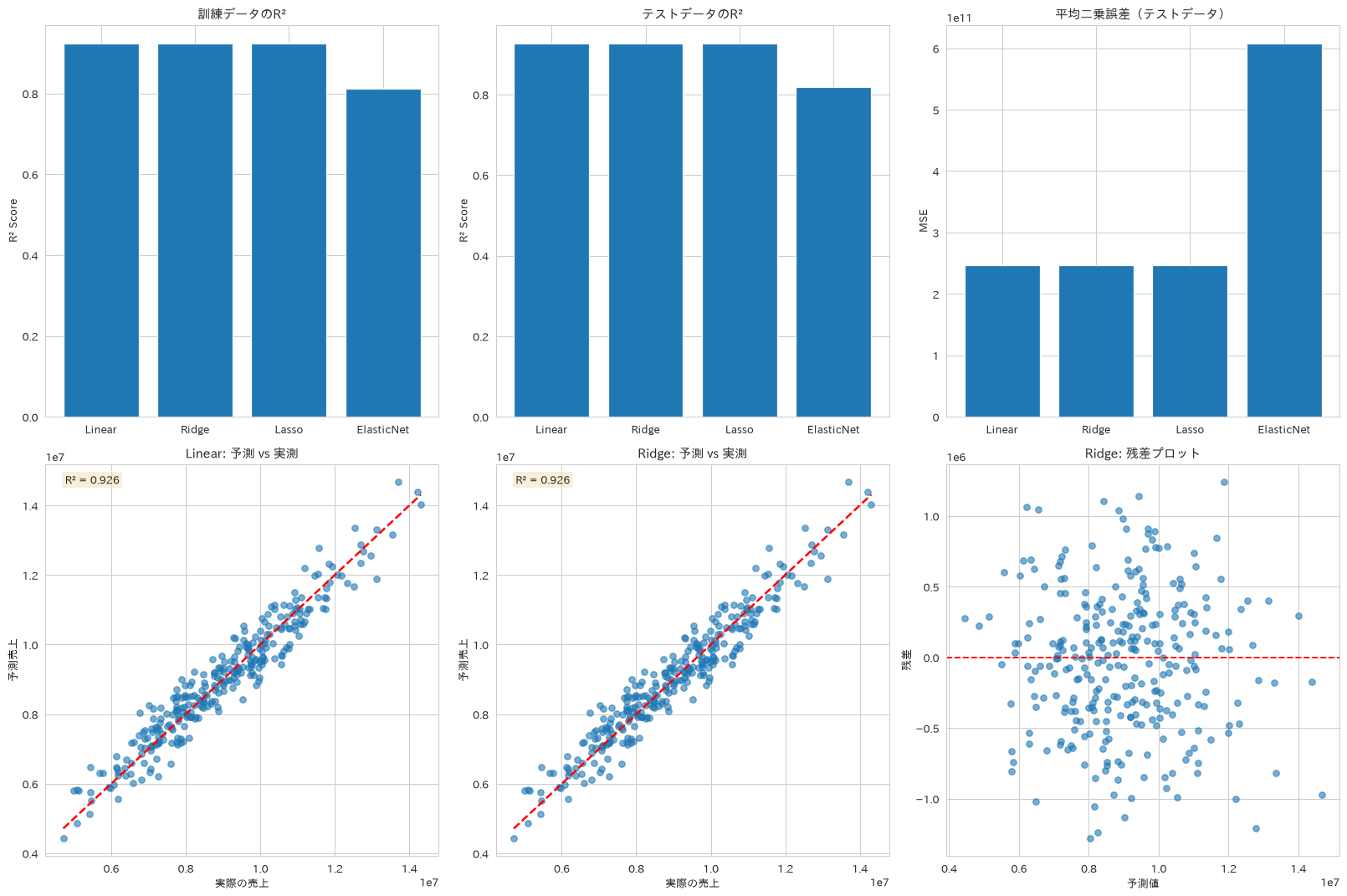
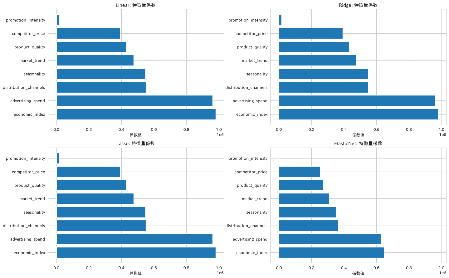
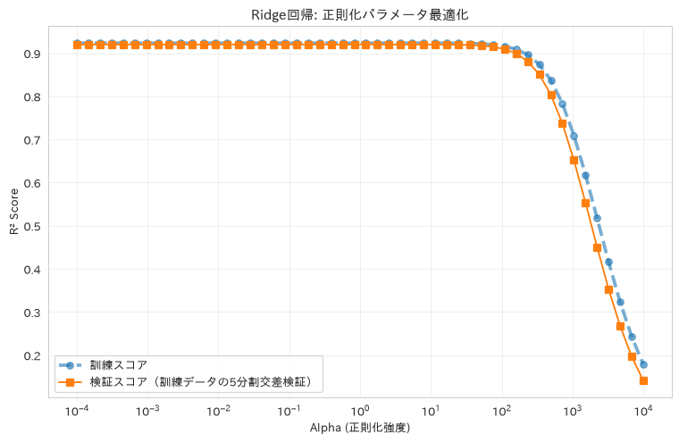
61. 多項式回帰
PolynomialFeaturesで次数を変えながら非線形パターンを捉え、検証曲線(validation_curve)で過学習と正則化のバランスを確認する方法を紹介します。次数の選択は訓練データの交差検証だけで行い、テストデータは最後の答え合わせにしか使いません。このデータでは交差検証スコアの差が誤差に埋もれる範囲に収まるため、最良値から1標準誤差以内で最も単純な次数を採る、いわゆる1標準誤差ルールで決めます。
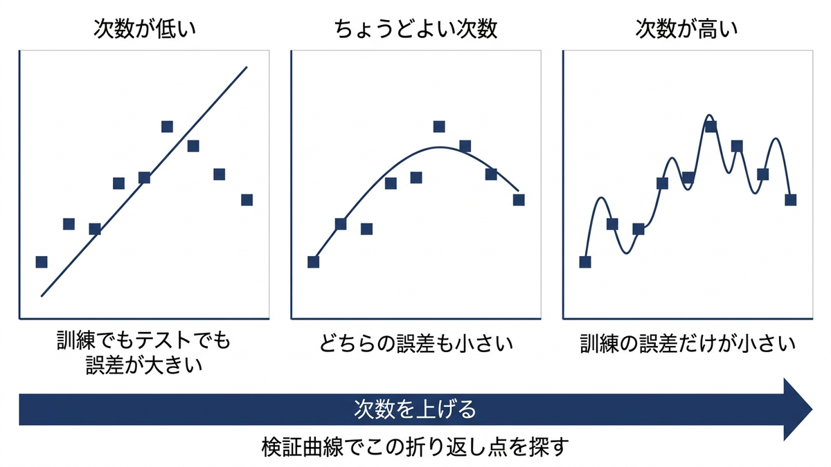
# 多項式回帰による非線形パターン学習
from sklearn.preprocessing import PolynomialFeatures
from sklearn.pipeline import Pipeline
from sklearn.model_selection import validation_curve, cross_val_score

# 非線形関係を含む合成データ生成
np.random.seed(42)
# サンプルが多くノイズが小さいと、次数を上げても過学習が起きず
# 「次数と過学習のバランス」を観察できない。ここでは50点・ノイズ大きめにする
n_poly_samples = 50
X_poly = np.random.rand(n_poly_samples, 1) * 10
y_poly = (2 * X_poly.ravel() ** 2 - 3 * X_poly.ravel()
          + np.random.normal(0, 15, n_poly_samples))

# レシピ60と同じ売上サンプルデータ(make_regressionで作った合成データ)も使う
X_real = df_sales[['advertising_spend']].values
y_real = df_sales['revenue'].values

# データ分割
X_train_poly, X_test_poly, y_train_poly, y_test_poly = train_test_split(
    X_poly, y_poly, test_size=0.3, random_state=42
)

X_train_real, X_test_real, y_train_real, y_test_real = train_test_split(
    X_real, y_real, test_size=0.3, random_state=42
)

# 異なる次数の多項式回帰を比較
degrees = [1, 2, 3, 4, 5, 6, 8, 10]
poly_results = {}

def choose_degree(degree_list, cv_means, cv_stds, n_folds=5):
    """交差検証スコアが最良値から1標準誤差以内に収まる中で、最も単純な次数を選ぶ。

    最良値だけで選ぶと、スコア差が誤差に埋もれるほど小さいときに
    不必要に複雑なモデルを拾ってしまう(1標準誤差ルール)。
    """
    best = int(np.argmax(cv_means))
    threshold = cv_means[best] - cv_stds[best] / np.sqrt(n_folds)
    return min(d for d, m in zip(degree_list, cv_means) if m >= threshold)


for degree in degrees:
    # パイプライン作成(多項式特徴量 → 標準化 → 線形回帰)
    poly_pipeline = Pipeline([
        ('poly', PolynomialFeatures(degree=degree, include_bias=False)),
        ('scaler', StandardScaler()),
        ('linear', LinearRegression())
    ])

    # 次数の選択は訓練データの交差検証で行う。テストスコアで選ぶと、
    # 選ぶのに使ったデータで最終評価することになる
    cv_r2 = cross_val_score(poly_pipeline, X_train_poly, y_train_poly,
                            cv=5, scoring='r2')

    # 合成データで訓練
    poly_pipeline.fit(X_train_poly, y_train_poly)

    # 予測
    y_pred_train = poly_pipeline.predict(X_train_poly)
    y_pred_test = poly_pipeline.predict(X_test_poly)

    # 評価
    train_r2 = r2_score(y_train_poly, y_pred_train)
    test_r2 = r2_score(y_test_poly, y_pred_test)

    poly_results[degree] = {
        'model': poly_pipeline,
        'train_r2': train_r2,
        'cv_r2': cv_r2.mean(),
        'cv_std': cv_r2.std(),
        'test_r2': test_r2,
        'train_pred': y_pred_train,
        'test_pred': y_pred_test
    }

# 結果可視化
fig, axes = plt.subplots(2, 3, figsize=(18, 12))

# 1. 次数別性能比較
degrees_list = list(poly_results.keys())
train_scores = [result['train_r2'] for result in poly_results.values()]
cv_scores = [result['cv_r2'] for result in poly_results.values()]
cv_stds = [result['cv_std'] for result in poly_results.values()]
test_scores = [result['test_r2'] for result in poly_results.values()]

axes[0, 0].plot(degrees_list, train_scores, 'o-', label='訓練スコア', linewidth=2)
# 誤差棒を付けると、次数2から10までの交差検証スコアの差が
# ばらつきに埋もれていることが見て取れる
axes[0, 0].errorbar(degrees_list, cv_scores, yerr=cv_stds, fmt='^-', capsize=4,
                    label='交差検証スコア(選択に使う)', linewidth=2)
axes[0, 0].plot(degrees_list, test_scores, 's-', label='テストスコア(最後の答え合わせ)', linewidth=2)
axes[0, 0].set_xlabel('多項式次数')
axes[0, 0].set_ylabel('R² Score')
axes[0, 0].set_title('多項式次数 vs 性能', fontweight='bold')
axes[0, 0].legend(fontsize=9)
axes[0, 0].grid(True, alpha=0.3)

# 2. 過学習の検出
overfitting_score = [train - test for train, test in zip(train_scores, test_scores)]
axes[0, 1].plot(degrees_list, overfitting_score, 'ro-', linewidth=2)
axes[0, 1].set_xlabel('多項式次数')
axes[0, 1].set_ylabel('過学習度 (Train R² - Test R²)')
axes[0, 1].set_title('過学習検出', fontweight='bold')
axes[0, 1].grid(True, alpha=0.3)
axes[0, 1].axhline(y=0, color='black', linestyle='--', alpha=0.5)

# 3. 採用する次数での予測結果(交差検証スコアと1標準誤差ルールで選ぶ)
best_degree = choose_degree(degrees_list, cv_scores, cv_stds)
best_model = poly_results[best_degree]['model']

# 予測曲線の描画
X_plot = np.linspace(X_poly.min(), X_poly.max(), 100).reshape(-1, 1)
y_plot = best_model.predict(X_plot)

axes[0, 2].scatter(X_test_poly, y_test_poly, alpha=0.6, label='実測値')
axes[0, 2].plot(X_plot, y_plot, 'r-', linewidth=2, label=f'多項式回帰 (次数={best_degree})')
axes[0, 2].set_xlabel('X値')
axes[0, 2].set_ylabel('Y値')
axes[0, 2].set_title(f'採用した次数({best_degree})での予測', fontweight='bold')
axes[0, 2].legend()

# 4. 係数の変化(正則化なし vs あり)
ridge_poly = Pipeline([
    ('poly', PolynomialFeatures(degree=6, include_bias=False)),
    ('scaler', StandardScaler()),
    ('ridge', Ridge(alpha=1.0))
])

ridge_poly.fit(X_train_poly, y_train_poly)
ridge_pred = ridge_poly.predict(X_test_poly)
ridge_r2 = r2_score(y_test_poly, ridge_pred)

# 係数比較
linear_coefs = poly_results[6]['model'].named_steps['linear'].coef_
ridge_coefs = ridge_poly.named_steps['ridge'].coef_

coef_comparison = pd.DataFrame({
    'feature': [f'x^{i+1}' for i in range(len(linear_coefs))],
    'linear': linear_coefs,
    'ridge': ridge_coefs
})

axes[1, 0].plot(coef_comparison.index, coef_comparison['linear'], 'o-',
                label='線形回帰', linewidth=2)
axes[1, 0].plot(coef_comparison.index, coef_comparison['ridge'], 's-',
                label='Ridge回帰', linewidth=2)
axes[1, 0].set_xticks(coef_comparison.index)
axes[1, 0].set_xticklabels(coef_comparison['feature'])
axes[1, 0].set_xlabel('多項式の項')
axes[1, 0].set_ylabel('係数値')
axes[1, 0].set_title('係数の正則化効果', fontweight='bold')
axes[1, 0].legend()
axes[1, 0].grid(True, alpha=0.3)

# 5. 売上サンプルデータでの多項式回帰
degrees_real = [1, 2, 3, 4, 5]
real_results = {}

for degree in degrees_real:
    poly_real = Pipeline([
        ('poly', PolynomialFeatures(degree=degree, include_bias=False)),
        ('scaler', StandardScaler()),
        ('linear', LinearRegression())
    ])

    # ここでも次数の選択は訓練データの交差検証で行う
    cv_r2_real = cross_val_score(poly_real, X_train_real, y_train_real,
                                 cv=5, scoring='r2')

    poly_real.fit(X_train_real, y_train_real)
    y_pred_real = poly_real.predict(X_test_real)
    r2_real = r2_score(y_test_real, y_pred_real)

    real_results[degree] = {
        'model': poly_real,
        'cv_r2': cv_r2_real.mean(),
        'cv_std': cv_r2_real.std(),
        'r2': r2_real,
        'pred': y_pred_real
    }

# 売上サンプルデータの結果プロット
real_degrees = list(real_results.keys())
real_cv_scores = [result['cv_r2'] for result in real_results.values()]
real_cv_stds = [result['cv_std'] for result in real_results.values()]
real_scores = [result['r2'] for result in real_results.values()]

axes[1, 1].plot(real_degrees, real_cv_scores, '^-', linewidth=2, markersize=8,
                label='交差検証スコア(選択に使う)')
axes[1, 1].plot(real_degrees, real_scores, 'go-', linewidth=2, markersize=8,
                label='テストスコア')
axes[1, 1].set_xticks(real_degrees)  # 次数は整数なので小数の目盛を出さない
axes[1, 1].set_xlabel('多項式次数')
axes[1, 1].set_ylabel('R² Score')
axes[1, 1].set_title('売上サンプルデータでの多項式回帰性能', fontweight='bold')
# 既定のままだと凡例が最良点(次数2)に重なるので、上に余白を作ってから置く
real_span = max(real_cv_scores + real_scores) - min(real_cv_scores + real_scores)
axes[1, 1].set_ylim(min(real_cv_scores + real_scores) - real_span * 0.08,
                    max(real_cv_scores + real_scores) + real_span * 0.50)
axes[1, 1].legend(fontsize=9, loc='upper right')
axes[1, 1].grid(True, alpha=0.3)

# 6. 残差分析
best_real_degree = choose_degree(real_degrees, real_cv_scores, real_cv_stds)
best_real_model = real_results[best_real_degree]['model']
residuals_real = y_test_real - real_results[best_real_degree]['pred']

axes[1, 2].scatter(real_results[best_real_degree]['pred'], residuals_real, alpha=0.6)
axes[1, 2].axhline(y=0, color='r', linestyle='--')
axes[1, 2].set_xlabel('予測値')
axes[1, 2].set_ylabel('残差')
axes[1, 2].set_title(f'残差分析 (次数={best_real_degree})', fontweight='bold')

plt.tight_layout()
plt.show()

# バイアス・バリアンス分析
from sklearn.model_selection import learning_curve

# 学習曲線の計算
train_sizes, train_scores_lc, val_scores_lc = learning_curve(
    best_model, X_poly, y_poly, cv=5,
    train_sizes=np.linspace(0.3, 1.0, 8),
    scoring='r2', random_state=42
)

# 検証曲線の計算(次数10の多項式に対してRidgeの正則化強度を振る)
param_range = np.logspace(-3, 3, 7)
vc_pipeline = Pipeline([
    ('poly', PolynomialFeatures(degree=10, include_bias=False)),
    ('scaler', StandardScaler()),
    ('ridge', Ridge())
])
train_scores_vc, val_scores_vc = validation_curve(
    vc_pipeline, X_train_poly, y_train_poly,
    param_name='ridge__alpha', param_range=param_range,
    cv=5, scoring='r2'
)

fig, curve_axes = plt.subplots(1, 2, figsize=(16, 6))

curve_axes[0].plot(train_sizes, np.mean(train_scores_lc, axis=1), 'o--',
                   label='訓練スコア', linewidth=3, alpha=0.6)
curve_axes[0].plot(train_sizes, np.mean(val_scores_lc, axis=1), 's-',
                   label='検証スコア', linewidth=2)
curve_axes[0].fill_between(train_sizes,
                 np.mean(train_scores_lc, axis=1) - np.std(train_scores_lc, axis=1),
                 np.mean(train_scores_lc, axis=1) + np.std(train_scores_lc, axis=1),
                 alpha=0.1)
curve_axes[0].fill_between(train_sizes,
                 np.mean(val_scores_lc, axis=1) - np.std(val_scores_lc, axis=1),
                 np.mean(val_scores_lc, axis=1) + np.std(val_scores_lc, axis=1),
                 alpha=0.1)
curve_axes[0].set_xlabel('訓練サンプル数')
curve_axes[0].set_ylabel('R² Score')
curve_axes[0].set_title('学習曲線(多項式回帰)', fontweight='bold')
curve_axes[0].legend()
curve_axes[0].grid(True, alpha=0.3)

curve_axes[1].semilogx(param_range, np.mean(train_scores_vc, axis=1), 'o--',
                       label='訓練スコア', linewidth=3, alpha=0.6)
curve_axes[1].semilogx(param_range, np.mean(val_scores_vc, axis=1), 's-',
                       label='検証スコア', linewidth=2)
curve_axes[1].set_xlabel('Ridgeの正則化強度 alpha')
curve_axes[1].set_ylabel('R² Score')
curve_axes[1].set_title('検証曲線(次数10の多項式にRidgeを掛ける)', fontweight='bold')
curve_axes[1].legend()
curve_axes[1].grid(True, alpha=0.3)

plt.tight_layout()
plt.show()

# 結果サマリー
print("多項式回帰 性能評価")
print("=" * 40)
print(f"合成データ 採用次数: {best_degree}"
      f"(訓練データの交差検証と1標準誤差ルールで選択。テストデータは使っていない)")
print(f"合成データ 採用次数の交差検証R²: {poly_results[best_degree]['cv_r2']:.3f} / "
      f"そのときのテストR²: {poly_results[best_degree]['test_r2']:.3f}")
print(f"(参考)交差検証スコアが最大なのは次数{degrees_list[int(np.argmax(cv_scores))]}"
      f"({max(cv_scores):.3f})だが、差はばらつきに埋もれる範囲なので単純なほうを採る")
print(f"売上サンプルデータ 採用次数: {best_real_degree}(同じ手順で選択)")
print(f"売上サンプルデータ 採用次数の交差検証R²: {real_results[best_real_degree]['cv_r2']:.3f} / "
      f"そのときのテストR²: {real_results[best_real_degree]['r2']:.3f}")
print(f"正則化効果(次数6・テストデータ): 通常の線形回帰 R² = "
      f"{poly_results[6]['test_r2']:.3f} → Ridge R² = {ridge_r2:.3f}")

print(f"\n次数別性能(合成データ):")
for degree, result in poly_results.items():
    print(f"次数{degree}: Train R² = {result['train_r2']:.3f}, "
          f"CV R² = {result['cv_r2']:.3f} ± {result['cv_std']:.3f}, "
          f"Test R² = {result['test_r2']:.3f}, "
          f"過学習度 = {result['train_r2'] - result['test_r2']:+.3f}")

print(f"\n検証曲線(次数10の多項式にRidgeを掛けたとき):")
for alpha_value, tr_score, va_score in zip(param_range,
                                           np.mean(train_scores_vc, axis=1),
                                           np.mean(val_scores_vc, axis=1)):
    print(f"alpha={alpha_value:>8.3f}: 訓練 R² = {tr_score:.3f}, 検証 R² = {va_score:.3f}, "
          f"差 = {tr_score - va_score:+.3f}")
多項式回帰 性能評価
========================================
合成データ 採用次数: 2(訓練データの交差検証と1標準誤差ルールで選択。テストデータは使っていない)
合成データ 採用次数の交差検証R²: 0.852 / そのときのテストR²: 0.888
(参考)交差検証スコアが最大なのは次数10(0.853)だが、差はばらつきに埋もれる範囲なので単純なほうを採る
売上サンプルデータ 採用次数: 1(同じ手順で選択)
売上サンプルデータ 採用次数の交差検証R²: 0.269 / そのときのテストR²: 0.289
正則化効果(次数6・テストデータ): 通常の線形回帰 R² = 0.856 → Ridge R² = 0.882

次数別性能(合成データ):
次数1: Train R² = 0.858, CV R² = 0.667 ± 0.328, Test R² = 0.747, 過学習度 = +0.111
次数2: Train R² = 0.934, CV R² = 0.852 ± 0.138, Test R² = 0.888, 過学習度 = +0.047
次数3: Train R² = 0.935, CV R² = 0.823 ± 0.193, Test R² = 0.887, 過学習度 = +0.047
次数4: Train R² = 0.935, CV R² = 0.819 ± 0.199, Test R² = 0.890, 過学習度 = +0.045
次数5: Train R² = 0.937, CV R² = 0.824 ± 0.185, Test R² = 0.897, 過学習度 = +0.040
次数6: Train R² = 0.942, CV R² = 0.829 ± 0.158, Test R² = 0.856, 過学習度 = +0.087
次数8: Train R² = 0.951, CV R² = 0.848 ± 0.104, Test R² = 0.840, 過学習度 = +0.111
次数10: Train R² = 0.950, CV R² = 0.853 ± 0.105, Test R² = 0.846, 過学習度 = +0.103

検証曲線(次数10の多項式にRidgeを掛けたとき):
alpha=   0.001: 訓練 R² = 0.943, 検証 R² = 0.835, 差 = +0.108
alpha=   0.010: 訓練 R² = 0.940, 検証 R² = 0.830, 差 = +0.109
alpha=   0.100: 訓練 R² = 0.938, 検証 R² = 0.835, 差 = +0.103
(出力は以降も続きます。ここでは冒頭のみ載せました)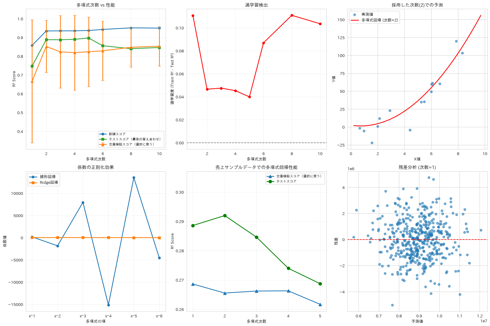
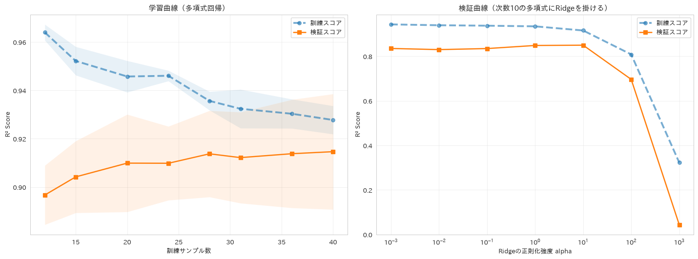
この章を深めたい方への参考書籍
- Jake VanderPlas『Pythonデータサイエンスハンドブック 第2版』(オライリー・ジャパン):42章「詳細:線形回帰」で、多項式基底関数への拡張と正則化が続けて説明されています。本章の多項式回帰と過学習の関係を、基底関数という見方から整理できます。
- Andreas C. Muller・Sarah Guido『Pythonではじめる機械学習』(オライリー・ジャパン):2.2節「汎化、過剰適合、適合不足」でモデルの複雑さとデータ量の関係が扱われます。本章の検証曲線が何を見ているのかを、より一般的な枠組みで押さえられます。
クラスタリング
62. K-平均クラスタリング
エルボー法やシルエットスコアで最適なクラスタ数を検討しながら、顧客セグメンテーションのようなマーケティング施策に直結する分析を行います。エルボー法は、クラスタ内のばらつきの合計をクラスタ数ごとに並べ、減り方が緩やかになり始める点をクラスタ数の目安にする見方です。コードではこれらに加えて、カリンスキー・ハラバススコアとデイビス・ボルディンスコアも計算しています。前者はクラスタどうしの離れ具合をクラスタ内のばらつきで割った比で、大きいほどクラスタがよく分かれていることを示します。後者は各クラスタについて、最も紛らわしい相手のクラスタとの近さをクラスタの広がりで測った値の平均で、こちらは小さいほど良い指標です。評価指標比較のグラフでは3つの向きをそろえるため、デイビス・ボルディンだけ大小を反転させたうえで正規化しています。このデータではクラスタ数4が選ばれ、そのときのシルエットスコアは0.623、カリンスキー・ハラバススコアは2698.5、デイビス・ボルディンスコアは0.565でした。
# K-平均クラスタリングによる顧客セグメンテーション
from sklearn.cluster import KMeans
from sklearn.metrics import silhouette_score, calinski_harabasz_score, davies_bouldin_score

# セグメンテーション用データ準備
X_cluster = df_segment[segment_features].values
scaler_cluster = StandardScaler()
X_cluster_scaled = scaler_cluster.fit_transform(X_cluster)

# エルボー法による最適クラスタ数決定
k_range = range(2, 11)
inertias = []
silhouette_scores = []
calinski_scores = []
davies_bouldin_scores = []

for k in k_range:
    kmeans = KMeans(n_clusters=k, random_state=42, n_init=10)
    labels = kmeans.fit_predict(X_cluster_scaled)

    inertias.append(kmeans.inertia_)
    silhouette_scores.append(silhouette_score(X_cluster_scaled, labels))
    calinski_scores.append(calinski_harabasz_score(X_cluster_scaled, labels))
    davies_bouldin_scores.append(davies_bouldin_score(X_cluster_scaled, labels))

# 最適クラスタ数での実行
optimal_k = k_range[np.argmax(silhouette_scores)]
kmeans_final = KMeans(n_clusters=optimal_k, random_state=42, n_init=10)
cluster_labels = kmeans_final.fit_predict(X_cluster_scaled)

# 結果可視化
fig, axes = plt.subplots(2, 3, figsize=(18, 12))

# 1. エルボー法
axes[0, 0].plot(k_range, inertias, 'bo-', linewidth=2, markersize=8)
axes[0, 0].set_xlabel('クラスタ数 (k)')
axes[0, 0].set_ylabel('慣性 (Inertia)')
axes[0, 0].set_title('エルボー法', fontweight='bold')
axes[0, 0].grid(True, alpha=0.3)

# 2. シルエット分析
axes[0, 1].plot(k_range, silhouette_scores, 'ro-', linewidth=2, markersize=8)
axes[0, 1].set_xlabel('クラスタ数 (k)')
axes[0, 1].set_ylabel('シルエットスコア')
axes[0, 1].set_title('シルエット分析', fontweight='bold')
axes[0, 1].grid(True, alpha=0.3)
axes[0, 1].axvline(x=optimal_k, color='green', linestyle='--',
                   label=f'最適k={optimal_k}')
axes[0, 1].legend()

# 3. 複数評価指標比較
# 正規化して比較
norm_silhouette = np.array(silhouette_scores) / max(silhouette_scores)
norm_calinski = np.array(calinski_scores) / max(calinski_scores)
norm_davies_bouldin = 1 - (np.array(davies_bouldin_scores) / max(davies_bouldin_scores))  # 反転(小さいほど良い)

axes[0, 2].plot(k_range, norm_silhouette, 'o-', label='シルエット', linewidth=2)
axes[0, 2].plot(k_range, norm_calinski, 's-', label='カリンスキー・ハラバス', linewidth=2)
axes[0, 2].plot(k_range, norm_davies_bouldin, '^-', label='デイビス・ボルディン', linewidth=2)
axes[0, 2].set_xlabel('クラスタ数 (k)')
axes[0, 2].set_ylabel('正規化スコア')
axes[0, 2].set_title('評価指標比較', fontweight='bold')
axes[0, 2].legend()
axes[0, 2].grid(True, alpha=0.3)

# 4. クラスタ可視化(PCAで2次元投影)
from sklearn.decomposition import PCA

pca_cluster = PCA(n_components=2)
X_cluster_pca = pca_cluster.fit_transform(X_cluster_scaled)

# クラスタ別色分けプロット
colors = plt.cm.tab10(np.linspace(0, 1, optimal_k))
for i in range(optimal_k):
    mask = cluster_labels == i
    axes[1, 0].scatter(X_cluster_pca[mask, 0], X_cluster_pca[mask, 1],
                      c=[colors[i]], alpha=0.6, s=50,
                      label=f'クラスタ {i}')

# 重心の表示
centroids_pca = pca_cluster.transform(kmeans_final.cluster_centers_)
axes[1, 0].scatter(centroids_pca[:, 0], centroids_pca[:, 1],
                  c='red', marker='x', s=200, linewidths=3, label='重心')

axes[1, 0].set_xlabel(f'第1主成分 ({pca_cluster.explained_variance_ratio_[0]:.2%})')
axes[1, 0].set_ylabel(f'第2主成分 ({pca_cluster.explained_variance_ratio_[1]:.2%})')
axes[1, 0].set_title('クラスタ可視化 (PCA)', fontweight='bold')
axes[1, 0].legend()

# 5. クラスタ特性分析
cluster_df = df_segment.copy()
cluster_df['cluster'] = cluster_labels

# 各クラスタの特徴量平均
cluster_means = cluster_df.groupby('cluster')[segment_features].mean()

# ヒートマップで可視化
# 列ごとに単位が違うので、特徴量ごとに標準化してから色にする
cluster_means_z = ((cluster_means - df_segment[segment_features].mean())
                   / df_segment[segment_features].std())
im = axes[1, 1].imshow(cluster_means_z.T, cmap='RdYlBu_r', aspect='auto')
axes[1, 1].set_xticks(range(optimal_k))
axes[1, 1].set_xticklabels([f'クラスタ {i}' for i in range(optimal_k)])
axes[1, 1].set_yticks(range(len(segment_features)))
axes[1, 1].set_yticklabels(segment_features)
axes[1, 1].set_title('クラスタ別特徴量平均(標準化)', fontweight='bold')
plt.colorbar(im, ax=axes[1, 1], label='全体平均からの乖離(標準偏差単位)')

# 6. クラスタサイズ分布
cluster_sizes = pd.Series(cluster_labels).value_counts().sort_index()
axes[1, 2].pie(cluster_sizes.values, labels=[f'クラスタ {i}\n({size}件)'
               for i, size in enumerate(cluster_sizes.values)],
               autopct='%1.1f%%')
axes[1, 2].set_title('クラスタサイズ分布', fontweight='bold')

plt.tight_layout()
plt.show()

# 詳細クラスタ分析
print("K-平均クラスタリング 分析結果")
print("=" * 50)
print(f"最適クラスタ数: {optimal_k}")
print(f"シルエットスコア: {silhouette_scores[optimal_k-2]:.3f}")
print(f"カリンスキー・ハラバススコア: {calinski_scores[optimal_k-2]:.1f}")
print(f"デイビス・ボルディンスコア: {davies_bouldin_scores[optimal_k-2]:.3f}")

print(f"\nクラスタ別統計:")
for i in range(optimal_k):
    cluster_data = cluster_df[cluster_df['cluster'] == i]
    print(f"\nクラスタ {i} (サイズ: {len(cluster_data)})")
    print("主な特徴:")
    for feature in segment_features:
        mean_val = cluster_data[feature].mean()
        overall_mean = cluster_df[feature].mean()
        if abs(overall_mean) < 1e-6:
            # 平均が0近傍のときは比率が発散するので、値だけを出す
            print(f"{feature}: {mean_val:,.1f}")
        else:
            diff_pct = ((mean_val - overall_mean) / overall_mean) * 100
            print(f"{feature}: {mean_val:,.1f} ({diff_pct:+.1f}%)")

# ビジネス価値の計算
cluster_value = cluster_df.groupby('cluster').agg({
    'annual_spend': 'mean',
    'purchase_frequency': 'mean',
    'customer_id': 'count'
}).round(2)
cluster_value.columns = ['平均年間支出', '平均購買頻度', '顧客数']
cluster_value['総価値(万円)'] = (
    cluster_value['平均年間支出'] * cluster_value['顧客数'] / 10000).round(0)

print(f"\nクラスタ別ビジネス価値:")
print(cluster_value.to_string())
K-平均クラスタリング 分析結果
==================================================
最適クラスタ数: 4
シルエットスコア: 0.623
カリンスキー・ハラバススコア: 2698.5
デイビス・ボルディンスコア: 0.565

クラスタ別統計:

クラスタ 0 (サイズ: 250)
主な特徴:
annual_spend: 800,794.6 (+44.2%)
purchase_frequency: 15.0 (-43.0%)
avg_order_value: 17,028.2 (-45.3%)
brand_loyalty: 29.9 (-37.5%)
price_sensitivity: 44.0 (+24.0%)
digital_engagement: 46.4 (+2.6%)

クラスタ 1 (サイズ: 250)
主な特徴:
annual_spend: 333,361.2 (-40.0%)
purchase_frequency: 34.9 (+32.8%)
avg_order_value: 33,982.3 (+9.1%)
brand_loyalty: 72.2 (+50.7%)
price_sensitivity: 21.7 (-39.0%)
digital_engagement: 73.3 (+62.2%)

クラスタ 2 (サイズ: 250)
主な特徴:
annual_spend: 525,001.5 (-5.4%)
purchase_frequency: 37.7 (+43.1%)
avg_order_value: 39,262.6 (+26.1%)
brand_loyalty: 63.6 (+32.8%)
price_sensitivity: 33.4 (-6.0%)
digital_engagement: 24.2 (-46.4%)

クラスタ 3 (サイズ: 250)
主な特徴:
annual_spend: 561,750.5 (+1.2%)
purchase_frequency: 17.7 (-32.9%)
avg_order_value: 34,281.3 (+10.1%)
brand_loyalty: 25.8 (-46.1%)
price_sensitivity: 43.0 (+21.0%)
digital_engagement: 36.9 (-18.4%)

クラスタ別ビジネス価値:
            平均年間支出  平均購買頻度  顧客数  総価値(万円)
cluster
0        800794.55   14.99  250  20020.0
(出力は以降も続きます。ここでは冒頭のみ載せました)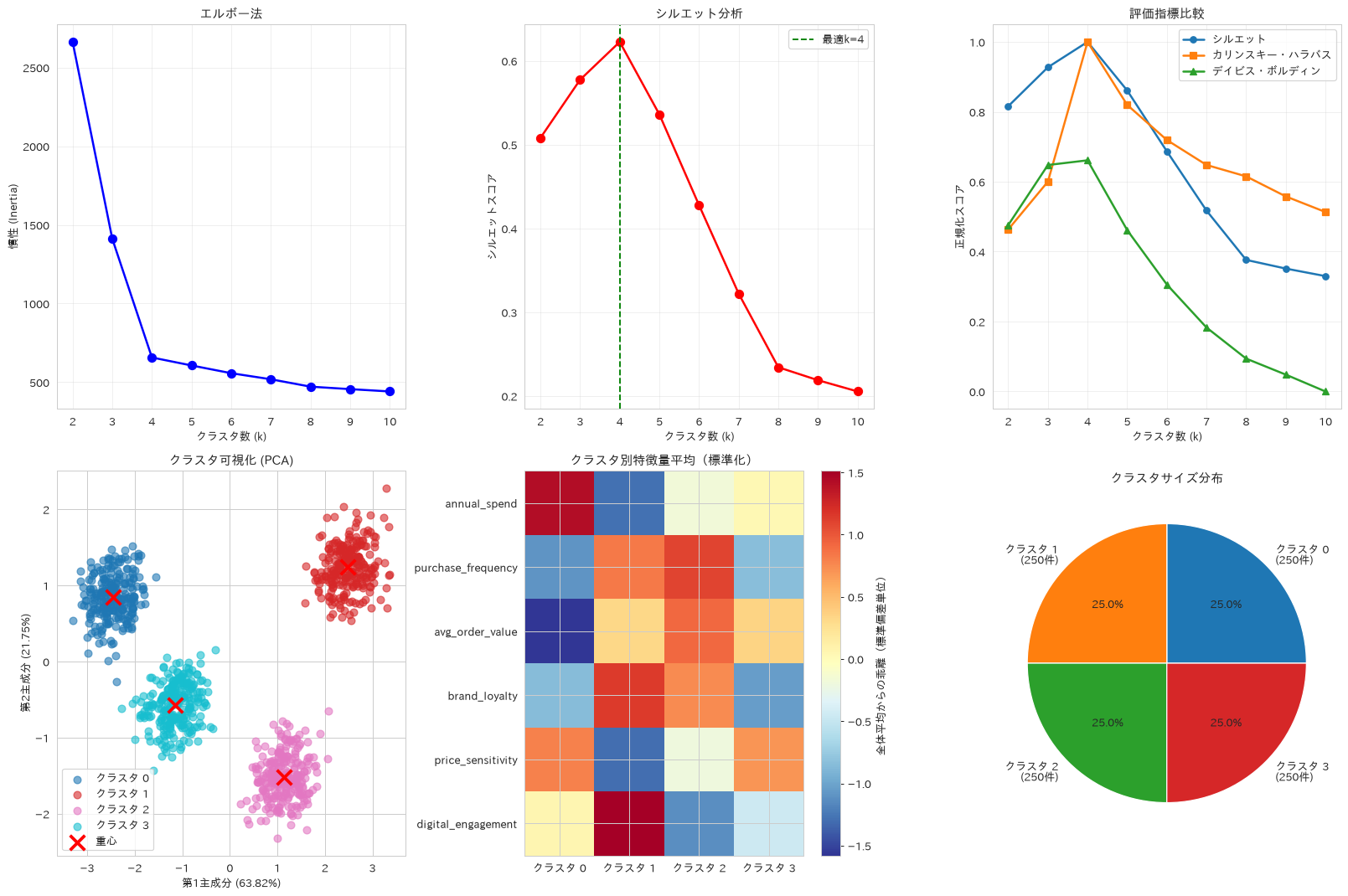
63. 階層クラスタリング
ward法や完全連結法など複数のリンク方式を比較し、デンドログラムによってデータの階層構造を解釈しやすい形で示します。ここで使う顧客セグメントデータは4つの塊がよく離れているため、このサンプルでは4方式とも同じ分割に行き着きます。方式の違いが結果に出る場面も見たいので、三日月形の非球形データもあわせて用意します。
# 階層クラスタリングによる詳細セグメント分析
from sklearn.cluster import AgglomerativeClustering
from sklearn.datasets import make_moons
from sklearn.metrics import adjusted_rand_score
from scipy.cluster.hierarchy import dendrogram, linkage as scipy_linkage

# 階層クラスタリングの実行(複数手法比較)
linkage_methods = ['ward', 'complete', 'average', 'single']
hierarchical_results = {}

# サンプルサイズ削減(計算時間短縮)
sample_size = 300
indices = np.random.choice(len(X_cluster_scaled), sample_size, replace=False)
X_sample = X_cluster_scaled[indices]

for method in linkage_methods:
    # 階層クラスタリング実行
    clustering = AgglomerativeClustering(n_clusters=optimal_k, linkage=method)
    labels = clustering.fit_predict(X_sample)

    # 評価
    silhouette = silhouette_score(X_sample, labels)

    hierarchical_results[method] = {
        'labels': labels,
        'silhouette': silhouette,
        'model': clustering
    }

# 結果可視化
fig, axes = plt.subplots(2, 3, figsize=(18, 12))

# 1. デンドログラム(階層構造そのものを描く)
# AgglomerativeClustering は結合の履歴を返さないので、履歴を持つ scipy の linkage を使う
linkage_matrix = scipy_linkage(X_sample, method='ward')
dendrogram(linkage_matrix, truncate_mode='lastp', p=20,
           ax=axes[0, 0], leaf_rotation=90, leaf_font_size=9)
axes[0, 0].set_title('デンドログラム(ward法・下位20ノードに集約)', fontweight='bold')
axes[0, 0].set_xlabel('サンプル(かっこ内は束ねた件数)')
axes[0, 0].set_ylabel('結合距離')

# 2. 手法別性能比較
methods = list(hierarchical_results.keys())
silhouettes = [result['silhouette'] for result in hierarchical_results.values()]

axes[0, 1].bar(methods, silhouettes)
axes[0, 1].set_ylabel('シルエットスコア')
axes[0, 1].set_title('リンケージ手法比較(顧客セグメント)', fontweight='bold')
axes[0, 1].set_ylim(0, max(silhouettes) * 1.45)
# 「4手法とも同値」と決め打ちせず、実際に一致しているかを確かめてから書く
if np.allclose(silhouettes, silhouettes[0]):
    note = f'4手法とも {silhouettes[0]:.3f} で同値\nこのデータでは分割が一致する'
else:
    note = (f'最小 {min(silhouettes):.3f} / 最大 {max(silhouettes):.3f}\n'
            f'リンク方式によって分割が変わる')
axes[0, 1].text(0.5, 0.97, note,
                transform=axes[0, 1].transAxes, ha='center', va='top',
                bbox=dict(boxstyle='round', fc='white', alpha=0.85))
axes[0, 1].tick_params(axis='x', rotation=45)

# 3. 最適手法でのクラスタ可視化
best_method = max(hierarchical_results.items(), key=lambda x: x[1]['silhouette'])
best_labels = best_method[1]['labels']

# PCA投影
X_sample_pca = pca_cluster.transform(X_sample)
colors = plt.cm.tab10(np.linspace(0, 1, optimal_k))

for i in range(optimal_k):
    mask = best_labels == i
    if mask.any():
        axes[0, 2].scatter(X_sample_pca[mask, 0], X_sample_pca[mask, 1],
                          c=[colors[i]], alpha=0.6, s=50,
                          label=f'クラスタ {i}')

axes[0, 2].set_xlabel('第1主成分')
axes[0, 2].set_ylabel('第2主成分')
axes[0, 2].set_title(f'階層クラスタリング ({best_method[0]})', fontweight='bold')
axes[0, 2].legend()

# 4. クラスタ数による性能変化
n_clusters_range = range(2, 8)
ward_silhouettes = []

for n_clusters in n_clusters_range:
    clustering = AgglomerativeClustering(n_clusters=n_clusters, linkage='ward')
    labels = clustering.fit_predict(X_sample)
    silhouette = silhouette_score(X_sample, labels)
    ward_silhouettes.append(silhouette)

axes[1, 0].plot(n_clusters_range, ward_silhouettes, 'o-', linewidth=2, markersize=8)
axes[1, 0].set_xlabel('クラスタ数')
axes[1, 0].set_ylabel('シルエットスコア')
axes[1, 0].set_title('階層クラスタリング最適化', fontweight='bold')
axes[1, 0].grid(True, alpha=0.3)

# 5. K-means との比較用(数値はサマリーで印字する)
kmeans_sample = KMeans(n_clusters=optimal_k, random_state=42)
kmeans_labels = kmeans_sample.fit_predict(X_sample)
kmeans_silhouette = silhouette_score(X_sample, kmeans_labels)

# 非球形データでのリンケージ手法比較
# 球状に分かれた顧客セグメントでは4手法とも同じ結果になるので、
# 三日月形のデータを用意してリンク方式の違いが出る場面を見る
X_moons, y_moons = make_moons(n_samples=300, noise=0.06, random_state=42)
moon_scores = {}
for method in linkage_methods:
    moon_labels = AgglomerativeClustering(n_clusters=2, linkage=method).fit_predict(X_moons)
    moon_scores[method] = adjusted_rand_score(y_moons, moon_labels)

axes[1, 1].bar(list(moon_scores.keys()), list(moon_scores.values()), color='tab:orange')
axes[1, 1].set_ylabel('正解ラベルとの一致度 (ARI)')
axes[1, 1].set_title('非球形データでのリンケージ手法比較', fontweight='bold')
axes[1, 1].set_ylim(0, 1.05)
axes[1, 1].tick_params(axis='x', rotation=45)

# 6. シルエットスコアのばらつき(ブートストラップ)
# 再標本化のたびにスコアがどれだけ動くかを見る。
# クラスタ割当そのものが安定かどうかは、再標本化どうしのARIやJaccardで別に測る
n_bootstrap = 50
stability_scores = []

for _ in range(n_bootstrap):
    # ブートストラップサンプル作成
    bootstrap_indices = np.random.choice(len(X_sample), len(X_sample), replace=True)
    X_bootstrap = X_sample[bootstrap_indices]

    # クラスタリング実行
    clustering = AgglomerativeClustering(n_clusters=optimal_k, linkage='ward')
    labels = clustering.fit_predict(X_bootstrap)

    # シルエットスコア計算
    if len(set(labels)) > 1: # クラスタが2つ以上ある場合
        silhouette = silhouette_score(X_bootstrap, labels)
        stability_scores.append(silhouette)

axes[1, 2].hist(stability_scores, bins=20, alpha=0.7, edgecolor='black')
axes[1, 2].axvline(np.mean(stability_scores), color='red', linestyle='--',
                   label=f'平均: {np.mean(stability_scores):.3f}')
axes[1, 2].set_xlabel('シルエットスコア')
axes[1, 2].set_ylabel('頻度')
axes[1, 2].set_title('シルエットスコアのばらつき(ブートストラップ50回)', fontweight='bold')
axes[1, 2].legend()

plt.tight_layout()
plt.show()

# 距離行列の可視化
from sklearn.metrics.pairwise import euclidean_distances

# サンプルを更に縮小(可視化のため)
viz_sample_size = 50
viz_indices = np.random.choice(len(X_sample), viz_sample_size, replace=False)
# クラスタ順に並べ替えると、対角に暗いブロックが現れて階層構造が読める
viz_indices = viz_indices[np.argsort(best_labels[viz_indices])]
X_viz = X_sample[viz_indices]

# 距離行列計算
distance_matrix = euclidean_distances(X_viz)

plt.figure(figsize=(10, 8))
plt.imshow(distance_matrix, cmap='viridis')
plt.colorbar(label='ユークリッド距離')
plt.title('サンプル間距離行列(クラスタ順に並べ替え)', fontweight='bold', fontsize=14)
plt.xlabel('サンプル番号')
plt.ylabel('サンプル番号')
plt.show()

# 結果サマリー
print("階層クラスタリング 分析結果")
print("=" * 50)
print(f"最適リンケージ手法: {best_method[0]}")
print(f"最高シルエットスコア: {best_method[1]['silhouette']:.3f}")
print(f"サンプルサイズ: {sample_size}")

print(f"\n手法別性能(顧客セグメントデータ):")
for method, result in hierarchical_results.items():
    print(f"{method}: {result['silhouette']:.3f}")
print("4手法とも同じ値になるのは、このデータの4クラスタが十分に離れていて、")
print("どのリンク方式でも同じ分割に行き着くため(上の最適手法はその同点の先頭)")

print(f"\nシルエットスコアのばらつき(ブートストラップ50回):")
print(f"平均シルエットスコア: {np.mean(stability_scores):.3f}")
print(f"標準偏差: {np.std(stability_scores):.3f}")
print(f"95%信頼区間: [{np.percentile(stability_scores, 2.5):.3f}, {np.percentile(stability_scores, 97.5):.3f}]")

print(f"\nK-means vs 階層クラスタリング:")
print(f"K-means: {kmeans_silhouette:.3f}")
print(f"階層 (Ward): {hierarchical_results['ward']['silhouette']:.3f}")

print(f"\n非球形データ(三日月形)でのリンケージ手法別の正解一致度 (ARI):")
for method, score in moon_scores.items():
    print(f"{method}: {score:.3f}")
階層クラスタリング 分析結果
==================================================
最適リンケージ手法: ward
最高シルエットスコア: 0.626
サンプルサイズ: 300

手法別性能(顧客セグメントデータ):
ward: 0.626
complete: 0.626
average: 0.626
single: 0.626
4手法とも同じ値になるのは、このデータの4クラスタが十分に離れていて、
どのリンク方式でも同じ分割に行き着くため(上の最適手法はその同点の先頭)

シルエットスコアのばらつき(ブートストラップ50回):
平均シルエットスコア: 0.631
標準偏差: 0.008
95%信頼区間: [0.616, 0.645]

K-means vs 階層クラスタリング:
K-means: 0.626
階層 (Ward): 0.626

非球形データ(三日月形)でのリンケージ手法別の正解一致度 (ARI):
ward: 0.597
complete: 0.311
average: 0.597
single: 1.000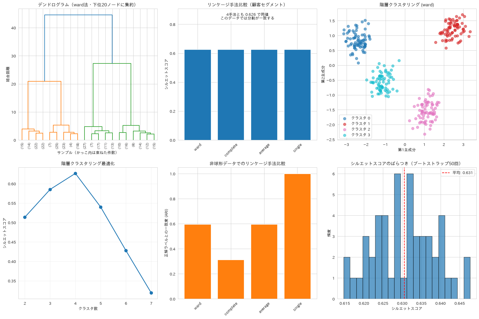
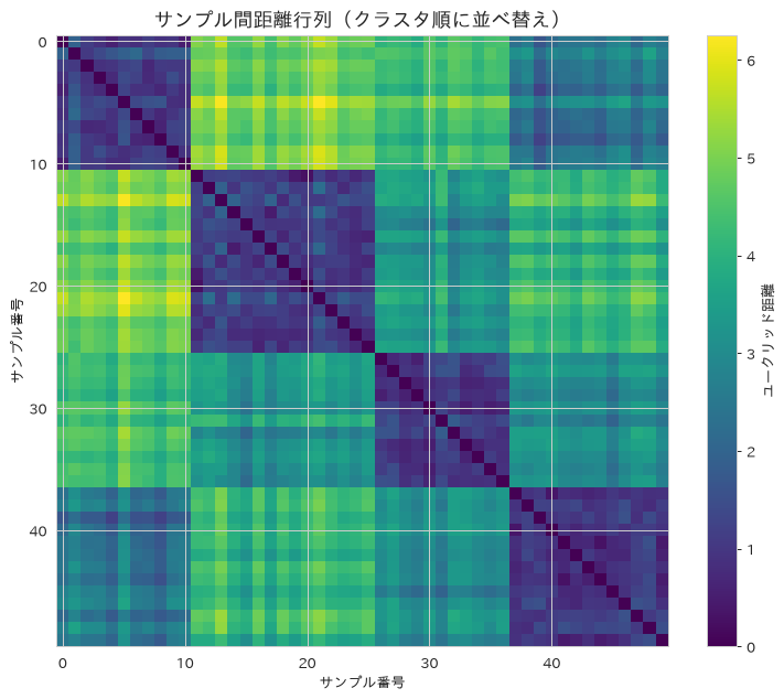
64. DBSCAN(密度ベースクラスタリング)
k距離プロットでeps(近傍半径)の目安を求め、その周辺を探索して密度に基づくクラスタリングを行い、外れ値や異常な顧客を検出する方法を扱います。
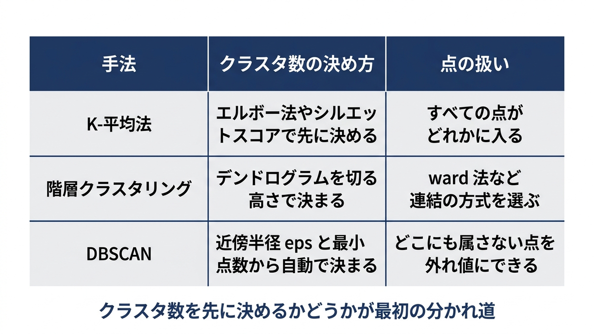
# DBSCAN(密度ベースクラスタリング)による外れ値検出
from sklearn.cluster import DBSCAN
from sklearn.neighbors import NearestNeighbors

# パラメータ最適化(eps値の決定)
# k-距離法による最適eps選択
k = 5  # min_samples の出発点の目安。適切な値は次元数とデータ密度で変わる
neighbors = NearestNeighbors(n_neighbors=k)
neighbors_fit = neighbors.fit(X_cluster_scaled)
distances, indices = neighbors_fit.kneighbors(X_cluster_scaled)

# k-距離プロット
# 差分の最大値を取ると、ソート済み曲線の最も急な立ち上がり、つまり必ず末端を拾ってしまう。
# 両端を結んだ直線から最も下に離れた点を肘とみなす
k_distances = np.sort(distances[:, k-1], axis=0)
x_axis = np.arange(len(k_distances))
x_norm = (x_axis - x_axis.min()) / (x_axis.max() - x_axis.min())
y_norm = (k_distances - k_distances.min()) / (k_distances.max() - k_distances.min())
knee_point = int(np.argmax(x_norm - y_norm))
optimal_eps = k_distances[knee_point]

# k距離法で得た目安の周辺を探索する
eps_range = np.linspace(optimal_eps * 0.8, optimal_eps * 1.8, 10)
min_samples_range = [3, 5, 7, 10]
max_noise_ratio = 0.10  # ノイズ率の上限。これを超える組み合わせは採用しない

dbscan_results = {}
best_score = -1
best_params = None

for eps in eps_range:
    for min_samples in min_samples_range:
        dbscan = DBSCAN(eps=eps, min_samples=min_samples)
        labels = dbscan.fit_predict(X_cluster_scaled)

        n_clusters = len(set(labels)) - (1 if -1 in labels else 0)
        n_noise = int((labels == -1).sum())

        # シルエットスコアだけを最大化すると「epsを極小にして大半をノイズ扱い」という
        # 退化解に必ず落ちる。クラスタが2つ以上あり、ノイズ率が上限以下のものに絞る
        if n_clusters < 2 or n_noise / len(labels) > max_noise_ratio:
            continue

        mask = labels != -1
        silhouette = silhouette_score(X_cluster_scaled[mask], labels[mask])

        dbscan_results[(eps, min_samples)] = {
            'labels': labels,
            'silhouette': silhouette,
            'n_clusters': n_clusters,
            'n_noise': n_noise,
            'model': dbscan
        }

        if silhouette > best_score:
            best_score = silhouette
            best_params = (eps, min_samples)

# 最適パラメータでの実行
if best_params:
    best_eps, best_min_samples = best_params
    dbscan_final = DBSCAN(eps=best_eps, min_samples=best_min_samples)
    final_labels = dbscan_final.fit_predict(X_cluster_scaled)
else:
    # フォールバック。ここで best_score を測り直さないと、
    # 初期値の -1 がそのままシルエットスコアとして表示されてしまう
    best_eps, best_min_samples = optimal_eps, 5
    dbscan_final = DBSCAN(eps=best_eps, min_samples=best_min_samples)
    final_labels = dbscan_final.fit_predict(X_cluster_scaled)
    fallback_mask = final_labels != -1
    if len(set(final_labels[fallback_mask])) > 1:
        best_score = silhouette_score(X_cluster_scaled[fallback_mask],
                                      final_labels[fallback_mask])
    else:
        best_score = float('nan')  # クラスタが1つ以下ならシルエットは定義できない

# 結果可視化
fig, axes = plt.subplots(2, 3, figsize=(18, 12))

# 1. k-距離プロット
axes[0, 0].plot(range(len(k_distances)), k_distances, 'b-', linewidth=2)
axes[0, 0].axvline(x=knee_point, color='red', linestyle='--',
                   label=f'肘の位置(epsの目安 {optimal_eps:.3f})')
axes[0, 0].axhline(y=optimal_eps, color='red', linestyle=':', alpha=0.6)
axes[0, 0].set_xlabel('データポイント (ソート済み)')
axes[0, 0].set_ylabel(f'{k}-距離')
axes[0, 0].set_title('k-距離法によるeps選択', fontweight='bold')
axes[0, 0].legend()
axes[0, 0].grid(True, alpha=0.3)

# 2. パラメータ最適化ヒートマップ
if dbscan_results:
    param_matrix = np.full((len(eps_range), len(min_samples_range)), np.nan)

    for i, eps in enumerate(eps_range):
        for j, min_samples in enumerate(min_samples_range):
            if (eps, min_samples) in dbscan_results:
                param_matrix[i, j] = dbscan_results[(eps, min_samples)]['silhouette']

    im = axes[0, 1].imshow(param_matrix, cmap='viridis', aspect='auto')
    axes[0, 1].set_xticks(range(len(min_samples_range)))
    axes[0, 1].set_yticks(range(len(eps_range)))
    axes[0, 1].set_xticklabels(min_samples_range)
    axes[0, 1].set_yticklabels([f'{eps:.2f}' for eps in eps_range])
    axes[0, 1].set_xlabel('min_samples')
    axes[0, 1].set_ylabel('eps')
    axes[0, 1].set_title('DBSCANパラメータ探索(採用条件を満たす組み合わせのみ)', fontweight='bold')
    plt.colorbar(im, ax=axes[0, 1], label='シルエットスコア')

# 3. DBSCAN結果可視化
X_cluster_pca = pca_cluster.transform(X_cluster_scaled)
unique_labels = sorted(set(final_labels))  # 凡例と色の対応を実行ごとに変えない
# Spectralは端が白に近い淡い黄色になり、白背景の散布図では点が見えなくなる。
# 質的な色分けにはtab10を使う
colors = plt.cm.tab10(np.arange(len(unique_labels)) % 10)

for k, col in zip(unique_labels, colors):
    if k == -1:
        # ノイズポイント(外れ値)
        class_member_mask = (final_labels == k)
        xy = X_cluster_pca[class_member_mask]
        axes[0, 2].scatter(xy[:, 0], xy[:, 1], c='black', marker='x',
                          s=50, alpha=0.6, label='ノイズ(外れ値)')
    else:
        # 通常クラスタ
        class_member_mask = (final_labels == k)
        xy = X_cluster_pca[class_member_mask]
        axes[0, 2].scatter(xy[:, 0], xy[:, 1], c=[col], alpha=0.6,
                          s=50, label=f'クラスタ {k}')

axes[0, 2].set_xlabel('第1主成分')
axes[0, 2].set_ylabel('第2主成分')
axes[0, 2].set_title('DBSCAN結果', fontweight='bold')
# 既定位置だとクラスタの点群に凡例が重なるので、空いている左下に置く
axes[0, 2].legend(loc='lower left')

# 4. クラスタサイズ分布
# 変数名は cluster_names にする。cluster_labels はレシピ62で作った
# k-meansの割り当て(整数の配列)で、以降のレシピでも使うため上書きしない
cluster_counts = pd.Series(final_labels).value_counts().sort_index()
cluster_names = ['ノイズ' if x == -1 else f'クラスタ {x}' for x in cluster_counts.index]

axes[1, 0].bar(range(len(cluster_counts)), cluster_counts.values)
axes[1, 0].set_xticks(range(len(cluster_counts)))
axes[1, 0].set_xticklabels(cluster_names, rotation=45)
axes[1, 0].set_ylabel('データポイント数')
axes[1, 0].set_title('クラスタサイズ分布', fontweight='bold')

# 5. 外れ値分析
noise_mask = final_labels == -1
if noise_mask.any():
    # 外れ値の特徴量分布
    noise_data = df_segment[segment_features].values[noise_mask]
    normal_data = df_segment[segment_features].values[~noise_mask]

    # 特徴量別の外れ値特性
    feature_means_noise = np.mean(noise_data, axis=0)
    feature_means_normal = np.mean(normal_data, axis=0)

    # DBSCANが外れ値と判定するのは、特定の特徴量が極端な点ではなく
    # 周囲の密度が低い点。5番目の近傍までの距離で違いを見る
    knn_dist = distances[:, -1]
    axes[1, 1].hist(knn_dist[~noise_mask], bins=30, alpha=0.7, density=True,
                    label=f'通常データ (n={int((~noise_mask).sum())})')
    axes[1, 1].hist(knn_dist[noise_mask], bins=30, alpha=0.7, density=True,
                    label=f'外れ値 (n={int(noise_mask.sum())})')
    axes[1, 1].axvline(best_eps, color='red', linestyle='--',
                       label=f'採用したeps {best_eps:.3f}')
    axes[1, 1].set_xlabel('5番目の近傍までの距離')
    axes[1, 1].set_ylabel('密度')
    axes[1, 1].set_title('外れ値 vs 通常データ(近傍密度)', fontweight='bold')
    axes[1, 1].legend()

# 6. 密度プロファイル
# 各クラスタの密度(近傍データ点数)を計算
neighbors_all = NearestNeighbors(n_neighbors=10)
neighbors_all.fit(X_cluster_scaled)
distances_all, _ = neighbors_all.kneighbors(X_cluster_scaled)
density_scores = 1 / (distances_all[:, -1] + 1e-6)  # 10番目の近傍距離の逆数

# クラスタ別密度分布
for label in set(final_labels):
    if label != -1:
        mask = final_labels == label
        axes[1, 2].hist(density_scores[mask], bins=20, alpha=0.6,
                       label=f'クラスタ {label}', density=True)

axes[1, 2].set_xlabel('密度スコア')
axes[1, 2].set_ylabel('密度')
axes[1, 2].set_title('クラスタ別密度分布', fontweight='bold')
axes[1, 2].legend()

plt.tight_layout()
plt.show()

# アルゴリズム比較(K-means vs 階層 vs DBSCAN)
# シルエットスコアは算出に使った点数が違うと比較できないので、母数も併記する
comparison_summary = pd.DataFrame({
    'アルゴリズム': ['K-means', '階層 (Ward)', 'DBSCAN'],
    'クラスタ数': [optimal_k, optimal_k, len(set(final_labels)) - (1 if -1 in final_labels else 0)],
    '外れ値検出': ['なし', 'なし', f'{list(final_labels).count(-1)}件'],
    'シルエットスコア': [
        round(silhouette_score(X_cluster_scaled, kmeans_final.labels_), 3),
        round(hierarchical_results['ward']['silhouette'], 3) if 'ward' in hierarchical_results else 0,
        round(best_score, 3) if best_score > 0 else 0
    ],
    '算出母数': [f'{len(X_cluster_scaled)}点', f'{sample_size}点',
             f'{int((final_labels != -1).sum())}点(ノイズを除く)']
})

print("DBSCAN分析結果")
print("=" * 40)
print(f"最適パラメータ: eps={best_eps:.3f}, min_samples={best_min_samples}")
print(f"発見クラスタ数: {len(set(final_labels)) - (1 if -1 in final_labels else 0)}")
print(f"外れ値数: {list(final_labels).count(-1)} ({list(final_labels).count(-1)/len(final_labels)*100:.1f}%)")
print(f"シルエットスコア: {best_score:.3f}")

print(f"\nアルゴリズム比較:")
print(comparison_summary.to_string(index=False))

if noise_mask.any():
    print(f"\n外れ値の性質:")
    print(f"5番目の近傍までの距離の平均 - 通常データ: {distances[:, -1][~noise_mask].mean():.3f} / "
          f"外れ値: {distances[:, -1][noise_mask].mean():.3f}")
    print("特徴量ごとの平均の差(外れ値 - 通常データ):")
    for i, feature in enumerate(segment_features):
        diff_pct = ((feature_means_noise[i] - feature_means_normal[i]) / feature_means_normal[i]) * 100
        print(f"{feature}: {diff_pct:+.1f}% 差異")
    print("平均で見るかぎり外れ値と通常データの特徴量の差は小さく、"
          "6次元空間で周囲の密度が低い点が外れ値として拾われている")
DBSCAN分析結果
========================================
最適パラメータ: eps=0.547, min_samples=7
発見クラスタ数: 4
外れ値数: 95 (9.5%)
シルエットスコア: 0.645

アルゴリズム比較:
   アルゴリズム  クラスタ数 外れ値検出  シルエットスコア         算出母数
  K-means      4    なし     0.623        1000点
階層 (Ward)      4    なし     0.626         300点
   DBSCAN      4   95件     0.645 905点(ノイズを除く)

外れ値の性質:
5番目の近傍までの距離の平均 - 通常データ: 0.452 / 外れ値: 0.717
特徴量ごとの平均の差(外れ値 - 通常データ):
annual_spend: -2.1% 差異
purchase_frequency: -1.1% 差異
avg_order_value: +3.1% 差異
brand_loyalty: -2.2% 差異
price_sensitivity: +0.2% 差異
digital_engagement: -0.7% 差異
平均で見るかぎり外れ値と通常データの特徴量の差は小さく、6次元空間で周囲の密度が低い点が外れ値として拾われている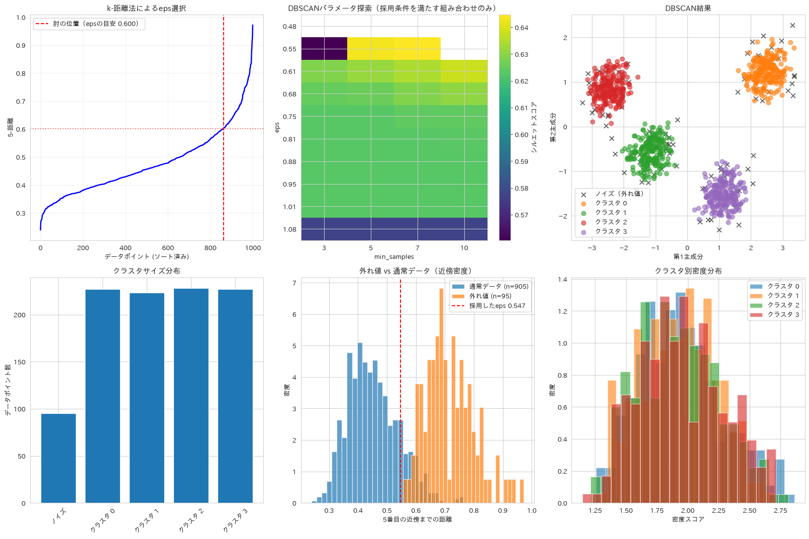
この章を深めたい方への参考書籍
- Andreas C. Muller・Sarah Guido『Pythonではじめる機械学習』(オライリー・ジャパン):3.5節のクラスタリングで、k平均法・凝集型クラスタリング・DBSCANが同じデータに適用して比較されています。本章の3手法をどう使い分けるかが図で確かめられます。
- 平井有三『はじめてのパターン認識』(森北出版):クラスタリングの章で、階層型と非階層型の分け方や距離の測り方が体系的に整理されています。本章で比較したward法や完全連結法の違いを数式で確認できます。
次元削減
65. 主成分分析(PCA)
成分数を変えながら累積寄与率を確認し、多くの特徴量を持つデータの可視化と、情報損失を抑えた次元削減の進め方を確認します。ここでは6次元のデータを2次元まで落とし、そのとき情報がどれだけ残るかを再構成誤差で測ります。
# 主成分分析による次元削減
from sklearn.decomposition import PCA
import matplotlib.pyplot as plt

# PCAの実行(異なる成分数で比較)
n_components_range = range(1, len(segment_features) + 1)
pca_results = {}

for n_comp in n_components_range:
    pca = PCA(n_components=n_comp)
    X_pca = pca.fit_transform(X_cluster_scaled)

    # 寄与率と累積寄与率
    explained_variance_ratio = pca.explained_variance_ratio_
    cumulative_variance_ratio = np.cumsum(explained_variance_ratio)

    pca_results[n_comp] = {
        'pca': pca,
        'transformed_data': X_pca,
        'explained_variance_ratio': explained_variance_ratio,
        'cumulative_variance_ratio': cumulative_variance_ratio[-1]
    }

# 結果可視化
fig, axes = plt.subplots(2, 3, figsize=(18, 12))

# 1. 寄与率と累積寄与率
components = list(n_components_range)
individual_ratios = [pca_results[n]['explained_variance_ratio'][n-1] if n <= len(pca_results[len(segment_features)]['explained_variance_ratio']) else 0 for n in components]
cumulative_ratios = [pca_results[n]['cumulative_variance_ratio'] for n in components]

axes[0, 0].bar(components, individual_ratios, alpha=0.7, label='個別寄与率')
axes[0, 0].plot(components, cumulative_ratios, 'ro-', linewidth=2, label='累積寄与率')
axes[0, 0].axhline(y=0.8, color='green', linestyle='--', label='80%線')
axes[0, 0].axhline(y=0.95, color='orange', linestyle='--', label='95%線')
axes[0, 0].set_xlabel('主成分数')
axes[0, 0].set_ylabel('寄与率')
axes[0, 0].set_title('主成分分析:寄与率', fontweight='bold')
axes[0, 0].legend()
axes[0, 0].grid(True, alpha=0.3)

# 2. 主成分の解釈(第1、第2主成分)
pca_full = pca_results[len(segment_features)]['pca']
components_matrix = pca_full.components_[:2]

# ヒートマップ
im = axes[0, 1].imshow(components_matrix, cmap='RdBu_r', aspect='auto')
axes[0, 1].set_xticks(range(len(segment_features)))
axes[0, 1].set_xticklabels(segment_features, rotation=45)
axes[0, 1].set_yticks([0, 1])
axes[0, 1].set_yticklabels(['第1主成分', '第2主成分'])
axes[0, 1].set_title('主成分の構成要素', fontweight='bold')
plt.colorbar(im, ax=axes[0, 1])

# 3. 2次元散布図
X_pca_2d = pca_results[2]['transformed_data']
scatter = axes[0, 2].scatter(X_pca_2d[:, 0], X_pca_2d[:, 1],
                            c=cluster_labels, cmap='tab10', alpha=0.6)
axes[0, 2].set_xlabel(f'第1主成分 ({pca_full.explained_variance_ratio_[0]:.1%})')
axes[0, 2].set_ylabel(f'第2主成分 ({pca_full.explained_variance_ratio_[1]:.1%})')
axes[0, 2].set_title('主成分空間でのクラスタ', fontweight='bold')

# 4. 次元削減効果の評価
# 元データとPCA変換データでクラスタリング性能比較。
# シルエットは次元ごとに別の空間で測る内部指標なので、そのままでは
# 「元の構造がどれだけ残ったか」を表さない。元データの割り当てとの一致度も併記する
from sklearn.metrics import adjusted_rand_score

silhouette_original = silhouette_score(X_cluster_scaled, cluster_labels)
silhouette_scores_pca = []
ari_scores_pca = []

for n_comp in range(2, len(segment_features) + 1):
    X_pca_temp = pca_results[n_comp]['transformed_data']
    kmeans_temp = KMeans(n_clusters=optimal_k, random_state=42)
    labels_temp = kmeans_temp.fit_predict(X_pca_temp)
    silhouette_temp = silhouette_score(X_pca_temp, labels_temp)
    silhouette_scores_pca.append(silhouette_temp)
    ari_scores_pca.append(adjusted_rand_score(cluster_labels, labels_temp))

axes[1, 0].plot(range(2, len(segment_features) + 1), silhouette_scores_pca, 'bo-',
                linewidth=2, label='シルエット(削減後の空間の内部指標)')
axes[1, 0].plot(range(2, len(segment_features) + 1), ari_scores_pca, 'g^-',
                linewidth=2, label='ARI(元データの割り当てとの一致度)')
axes[1, 0].set_xticks(range(2, len(segment_features) + 1))  # 主成分数は整数
axes[1, 0].axhline(y=silhouette_original, color='red', linestyle='--',
                   label=f'元データのシルエット: {silhouette_original:.3f}')
axes[1, 0].set_xlabel('主成分数')
axes[1, 0].set_ylabel('スコア')
axes[1, 0].set_title('次元削減がクラスタリングに与える影響', fontweight='bold')
axes[1, 0].legend(fontsize=8)
axes[1, 0].grid(True, alpha=0.3)

# 5. バイプロット(特徴量ベクトル表示)
def biplot(X_pca, features, pca_model, ax):
    # データ点は下地なので薄く描く
    ax.scatter(X_pca[:, 0], X_pca[:, 1], alpha=0.15, s=20)

    # 特徴量ベクトルをプロット(データの広がりに合わせて伸ばす)
    feature_vectors = (pca_model.components_.T
                       * np.sqrt(pca_model.explained_variance_) * 2.5)

    for i, feature in enumerate(features):
        ax.arrow(0, 0, feature_vectors[i, 0], feature_vectors[i, 1],
                head_width=0.15, head_length=0.2, fc='red', ec='red',
                length_includes_head=True)
        label_ha = 'left' if feature_vectors[i, 0] >= 0 else 'right'
        label_va = 'bottom' if feature_vectors[i, 1] >= 0 else 'top'
        ax.text(feature_vectors[i, 0] * 1.08, feature_vectors[i, 1] * 1.08,
               feature, fontsize=9, ha=label_ha, va=label_va,
               bbox=dict(boxstyle='round', fc='white', ec='none', alpha=0.8))

    ax.set_xlabel(f'第1主成分 ({pca_model.explained_variance_ratio_[0]:.1%})')
    ax.set_ylabel(f'第2主成分 ({pca_model.explained_variance_ratio_[1]:.1%})')

biplot(X_pca_2d, segment_features, pca_results[2]['pca'], axes[1, 1])
axes[1, 1].set_title('バイプロット', fontweight='bold')

# 6. 再構成誤差分析
reconstruction_errors = []

for n_comp in range(1, len(segment_features)):
    pca_temp = PCA(n_components=n_comp)
    X_pca_temp = pca_temp.fit_transform(X_cluster_scaled)
    X_reconstructed = pca_temp.inverse_transform(X_pca_temp)

    # 再構成誤差(MSE)
    mse = mean_squared_error(X_cluster_scaled, X_reconstructed)
    reconstruction_errors.append(mse)

axes[1, 2].plot(range(1, len(segment_features)), reconstruction_errors, 'go-', linewidth=2)
axes[1, 2].set_xticks(range(1, len(segment_features)))  # 主成分数は整数
axes[1, 2].set_xlabel('主成分数')
axes[1, 2].set_ylabel('再構成誤差 (MSE)')
axes[1, 2].set_title('情報損失量', fontweight='bold')
axes[1, 2].grid(True, alpha=0.3)

plt.tight_layout()
plt.show()

# 最適主成分数の決定
optimal_components_80 = next(n for n, result in pca_results.items()
                           if result['cumulative_variance_ratio'] >= 0.8)
optimal_components_95 = next(n for n, result in pca_results.items()
                           if result['cumulative_variance_ratio'] >= 0.95)

print("主成分分析 結果")
print("=" * 40)
print(f"元の特徴量数: {len(segment_features)}")
print(f"80%の情報を保持する主成分数: {optimal_components_80}")
print(f"95%の情報を保持する主成分数: {optimal_components_95}")
print(f"次元削減率 (80%): {(1 - optimal_components_80/len(segment_features))*100:.1f}%")

print(f"\n主成分別寄与率:")
for i, ratio in enumerate(pca_full.explained_variance_ratio_):
    print(f"第{i+1}主成分: {ratio:.3f} ({ratio*100:.1f}%)")

print(f"\n特徴量の主成分への影響度 (絶対値上位3):")
for i in range(min(3, len(pca_full.components_))):
    component = pca_full.components_[i]
    top_features_idx = np.argsort(np.abs(component))[::-1][:3]
    print(f"第{i+1}主成分:")
    for idx in top_features_idx:
        print(f"{segment_features[idx]}: {component[idx]:.3f}")
主成分分析 結果
========================================
元の特徴量数: 6
80%の情報を保持する主成分数: 2
95%の情報を保持する主成分数: 4
次元削減率 (80%): 66.7%

主成分別寄与率:
第1主成分: 0.638 (63.8%)
第2主成分: 0.218 (21.8%)
第3主成分: 0.081 (8.1%)
第4主成分: 0.039 (3.9%)
第5主成分: 0.014 (1.4%)
第6主成分: 0.011 (1.1%)

特徴量の主成分への影響度 (絶対値上位3):
第1主成分:
brand_loyalty: 0.467
annual_spend: -0.463
purchase_frequency: 0.461
第2主成分:
digital_engagement: 0.781
avg_order_value: -0.530
price_sensitivity: -0.249
第3主成分:
annual_spend: 0.524
avg_order_value: -0.495
brand_loyalty: 0.472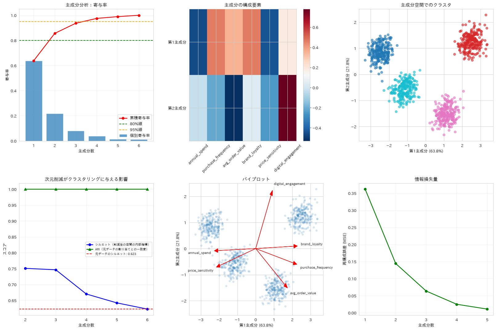
66. t-SNE(非線形次元削減)
perplexityを変えて非線形の次元削減を行い、PCAでは捉えにくいクラスタ構造やパターンを可視化する手法を紹介します。差が出る題材が必要なので、ここでは三日月が2つ絡み合った形(make_moons)を6次元に埋め込んだデータを使います。PCAは線形の手法なので、絡み合った2つの三日月を引き離すことはできません。三日月の形そのものは2次元に落としても残りますが、K-meansのように凸形状を仮定する手法では、この構造を2群に分けられないままになります。
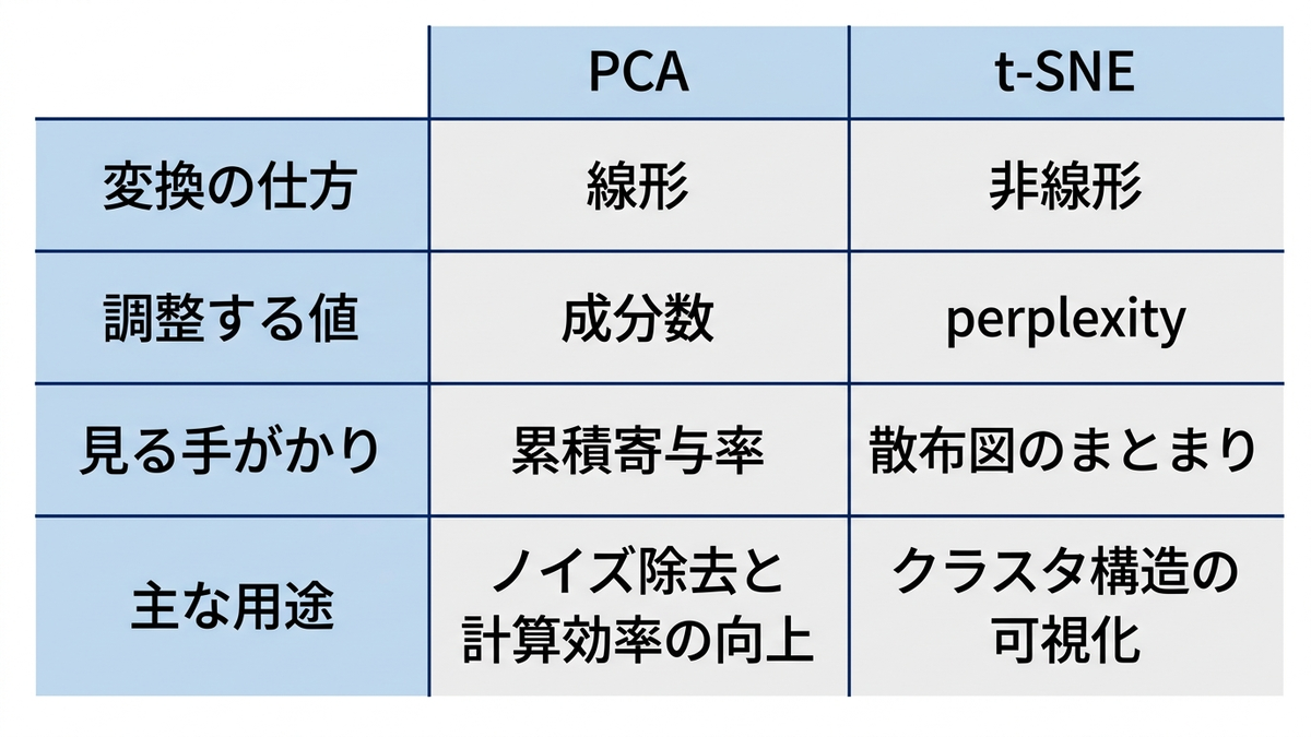
perplexityは、埋め込んだあとのまとまり(シルエット係数)が最も高いものを選びます。ただしこれは見た目のまとまりを測る指標なので、正解ラベルの無い実務では参考値として扱います。本レシピでは正解ラベルを持つ合成データを使っているため、選んだあとでARIとNMIによる答え合わせもあわせて行います。
# t-SNEによる非線形次元削減と可視化
from sklearn.manifold import TSNE
from sklearn.datasets import make_moons
from sklearn.metrics import silhouette_score
import time

# 非線形構造を持つデータを用意する。
# 三日月2つ(make_moons)は直線では分離できない。これを6次元へ線形に埋め込み、
# 「高次元の中に潜んでいる非線形構造」を作る
X_moon, y_moon = make_moons(n_samples=500, noise=0.06, random_state=42)
rng_embed = np.random.RandomState(0)
embed_matrix = rng_embed.normal(size=(2, 6))
X_sample = X_moon @ embed_matrix + rng_embed.normal(scale=0.03, size=(500, 6))
labels_sample = y_moon  # 正解ラベル。クラスタリング結果を正解に使うと評価が循環する
sample_size = len(X_sample)
n_true_clusters = 2

# 異なるperplexityでt-SNEを実行
perplexity_values = [5, 10, 30, 50]
tsne_results = {}

for perplexity in perplexity_values:
    start_time = time.time()

    tsne = TSNE(n_components=2, perplexity=perplexity, random_state=42,
                max_iter=1000, verbose=0)
    X_tsne = tsne.fit_transform(X_sample)

    end_time = time.time()

    # 埋め込みの良し悪しは、KLダイバージェンスではなく
    # 埋め込み後のまとまり(シルエット係数)で測る。
    # perplexityを変えると目的関数側の分布そのものが変わるため、
    # perplexityをまたいでKL値を横並びに比べることには意味がない
    tmp_labels = KMeans(n_clusters=n_true_clusters, random_state=42,
                        n_init=10).fit_predict(X_tsne)

    tsne_results[perplexity] = {
        'embedding': X_tsne,
        'time': end_time - start_time,
        'kl_divergence': tsne.kl_divergence_,
        'silhouette': silhouette_score(X_tsne, tmp_labels)
    }

# PCAとの比較用
pca_2d = PCA(n_components=2)
X_pca_sample = pca_2d.fit_transform(X_sample)

# 結果可視化
fig, axes = plt.subplots(2, 3, figsize=(18, 12))
axes = axes.ravel()

# PCA結果
axes[0].scatter(X_pca_sample[:, 0], X_pca_sample[:, 1],
                c=labels_sample, cmap='tab10', alpha=0.7)
axes[0].set_title('PCA (線形次元削減)', fontweight='bold')
axes[0].set_xlabel('第1主成分')
axes[0].set_ylabel('第2主成分')

# 各perplexityでのt-SNE結果
for i, (perplexity, result) in enumerate(tsne_results.items()):
    axes[i + 1].scatter(result['embedding'][:, 0], result['embedding'][:, 1],
                        c=labels_sample, cmap='tab10', alpha=0.7)
    axes[i + 1].set_title(f't-SNE (perplexity={perplexity})', fontweight='bold')
    axes[i + 1].set_xlabel('t-SNE 1')
    axes[i + 1].set_ylabel('t-SNE 2')

# パフォーマンス比較。右軸を使うと軸ラベルが図の外に出て切れるので、
# 1軸にまとめて計算時間は各点の注記で示す
perplexities = list(tsne_results.keys())
sil_scores = [result['silhouette'] for result in tsne_results.values()]
times = [result['time'] for result in tsne_results.values()]

ax_perf = axes[5]
ax_perf.plot(perplexities, sil_scores, 'o-', color='tab:red', linewidth=2)
for p, s, tm in zip(perplexities, sil_scores, times):
    ax_perf.annotate(f'{tm:.1f}秒', (p, s), xytext=(0, -22),
                     textcoords='offset points', ha='center', fontsize=9)
ax_perf.set_xlabel('Perplexity')
ax_perf.set_ylabel('シルエット係数(埋め込み後)')
ax_perf.set_title('perplexityと埋め込みの質・計算時間', fontweight='bold')
ax_perf.margins(y=0.15)
ax_perf.grid(True, alpha=0.3)

plt.tight_layout()
plt.show()

# クラスタ分離度の定量評価
from sklearn.metrics import adjusted_rand_score, normalized_mutual_info_score

methods_comparison = {}

# PCA + K-means
kmeans_pca = KMeans(n_clusters=n_true_clusters, random_state=42, n_init=10)
labels_pca = kmeans_pca.fit_predict(X_pca_sample)
ari_pca = adjusted_rand_score(labels_sample, labels_pca)
nmi_pca = normalized_mutual_info_score(labels_sample, labels_pca)

methods_comparison['PCA'] = {'ARI': ari_pca, 'NMI': nmi_pca}

# t-SNE + K-means(シルエット係数が最も高いperplexityを採用)
best_perplexity = max(tsne_results.items(), key=lambda x: x[1]['silhouette'])[0]
X_tsne_best = tsne_results[best_perplexity]['embedding']
kmeans_tsne = KMeans(n_clusters=n_true_clusters, random_state=42, n_init=10)
labels_tsne = kmeans_tsne.fit_predict(X_tsne_best)
ari_tsne = adjusted_rand_score(labels_sample, labels_tsne)
nmi_tsne = normalized_mutual_info_score(labels_sample, labels_tsne)

methods_comparison['t-SNE'] = {'ARI': ari_tsne, 'NMI': nmi_tsne}

# 比較結果の可視化
fig, (ax1, ax2) = plt.subplots(1, 2, figsize=(12, 5))

methods = list(methods_comparison.keys())
ari_scores = [methods_comparison[method]['ARI'] for method in methods]
nmi_scores = [methods_comparison[method]['NMI'] for method in methods]

x_pos = np.arange(len(methods))
width = 0.35

ax1.bar(x_pos - width/2, ari_scores, width, label='ARI', alpha=0.8)
ax1.bar(x_pos + width/2, nmi_scores, width, label='NMI', alpha=0.8)
ax1.set_ylabel('正解ラベルとの一致度')
ax1.set_title('次元削減手法の比較', fontweight='bold')
ax1.set_xticks(x_pos)
ax1.set_xticklabels(methods)
ax1.legend()
ax1.set_ylim(0, 1.05)
for i, (a, n) in enumerate(zip(ari_scores, nmi_scores)):
    ax1.text(i - width/2, a + 0.02, f'{a:.2f}', ha='center', fontsize=9)
    ax1.text(i + width/2, n + 0.02, f'{n:.2f}', ha='center', fontsize=9)

# perplexity vs 埋め込みの質
ax2.plot(perplexities, sil_scores, 'ro-', linewidth=2, markersize=8)
ax2.set_xlabel('Perplexity')
ax2.set_ylabel('シルエット係数(埋め込み後)')
ax2.set_title('perplexityの選び方', fontweight='bold')
ax2.grid(True, alpha=0.3)
ax2.axvline(x=best_perplexity, color='green', linestyle='--',
            label=f'採用値: {best_perplexity}')
ax2.legend()

plt.tight_layout()
plt.show()

# PCAで前処理してからt-SNEに渡すと速くなるかを実際に測る
start_time = time.time()
X_pre = PCA(n_components=4, random_state=42).fit_transform(X_sample)
TSNE(n_components=2, perplexity=best_perplexity, random_state=42,
     max_iter=1000).fit_transform(X_pre)
time_with_pca = time.time() - start_time

print("t-SNE分析結果")
print("=" * 40)
print(f"サンプルサイズ: {sample_size}")
print(f"採用perplexity: {best_perplexity}(シルエット係数が最大)")

print(f"\nperplexityごとの指標:")
for perplexity, result in tsne_results.items():
    print(f"Perplexity {perplexity}: シルエット {result['silhouette']:.3f} / "
          f"KL {result['kl_divergence']:.3f} / {result['time']:.2f}秒")
print("perplexityが変わると目的関数側の分布も変わるため、"
      "KL値はperplexityをまたいで比べられない。選択の基準には使わない")

print(f"\n次元削減手法比較(正解ラベルとの一致度):")
for method, scores in methods_comparison.items():
    print(f"{method}:")
    print(f"ARI (調整ランド指数): {scores['ARI']:.3f}")
    print(f"NMI (正規化相互情報量): {scores['NMI']:.3f}")

print(f"\nPCA(4成分)で前処理してから t-SNE: {time_with_pca:.2f}秒 "
      f"(前処理なし perplexity={best_perplexity} は {tsne_results[best_perplexity]['time']:.2f}秒)")
print("元が6次元しかないので、この題材では前処理しても速くならない。"
      "PCA前処理が効いてくるのは、目安として数百次元以上の高次元データのとき。"
      "実際の効き方はデータ件数やノイズの量にも左右される")
print("- perplexity: データ点数に応じて調整(推奨: 5-50)")
print("- 線形手法では重なってしまう構造の可視化に有効")
t-SNE分析結果
========================================
サンプルサイズ: 500
採用perplexity: 50(シルエット係数が最大)

perplexityごとの指標:
Perplexity 5: シルエット 0.356 / KL 0.309 / 0.71秒
Perplexity 10: シルエット 0.398 / KL 0.256 / 0.82秒
Perplexity 30: シルエット 0.506 / KL 0.158 / 0.91秒
Perplexity 50: シルエット 0.579 / KL 0.144 / 1.26秒
perplexityが変わると目的関数側の分布も変わるため、KL値はperplexityをまたいで比べられない。選択の基準には使わない

次元削減手法比較(正解ラベルとの一致度):
PCA:
ARI (調整ランド指数): 0.103
NMI (正規化相互情報量): 0.078
t-SNE:
ARI (調整ランド指数): 1.000
NMI (正規化相互情報量): 1.000

PCA(4成分)で前処理してから t-SNE: 1.81秒 (前処理なし perplexity=50 は 1.26秒)
元が6次元しかないので、この題材では前処理しても速くならない。PCA前処理が効いてくるのは、目安として数百次元以上の高次元データのとき。実際の効き方はデータ件数やノイズの量にも左右される
- perplexity: データ点数に応じて調整(推奨: 5-50)
- 線形手法では重なってしまう構造の可視化に有効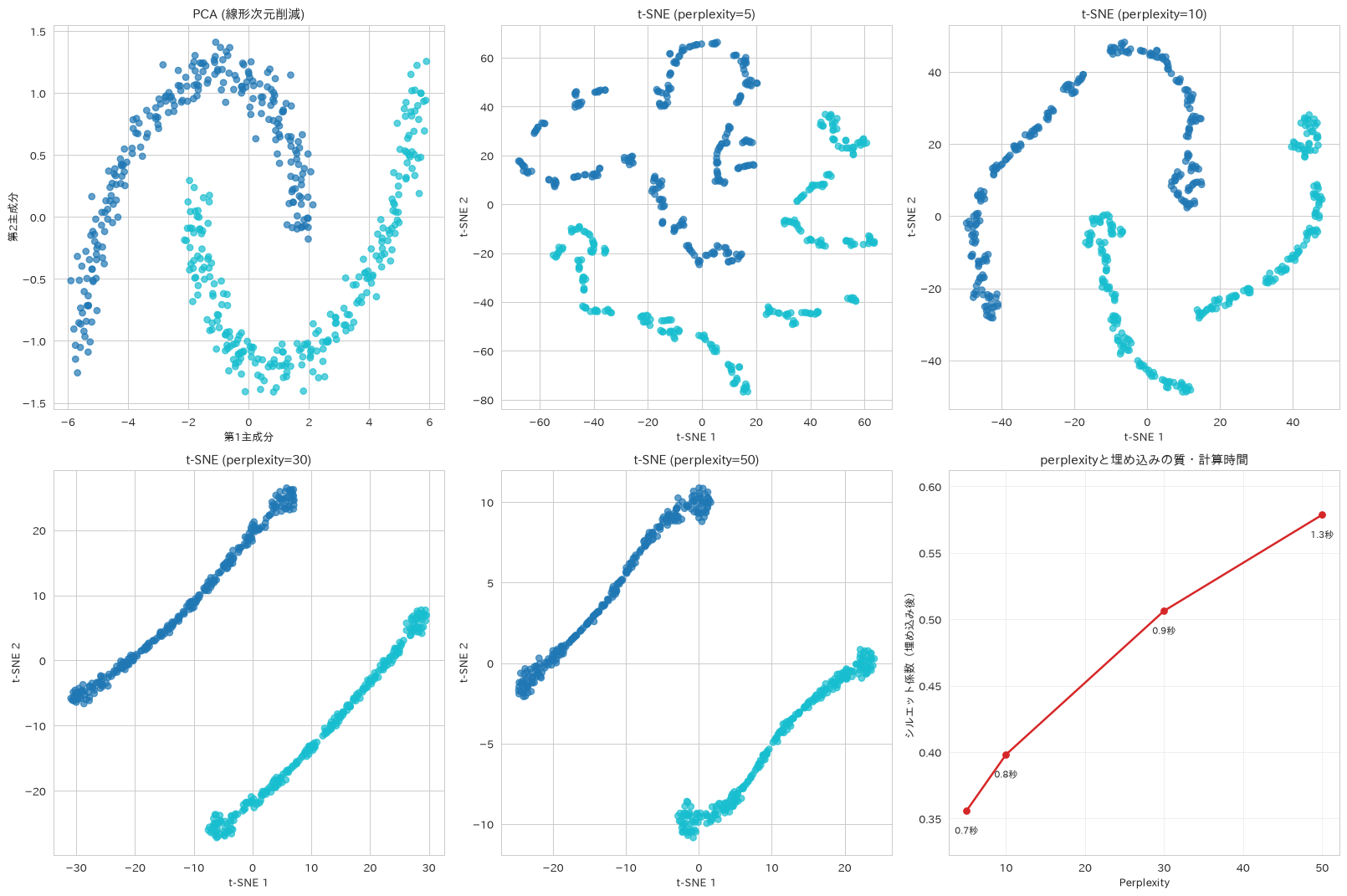
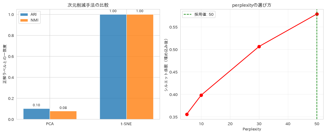
この章を深めたい方への参考書籍
- Andreas C. Muller・Sarah Guido『Pythonではじめる機械学習』(オライリー・ジャパン):3.4節「次元削減、特徴量抽出、多様体学習」で、可視化のための次元削減と前処理のための次元削減が分けて説明されています。本章のPCAとt-SNEの役割の違いが整理できます。
- Jake VanderPlas『Pythonデータサイエンスハンドブック 第2版』(オライリー・ジャパン):45章「詳細:主成分分析」と46章「詳細:多様体学習」があり、寄与率の読み方やノイズ除去への応用が実例つきで示されています。本章の累積寄与率の判断を補強できます。
モデル評価とハイパーパラメータ探索
67. 交差検証による性能評価
複数モデルをStratifiedKFoldなどで交差検証し、単一の分割に依存しない頑健な性能評価を行う考え方を整理します。ここで使うのはレシピ55で用意した顧客離脱データで、特徴量Xはdf_churnから離脱ラベルと顧客IDを除いた10列、目的変数yは離脱ラベルchurnです。レシピ56から66では売上データやセグメントデータ、三日月形のデータも扱いましたが、このレシピは離脱データに戻ります。スケーリングが必要なモデルはStandardScalerと組み合わせたPipelineとして交差検証に渡すことで、foldごとに訓練データだけでスケーラーを学習させ、検証データの情報が前処理に漏れ込むこと(リーク)を防ぎます。
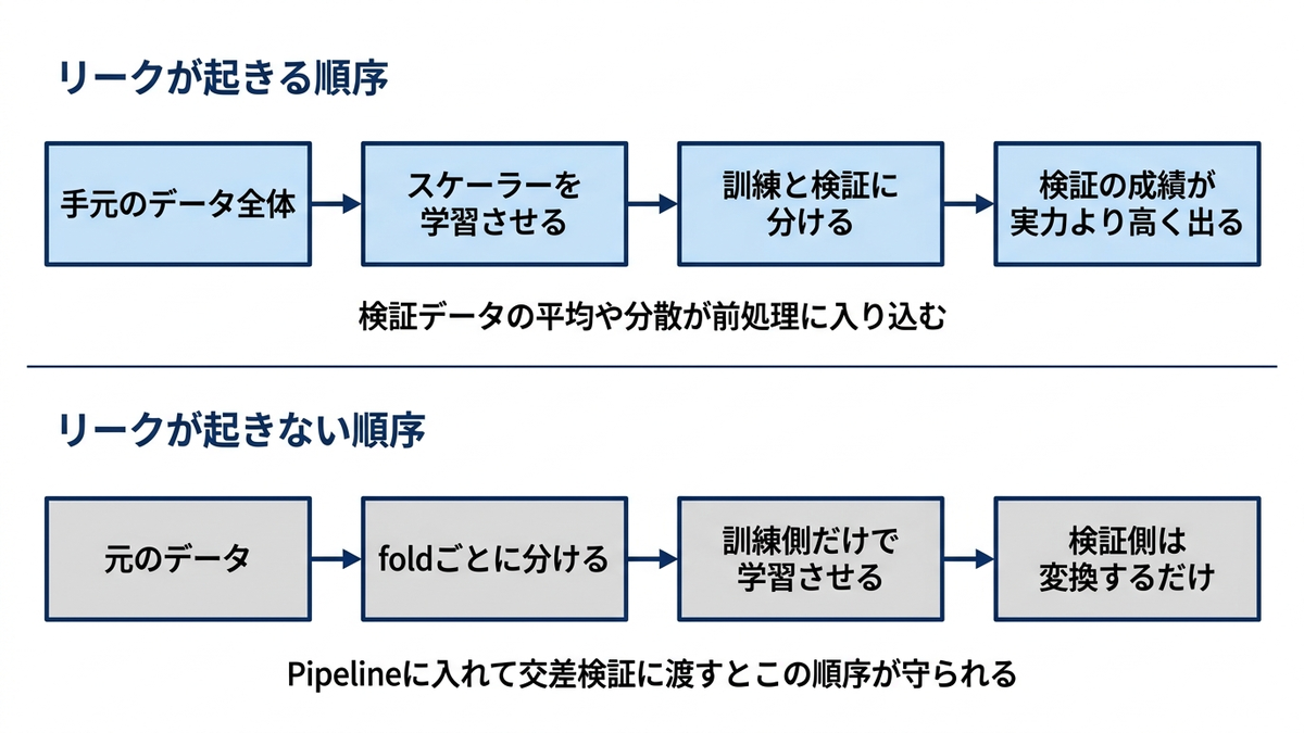
# 交差検証による robust な性能評価
from sklearn.model_selection import cross_val_score, cross_validate, StratifiedKFold
from sklearn.model_selection import RepeatedStratifiedKFold, LeaveOneOut

# 複数のモデルで交差検証比較
# スケーリングが必要なモデルはPipeline化し、foldごとに訓練データのみでスケーラーを学習させる(リーク防止)
from sklearn.pipeline import Pipeline

models = {
    'Logistic Regression': Pipeline([('scaler', StandardScaler()),
                                     ('model', LogisticRegression(random_state=42, max_iter=1000))]),
    'Random Forest': RandomForestClassifier(n_estimators=100, random_state=42),
    'SVM': Pipeline([('scaler', StandardScaler()),
                     ('model', CalibratedClassifierCV(SVC(random_state=42), ensemble=False))]),
    'Decision Tree': DecisionTreeClassifier(random_state=42)
}

# 複数の交差検証戦略
cv_strategies = {
    'StratifiedKFold': StratifiedKFold(n_splits=5, shuffle=True, random_state=42),
    'RepeatedStratifiedKFold': RepeatedStratifiedKFold(n_splits=5, n_repeats=3, random_state=42),
    'StratifiedKFold_10': StratifiedKFold(n_splits=10, shuffle=True, random_state=42)
}

# 評価指標
scoring = ['accuracy', 'precision', 'recall', 'f1', 'roc_auc']

# データ準備(スケーリングはPipeline内でfoldごとに実行するため、ここでは元の特徴量をそのまま使う)
y_binary = y

# 交差検証実行
cv_results = {}

for cv_name, cv_strategy in cv_strategies.items():
    cv_results[cv_name] = {}

    for model_name, model in models.items():
        print(f"実行中: {cv_name} - {model_name}")

        # マルチメトリクス交差検証
        scores = cross_validate(model, X, y_binary,
                              cv=cv_strategy, scoring=scoring,
                              return_train_score=True, n_jobs=-1)

        cv_results[cv_name][model_name] = scores

# 結果可視化
fig, axes = plt.subplots(2, 3, figsize=(18, 12))
axes = axes.ravel()

# 1. モデル別性能比較(StratifiedKFold)
cv_name = 'StratifiedKFold'
metrics = ['test_accuracy', 'test_precision', 'test_recall', 'test_f1', 'test_roc_auc']
model_names = list(models.keys())

mean_scores = np.array([[np.mean(cv_results[cv_name][model][metric])
                        for metric in metrics] for model in model_names])

# ヒートマップ
im = axes[0].imshow(mean_scores, cmap='YlOrRd', aspect='auto')
axes[0].grid(False)  # seabornのwhitegridの白線がセルの数値を横切るので消す
axes[0].set_xticks(range(len(metrics)))
axes[0].set_yticks(range(len(model_names)))
axes[0].set_xticklabels([m.replace('test_', '') for m in metrics])
axes[0].set_yticklabels(model_names)
axes[0].set_title('モデル性能比較(5-fold CV)', fontweight='bold')

# 数値を表示。文字色のしきい値は値域の真ん中に合わせる
# (0.5固定にすると、値域が0.93〜0.99のこの図では全セルが白文字になって淡色セルで消える)
color_pivot = (mean_scores.min() + mean_scores.max()) / 2
for i in range(len(model_names)):
    for j in range(len(metrics)):
        axes[0].text(j, i, f'{mean_scores[i, j]:.3f}',
                    ha='center', va='center',
                    color='white' if mean_scores[i, j] > color_pivot else 'black')

plt.colorbar(im, ax=axes[0])

# 2. 学習曲線 vs 検証曲線
best_model = RandomForestClassifier(n_estimators=100, random_state=42)
train_sizes, train_scores_lc, val_scores_lc = learning_curve(
    best_model, X, y_binary, cv=5,
    train_sizes=np.linspace(0.1, 1.0, 10), scoring='accuracy'
)

axes[1].plot(train_sizes, np.mean(train_scores_lc, axis=1), 'o-',
             label='訓練スコア', linewidth=2, markersize=6)
axes[1].plot(train_sizes, np.mean(val_scores_lc, axis=1), 's-',
             label='検証スコア', linewidth=2, markersize=6)
axes[1].fill_between(train_sizes,
                     np.mean(train_scores_lc, axis=1) - np.std(train_scores_lc, axis=1),
                     np.mean(train_scores_lc, axis=1) + np.std(train_scores_lc, axis=1),
                     alpha=0.1)
axes[1].fill_between(train_sizes,
                     np.mean(val_scores_lc, axis=1) - np.std(val_scores_lc, axis=1),
                     np.mean(val_scores_lc, axis=1) + np.std(val_scores_lc, axis=1),
                     alpha=0.1)
axes[1].set_xlabel('訓練サンプル数')
axes[1].set_ylabel('Accuracy')
axes[1].set_title('学習曲線(Random Forest)', fontweight='bold')
axes[1].legend()
axes[1].grid(True, alpha=0.3)

# 3. 交差検証戦略の比較
# 12本を1軸に並べて2行ラベルを回転させると帯状に重なって読めないので、
# CV戦略を色で分け、x軸にはモデル名だけを置く
metric_to_compare = 'test_accuracy'
n_cv = len(cv_strategies)
box_width = 0.8 / n_cv
cv_colors = ['tab:blue', 'tab:orange', 'tab:green', 'tab:red'][:n_cv]

for k, cv_name in enumerate(cv_strategies.keys()):
    data_k = [cv_results[cv_name][model_name][metric_to_compare]
              for model_name in model_names]
    pos = np.arange(len(model_names)) + (k - (n_cv - 1) / 2) * box_width
    bp = axes[2].boxplot(data_k, positions=pos, widths=box_width * 0.85,
                         patch_artist=True, manage_ticks=False)
    for box in bp['boxes']:
        box.set_facecolor(cv_colors[k])
        box.set_alpha(0.6)
    axes[2].plot([], [], color=cv_colors[k], linewidth=6, alpha=0.6, label=cv_name)

axes[2].set_xticks(np.arange(len(model_names)))
axes[2].set_xticklabels(model_names, rotation=20, ha='right')
axes[2].set_ylabel('Accuracy')
axes[2].set_title('交差検証戦略比較', fontweight='bold')
axes[2].legend(fontsize=8)

# 4. 訓練データの違いによる性能ばらつきの確認
# 訓練セットを取り直すたびに交差検証スコアがどれだけ動くかを見る。
# バイアスとバリアンスへの分解までは行っていない
model_for_analysis = RandomForestClassifier(n_estimators=50, random_state=42)
n_experiments = 30
performance_variance = []

for _ in range(n_experiments):
    # ランダムに訓練データを作成
    X_temp, _, y_temp, _ = train_test_split(X, y_binary, test_size=0.3, random_state=None)

    # 交差検証実行
    scores = cross_val_score(model_for_analysis, X_temp, y_temp, cv=3, scoring='accuracy')
    performance_variance.append(np.std(scores))

axes[3].hist(performance_variance, bins=15, alpha=0.7, edgecolor='black')
axes[3].set_xlabel('性能の標準偏差')
axes[3].set_ylabel('頻度')
axes[3].set_title('モデル性能の安定性', fontweight='bold')
axes[3].axvline(np.mean(performance_variance), color='red', linestyle='--',
                label=f'平均: {np.mean(performance_variance):.3f}')
axes[3].legend()

# 5. 特徴量重要度の安定性分析
# ブートストラップによる特徴量重要度の安定性評価
from sklearn.utils import resample

rf_model = RandomForestClassifier(n_estimators=50, random_state=42)
lr_model = Pipeline([('scaler', StandardScaler()),
                     ('model', LogisticRegression(random_state=42, max_iter=1000))])

# ブートストラップによる重要度分析
n_bootstrap = 20
rf_importances = []
lr_coefficients = []

for i in range(n_bootstrap):
    # ブートストラップサンプリング
    X_boot, y_boot = resample(X, y_binary, random_state=i)

    # Random Forest重要度
    rf_model.fit(X_boot, y_boot)
    rf_importances.append(rf_model.feature_importances_)

    # Logistic Regression係数
    lr_model.fit(X_boot, y_boot)
    lr_coefficients.append(np.abs(lr_model.named_steps['model'].coef_[0]))

rf_importances = np.array(rf_importances)
lr_coefficients = np.array(lr_coefficients)

# 重要度の安定性比較
# ジニ重要度は合計1に正規化された値、ロジスティック回帰の係数は正規化されていない値なので、
# 標準偏差をそのまま比べると「値が小さいほうが安定」と読めてしまう。
# 両方を合計1に揃えたうえで変動係数(標準偏差 ÷ 平均)にして、初めて比較できる
lr_normalized = lr_coefficients / lr_coefficients.sum(axis=1, keepdims=True)
rf_stability = np.std(rf_importances, axis=0) / np.mean(rf_importances, axis=0)
lr_stability = np.std(lr_normalized, axis=0) / np.mean(lr_normalized, axis=0)

bar_x = np.arange(len(rf_stability))
axes[4].bar(bar_x - 0.2, rf_stability, width=0.4, alpha=0.8, label='Random Forest')
axes[4].bar(bar_x + 0.2, lr_stability, width=0.4, alpha=0.8, label='Logistic Regression')
axes[4].set_xticks(bar_x)
axes[4].set_xticklabels(X.columns, rotation=45, ha='right', fontsize=8)
axes[4].set_ylabel('変動係数(小さいほど安定)')
axes[4].set_title('特徴量重要度の安定性', fontweight='bold')
axes[4].legend()

# 6. ROC曲線の交差検証
from sklearn.model_selection import cross_val_predict
from sklearn.metrics import roc_curve, auc

# ROC曲線のためのprediction probability
y_pred_proba = cross_val_predict(RandomForestClassifier(n_estimators=100, random_state=42),
                                X, y_binary, cv=5, method='predict_proba')

fpr, tpr, _ = roc_curve(y_binary, y_pred_proba[:, 1])
roc_auc = auc(fpr, tpr)

axes[5].plot(fpr, tpr, color='darkorange', lw=2,
             label=f'ROC curve (AUC = {roc_auc:.3f})')
axes[5].plot([0, 1], [0, 1], color='navy', lw=2, linestyle='--')
axes[5].set_xlim([0.0, 1.0])
axes[5].set_ylim([0.0, 1.05])
axes[5].set_xlabel('False Positive Rate')
axes[5].set_ylabel('True Positive Rate')
axes[5].set_title('Cross-Validated ROC', fontweight='bold')
axes[5].legend()

plt.tight_layout()
plt.show()

# パフォーマンスサマリーテーブル
print("交差検証 性能評価結果")
print("=" * 60)

# 最良の設定での結果
best_cv = 'StratifiedKFold'
summary_df = pd.DataFrame()

for model_name in model_names:
    row_data = {}
    for metric in scoring:
        scores = cv_results[best_cv][model_name][f'test_{metric}']
        row_data[metric] = f"{np.mean(scores):.3f} ± {np.std(scores):.3f}"
    summary_df = pd.concat([summary_df, pd.DataFrame([row_data], index=[model_name])])

print("モデル性能サマリー (平均 ± 標準偏差):")
print(summary_df.to_string())

# 重要度の安定性(変動係数。尺度を揃えたので手法間で比較できる)
print(f"\n特徴量重要度の安定性(変動係数。小さいほど安定):")
print(f"Random Forest平均: {np.mean(rf_stability):.4f}")
print(f"Logistic Regression平均: {np.mean(lr_stability):.4f}")
most_stable_rf = X.columns[np.argmin(rf_stability)]
most_stable_lr = X.columns[np.argmin(lr_stability)]
print(f"最安定特徴量 - RF: {most_stable_rf}, LR: {most_stable_lr}")

print(f"\n推奨モデル:")
best_model_name = max(model_names, key=lambda m: np.mean(cv_results[best_cv][m]['test_accuracy']))
best_score = np.mean(cv_results[best_cv][best_model_name]['test_accuracy'])
print(f"{best_model_name}: {best_score:.3f}")
実行中: StratifiedKFold - Logistic Regression
実行中: StratifiedKFold - Random Forest
実行中: StratifiedKFold - SVM
実行中: StratifiedKFold - Decision Tree
実行中: RepeatedStratifiedKFold - Logistic Regression
実行中: RepeatedStratifiedKFold - Random Forest
実行中: RepeatedStratifiedKFold - SVM
実行中: RepeatedStratifiedKFold - Decision Tree
実行中: StratifiedKFold_10 - Logistic Regression
実行中: StratifiedKFold_10 - Random Forest
実行中: StratifiedKFold_10 - SVM
実行中: StratifiedKFold_10 - Decision Tree
交差検証 性能評価結果
============================================================
モデル性能サマリー (平均 ± 標準偏差):
                          accuracy      precision         recall             f1        roc_auc
Logistic Regression  0.958 ± 0.006  0.963 ± 0.016  0.953 ± 0.009  0.958 ± 0.006  0.989 ± 0.004
Random Forest        0.974 ± 0.001  0.977 ± 0.009  0.972 ± 0.011  0.974 ± 0.001  0.993 ± 0.003
SVM                  0.985 ± 0.004  0.982 ± 0.005  0.987 ± 0.007  0.984 ± 0.004  0.993 ± 0.002
Decision Tree        0.938 ± 0.005  0.940 ± 0.009  0.935 ± 0.018  0.937 ± 0.006  0.937 ± 0.005

特徴量重要度の安定性(変動係数。小さいほど安定):
Random Forest平均: 0.1131
Logistic Regression平均: 0.2043
最安定特徴量 - RF: data_usage, LR: total_charges

推奨モデル:
SVM: 0.985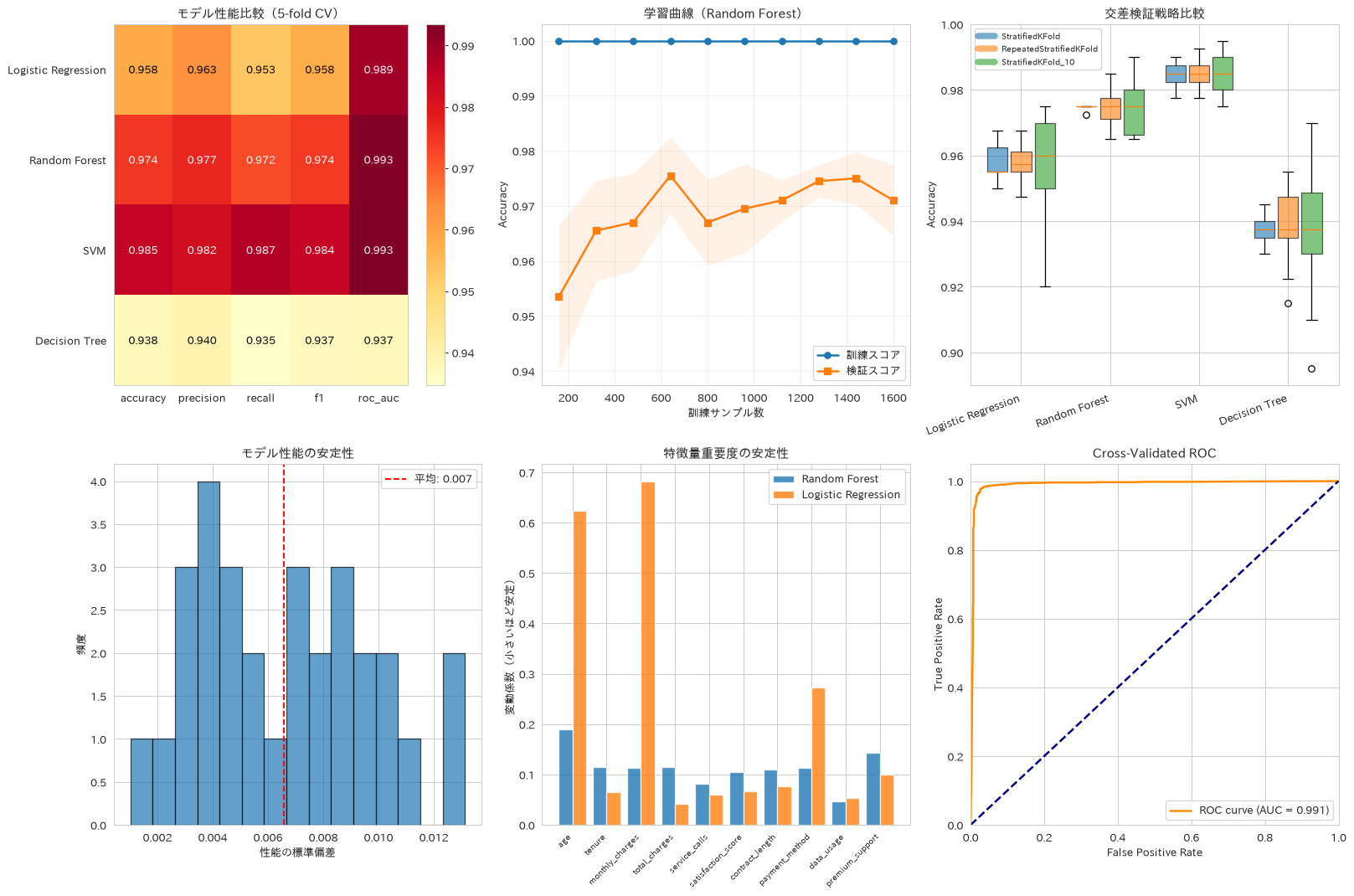
68. グリッドサーチによるハイパーパラメータ最適化
GridSearchCVとRandomizedSearchCVを比較し、計算資源と探索精度のトレードオフを踏まえたハイパーパラメータ最適化の進め方を紹介します。ここで比べているのは探索手法そのものではありません。グリッドサーチ側は計算時間の都合で候補を絞った限定グリッド、ランダムサーチ側は元の広い空間から同じ試行数だけ引く設定にしてあり、「同じ試行数の予算で、狭く総当たりするのと広く引くのとではどちらが良い解に届くか」を見ています。なお同じ試行数でも、ランダムサーチは広い空間から引くため1試行あたりの計算コストが重くなることがあります。
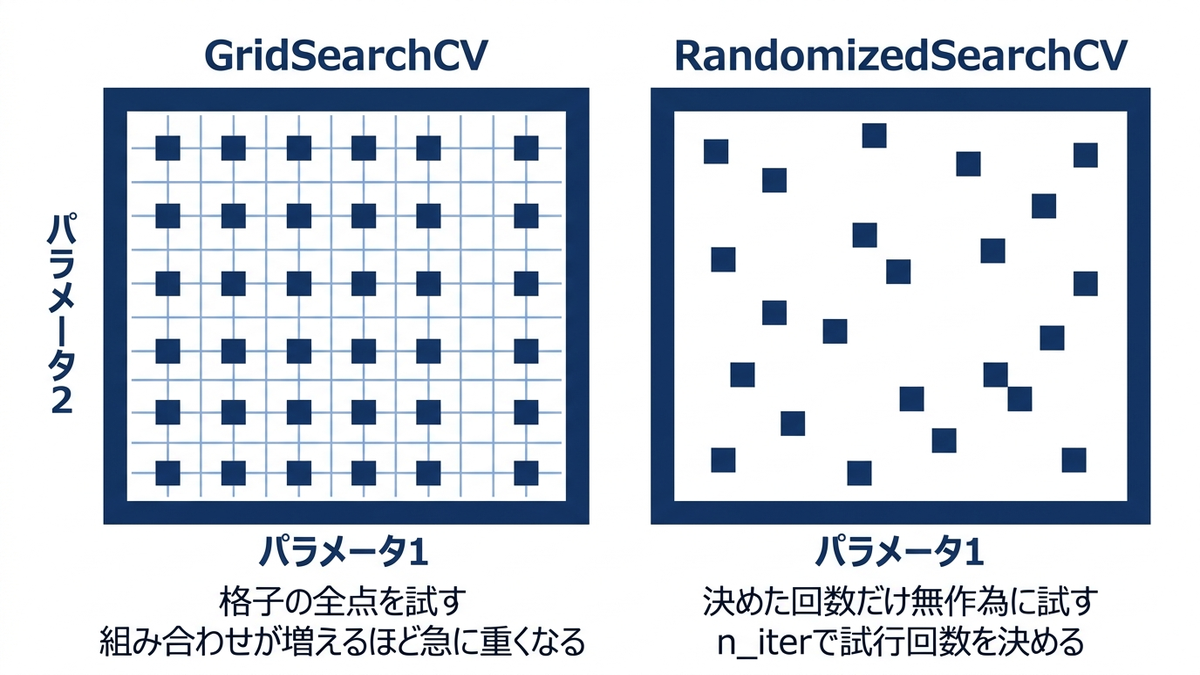
# グリッドサーチとランダムサーチの比較最適化
from sklearn.model_selection import GridSearchCV, RandomizedSearchCV
from sklearn.ensemble import GradientBoostingClassifier
import time

# 複数アルゴリズムの大規模ハイパーパラメータ探索
param_grids = {
    'RandomForest': {
        'n_estimators': [50, 100, 200],
        'max_depth': [3, 5, 10, None],
        'min_samples_split': [2, 5, 10],
        'min_samples_leaf': [1, 2, 4],
        'max_features': ['sqrt', 'log2', None]
    },
    'GradientBoosting': {
        'n_estimators': [50, 100, 200],
        'learning_rate': [0.01, 0.1, 0.2],
        'max_depth': [3, 5, 7],
        'subsample': [0.8, 0.9, 1.0]
    },
    'SVM': {
        'C': [0.1, 1, 10, 100],
        'gamma': ['scale', 'auto', 0.001, 0.01, 0.1, 1],
        'kernel': ['rbf', 'poly', 'sigmoid']
    }
}

# モデル定義
models_for_tuning = {
    'RandomForest': RandomForestClassifier(random_state=42),
    'GradientBoosting': GradientBoostingClassifier(random_state=42),
    'SVM': CalibratedClassifierCV(SVC(random_state=42), ensemble=False)
}

# グリッドサーチ vs ランダムサーチ比較
tuning_results = {}
search_methods = ['GridSearch', 'RandomSearch']

grid_sizes = {}

for model_name in ['RandomForest', 'GradientBoosting']: # SVMは計算時間の都合で除外
    tuning_results[model_name] = {}

    model = models_for_tuning[model_name]
    param_grid = param_grids[model_name]

    for search_method in search_methods:
        start_time = time.time()

        if search_method == 'GridSearch':
            # 計算時間短縮のため一部パラメータのみ
            limited_grid = {
                'n_estimators': param_grid['n_estimators'][:2],
                'max_depth': param_grid['max_depth'][:3]
            }
            if model_name == 'GradientBoosting':
                limited_grid['learning_rate'] = param_grid['learning_rate'][:2]
            else:
                limited_grid['min_samples_split'] = param_grid['min_samples_split'][:2]

            # 「同じ予算でどちらが良い解に届くか」を見たいので、
            # Gridの組み合わせ数を覚えておき、Randomの試行数をそれに合わせる
            grid_sizes[model_name] = int(np.prod([len(v) for v in limited_grid.values()]))
            search = GridSearchCV(model, limited_grid, cv=3,
                                scoring='accuracy', n_jobs=-1)
        else:
            search = RandomizedSearchCV(model, param_grid, n_iter=grid_sizes[model_name],
                                      cv=3, scoring='accuracy', n_jobs=-1, random_state=42)

        search.fit(X_train, y_train)

        end_time = time.time()

        tuning_results[model_name][search_method] = {
            'best_score': search.best_score_,
            'best_params': search.best_params_,
            'n_candidates': len(search.cv_results_['params']),
            'time': end_time - start_time,
            'search_object': search
        }

# 結果可視化
fig, axes = plt.subplots(2, 3, figsize=(18, 10))

# 1. 性能 vs 計算時間比較
model_names_tuning = list(tuning_results.keys())
methods = search_methods

# グリッドサーチ結果
grid_scores = [tuning_results[model]['GridSearch']['best_score'] for model in model_names_tuning]
grid_times = [tuning_results[model]['GridSearch']['time'] for model in model_names_tuning]

# ランダムサーチ結果
random_scores = [tuning_results[model]['RandomSearch']['best_score'] for model in model_names_tuning]
random_times = [tuning_results[model]['RandomSearch']['time'] for model in model_names_tuning]

axes[0, 0].scatter(grid_times, grid_scores, c='blue', s=100, label='Grid Search', alpha=0.7)
axes[0, 0].scatter(random_times, random_scores, c='red', s=100, label='Random Search', alpha=0.7)

# 赤い点にも名前を付ける(付けないとどちらのモデルか判別できない)
for i, model in enumerate(model_names_tuning):
    axes[0, 0].annotate(model, (grid_times[i], grid_scores[i]), xytext=(5, 6),
                       textcoords='offset points', fontsize=8, color='blue')
    axes[0, 0].annotate(model, (random_times[i], random_scores[i]), xytext=(5, -12),
                       textcoords='offset points', fontsize=8, color='red')

axes[0, 0].set_xlabel('計算時間 (秒)')
axes[0, 0].set_ylabel('最高CV score')
axes[0, 0].set_title('性能 vs 計算時間(試行数を揃えた比較)', fontweight='bold')
axes[0, 0].legend()
axes[0, 0].margins(x=0.2)
axes[0, 0].grid(True, alpha=0.3)

# 2. 最適化経過の可視化 (Random Forest)
rf_grid = tuning_results['RandomForest']['GridSearch']['search_object']
rf_random = tuning_results['RandomForest']['RandomSearch']['search_object']

# グリッドサーチ結果のヒートマップ(n_estimators vs max_depth)
grid_results = pd.DataFrame(rf_grid.cv_results_)
pivot_grid = grid_results.pivot_table(values='mean_test_score',
                                     index='param_max_depth',
                                     columns='param_n_estimators')

im1 = axes[0, 1].imshow(pivot_grid, cmap='viridis', aspect='auto')
axes[0, 1].set_xticks(range(len(pivot_grid.columns)))
axes[0, 1].set_yticks(range(len(pivot_grid.index)))
axes[0, 1].set_xticklabels(pivot_grid.columns)
axes[0, 1].set_yticklabels(pivot_grid.index)
axes[0, 1].set_xlabel('n_estimators')
axes[0, 1].set_ylabel('max_depth')
axes[0, 1].set_title('Grid Search結果 (RF)', fontweight='bold')
plt.colorbar(im1, ax=axes[0, 1])

# 3. ランダムサーチの探索分布
# max_depth は None を含むので、そのまま縦軸に渡すと型が混ざって描けない。
# 文字列に直したうえで順序を決め、目盛りの位置に置き換える
random_results = pd.DataFrame(rf_random.cv_results_)
depth_labels = [str(v) for v in random_results['param_max_depth']]
depth_order = sorted(set(depth_labels),
                     key=lambda s: (s == 'None', float(s) if s != 'None' else 0.0))
depth_pos = [depth_order.index(s) for s in depth_labels]

axes[0, 2].scatter(random_results['param_n_estimators'].astype(float),
                  depth_pos,
                  c=random_results['mean_test_score'],
                  cmap='viridis', s=100, alpha=0.7)
axes[0, 2].set_yticks(range(len(depth_order)))
axes[0, 2].set_yticklabels(depth_order)
axes[0, 2].set_xlabel('n_estimators')
axes[0, 2].set_ylabel('max_depth')
axes[0, 2].set_title('Random Search探索点 (RF)', fontweight='bold')

# 4. 学習曲線(最適パラメータ)
# 以降のレシピで使うモデルは、2つの探索のうちスコアが高かった方を採用する
best_search_method = max(search_methods,
                         key=lambda m: tuning_results['RandomForest'][m]['best_score'])
best_rf = tuning_results['RandomForest'][best_search_method]['search_object'].best_estimator_
train_sizes_opt, train_scores_opt, val_scores_opt = learning_curve(
    best_rf, X_train, y_train, cv=3,
    train_sizes=np.linspace(0.1, 1.0, 8), scoring='accuracy'
)

axes[1, 0].plot(train_sizes_opt, np.mean(train_scores_opt, axis=1), 'o-',
               label='訓練スコア', linewidth=2)
axes[1, 0].plot(train_sizes_opt, np.mean(val_scores_opt, axis=1), 's-',
               label='検証スコア', linewidth=2)
axes[1, 0].fill_between(train_sizes_opt,
                       np.mean(train_scores_opt, axis=1) - np.std(train_scores_opt, axis=1),
                       np.mean(train_scores_opt, axis=1) + np.std(train_scores_opt, axis=1),
                       alpha=0.1)
axes[1, 0].set_xlabel('訓練サンプル数')
axes[1, 0].set_ylabel('Accuracy')
axes[1, 0].set_title('最適化後学習曲線', fontweight='bold')
axes[1, 0].legend()
axes[1, 0].grid(True, alpha=0.3)

# 5. 特徴量重要度(最適モデル)
feature_importance = best_rf.feature_importances_
importance_df = pd.DataFrame({
    'feature': X_train.columns,
    'importance': feature_importance
}).sort_values('importance', ascending=False).head(10)

axes[1, 1].barh(importance_df['feature'], importance_df['importance'])
axes[1, 1].set_title('最適化後特徴量重要度', fontweight='bold')
axes[1, 1].set_xlabel('重要度')

# 6. ROC比較(既定設定 vs 調整後。参考として極端に浅いモデルも並べる)
# 評価は必ずチューニングに使っていない X_test で行う。
# データ全体で測ると、探索に使った訓練データが評価側に混ざる。
# 比較相手は「何も調整していない既定設定」に取る。意図的に弱いモデルと比べると、
# 調整の効果を実際より大きく見せてしまう
default_rf = RandomForestClassifier(random_state=42)
default_rf.fit(X_train, y_train)

shallow_rf = RandomForestClassifier(max_depth=2, random_state=42)
shallow_rf.fit(X_train, y_train)

proba_default = default_rf.predict_proba(X_test)[:, 1]
proba_shallow = shallow_rf.predict_proba(X_test)[:, 1]
proba_optimized = best_rf.predict_proba(X_test)[:, 1]

fpr_default, tpr_default, _ = roc_curve(y_test, proba_default)
fpr_shallow, tpr_shallow, _ = roc_curve(y_test, proba_shallow)
fpr_optimized, tpr_optimized, _ = roc_curve(y_test, proba_optimized)

auc_default = auc(fpr_default, tpr_default)
auc_shallow = auc(fpr_shallow, tpr_shallow)
auc_optimized = auc(fpr_optimized, tpr_optimized)

axes[1, 2].plot(fpr_shallow, tpr_shallow, linestyle=':', linewidth=2, alpha=0.7,
                label=f'極端に浅い max_depth=2 (AUC={auc_shallow:.3f})')
axes[1, 2].plot(fpr_default, tpr_default, linestyle='--', linewidth=3, alpha=0.7,
                label=f'既定設定 (AUC={auc_default:.3f})')
axes[1, 2].plot(fpr_optimized, tpr_optimized, linewidth=2,
                label=f'調整後 (AUC={auc_optimized:.3f})')
axes[1, 2].plot([0, 1], [0, 1], 'k--', alpha=0.5)
axes[1, 2].set_xlabel('False Positive Rate')
axes[1, 2].set_ylabel('True Positive Rate')
axes[1, 2].set_title('既定設定と調整後の比較(テストデータ)', fontweight='bold')
axes[1, 2].legend(fontsize=8)

plt.tight_layout()
plt.show()

# 結果サマリー
print("ハイパーパラメータ最適化結果")
print("=" * 60)

for model_name in model_names_tuning:
    print(f"\n{model_name}:")
    for method in search_methods:
        result = tuning_results[model_name][method]
        print(f"{method}:")
        print(f"試行数: {result['n_candidates']}")
        print(f"最高スコア: {result['best_score']:.3f}")
        print(f"計算時間: {result['time']:.1f}秒")
        print(f"最適パラメータ: {result['best_params']}")

print(f"\n以降のレシピで使うモデル: {best_search_method} の最良モデル")
print(f"\n調整の効果(テストデータのAUC):")
print(f"既定設定: {auc_default:.3f}")
print(f"調整後: {auc_optimized:.3f}")
print(f"差: {auc_optimized - auc_default:+.3f}")
print(f"(参考)極端に浅い max_depth=2: {auc_shallow:.3f}")
print("このデータでは、調整後のモデルは既定設定を上回らなかった。"
      "調整に意味があったかどうかは、弱いモデルではなく既定設定と比べて初めて分かる")
print("\n試行数を揃えると、Randomは広い空間から引くぶん1試行あたりが重くなることがある。"
      "探索空間の広さと1試行のコストは別々に効くので、計算時間だけで優劣は決まらない")
ハイパーパラメータ最適化結果
============================================================

RandomForest:
GridSearch:
試行数: 12
最高スコア: 0.974
計算時間: 2.2秒
最適パラメータ: {'max_depth': 10, 'min_samples_split': 5, 'n_estimators': 100}
RandomSearch:
試行数: 12
最高スコア: 0.973
計算時間: 4.5秒
最適パラメータ: {'n_estimators': 200, 'min_samples_split': 2, 'min_samples_leaf': 1, 'max_features': 'sqrt', 'max_depth': 10}

GradientBoosting:
GridSearch:
試行数: 12
最高スコア: 0.971
計算時間: 5.3秒
最適パラメータ: {'learning_rate': 0.1, 'max_depth': 5, 'n_estimators': 100}
RandomSearch:
試行数: 12
最高スコア: 0.974
計算時間: 6.0秒
最適パラメータ: {'subsample': 0.9, 'n_estimators': 200, 'max_depth': 5, 'learning_rate': 0.2}

以降のレシピで使うモデル: GridSearch の最良モデル

調整の効果(テストデータのAUC):
既定設定: 0.990
調整後: 0.989
差: -0.001
(参考)極端に浅い max_depth=2: 0.968
このデータでは、調整後のモデルは既定設定を上回らなかった。調整に意味があったかどうかは、弱いモデルではなく既定設定と比べて初めて分かる

試行数を揃えると、Randomは広い空間から引くぶん1試行あたりが重くなることがある。探索空間の広さと1試行のコストは別々に効くので、計算時間だけで優劣は決まらない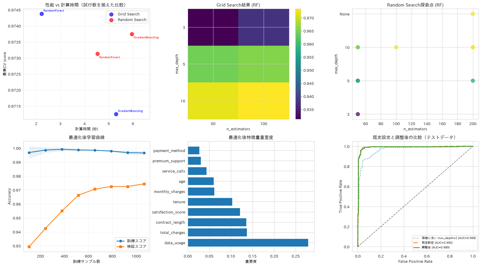
この章を深めたい方への参考書籍
- 高柳慎一・長田怜士『評価指標入門』(技術評論社):回帰・二値分類・多クラス分類の評価指標を、それぞれが何を測っているかとKPIとの対応から解説します。本章の交差検証で何をスコアに置くべきかを、事業側の目的から決められるようになります。
- 門脇大輔・阪田隆司・保坂桂佑・平松雄司『Kaggleで勝つデータ分析の技術』(技術評論社):第6章「モデルのチューニング」で、探索範囲の決め方や優先して動かすパラメータの順序が整理されています。本章のグリッドサーチを、計算資源の制約のなかで効率よく回す指針になります。
実務でよく使う周辺テクニック集
ここからは、実務で頻出する周辺テクニックを短い実装例でまとめて紹介します。ここまでの第2部は前処理から分類・回帰・クラスタリング・次元削減・モデル評価へと、機械学習の工程と手法の系統に沿って章を分けてきましたが、この章と次の章は区切り方が変わり、手法の系統ではなく実務で出会う場面ごとにレシピを並べます。勾配ブースティング、パイプライン化、不均衡データへの対処、モデルの保存、異常検知、時系列の交差検証、確率の校正と、手法としては互いに離れていますが、いずれも学習が一通り済んだあとで詰まりやすい箇所です。
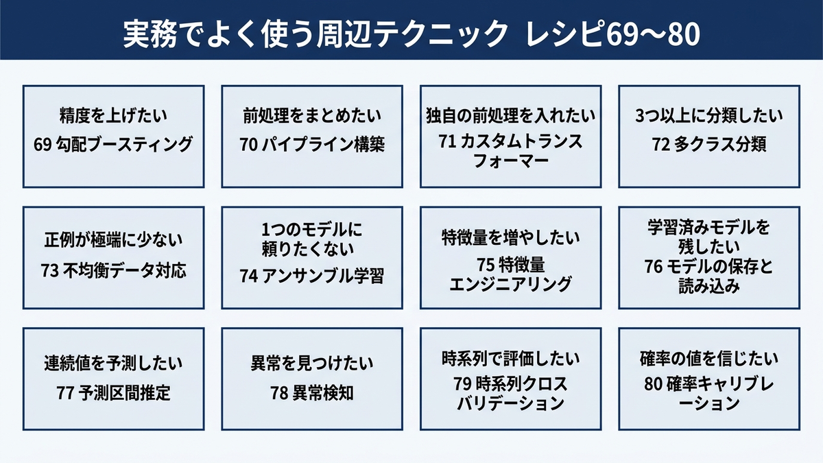
69. 勾配ブースティング分類器
GradientBoostingClassifierとAdaBoostClassifierを比較し、浅い決定木(弱学習器)を逐次的に積み上げて前の木の誤りを補正していく、ブースティングの仕組みを確認します。ここでの2つの精度は、レシピ56のロジスティック回帰(0.965)やレシピ59のSVM(0.980)を上回るものではありません。手法の優劣はデータ次第で入れ替わるため、必ず同じテストデータで並べて確かめます。
# 勾配ブースティング分類器による逐次的な学習
from sklearn.ensemble import GradientBoostingClassifier, AdaBoostClassifier
from sklearn.tree import DecisionTreeClassifier

# Gradient Boosting実装
gb_model = GradientBoostingClassifier(
    n_estimators=100, learning_rate=0.1, max_depth=3, random_state=42
)
gb_model.fit(X_train, y_train)
gb_pred = gb_model.predict(X_test)
gb_accuracy = accuracy_score(y_test, gb_pred)

# AdaBoost実装(比較用)
# learning_rate は既定の1.0にする。0.1に下げると100本では学習が足りない
ada_model = AdaBoostClassifier(
    estimator=DecisionTreeClassifier(max_depth=1),
    n_estimators=100, learning_rate=1.0, random_state=42
)
ada_model.fit(X_train, y_train)
ada_pred = ada_model.predict(X_test)
ada_accuracy = accuracy_score(y_test, ada_pred)

print(f"Gradient Boosting精度: {gb_accuracy:.3f}")
print(f"AdaBoost精度: {ada_accuracy:.3f}")
Gradient Boosting精度: 0.953
AdaBoost精度: 0.943
70. パイプライン構築
スケーリング・次元削減・分類器を1本のPipelineにまとめ、前処理の再現性とモデル管理を効率化する実装パターンを紹介します。
# 前処理から予測までの自動化パイプライン構築
from sklearn.pipeline import Pipeline
pipe = Pipeline([
    ('scaler', StandardScaler()),
    ('pca', PCA(n_components=5)),
    ('classifier', RandomForestClassifier(random_state=42))
])
pipe.fit(X_train, y_train)
pipe_accuracy = pipe.score(X_test, y_test)
print(f"パイプライン精度: {pipe_accuracy:.3f}")
71. カスタムトランスフォーマー
BaseEstimatorとTransformerMixinを継承した独自の前処理クラスを作成し、ドメイン知識を活かした特化型の前処理をパイプラインに組み込む方法を示します。ここで注意したいのは、Pipelineの中に置く変換器は行数を変えてはいけないという点です。行を削るとXだけが短くなり、yと長さが合わずに学習が失敗します。外れ値は削るのではなく、訓練データから決めた上下限に丸めます。もう1つの注意点は、基準となる統計量をfitで学習しておくことです。transformのたびに渡されたデータの平均と標準偏差を計算すると、訓練時と推論時で基準がずれます。
# ビジネス要件に特化したカスタム変換器作成
from sklearn.base import BaseEstimator, TransformerMixin
from sklearn.pipeline import Pipeline

class OutlierClipper(BaseEstimator, TransformerMixin):
    """外れ値を除去せず、訓練データで決めた上下限に丸める変換器。

    行数が変わらないのでPipelineに組み込める。
    """
    def __init__(self, threshold=2.5):
        self.threshold = threshold

    def fit(self, X, y=None):
        # 基準は訓練データから学習して保持する
        X = np.asarray(X, dtype=float)
        self.mean_ = X.mean(axis=0)
        self.std_ = X.std(axis=0)
        self.lower_ = self.mean_ - self.threshold * self.std_
        self.upper_ = self.mean_ + self.threshold * self.std_
        return self

    def transform(self, X):
        return np.clip(np.asarray(X, dtype=float), self.lower_, self.upper_)

# パイプラインに組み込んで学習・評価する
clip_pipeline = Pipeline([
    ('clip', OutlierClipper(threshold=2.5)),
    ('scaler', StandardScaler()),
    ('clf', LogisticRegression(max_iter=1000, random_state=42))
])
plain_pipeline = Pipeline([
    ('scaler', StandardScaler()),
    ('clf', LogisticRegression(max_iter=1000, random_state=42))
])

clip_pipeline.fit(X_train, y_train)
plain_pipeline.fit(X_train, y_train)

clipped = clip_pipeline.named_steps['clip'].transform(X_train)
n_clipped = int((np.asarray(X_train, dtype=float) != clipped).sum())

print(f"クリップされた値: {n_clipped} / {X_train.size}(行数は {len(X_train)} 件のまま)")
print(f"クリップなし テスト精度: {plain_pipeline.score(X_test, y_test):.3f}")
print(f"クリップあり テスト精度: {clip_pipeline.score(X_test, y_test):.3f}")
print("この題材では精度は動かない。狙いは、行数を変えない実装にしたことで"
      "Pipelineの中に置け、推論時も訓練時と同じ基準でクリップされるようにすること")
クリップされた値: 172 / 16000(行数は 1600 件のまま)
クリップなし テスト精度: 0.963
クリップあり テスト精度: 0.963
この題材では精度は動かない。狙いは、行数を変えない実装にしたことでPipelineの中に置け、推論時も訓練時と同じ基準でクリップされるようにすること
72. 多クラス分類
3クラス以上のカテゴリ予測にランダムフォレストを適用し、顧客セグメントや製品カテゴリの分類など多様な用途への応用を確認します。
# 多クラス分類による複雑なカテゴリ予測
from sklearn.datasets import make_classification
from sklearn.metrics import classification_report

# n_classes を増やすときは n_informative も一緒に増やす。
# make_classification は n_classes * n_clusters_per_class <= 2 ** n_informative
# を満たさないとエラーになる(n_informative の既定値は2)
X_multi, y_multi = make_classification(n_samples=1000, n_classes=4, n_features=10,
                                       n_informative=6, n_clusters_per_class=1,
                                       random_state=42)

# 学習に使ったデータで測ると必ず高く出るので、分けてから評価する
Xm_train, Xm_test, ym_train, ym_test = train_test_split(
    X_multi, y_multi, test_size=0.2, random_state=42, stratify=y_multi)

multi_classifier = RandomForestClassifier(random_state=42)
multi_classifier.fit(Xm_train, ym_train)
multi_accuracy = multi_classifier.score(Xm_test, ym_test)

print(f"多クラス分類精度(テストデータ): {multi_accuracy:.3f}")
print(f"参考: 学習データでの精度: {multi_classifier.score(Xm_train, ym_train):.3f}")
print(f"クラス数: {len(np.unique(y_multi))}")
print(classification_report(ym_test, multi_classifier.predict(Xm_test), digits=3))
多クラス分類精度(テストデータ): 0.920
参考: 学習データでの精度: 1.000
クラス数: 4
              precision    recall  f1-score   support

           0      0.870     0.940     0.904        50
           1      0.941     0.960     0.950        50
           2      0.939     0.920     0.929        50
           3      0.935     0.860     0.896        50

    accuracy                          0.920       200
   macro avg      0.921     0.920     0.920       200
weighted avg      0.921     0.920     0.920       200
73. 不均衡データ対応
compute_class_weightとclass_weight=’balanced’を用い、離脱や不正といった発生頻度の低い事象の検出精度を高める方法を扱います。ここまで使ってきた顧客離脱データは正例が約50%で均衡しているため、このレシピでは正例5%の不均衡データをあらためて作ります。不均衡データで正解率を見てはいけません。全件を多数派と予測するだけで95%に達してしまい、指標として機能しないためです。稀な事象を取りこぼさずに捕まえられたかは、再現率・F1・PR-AUCで測ります。PR-AUCは適合率と再現率の曲線の下側の面積で、少数派を正例としたときに、拾い上げた件数とその当たりの精度をどこまで両立できたかを表します。レシピ56で描いたROC曲線の下側面積(ROC-AUC)ではなくこちらを併記するのは、負例が圧倒的に多いと偽陽性率の分母が大きくなり、少数派をほとんど取りこぼしていてもROC-AUCが高いままになりやすいためです。このデータでも、class_weight=’balanced’を指定すると再現率は0.762から0.857へ上がりました。
# クラス不均衡問題の解決手法
from sklearn.utils.class_weight import compute_class_weight
from sklearn.metrics import recall_score, f1_score, average_precision_score

# 正例5%の不均衡データを作る
X_imb, y_imb = make_classification(n_samples=2000, n_features=10, n_informative=8,
                                   n_redundant=2, weights=[0.95, 0.05],
                                   n_clusters_per_class=1, random_state=42)
Xi_train, Xi_test, yi_train, yi_test = train_test_split(
    X_imb, y_imb, test_size=0.2, random_state=42, stratify=y_imb)

class_weights = compute_class_weight('balanced', classes=np.unique(yi_train), y=yi_train)
print(f"訓練データの正例割合: {yi_train.mean():.1%}")
print(f"クラス重み: {dict(zip(np.unique(yi_train), np.round(class_weights, 3)))}")

for label, weight in [('重み無し  ', None), ('balanced', 'balanced')]:
    model = RandomForestClassifier(class_weight=weight, random_state=42)
    model.fit(Xi_train, yi_train)
    pred = model.predict(Xi_test)
    proba = model.predict_proba(Xi_test)[:, 1]
    print(f"{label}: 正解率 {model.score(Xi_test, yi_test):.3f} / "
          f"再現率 {recall_score(yi_test, pred):.3f} / "
          f"F1 {f1_score(yi_test, pred):.3f} / "
          f"PR-AUC {average_precision_score(yi_test, proba):.3f}")
訓練データの正例割合: 5.2%
クラス重み: {np.int64(0): np.float64(0.528), np.int64(1): np.float64(9.524)}
重み無し  : 正解率 0.988 / 再現率 0.762 / F1 0.865 / PR-AUC 0.989
balanced: 正解率 0.993 / 再現率 0.857 / F1 0.923 / PR-AUC 0.994
74. アンサンブル学習
VotingClassifierでロジスティック回帰・ランダムフォレスト・SVMを組み合わせ、異なるアルゴリズムの強みを活かしてリスクを分散する方法を紹介します。
# 複数モデルの多数決で、単一モデルの当たり外れを平準化する
from sklearn.ensemble import VotingClassifier
from sklearn.pipeline import Pipeline

# SVMとロジスティック回帰はスケーリングが要るので、各推定器をPipelineで包む。
# 生の特徴量をそのまま渡すと、記事の他のレシピと条件がそろわない
ensemble = VotingClassifier([
    ('lr', Pipeline([('sc', StandardScaler()),
                     ('m', LogisticRegression(max_iter=1000, random_state=42))])),
    ('rf', RandomForestClassifier(random_state=42)),
    ('svm', Pipeline([('sc', StandardScaler()),
                      ('m', CalibratedClassifierCV(SVC(random_state=42), ensemble=False))]))
], voting='soft')
ensemble.fit(X_train, y_train)
ensemble_accuracy = ensemble.score(X_test, y_test)

print(f"アンサンブル精度: {ensemble_accuracy:.3f}")
for name, estimator in ensemble.named_estimators_.items():
    print(f"  単体 {name}: {estimator.score(X_test, y_test):.3f}")
print("最良の単体モデルを常に上回るわけではない。"
      "アンサンブルの狙いは、どのモデルが当たるか事前に分からないときに"
      "外れたときの落ち込みを小さくすることにある")
アンサンブル精度: 0.978
  単体 lr: 0.963
  単体 rf: 0.963
  単体 svm: 0.980
最良の単体モデルを常に上回るわけではない。アンサンブルの狙いは、どのモデルが当たるか事前に分からないときに外れたときの落ち込みを小さくすることにある
75. 特徴量エンジニアリング
PolynomialFeaturesのinteraction_only=Trueで、変数どうしの掛け合わせ(交互作用)だけを生成します。この設定では2乗項が作られないため、出力されるのは定数項1つと元の10項、2変数の積45項の合計56項になります。特徴量を増やせば必ず精度が上がるわけではないので、生成の前後で交差検証のスコアを並べて確かめます。
# 交互作用特徴量の生成と、その効果の確認
from sklearn.preprocessing import PolynomialFeatures
poly_features = PolynomialFeatures(degree=2, interaction_only=True)
X_poly_features = poly_features.fit_transform(X_train)
print(f"特徴量エンジニアリング: {X_train.shape[1]} → {X_poly_features.shape[1]} 特徴量")
print("(内訳は 定数項1 + 元の10項 + 2変数の積45項。2乗項は作られない)")

# 増やした結果、精度が上がったかどうかは必ず測る
base_cv = cross_val_score(RandomForestClassifier(random_state=42), X_train, y_train, cv=5)
poly_cv = cross_val_score(RandomForestClassifier(random_state=42), X_poly_features, y_train, cv=5)
print(f"交差検証スコア 元の10特徴量: {base_cv.mean():.3f} ± {base_cv.std():.3f}")
print(f"交差検証スコア 交互作用あり: {poly_cv.mean():.3f} ± {poly_cv.std():.3f}")
特徴量エンジニアリング: 10 → 56 特徴量
(内訳は 定数項1 + 元の10項 + 2変数の積45項。2乗項は作られない)
交差検証スコア 元の10特徴量: 0.973 ± 0.002
交差検証スコア 交互作用あり: 0.978 ± 0.005
76. モデル保存・読み込み
joblibを用いた学習済みモデルの保存と読み込みを扱い、モデルのバージョン管理やデプロイメント自動化の基盤となる考え方を紹介します。joblib.loadはpickleと同じ仕組みで復元するため、読み込むだけでファイルの中のコードが動きます。出所の分からない.pklは読み込まず、自分たちで作ったファイルだけを扱う運用にしてください。
# プロダクション環境でのモデル永続化
import joblib
joblib.dump(best_rf, 'best_model.pkl')
loaded_model = joblib.load('best_model.pkl')
print("モデル保存・読み込み完了")
77. 予測区間推定
RandomForestRegressorの各決定木の予測がどれだけばらつくかを見て、点予測に不確実性の目安を添える方法です。学習済みの森から木ごとの予測を集めるだけなので、再学習は要りません。ただし、木ごとの予測の分位点は校正された予測分布ではないため、「5〜95パーセンタイルの幅」が名目どおり90%を覆う保証はありません。実際に覆えているかは下のコードのように必ず実測で確かめ、被覆を保証したい場合はConformal Prediction(手元の予測誤差の分布から、指定した確率で真の値を含むように区間の幅を決める手法)やQuantile Regression Forest(森の葉に集まった実測値から、上側と下側の分位点を直接推定する手法)など、被覆を設計に組み込んだ手法を使います。
# 回帰予測の不確実性定量化
from sklearn.ensemble import RandomForestRegressor
quantile_rf = RandomForestRegressor(n_estimators=100, random_state=42)
quantile_rf.fit(X_train_sales, y_train_sales)
predictions = quantile_rf.predict(X_test_sales)
regression_r2 = quantile_rf.score(X_test_sales, y_test_sales)
print(f"回帰予測精度 R²: {regression_r2:.3f}")

# 各決定木の予測を集めると、再学習なしでばらつきの目安が作れる
tree_predictions = np.stack([tree.predict(X_test_sales)
                             for tree in quantile_rf.estimators_])
lower_bound, upper_bound = np.percentile(tree_predictions, [5, 95], axis=0)
covered = ((y_test_sales >= lower_bound) & (y_test_sales <= upper_bound)).mean()

print(f"木ごとの予測の5〜95パーセンタイル幅の平均: {(upper_bound - lower_bound).mean():,.0f}")
print(f"実測値がその幅に入った割合: {covered:.1%}(名目90%を保証するものではない)")
print(f"幅が最も狭いサンプル: {(upper_bound - lower_bound).min():,.0f}")
print(f"幅が最も広いサンプル: {(upper_bound - lower_bound).max():,.0f}")
回帰予測精度 R²: 0.797
木ごとの予測の5〜95パーセンタイル幅の平均: 3,237,162
実測値がその幅に入った割合: 92.0%(名目90%を保証するものではない)
幅が最も狭いサンプル: 1,724,820
幅が最も広いサンプル: 6,736,358
78. 異常検知
IsolationForestによる教師なし異常検知を扱い、不正取引や設備故障といった異常の早期発見に活用する方法を紹介します。ここで注意したいのは、contaminationが「異常の割合の検出結果」ではなく「スコアの下位何割を異常とみなすか」という閾値の指定である点です。contaminationに0.1を渡せば、異常が1件も無いデータでも必ず10%が異常と判定されます。効果を確かめるには、異常が分かっているデータで、そのうち何件を捕まえられたかを測る必要があります。
# 教師なし異常検知による外れ値特定
from sklearn.ensemble import IsolationForest

# 検証のため、正常データに明らかな異常を20件混ぜる
rng = np.random.RandomState(0)
X_outliers = rng.uniform(-8, 8, size=(20, X_cluster_scaled.shape[1]))
X_mixed = np.vstack([X_cluster_scaled, X_outliers])
is_true_anomaly = np.zeros(len(X_mixed), dtype=bool)
is_true_anomaly[-20:] = True

iso_forest = IsolationForest(contamination=0.02, random_state=42)
anomalies = iso_forest.fit_predict(X_mixed)
flagged = anomalies == -1

print(f"データ件数: {len(X_mixed)}(うち仕込んだ異常 {is_true_anomaly.sum()}件)")
print(f"異常と判定された件数: {flagged.sum()}件")
print(f"再現率(仕込んだ異常を捕まえた割合): {(flagged & is_true_anomaly).sum() / is_true_anomaly.sum():.1%}")
print(f"適合率(判定のうち本当に異常だった割合): {(flagged & is_true_anomaly).sum() / flagged.sum():.1%}")

# contamination は閾値であって検出結果ではない
for c in [0.05, 0.1, 0.2]:
    rate = (IsolationForest(contamination=c, random_state=42)
            .fit_predict(X_cluster_scaled) == -1).mean()
    print(f"  contamination={c} を正常データだけに当てると異常率 {rate:.1%}")
データ件数: 1020(うち仕込んだ異常 20件)
異常と判定された件数: 21件
再現率(仕込んだ異常を捕まえた割合): 100.0%
適合率(判定のうち本当に異常だった割合): 95.2%
  contamination=0.05 を正常データだけに当てると異常率 5.0%
  contamination=0.1 を正常データだけに当てると異常率 10.0%
  contamination=0.2 を正常データだけに当てると異常率 20.0%
79. 時系列クロスバリデーション
TimeSeriesSplitを用いた交差検証により、時間的な依存関係があるデータで未来の情報が混入しない正しい性能評価を行う方法を扱います。差が出る題材が必要なので、ここではトレンドと季節性を持つ系列を作り、過去の値(ラグ)から次の値を当てる問題にします。時点をシャッフルする通常のKFoldは、未来を見てから過去を当てる形になるため、実力より高いスコアを返します。
# 時間依存データの適切な評価手法
from sklearn.model_selection import TimeSeriesSplit, KFold

# トレンド+季節性+ノイズの系列を作り、過去の値から次の値を予測する形にする
rng_ts = np.random.RandomState(42)
n_periods = 1000
t_index = np.arange(n_periods)
series = (50 + 0.05 * t_index + 8 * np.sin(2 * np.pi * t_index / 30)
          + rng_ts.normal(0, 2, n_periods))

df_ts_lag = pd.DataFrame({'y': series})
for lag in [1, 2, 3, 7, 14]:
    df_ts_lag[f'lag_{lag}'] = df_ts_lag['y'].shift(lag)
df_ts_lag = df_ts_lag.dropna().reset_index(drop=True)

X_ts_lag = df_ts_lag.drop(columns='y')
y_ts_lag = df_ts_lag['y']

ts_model = RandomForestRegressor(n_estimators=100, random_state=42)
kf_scores = cross_val_score(ts_model, X_ts_lag, y_ts_lag, scoring='r2',
                            cv=KFold(n_splits=5, shuffle=True, random_state=42))
ts_cv = TimeSeriesSplit(n_splits=5)
ts_scores = cross_val_score(ts_model, X_ts_lag, y_ts_lag, cv=ts_cv, scoring='r2')

print(f"KFold(時点をシャッフル): {kf_scores.mean():.3f} ± {kf_scores.std():.3f}")
print(f"時系列CV平均スコア: {ts_scores.mean():.3f} ± {ts_scores.std():.3f}")
print("シャッフルすると前後の時点が訓練側に入り、実力より高いスコアが出る")
KFold(時点をシャッフル): 0.963 ± 0.005
時系列CV平均スコア: 0.423 ± 0.088
シャッフルすると前後の時点が訓練側に入り、実力より高いスコアが出る
80. 確率キャリブレーション
CalibratedClassifierCVで予測確率の信頼性を高め、リスク管理など確率の解釈が重要な場面での活用方法を紹介します。キャリブレーションの良し悪しは、予測確率の範囲の広さではなく、ブライアスコア(予測確率と実際の結果の二乗誤差の平均。小さいほど良い)や信頼性曲線で測ります。ここでは補正の前後で両方を比べます。
# 予測確率の信頼性向上
from sklearn.calibration import CalibratedClassifierCV, calibration_curve
from sklearn.metrics import brier_score_loss

base_rf = RandomForestClassifier(random_state=42).fit(X_train, y_train)
base_proba = base_rf.predict_proba(X_test)[:, 1]

calibrated = CalibratedClassifierCV(RandomForestClassifier(random_state=42), cv=3)
calibrated.fit(X_train, y_train)
calibrated_proba = calibrated.predict_proba(X_test)[:, 1]

print(f"ブライアスコア 補正前: {brier_score_loss(y_test, base_proba):.4f}")
print(f"ブライアスコア 補正後: {brier_score_loss(y_test, calibrated_proba):.4f}")

# 信頼性曲線(対角線に近いほど、予測確率が実際の発生率と一致している)
plt.figure(figsize=(7, 6))
for proba, label in [(base_proba, '補正前'), (calibrated_proba, '補正後')]:
    true_rate, pred_rate = calibration_curve(y_test, proba, n_bins=10, strategy='quantile')
    plt.plot(pred_rate, true_rate, 'o-', label=label)
plt.plot([0, 1], [0, 1], 'k--', linewidth=1, label='理想(完全に一致)')
plt.xlabel('予測した確率')
plt.ylabel('実際に起きた割合')
plt.title('信頼性曲線')
plt.legend(loc='upper left')
plt.grid(True, alpha=0.3)
plt.show()
ブライアスコア 補正前: 0.0299
ブライアスコア 補正後: 0.0278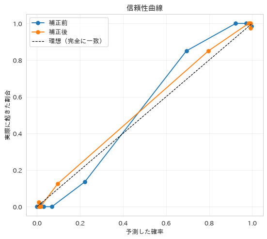
この章を深めたい方への参考書籍
- 門脇大輔・阪田隆司・保坂桂佑・平松雄司『Kaggleで勝つデータ分析の技術』(技術評論社):第4章「モデルの作成」と第7章「アンサンブル」で、勾配ブースティングと組み合わせ手法が詳しく扱われます。本章で短くまとめた手法それぞれの実務的な使いどころを掘り下げられます。
- 有賀康顕・中山心太・西林孝『仕事ではじめる機械学習 第2版』(オライリー・ジャパン):モデルを作った後に必要になる保存・配信・検証の判断を扱います。本章のパイプライン化やモデル保存が、なぜ運用の前提になるのかが理解できます。
高度な機械学習テクニック
続いて、より高度な分析・学習手法を扱います。この章も前の章と同じく、手法の系統ではなく場面で区切っています。パラメータの効き方を確かめる、外れ値やラベル不足といった扱いにくいデータのほうに手法を合わせる、モデルが何を根拠に予測しているかを取り出すというように、モデルの性質を見極めるための技術が並びます。
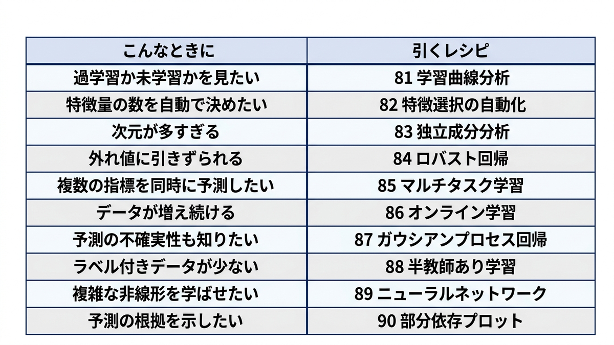
81. 検証曲線によるパラメータ影響分析
validation_curveでハイパーパラメータの影響を可視化し、訓練スコアと検証スコアの開き方からモデルの過学習・未学習を判断する方法を紹介します。パラメータCを大きくしていくと訓練スコアだけが1.0に張り付き、検証スコアが伸び止まって差が開き始めます。その点が過学習の入口です。横軸に訓練データ量を取る学習曲線とは別の図なので、区別して使います。
# 検証曲線による最適パラメータ探索
from sklearn.model_selection import validation_curve

param_range = np.logspace(-3, 2, 6)
train_scores, test_scores = validation_curve(
    SVC(), X_train_scaled, y_train,
    param_name='C', param_range=param_range,
    cv=3, scoring='accuracy', n_jobs=-1)

# 結果可視化
# 全体図だけだと C=0.001 の落ち込みで縦軸が広がり、
# 本題である訓練スコアと検証スコアの開きがつぶれて見えない。右に拡大図を並べる
train_mean = np.mean(train_scores, axis=1)
test_mean = np.mean(test_scores, axis=1)

fig, vc_axes = plt.subplots(1, 2, figsize=(14, 5))
for ax, start in [(vc_axes[0], 0), (vc_axes[1], 1)]:
    ax.plot(param_range[start:], train_mean[start:], 'o-', label='訓練スコア', linewidth=2)
    ax.plot(param_range[start:], test_mean[start:], 's-', label='検証スコア', linewidth=2)
    ax.set_xscale('log')
    ax.set_xlabel('パラメータ C')
    ax.set_ylabel('Accuracy')
    ax.legend()
    ax.grid(True, alpha=0.3)

vc_axes[0].set_title('検証曲線分析(全体)', fontweight='bold')
vc_axes[1].set_title('検証曲線分析(C=0.01以上の拡大。2本の開きが過学習の目安)',
                     fontweight='bold')

plt.tight_layout()
plt.show()

print("検証曲線分析完了")
for c, tr, te in zip(param_range, np.mean(train_scores, axis=1), np.mean(test_scores, axis=1)):
    print(f"C={c:>8.3f}  訓練 {tr:.3f} / 検証 {te:.3f}  開き {tr - te:+.3f}")
検証曲線分析完了
C=   0.001  訓練 0.503 / 検証 0.503  開き -0.000
C=   0.010  訓練 0.950 / 検証 0.946  開き +0.004
C=   0.100  訓練 0.978 / 検証 0.977  開き +0.001
C=   1.000  訓練 0.989 / 検証 0.984  開き +0.005
C=  10.000  訓練 0.992 / 検証 0.986  開き +0.006
C= 100.000  訓練 0.998 / 検証 0.974  開き +0.025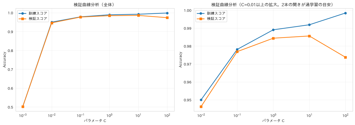
82. 特徴選択の自動化
RFECV(交差検証付き再帰的特徴量削減)により最適な特徴量数を自動的に決定する方法を扱います。特徴量を減らせば必ず汎化性能が上がるわけではないので、全特徴量を使った場合とテストスコアを並べて確かめます。
# 再帰的特徴除去による自動特徴選択
from sklearn.feature_selection import RFECV

selector = RFECV(RandomForestClassifier(random_state=42),
                 step=1, cv=3, scoring='accuracy')
selector.fit(X_train, y_train)

optimal_features = selector.n_features_
selected_features = X_train.columns[selector.support_]

# 特徴量削減効果の可視化
plt.figure(figsize=(12, 5))

# サブプロット1: 特徴量数 vs スコア
plt.subplot(1, 2, 1)
plt.plot(range(1, len(selector.cv_results_['mean_test_score']) + 1),
         selector.cv_results_['mean_test_score'], 'o-', linewidth=2)
plt.axvline(x=optimal_features, color='red', linestyle='--',
           label=f'最適数: {optimal_features}')
plt.xlabel('特徴量数')
plt.ylabel('交差検証スコア')
plt.title('特徴量選択効果', fontweight='bold')
plt.legend()
plt.grid(True, alpha=0.3)

# サブプロット2: 全特徴量のRFE順位
# 選ばれたものだけに同じ長さの棒を描いても何も分からないので、
# 除外された特徴量も含めて順位を並べる
plt.subplot(1, 2, 2)
feature_ranking = pd.DataFrame({
    'feature': X_train.columns,
    'ranking': selector.ranking_,
    'selected': selector.support_
}).sort_values('ranking')
bar_colors = ['tab:blue' if s else 'tab:gray' for s in feature_ranking['selected']]
plt.barh(range(len(feature_ranking)), feature_ranking['ranking'], color=bar_colors)
plt.yticks(range(len(feature_ranking)), feature_ranking['feature'])
plt.xlabel('RFE順位(1が選択、2以上は除外された順)')
plt.title('特徴量の選択順位', fontweight='bold')
plt.gca().invert_yaxis()

plt.tight_layout()
plt.show()

print(f"最適特徴量数: {optimal_features}")
print(f"選択特徴量: {list(selected_features)}")
print(f"除外特徴量: {list(X_train.columns[~selector.support_])}")

# 削減して本当に良くなったのかを、テストデータで確かめる
score_all = RandomForestClassifier(random_state=42).fit(X_train, y_train).score(X_test, y_test)
score_selected = (RandomForestClassifier(random_state=42)
                  .fit(X_train[selected_features], y_train)
                  .score(X_test[selected_features], y_test))
print(f"テスト精度 全{X_train.shape[1]}特徴量: {score_all:.3f}")
print(f"テスト精度 選択{optimal_features}特徴量: {score_selected:.3f}")
最適特徴量数: 9
選択特徴量: ['age', 'tenure', 'monthly_charges', 'total_charges', 'service_calls', 'satisfaction_score', 'contract_length', 'data_usage', 'premium_support']
除外特徴量: ['payment_method']
テスト精度 全10特徴量: 0.963
テスト精度 選択9特徴量: 0.963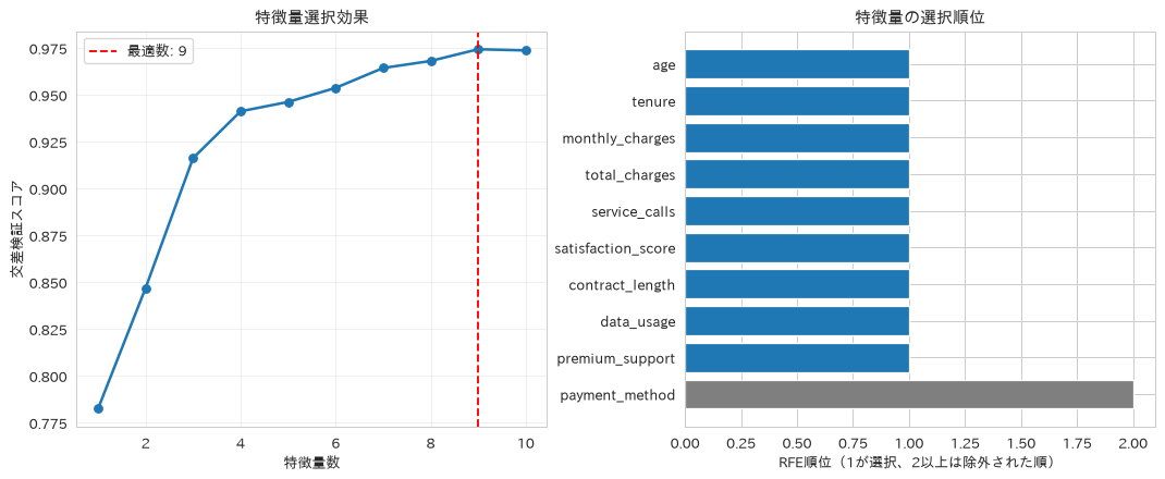
83. 独立成分分析(ICA)による信号分離
FastICAによる独立成分分析をPCAと比較します。ICAが本領を発揮するのは、非ガウス性の強い信号が混ざった観測から元の信号を取り出す場面です。そこで、正弦波・矩形波・のこぎり波を混ぜた古典的な題材で、ICAだけが元の信号を復元できることを確認します。あわせて、ガウス分布ベースのデータに次元削減として使った場合はどうなるかも見ます。
# 独立成分分析による信号分離
from sklearn.decomposition import FastICA

# ICAが効くのは「非ガウスな信号が混ざっている」場面。
# 正弦波・矩形波・のこぎり波という古典的な題材で、PCAとの違いを見る
rng_ica = np.random.RandomState(0)
n_points = 2000
t_signal = np.linspace(0, 8, n_points)
S_true = np.c_[np.sin(2 * t_signal),               # 正弦波
               np.sign(np.sin(3 * t_signal)),      # 矩形波
               np.mod(t_signal, 1.0) - 0.5]        # のこぎり波
S_true = S_true + 0.05 * rng_ica.normal(size=S_true.shape)
S_true = S_true / S_true.std(axis=0)

mixing_matrix = np.array([[1.0, 1.0, 1.0],
                          [0.5, 2.0, 1.0],
                          [1.5, 1.0, 2.0]])
X_mixed = S_true @ mixing_matrix.T

S_ica = FastICA(n_components=3, random_state=42, max_iter=1000,
                whiten='unit-variance').fit_transform(X_mixed)
S_pca = PCA(n_components=3).fit_transform(X_mixed)


def recovery_score(recovered, source):
    """元信号ごとに、いちばん近い復元成分との相関(絶対値)を返す"""
    corr = np.abs(np.corrcoef(recovered.T, source.T))
    n = recovered.shape[1]
    return corr[:n, n:].max(axis=0)


# 可視化比較
fig, axes = plt.subplots(2, 2, figsize=(16, 9))
window = slice(0, 500)
panels = [(axes[0, 0], S_true, '元の3信号(正弦波・矩形波・のこぎり波)'),
          (axes[0, 1], X_mixed, '観測される混合信号'),
          (axes[1, 0], S_ica, 'ICAで復元した信号'),
          (axes[1, 1], S_pca, 'PCAで取り出した主成分')]

for ax, data, title in panels:
    for i in range(3):
        ax.plot(t_signal[window], data[window, i], linewidth=1)
    ax.set_title(title, fontweight='bold')
    ax.set_xlabel('時間')
    ax.grid(True, alpha=0.3)

plt.tight_layout()
plt.show()

ica_corr = recovery_score(S_ica, S_true)
pca_corr = recovery_score(S_pca, S_true)
print("元信号との相関(1に近いほど復元できている)")
print(f"ICA: {np.round(ica_corr, 3)} 平均 {ica_corr.mean():.3f}")
print(f"PCA: {np.round(pca_corr, 3)} 平均 {pca_corr.mean():.3f}")

# 次元削減として顧客離脱データ(ガウス分布ベース)に使った場合
n_components = min(8, X_train.shape[1])
ica = FastICA(n_components=n_components, random_state=42, max_iter=1000,
              whiten='unit-variance')
X_ica = ica.fit_transform(X_train_scaled)
X_test_ica = ica.transform(X_test_scaled)

pca_comparison = PCA(n_components=n_components)
X_pca_comp = pca_comparison.fit_transform(X_train_scaled)
X_test_pca_comp = pca_comparison.transform(X_test_scaled)

original_score = RandomForestClassifier(random_state=42).fit(
    X_train_scaled, y_train).score(X_test_scaled, y_test)
pca_score = RandomForestClassifier(random_state=42).fit(
    X_pca_comp, y_train).score(X_test_pca_comp, y_test)
ica_score = RandomForestClassifier(random_state=42).fit(
    X_ica, y_train).score(X_test_ica, y_test)

print(f"\nICA次元削減: {X_train.shape[1]} → {X_ica.shape[1]}")
print(f"性能比較:")
print(f"元データ: {original_score:.3f}")
print(f"PCA: {pca_score:.3f}")
print(f"ICA: {ica_score:.3f}")
print(f"ただしテスト{len(y_test)}件での差は "
      f"{abs(ica_score - original_score) * len(y_test):.0f}件ぶんで、単一の乱数シードでは差とは言えない。"
      "ICAを次元削減の一般解として選ぶ根拠にはならない")
元信号との相関(1に近いほど復元できている)
ICA: [0.997 0.999 0.997] 平均 0.998
PCA: [0.754 0.784 0.67 ] 平均 0.736

ICA次元削減: 10 → 8
性能比較:
元データ: 0.963
PCA: 0.973
ICA: 0.985
ただしテスト400件での差は 9件ぶんで、単一の乱数シードでは差とは言えない。ICAを次元削減の一般解として選ぶ根拠にはならない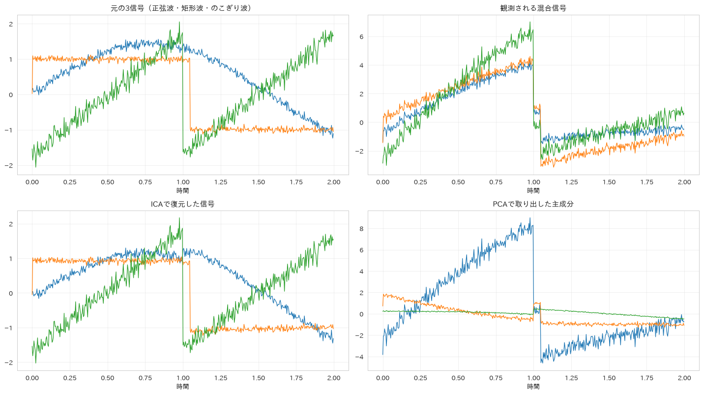
84. ロバスト回帰
HuberRegressorと通常の線形回帰を比較し、外れ値やノイズの多いデータに対してロバスト回帰が安定した予測を行えることを確認します。
# 外れ値に対して頑健なロバスト回帰
from sklearn.linear_model import HuberRegressor, LinearRegression

# まず外れ値のないデータで比較する
robust_reg = HuberRegressor(epsilon=1.35, max_iter=500)
linear_reg = LinearRegression()

robust_reg.fit(X_train_sales_scaled, y_train_sales)
linear_reg.fit(X_train_sales_scaled, y_train_sales)

robust_score = robust_reg.score(X_test_sales_scaled, y_test_sales)
linear_score = linear_reg.score(X_test_sales_scaled, y_test_sales)

# 外れ値ロバスト性の検証
# 訓練データ60件の目的変数を10倍に飛ばす
np.random.seed(42)
outlier_indices = np.random.choice(len(y_train_sales), 60, replace=False)
y_train_outlier = y_train_sales.copy()
y_train_outlier.iloc[outlier_indices] *= 10  # 外れ値作成

# 外れ値ありデータで再訓練
robust_reg_outlier = HuberRegressor(epsilon=1.35, max_iter=500)
linear_reg_outlier = LinearRegression()

robust_reg_outlier.fit(X_train_sales_scaled, y_train_outlier)
linear_reg_outlier.fit(X_train_sales_scaled, y_train_outlier)

robust_score_outlier = robust_reg_outlier.score(X_test_sales_scaled, y_test_sales)
linear_score_outlier = linear_reg_outlier.score(X_test_sales_scaled, y_test_sales)

# 外れ値を含むデータで学習したモデルの予測を描く。
# 外れ値を入れる前のモデルで描くと2本が完全に重なり、主題が図に出ない
robust_pred = robust_reg_outlier.predict(X_test_sales_scaled)
linear_pred = linear_reg_outlier.predict(X_test_sales_scaled)

fig, axes = plt.subplots(1, 2, figsize=(15, 6))

# 予測 vs 実測比較(マーカーを変えて重なりを避ける)
axes[0].scatter(y_test_sales, linear_pred, alpha=0.5, marker='x',
                label=f'Linear Regression (R²={linear_score_outlier:.3f})')
axes[0].scatter(y_test_sales, robust_pred, alpha=0.6, facecolors='none',
                edgecolors='tab:orange',
                label=f'Huber Regression (R²={robust_score_outlier:.3f})')
axes[0].plot([y_test_sales.min(), y_test_sales.max()],
            [y_test_sales.min(), y_test_sales.max()], 'r--', lw=2)
axes[0].set_xlabel('実際の売上')
axes[0].set_ylabel('予測売上')
axes[0].set_title('外れ値を含むデータで学習した場合の予測 vs 実測', fontweight='bold')
axes[0].legend()

# 残差分析
residuals_linear = y_test_sales - linear_pred
residuals_robust = y_test_sales - robust_pred

# 2つの残差はばらつきの桁が違うので、密度で描くと片方が潰れて何も見えない。
# 同じ区切りで件数を数え、縦軸を対数にする。
# 区切りは両方の残差をまとめて作る。線形回帰の残差だけで作ると、
# 0付近に集まるHuberの残差が区間の外に落ちて1本も描かれない
bin_edges = np.histogram_bin_edges(
    np.concatenate([residuals_linear, residuals_robust]), bins=40)
axes[1].hist(residuals_linear, bins=bin_edges, alpha=0.6, label='Linear')
axes[1].hist(residuals_robust, bins=bin_edges, alpha=0.6, label='Huber')
axes[1].set_yscale('log')
axes[1].set_xlabel('残差')
axes[1].set_ylabel('件数(対数目盛)')
axes[1].set_title('残差分布比較(外れ値ありデータで学習)', fontweight='bold')
axes[1].legend()

plt.tight_layout()
plt.show()

print(f"外れ値なしデータ  ロバスト回帰 R²: {robust_score:.3f} / 線形回帰 R²: {linear_score:.3f}")
print(f"外れ値ありデータ  ロバスト回帰 R²: {robust_score_outlier:.3f} / 線形回帰 R²: {linear_score_outlier:.3f}")
print(f"外れ値60件の混入で線形回帰は R² が {linear_score:.3f} → {linear_score_outlier:.3f} に落ちたが、"
      f"Huberは {robust_score:.3f} → {robust_score_outlier:.3f} を保っている")
外れ値なしデータ  ロバスト回帰 R²: 0.925 / 線形回帰 R²: 0.926
外れ値ありデータ  ロバスト回帰 R²: 0.924 / 線形回帰 R²: -4.359
外れ値60件の混入で線形回帰は R² が 0.926 → -4.359 に落ちたが、Huberは 0.925 → 0.924 を保っている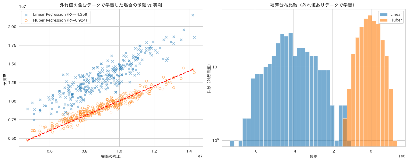
85. マルチタスク学習
MultiOutputRegressorで売上と利益といった複数の関連指標を同時に予測し、一貫性のある意思決定支援を行う方法を扱います。この推定器はターゲットごとに独立のモデルを当てはめるラッパーなので、個別に2本学習した場合と結果は一致します。利点は精度ではなく、1つのオブジェクトで複数出力を扱えるコードの単純さにあります。
# 複数ターゲットの同時予測
from sklearn.multioutput import MultiOutputRegressor
from sklearn.metrics import mean_squared_error

# 複数ターゲットの作成(売上と利益)
np.random.seed(42)
multi_target = np.column_stack([
    y_train_sales,  # 売上
    y_train_sales * 0.2 + np.random.normal(0, 5000, len(y_train_sales))  # 利益
])

multi_test_target = np.column_stack([
    y_test_sales,
    y_test_sales * 0.2 + np.random.normal(0, 5000, len(y_test_sales))
])

# マルチタスクモデルの訓練
multi_regressor = MultiOutputRegressor(RandomForestRegressor(n_estimators=50, random_state=42))
multi_regressor.fit(X_train_sales, multi_target)

# 予測実行
multi_predictions = multi_regressor.predict(X_test_sales)

# 個別モデルとの比較
single_revenue_model = RandomForestRegressor(n_estimators=50, random_state=42)
single_profit_model = RandomForestRegressor(n_estimators=50, random_state=42)

single_revenue_model.fit(X_train_sales, multi_target[:, 0])
single_profit_model.fit(X_train_sales, multi_target[:, 1])

single_revenue_pred = single_revenue_model.predict(X_test_sales)
single_profit_pred = single_profit_model.predict(X_test_sales)

# 性能評価
multi_mse_revenue = mean_squared_error(multi_test_target[:, 0], multi_predictions[:, 0])
multi_mse_profit = mean_squared_error(multi_test_target[:, 1], multi_predictions[:, 1])

single_mse_revenue = mean_squared_error(multi_test_target[:, 0], single_revenue_pred)
single_mse_profit = mean_squared_error(multi_test_target[:, 1], single_profit_pred)

# 予測がどれだけ一致しているかを実際に測る
max_gap_revenue = np.max(np.abs(multi_predictions[:, 0] - single_revenue_pred))
max_gap_profit = np.max(np.abs(multi_predictions[:, 1] - single_profit_pred))

# 結果可視化
fig, axes = plt.subplots(2, 2, figsize=(15, 12))

# 売上予測結果
# マルチタスクと個別モデルの予測は厳密に同一なので、重ねて描くと片方が完全に隠れる。
# ここでは1系列だけ描き、一致することは注記と実測値で示す
axes[0, 0].scatter(multi_test_target[:, 0], multi_predictions[:, 0], alpha=0.6,
                   label='マルチタスク(個別モデルと同一)')
axes[0, 0].plot([multi_test_target[:, 0].min(), multi_test_target[:, 0].max()],
               [multi_test_target[:, 0].min(), multi_test_target[:, 0].max()], 'r--')
axes[0, 0].set_xlabel('実際の売上')
axes[0, 0].set_ylabel('予測売上')
axes[0, 0].set_title(f'売上予測(個別モデルとの最大差 {max_gap_revenue:.4f})', fontweight='bold')
axes[0, 0].legend()

# 利益予測結果
axes[0, 1].scatter(multi_test_target[:, 1], multi_predictions[:, 1], alpha=0.6,
                   label='マルチタスク(個別モデルと同一)')
axes[0, 1].plot([multi_test_target[:, 1].min(), multi_test_target[:, 1].max()],
               [multi_test_target[:, 1].min(), multi_test_target[:, 1].max()], 'r--')
axes[0, 1].set_xlabel('実際の利益')
axes[0, 1].set_ylabel('予測利益')
axes[0, 1].set_title(f'利益予測(個別モデルとの最大差 {max_gap_profit:.4f})', fontweight='bold')
axes[0, 1].legend()

# MSE比較
labels = ['売上', '利益']
multi_mse = [multi_mse_revenue, multi_mse_profit]
single_mse = [single_mse_revenue, single_mse_profit]

x = np.arange(len(labels))
width = 0.35

axes[1, 0].bar(x - width/2, multi_mse, width, label='マルチタスク', alpha=0.7)
axes[1, 0].bar(x + width/2, single_mse, width, label='個別モデル', alpha=0.7)
axes[1, 0].set_ylabel('Mean Squared Error')
axes[1, 0].set_title('MSE比較(原理的に一致する)', fontweight='bold')
axes[1, 0].set_xticks(x)
axes[1, 0].set_xticklabels(labels)
axes[1, 0].legend()

# 特徴量重要度比較
# 同じy位置に2回barhを描くと後の系列が前を完全に覆うので、上下にずらす
importances_multi_revenue = multi_regressor.estimators_[0].feature_importances_
importances_multi_profit = multi_regressor.estimators_[1].feature_importances_

feature_names = X_train_sales.columns
y_bar = np.arange(len(feature_names))
axes[1, 1].barh(y_bar - 0.2, importances_multi_revenue, height=0.4, alpha=0.8, label='売上タスク')
axes[1, 1].barh(y_bar + 0.2, importances_multi_profit, height=0.4, alpha=0.8, label='利益タスク')
axes[1, 1].set_yticks(y_bar)
axes[1, 1].set_yticklabels(feature_names)
axes[1, 1].set_xlabel('特徴量重要度')
axes[1, 1].set_title('タスク別特徴量重要度', fontweight='bold')
axes[1, 1].legend()

plt.tight_layout()
plt.show()

print("マルチタスク学習モデル訓練完了")
print(f"売上予測 MSE - マルチ: {multi_mse_revenue:.0f}, 個別: {single_mse_revenue:.0f}")
print(f"利益予測 MSE - マルチ: {multi_mse_profit:.0f}, 個別: {single_mse_profit:.0f}")
print(f"予測値の最大差 - 売上: {max_gap_revenue:.6f}, 利益: {max_gap_profit:.6f}")
print("MultiOutputRegressorはターゲットごとに独立モデルを作るラッパーなので、"
      "個別に学習した場合と結果が一致するのは当然で、この比較から精度の優劣は読み取れない。"
      "タスク間で情報を共有する手法が要る場合は MultiTaskLasso などを使う")
マルチタスク学習モデル訓練完了
売上予測 MSE - マルチ: 684540214371, 個別: 684540214371
利益予測 MSE - マルチ: 27766855111, 個別: 27766855111
予測値の最大差 - 売上: 0.000000, 利益: 0.000000
MultiOutputRegressorはターゲットごとに独立モデルを作るラッパーなので、個別に学習した場合と結果が一致するのは当然で、この比較から精度の優劣は読み取れない。タスク間で情報を共有する手法が要る場合は MultiTaskLasso などを使う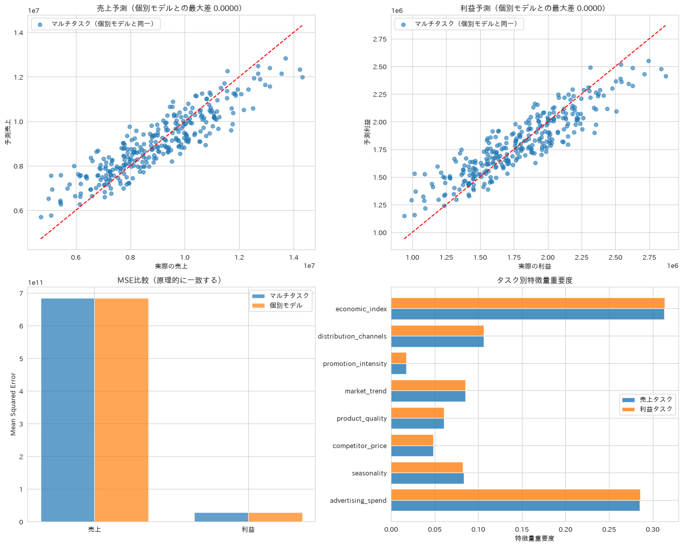
86. オンライン学習(逐次学習)
SGDClassifierのpartial_fitを使い、データを小分けにして少しずつ学習を進める手順を扱います。ここではメモリに載せ済みの訓練データを100件ずつ切り出してバッチ到着を模擬しています。実際に大量データをメモリに載せずに扱う場合は、読み込み自体をチャンク単位にし、標準化もStandardScalerのpartial_fitなどで逐次化する必要があります。
# ストリーミングデータに対する逐次学習
from sklearn.linear_model import SGDClassifier
import time

# オンライン学習モデルの初期化
online_model = SGDClassifier(loss='log_loss', random_state=42, learning_rate='constant', eta0=0.01)

# バッチ学習のシミュレーション
batch_size = 100
n_batches = len(X_train) // batch_size

# 学習進化の記録
training_scores = []
batch_numbers = []

for i in range(0, len(X_train), batch_size):
    X_batch = X_train_scaled[i:i+batch_size]
    y_batch = y_train.iloc[i:i+batch_size]

    # 部分フィット(逐次学習)
    online_model.partial_fit(X_batch, y_batch, classes=np.unique(y_train))

    # 定期的な性能評価(毎バッチ測る必要はないので5バッチごと)
    if (i // batch_size) % 5 == 0:
        score = online_model.score(X_test_scaled, y_test)
        training_scores.append(score)
        batch_numbers.append(i // batch_size)

# バッチ学習との比較
batch_model = LogisticRegression(random_state=42, max_iter=1000)
batch_model.fit(X_train_scaled, y_train)
batch_score = batch_model.score(X_test_scaled, y_test)

# 結果可視化
fig, axes = plt.subplots(1, 2, figsize=(15, 6))

# 学習進化
axes[0].plot(batch_numbers, training_scores, 'o-', linewidth=2, label='オンライン学習')
axes[0].axhline(y=batch_score, color='red', linestyle='--',
               label=f'バッチ学習: {batch_score:.3f}')
axes[0].set_xlabel('バッチ番号(全%d バッチ中)' % n_batches)
axes[0].set_ylabel('テスト精度')
axes[0].set_title('オンライン学習の進化', fontweight='bold')
# 破線が枠線に張り付いて読みにくくなるので、上に余白を作る
axes[0].set_ylim(top=max(max(training_scores), batch_score) + 0.02)
axes[0].legend()
axes[0].grid(True, alpha=0.3)

# 最終性能比較
final_online_score = online_model.score(X_test_scaled, y_test)
comparison_data = ['Online Learning', 'Batch Learning']
comparison_scores = [final_online_score, batch_score]

axes[1].bar(comparison_data, comparison_scores, alpha=0.7)
axes[1].set_ylabel('テスト精度')
axes[1].set_title('最終性能比較', fontweight='bold')
for i, score in enumerate(comparison_scores):
    axes[1].text(i, score + 0.01, f'{score:.3f}', ha='center', va='bottom')

plt.tight_layout()
plt.show()

# メモリ使用量の比較(1バッチだけを持てばよいので、その分だけ小さくて済む)
batch_bytes = X_train_scaled[:batch_size].nbytes
full_bytes = X_train_scaled.nbytes

print("オンライン学習完了")
print(f"オンライン学習精度: {final_online_score:.3f}")
print(f"バッチ学習精度: {batch_score:.3f}")
print(f"使用バッチ数: {n_batches}")
print(f"性能評価回数: {len(batch_numbers)}")
print(f"1バッチ({batch_size}件)のメモリ: {batch_bytes:,}バイト / "
      f"全{len(X_train)}件: {full_bytes:,}バイト({full_bytes / batch_bytes:.0f}分の1)")
オンライン学習完了
オンライン学習精度: 0.940
バッチ学習精度: 0.963
使用バッチ数: 16
性能評価回数: 4
1バッチ(100件)のメモリ: 8,000バイト / 全1600件: 128,000バイト(16分の1)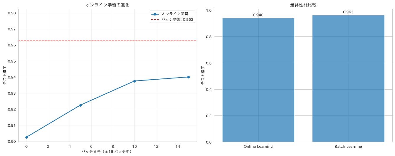
87. ガウシアンプロセス回帰
RBFカーネルとホワイトカーネルを組み合わせたガウシアンプロセス回帰により、予測値だけでなく不確実性も定量化し、リスク管理に役立てる方法を紹介します。
# 不確実性を考慮したガウシアンプロセス回帰
from sklearn.gaussian_process import GaussianProcessRegressor
from sklearn.gaussian_process.kernels import RBF, WhiteKernel

# サンプル数を制限(計算時間短縮)
sample_size = 100
sample_indices = np.random.choice(len(X_train_sales), sample_size, replace=False)
X_train_gp = X_train_sales_scaled[sample_indices]
y_train_gp = y_train_sales.iloc[sample_indices]

# カーネルの定義
kernel = RBF(length_scale=1.0) + WhiteKernel(noise_level=1e-5)

# ガウシアンプロセスモデルの訓練
gp_model = GaussianProcessRegressor(kernel=kernel, alpha=1e-6,
                                   normalize_y=True, random_state=42)
gp_model.fit(X_train_gp, y_train_gp)

# 予測(不確実性あり)
test_sample_size = 50
test_indices = np.random.choice(len(X_test_sales), test_sample_size, replace=False)
X_test_gp = X_test_sales_scaled[test_indices]
y_test_gp = y_test_sales.iloc[test_indices]

y_pred_gp, y_std_gp = gp_model.predict(X_test_gp, return_std=True)

# 通常の回帰モデルとの比較
rf_comparison = RandomForestRegressor(n_estimators=50, random_state=42)
rf_comparison.fit(X_train_gp, y_train_gp)
y_pred_rf = rf_comparison.predict(X_test_gp)

# 結果可視化
fig, axes = plt.subplots(2, 2, figsize=(16, 12))

# 予測 vs 実測(不確実性あり)
axes[0, 0].scatter(y_test_gp, y_pred_gp, alpha=0.6, label='GP予測')
axes[0, 0].errorbar(y_test_gp, y_pred_gp, yerr=y_std_gp, fmt='none', alpha=0.3)
axes[0, 0].plot([y_test_gp.min(), y_test_gp.max()],
               [y_test_gp.min(), y_test_gp.max()], 'r--', lw=2)
axes[0, 0].set_xlabel('実際の売上')
axes[0, 0].set_ylabel('GP予測売上')
axes[0, 0].set_title('ガウシアンプロセス予測(不確実性あり)', fontweight='bold')
axes[0, 0].legend()

# Random Forestとの比較
axes[0, 1].scatter(y_test_gp, y_pred_rf, alpha=0.6, label='Random Forest', color='orange')
axes[0, 1].scatter(y_test_gp, y_pred_gp, alpha=0.6, label='Gaussian Process')
axes[0, 1].plot([y_test_gp.min(), y_test_gp.max()],
               [y_test_gp.min(), y_test_gp.max()], 'r--', lw=2)
axes[0, 1].set_xlabel('実際の売上')
axes[0, 1].set_ylabel('予測売上')
axes[0, 1].set_title('モデル比較', fontweight='bold')
axes[0, 1].legend()

# 不確実性の分布
axes[1, 0].hist(y_std_gp, bins=20, alpha=0.7, edgecolor='black')
axes[1, 0].set_xlabel('予測不確実性(標準偏差)')
axes[1, 0].set_ylabel('頻度')
axes[1, 0].set_title('予測不確実性分布', fontweight='bold')

# 不確実性 vs 誤差
residuals_gp = np.abs(y_test_gp - y_pred_gp)
axes[1, 1].scatter(y_std_gp, residuals_gp, alpha=0.6)
axes[1, 1].set_xlabel('予測不確実性')
axes[1, 1].set_ylabel('絶対誤差')
axes[1, 1].set_title('不確実性 vs 誤差', fontweight='bold')

# 相関係数を計算して表示
correlation = np.corrcoef(y_std_gp, residuals_gp)[0, 1]
axes[1, 1].text(0.05, 0.95, f'相関: {correlation:.3f}',
               transform=axes[1, 1].transAxes,
               bbox=dict(boxstyle='round', facecolor='wheat', alpha=0.5))

plt.tight_layout()
plt.show()

# 性能評価
gp_score = r2_score(y_test_gp, y_pred_gp)
rf_score = r2_score(y_test_gp, y_pred_rf)
mean_uncertainty = np.mean(y_std_gp)

print(f"ガウシアンプロセス訓練完了")
print(f"GP R²: {gp_score:.3f}")
print(f"RF R²: {rf_score:.3f}")
print(f"平均不確実性: {mean_uncertainty:.0f}")
print(f"不確実性と誤差の相関: {correlation:.3f}")
ガウシアンプロセス訓練完了
GP R²: 0.884
RF R²: 0.560
平均不確実性: 531268
不確実性と誤差の相関: 0.233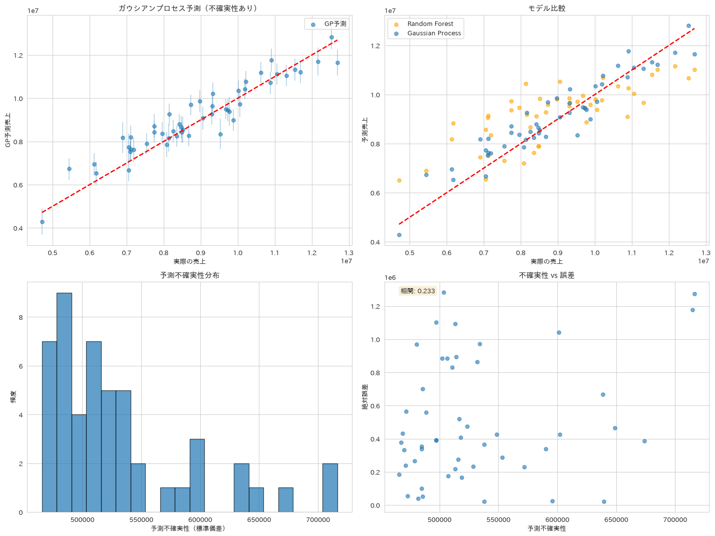
88. 半教師あり学習
LabelSpreadingとLabelPropagationは、ラベルのないデータも使って学習する手法です。似ているデータ点どうしを線で結び、ラベルのある点からラベルのない点へ、その線をたどって値を伝えていきます。ラベル付けにコストがかかる場面で検討されます。
ただし、半教師あり学習は常に有利になるわけではありません。ここではラベルの比率を変えながら、ラベルありデータだけで学習した通常の教師あり学習と比べます。実行してみると、ラベルが30%あるときは教師あり学習のほうが正解率が高く、比率を下げていくと差が縮まって、ある比率で入れ替わります。実際に採用するかどうかは、この比較を自分のデータで行ってから決めるのが安全です。
# ラベル伝播による半教師あり学習
from sklearn.semi_supervised import LabelSpreading, LabelPropagation

# ラベル付きデータの一部を未ラベル化
np.random.seed(42)
y_semi = y_train.copy()
labeled_ratio = 0.3  # 30%のみラベルあり
mask = np.random.random(len(y_semi)) < labeled_ratio
y_semi[~mask] = -1  # 未ラベル化

# 複数の半教師あり学習手法の比較
semi_methods = {
    'LabelSpreading': LabelSpreading(kernel='rbf', gamma=0.1),
    'LabelPropagation': LabelPropagation(kernel='rbf', gamma=0.1)
}

semi_results = {}
for name, model in semi_methods.items():
    model.fit(X_train_scaled, y_semi)
    pred = model.predict(X_test_scaled)
    score = accuracy_score(y_test, pred)

    # 未ラベルデータの予測確信度
    pred_proba = model.predict_proba(X_train_scaled[~mask])
    confidence = np.max(pred_proba, axis=1)

    semi_results[name] = {
        'model': model,
        'accuracy': score,
        'predictions': pred,
        'confidence': confidence
    }

# 教師あり学習との比較
supervised_model = RandomForestClassifier(random_state=42)
supervised_model.fit(X_train_scaled[mask], y_train[mask])  # ラベルありデータのみ
supervised_pred = supervised_model.predict(X_test_scaled)
supervised_score = accuracy_score(y_test, supervised_pred)

# ラベル比率を振って、半教師ありが有利になる領域を探す
print("ラベル比率ごとの比較(正解率)")
print("比率   教師あり   LabelSpreading")
ratio_curve = []
for r in [0.02, 0.05, 0.1, 0.3]:
    rs = np.random.RandomState(42)
    m = rs.random(len(y_train)) < r
    if m.sum() < 5 or len(np.unique(y_train[m])) < 2:
        continue
    ys = y_train.copy(); ys[~m] = -1
    sup = accuracy_score(y_test, RandomForestClassifier(random_state=42)
                         .fit(X_train_scaled[m], y_train[m]).predict(X_test_scaled))
    semi = accuracy_score(y_test, LabelSpreading(kernel='rbf', gamma=0.1)
                          .fit(X_train_scaled, ys).predict(X_test_scaled))
    ratio_curve.append((r, sup, semi))
    print(f"{r:.0%}     {sup:.3f}      {semi:.3f}")

# 結果可視化
fig, axes = plt.subplots(2, 2, figsize=(16, 12))

# ラベル付きデータの分布
# 可視化用のPCAは、この特徴量セットに対して改めて学習させる。
# 別のデータセットで学習したPCAを使い回すと特徴量数が合わずに失敗する
pca_semi = PCA(n_components=2, random_state=42)
X_train_pca = pca_semi.fit_transform(X_train_scaled)

# ラベルありデータ(クラスごとに描くと、凡例の色が実際の点の色と一致する)
for cls, color in [(0, 'tab:blue'), (1, 'tab:orange')]:
    sel = mask & (y_train == cls)
    axes[0, 0].scatter(X_train_pca[sel, 0], X_train_pca[sel, 1],
                      c=color, alpha=0.8, s=50, label=f'ラベルあり クラス{cls}')
# ラベルなしデータ
axes[0, 0].scatter(X_train_pca[~mask, 0], X_train_pca[~mask, 1],
                  c='gray', alpha=0.3, s=20, marker='x',
                  label='ラベルなし')
axes[0, 0].set_xlabel('第1主成分')
axes[0, 0].set_ylabel('第2主成分')
axes[0, 0].set_title(f'ラベルありデータ ({labeled_ratio:.1%})', fontweight='bold')
axes[0, 0].legend()

# 性能比較
methods = list(semi_results.keys()) + ['Supervised']
scores = [result['accuracy'] for result in semi_results.values()] + [supervised_score]

axes[0, 1].bar(methods, scores, alpha=0.7)
axes[0, 1].set_ylabel('Accuracy')
axes[0, 1].set_title('手法別性能比較', fontweight='bold')
axes[0, 1].tick_params(axis='x', rotation=45)
for i, score in enumerate(scores):
    axes[0, 1].text(i, score + 0.01, f'{score:.3f}', ha='center', va='bottom')

# 予測確信度の分布(LabelSpreading)
confidence_ls = semi_results['LabelSpreading']['confidence']
axes[1, 0].hist(confidence_ls, bins=20, alpha=0.7, edgecolor='black')
axes[1, 0].axvline(x=np.mean(confidence_ls), color='red', linestyle='--',
                  label=f'平均: {np.mean(confidence_ls):.3f}')
axes[1, 0].set_xlabel('予測確信度')
axes[1, 0].set_ylabel('頻度')
axes[1, 0].set_title('未ラベルデータ予測確信度', fontweight='bold')
axes[1, 0].legend()

# ラベル伝播結果の可視化
label_spread_model = semi_results['LabelSpreading']['model']
pseudo_labels = label_spread_model.predict(X_train_scaled[~mask])

# 伝播されたラベルを表示
X_unlabeled_pca = X_train_pca[~mask]
axes[1, 1].scatter(X_unlabeled_pca[:, 0], X_unlabeled_pca[:, 1],
                  c=pseudo_labels, cmap='viridis', alpha=0.6, s=30)
axes[1, 1].set_xlabel('第1主成分')
axes[1, 1].set_ylabel('第2主成分')
axes[1, 1].set_title('伝播された擬似ラベル', fontweight='bold')

plt.tight_layout()
plt.show()

# 結果サマリー
print("半教師あり学習完了")
print(f"ラベルありデータ: {mask.sum()}件 ({labeled_ratio:.1%})")
print(f"未ラベルデータ: {(~mask).sum()}件")
print("\n性能比較:")
for name, result in semi_results.items():
    print(f"{name}: {result['accuracy']:.3f}")
print(f"教師ありのみ: {supervised_score:.3f}")
print(f"\n平均予測確信度: {np.mean(confidence_ls):.3f}")
ラベル比率ごとの比較(正解率)
比率   教師あり   LabelSpreading
2%     0.880      0.767
5%     0.890      0.897
10%     0.922      0.873
30%     0.948      0.890
半教師あり学習完了
ラベルありデータ: 498件 (30.0%)
未ラベルデータ: 1102件

性能比較:
LabelSpreading: 0.890
LabelPropagation: 0.875
教師ありのみ: 0.948

平均予測確信度: 0.613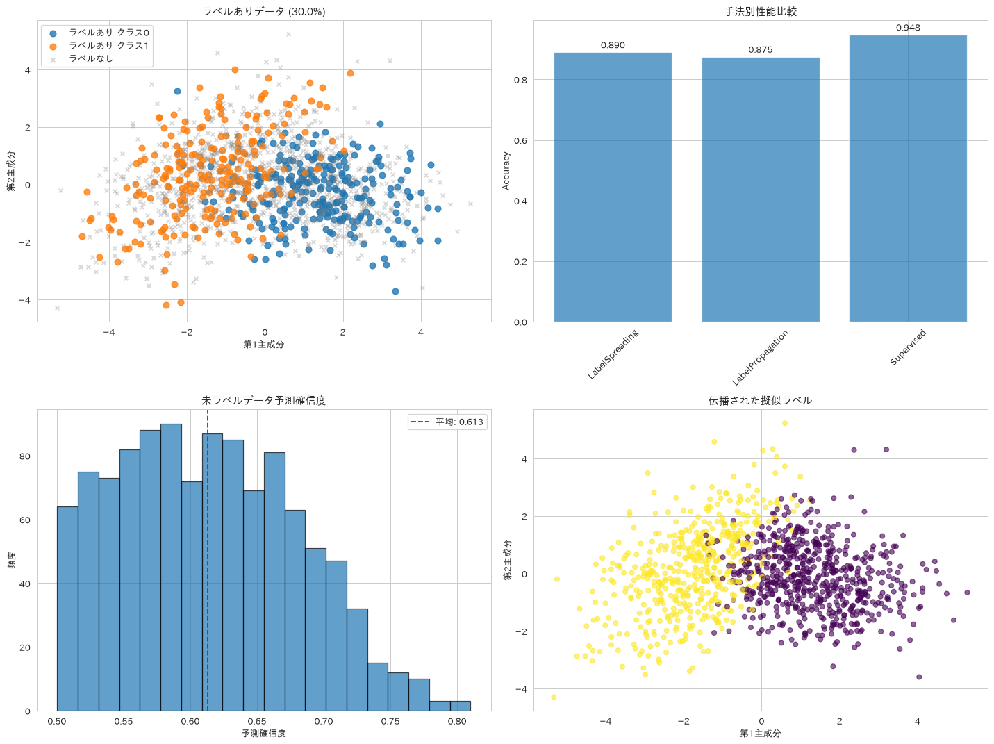
89. ニューラルネットワーク(MLP)
隠れ層の構成が異なる複数のMLPClassifierを比較し、非線形パターンの学習と特徴量の自動的な組み合わせを確認します。あわせて回帰タスクにも当てはめますが、ここでは前処理を意図的に省いてあります。目的変数の売上は平均900万円台の生スケールのままで、MLPRegressorの最適化はこのスケールに強く影響されます。実際、TransformedTargetRegressorで目的変数を標準化してから当てはめるとR²は0.880まで戻り、生スケールのままの結果とは大きく変わります。そのうえで、この売上データはmake_regressionによる線形生成なので、標準化しても線形回帰のR²(レシピ60の実測で0.926)には届きません。前処理の条件とデータの生成過程は別々に効くという例として読めます。
# 多層パーセプトロンによる深層学習
from sklearn.neural_network import MLPClassifier, MLPRegressor
from sklearn.model_selection import validation_curve

# 複数のネットワーク構成の比較
mlp_configs = {
    'Small': MLPClassifier(hidden_layer_sizes=(50,), max_iter=500, random_state=42),
    'Medium': MLPClassifier(hidden_layer_sizes=(100, 50), max_iter=500, random_state=42),
    'Large': MLPClassifier(hidden_layer_sizes=(200, 100, 50), max_iter=500, random_state=42),
    'Deep': MLPClassifier(hidden_layer_sizes=(100, 100, 100), max_iter=500, random_state=42)
}

mlp_results = {}
for name, model in mlp_configs.items():
    model.fit(X_train_scaled, y_train)
    train_score = model.score(X_train_scaled, y_train)
    test_score = model.score(X_test_scaled, y_test)

    mlp_results[name] = {
        'model': model,
        'train_score': train_score,
        'test_score': test_score,
        'loss_curve': model.loss_curve_
    }

# 最良構成をここで決めておき、以降の比較でも同じ値を使う
best_mlp = max(mlp_results.items(), key=lambda x: x[1]['test_score'])

# アクティベーション関数の比較
activation_functions = ['relu', 'tanh', 'logistic']
activation_results = {}

for activation in activation_functions:
    model = MLPClassifier(hidden_layer_sizes=(100, 50), activation=activation,
                         max_iter=500, random_state=42)
    model.fit(X_train_scaled, y_train)
    score = model.score(X_test_scaled, y_test)
    activation_results[activation] = score

# 結果可視化
fig, axes = plt.subplots(2, 3, figsize=(18, 12))

# ネットワークサイズ vs 性能
config_names = list(mlp_results.keys())
train_scores = [result['train_score'] for result in mlp_results.values()]
test_scores = [result['test_score'] for result in mlp_results.values()]

x_pos = np.arange(len(config_names))
width = 0.35

axes[0, 0].bar(x_pos - width/2, train_scores, width, label='訓練スコア', alpha=0.7)
axes[0, 0].bar(x_pos + width/2, test_scores, width, label='テストスコア', alpha=0.7)
axes[0, 0].set_xlabel('ネットワーク構成')
axes[0, 0].set_ylabel('Accuracy')
axes[0, 0].set_title('ネットワークサイズ比較', fontweight='bold')
axes[0, 0].set_xticks(x_pos)
axes[0, 0].set_xticklabels(config_names)
# 棒が1.0近くまで伸びるので、凡例が棒に重ならないよう上に余白を作ってそこへ置く
axes[0, 0].set_ylim(0, 1.25)
axes[0, 0].legend(loc='upper center', ncol=2, fontsize=9)

# 学習曲線
for name, result in mlp_results.items():
    axes[0, 1].plot(result['loss_curve'], label=name, linewidth=2)

axes[0, 1].set_xlabel('エポック')
axes[0, 1].set_ylabel('損失')
axes[0, 1].set_title('学習曲線比較', fontweight='bold')
axes[0, 1].legend()
axes[0, 1].set_yscale('log')

# アクティベーション関数比較
activations = list(activation_results.keys())
activation_scores = list(activation_results.values())

axes[0, 2].bar(activations, activation_scores, alpha=0.7)
axes[0, 2].set_ylabel('Test Accuracy')
axes[0, 2].set_title('アクティベーション関数比較', fontweight='bold')
for i, score in enumerate(activation_scores):
    axes[0, 2].text(i, score + 0.01, f'{score:.3f}', ha='center', va='bottom')

# 正則化効果の検証
alpha_range = np.logspace(-4, 1, 6)
train_scores_reg, test_scores_reg = validation_curve(
    MLPClassifier(hidden_layer_sizes=(100, 50), max_iter=500, random_state=42),
    X_train_scaled, y_train, param_name='alpha', param_range=alpha_range,
    cv=3, scoring='accuracy')

axes[1, 0].plot(alpha_range, np.mean(train_scores_reg, axis=1), 'o-',
               label='訓練スコア', linewidth=2)
axes[1, 0].plot(alpha_range, np.mean(test_scores_reg, axis=1), 's-',
               label='検証スコア', linewidth=2)
axes[1, 0].set_xscale('log')
axes[1, 0].set_xlabel('Alpha (正則化パラメータ)')
axes[1, 0].set_ylabel('Accuracy')
axes[1, 0].set_title('正則化効果', fontweight='bold')
axes[1, 0].legend()
axes[1, 0].grid(True, alpha=0.3)

# 回帰タスクでの性能
# ここでは目的変数(売上)を生スケールのまま渡している。
# MLPRegressorはこのスケールに強く影響されるので、標準化した場合とも比べる
mlp_regressor = MLPRegressor(hidden_layer_sizes=(100, 50), max_iter=500, random_state=42)
mlp_regressor.fit(X_train_sales_scaled, y_train_sales)
mlp_pred_sales = mlp_regressor.predict(X_test_sales_scaled)
mlp_r2 = r2_score(y_test_sales, mlp_pred_sales)

# 目的変数を標準化してから同じMLPを当てると、どこまで戻るかを測る
from sklearn.compose import TransformedTargetRegressor

mlp_scaled_target = TransformedTargetRegressor(
    regressor=MLPRegressor(hidden_layer_sizes=(100, 50), max_iter=500, random_state=42),
    transformer=StandardScaler())
mlp_scaled_target.fit(X_train_sales_scaled, y_train_sales)
mlp_r2_scaled = r2_score(y_test_sales, mlp_scaled_target.predict(X_test_sales_scaled))

axes[1, 1].scatter(y_test_sales, mlp_pred_sales, alpha=0.6)
axes[1, 1].plot([y_test_sales.min(), y_test_sales.max()],
               [y_test_sales.min(), y_test_sales.max()], 'r--', lw=2)
axes[1, 1].set_xlabel('実際の売上')
axes[1, 1].set_ylabel('MLP予測売上')
axes[1, 1].set_title(f'MLP回帰 (R²={mlp_r2:.3f})\n目的変数を生スケールのまま渡した場合',
                     fontweight='bold')

# 他手法との性能比較(MLPは上で決めた最良構成の値を使う)
comparison_models = {
    f'MLP ({best_mlp[0]})': best_mlp[1]['test_score'],
    'Random Forest': RandomForestClassifier(random_state=42).fit(X_train_scaled, y_train).score(X_test_scaled, y_test),
    'Logistic Regression': LogisticRegression(random_state=42, max_iter=1000).fit(X_train_scaled, y_train).score(X_test_scaled, y_test),
    'SVM': SVC(random_state=42).fit(X_train_scaled, y_train).score(X_test_scaled, y_test)
}

comp_names = list(comparison_models.keys())
comp_scores = list(comparison_models.values())

axes[1, 2].bar(comp_names, comp_scores, alpha=0.7)
axes[1, 2].set_ylabel('Test Accuracy')
axes[1, 2].set_title('手法全体比較', fontweight='bold')
axes[1, 2].tick_params(axis='x', rotation=45)
for i, score in enumerate(comp_scores):
    axes[1, 2].text(i, score + 0.01, f'{score:.3f}', ha='center', va='bottom')

plt.tight_layout()
plt.show()

# 結果サマリー
print(f"ニューラルネットワーク精度: {best_mlp[1]['test_score']:.3f}")
print(f"最適構成: {best_mlp[0]}")
print(f"MLP回帰 R²: {mlp_r2:.3f}(目的変数を生スケールのまま渡した場合)")
print(f"MLP回帰 R²: {mlp_r2_scaled:.3f}(目的変数を標準化した場合)")
print("同じデータで線形回帰は R² 0.926(レシピ60の実測)。"
      "生成過程が線形なので、前処理を直しても線形回帰は超えない")
print(f"最適アクティベーション: {max(activation_results.items(), key=lambda x: x[1])[0]}")
ニューラルネットワーク精度: 0.978
最適構成: Large
MLP回帰 R²: -20.108(目的変数を生スケールのまま渡した場合)
MLP回帰 R²: 0.880(目的変数を標準化した場合)
同じデータで線形回帰は R² 0.926(レシピ60の実測)。生成過程が線形なので、前処理を直しても線形回帰は超えない
最適アクティベーション: tanh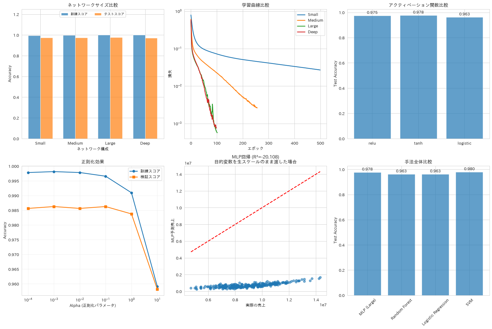
90. モデル解釈・部分依存プロット
PartialDependenceDisplayとパーミューテーション重要度を用い、モデルの予測根拠を可視化して意思決定の透明性を高める方法を紹介します。部分依存プロットは、注目する特徴量の値だけを横軸に沿って動かしたときに、モデルの予測が平均でどう変わるかを示す図です。ほかの特徴量はデータにある値の分布のまま残して予測を平均するので、ほかの条件による違いは打ち消され、その特徴量が単独で予測をどちらへ動かすかが残ります。後半で出す「特徴量値×重要度の簡易スコア」は、影響の大きさの目安を作るだけのもので、SHAPの加法的な寄与分解とは別物です。個別予測をきちんと説明する場合はshapライブラリを使ってください。またこの簡易スコアでは、符号は特徴量値の符号を写しているだけで、予測を押し上げたか押し下げたかの向きは表しません。向きまで知りたい場合はレシピ99の局所的な代理モデルを使います。
# 部分依存プロットと特徴量重要度によるモデル解釈
from sklearn.inspection import partial_dependence, PartialDependenceDisplay
from sklearn.inspection import permutation_importance

# 部分依存プロットの作成
# 先頭4列ではなく、重要度の上位4件を選ぶ
feature_names = X_train.columns
features_to_analyze = [int(i) for i in np.argsort(best_rf.feature_importances_)[-4:][::-1]]

# 個別特徴量の部分依存
fig, axes = plt.subplots(2, 3, figsize=(18, 12))
axes = axes.ravel()

# partial_dependence の戻り値は Bunch。整数の添字ではなく
# 'average'(値)と 'grid_values'(軸の刻み)というキーで取り出す
for i, feature_idx in enumerate(features_to_analyze):
    if i < 4:
        pd_result = partial_dependence(best_rf, X_train, features=[feature_idx], kind='average')
        axes[i].plot(pd_result['grid_values'][0], pd_result['average'][0], linewidth=3)
        axes[i].set_xlabel(feature_names[feature_idx])
        axes[i].set_ylabel('部分依存')
        axes[i].set_title(f'部分依存: {feature_names[feature_idx]}', fontweight='bold')
        axes[i].grid(True, alpha=0.3)

# 2変数の相互作用
# ヒートマップで表示。ここも重要度の上位2件を使う
top1, top2 = features_to_analyze[0], features_to_analyze[1]
pd_2d = partial_dependence(best_rf, X_train, features=[(top1, top2)], kind='average')
X_mesh, Y_mesh = np.meshgrid(pd_2d['grid_values'][0], pd_2d['grid_values'][1])

im = axes[4].contourf(X_mesh, Y_mesh, pd_2d['average'][0].T, levels=20, cmap='viridis', alpha=0.8)
axes[4].set_xlabel(feature_names[top1])
axes[4].set_ylabel(feature_names[top2])
axes[4].set_title(f'相互作用: {feature_names[top1]} x {feature_names[top2]}', fontweight='bold')
plt.colorbar(im, ax=axes[4])

# パーミュテーション重要度とジニ重要度の比較
perm_importance = permutation_importance(best_rf, X_test, y_test,
                                       n_repeats=10, random_state=42)

importance_comparison = pd.DataFrame({
    'feature': feature_names,
    'gini_importance': best_rf.feature_importances_,
    'permutation_importance': perm_importance.importances_mean,
    'perm_std': perm_importance.importances_std
}).sort_values('permutation_importance', ascending=True)

# 横棒グラフで比較
y_pos = np.arange(len(importance_comparison))
axes[5].barh(y_pos - 0.2, importance_comparison['gini_importance'],
            height=0.4, alpha=0.7, label='Gini重要度')
axes[5].barh(y_pos + 0.2, importance_comparison['permutation_importance'],
            height=0.4, alpha=0.7, label='パーミュテーション重要度')
axes[5].set_yticks(y_pos)
axes[5].set_yticklabels(importance_comparison['feature'])
axes[5].set_xlabel('重要度')
axes[5].set_title('特徴量重要度比較', fontweight='bold')
axes[5].legend()

plt.tight_layout()
plt.show()

# 特徴量値 x 重要度による簡易スコア(SHAPの寄与分解とは別物)
def feature_value_times_importance(model, X_sample):
    """特徴量の値と重要度の積を、影響の大きさの目安として返す"""
    feature_importance = model.feature_importances_
    # 正規化された特徴量値 x 重要度
    contribution_approx = X_sample * feature_importance
    return contribution_approx

# サンプル予測の解釈(best_rfは非スケーリングのX_trainで学習しているため、X_testをそのまま使う)
sample_idx = 0
X_sample = X_test.iloc[sample_idx].values
y_sample_true = y_test.iloc[sample_idx]
y_sample_pred = best_rf.predict(X_sample.reshape(1, -1))[0]
y_sample_proba = best_rf.predict_proba(X_sample.reshape(1, -1))[0, 1]

shap_values = feature_value_times_importance(best_rf, X_sample)

# 解釈結果の可視化
fig, (ax1, ax2) = plt.subplots(1, 2, figsize=(16, 6))

# 特徴量の影響度
# この近似では寄与の符号は特徴量値の符号を写しているだけなので、
# 正負で色を分けず、影響の大きさ(絶対値)で並べる
feature_contrib = pd.DataFrame({
    'feature': feature_names,
    'value': X_sample,
    'contribution': shap_values
})
feature_contrib['abs_contribution'] = feature_contrib['contribution'].abs()
feature_contrib = feature_contrib.sort_values('abs_contribution', ascending=True)

ax1.barh(range(len(feature_contrib)), feature_contrib['abs_contribution'],
         color='tab:blue', alpha=0.7)
ax1.set_yticks(range(len(feature_contrib)))
ax1.set_yticklabels(feature_contrib['feature'])
ax1.set_xlabel('影響の大きさ(|特徴量値| x 重要度)')
ax1.set_title(f'個別予測の影響度\n予測: {y_sample_pred}, 確率: {y_sample_proba:.3f}', fontweight='bold')

# 特徴量値 vs 重要度の関係
ax2.scatter(X_sample, best_rf.feature_importances_, s=100, alpha=0.7)
for i, feature in enumerate(feature_names):
    # ラベルどうしが重ならないよう、点ごとに寄せる向きと上下を変える
    dx, ha = (7, 'left') if X_sample[i] < 0 else (-7, 'right')
    dy = 8 if i % 2 == 0 else -14
    ax2.annotate(feature, (X_sample[i], best_rf.feature_importances_[i]),
                xytext=(dx, dy), textcoords='offset points', fontsize=8, ha=ha,
                bbox=dict(boxstyle='round,pad=0.2', fc='white', ec='none', alpha=0.8))
ax2.set_xlabel('特徴量値')
ax2.set_ylabel('特徴量重要度')
ax2.set_title('特徴量値 vs 重要度', fontweight='bold')
ax2.margins(x=0.25, y=0.2)
ax2.grid(True, alpha=0.3)

plt.tight_layout()
plt.show()

# 結果サマリー
print("モデル解釈分析完了")
print(f"サンプル{sample_idx}: 実際={y_sample_true}, 予測={y_sample_pred}, 確率={y_sample_proba:.3f}")
print(f"最も影響の大きい特徴量: {feature_contrib.iloc[-1]['feature']} ({feature_contrib.iloc[-1]['abs_contribution']:.3f})")
print(f"最も影響の小さい特徴量: {feature_contrib.iloc[0]['feature']} ({feature_contrib.iloc[0]['abs_contribution']:.3f})")
モデル解釈分析完了
サンプル0: 実際=1, 予測=1, 確率=0.700
最も影響の大きい特徴量: data_usage (0.210)
最も影響の小さい特徴量: payment_method (0.001)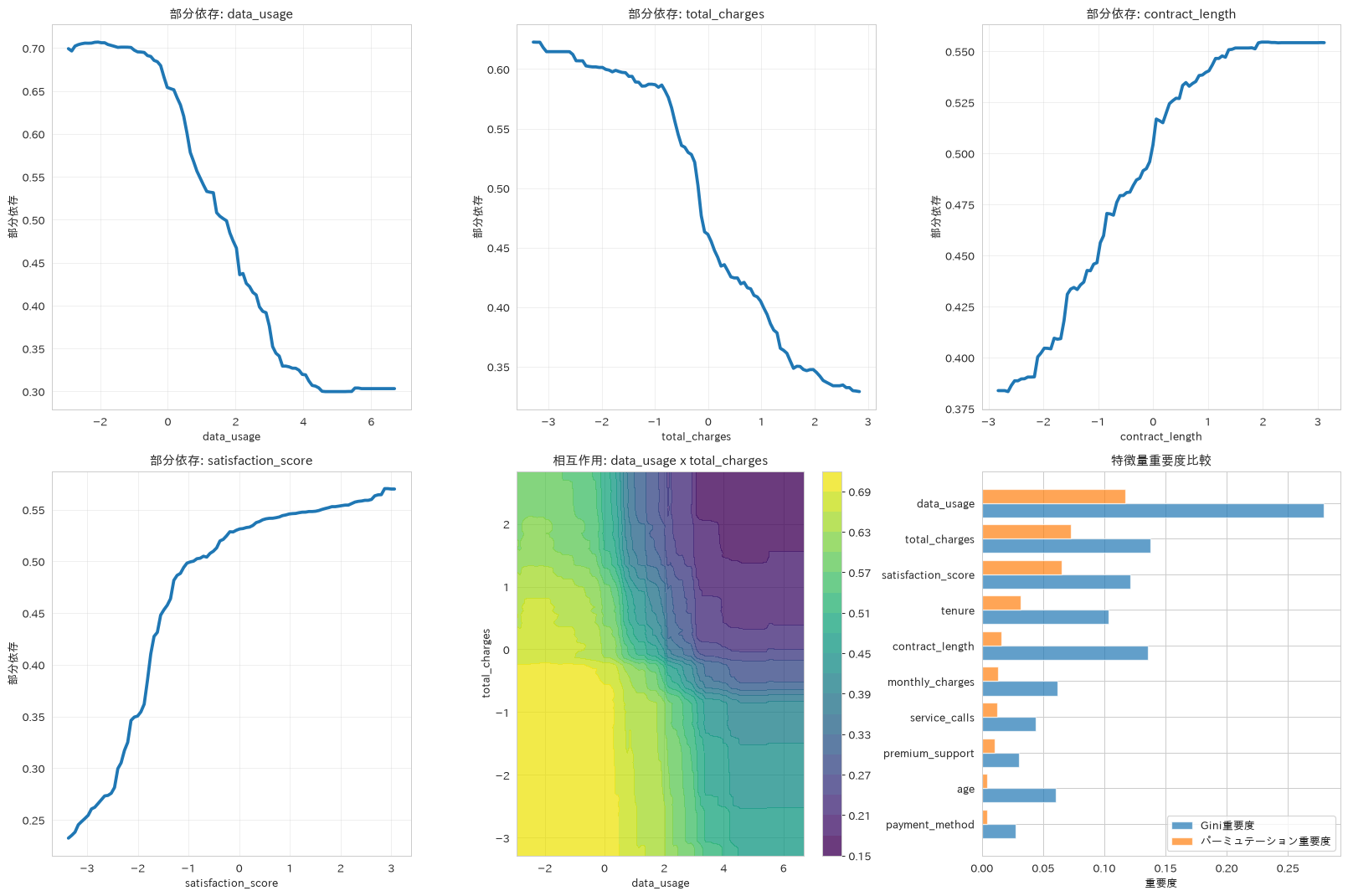
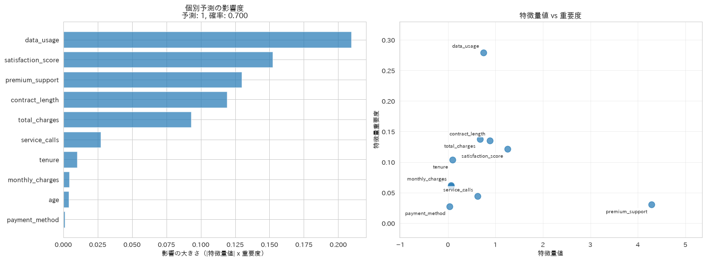
この章を深めたい方への参考書籍
- 森下光之助『機械学習を解釈する技術』(技術評論社):PFI・PD・ICE・SHAPの4手法を、実装とシミュレーションの両面から扱います。本章の部分依存プロットとパーミュテーション重要度を、結果の読み違いを避けながら使えるようになります。
- Andreas C. Muller・Sarah Guido『Pythonではじめる機械学習』(オライリー・ジャパン):4.5節「自動特徴量選択」で、単変量統計・モデルベース・反復選択の3系統が比較されています。本章のRFECVがどの考え方に立つ手法なのかを位置づけられます。
モデル運用とMLOps
最後に、学習済みモデルを実運用に乗せるための実装パターンを扱います。
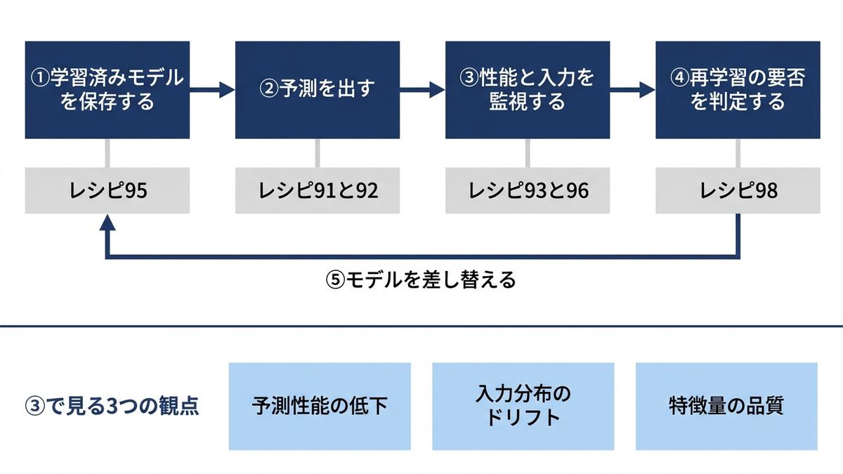
91. バッチ予測システム
データをチャンク単位で処理するバッチ予測関数を実装し、全件を一度に読み込まずに予測を回す書き方を紹介します。ここでは400件を200件ずつの2チャンクで処理する小さな例ですが、同じ関数のまま件数を増やせます。メモリが効いてくるのは入力側なので、1チャンクぶんと全件の入力サイズを実測して並べます。予測結果をすべて配列に貯めるこの実装では、出力側のメモリは減りません。件数が本当に大きい場合は、チャンクごとにファイルへ書き出す形にします。
# データを分割しながら進めるバッチ予測
def batch_predict(model, data_chunks, chunk_size=1000):
    """チャンク単位で予測する"""
    predictions = []
    probabilities = []

    for i in range(0, len(data_chunks), chunk_size):
        chunk = data_chunks[i:i+chunk_size]
        pred = model.predict(chunk)
        pred_proba = model.predict_proba(chunk)[:, 1] if hasattr(model, 'predict_proba') else None

        predictions.extend(pred)
        if pred_proba is not None:
            probabilities.extend(pred_proba)

    return {
        'predictions': np.array(predictions),
        'probabilities': np.array(probabilities) if probabilities else None,
        'total_processed': len(predictions)
    }

# バッチ予測のデモンストレーション
# best_rfは非スケーリングのX_trainで学習しているため、X_testをそのまま渡す
chunk_size = 200
batch_results = batch_predict(best_rf, X_test, chunk_size=chunk_size)
print(f"バッチ予測完了: {batch_results['total_processed']}件処理"
      f"({chunk_size}件ずつ {int(np.ceil(len(X_test) / chunk_size))} チャンク)")

# 入力側のメモリを実測して比べる
chunk_bytes = int(X_test.iloc[:chunk_size].memory_usage(deep=True).sum())
full_bytes = int(X_test.memory_usage(deep=True).sum())
print(f"1チャンク({chunk_size}件)の入力サイズ: {chunk_bytes:,}バイト")
print(f"全{len(X_test)}件をまとめて渡した場合: {full_bytes:,}バイト")
バッチ予測完了: 400件処理(200件ずつ 2 チャンク)
1チャンク(200件)の入力サイズ: 17,600バイト
全400件をまとめて渡した場合: 35,200バイト
92. リアルタイム予測API
入力検証とレスポンスタイム計測を組み込んだリアルタイム予測関数を実装し、API設計で重視すべき信頼性と応答速度の観点を扱います。
# API形式のリアルタイム予測関数
import time
import json

def real_time_predict(model, input_data, confidence_threshold=0.5):
    """リアルタイム予測関数
    前処理が必要なモデルは、スケーラー込みのPipelineを渡せばこの関数のまま利用できる
    """
    start_time = time.time()

    try:
        # 入力データの検証
        if len(input_data) != model.n_features_in_:
            return {"error": "Invalid input dimensions", "status": "failed"}

        # 予測
        input_array = np.asarray(input_data).reshape(1, -1)
        prediction_class = model.predict(input_array)[0]
        prediction_proba = model.predict_proba(input_array)[0]

        # 予測結果の解釈
        # NumPyの数値・真偽値はそのままだと json.dumps に渡せないので
        # Python標準の float / bool に直しておく
        confidence = float(max(prediction_proba))
        is_confident = bool(confidence >= confidence_threshold)

        end_time = time.time()

        return {
            "prediction_class": int(prediction_class),
            "prediction_probability": float(prediction_proba[1]),
            "confidence": float(confidence),
            "is_confident": is_confident,
            "response_time_ms": round((end_time - start_time) * 1000, 2),
            "status": "success"
        }

    except Exception as e:
        return {"error": str(e), "status": "failed"}

# APIデモンストレーション(best_rfは非スケーリングのX_trainで学習しているため、X_testの生の値を渡す)
sample_input = X_test.iloc[0].values
api_result = real_time_predict(best_rf, sample_input)
print(f"APIレスポンス: {json.dumps(api_result, indent=2)}")
APIレスポンス: {
  "prediction_class": 1,
  "prediction_probability": 0.6998809523809524,
  "confidence": 0.6998809523809524,
  "is_confident": true,
  "response_time_ms": 9.95,
  "status": "success"
}
93. モデルドリフト検出
統計的検定を用いて訓練時と運用時のデータ分布のずれ(ドリフト)を検出し、モデル劣化の予兆を早期に発見して再学習判断につなげる方法を紹介します。ここで大事なのは、ドリフトが起きていないときに「正常」と出ることと、起きたときに「検出」と出ることを、両方確かめておく点です。片方しか試していない監視は、誤検知しているのか本当に検出しているのかを区別できません。
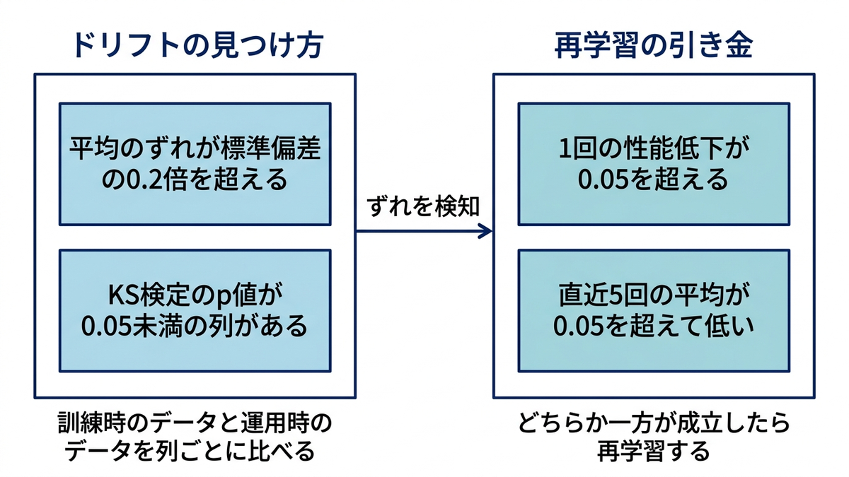
もう1つの落とし穴が判定式です。平均の変化を相対変化率(差÷基準の平均)で測ると、標準化済みの特徴量のように基準の平均がゼロ近くの列では、ごくわずかな差でも比率が発散して誤検知します。差は標準偏差で割った標準化平均差で測ります。
# データドリフト検出による予測性能劣化の早期発見
from scipy import stats

X_train_drift = X_train_scaled
X_test_drift = X_test_scaled

# 運用データにドリフトを注入したものも用意し、検出できるかを対比する
X_drifted = X_test_drift.copy()
X_drifted[:, 2] += 2.0     # monthly_charges の水準が上がった
X_drifted[:, 1] *= 1.5     # tenure のばらつきが広がった

def detect_drift(reference_data, current_data, threshold=0.2):
    """平均とばらつきの変化でドリフトを判定する。

    平均の差は標準偏差で割る(標準化平均差)。基準の平均で割ると、
    標準化済みの特徴量では分母がゼロ近くになり、わずかな差でも発散する。
    """
    ref_std = np.std(reference_data, axis=0)
    curr_std = np.std(current_data, axis=0)
    ref_mean = np.mean(reference_data, axis=0)
    curr_mean = np.mean(current_data, axis=0)

    std_change = np.max(np.abs(curr_std - ref_std) / ref_std)
    mean_change = np.max(np.abs(curr_mean - ref_mean) / ref_std)

    return (std_change > threshold) or (mean_change > threshold)

def statistical_drift_test(reference_data, current_data, alpha=0.05):
    """統計的検定による厳密なドリフト検出"""
    drift_features = []
    p_values = []
    statistics = []

    for i in range(reference_data.shape[1]):
        # コルモゴロフ・スミルノフ検定
        statistic, p_value = stats.ks_2samp(reference_data[:, i], current_data[:, i])
        p_values.append(p_value)
        statistics.append(statistic)

        if p_value < alpha:
            drift_features.append(i)

    return {
        'drift_detected': len(drift_features) > 0,
        'drift_features': drift_features,
        'p_values': p_values,
        'statistics': statistics,
        'overall_drift_ratio': len(drift_features) / reference_data.shape[1]
    }

# ドリフトなし(同じ分布のデータ)と、ドリフトあり(注入したデータ)の両方で実行する
for label, current in [('ドリフトなし', X_test_drift), ('ドリフトあり', X_drifted)]:
    simple = detect_drift(X_train_drift, current)
    test = statistical_drift_test(X_train_drift, current)
    names = [X_train.columns[i] for i in test['drift_features']]
    print(f"[{label}]")
    print(f"  簡易判定: {'検出' if simple else '正常'}")
    print(f"  統計検定: {'検出' if test['drift_detected'] else '正常'}"
          f" / 該当 {len(test['drift_features'])}列 ({test['overall_drift_ratio']:.0%})")
    if names:
        print(f"  該当した列: {names}")

# 結果可視化
drift_test_results = statistical_drift_test(X_train_drift, X_drifted)
fig, axes = plt.subplots(1, 2, figsize=(15, 6))

# 特徴量別分布比較(ドリフトを入れた monthly_charges で見る)
feature_idx = 2
axes[0].hist(X_train_drift[:, feature_idx], bins=30, alpha=0.6, label='訓練時', density=True)
axes[0].hist(X_test_drift[:, feature_idx], bins=30, alpha=0.6, label='運用時(ドリフトなし)', density=True)
axes[0].hist(X_drifted[:, feature_idx], bins=30, alpha=0.6, label='運用時(ドリフトあり)', density=True)
axes[0].set_xlabel(f'{X_train.columns[feature_idx]}(標準化後)')
axes[0].set_ylabel('密度')
axes[0].set_title('特徴量分布の比較', fontweight='bold')
axes[0].legend()

# 特徴量ごとに分布のずれの大きさ(KS統計量)を並べ、有意だった列を赤で示す。
# p値をそのまま棒にすると、ドリフトを入れた列ほどp値がほぼ0になって棒が消え、
# 肝心の「検出された列」だけが図から見えなくなる
ks_stats = drift_test_results['statistics']
pvals = drift_test_results['p_values']
colors = ['tab:red' if p < 0.05 else 'tab:blue' for p in pvals]
drift_bars = axes[1].bar(range(len(ks_stats)), ks_stats, color=colors)
for rect, p in zip(drift_bars, pvals):
    axes[1].text(rect.get_x() + rect.get_width() / 2, rect.get_height(),
                 'p<0.001' if p < 0.001 else f'p={p:.3f}',
                 ha='center', va='bottom', fontsize=8)
axes[1].set_xticks(range(len(ks_stats)))
axes[1].set_xticklabels(X_train.columns, rotation=45, ha='right')
axes[1].set_ylim(0, max(ks_stats) * 1.20)
axes[1].set_ylabel('KS統計量(分布のずれの大きさ)')
axes[1].set_title('特徴量ごとの分布のずれ(赤は p<0.05 でドリフト検出)', fontweight='bold')

plt.tight_layout()
plt.show()
[ドリフトなし]
  簡易判定: 正常
  統計検定: 正常 / 該当 0列 (0%)
[ドリフトあり]
  簡易判定: 検出
  統計検定: 検出 / 該当 2列 (20%)
  該当した列: ['tenure', 'monthly_charges']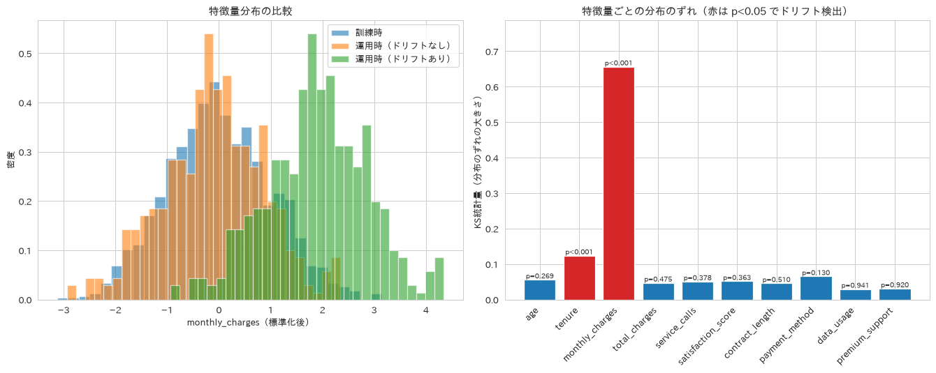
94. A/Bテスト効果分析
効果量(Cohen’s d)や改善率に加えて、t検定のp値と差の95%信頼区間を算出するA/Bテスト分析関数を実装し、統計的有意性と実務上の意義の両面から施策効果を評価する考え方を扱います。コンバージョンは申し込んだか否かの二値なので、正規分布から生成すると負の率が混ざります。ここでは二項分布で生成します。
効果量(Cohen’s d)は、2群の平均の差を、両群をまとめた標準偏差で割った値です。目安としては0.2で小、0.5で中、0.8で大とされることが多いのですが、これは分野を問わず成り立つ定数ではなく慣習にすぎず、指標の性質や比較する対象によって基準は変わります。ここで得られる効果量は0.077で、この目安に当てはめれば「小」にも届きません。それでもコンバージョン率はコントロール群の5.12%に対して施策群が6.96%、改善率にすると35.9%あり、p値は0.000112で有意です。0か1しか取らない指標は1件ごとの散らばりが平均に比べて大きく、率の差を標準偏差で割ると小さな値になるためで、慣習の目安だけで切り捨てると事業として十分に大きい差を見落とします。
# A/Bテスト効果の統計的評価
from scipy import stats

def ab_test_analysis(control_group, treatment_group):
    """A/Bテスト効果分析"""
    control_mean = np.mean(control_group)
    treatment_mean = np.mean(treatment_group)

    # エフェクトサイズ(Cohen's d)
    # サンプルサイズが違っても成り立つよう、自由度で重み付けしたpooled標準偏差を使う
    n_control, n_treatment = len(control_group), len(treatment_group)
    pooled_var = ((n_control - 1) * np.var(control_group, ddof=1)
                  + (n_treatment - 1) * np.var(treatment_group, ddof=1)) \
        / (n_control + n_treatment - 2)
    pooled_std = np.sqrt(pooled_var)
    effect_size = (treatment_mean - control_mean) / pooled_std

    # 相対的改善率
    improvement_rate = (treatment_mean - control_mean) / control_mean * 100

    # 統計的有意性(分散が等しいと仮定しないWelchのt検定)
    t_stat, p_value = stats.ttest_ind(treatment_group, control_group, equal_var=False)

    # 差の95%信頼区間
    diff = treatment_mean - control_mean
    standard_error = np.sqrt(np.var(control_group, ddof=1) / len(control_group)
                             + np.var(treatment_group, ddof=1) / len(treatment_group))
    ci_95 = (diff - 1.96 * standard_error, diff + 1.96 * standard_error)

    return {
        "control_mean": control_mean,
        "treatment_mean": treatment_mean,
        "effect_size": effect_size,
        "improvement_rate": improvement_rate,
        "t_stat": t_stat,
        "p_value": p_value,
        "ci_95": ci_95
    }

# サンプルA/Bテストデータでの効果測定(コンバージョンは0か1の二値)
np.random.seed(42)
control_conversion = np.random.binomial(1, 0.05, 5000)  # コントロール群
treatment_conversion = np.random.binomial(1, 0.07, 5000)  # 施策群

ab_results = ab_test_analysis(control_conversion, treatment_conversion)
print("A/Bテスト分析結果")
print(f"コントロール群平均: {ab_results['control_mean']:.4f}")
print(f"施策群平均: {ab_results['treatment_mean']:.4f}")
print(f"効果サイズ: {ab_results['effect_size']:.3f}")
print(f"改善率: {ab_results['improvement_rate']:.1f}%")
print(f"t統計量: {ab_results['t_stat']:.3f}")
print(f"p値: {ab_results['p_value']:.6f}"
      f"(有意水準5%で{'有意' if ab_results['p_value'] < 0.05 else '有意ではない'})")
print(f"差の95%信頼区間: [{ab_results['ci_95'][0]:.4f}, {ab_results['ci_95'][1]:.4f}]")
A/Bテスト分析結果
コントロール群平均: 0.0512
施策群平均: 0.0696
効果サイズ: 0.077
改善率: 35.9%
t統計量: 3.864
p値: 0.000112(有意水準5%で有意)
差の95%信頼区間: [0.0091, 0.0277]
95. モデルバージョン管理システム
モデルとメタデータをまとめて管理するクラスを実装し、運用中のモデルを体系的にバージョン管理して透明性を確保する方法を紹介します。
# プロダクション対応モデルバージョン管理
import joblib
import json
from datetime import datetime

class ModelVersion:
    """MLモデルのバージョン管理クラス"""
    def __init__(self, model, version, metadata):
        self.model = model
        self.version = version
        self.metadata = metadata
        self.created_at = pd.Timestamp.now()

    def save(self, filepath):
        """モデル本体とメタデータをまとめて保存する"""
        model_path = f"{filepath}.joblib"
        joblib.dump(self.model, model_path)
        info = {
            "version": self.version,
            "created_at": str(self.created_at),
            "model_path": model_path,
            "metadata": self.metadata
        }
        with open(f"{filepath}_info.json", 'w') as f:
            json.dump(info, f, indent=2, default=str)
        return model_path

    def load_model_info(self, filepath):
        """モデル情報の読み込み"""
        with open(f"{filepath}_info.json", 'r') as f:
            return json.load(f)

# モデルバージョン作成と管理
model_v1 = ModelVersion(
    model=best_rf,
    version="v1.0",
    metadata={
        # 台帳に架空の数字を書かない。その時点の実測値をそのまま残す
        "accuracy": best_rf.score(X_test, y_test),
        "features": len(X_train.columns),
        "algorithm": "RandomForest",
        "hyperparameters": best_rf.get_params(),
        "training_samples": len(X_train)
    }
)

# 保存して、モデル本体とメタデータの両方が残ることを確かめる
saved_model_path = model_v1.save('model_registry_v1')
restored_info = model_v1.load_model_info('model_registry_v1')

# バージョン情報表示
print("モデルバージョン管理システム")
print(f"バージョン: {model_v1.version}")
print(f"作成日時: {model_v1.created_at}")
print(f"精度: {model_v1.metadata['accuracy']:.3f}")
print(f"特徴量数: {model_v1.metadata['features']}")
print(f"保存したモデル本体: {saved_model_path}")
print(f"読み戻したメタデータのバージョン: {restored_info['version']}")
モデルバージョン管理システム
バージョン: v1.0
作成日時: 2026-08-27 11:04:51.201996
精度: 0.968
特徴量数: 10
保存したモデル本体: model_registry_v1.joblib
読み戻したメタデータのバージョン: v1.0
96. 特徴量品質モニタリング
運用データの特徴量分布を継続的に監視する仕組みを実装し、新規特徴量の出現や分布変化を早期に検知してモデル劣化を防ぐ方法を扱います。レシピ93と同じ理由で、平均の変化は基準の平均で割らず標準偏差で割ります。基準の平均がゼロ付近の列では、0.05標準偏差ほどの差が「4000%の逸脱」に化けて、監視が誤報だらけになります。ここでも、正常なデータでは何も鳴らないことと、壊したデータでだけ鳴ることの両方を確かめます。
# プロダクション環境での特徴量ドリフト検出
def monitor_feature_quality(current_features, reference_stats, threshold=0.2):
    """特徴量品質モニタリングシステム。

    threshold は標準偏差を単位とした差(0.2なら0.2標準偏差ぶんのずれ)。
    """
    alerts = []
    quality_report = {}

    for col in current_features.columns:
        if col not in reference_stats:
            alerts.append(f"基準に無い特徴量 {col} が来ています")
            continue

        current_mean = current_features[col].mean()
        current_std = current_features[col].std()
        ref_mean = reference_stats[col]['mean']
        ref_std = reference_stats[col]['std']

        # 平均の差は標準偏差を単位にして測る(基準の平均で割らない)
        mean_shift = abs(current_mean - ref_mean) / ref_std if ref_std != 0 else float('inf')
        # ばらつきは比なので、そのまま変化率で測ってよい
        std_change = abs(current_std - ref_std) / ref_std if ref_std != 0 else float('inf')

        quality_report[col] = {
            'mean_shift': mean_shift,
            'std_change': std_change,
            'current_mean': current_mean,
            'reference_mean': ref_mean
        }

        if mean_shift > threshold:
            alerts.append(f"特徴量 {col} の平均が基準から {mean_shift:.2f}標準偏差ずれています")
        if std_change > threshold:
            alerts.append(f"特徴量 {col} のばらつきが基準から {std_change:.1%} 変化しています")

    return alerts, quality_report

# 参照統計情報の作成
reference_stats = {}
for col in X_train.columns:
    reference_stats[col] = {
        'mean': X_train[col].mean(),
        'std': X_train[col].std(),
        'min': X_train[col].min(),
        'max': X_train[col].max()
    }

# 壊したデータも用意する(水準のずれ・ばらつきの拡大・見覚えのない列)
X_broken = X_test.copy()
X_broken['monthly_charges'] = X_broken['monthly_charges'] + 1.5 * X_train['monthly_charges'].std()
X_broken['tenure'] = X_broken['tenure'] * 1.8
X_broken['campaign_code'] = 1

for label, data in [('正常な運用データ', X_test), ('壊れた運用データ', X_broken)]:
    alerts, quality_report = monitor_feature_quality(data, reference_stats)
    print(f"[{label}]")
    if alerts:
        for alert in alerts:
            print(f"  - {alert}")
    else:
        print("  全特徴量が正常範囲内")
    top = sorted(quality_report.items(), key=lambda x: x[1]['mean_shift'], reverse=True)[:3]
    for feature, st in top:
        print(f"    {feature}: 平均のずれ {st['mean_shift']:.2f}標準偏差")
[正常な運用データ]
  全特徴量が正常範囲内
    monthly_charges: 平均のずれ 0.11標準偏差
    payment_method: 平均のずれ 0.07標準偏差
    age: 平均のずれ 0.06標準偏差
[壊れた運用データ]
  - 特徴量 tenure のばらつきが基準から 88.4% 変化しています
  - 特徴量 monthly_charges の平均が基準から 1.39標準偏差ずれています
  - 基準に無い特徴量 campaign_code が来ています
    monthly_charges: 平均のずれ 1.39標準偏差
    payment_method: 平均のずれ 0.07標準偏差
    age: 平均のずれ 0.06標準偏差
97. 予測不確実性の定量化
予測がどれくらい当てにならないかを、顧客1件ごとに数値で出す方法です。ランダムフォレストの予測確率は、中にある多数の決定木が返す確率の平均です。ここでは、その平均を投票割合に見立てて、二項分布の標準誤差から幅を作ります。木の意見が割れている顧客ほど幅が広くなり、人が目で確認すべき対象になります。
ただし、これは校正された予測区間ではなく、木のばらつきを見るための近似的な指標です。深さを制限した木の葉は純粋とは限らないため、各木が返すのは0か1の票とは限らず、0から1のあいだの確率値も混じります。木どうしも独立なベルヌーイ試行ではないので、p * (1 - p) / n_treesは厳密な95%信頼区間にはなりません。被覆を保証したい場合は、レシピ77と同じくConformal Prediction(指定した確率で真の値を含むように区間の幅を決める手法)などを使います。
ここで避けたいのは、入力の行そのものをリサンプリングして「ばらつき」と呼ぶやり方です。反復ごとに別の顧客を引いてしまうため、測っているのは「顧客をランダムに選んだときの予測値の散らばり」であって、特定の顧客に対する予測の不確かさではありません。区間はほぼ0から1の全域に広がり、どの顧客が危ういのかが何も分からない図になります。
木ごとの予測の分位点を取るやり方にも注意が要ります。深さを制限していない決定木は1本ずつが0か1しか返さないため、意見が少しでも割れると2.5パーセンタイルが0、97.5パーセンタイルが1になり、区間が全域に張り付きます。割合そのものの標準誤差を使うほうが、顧客ごとの差が見える形になります。
# 木ごとの予測確率の平均と、それを投票割合に見立てた標準誤差から1件ごとの幅を出す
def prediction_uncertainty(model, X):
    """木の予測の平均を投票割合とみなし、二項分布の標準誤差で幅を作る近似指標。

    厳密な信頼区間ではない。木どうしは独立なベルヌーイ試行ではなく、
    深さを制限した木は0か1ではなく0から1の確率を返すためである。
    """
    tree_preds = np.stack([t.predict_proba(X)[:, 1] for t in model.estimators_])
    n_trees = tree_preds.shape[0]
    p = tree_preds.mean(axis=0)                 # 木ごとの確率の平均
    se = np.sqrt(p * (1 - p) / n_trees)         # 割合とみなしたときの標準誤差
    return {
        'mean': p,
        'se': se,
        'lower_ci': np.clip(p - 1.96 * se, 0, 1),
        'upper_ci': np.clip(p + 1.96 * se, 0, 1),
        'n_trees': n_trees,
    }

uncertainty_results = prediction_uncertainty(best_rf, X_test)
width = uncertainty_results['upper_ci'] - uncertainty_results['lower_ci']

print("予測不確実性分析結果")
print(f"木の本数: {uncertainty_results['n_trees']} / 対象サンプル数: {len(width)}")
print(f"近似区間の幅の平均: {width.mean():.3f}")
print(f"近似区間の幅の最小 / 最大: {width.min():.3f} / {width.max():.3f}")
print(f"幅が0.10を超えた(木の意見が割れた)サンプル: {(width > 0.10).sum()}件")

worst = np.argsort(width)[-3:][::-1]
for i in worst:
    print(f"  最も不確実なサンプル {i}: 予測 {uncertainty_results['mean'][i]:.3f}"
          f" / 区間 [{uncertainty_results['lower_ci'][i]:.3f}, {uncertainty_results['upper_ci'][i]:.3f}]")

# 不確実性の可視化(予測値の順に並べると、確信の強弱が読み取れる)
order = np.argsort(uncertainty_results['mean'])
x = np.arange(len(order))

plt.figure(figsize=(10, 6))
plt.fill_between(x,
                uncertainty_results['lower_ci'][order],
                uncertainty_results['upper_ci'][order],
                alpha=0.35, label='近似区間(木のばらつきの目安)')
plt.plot(x, uncertainty_results['mean'][order], '-', label='予測(木ごとの確率の平均)', linewidth=2)
plt.xlabel('テストサンプル(予測確率の小さい順)')
plt.ylabel('予測確率')
plt.title('サンプルごとの予測不確実性', fontweight='bold')
plt.legend(loc='upper left', framealpha=0.9)
plt.grid(True, alpha=0.3)
plt.show()
予測不確実性分析結果
木の本数: 100 / 対象サンプル数: 400
近似区間の幅の平均: 0.073
近似区間の幅の最小 / 最大: 0.000 / 0.196
幅が0.10を超えた(木の意見が割れた)サンプル: 124件
  最も不確実なサンプル 11: 予測 0.492 / 区間 [0.394, 0.590]
  最も不確実なサンプル 199: 予測 0.535 / 区間 [0.437, 0.633]
  最も不確実なサンプル 16: 予測 0.540 / 区間 [0.443, 0.638]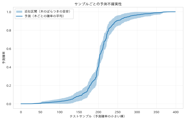
98. 自動リトレーニングシステム
性能低下とデータドリフトの閾値に基づいて再学習の要否を判定するクラスを実装し、モデル品質を自動的に維持する運用設計を扱います。低下幅は符号付きで見ます。絶対値で見ると、性能が上がったときにも「変化した」と判定されて再学習が走ってしまうためです。ドリフトの大きさは、レシピ93・96と同じく標準偏差を単位にした平均のずれで測ります。
# モデル性能監視と自動リトレーニング判定
class AutoRetrainSystem:
    def __init__(self, performance_threshold=0.05, data_drift_threshold=0.3):
        self.performance_threshold = performance_threshold
        # ドリフトの閾値は標準偏差を単位とした平均のずれ(0.3なら0.3標準偏差)
        self.data_drift_threshold = data_drift_threshold
        self.baseline_performance = None
        self.reference_stats = None
        self.performance_history = []

    def fit_reference(self, X_reference):
        """基準となるデータの分布を覚える"""
        X_reference = np.asarray(X_reference, dtype=float)
        self.reference_stats = (X_reference.mean(axis=0), X_reference.std(axis=0))
        return self

    def drift_score(self, X_new):
        """基準からの平均のずれを標準偏差単位で測り、最大値を返す"""
        if self.reference_stats is None:
            return 0.0
        ref_mean, ref_std = self.reference_stats
        safe_std = np.where(ref_std == 0, 1e-8, ref_std)
        shift = np.abs(np.asarray(X_new, dtype=float).mean(axis=0) - ref_mean) / safe_std
        return float(np.max(shift))

    def should_retrain(self, current_performance, drift=0.0, baseline_performance=None):
        """リトレーニング必要性の判定"""
        if baseline_performance is not None:
            self.baseline_performance = baseline_performance

        if self.baseline_performance is None:
            return False

        # 符号付きで見る。絶対値にすると性能が向上したときも再学習が走る
        performance_drop = self.baseline_performance - current_performance
        self.performance_history.append(current_performance)

        # 性能低下判定
        performance_trigger = performance_drop > self.performance_threshold

        # 連続的な性能低下判定(直近5回の平均)
        if len(self.performance_history) >= 5:
            recent_avg = np.mean(self.performance_history[-5:])
            trend_trigger = (self.baseline_performance - recent_avg) > self.performance_threshold
        else:
            trend_trigger = False

        # データドリフト判定
        drift_trigger = drift > self.data_drift_threshold

        return performance_trigger or trend_trigger or drift_trigger

    def evaluate_retrain_trigger(self, model, X_new, y_new):
        """新データでの総合的リトレーニング判定"""
        # 現在の性能評価
        current_score = model.score(X_new, y_new)
        drift = self.drift_score(X_new)

        # リトレーニング判定
        retrain_needed = self.should_retrain(current_score, drift=drift)

        return {
            'retrain_needed': retrain_needed,
            'current_performance': current_score,
            'baseline_performance': self.baseline_performance,
            'performance_drop': self.baseline_performance - current_score,
            'drift_score': drift,
            'history_length': len(self.performance_history)
        }

# リトレーニングシステムの使用例
retrain_system = AutoRetrainSystem(performance_threshold=0.05, data_drift_threshold=0.3)
retrain_system.fit_reference(X_train)

# ベースライン性能の設定
baseline_accuracy = best_rf.score(X_test, y_test)
retrain_system.baseline_performance = baseline_accuracy

# 新データでの評価(シミュレーション)
# ベースライン近傍から少しずつ下げると、閾値をまたぐ瞬間が見える
simulated_performance = [0.960, 0.945, 0.930, 0.905, 0.890]

print("自動リトレーニングシステム")
print(f"ベースライン性能: {baseline_accuracy:.3f}")
print(f"性能低下閾値: {retrain_system.performance_threshold:.3f}")

for i, perf in enumerate(simulated_performance, 1):
    retrain_needed = retrain_system.should_retrain(perf)
    print(f"期間 {i}: 性能 {perf:.3f}, 低下幅 {baseline_accuracy - perf:+.3f}, "
          f"リトレーニング必要: {retrain_needed}")

# ドリフト判定も実際に動かす
X_shifted = X_test.copy()
X_shifted['monthly_charges'] = X_shifted['monthly_charges'] + 2.0
print(f"\nドリフト閾値: {retrain_system.data_drift_threshold} 標準偏差")
print(f"ドリフト無し(X_test)のスコア: {retrain_system.drift_score(X_test):.3f}")
print(f"ドリフト有り(1列に+2.0)のスコア: {retrain_system.drift_score(X_shifted):.3f}")

# 性能が落ちていなくても、ドリフトだけで再学習の判定が立つことを確かめる
drift_only = retrain_system.should_retrain(baseline_accuracy,
                                           drift=retrain_system.drift_score(X_shifted))
print(f"性能は基準どおりでもドリフトだけで再学習が必要になるか: {drift_only}")
自動リトレーニングシステム
ベースライン性能: 0.968
性能低下閾値: 0.050
期間 1: 性能 0.960, 低下幅 +0.008, リトレーニング必要: False
期間 2: 性能 0.945, 低下幅 +0.023, リトレーニング必要: False
期間 3: 性能 0.930, 低下幅 +0.037, リトレーニング必要: False
期間 4: 性能 0.905, 低下幅 +0.062, リトレーニング必要: True
期間 5: 性能 0.890, 低下幅 +0.078, リトレーニング必要: True

ドリフト閾値: 0.3 標準偏差
ドリフト無し(X_test)のスコア: 0.106
ドリフト有り(1列に+2.0)のスコア: 0.840
性能は基準どおりでもドリフトだけで再学習が必要になるか: True
99. 説明可能AI(XAI)の実装
個別の予測がなぜその値になったのかを、局所的な代理モデルで説明する方法です。LIMEの考え方は、説明したい1点のまわりで入力を少しずつ揺らして予測を集め、その狭い範囲だけに線形モデルを当てはめる、というものです。当てはめた線形モデルの係数が、そのまま「この特徴量が増えると予測がどちら向きに動くか」を表します。
レシピ90で使った「特徴量の値×重要度」の近似では、この向きが取れません。feature_importances_は常に非負なので、積の符号は特徴量の値の符号を写しているだけで、予測を押し上げたか押し下げたかとは無関係だからです。ここでは実際に摂動を行い、符号に意味のある係数を得ます。
# 局所的な代理モデルによる個別予測の説明(LIMEの考え方)
from sklearn.linear_model import Ridge

def explain_prediction(model, X_sample, feature_names, X_background,
                       n_perturbations=1000, random_state=0):
    """説明したい1点のまわりを揺らし、その近傍に線形モデルを当てる"""
    rs = np.random.RandomState(random_state)
    x0 = np.asarray(X_sample, dtype=float).ravel()

    # 各特徴量の散らばりに合わせた幅で摂動させる。
    # 定数列があると 0 で割ることになるので、レシピ98と同じ形で保護する
    scale = np.asarray(X_background, dtype=float).std(axis=0)
    safe_scale = np.where(scale == 0, 1e-8, scale)
    noise = rs.normal(0, 0.5 * safe_scale, size=(n_perturbations, len(x0)))
    X_perturbed = x0 + noise

    y_perturbed = model.predict_proba(X_perturbed)[:, 1]

    # 元の点に近いものほど重く見る
    dist = np.linalg.norm(noise / safe_scale, axis=1)
    weights = np.exp(-(dist ** 2) / (2 * (np.median(dist) ** 2)))

    surrogate = Ridge(alpha=1.0)
    surrogate.fit(X_perturbed, y_perturbed, sample_weight=weights)

    base_prediction = float(model.predict_proba(x0.reshape(1, -1))[0, 1])
    explanation = pd.DataFrame({
        'feature': list(feature_names),
        'value': x0,
        'coef': surrogate.coef_,
        'effect': surrogate.coef_ * (x0 - np.asarray(X_background, dtype=float).mean(axis=0)),
    })
    explanation['abs_effect'] = explanation['effect'].abs()
    explanation = explanation.sort_values('abs_effect', ascending=False)

    return {
        'prediction': base_prediction,
        'prediction_class': 'High Risk' if base_prediction > 0.5 else 'Low Risk',
        'local_r2': surrogate.score(X_perturbed, y_perturbed, sample_weight=weights),
        'top_factors': explanation.head(5),
    }

def create_explanation_report(model, X_samples, feature_names, X_background, n_samples=5):
    """複数サンプルの説明レポート作成"""
    rows = []
    for i in range(min(n_samples, len(X_samples))):
        sample = X_samples.iloc[i] if hasattr(X_samples, 'iloc') else X_samples[i]
        e = explain_prediction(model, sample, feature_names, X_background)
        top = e['top_factors'].iloc[0]
        rows.append({
            'sample_id': i,
            'prediction': e['prediction'],
            'top_factor': top['feature'],
            'effect': top['effect'],
            'direction': '押し上げ' if top['effect'] > 0 else '押し下げ',
        })
    return pd.DataFrame(rows)

# 説明可能AI実行
X_bg = X_train.values
sample_explanation = explain_prediction(best_rf, X_test.iloc[0].values, X_test.columns, X_bg)

print("説明可能AI分析結果")
print(f"予測結果: {sample_explanation['prediction']:.3f}")
print(f"予測クラス: {sample_explanation['prediction_class']}")
print(f"代理モデルの当てはまり(局所R2): {sample_explanation['local_r2']:.3f}")

print(f"\n主要影響因子 (Top 5):")
for _, row in sample_explanation['top_factors'].iterrows():
    direction = "押し上げ" if row['effect'] > 0 else "押し下げ"
    print(f"{row['feature']}: 値 {row['value']:.3f} / 係数 {row['coef']:+.4f}"
          f" / 寄与 {row['effect']:+.4f}({direction})")

# 複数サンプルの説明レポート
explanation_report = create_explanation_report(best_rf, X_test, X_test.columns, X_bg)
print(f"\n説明レポートサマリー:")
print(explanation_report.head())
説明可能AI分析結果
予測結果: 0.700
予測クラス: High Risk
代理モデルの当てはまり(局所R2): 0.848

主要影響因子 (Top 5):
data_usage: 値 0.751 / 係数 -0.1135 / 寄与 +0.0915(押し上げ)
total_charges: 値 0.676 / 係数 -0.1283 / 寄与 -0.0865(押し下げ)
satisfaction_score: 値 1.257 / 係数 +0.0423 / 寄与 +0.0516(押し上げ)
payment_method: 値 0.038 / 係数 -0.0177 / 寄与 -0.0198(押し下げ)
service_calls: 値 0.625 / 係数 -0.0390 / 寄与 +0.0111(押し上げ)

説明レポートサマリー:
   sample_id  prediction       top_factor    effect direction
0          0    0.699881       data_usage  0.091513      押し上げ
1          1    0.984671    total_charges  0.038579      押し上げ
2          2    0.989063       data_usage  0.154816      押し上げ
3          3    0.111853  contract_length -0.060118      押し下げ
4          4    0.987500       data_usage  0.066619      押し上げ
100. 総合性能ダッシュボード
複数モデルの正解率・適合率・再現率・F1・AUCを一括算出するダッシュボード関数を実装し、運用中の全モデルの性能を一元的に管理する方法を紹介します。
# MLモデル総合性能ダッシュボードの構築
from sklearn.metrics import roc_auc_score

def create_model_dashboard(models_dict, X_test, y_test):
    """モデル性能総合ダッシュボード"""
    dashboard = {}

    for name, model in models_dict.items():
        try:
            y_pred = model.predict(X_test)
            y_pred_proba = model.predict_proba(X_test)[:, 1] if hasattr(model, 'predict_proba') else None

            dashboard[name] = {
                'accuracy': accuracy_score(y_test, y_pred),
                'precision': precision_score(y_test, y_pred, zero_division=0),
                'recall': recall_score(y_test, y_pred, zero_division=0),
                'f1_score': f1_score(y_test, y_pred, zero_division=0),
                'auc': roc_auc_score(y_test, y_pred_proba) if y_pred_proba is not None else None,
                'support': len(y_test)
            }
        except Exception as e:
            dashboard[name] = {'error': f'Prediction failed: {str(e)[:50]}...'}

    return pd.DataFrame(dashboard).T

def generate_model_summary_report(dashboard_df):
    """モデル性能サマリーレポート生成"""
    if 'error' in dashboard_df.columns:
        clean_df = dashboard_df.drop(columns=['error']).dropna()
    else:
        clean_df = dashboard_df.dropna()

    if len(clean_df) == 0:
        return "評価可能なモデルがありません"

    # 最高性能モデルの特定
    best_models = {}
    for metric in ['accuracy', 'precision', 'recall', 'f1_score', 'auc']:
        if metric in clean_df.columns:
            best_idx = clean_df[metric].idxmax()
            best_models[metric] = {
                'model': best_idx,
                'score': clean_df.loc[best_idx, metric]
            }

    return best_models

# ダッシュボード用モデル準備
# 全モデルを同じ非スケーリングのX_train/X_testで扱えるよう、スケーリングが必要なモデルはPipeline化する
from sklearn.pipeline import Pipeline

models_for_dashboard = {}

# 学習済みモデルの追加(best_rfは非スケーリングのX_trainで学習済み)
models_for_dashboard['RandomForest_Optimized'] = best_rf

# 新規モデルの訓練と追加
models_for_dashboard['LogisticRegression'] = Pipeline([
    ('scaler', StandardScaler()),
    ('model', LogisticRegression(random_state=42, max_iter=1000))
])
models_for_dashboard['LogisticRegression'].fit(X_train, y_train)

models_for_dashboard['SVM_RBF'] = Pipeline([
    ('scaler', StandardScaler()),
    ('model', CalibratedClassifierCV(SVC(random_state=42, C=1.0, gamma='scale'), ensemble=False))
])
models_for_dashboard['SVM_RBF'].fit(X_train, y_train)

models_for_dashboard['DecisionTree'] = DecisionTreeClassifier(random_state=42, max_depth=5)
models_for_dashboard['DecisionTree'].fit(X_train, y_train)

# ダッシュボード作成(全モデルを同じ非スケーリングのX_testで評価)
dashboard_df = create_model_dashboard(models_for_dashboard, X_test, y_test)
best_models = generate_model_summary_report(dashboard_df)

# 結果表示
print("総合性能ダッシュボード")
print("=" * 60)
print(dashboard_df.round(3).to_string())

print(f"\n最高性能モデル:")
for metric, info in best_models.items():
    print(f"{metric}: {info['model']} ({info['score']:.3f})")

# パフォーマンス可視化
fig, axes = plt.subplots(2, 2, figsize=(15, 10))
axes = axes.ravel()

metrics = ['accuracy', 'precision', 'recall', 'f1_score']
colors = ['skyblue', 'lightgreen', 'lightcoral', 'plum']

for i, metric in enumerate(metrics):
    if metric in dashboard_df.columns:
        values = dashboard_df[metric].dropna()
        axes[i].bar(values.index, values.values, color=colors[i], alpha=0.7)
        # 0起点のままだと上位3モデルの差が棒の高さに出ないので、数値を添える
        for pos, v in enumerate(values.values):
            axes[i].text(pos, v + 0.012, f'{v:.3f}', ha='center', va='bottom', fontsize=9)
        axes[i].set_ylim(0, 1.12)
        axes[i].set_title(f'{metric.upper()}比較', fontweight='bold')
        axes[i].set_ylabel(metric.capitalize())
        # 回転だけだとラベルの中心が棒からずれるので、右端を目盛りに合わせる
        plt.setp(axes[i].get_xticklabels(), rotation=45, ha='right')
        axes[i].grid(True, alpha=0.3)

plt.tight_layout()
plt.show()
総合性能ダッシュボード
============================================================
                        accuracy  precision  recall  f1_score    auc  support
RandomForest_Optimized     0.968      0.974   0.960     0.967  0.989    400.0
LogisticRegression         0.962      0.974   0.950     0.962  0.988    400.0
SVM_RBF                    0.980      0.985   0.975     0.980  0.994    400.0
DecisionTree               0.915      0.941   0.884     0.912  0.931    400.0

最高性能モデル:
accuracy: SVM_RBF (0.980)
precision: SVM_RBF (0.985)
recall: SVM_RBF (0.975)
f1_score: SVM_RBF (0.980)
auc: SVM_RBF (0.994)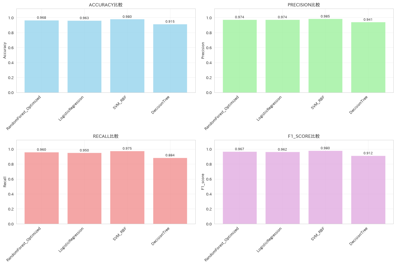
この章を深めたい方への参考書籍
- Chip Huyen『機械学習システムデザイン』(オライリー・ジャパン):第8章「データ分布のシフトと監視」と第9章「実現場での継続学習とテスト」が本章に直接対応します。ドリフト検出や自動リトレーニングを、単発の実装ではなくシステム全体の設計として捉え直せます。
- Valliappa Lakshmanan・Sara Robinson・Michael Munn『機械学習デザインパターン』(オライリー・ジャパン):運用で繰り返し現れる課題が30のパターンとして整理されています。本章のバッチ予測・リアルタイム予測・バージョン管理に、名前のついた設計の型を当てはめて議論できるようになります。
終章 レシピを実務の成果につなげるために
100のレシピを見てきました。最後に、これらを実務の成果につなげるための視点を3つお伝えします。
1つ目は、レシピを「工程」で覚えることです。個々の関数名を暗記する必要はありません。データ分析には「読み込む→確かめる→整える→集計する→学習する→検証する」という普遍的な工程があり、各工程に定石のレシピがあります。この地図が頭に入っていれば、細部は本コラムを引けば済みます。
2つ目は、検証の作法だけは省略しないことです。実務のスピードに追われると、データ分割や交差検証を「あとで」にしたくなります。しかし、データリークによって高く見えている精度ほど怖いものはありません。第2部で繰り返し登場した分割・検証・パイプラインのレシピは、遠回りに見えて、手戻りを最も減らしてくれる投資だと思います。
3つ目は、生成AIと組み合わせることです。生成AIにコードを書かせる場面は増えていますが、出てきたコードの良し悪しを判断するのは人間です。「この結合はleftで正しいか」「この評価指標はタスクに合っているか」。レシピの引き出しは、AIの出力を見極める目としてこそ、これからの時代に効いてくると感じています。
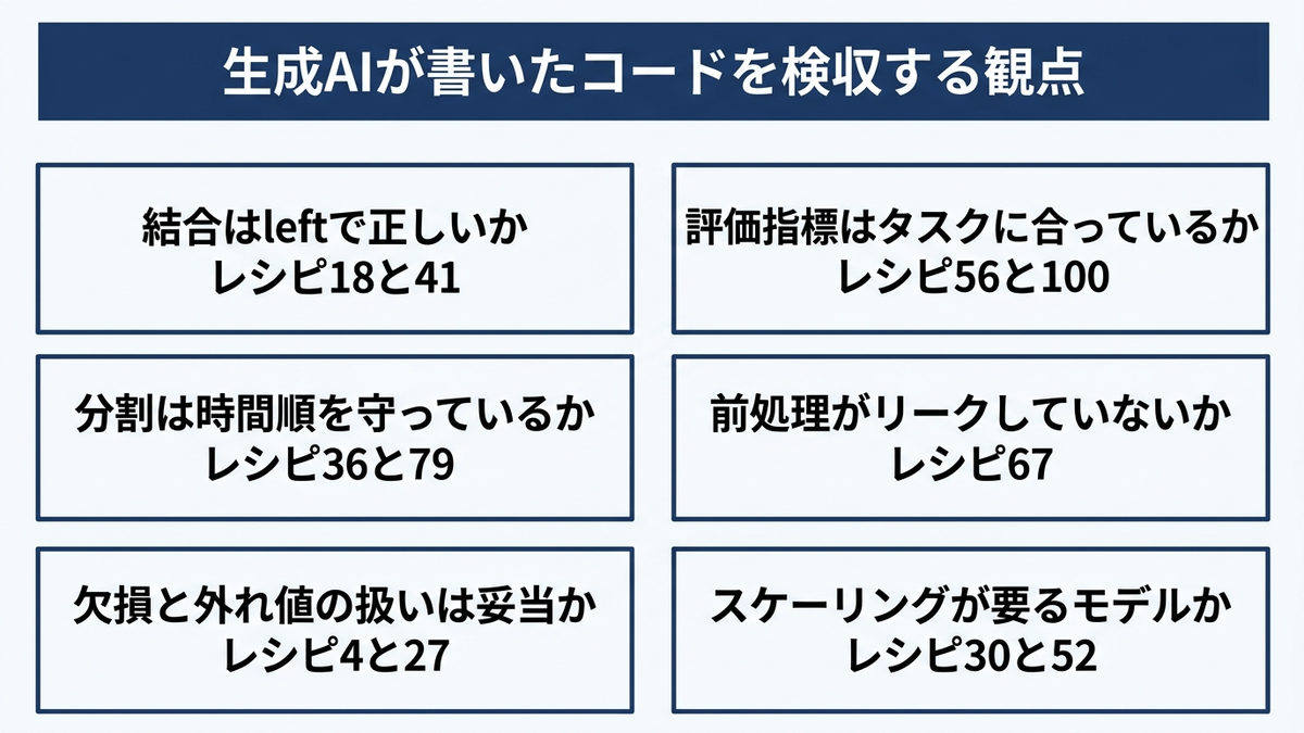
Anagraftでは、AIプロジェクトの構想・課題設計から、データ分析・機械学習モデルの開発、AI人材の育成まで一貫したご支援を行っています。会社概要・ご支援内容の詳細は、以下の資料からご覧いただけます。
本コラムで紹介した書籍一覧
本コラムの各章末で紹介した書籍を、まとめて並べます。いずれも本コラムのレシピの背景にある考え方を、より体系的に扱っているものです。
- Wes McKinney『Pythonによるデータ分析入門 第3版』(オライリー・ジャパン):pandasの開発者自身によるデータハンドリングの解説書です。読み込み・クリーニング・結合・集約・時系列という章立てが本コラム第1部の工程とほぼ重なるため、レシピの背景にある考え方をたどるのに向いています。
- 本橋智光・橋本秀太郎『改訂新版 前処理大全』(技術評論社):前処理を場当たりの作業ではなく設計として整理した一冊です。抽出・集約・結合・整形と、数値・カテゴリ・日時・文字列・ウィンドウ関数を独立した章で扱い、同じ処理をSQL・pandas・Polarsで書き比べられます。
- Jake VanderPlas『Pythonデータサイエンスハンドブック 第2版』(オライリー・ジャパン):NumPy・pandas・Matplotlib・scikit-learnを一冊で通すリファレンスです。配列演算の基礎から線形回帰・主成分分析・多様体学習まで、話題ごとに独立した短い章で参照できます。
- 吉田拓真・尾原颯『現場で使える!NumPyデータ処理入門 第2版』(翔泳社):pandasの内部基盤として使われる場面も多いNumPyを、ndarrayの構造とブロードキャストから積み上げて解説します。ベクトル化がなぜ速いのかを配列の側から理解したいときに向いています。
- 下山輝昌・松田雄馬・三木孝行『Python実践データ分析100本ノック 第3版』(秀和システム新社):表記ゆれや欠けのある実務さながらのデータを題材に、読み込みから集計・可視化・機械学習までを演習形式で進めます。手を動かして定石を身体に入れたいときの副読本になります。
- Micha Gorelick・Ian Ozsvald『ハイパフォーマンスPython 第2版』(オライリー・ジャパン):遅い箇所をプロファイリングで特定し、データ構造の選択・ベクトル化・省メモリ化で直す手順を扱います。処理時間とメモリを勘ではなく計測で語れるようになります。
- 寺田学・辻真吾・鈴木たかのり・福島真太朗『Pythonによるあたらしいデータ分析の教科書 第3版』(翔泳社):環境構築からNumPy・pandas・Matplotlib・scikit-learnまでを順に通す教科書です。数学の基礎を挟んでから機械学習に入る構成で、道具の使い方と背景の理屈を並行して固められます。
- Andreas C. Muller・Sarah Guido『Pythonではじめる機械学習』(オライリー・ジャパン):scikit-learnの開発に深く関わるAndreas C. Muller氏らによる解説書で、特徴量エンジニアリングとモデルの評価に重心を置いています。本コラム第2部のAPIが、なぜその設計になっているのかをたどれます。
- 平井有三『はじめてのパターン認識』(森北出版):識別規則の考え方を、ベイズの識別規則からサポートベクトルマシン、クラスタリングまで数式で追える教科書です。ライブラリの引数の裏側にある最適化問題を確認したいときに参照できます。
- 門脇大輔・阪田隆司・保坂桂佑・平松雄司『Kaggleで勝つデータ分析の技術』(技術評論社):特徴量の作り方、バリデーション設計、パラメータ調整、アンサンブルを、一般の教科書では省かれがちな勘所まで踏み込んで整理した一冊です。精度を上げる打ち手の優先順位がつかめます。
- 有賀康顕・中山心太・西林孝『仕事ではじめる機械学習 第2版』(オライリー・ジャパン):機械学習を仕事として成立させるための判断を扱います。第2版でMLOpsとモデルの検証の章が加わり、モデルを作った後に何を決めるべきかが具体化されています。
- 高柳慎一・長田怜士『評価指標入門』(技術評論社):MAEやRMSE、適合率・再現率、ROC-AUCといった指標を、それが何を測っているのかとビジネスのKPIとの対応から解説します。最適化すべきスコアを決める場面で効きます。
- 森下光之助『機械学習を解釈する技術』(技術評論社):PFI・PD・ICE・SHAPという4つの解釈手法を、線形回帰を出発点に実装とシミュレーションの両面から扱います。予測根拠の説明が求められる場面での標準的な進め方が分かります。
- Chip Huyen『機械学習システムデザイン』(オライリー・ジャパン):学習済みモデルを運用に載せた後の設計を、データ分布の変化への対応・監視・継続学習まで通して扱います。個々の実装をシステム全体の判断に接続できます。
- Valliappa Lakshmanan・Sara Robinson・Michael Munn『機械学習デザインパターン』(オライリー・ジャパン):機械学習で繰り返し現れる課題を30のパターンに整理した設計集です。バッチ予測や再現性の確保といった選択肢に名前がつき、設計の議論がしやすくなります。
- 井手剛・杉山将『異常検知と変化検知』(講談社):外れ値の検出と変化点の検知を、確率分布に基づく異常度という共通の枠組みで体系立てた専門書です。閾値の決め方に根拠を持たせたいときに参照できます。
参考情報
- pandas 公式ドキュメント:https://pandas.pydata.org/docs/
- scikit-learn 公式ドキュメント:https://scikit-learn.org/stable/
- NumPy 公式ドキュメント:https://numpy.org/doc/stable/
- matplotlib 公式ドキュメント:https://matplotlib.org/stable/
- statsmodels 公式ドキュメント:https://www.statsmodels.org/stable/
- matplotlib-fontja(matplotlibの日本語表示):https://pypi.org/project/matplotlib-fontja/