こんにちは。Anagraftの伊藤です。
本コラムは、Pythonで作れるグラフを種類ごとに整理し、106のレシピとしてまとめたものです。棒グラフや折れ線グラフといった定番から、バンプチャート・ストリームグラフ・サンキーダイアグラム・コードダイアグラムのような表現力のあるチャート、さらに地図・ネットワーク・テキストの可視化まで、実務で出番のあるグラフを一通り収録しました。
棒グラフ、円グラフ、分布、時系列、散布図、地図、ネットワークというように章を分けてありますので、描きたいグラフの形が決まっていれば、その章を開けばコードを参照できるようにしてあります。逆に「このデータをどう見せるか」から考える場合も、章の並びを眺めることで選択肢の把握に役立ててもらえたらと思います。
各レシピのコードは単体で完結しています。必要なライブラリのインポートとサンプルデータの生成をレシピごとに書いてあるので、記事の途中からコピーしても、そのまま実行して同じグラフを再現できます。ただし、地図の一部のレシピは境界データの取得にインターネット接続が必要で、Plotlyのグラフを画像として保存する場合はChromeが必要になります。
掲載したグラフは、matplotlib・seaborn・Plotly・folium・wordcloud・networkxで作成しています。グラフの種類ごとに適したライブラリを選んでいるため、読み進めるうちにライブラリの使い分けも見えてくると思います。
想定している読者は、次のような方々です。
- データ分析の実務で、グラフ作成を頻繁に行うアナリスト・データサイエンティストの方
- Pythonを学び始めて、可視化の「実務で使う形」を一気に押さえたい方
- 経営層やクライアントへの報告資料で、伝わるグラフを速く作りたいコンサルタント・企画職の方
- 地図・テキスト・ネットワークなど、定番グラフの一歩先の表現に手を広げたい方
- 生成AIにグラフ作成を指示する際の、正確な語彙と型を持っておきたい方
なお本コラムは、グラフの種類と作り方の紹介に絞っています。統計分析や機械学習の手法そのものの解説は扱いません。最終章までの各章でグラフの型をひととおり押さえたあと、第12章から第14章では、軸・色・注釈・出力といった、どのグラフにも共通して効く仕上げの調整をまとめています。

目次
- 序章 ライブラリの使い分け
- レシピの全体像
- 1章 棒グラフ
- 2章 比較・順位のチャート
- 3章 円グラフ
- 4章 構成比・内訳のチャート
- 5章 階層構造のチャート
- 6章 分布のチャート
- 7章 時系列のチャート
- 8章 ヒートマップ
- 9章 散布図・多変量のチャート
- 10章 地図のチャート
- 11章 フロー・ネットワーク・テキストのチャート
- 12章 レイアウトと軸
- 13章 色とスタイル
- 14章 注釈・動き・出力
- 90. 注釈とテキスト(annotate, text)
- 91. カスタム凡例とアノテーション
- 92. 図形描画(Rectangle, Circle, Polygon)
- 93. 画像の埋め込み(imshow)
- 94. 塗りつぶし(fill_between)
- 95. アニメーション基礎(FuncAnimation)
- 96. 高度なアニメーション
- 97. インタラクティブ要素(widgets)
- 98. カスタムホバー情報
- 99. カスタムツールチップ
- 100. カスタムボタンによるデータ切り替え
- 101. パラメータスライダー
- 102. 日本語フォント設定
- 103. 保存形式最適化(savefig)
- 104. エクスポート・共有機能
- 105. パフォーマンス最適化(静的グラフ)
- 106. パフォーマンス最適化(インタラクティブ)
- 終章 グラフを選ぶときの視点
- より深く学びたい方への参考書籍
- 参考情報
序章 ライブラリの使い分け
本コラムで使う6つの可視化ライブラリの関係を整理しておきます。
| ライブラリ | 得意なこと | 実務での主な出番 |
|---|---|---|
| matplotlib | 静的グラフの細部まで自由に制御できる。Python可視化の土台 | 報告書・論文用の作り込み、定型レポートの自動生成 |
| seaborn | 統計的なグラフを短いコードで美しく描ける。matplotlibの高級ラッパー | 探索的データ分析(EDA)、分布・相関の確認 |
| Plotly | ズームやホバーができるインタラクティブなグラフ。HTML出力で共有も簡単 | ダッシュボード、Webでの共有、データの深掘り |
| folium | 地図の上にデータを重ねるインタラクティブ地図。HTMLで共有できる | 店舗網・顧客分布・地域比較などの地理データの可視化 |
| wordcloud | テキストの頻出語を一目で伝えるワードクラウド生成 | レビュー・アンケート・問い合わせ内容の要約 |
| networkx | ネットワーク構造の計算と描画 | 組織・取引・共起関係など「つながり」の可視化 |
matplotlib・seaborn・Plotlyの3つは競合というより層の関係にあります。seabornはmatplotlibの上に作られているので、seabornで描いてmatplotlibの機能で微調整する、という合わせ技が日常的に使えます。Plotlyだけは描画の仕組みが異なりますが、「静止画で配るならmatplotlibとseaborn、画面上で操作させるならPlotly」と覚えておけば十分です。folium・wordcloud・networkxは、地図・テキスト・ネットワークという特定のデータ形式に対応した道具で、それぞれ対応する章で使います。
ライブラリのインストールは以下でまとめて行えます。各レシピのコードは、この中から必要なものだけをインポートする形になっています。
pip install numpy pandas matplotlib seaborn plotly scipy networkx \
    japanize-matplotlib folium wordcloud janome squarify circlify matplotlib-venn kaleido
日本語のラベルを表示するために japanize-matplotlib を使っています。Plotlyのグラフを静止画像として保存する場合は kaleido が必要で、現行のv1系は描画にChromeを使うため plotly_get_chrome の実行もあわせて必要になります。
Anagraftでは、AIプロジェクトの構想・課題設計から、データ分析・機械学習モデルの開発、AI人材の育成まで一貫したご支援を行っています。会社概要・ご支援内容の詳細は、以下の資料からご覧いただけます。

レシピの全体像
106レシピの全体像です。描きたいグラフの種類から逆引きできるよう、章とレシピ番号、使用ライブラリの対応をまとめました。
| 章 | レシピ番号 | 主なライブラリ |
|---|---|---|
| 1章 棒グラフ | レシピ1〜7 | matplotlib・plotly |
| 2章 比較・順位のチャート | レシピ8〜11 | matplotlib |
| 3章 円グラフ | レシピ12〜16 | matplotlib |
| 4章 構成比・内訳のチャート | レシピ17〜24 | matplotlib・matplotlib-venn・plotly |
| 5章 階層構造のチャート | レシピ25〜30 | plotly・circlify・scipy・seaborn |
| 6章 分布のチャート | レシピ31〜39 | matplotlib・seaborn |
| 7章 時系列のチャート | レシピ40〜44 | matplotlib |
| 8章 ヒートマップ | レシピ45〜46 | seaborn・matplotlib |
| 9章 散布図・多変量のチャート | レシピ47〜53 | seaborn・plotly |
| 10章 地図のチャート | レシピ54〜59 | folium |
| 11章 フロー・ネットワーク・テキストのチャート | レシピ60〜64 | plotly・networkx・matplotlib・wordcloud |
| 12章 レイアウトと軸 | レシピ65〜77 | matplotlib・plotly |
| 13章 色とスタイル | レシピ78〜89 | matplotlib・seaborn・plotly |
| 14章 注釈・動き・出力 | レシピ90〜106 | matplotlib・plotly |
1章 棒グラフ
棒グラフは、カテゴリごとの数量を長さで比較する最も基本的なグラフです。この章では縦棒・横棒の基本形から、系列を並べるグループ棒、左右に広げるバタフライチャート、線と点で軽く見せるロリポップチャート、順位の変化を動きで見せるバーチャートレースまでを扱います。
1. 縦棒グラフ
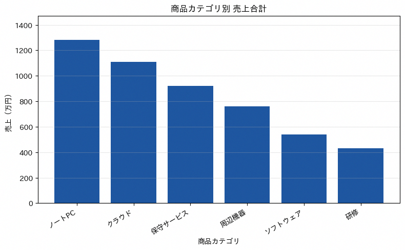
縦棒グラフは、カテゴリ別の数値をバーの高さで比較する最も基本的なグラフです。カテゴリ数が少なく、絶対値の大小をひと目で伝えたい場面に向いており、商品カテゴリ別の売上合計を経営会議で共有するような用途で使われます。作図の鉄則は縦軸を0から始めることで、途中から始めると差が誇張されて誤読を招きます。またカテゴリの並び順は値の大きい順に揃えると、読み手が比較しやすくなります。コードではgroupby()で集計してからsort_values()で降順に並べ替え、そのままplt.bar()に渡しています。
import pandas as pd
import matplotlib.pyplot as plt
import japanize_matplotlib

HIGHLIGHT = '#1E56A0'

df_sales = pd.DataFrame({
    '商品カテゴリ': ['ノートPC', '周辺機器', 'ソフトウェア', '保守サービス', 'クラウド', '研修'],
    '売上': [1280, 760, 540, 920, 1110, 430],
})

sales_by_category = (
    df_sales.groupby('商品カテゴリ')['売上']
    .sum()
    .sort_values(ascending=False)
)

plt.figure(figsize=(8, 5))
plt.bar(sales_by_category.index, sales_by_category.values, color=HIGHLIGHT)
plt.title('商品カテゴリ別 売上合計')
plt.xlabel('商品カテゴリ')
plt.ylabel('売上(万円)')
plt.ylim(0, sales_by_category.max() * 1.15)
plt.xticks(rotation=30, ha='right')
plt.grid(axis='y', alpha=0.3)

plt.tight_layout()
plt.show()
2. 横棒グラフ
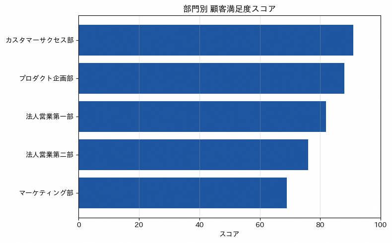
横棒グラフは、縦棒グラフの向きを90度回転させ、カテゴリ名を縦軸に並べる形式です。部門名や商品名のようにラベルの文字数が長いカテゴリを比較する場面に向いており、縦棒グラフではラベルを斜めに傾けないと収まらないケースでも、横棒グラフなら文字を横書きのまま読みやすく配置できます。作図の鉄則は値の小さい順に並べ替えてから描画することで、一番上に最大値が来るグラフになり、視線の流れと数値の大小関係が一致します。コードではnp.argsort()でスコアの昇順インデックスを求め、ラベルと値を並べ替えたうえでplt.barh()に渡しています。
import numpy as np
import matplotlib.pyplot as plt
import japanize_matplotlib

departments = np.array(['法人営業第一部', '法人営業第二部', 'カスタマーサクセス部', 'マーケティング部', 'プロダクト企画部'])
scores = np.array([82, 76, 91, 69, 88])

order = np.argsort(scores)
departments_sorted = departments[order]
scores_sorted = scores[order]

plt.figure(figsize=(8, 5))
plt.barh(departments_sorted, scores_sorted, color='#1E56A0')
plt.title('部門別 顧客満足度スコア')
plt.xlabel('スコア')
plt.xlim(0, 100)
plt.grid(axis='x', alpha=0.3)

plt.tight_layout()
plt.show()
3. グループ縦棒グラフ
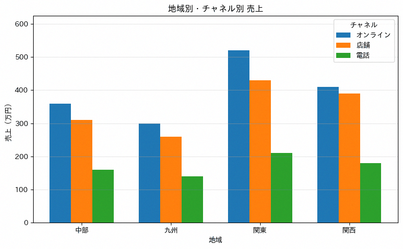
グループ棒グラフは、1つのカテゴリ軸上に複数系列の棒を並べて表示し、カテゴリ内訳と系列間の差を同時に比較できるグラフです。地域別の売上をチャネル別(オンライン・店舗・電話)に内訳表示するなど、2つの切り口を一度に見せたい場面に向いています。作図の鉄則は系列数を3〜4程度に抑えることで、棒の本数が増えすぎると個々の高さの比較が難しくなります。コードではgroupby().unstack()でカテゴリ×系列のクロス集計表を作り、系列ごとにx座標をwidth分だけずらしてplt.bar()を呼び出しています。
import numpy as np
import pandas as pd
import matplotlib.pyplot as plt
import japanize_matplotlib

df_sales = pd.DataFrame({
    '地域': ['関東', '関東', '関東', '関西', '関西', '関西', '中部', '中部', '中部', '九州', '九州', '九州'],
    'チャネル': ['オンライン', '店舗', '電話'] * 4,
    '売上': [520, 430, 210, 410, 390, 180, 360, 310, 160, 300, 260, 140],
})

pivot = df_sales.groupby(['地域', 'チャネル'])['売上'].sum().unstack()

x = np.arange(len(pivot.index))
width = 0.24
colors = ['#1f77b4', '#ff7f0e', '#2ca02c']

plt.figure(figsize=(8, 5))
for i, channel in enumerate(pivot.columns):
    plt.bar(x + (i - 1) * width, pivot[channel], width, label=channel, color=colors[i])

plt.title('地域別・チャネル別 売上')
plt.xlabel('地域')
plt.ylabel('売上(万円)')
plt.xticks(x, pivot.index)
plt.ylim(0, pivot.max().max() * 1.2)
plt.legend(title='チャネル')
plt.grid(axis='y', alpha=0.3)

plt.tight_layout()
plt.show()
4. グループ横棒グラフ
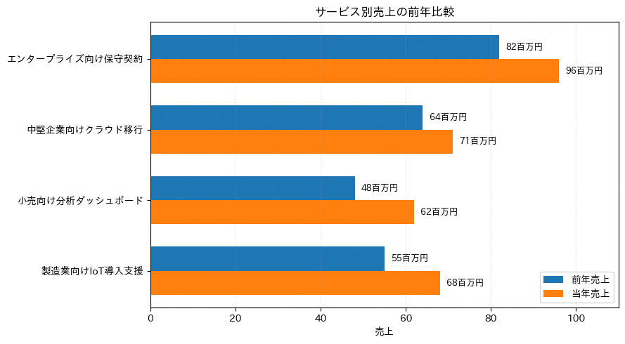
グループ横棒グラフは、複数系列を同じカテゴリ内で横に並べて比較するグラフです。カテゴリ名が長いサービス名や製品名でも読みやすく、前年比較や部門別比較に向いています。barh に渡す y 位置を少しずつずらすことで、系列を重ならないように配置しています。値ラベルは棒の右側に置くと、凡例を見なくても規模感を確認しやすくなります。
import numpy as np
import matplotlib.pyplot as plt
import japanize_matplotlib

colors_professional = ['#1f77b4', '#ff7f0e', '#2ca02c', '#d62728', '#9467bd', '#8c564b']

categories = [
    'エンタープライズ向け保守契約',
    '中堅企業向けクラウド移行',
    '小売向け分析ダッシュボード',
    '製造業向けIoT導入支援',
]
last_year = np.array([82, 64, 48, 55])
this_year = np.array([96, 71, 62, 68])

y = np.arange(len(categories))
bar_height = 0.34

fig, ax = plt.subplots(figsize=(9, 5))
ax.barh(y - bar_height / 2, last_year, height=bar_height,
        color=colors_professional[0], label='前年売上')
ax.barh(y + bar_height / 2, this_year, height=bar_height,
        color=colors_professional[1], label='当年売上')

for values, offset in [(last_year, -bar_height / 2), (this_year, bar_height / 2)]:
    for index, value in enumerate(values):
        ax.text(value + 1.5, index + offset, f'{value}百万円',
                va='center', fontsize=9)

ax.set_yticks(y)
ax.set_yticklabels(categories)
ax.invert_yaxis()
ax.set_xlabel('売上')
ax.set_title('サービス別売上の前年比較')
ax.legend(loc='lower right')
ax.grid(axis='x', linestyle=':', alpha=0.4)
ax.set_xlim(0, 110)

plt.tight_layout()
plt.show()
5. バタフライチャート
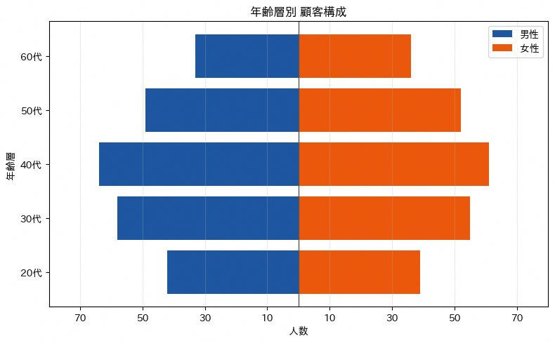
バタフライチャート(人口ピラミッド)は、中央の軸を挟んで左右対称に2つのグループの値を横棒で描く表現です。年齢層別の男女人口構成のように、2つの属性を左右に分けて比較したい場面に向いています。作図の鉄則は片方の値を負の値として扱い中央の0を基準にすることと、軸ラベルは絶対値表示に変換して負の値のまま見せないことです。コードでは男性側の値を-maleとしてplt.barh()に渡し、目盛りラベルだけabs()で絶対値表示に変換しています。
import numpy as np
import matplotlib.pyplot as plt
import japanize_matplotlib

age_groups = ['20代', '30代', '40代', '50代', '60代']
male = np.array([42, 58, 64, 49, 33])
female = np.array([39, 55, 61, 52, 36])

y = np.arange(len(age_groups))

plt.figure(figsize=(8, 5))
plt.barh(y, -male, color='#1E56A0', label='男性')
plt.barh(y, female, color='#EA580C', label='女性')

max_value = max(male.max(), female.max())
ticks = np.arange(-70, 71, 20)
plt.xticks(ticks, [abs(tick) for tick in ticks])
plt.yticks(y, age_groups)
plt.axvline(0, color='#555555', linewidth=1)
plt.title('年齢層別 顧客構成')
plt.xlabel('人数')
plt.ylabel('年齢層')
plt.xlim(-max_value * 1.25, max_value * 1.25)
plt.legend()
plt.grid(axis='x', alpha=0.25)

plt.tight_layout()
plt.show()
6. ロリポップチャート
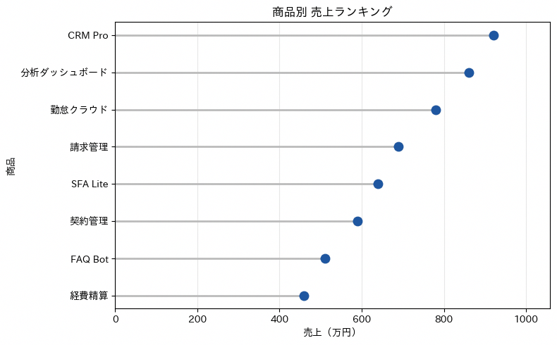
ロリポップチャートは、棒グラフの棒を細い線に置き換え、先端に丸い点を付けたグラフです。カテゴリ数がある程度多い比較で、棒グラフの太い面が並ぶと画面が重く見える場合に向いており、商品別の売上合計を軽やかに見せたい場面で使われます。作図の鉄則は線を細く、点をやや大きめにして視線が点の位置に集まるようにすることです。コードではplt.hlines()で0から値までの線を引いたあと、同じ値の位置にplt.plot()で丸印を重ねています。
import pandas as pd
import matplotlib.pyplot as plt
import japanize_matplotlib

df_sales = pd.DataFrame({
    '商品': ['CRM Pro', '分析ダッシュボード', '勤怠クラウド', '請求管理', 'SFA Lite', '契約管理', 'FAQ Bot', '経費精算'],
    '売上': [920, 860, 780, 690, 640, 590, 510, 460],
})

sales_by_product = df_sales.sort_values('売上', ascending=True)

plt.figure(figsize=(8, 5))
plt.hlines(
    y=sales_by_product['商品'],
    xmin=0,
    xmax=sales_by_product['売上'],
    color='#BBBBBB',
    linewidth=2,
)
plt.plot(
    sales_by_product['売上'],
    sales_by_product['商品'],
    'o',
    color='#1E56A0',
    markersize=9,
)

plt.title('商品別 売上ランキング')
plt.xlabel('売上(万円)')
plt.ylabel('商品')
plt.xlim(0, sales_by_product['売上'].max() * 1.15)
plt.grid(axis='x', alpha=0.3)

plt.tight_layout()
plt.show()
7. バーチャートレース
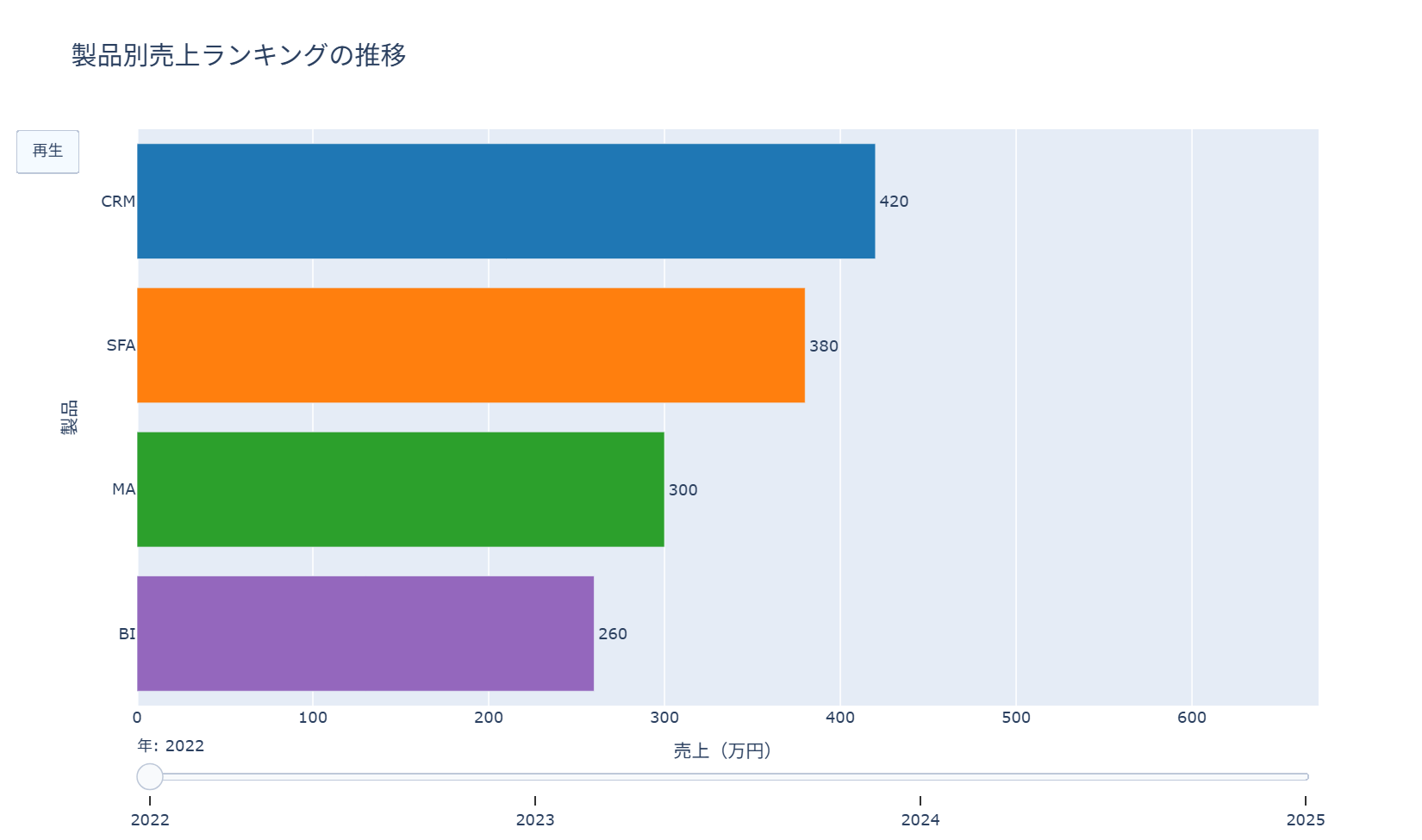
バーチャートレース風アニメーションは、時間経過に伴う横棒グラフの順位入れ替わりをコマ送りで見せる表現です。年別のブランドランキングや製品別売上シェアの推移など、順位変動そのものをストーリーとして伝えたい場面に向いています。作図の鉄則はコマ数(年や月などの単位)を絞り、動きが速すぎて読み取れなくならないようにすることです。コードでは年ごとの売上をgo.Frameとしてリスト化し、初期状態のgo.Figureにframesとして渡したうえで、updatemenusに再生ボタンを追加しています。
import pandas as pd
import plotly.graph_objects as go

df_sales = pd.DataFrame({
    '年': [2022, 2022, 2022, 2022, 2023, 2023, 2023, 2023, 2024, 2024, 2024, 2024, 2025, 2025, 2025, 2025],
    '製品': ['CRM', 'SFA', 'MA', 'BI'] * 4,
    '売上': [420, 380, 300, 260, 460, 410, 360, 320, 510, 430, 420, 390, 560, 470, 455, 430],
})

years = sorted(df_sales['年'].unique())
colors = {
    'CRM': '#1f77b4',
    'SFA': '#ff7f0e',
    'MA': '#2ca02c',
    'BI': '#9467bd',
}

frames = []
for year in years:
    yearly = df_sales[df_sales['年'] == year].sort_values('売上', ascending=True)
    frames.append(
        go.Frame(
            data=[
                go.Bar(
                    x=yearly['売上'],
                    y=yearly['製品'],
                    orientation='h',
                    marker_color=[colors[product] for product in yearly['製品']],
                    text=yearly['売上'],
                    textposition='outside',
                )
            ],
            name=str(year),
        )
    )

initial = df_sales[df_sales['年'] == years[0]].sort_values('売上', ascending=True)

fig = go.Figure(
    data=[
        go.Bar(
            x=initial['売上'],
            y=initial['製品'],
            orientation='h',
            marker_color=[colors[product] for product in initial['製品']],
            text=initial['売上'],
            textposition='outside',
        )
    ],
    frames=frames,
)

fig.update_layout(
    title=dict(text='製品別売上ランキングの推移', font=dict(size=20)),
    xaxis=dict(title='売上(万円)', range=[0, df_sales['売上'].max() * 1.2]),
    yaxis=dict(title='製品'),
    updatemenus=[
        dict(
            type='buttons',
            buttons=[
                dict(
                    label='再生',
                    method='animate',
                    args=[None, dict(frame=dict(duration=900, redraw=True), fromcurrent=True)],
                )
            ],
        )
    ],
    sliders=[
        dict(
            steps=[
                dict(
                    label=str(year),
                    method='animate',
                    args=[[str(year)], dict(frame=dict(duration=0, redraw=True), mode='immediate')],
                )
                for year in years
            ],
            currentvalue=dict(prefix='年: '),
        )
    ],
)

fig.show()
2章 比較・順位のチャート
この章では、複数の対象や2時点を比較するためのチャートを扱います。多項目のバランスを見るレーダーチャート、2時点の差を線で結ぶダンベルプロットとスロープグラフ、順位の入れ替わりを追うバンプチャートを収録しました。
8. レーダーチャート
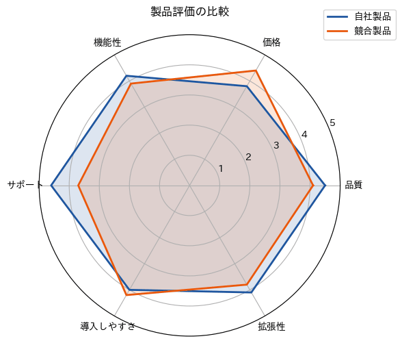
レーダーチャート(極座標)は、複数の評価軸を放射状に配置し、各軸の値を結んだ多角形として描く表現です。自社製品と競合製品を品質・価格・機能性など複数の観点で同時に比較したい場面に向いています。作図の鉄則は評価軸の数を5〜8程度に抑えることと、比較対象を2〜3系列までにとどめて多角形が重なりすぎないようにすることです。コードでは評価軸の数からnp.linspace()で角度を計算し、subplot_kw=dict(polar=True)で極座標のAxesを作成したうえで、系列ごとにax.plot()とax.fill()を呼び出しています。
import numpy as np
import pandas as pd
import matplotlib.pyplot as plt
import japanize_matplotlib

df_scores = pd.DataFrame({
    '評価軸': ['品質', '価格', '機能性', 'サポート', '導入しやすさ', '拡張性'],
    '自社製品': [4.5, 3.8, 4.2, 4.6, 4.0, 4.1],
    '競合製品': [4.1, 4.4, 3.9, 3.7, 4.2, 3.8],
})

labels = df_scores['評価軸'].tolist()
angles = np.linspace(0, 2 * np.pi, len(labels), endpoint=False).tolist()
angles += angles[:1]

plt.figure(figsize=(6, 6))
ax = plt.subplot(111, polar=True)

for column, color in [('自社製品', '#1E56A0'), ('競合製品', '#EA580C')]:
    values = df_scores[column].tolist()
    values += values[:1]
    ax.plot(angles, values, color=color, linewidth=2, label=column)
    ax.fill(angles, values, color=color, alpha=0.15)

ax.set_xticks(angles[:-1])
ax.set_xticklabels(labels)
ax.set_ylim(0, 5)
ax.set_yticks([1, 2, 3, 4, 5])
ax.set_title('製品評価の比較', pad=20)
ax.legend(loc='upper right', bbox_to_anchor=(1.2, 1.1))

plt.tight_layout()
plt.show()
9. ダンベルプロット
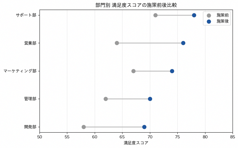
ダンベルプロットは、1つのカテゴリについて2時点(施策前後など)の値を2つの点で示し、その間を線で結んで差を強調するグラフです。部門別の施策前後の満足度スコアのように、変化の大きさそのものを見せたい場面に向いています。作図の鉄則は2つの点の色を明確に変えることと、線は目立たせすぎない淡い色に抑えて点に視線を集めることです。コードでは各カテゴリについてplt.plot()で施策前後をつなぐ横線を描いたあと、plt.scatter()で施策前と施策後の点を別々の色で重ねています。
import pandas as pd
import matplotlib.pyplot as plt
import japanize_matplotlib

df_scores = pd.DataFrame({
    '部門': ['営業部', '開発部', 'サポート部', '管理部', 'マーケティング部'],
    '施策前': [64, 58, 71, 62, 67],
    '施策後': [76, 69, 78, 70, 74],
})

df_scores = df_scores.sort_values('施策後')
y_positions = range(len(df_scores))

plt.figure(figsize=(8, 5))
for y, (_, row) in zip(y_positions, df_scores.iterrows()):
    plt.plot([row['施策前'], row['施策後']], [y, y], color='#BBBBBB', linewidth=2)

plt.scatter(df_scores['施策前'], y_positions, color='#999999', s=80, label='施策前', zorder=3)
plt.scatter(df_scores['施策後'], y_positions, color='#1E56A0', s=80, label='施策後', zorder=3)

plt.yticks(y_positions, df_scores['部門'])
plt.title('部門別 満足度スコアの施策前後比較')
plt.xlabel('満足度スコア')
plt.xlim(50, 85)
plt.legend()
plt.grid(axis='x', alpha=0.3)

plt.tight_layout()
plt.show()
10. スロープグラフ
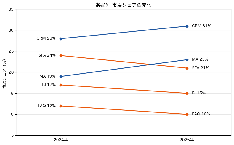
スロープグラフは、2つの時点における値を左右の縦軸上に置き、同じカテゴリの値を1本の線でつなぐグラフです。市場シェアのように複数カテゴリの大小関係が2時点でどう入れ替わったかを見せたい場面に向いています。作図の鉄則は線の傾きの向き(上昇か下降か)で色を変え、上昇と下降を直感的に区別できるようにすることです。コードでは各カテゴリについてx座標を0と1に固定してplt.plot()で線を引き、両端にplt.text()でカテゴリ名と値を添えています。
import pandas as pd
import matplotlib.pyplot as plt
import japanize_matplotlib

df_share = pd.DataFrame({
    '製品': ['CRM', 'SFA', 'MA', 'BI', 'FAQ'],
    '2024年': [28, 24, 19, 17, 12],
    '2025年': [31, 21, 23, 15, 10],
})

plt.figure(figsize=(8, 5))

for _, row in df_share.iterrows():
    x = [0, 1]
    y = [row['2024年'], row['2025年']]
    color = '#1E56A0' if row['2025年'] >= row['2024年'] else '#EA580C'
    plt.plot(x, y, marker='o', color=color, linewidth=2)
    plt.text(-0.04, row['2024年'], f"{row['製品']} {row['2024年']}%", ha='right', va='center')
    plt.text(1.04, row['2025年'], f"{row['製品']} {row['2025年']}%", ha='left', va='center')

plt.xticks([0, 1], ['2024年', '2025年'])
plt.xlim(-0.35, 1.35)
plt.ylim(5, 35)
plt.title('製品別 市場シェアの変化')
plt.ylabel('市場シェア(%)')
plt.grid(axis='y', alpha=0.3)

plt.tight_layout()
plt.show()
11. バンプチャート
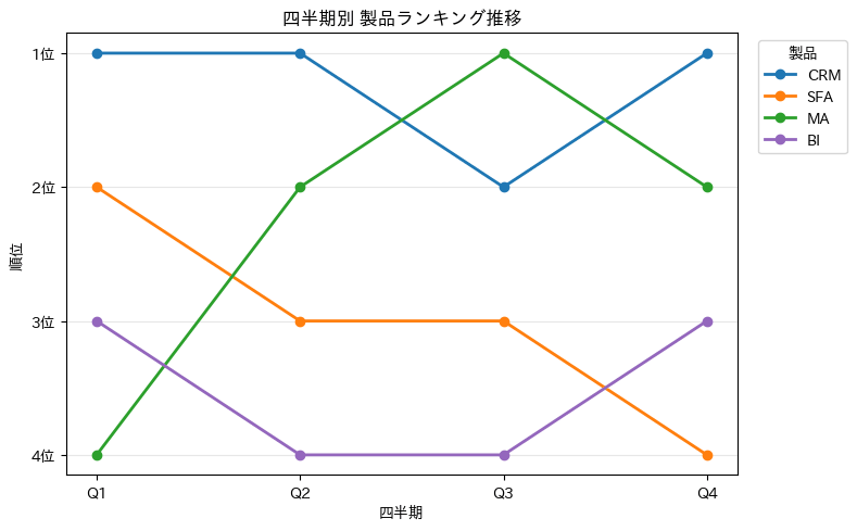
バンプチャート(順位の推移)は、複数カテゴリの順位を時系列で追い、線の上下動で順位変動を見せるグラフです。四半期ごとの製品別売上ランキングのように、値そのものより順位の入れ替わりを伝えたい場面に向いています。作図の鉄則は縦軸を反転させて1位を上に配置することと、線の交差が読み取りやすいようマーカーを付けることです。コードでは製品ごとの四半期別順位を折れ線で描いたあと、plt.gca().invert_yaxis()で縦軸を反転させています。
import pandas as pd
import matplotlib.pyplot as plt
import japanize_matplotlib

df_rank = pd.DataFrame({
    '四半期': ['Q1', 'Q2', 'Q3', 'Q4'],
    'CRM': [1, 1, 2, 1],
    'SFA': [2, 3, 3, 4],
    'MA': [4, 2, 1, 2],
    'BI': [3, 4, 4, 3],
})

quarters = df_rank['四半期']
products = ['CRM', 'SFA', 'MA', 'BI']
colors = ['#1f77b4', '#ff7f0e', '#2ca02c', '#9467bd']

plt.figure(figsize=(8, 5))
for product, color in zip(products, colors):
    plt.plot(quarters, df_rank[product], marker='o', linewidth=2, color=color, label=product)

plt.gca().invert_yaxis()
plt.yticks([1, 2, 3, 4], ['1位', '2位', '3位', '4位'])
plt.title('四半期別 製品ランキング推移')
plt.xlabel('四半期')
plt.ylabel('順位')
plt.legend(title='製品', bbox_to_anchor=(1.02, 1), loc='upper left')
plt.grid(axis='y', alpha=0.3)

plt.tight_layout()
plt.show()
3章 円グラフ
円グラフは、全体を100%として内訳の割合を示すグラフです。この章では基本の円グラフ、中央を空けたドーナツチャート、達成率を示す半ドーナツとゲージ、扇の面積で量を表す鶏頭図を扱います。
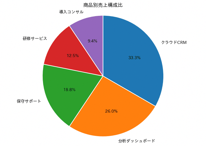
12. 円グラフ
円グラフは全体を100%として、各カテゴリの構成比を扇形の面積で示す図表です。商品別の売上構成や顧客セグメントの比率など、全体に占める割合を一目で把握したい場面に向いています。作図の鉄則として、カテゴリ数は5個までに絞り、値の大きい順に12時の位置から時計回りに並べることが望ましいとされます。要素が多すぎると扇形どうしの面積比較が難しくなり、細かい違いを見誤りやすくなります。コードではstartangle=90とcounterclock=Falseを組み合わせることで、12時の位置を起点に時計回りへ並ぶ描画順を実現しています。
import pandas as pd
import matplotlib.pyplot as plt
import japanize_matplotlib

colors_professional = ['#1f77b4', '#ff7f0e', '#2ca02c', '#d62728', '#9467bd']

df = pd.DataFrame({
    "商品": ["クラウドCRM", "分析ダッシュボード", "保守サポート", "研修サービス", "導入コンサル"],
    "売上": [3200000, 2500000, 1800000, 1200000, 900000],
}).sort_values("売上", ascending=False)

fig, ax = plt.subplots(figsize=(7, 5))
ax.pie(
    df["売上"],
    labels=df["商品"],
    autopct="%1.1f%%",
    startangle=90,
    counterclock=False,
    colors=colors_professional,
    wedgeprops={"edgecolor": "white", "linewidth": 1.5},
)
ax.set_title("商品別売上構成比")
ax.axis("equal")

plt.tight_layout()
plt.show()
13. ドーナツチャート
ドーナツチャートは円グラフの中心を切り抜いた形状で、中央の空白に合計値やラベルを配置できる点が特徴です。会員セグメントの構成比を示しつつ、中心に総会員数を添えるといった使い方に向いています。円グラフとの違いは、中心の余白を情報の置き場として使えることにあり、構成比と全体量の2つを1枚で伝えられます。作図ではax.pie()にwedgeprops={'width': ...}を渡して輪の太さを指定するだけで、円グラフをドーナツ形状に変えられます。輪を二重・三重に重ねる描き方もありますが、内側と外側の対応を読み手が目で追う必要があり誤読を招きやすいため、階層を見せたい場合はサンバーストチャート(レシピ26)に切り替えるほうが確実です。
import pandas as pd
import matplotlib.pyplot as plt
import japanize_matplotlib

df = pd.DataFrame({
    "会員区分": ["法人", "個人", "学生"],
    "会員数": [500, 400, 200],
})

colors = ['#1f77b4', '#ff7f0e', '#2ca02c']

fig, ax = plt.subplots(figsize=(7, 6))
wedges, texts, autotexts = ax.pie(
    df["会員数"],
    labels=df["会員区分"],
    colors=colors,
    startangle=90,
    counterclock=False,
    autopct=lambda pct: f"{pct:.1f}%",
    pctdistance=0.82,
    labeldistance=1.08,
    wedgeprops={"width": 0.34, "edgecolor": "white", "linewidth": 2},
    textprops={"fontsize": 13},
)
for autotext in autotexts:
    autotext.set_color("white")
    autotext.set_fontweight("bold")

ax.text(0, 0, f"総会員数\n{df['会員数'].sum():,}人",
        ha="center", va="center", fontsize=15, fontweight="bold")
ax.set_title("会員区分別の構成比(ドーナツチャート)", fontsize=15)
ax.axis("equal")

plt.tight_layout()
plt.show()

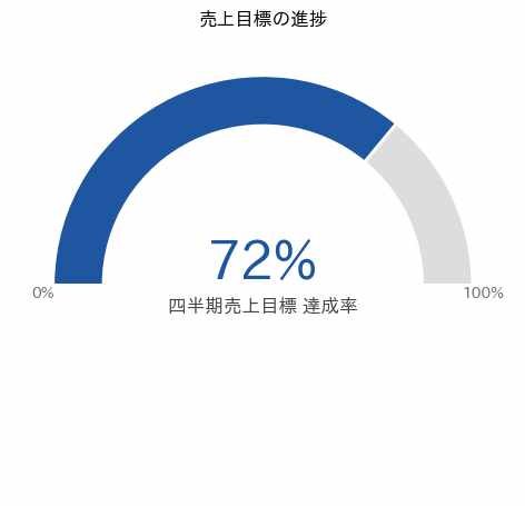
14. 半ドーナツチャート
半ドーナツチャートは、達成率や消化率のような単一指標を大きく見せたい場面に向いています。pie に下半分用の透明な要素を加え、startangle と counterclock で上半分に進捗部分を配置しています。中央に数値を置くことで、細かな比率よりも現在の水準を直感的に伝えられます。比較対象が多い場合には不向きなので、重要なKPIを一つだけ強調する用途で使います。
import matplotlib.pyplot as plt
import japanize_matplotlib

HIGHLIGHT = '#1E56A0'
GRAYS = ['#999999', '#BBBBBB', '#DDDDDD']

achievement_rate = 72
remaining_rate = 100 - achievement_rate

values = [achievement_rate, remaining_rate, 100]
colors = [HIGHLIGHT, GRAYS[2], 'none']

fig, ax = plt.subplots(figsize=(7, 4.5))
wedges, _ = ax.pie(
    values,
    startangle=180,
    counterclock=False,
    colors=colors,
    wedgeprops=dict(width=0.24, edgecolor='white', linewidth=2)
)

wedges[-1].set_alpha(0)

ax.text(0, 0.10, f'{achievement_rate}%',
        ha='center', va='center', fontsize=34,
        fontweight='bold', color=HIGHLIGHT)
ax.text(0, -0.10, '四半期売上目標 達成率',
        ha='center', va='center', fontsize=12, color='#444444')

ax.text(-1.05, -0.04, '0%', ha='center', va='center',
        fontsize=10, color='#666666')
ax.text(1.05, -0.04, '100%', ha='center', va='center',
        fontsize=10, color='#666666')

ax.set_aspect('equal')
ax.set_xlim(-1.2, 1.2)
ax.set_ylim(-0.18, 1.15)
ax.axis('off')
ax.set_title('売上目標の進捗', pad=12)

plt.tight_layout()
plt.show()
15. ゲージチャート
ゲージチャートは、KPIがどの水準帯に入っているかを一目で示すためのグラフです。色分けした円弧で評価区間を作り、その上に現在値を示す針を重ねています。値を角度に変換する関数を分けておくと、目盛りや針の位置を同じルールで計算できます。細かな差の比較よりも、目標に対する現在位置を共有する用途に向いています。帯の上に区間名を重ねる場合は、帯の色と文字色のコントラストに注意が必要です。濃い帯に白文字を置くと印刷や縮小表示で読めなくなるため、ここでは帯を淡い色にして文字を濃いグレーにし、位置も帯の幅の中央にそろえています。
import math
import matplotlib.pyplot as plt
from matplotlib.patches import Circle, Wedge
import japanize_matplotlib

HIGHLIGHT = '#1E56A0'
ACCENT = '#EA580C'

score = 78
ranges = [
    (0, 60, '#F4B6B3', '要注意'),
    (60, 85, '#F8D9A0', '順調'),
    (85, 100, '#A8D5B5', '目標達成'),
]

def value_to_angle(value):
    return 180 - 180 * value / 100

fig, ax = plt.subplots(figsize=(8, 4.8))

for start, end, color, label in ranges:
    theta_start = value_to_angle(start)
    theta_end = value_to_angle(end)
    band = Wedge(
        (0, 0), 1.0, theta_end, theta_start,
        width=0.26, facecolor=color, edgecolor='white', linewidth=2
    )
    ax.add_patch(band)

    label_angle = math.radians(value_to_angle((start + end) / 2))
    ax.text(0.87 * math.cos(label_angle), 0.87 * math.sin(label_angle),
            label, ha='center', va='center', fontsize=12, color='#1F1F1F',
            fontweight='bold')

needle_angle = math.radians(value_to_angle(score))
needle_x = 0.68 * math.cos(needle_angle)
needle_y = 0.68 * math.sin(needle_angle)
ax.plot([0, needle_x], [0, needle_y], color='#222222', linewidth=4,
        solid_capstyle='round')
ax.add_patch(Circle((0, 0), 0.055, color='#222222'))

for tick in [0, 20, 40, 60, 80, 100]:
    angle = math.radians(value_to_angle(tick))
    ax.text(1.13 * math.cos(angle), 1.13 * math.sin(angle),
            str(tick), ha='center', va='center', fontsize=10, color='#333333')

ax.text(0, -0.22, f'顧客満足度スコア {score}',
        ha='center', va='center', fontsize=16,
        fontweight='bold', color=HIGHLIGHT)
ax.set_title('顧客満足度KPIゲージ', pad=14)
ax.set_aspect('equal')
ax.set_xlim(-1.25, 1.25)
ax.set_ylim(-0.35, 1.2)
ax.axis('off')

plt.tight_layout()
plt.show()

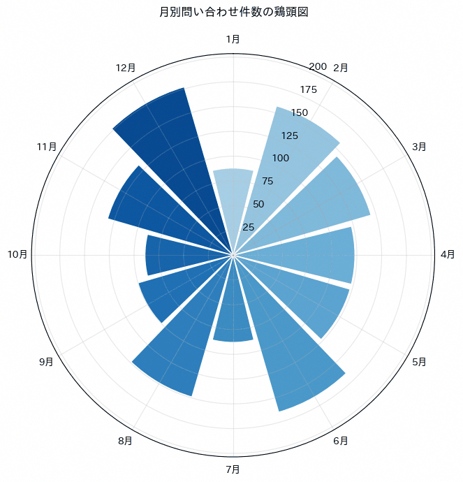
16. 鶏頭図(ポーラーエリアチャート)
鶏頭図は極座標上で角度を均等に割り振り、値の大きさを扇形の半径で表現する図表で、考案者にちなんでナイチンゲールのローズチャートとも呼ばれます。月別や曜日別など周期性のあるカテゴリの大小を、通常の棒グラフとは異なる印象で見せたい場合に向いています。円グラフと違って各カテゴリの角度幅は固定されているため、値の差は半径の違いとしてのみ表現されますが、面積は半径の2乗に比例して増えるため、実際の値の比率よりも大小の差が強調されて見える点に注意が必要です。実務での多用は避け、季節性の把握や資料の彩りとして補助的に使う程度にとどめるのが無難です。コードではsubplot_kw={'projection': 'polar'}で極座標軸を作成し、ax.bar()に角度の配列を渡して扇形を描画しています。
import numpy as np
import pandas as pd
import matplotlib.pyplot as plt
import japanize_matplotlib

rng = np.random.default_rng(42)
df = pd.DataFrame({
    "月": [f"{m}月" for m in range(1, 13)],
    "問い合わせ件数": rng.integers(80, 180, size=12),
})

angles = np.linspace(0, 2 * np.pi, len(df), endpoint=False)
width = 2 * np.pi / len(df)
colors = plt.cm.Blues(np.linspace(0.35, 0.9, len(df)))

fig, ax = plt.subplots(figsize=(7, 7), subplot_kw={"projection": "polar"})
ax.bar(
    angles,
    df["問い合わせ件数"],
    width=width * 0.92,
    color=colors,
    edgecolor="white",
    linewidth=1,
)

ax.set_theta_offset(np.pi / 2)
ax.set_theta_direction(-1)
ax.set_xticks(angles)
ax.set_xticklabels(df["月"])
ax.set_ylim(0, df["問い合わせ件数"].max() * 1.15)
ax.set_title("月別問い合わせ件数の鶏頭図", pad=20)
ax.grid(alpha=0.3)

plt.tight_layout()
plt.show()
4章 構成比・内訳のチャート
内訳を見せる方法は円グラフだけではありません。この章では、量と構成比を同時に示す積み上げ棒、割合だけを比べる100%積み上げ棒、面積で二軸の構成を示すマリメッコ、単位を数えて見せるワッフルとピクトグラム、集合の重なりを示すベン図、増減の内訳を追うウォーターフォール、段階ごとの減少を示すファネルを扱います。
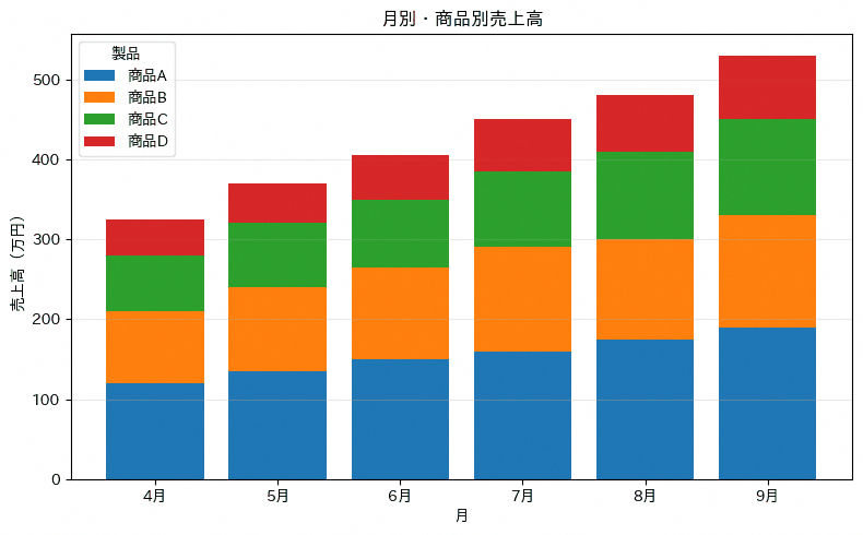
17. 積み上げ棒グラフ
積み上げ棒グラフは、カテゴリ別の内訳を持つ数量を1本の棒の中に積み重ねて表示し、合計値と内訳の両方を同時に伝える図表です。月別の製品別売上高のように、全体の推移と構成要素の推移を同時に追いたい場面に向いています。作図の鉄則として、積み上げるカテゴリ数は5個までに絞り、凡例の並び順を積み上げの順序と一致させることで、どの帯がどのカテゴリかを直感的に対応づけられるようにします。カテゴリ数が多い、あるいは各帯の高さが近い場合は、途中の帯の増減が読み取りにくくなる点に注意が必要です。コードではbottom引数に前のカテゴリまでの累積値を渡しながらax.bar()を繰り返し呼び出すことで、積み上げを実現しています。
import pandas as pd
import matplotlib.pyplot as plt
import japanize_matplotlib

colors_professional = ['#1f77b4', '#ff7f0e', '#2ca02c', '#d62728']

df = pd.DataFrame({
    "月": ["4月", "5月", "6月", "7月", "8月", "9月"],
    "商品A": [120, 135, 150, 160, 175, 190],
    "商品B": [90, 105, 115, 130, 125, 140],
    "商品C": [70, 80, 85, 95, 110, 120],
    "商品D": [45, 50, 55, 65, 70, 80],
})

products = ["商品A", "商品B", "商品C", "商品D"]
bottom = pd.Series(0, index=df.index)

fig, ax = plt.subplots(figsize=(8, 5))
for product, color in zip(products, colors_professional):
    ax.bar(df["月"], df[product], bottom=bottom, label=product, color=color)
    bottom = bottom + df[product]

ax.set_title("月別・商品別売上高")
ax.set_xlabel("月")
ax.set_ylabel("売上高(万円)")
ax.legend(title="製品")
ax.grid(axis="y", alpha=0.3)

plt.tight_layout()
plt.show()
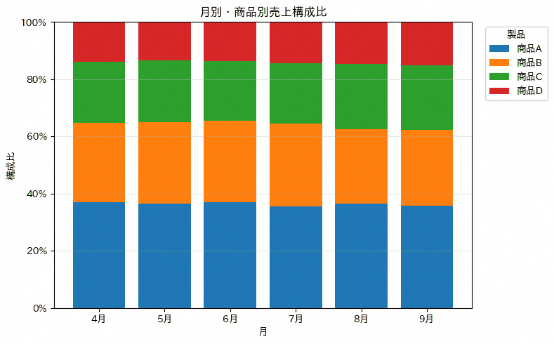
18. 100%積み上げ棒グラフ
100%積み上げ棒グラフは、積み上げ棒グラフの各カテゴリを合計に対する構成比に変換し、すべての棒の高さを100%にそろえて表示する図表です。総量の異なる月同士でも構成比の変化だけを比較したい場合や、シェアの推移を追いたい場面に向いています。実数を扱う積み上げ棒グラフとは異なり、全体量の増減は読み取れなくなるため、量そのものを伝えたいのか構成比を伝えたいのかを事前に整理してから選ぶことが鉄則です。作図では、各カテゴリの値を行ごとの合計で割ってから積み上げる点が実数版との違いです。コードではpivot.div(pivot.sum(axis=1), axis=0)で各行を合計に対する比率へ変換したうえで、積み上げ棒グラフと同じ手順で描画しています。
import pandas as pd
import matplotlib.pyplot as plt
from matplotlib.ticker import PercentFormatter
import japanize_matplotlib

colors_professional = ['#1f77b4', '#ff7f0e', '#2ca02c', '#d62728']

pivot = pd.DataFrame({
    "月": ["4月", "5月", "6月", "7月", "8月", "9月"],
    "商品A": [120, 135, 150, 160, 175, 190],
    "商品B": [90, 105, 115, 130, 125, 140],
    "商品C": [70, 80, 85, 95, 110, 120],
    "商品D": [45, 50, 55, 65, 70, 80],
}).set_index("月")

ratio = pivot.div(pivot.sum(axis=1), axis=0)
bottom = pd.Series(0, index=ratio.index)

fig, ax = plt.subplots(figsize=(8, 5))
for product, color in zip(ratio.columns, colors_professional):
    ax.bar(ratio.index, ratio[product], bottom=bottom, label=product, color=color)
    bottom = bottom + ratio[product]

ax.set_title("月別・商品別売上構成比")
ax.set_xlabel("月")
ax.set_ylabel("構成比")
ax.set_ylim(0, 1)
ax.yaxis.set_major_formatter(PercentFormatter(1.0))
ax.legend(title="製品", bbox_to_anchor=(1.02, 1), loc="upper left")
ax.grid(axis="y", alpha=0.3)

plt.tight_layout()
plt.show()
19. マリメッコチャート
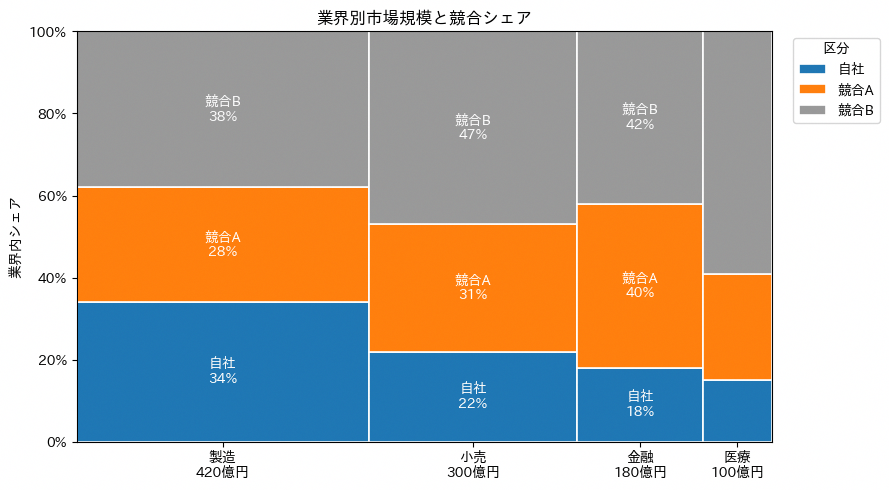
マリメッコチャートは、横幅で1つ目の量(市場規模など)、縦方向の積み上げで2つ目の内訳(シェアなど)を同時に表現する図表です。業界別の市場規模と、その業界内での自社・競合のシェアを一枚で比較したい場面に向いています。通常の積み上げ棒グラフでは棒の幅が一定であるのに対し、マリメッコチャートは幅も情報として使うため、規模の大きい業界ほど横幅が広くなり、規模とシェアの両方を面積として直感的に把握できます。作図の注意点として、幅の合計と各業界内の高さの合計(縦方向は必ず100%)を正しく管理しないと、比率がずれた図になってしまいます。コードではRectangleを業界ごと・シェア区分ごとに配置し、横位置の起点を市場規模の累積値から、縦方向の高さをシェアの割合から計算しています。
import pandas as pd
import matplotlib.pyplot as plt
from matplotlib.patches import Rectangle
from matplotlib.ticker import PercentFormatter
import japanize_matplotlib

df = pd.DataFrame({
    "業界": ["製造", "小売", "金融", "医療"],
    "市場規模": [420, 300, 180, 100],
    "自社": [0.34, 0.22, 0.18, 0.15],
    "競合A": [0.28, 0.31, 0.40, 0.26],
    "競合B": [0.38, 0.47, 0.42, 0.59],
})

segments = ["自社", "競合A", "競合B"]
colors = ['#1f77b4', '#ff7f0e', '#999999']
total_market = df["市場規模"].sum()

fig, ax = plt.subplots(figsize=(9, 5))
x = 0
centers = []

for _, row in df.iterrows():
    width = row["市場規模"] / total_market
    y = 0
    centers.append(x + width / 2)

    for segment, color in zip(segments, colors):
        height = row[segment]
        ax.add_patch(Rectangle((x, y), width, height, facecolor=color, edgecolor="white", linewidth=1.2, label=segment if x == 0 else None))
        if width > 0.12 and height > 0.12:
            ax.text(x + width / 2, y + height / 2, f"{segment}\n{height:.0%}", ha="center", va="center", color="white", fontsize=10)
        y += height

    x += width

ax.set_xlim(0, 1)
ax.set_ylim(0, 1)
ax.set_xticks(centers)
ax.set_xticklabels([f"{r.業界}\n{r.市場規模}億円" for r in df.itertuples()])
ax.yaxis.set_major_formatter(PercentFormatter(1.0))
ax.set_title("業界別市場規模と競合シェア")
ax.set_ylabel("業界内シェア")
ax.legend(title="区分", bbox_to_anchor=(1.02, 1), loc="upper left")

plt.tight_layout()
plt.show()
20. ワッフルチャート
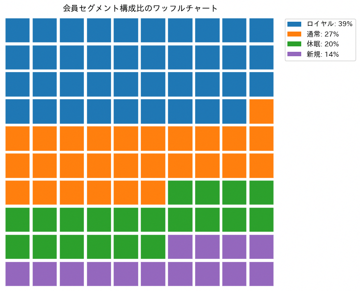
ワッフルチャートは、10×10などの正方形グリッドを1マスあたり一定の割合や数量に対応させ、色分けしたマス目の数で構成比を表現する図表です。円グラフや積み上げ棒グラフに比べてマスを1つずつ数えられるため、会員セグメントの構成比のように「だいたい何割か」を直感的かつ正確に伝えたい場面に向いています。作図の鉄則は、100マスちょうどに収まるよう端数を調整することで、四捨五入の誤差でマスが余ったり不足したりしないようにする点です。カテゴリ数が多いと色の判別が難しくなるため、円グラフと同様に5個程度までに絞るのが無難です。作図には標準のグラフ関数の中に専用のワッフル形式がないため、コードではRectangleを100個分ループで配置し、構成比に応じた数だけ色を割り当てて自前で描画しています。
import pandas as pd
import matplotlib.pyplot as plt
from matplotlib.patches import Rectangle
import japanize_matplotlib

df = pd.DataFrame({
    "会員セグメント": ["ロイヤル", "通常", "休眠", "新規"],
    "会員数": [386, 274, 203, 137],
})

colors_professional = ['#1f77b4', '#ff7f0e', '#2ca02c', '#9467bd']
grid_counts = (df["会員数"] / df["会員数"].sum() * 100).round().astype(int)
grid_counts.iloc[-1] += 100 - grid_counts.sum()

cell_colors = []
for count, color in zip(grid_counts, colors_professional):
    cell_colors.extend([color] * count)

fig, ax = plt.subplots(figsize=(7, 6))
for i, color in enumerate(cell_colors):
    col = i % 10
    row = 9 - i // 10
    ax.add_patch(Rectangle((col, row), 0.92, 0.92, facecolor=color, edgecolor="white", linewidth=1))

handles = [
    Rectangle((0, 0), 1, 1, facecolor=color, label=f"{segment}: {count}%")
    for segment, count, color in zip(df["会員セグメント"], grid_counts, colors_professional)
]
ax.legend(handles=handles, bbox_to_anchor=(1.02, 1), loc="upper left")
ax.set_title("会員セグメント構成比のワッフルチャート")
ax.set_xlim(0, 10)
ax.set_ylim(0, 10)
ax.set_aspect("equal")
ax.axis("off")

plt.tight_layout()
plt.show()
21. ピクトグラム
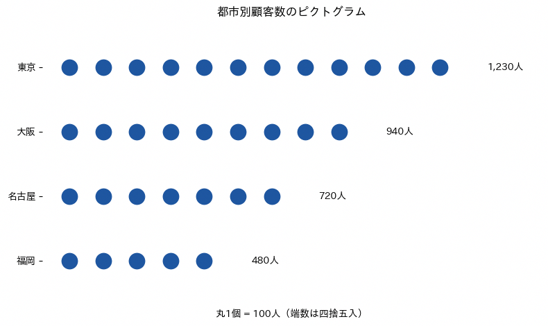
ピクトグラムは、同じ形のマークを一定数量あたり1個と決めて並べ、数量の大小をマークの個数で表現する図表です。都市別の顧客数のように、絶対数の規模感を目盛りや棒の長さよりも直感的に伝えたい場面に向いています。人物やモノを模したアイコンを使う例もありますが、実務では丸や四角のような単純な図形を使っても十分に数量感は伝わり、素材の準備や著作権の手間もかかりません。作図の鉄則は、1マークあたりの数量(単位)を図の中に明記し、端数は四捨五入で近似する程度にとどめることです。コードではax.scatter()で丸いマーカーを行列状に並べ、カテゴリごとのマーク数を数量を単位で割って四捨五入することで算出しています。
import pandas as pd
import matplotlib.pyplot as plt
import japanize_matplotlib

df = pd.DataFrame({
    "都市": ["東京", "大阪", "名古屋", "福岡"],
    "顧客数": [1230, 940, 720, 480],
})

unit = 100
df["マーク数"] = (df["顧客数"] / unit).round().astype(int)

fig, ax = plt.subplots(figsize=(8, 4.8))
for y, row in enumerate(df.itertuples()):
    xs = list(range(row.マーク数))
    ys = [y] * row.マーク数
    ax.scatter(xs, ys, s=260, color="#1E56A0")
    ax.text(row.マーク数 + 0.4, y, f"{row.顧客数:,}人", va="center", fontsize=10)

ax.set_yticks(range(len(df)))
ax.set_yticklabels(df["都市"])
ax.set_xlim(-0.8, df["マーク数"].max() + 2)
ax.set_ylim(-0.7, len(df) - 0.3)
ax.invert_yaxis()
ax.set_xlabel(f"丸1個 = {unit:,}人(端数は四捨五入)")
ax.set_title("都市別顧客数のピクトグラム")
ax.tick_params(axis="x", bottom=False, labelbottom=False)
for spine in ax.spines.values():
    spine.set_visible(False)

plt.tight_layout()
plt.show()
22. ベン図
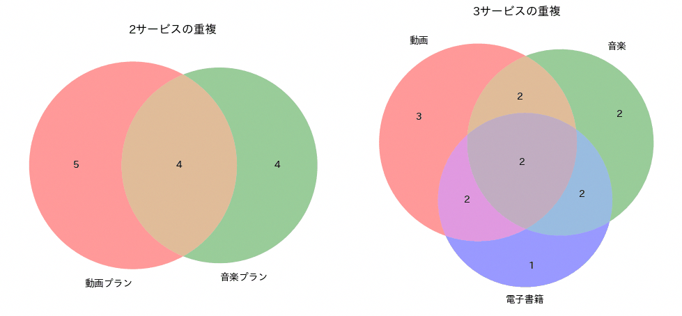
ベン図は、複数の集合の要素がどれだけ重なり合っているかを、円の重なりの面積で表現する図表です。サービスAとサービスBの併用者数のように、顧客セグメント同士の重複を把握し、クロスセルの余地を検討したい場面に向いています。2集合までは重なりの面積を直感的に比較できますが、3集合を超えると円だけでは正しい重なりを描けなくなるため、実務で扱う集合は3つまでにとどめるのが鉄則です。また、円の面積や重なりの大きさはあくまで目安であり、正確な比率までは読み取れないため、実数は各領域に添えるラベルで補うことが望まれます。コードではmatplotlib_vennライブラリのvenn2()とvenn3()に、それぞれの集合オブジェクトのリストを渡して描画しています。
import pandas as pd
import matplotlib.pyplot as plt
from matplotlib_venn import venn2, venn3
import japanize_matplotlib

df = pd.DataFrame({
    "顧客ID": [f"C{i:03d}" for i in range(1, 15)],
    "動画プラン": [True, True, True, True, True, False, False, True, False, True, False, True, False, True],
    "音楽プラン": [True, True, False, False, True, True, True, False, False, True, True, False, True, False],
    "電子書籍": [True, False, True, False, False, True, False, True, True, True, False, False, True, False],
})

video = set(df.loc[df["動画プラン"], "顧客ID"])
music = set(df.loc[df["音楽プラン"], "顧客ID"])
ebook = set(df.loc[df["電子書籍"], "顧客ID"])

fig, axes = plt.subplots(1, 2, figsize=(10, 4.5))

v2 = venn2([video, music], set_labels=("動画プラン", "音楽プラン"), ax=axes[0])
axes[0].set_title("2サービスの重複")

v3 = venn3([video, music, ebook], set_labels=("動画", "音楽", "電子書籍"), ax=axes[1])
axes[1].set_title("3サービスの重複")

for diagram in [v2, v3]:
    for label in diagram.subset_labels:
        if label:
            label.set_fontsize(10)
    for label in diagram.set_labels:
        if label:
            label.set_fontsize(10)

plt.tight_layout()
plt.show()
23. ウォーターフォールチャート
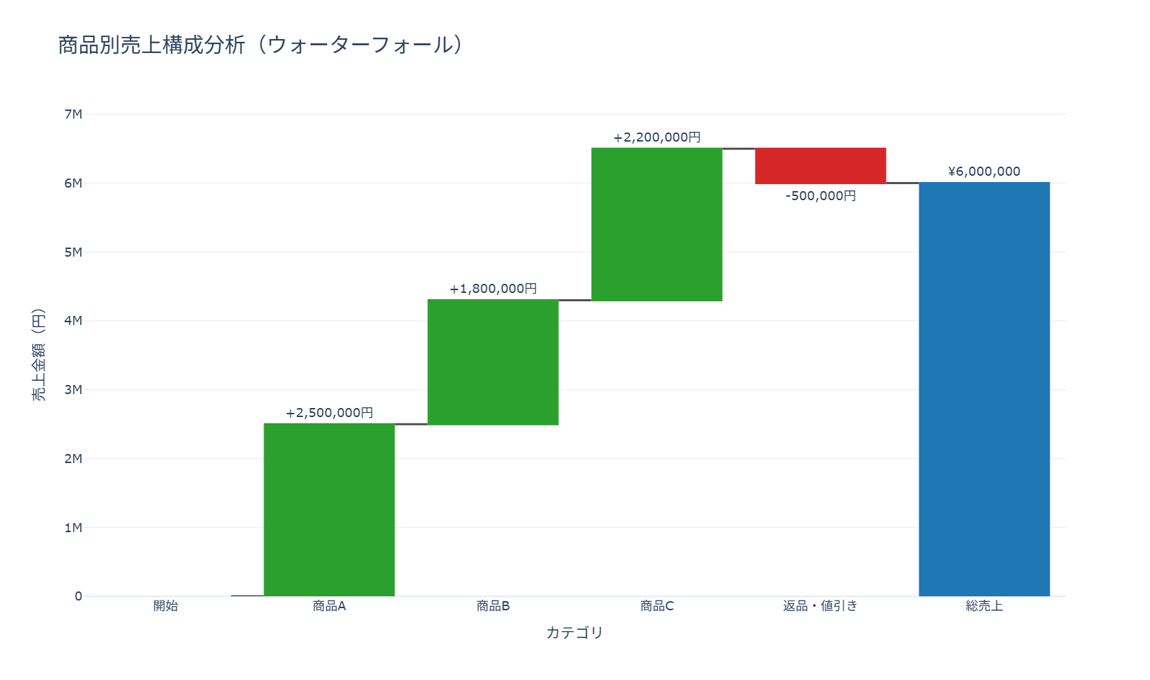
商品別の売上がどのように積み上がって総売上に至るかを、増減の内訳ごとに段階的な棒グラフとして示すレシピです。経営会議で売上構成の変化要因を説明する場面や、コスト増減の内訳を示す場面に向いています。go.Waterfallのmeasureにabsolute(絶対値)・relative(相対的な増減)・total(合計)を指定し分けている部分が構成の要で、increasing・decreasing・totalsそれぞれに色を設定することでプラス要因とマイナス要因を視覚的に区別させています。
import pandas as pd
import plotly.graph_objects as go

df = pd.DataFrame({
    "カテゴリ": ["開始", "商品A", "商品B", "商品C", "返品・値引き", "総売上"],
    "金額": [0, 2500000, 1800000, 2200000, -500000, 0],
    "区分": ["absolute", "relative", "relative", "relative", "relative", "total"],
})

running_total = 0
text = []
for amount, measure in zip(df["金額"], df["区分"]):
    if measure == "absolute":
        running_total = amount
        text.append("" if amount == 0 else f"¥{amount:,.0f}")
    elif measure == "relative":
        running_total += amount
        text.append(f"{amount:+,.0f}円")
    else:
        text.append(f"¥{running_total:,.0f}")

fig = go.Figure()
fig.add_trace(go.Waterfall(
    name="売上構成",
    orientation="v",
    measure=df["区分"],
    x=df["カテゴリ"],
    y=df["金額"],
    text=text,
    textposition="outside",
    connector={"line": {"color": "rgb(80, 80, 80)"}},
    increasing={"marker": {"color": "#2ca02c"}},
    decreasing={"marker": {"color": "#d62728"}},
    totals={"marker": {"color": "#1f77b4"}},
))

fig.update_layout(
    title=dict(text="商品別売上構成分析(ウォーターフォール)", font=dict(size=20)),
    xaxis_title="カテゴリ",
    yaxis_title="売上金額(円)",
    template="plotly_white",
    height=600,
    showlegend=False,
)

fig.show()
24. ファネルチャート
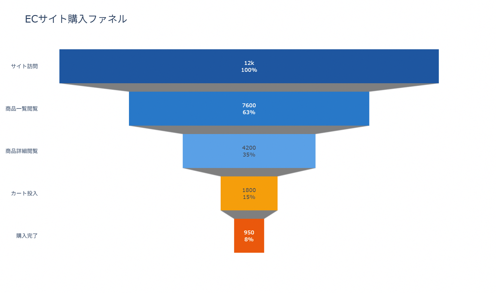
ファネルチャートは、複数の段階を経て人数や件数が減っていくプロセスを、上から下に向かって狭まる帯の形で表現する図表です。サイト訪問から購入完了までのコンバージョンファネルのように、各段階でどれだけ離脱しているかを把握し、改善すべき段階を特定したい場面に向いています。作図の鉄則は、段階の並び順を実際のプロセス順のまま保つことと、各段階の値を必ず直前の段階以下にすることで、帯の幅が単調に狭まる形を保つことです。インタラクティブ版では、帯にカーソルを合わせると各段階の件数や初期段階に対する割合が表示されるため、資料化する前の探索的な確認に向いています。コードではgo.Funnel()に段階のラベルと値を渡し、textinfo='value+percent initial'で件数と初期比率を帯の中に表示させています。
import plotly.graph_objects as go

stages = ['サイト訪問', '商品一覧閲覧', '商品詳細閲覧', 'カート投入', '購入完了']
values = [12000, 7600, 4200, 1800, 950]

fig = go.Figure(
    go.Funnel(
        y=stages,
        x=values,
        textinfo='value+percent initial',
        marker=dict(color=['#1E56A0', '#2878C8', '#5AA0E6', '#F59E0B', '#EA580C']),
        connector=dict(line=dict(color='#BBBBBB', width=1))
    )
)

fig.update_layout(
    title=dict(text='ECサイト購入ファネル', font=dict(size=22)),
    template='plotly_white',
    height=520
)

fig.show()
5章 階層構造のチャート
階層のあるデータは、入れ子の面積や円で表現すると全体と部分の関係が一目で伝わります。この章ではツリーマップ、サンバースト、アイシクル、サークルパッキングに加えて、似たもの同士をまとめて枝分かれで示すデンドログラムとクラスターマップを扱います。
25. ツリーマップ
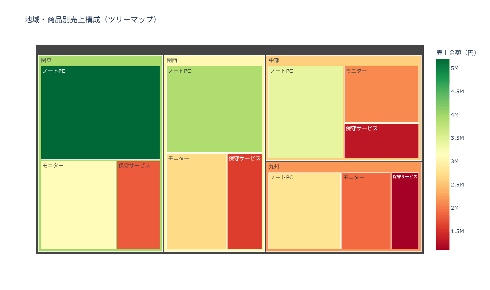
地域と商品という階層構造を持つ売上データを、面積の大きさで規模を、色の濃淡で相対的な大小を同時に示すツリーマップとして描くレシピです。売上構成のどこにボリュームが集中しているかを俯瞰したい経営報告の場面に向いています。コードの要点はpx.treemapのpathに[‘region’, ‘product’]と階層の順序どおりに列名を渡している部分で、この順序を入れ替えるだけで集計の切り口を変えられます。
import pandas as pd
import plotly.express as px

df_sales_daily = pd.DataFrame({
    'region': ['関東', '関東', '関東', '関西', '関西', '関西', '中部', '中部', '中部', '九州', '九州', '九州'],
    'product': ['ノートPC', 'モニター', '保守サービス'] * 4,
    'sales': [5200000, 3100000, 1800000, 3900000, 2700000, 1600000, 3400000, 2100000, 1300000, 2800000, 1900000, 1100000]
})

region_product_sales = df_sales_daily.groupby(['region', 'product'], as_index=False)['sales'].sum()

fig = px.treemap(
    region_product_sales,
    path=['region', 'product'],
    values='sales',
    title='地域・商品別売上構成(ツリーマップ)',
    color='sales',
    color_continuous_scale='RdYlGn',
    labels={'sales': '売上金額(円)'}
)

fig.update_layout(
    template='plotly_white',
    height=600
)

fig.show()
26. サンバーストチャート
サンバーストチャートは、中心から外側に向かって階層を同心円状に広げ、各セグメントの角度で構成比を表すグラフです。地域という大分類の下に商品カテゴリという小分類がぶら下がるような2階層以上のデータで、どの大分類がどの小分類によって構成されているかを対話的に確認したい場合に適しています。階層が深くなるほど中心付近のラベルが読みにくくなるため、ラベルの表示形式や色分けの粒度を階層の深さに合わせて調整することが作図上の注意点です。コードではpx.sunburst()のpath引数に地域と商品カテゴリの列を順に渡し、colorで地域ごとの色分けを行っています。
import pandas as pd
import plotly.express as px

df_sales = pd.DataFrame({
    'region': ['関東', '関東', '関東', '関西', '関西', '関西', '中部', '中部', '九州', '九州'],
    'category': ['ハードウェア', 'ハードウェア', 'サービス', 'ハードウェア', 'ソフトウェア', 'サービス', 'ソフトウェア', 'サービス', 'ハードウェア', 'サービス'],
    'sales': [6200000, 3500000, 2400000, 4300000, 2600000, 1800000, 3100000, 1500000, 2900000, 1200000]
})

fig = px.sunburst(
    df_sales,
    path=['region', 'category'],
    values='sales',
    color='region',
    title='地域・商品カテゴリ別売上構成(サンバースト)',
    labels={'sales': '売上金額(円)'}
)

fig.update_layout(
    template='plotly_white',
    height=600
)

fig.show()
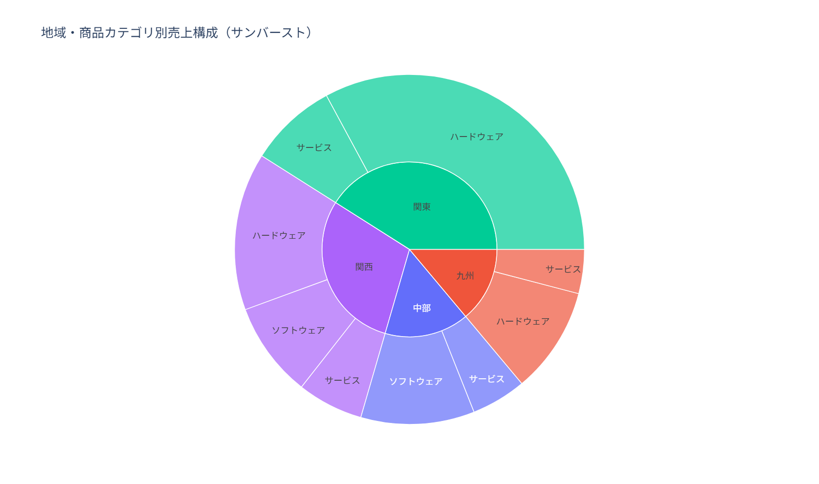
27. アイシクルチャート
アイシクルチャートは、サンバーストと同じ階層構造を、円ではなく積み重なった長方形の帯で表現するグラフです。階層が3段、4段と深くなる場合でも横方向に帯を並べていくだけなので、サンバーストより階層のラベルが読み取りやすく、社内資料での構成説明に使いやすい形式です。帯の高さや幅の比較は面積比較よりも直感的に伝わりやすい一方、末端の階層が多いとラベルが重なりやすいため、深い階層では上位数件に絞るなどの工夫が必要になります。コードではpx.icicle()にpathで地域と商品カテゴリを指定し、サンバーストと同様の集計結果をそのまま利用しています。
import pandas as pd
import plotly.express as px

df_sales = pd.DataFrame({
    'region': ['関東', '関東', '関東', '関西', '関西', '関西', '中部', '中部', '九州', '九州'],
    'category': ['ハードウェア', 'ハードウェア', 'サービス', 'ハードウェア', 'ソフトウェア', 'サービス', 'ソフトウェア', 'サービス', 'ハードウェア', 'サービス'],
    'sales': [6200000, 3500000, 2400000, 4300000, 2600000, 1800000, 3100000, 1500000, 2900000, 1200000]
})

fig = px.icicle(
    df_sales,
    path=['region', 'category'],
    values='sales',
    color='region',
    title='地域・商品カテゴリ別売上構成(アイシクル)',
    labels={'sales': '売上金額(円)'}
)

fig.update_layout(
    template='plotly_white',
    height=600
)

fig.show()

28. サークルパッキング
サークルパッキングは、階層構造を円の入れ子で表現し、大きい円の中に小さい円を詰め込むことで全体と部分の関係を示すグラフです。ツリーマップと同じく構成比を面積で表しますが、円という有機的な形状になるため、事業ポートフォリオや組織構成のように「まとまり」を強調したい資料と相性が良い形式です。円同士の間隔が詰まりすぎるとラベルが読みにくくなるため、親の円は薄い塗り、子の円は濃い塗りにするなど階層ごとに色の濃淡を変えることが見やすさの鍵になります。コードでは地域を親、商品カテゴリを子とする階層データを組み立て、circlify.circlify()で円の座標と半径を計算しています。計算される座標は−1から1の範囲に収まるため、描画時には軸の表示範囲を±1に合わせておくことが、円の見切れを防ぐポイントです。
import matplotlib.pyplot as plt
import pandas as pd
import circlify
import japanize_matplotlib

colors_professional = ['#1f77b4', '#ff7f0e', '#2ca02c', '#d62728']

df_sales = pd.DataFrame({
    'region': ['関東', '関東', '関東', '関西', '関西', '中部', '中部', '九州'],
    'category': ['PC', '周辺機器', '保守', 'PC', 'ソフトウェア', 'PC', '保守', 'ソフトウェア'],
    'sales': [6200000, 3100000, 1800000, 4200000, 2600000, 3300000, 1500000, 2100000]
})

hierarchy = []
for region, group in df_sales.groupby('region'):
    hierarchy.append({
        'id': region,
        'datum': group['sales'].sum(),
        'children': [
            {'id': row['category'], 'datum': row['sales'], 'parent': region}
            for _, row in group.iterrows()
        ]
    })

circles = circlify.circlify(
    hierarchy,
    show_enclosure=False,
    target_enclosure=circlify.Circle(x=0, y=0, r=1)
)

fig, ax = plt.subplots(figsize=(8, 8))
ax.set_title('地域・商品カテゴリ別売上構成(サークルパッキング)', fontsize=16, pad=16)
ax.axis('off')
ax.set_xlim(-1.05, 1.05)
ax.set_ylim(-1.05, 1.05)
ax.set_aspect('equal')

region_color = {item['id']: colors_professional[i] for i, item in enumerate(hierarchy)}

for circle in circles:
    if circle.level == 1:
        color = region_color[circle.ex['id']]
        ax.add_patch(plt.Circle((circle.x, circle.y), circle.r, color=color, alpha=0.18, linewidth=2))
        ax.text(circle.x, circle.y + circle.r * 0.75, circle.ex['id'], ha='center', va='center', fontsize=13, weight='bold')
    elif circle.level == 2:
        color = region_color[circle.ex['parent']]
        ax.add_patch(plt.Circle((circle.x, circle.y), circle.r, color=color, alpha=0.65, linewidth=1))
        ax.text(circle.x, circle.y, circle.ex['id'], ha='center', va='center', fontsize=10, color='white', weight='bold')

plt.tight_layout()
plt.show()
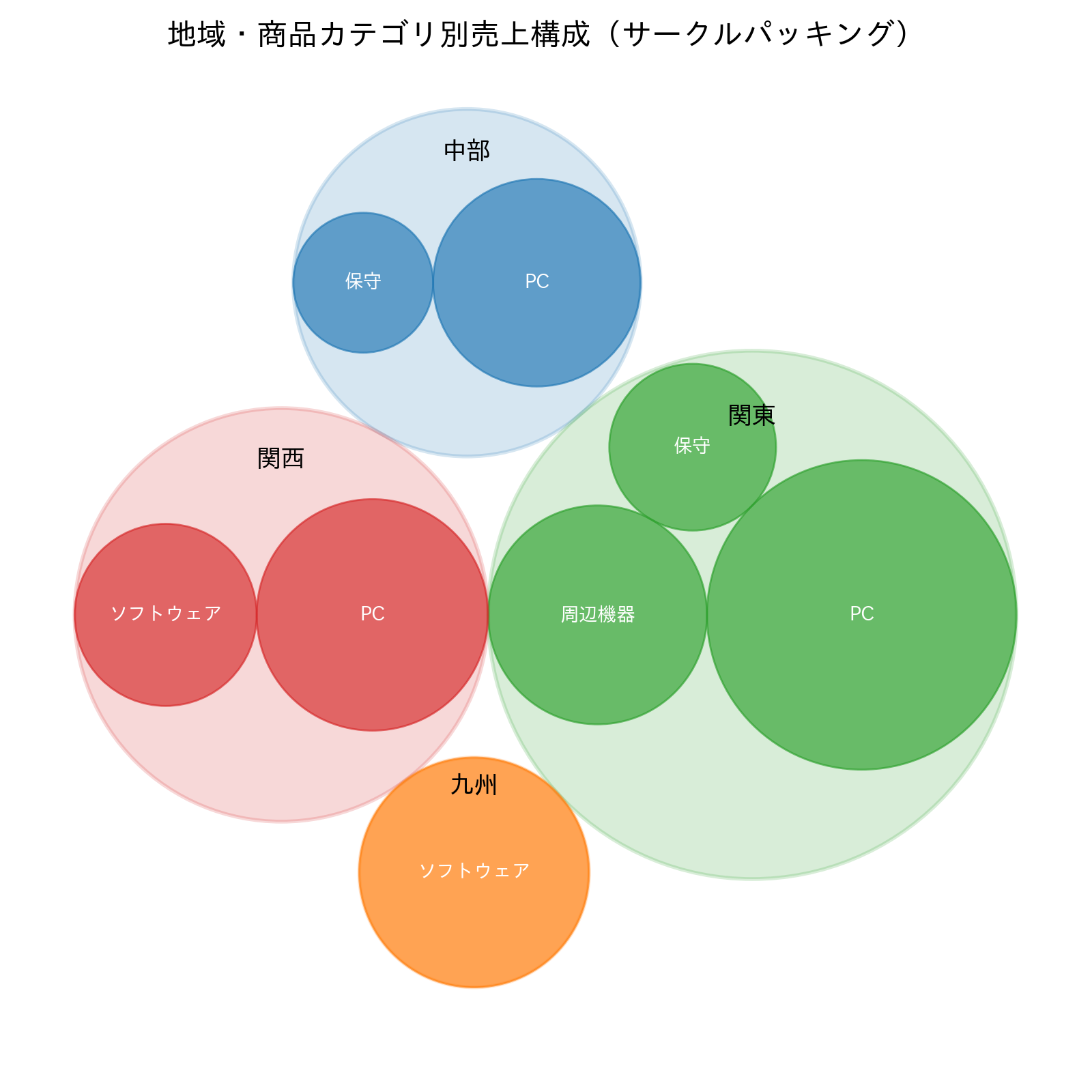
29. デンドログラム
デンドログラムは、個々のデータ同士の近さを木構造で表し、どの単位とどの単位が似ているかを距離の高さで示すグラフです。あらかじめカテゴリが決まっていない状況で、顧客セグメントと居住都市の組み合わせのようなグループ同士が実際にどこまで似ているかを確認し、統合や分割の判断材料にする場面に向いています。クラスタリングの前に各変数を標準化しておかないと、値のスケールが大きい変数(年収など)に距離計算が引きずられてしまう点が注意点です。コードではsegmentとcityの組み合わせごとに年収・支出額などの平均プロファイルを作り、zscoreで標準化したうえでscipy.cluster.hierarchy.linkage()とdendrogram()で描画しています。
import matplotlib.pyplot as plt
import pandas as pd
import japanize_matplotlib
from scipy.cluster.hierarchy import dendrogram, linkage
from scipy.stats import zscore

df_customers = pd.DataFrame({
    'segment': ['法人高単価', '法人高単価', '法人標準', '法人標準', '個人優良', '個人優良', '個人一般', '個人一般'],
    'city': ['東京', '大阪', '東京', '名古屋', '東京', '福岡', '大阪', '福岡'],
    'annual_income': [950, 880, 720, 690, 610, 570, 430, 390],
    'monthly_spend': [48, 44, 32, 29, 27, 24, 16, 14],
    'purchase_count': [32, 29, 24, 21, 20, 18, 12, 10]
})

profile = df_customers.groupby(['segment', 'city']).mean(numeric_only=True)
scaled_profile = profile.apply(zscore)

linked = linkage(scaled_profile, method='ward')

fig, ax = plt.subplots(figsize=(10, 5))
dendrogram(
    linked,
    labels=[f'{segment}・{city}' for segment, city in profile.index],
    leaf_rotation=35,
    leaf_font_size=10,
    ax=ax
)

ax.set_title('顧客グループの類似度(デンドログラム)', fontsize=15)
ax.set_ylabel('距離')
ax.grid(axis='y', alpha=0.3)

plt.tight_layout()
plt.show()
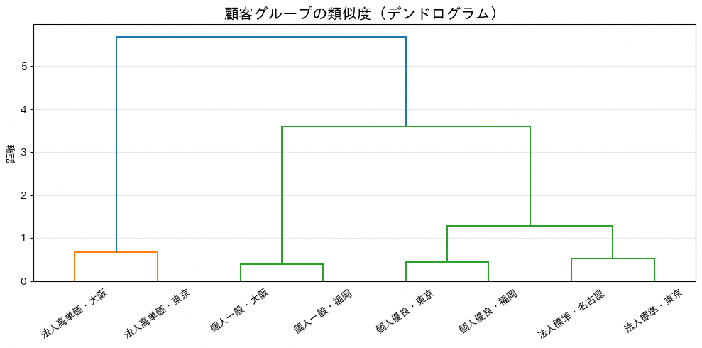
30. クラスターマップ
クラスターマップは、ヒートマップの行と列を類似度に基づいて自動的に並べ替え、両端にデンドログラムを添えることで行列データの中に潜む塊を浮かび上がらせるグラフです。地域×商品カテゴリの平均売上のように行と列がともにカテゴリである集計表で、似た傾向を持つ行同士・列同士をまとめて把握したい場合に向いています。並べ替えによって元の行列の並び順(地域名の五十音順など)は失われるため、業務上決まった並び順を残したい表とは別に補助資料として使うのが実務的な使い方です。コードではpivot_table()で地域×商品カテゴリの平均売上を作り、sns.clustermap()に渡して色と数値を同時に表示しています。
import pandas as pd
import seaborn as sns
import matplotlib.pyplot as plt

sns.set_theme(style='white')
import japanize_matplotlib

df_sales_daily = pd.DataFrame({
    'region': ['関東', '関東', '関東', '関西', '関西', '関西', '中部', '中部', '中部', '九州', '九州', '九州'],
    'category': ['PC', '周辺機器', '保守'] * 4,
    'sales': [5200000, 3100000, 1800000, 3900000, 2700000, 1600000, 3400000, 2100000, 1300000, 2800000, 1900000, 1100000]
})

sales_matrix = df_sales_daily.pivot_table(
    index='region',
    columns='category',
    values='sales',
    aggfunc='mean'
)

g = sns.clustermap(
    sales_matrix,
    cmap='YlGnBu',
    annot=True,
    fmt='.0f',
    linewidths=0.5,
    figsize=(8, 6),
    cbar_kws={'label': '平均売上(円)'}
)

g.fig.suptitle('地域×商品カテゴリの平均売上(クラスターマップ)', y=1.02, fontsize=15)
plt.tight_layout()
plt.show()
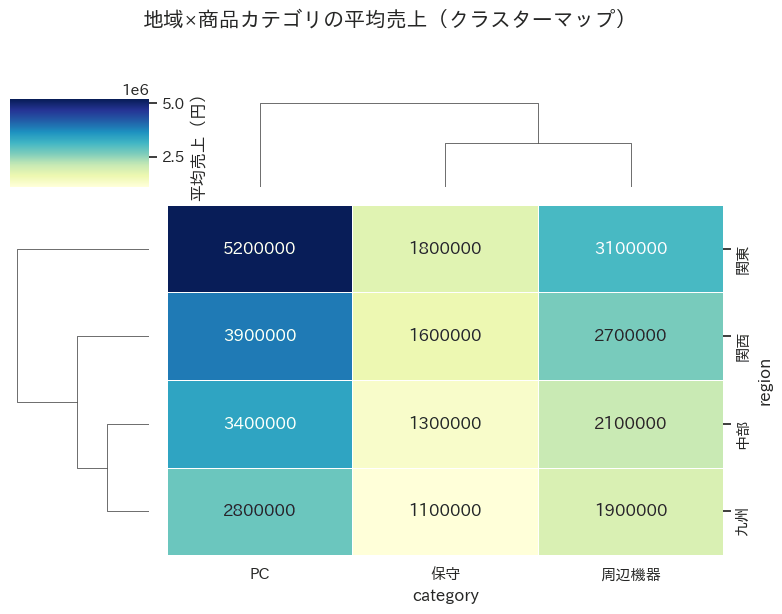
6章 分布のチャート
データのばらつきや偏りを見るためのチャート群です。この章ではヒストグラムとKDE(カーネル密度推定)で分布の形を捉え、箱ひげ図・バイオリンプロットで要約し、ストリッププロットやスウォームプロット、レインクラウドプロットで個々のデータ点まで見せる方法を扱います。
31. ヒストグラム
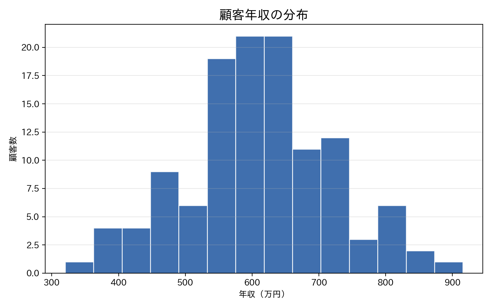
ヒストグラムは、数値を一定幅の区間(ビン)に区切り、各区間に含まれるデータ件数を棒の高さで表すグラフです。顧客の年収や購入金額のような連続値がどのあたりに集中し、どの程度ばらついているかを最初に把握したいときの基本ツールとして使われます。ビンの数を変えるだけで分布の印象が大きく変わるため、まずはデフォルトの区切り方で全体像を確認し、必要に応じて細かく調整する進め方が実務的です。コードではax.hist()で年収の分布を描き、binsでビンの数を、edgecolorで棒同士の境界線を指定しています。
import matplotlib.pyplot as plt
import numpy as np
import pandas as pd
import japanize_matplotlib

np.random.seed(42)

df_customers = pd.DataFrame({
    'annual_income': np.random.normal(loc=620, scale=120, size=120).clip(320, 980)
})

fig, ax = plt.subplots(figsize=(8, 5))
ax.hist(
    df_customers['annual_income'],
    bins=14,
    color='#1E56A0',
    edgecolor='white',
    alpha=0.85
)

ax.set_title('顧客年収の分布', fontsize=15)
ax.set_xlabel('年収(万円)')
ax.set_ylabel('顧客数')
ax.grid(axis='y', alpha=0.3)

plt.tight_layout()
plt.show()
32. KDE(カーネル密度推定)
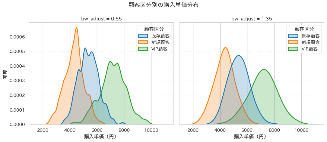
KDEは、ヒストグラムのような分布を滑らかな曲線として表すグラフです。複数の顧客区分を重ねることで、購入単価の山の位置や広がりを比較できます。bw_adjust を小さくすると細かな凹凸が出やすく、大きくすると全体傾向が滑らかに見えます。サンプル数や外れ値の影響を受けるため、比較では同じ設定を使うことが重要です。
import numpy as np
import pandas as pd
import matplotlib.pyplot as plt
import seaborn as sns

sns.set_theme(style='whitegrid')
import japanize_matplotlib

rng = np.random.default_rng(42)

regular = rng.normal(loc=5400, scale=850, size=220)
new = rng.normal(loc=4300, scale=700, size=180)
vip = rng.normal(loc=7200, scale=950, size=120)

df = pd.DataFrame({
    '購入単価': np.concatenate([regular, new, vip]).clip(1800, 9800),
    '顧客区分': (
        ['既存顧客'] * len(regular)
        + ['新規顧客'] * len(new)
        + ['VIP顧客'] * len(vip)
    )
})

palette = {
    '既存顧客': '#1f77b4',
    '新規顧客': '#ff7f0e',
    'VIP顧客': '#2ca02c',
}

fig, axes = plt.subplots(1, 2, figsize=(11, 4.8), sharex=True, sharey=True)

for ax, bw in zip(axes, [0.55, 1.35]):
    sns.kdeplot(
        data=df, x='購入単価', hue='顧客区分',
        bw_adjust=bw, common_norm=False, fill=True,
        alpha=0.24, linewidth=2, palette=palette, ax=ax
    )
    ax.set_title(f'bw_adjust = {bw}')
    ax.set_xlabel('購入単価(円)')
    ax.set_ylabel('密度')
    ax.grid(axis='y', linestyle=':', alpha=0.45)

fig.suptitle('顧客区分別の購入単価分布', fontsize=14, fontweight='bold')

plt.tight_layout()
plt.show()
33. 2次元KDE
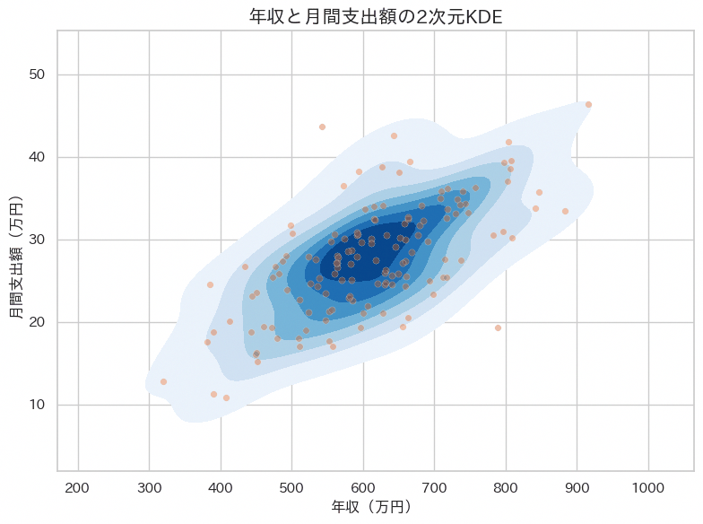
2次元KDEは、2つの数値変数の同時分布を等高線状の濃淡で表し、データがどの組み合わせに集中しているかを面で示すグラフです。年収と支出額のように関連が想定される2変数について、単純な散布図では点が重なって読み取りにくい密集領域を、色の濃さとして視覚化したい場面に向いています。等高線が細かくなりすぎるとノイズを拾った複雑な形になるため、levelsやthreshで表示する等高線の本数と最低密度を調整し、主要な塊が読み取れる程度に抑えることが作図の勘所です。コードではsns.kdeplot()のfill=Trueで塗りつぶし等高線を描き、実データの散布図を薄く重ねて分布と個々の点の両方を確認できるようにしています。
import matplotlib.pyplot as plt
import numpy as np
import pandas as pd
import seaborn as sns

sns.set_theme(style='whitegrid')
import japanize_matplotlib

np.random.seed(42)

df_customers = pd.DataFrame({
    'annual_income': np.random.normal(loc=620, scale=120, size=140).clip(320, 980)
})
df_customers['monthly_spend'] = (
    df_customers['annual_income'] * 0.045
    + np.random.normal(loc=0, scale=5, size=len(df_customers))
).clip(8, 60)

fig, ax = plt.subplots(figsize=(8, 6))
sns.kdeplot(
    data=df_customers,
    x='annual_income',
    y='monthly_spend',
    fill=True,
    levels=8,
    thresh=0.05,
    cmap='Blues',
    ax=ax
)
sns.scatterplot(
    data=df_customers,
    x='annual_income',
    y='monthly_spend',
    color='#EA580C',
    alpha=0.35,
    s=28,
    ax=ax
)

ax.set_title('年収と月間支出額の2次元KDE', fontsize=15)
ax.set_xlabel('年収(万円)')
ax.set_ylabel('月間支出額(万円)')

plt.tight_layout()
plt.show()
34. リッジラインプロット
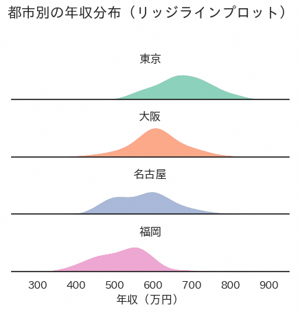
リッジラインプロットは、カテゴリごとの分布曲線を縦方向にわずかに重ねながら段々に並べ、複数グループの分布を1枚の図にまとめて比較するグラフです。都市別の年収分布のように、カテゴリ数が3から6程度あり、それぞれの分布の位置やばらつきを縦に見比べたい場面に向いています。段の間隔を詰めすぎると隣同士の山が重なって読み取りにくくなるため、subplots_adjustの負の値を小さめに調整し、山の形が潰れない範囲で重ねることが見やすさの鍵になります。コードではsns.FacetGridのrowにカテゴリ変数を指定し、各行にsns.kdeplotを塗りつぶしと輪郭線の2回描画したうえで行間を詰めています。
import matplotlib.pyplot as plt
import numpy as np
import pandas as pd
import seaborn as sns

sns.set_theme(style='white')
import japanize_matplotlib

np.random.seed(42)

cities = ['東京', '大阪', '名古屋', '福岡']
means = {'東京': 690, '大阪': 610, '名古屋': 570, '福岡': 520}

df_customers = pd.DataFrame([
    {'city': city, 'annual_income': income}
    for city in cities
    for income in np.random.normal(loc=means[city], scale=75, size=60).clip(320, 980)
])

g = sns.FacetGrid(
    df_customers,
    row='city',
    hue='city',
    aspect=4,
    height=1.1,
    palette='Set2',
    sharex=True
)

g.map_dataframe(sns.kdeplot, x='annual_income', fill=True, alpha=0.75, linewidth=0)
g.map_dataframe(sns.kdeplot, x='annual_income', color='white', linewidth=1.2)
g.set_titles('{row_name}')
g.set_axis_labels('年収(万円)', '')
g.set(yticks=[], ylabel='')
g.despine(left=True)

g.fig.suptitle('都市別の年収分布(リッジラインプロット)', y=1.03, fontsize=15)
g.fig.subplots_adjust(hspace=-0.25)

plt.tight_layout()
plt.show()
35. 箱ひげ図
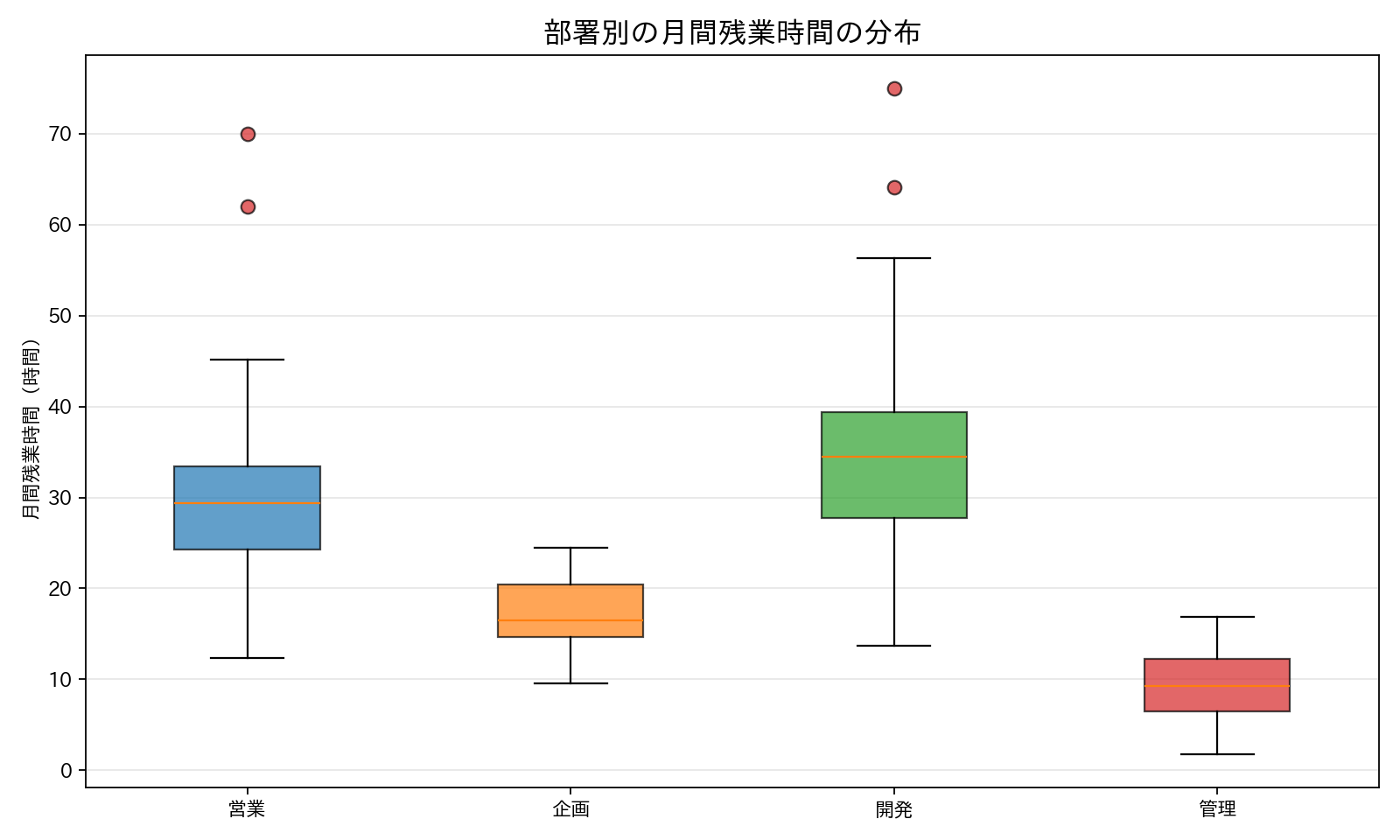
部署別の月間残業時間を箱ひげ図で比較するレシピです。グループ間で分布のばらつきや外れ値を比較したい場面、たとえば部署ごとの負荷の偏りや、特定の人への業務集中を説明する場面で使えます。箱の上下端が四分位、中央の線が中央値、ひげの外側の点が外れ値を表すため、平均値の比較だけでは見えない「一部の人だけ極端に長い」という状況を1枚で示せます。コードはpatch_artistで箱に色を付ける基本形に、flierpropsで外れ値を目立たせる設定を組み合わせています。
import numpy as np
import matplotlib.pyplot as plt
import japanize_matplotlib

colors_professional = ['#1f77b4', '#ff7f0e', '#2ca02c', '#d62728']

rng = np.random.default_rng(42)
departments = ['営業', '企画', '開発', '管理']
overtime_hours = [
    np.concatenate([rng.normal(28, 8, 60), [62, 70]]),
    rng.normal(18, 5, 45),
    np.concatenate([rng.normal(35, 10, 80), [75]]),
    rng.normal(10, 4, 30),
]
overtime_hours = [np.clip(x, 0, None) for x in overtime_hours]

fig, ax = plt.subplots(figsize=(10, 6))
bp = ax.boxplot(
    overtime_hours,
    tick_labels=departments,
    patch_artist=True,
    flierprops=dict(marker='o', markerfacecolor='#d62728', markersize=7, alpha=0.7),
)
for patch, color in zip(bp['boxes'], colors_professional):
    patch.set_facecolor(color)
    patch.set_alpha(0.7)

ax.set_ylabel('月間残業時間(時間)')
ax.set_title('部署別の月間残業時間の分布', fontsize=15)
ax.grid(axis='y', alpha=0.3)

plt.tight_layout()
plt.show()
最小限使う場合はax.boxplot(data, tick_labels=labels)の1行で基本の箱ひげ図が描け、色分けや外れ値の強調表示はpatch_artistやflierpropsを必要に応じて追加します。
36. バイオリンプロット
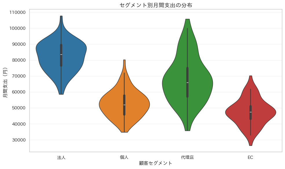
セグメント別の支出データをviolinplotで描き、箱ひげ図の要約統計量に加えて分布の密度形状まで表現するレシピです。単峰性か多峰性か、分布の裾がどちらに厚いかといった、箱ひげ図だけでは読み取りにくい分布の細部を確認したい場合に使います。コードでは、セグメント別の支出データをその場で作成し、violinplotとpaletteで分布形状を色分けして表示します。
import numpy as np
import pandas as pd
import seaborn as sns
import matplotlib.pyplot as plt

sns.set_theme(style='whitegrid')
import japanize_matplotlib

colors_professional = ['#1f77b4', '#ff7f0e', '#2ca02c', '#d62728']

rng = np.random.default_rng(42)
segments = ['法人', '個人', '代理店', 'EC']
averages = [82000, 54000, 68000, 47000]
spreads = [12000, 9000, 15000, 8000]

df_spending = pd.DataFrame({
    'セグメント': np.repeat(segments, 80),
    '月間支出': np.concatenate([
        np.clip(rng.normal(avg, spread, 80), 10000, None)
        for avg, spread in zip(averages, spreads)
    ]),
})

fig, ax = plt.subplots(figsize=(10, 6))
sns.violinplot(
    data=df_spending,
    x='セグメント',
    y='月間支出',
    hue='セグメント',
    palette=colors_professional,
    inner='box',
    cut=0,
    linewidth=1.2,
    legend=False,
    ax=ax,
)

ax.set_title('セグメント別月間支出の分布', fontsize=14, fontweight='bold')
ax.set_xlabel('顧客セグメント')
ax.set_ylabel('月間支出(円)')
ax.grid(axis='y', alpha=0.3)

plt.tight_layout()
plt.show()
37. ストリッププロット
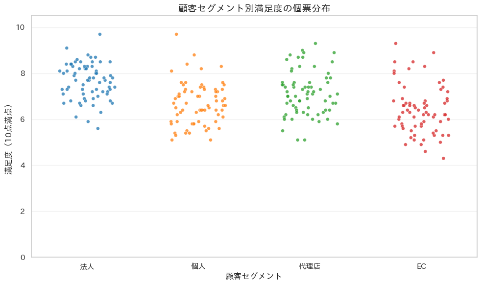
ストリッププロットは、カテゴリごとに個々のデータ点をそのまま横一列に並べて描く散布図で、集計する前の生の分布を確認したいときに使います。件数が数百件程度までのアンケート結果や顧客セグメント別の満足度など、平均値やヒートマップでは埋もれてしまう個票の分布感をそのまま経営層に見せたい場面に向いています。点をそのまま重ねると同じ値の点が重なって見えなくなるため、jitterで横方向にランダムなずれを加えて点を散らすのが作図の基本になります。コードではhueにカテゴリ自身を渡してpaletteによる色分けを行い、legend=Falseで重複する凡例を省いています。
import numpy as np
import pandas as pd
import seaborn as sns
import matplotlib.pyplot as plt

sns.set_theme(style='whitegrid')
import japanize_matplotlib

colors_professional = ['#1f77b4', '#ff7f0e', '#2ca02c', '#d62728']

rng = np.random.default_rng(42)
segments = ['法人', '個人', '代理店', 'EC']
centers = [7.6, 6.8, 7.2, 6.4]

df_satisfaction = pd.DataFrame({
    'セグメント': np.repeat(segments, 70),
    '満足度': np.concatenate([
        np.clip(np.round(rng.normal(center, 1.0, 70), 1), 1, 10)
        for center in centers
    ]),
})

fig, ax = plt.subplots(figsize=(10, 6))
sns.stripplot(
    data=df_satisfaction,
    x='セグメント',
    y='満足度',
    hue='セグメント',
    palette=colors_professional,
    jitter=0.25,
    size=5,
    alpha=0.75,
    edgecolor='white',
    linewidth=0.4,
    legend=False,
    ax=ax,
)

ax.set_title('顧客セグメント別満足度の個票分布', fontsize=14, fontweight='bold')
ax.set_xlabel('顧客セグメント')
ax.set_ylabel('満足度(10点満点)')
ax.set_ylim(0, 10.5)
ax.grid(axis='y', alpha=0.3)

plt.tight_layout()
plt.show()
38. スウォームプロット
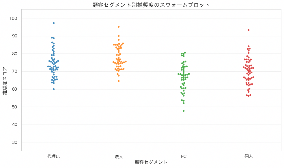
スウォームプロットはストリッププロットの発展形で、点同士が重ならないように左右へ自動的にずらして配置し、蜂の群れのような形で分布を見せるグラフです。件数がそれほど多くない調査データで、値の密集度合いや外れ値の位置をひと目で確認したい場合に向いており、少人数のアンケート結果をそのまま提示するような場面で有効です。ただし件数が数千件規模になると点の配置計算に時間がかかり、図全体も点が敷き詰められて読みにくくなるため、あらかじめサンプリングするか他の分布図に切り替える判断が必要になります。コードではsample()で200件に絞ったうえでswarmplot()にセグメントごとの色分けを設定しています。
import numpy as np
import pandas as pd
import seaborn as sns
import matplotlib.pyplot as plt

sns.set_theme(style='whitegrid')
import japanize_matplotlib

colors_professional = ['#1f77b4', '#ff7f0e', '#2ca02c', '#d62728']

rng = np.random.default_rng(42)
segments = ['法人', '個人', '代理店', 'EC']
centers = [78, 70, 74, 66]

df_survey = pd.DataFrame({
    'セグメント': np.repeat(segments, 90),
    '推奨度': np.concatenate([
        np.clip(rng.normal(center, 8, 90), 30, 100)
        for center in centers
    ]),
})

df_sample = df_survey.sample(n=200, random_state=42)

fig, ax = plt.subplots(figsize=(10, 6))
sns.swarmplot(
    data=df_sample,
    x='セグメント',
    y='推奨度',
    hue='セグメント',
    palette=colors_professional,
    size=4.5,
    alpha=0.85,
    legend=False,
    ax=ax,
)

ax.set_title('顧客セグメント別推奨度のスウォームプロット', fontsize=14, fontweight='bold')
ax.set_xlabel('顧客セグメント')
ax.set_ylabel('推奨度スコア')
ax.set_ylim(25, 105)
ax.grid(axis='y', alpha=0.3)

plt.tight_layout()
plt.show()
39. レインクラウドプロット
レインクラウドプロットは、分布の形を示す半分だけのバイオリン図と、四分位範囲を示す箱ひげ図、個々の値を示すストリップ点を1つの軸上に重ねて描くグラフで、分布の形・代表値・個票のすべてを同時に確認できます。セグメント別の満足度や店舗別の売上額など、平均値の比較だけでは見落としがちな分布の歪みや二峰性を経営層に伝えたいときに向いています。作図の要点は、バイオリンの片側だけを残すためにviolinplot()が返す面のパス座標を中心値でクリップする点と、箱ひげ図とストリップ点をバイオリンの反対側にずらして重ならないよう配置する点です。コードではviolinplot()の面を右半分だけ残し、細い箱ひげ図をその左に、ジッターを加えた散布点をさらに左側に配置しています。y軸の範囲は満点の1〜10ではなく実際のデータの最小値と最大値から決めています。満足度のように理論上の下限からデータが離れている指標では、軸を満点いっぱいに取ると図の下半分が空白になり、肝心の分布の違いが潰れて見えなくなるためです。
import numpy as np
import pandas as pd
import seaborn as sns
import matplotlib.pyplot as plt
from matplotlib.collections import PolyCollection

sns.set_theme(style='whitegrid')
import japanize_matplotlib

colors_professional = ['#1f77b4', '#ff7f0e', '#2ca02c']

rng = np.random.default_rng(42)
segments = ['法人', '個人', 'EC']
centers = [7.5, 6.8, 7.9]

df_score = pd.DataFrame({
    'セグメント': np.repeat(segments, 70),
    '満足度': np.concatenate([
        np.clip(rng.normal(center, 0.9, 70), 1, 10)
        for center in centers
    ]),
})

fig, ax = plt.subplots(figsize=(10, 6))
sns.violinplot(
    data=df_score,
    x='セグメント',
    y='満足度',
    hue='セグメント',
    palette=colors_professional,
    inner=None,
    cut=0,
    linewidth=1.1,
    density_norm='width',
    legend=False,
    ax=ax,
)

for collection in ax.collections:
    if isinstance(collection, PolyCollection):
        for path in collection.get_paths():
            vertices = path.vertices
            center = (vertices[:, 0].min() + vertices[:, 0].max()) / 2
            vertices[:, 0] = np.maximum(vertices[:, 0], center)

positions = np.arange(len(segments))
box_data = [
    df_score.loc[df_score['セグメント'] == segment, '満足度'].to_numpy()
    for segment in segments
]

ax.boxplot(
    box_data,
    positions=positions - 0.18,
    widths=0.12,
    patch_artist=True,
    showfliers=False,
    manage_ticks=False,
    boxprops=dict(facecolor='white', edgecolor='#333333', linewidth=1.1),
    medianprops=dict(color='#333333', linewidth=1.6),
    whiskerprops=dict(color='#333333', linewidth=1.1),
    capprops=dict(color='#333333', linewidth=1.1),
)

for i, (segment, color) in enumerate(zip(segments, colors_professional)):
    values = df_score.loc[df_score['セグメント'] == segment, '満足度'].to_numpy()
    x = rng.normal(i - 0.35, 0.035, size=len(values))
    ax.scatter(
        x,
        values,
        s=24,
        color=color,
        alpha=0.55,
        edgecolors='white',
        linewidths=0.4,
        zorder=3,
    )

score_min = df_score['満足度'].min()
score_max = df_score['満足度'].max()
margin = (score_max - score_min) * 0.1

ax.set_xticks(positions)
ax.set_xticklabels(segments)
ax.set_title('セグメント別満足度のレインクラウドプロット', fontsize=14, fontweight='bold')
ax.set_xlabel('顧客セグメント')
ax.set_ylabel('満足度(10点満点)')
ax.set_ylim(score_min - margin, score_max + margin)
ax.grid(axis='y', alpha=0.3)

plt.tight_layout()
plt.show()

7章 時系列のチャート
時間の流れに沿った変化を見せるチャート群です。この章では折れ線グラフを起点に、量の推移を面で示す面グラフと積み上げ面グラフ、株価などの値動きを示すローソク足、構成の変化を流れるように見せるストリームグラフを扱います。
40. 折れ線グラフ
横軸に日付、縦軸に数値を取り、観測点を線でつないで時間の推移を表す最も基本的なグラフです。日次売上や来店数のように連続的に変化する指標の増減やトレンドを一目で把握するのに向いており、経営会議で月次の売上推移を報告する場面などで使われます。横軸は必ず時系列順に並べ、目盛りの間隔は月や週など意味のある単位に揃えるのが作図の鉄則です。コードではmatplotlib.datesのMonthLocator()とDateFormatter()を使い、横軸の目盛りを月単位でそろえて表示させています。
import numpy as np
import pandas as pd
import matplotlib.pyplot as plt
import matplotlib.dates as mdates
import japanize_matplotlib

rng = np.random.default_rng(42)
dates = pd.date_range('2026-01-01', periods=180, freq='D')
trend = np.linspace(0, 70, len(dates))
weekly = 18 * np.sin(np.arange(len(dates)) * 2 * np.pi / 7)
sales = 240 + trend + weekly + rng.normal(0, 14, len(dates))

df_sales_daily = pd.DataFrame({
    '日付': dates,
    '売上': np.round(sales, 1),
})

fig, ax = plt.subplots(figsize=(12, 6))
ax.plot(
    df_sales_daily['日付'],
    df_sales_daily['売上'],
    color='#1E56A0',
    linewidth=2.2,
    marker='o',
    markersize=3,
    markevery=7,
)

ax.xaxis.set_major_locator(mdates.MonthLocator())
ax.xaxis.set_major_formatter(mdates.DateFormatter('%Y/%m'))
ax.set_title('日次売上の推移', fontsize=14, fontweight='bold')
ax.set_xlabel('日付')
ax.set_ylabel('売上(万円)')
ax.grid(True, alpha=0.3)
ax.tick_params(axis='x', rotation=45)

plt.tight_layout()
plt.show()
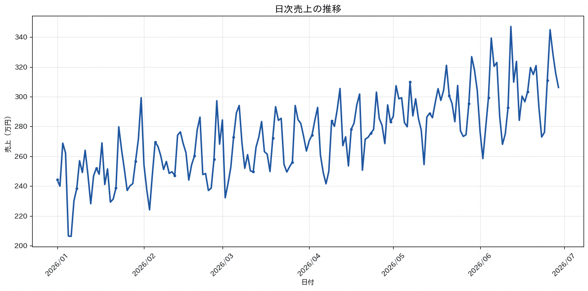
41. 面グラフ
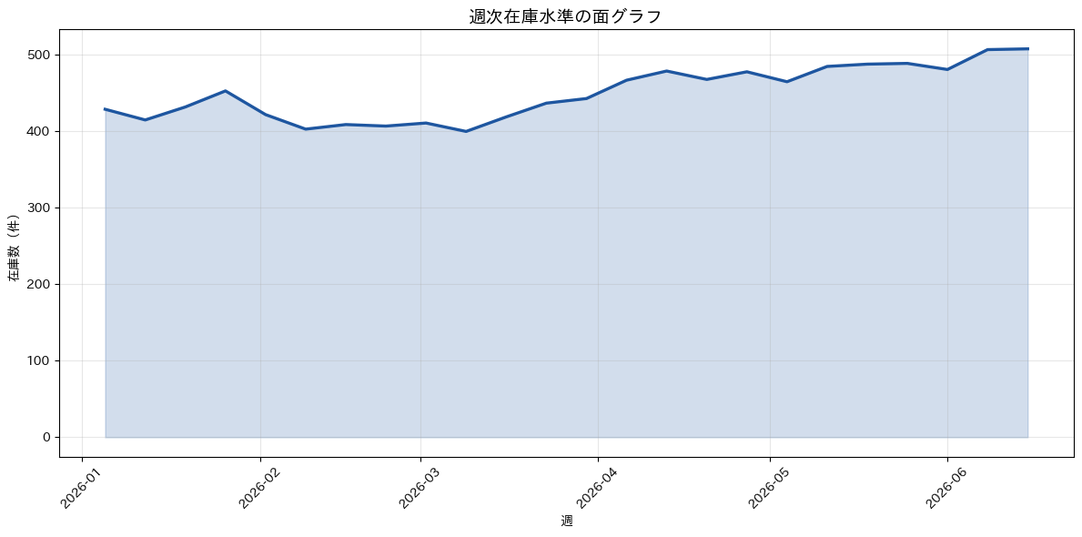
折れ線と横軸の間を塗りつぶし、値の大きさを面積としても感じ取れるようにしたグラフです。累積的な量や在庫水準のように、線の高さそのものにボリューム感を持たせたい指標を見せるのに向いています。塗りつぶす面積が大きいと視覚的な重みが強くなりすぎるため、透過度を下げて背景の目盛りが透けて見える程度に抑えるのが鉄則です。コードではax.fill_between()に折れ線のy座標とゼロを渡し、alpha=0.2で薄く塗って線そのものの視認性を保っています。
import numpy as np
import pandas as pd
import matplotlib.pyplot as plt
import japanize_matplotlib

HIGHLIGHT = '#1E56A0'

rng = np.random.default_rng(42)
weeks = pd.date_range('2026-01-05', periods=24, freq='W-MON')
inventory = 420 + np.cumsum(rng.normal(4, 18, len(weeks)))
inventory = np.clip(inventory, 260, 620)

df_inventory = pd.DataFrame({
    '週': weeks,
    '在庫数': np.round(inventory),
})

fig, ax = plt.subplots(figsize=(12, 6))
ax.plot(
    df_inventory['週'],
    df_inventory['在庫数'],
    color=HIGHLIGHT,
    linewidth=2.4,
)
ax.fill_between(
    df_inventory['週'],
    df_inventory['在庫数'],
    0,
    color=HIGHLIGHT,
    alpha=0.2,
)

ax.set_title('週次在庫水準の面グラフ', fontsize=14, fontweight='bold')
ax.set_xlabel('週')
ax.set_ylabel('在庫数(件)')
ax.grid(True, alpha=0.3)
ax.tick_params(axis='x', rotation=45)

plt.tight_layout()
plt.show()
42. 積み上げ面グラフ
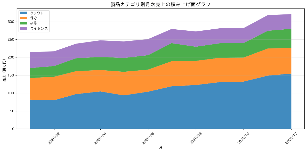
複数系列の面グラフを積み上げて、内訳の推移と全体の合計の推移を同時に示すグラフです。製品カテゴリ別の売上のように、全体の伸びとその内訳の構成変化を同じグラフで見せたい場面に向いています。系列を積み上げる順番によって各層の読み取りやすさが変わるため、変動の大きい系列を一番上か一番下に置き、比較したい系列を隣り合わせに配置するのが鉄則です。コードではax.stackplot()に製品別の月次売上をピボットしたデータを渡し、各層を専用のカラーパレットで塗り分けています。
import numpy as np
import pandas as pd
import matplotlib.pyplot as plt
import matplotlib.dates as mdates
import japanize_matplotlib

colors_professional = ['#1f77b4', '#ff7f0e', '#2ca02c', '#9467bd']

rng = np.random.default_rng(42)
months = pd.date_range('2025-01-01', periods=12, freq='MS')
products = ['クラウド', '保守', '研修', 'ライセンス']

sales_by_product = pd.DataFrame({
    '月': months,
    'クラウド': np.linspace(80, 150, 12) + rng.normal(0, 6, 12),
    '保守': np.linspace(60, 72, 12) + rng.normal(0, 4, 12),
    '研修': np.linspace(30, 48, 12) + rng.normal(0, 5, 12),
    'ライセンス': np.linspace(45, 40, 12) + rng.normal(0, 4, 12),
})

fig, ax = plt.subplots(figsize=(12, 6))
ax.stackplot(
    sales_by_product['月'],
    sales_by_product[products].to_numpy().T,
    labels=products,
    colors=colors_professional,
    alpha=0.85,
)

ax.xaxis.set_major_locator(mdates.MonthLocator(interval=2))
ax.xaxis.set_major_formatter(mdates.DateFormatter('%Y/%m'))
ax.set_title('製品カテゴリ別月次売上の積み上げ面グラフ', fontsize=14, fontweight='bold')
ax.set_xlabel('月')
ax.set_ylabel('売上(百万円)')
ax.legend(loc='upper left')
ax.grid(axis='y', alpha=0.3)
ax.tick_params(axis='x', rotation=45)

plt.tight_layout()
plt.show()
43. ローソク足チャート
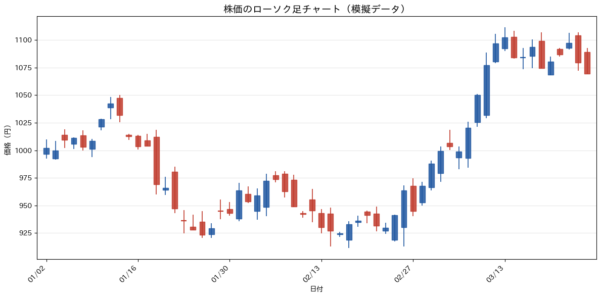
始値・高値・安値・終値の4つの値を1本の実体と上下のひげで表現する、株価分析で使われる伝統的なグラフです。日々の値動きの方向だけでなく、値幅の大きさや始値と終値の関係まで含めて確認したい場面に向いており、投資判断のレビューや価格変動の要因分析に使われます。上昇した日と下落した日を色で塗り分けることで方向感を一目で追えるようにするのが鉄則で、本レシピでは終値が始値以上の日をネイビー、それ以外をレッドで描き分けています。コードでは高値・安値を細い線、始値・終値の範囲を太い線として重ねて描くことで、専用ライブラリなしでもローソク足の見た目を再現しています。
import numpy as np
import pandas as pd
import matplotlib.pyplot as plt
from matplotlib.patches import Rectangle
import japanize_matplotlib

HIGHLIGHT = '#1E56A0'

rng = np.random.default_rng(0)
n_days = 60
biz_dates = pd.bdate_range('2023-01-02', periods=n_days)

close = 1000 + np.cumsum(rng.normal(0, 15, n_days))
open_ = np.r_[1000, close[:-1]] + rng.normal(0, 8, n_days)
high = np.maximum(open_, close) + np.abs(rng.normal(5, 4, n_days))
low = np.minimum(open_, close) - np.abs(rng.normal(5, 4, n_days))

ohlc = pd.DataFrame({
    'date': biz_dates,
    'open': open_,
    'high': high,
    'low': low,
    'close': close,
})

fig, ax = plt.subplots(figsize=(12, 6))
body_width = 0.6

for i, row in ohlc.iterrows():
    color = HIGHLIGHT if row['close'] >= row['open'] else '#C0392B'
    ax.vlines(i, row['low'], row['high'], color=color, linewidth=1.2, zorder=2)

    body_bottom = min(row['open'], row['close'])
    body_height = abs(row['close'] - row['open'])
    if body_height < 0.8:
        ax.hlines(
            row['close'],
            i - body_width / 2,
            i + body_width / 2,
            color=color,
            linewidth=1.6,
            zorder=3,
        )
    else:
        ax.add_patch(Rectangle(
            (i - body_width / 2, body_bottom),
            body_width,
            body_height,
            facecolor=color,
            edgecolor=color,
            alpha=0.85,
            zorder=3,
        ))

tick_positions = np.arange(0, n_days, 10)
ax.set_xticks(tick_positions)
ax.set_xticklabels(
    ohlc.loc[tick_positions, 'date'].dt.strftime('%m/%d'),
    rotation=45,
    ha='right',
)
ax.set_xlim(-1, n_days)
ax.set_title('株価のローソク足チャート(模擬データ)', fontsize=14, fontweight='bold')
ax.set_xlabel('日付')
ax.set_ylabel('価格(円)')
ax.grid(axis='y', alpha=0.3)

plt.tight_layout()
plt.show()
44. ストリームグラフ
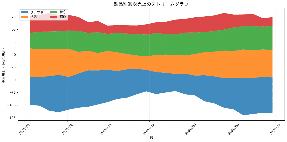
積み上げ面グラフの基準線を上下に波打たせることで、各系列の増減を左右対称の帯として見せるグラフです。個々の系列の絶対値よりも、全体の中での構成比がどう膨らみ縮んでいくかという流れを直感的に伝えたい場面に向いています。基準線が固定された積み上げ面グラフに比べて上下の帯の太さの変化が目に入りやすくなる一方、正確な数値の読み取りには不向きなので、細かい値の比較が必要な資料には別のグラフを併用するのが鉄則です。コードではax.stackplot()のbaseline='wiggle'を指定し、製品別の週次売上を波打つ帯として描いています。
import numpy as np
import pandas as pd
import matplotlib.pyplot as plt
import matplotlib.dates as mdates
import japanize_matplotlib

colors_professional = ['#1f77b4', '#ff7f0e', '#2ca02c', '#d62728']

rng = np.random.default_rng(42)
weeks = pd.date_range('2026-01-05', periods=26, freq='W-MON')
products = ['クラウド', '広告', '保守', '研修']

weekly_sales = pd.DataFrame({
    '週': weeks,
    'クラウド': 55 + 18 * np.sin(np.linspace(0, 2.6 * np.pi, 26)) + rng.normal(0, 4, 26),
    '広告': 42 + 12 * np.cos(np.linspace(0, 2.2 * np.pi, 26)) + rng.normal(0, 4, 26),
    '保守': 35 + np.linspace(0, 12, 26) + rng.normal(0, 3, 26),
    '研修': 25 + 10 * np.sin(np.linspace(0.8, 3.4 * np.pi, 26)) + rng.normal(0, 3, 26),
})

weekly_sales[products] = weekly_sales[products].clip(lower=5)

fig, ax = plt.subplots(figsize=(12, 6))
ax.stackplot(
    weekly_sales['週'],
    weekly_sales[products].to_numpy().T,
    labels=products,
    colors=colors_professional,
    baseline='wiggle',
    alpha=0.85,
)

ax.xaxis.set_major_locator(mdates.MonthLocator())
ax.xaxis.set_major_formatter(mdates.DateFormatter('%Y/%m'))
ax.set_title('製品別週次売上のストリームグラフ', fontsize=14, fontweight='bold')
ax.set_xlabel('週')
ax.set_ylabel('週次売上(中心化表示)')
ax.legend(loc='upper left', ncol=2)
ax.grid(axis='x', alpha=0.2)
ax.tick_params(axis='x', rotation=45)

plt.tight_layout()
plt.show()
8章 ヒートマップ
ヒートマップは、行と列で構成される表の値を色の濃淡で表すチャートです。この章では基本のヒートマップと、日付を曜日と週で格子状に並べるカレンダーヒートマップを扱います。
45. ヒートマップ
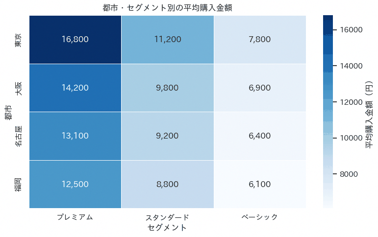
カテゴリ×数値のヒートマップは、2つのカテゴリ変数を縦横に並べた表の各セルを数値の大小に応じて色分けし、さらにセル内に数値そのものも表示するグラフです。都市別・セグメント別の平均購入金額のように、行と列の両方がカテゴリになる集計結果を確認する場合に向いており、どの都市のどのセグメントで単価が突出しているかを一覧で把握したい場面に使えます。作図の鉄則は、色の濃淡だけに頼らずannot=Trueで実数値も併記することで、色の判断が難しい読み手にも正確な値を伝えられるようにする点です。コードではpivot_table()で都市とセグメントの組み合わせごとに平均購入金額を集計し、heatmap()に渡しています。
import pandas as pd
import matplotlib.pyplot as plt
import seaborn as sns

sns.set_theme(style="white", font_scale=1.0)
import japanize_matplotlib

df_customers = pd.DataFrame({
    "都市": ["東京", "東京", "東京", "大阪", "大阪", "大阪", "名古屋", "名古屋", "名古屋", "福岡", "福岡", "福岡"],
    "セグメント": ["プレミアム", "スタンダード", "ベーシック"] * 4,
    "購入金額": [16800, 11200, 7800, 14200, 9800, 6900, 13100, 9200, 6400, 12500, 8800, 6100],
})

heatmap_data = df_customers.pivot_table(
    index="都市",
    columns="セグメント",
    values="購入金額",
    aggfunc="mean",
).reindex(
    index=["東京", "大阪", "名古屋", "福岡"],
    columns=["プレミアム", "スタンダード", "ベーシック"],
)

plt.figure(figsize=(8, 5))
ax = sns.heatmap(
    heatmap_data,
    annot=True,
    fmt=",.0f",
    cmap="Blues",
    linewidths=0.5,
    cbar_kws={"label": "平均購入金額(円)"},
)

ax.set_title("都市・セグメント別の平均購入金額")
ax.set_xlabel("セグメント")
ax.set_ylabel("都市")

plt.tight_layout()
plt.show()
46. カレンダーヒートマップ
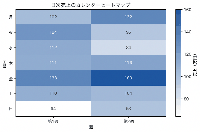
横軸に週、縦軸に曜日を取った格子の中に、日次データの大小を色の濃淡で敷き詰めるグラフです。曜日ごとのくせや特定の期間だけ値が高い・低いといった、暦に沿ったパターンを見つけるのに向いており、繁忙曜日の把握やキャンペーン期間の効果確認に使われます。1年分のような長期間のデータを1枚に収めるため、色の階調は白から濃い色へ単調に変化するものを選び、極端な外れ値で色域が偏らないよう事前に確認しておくのが鉄則です。コードでは日付から曜日と通し週番号を作り、pivot_table()で曜日×週の格子に変換したうえでax.imshow()により濃淡表示しています。
import numpy as np
import pandas as pd
import matplotlib.pyplot as plt
from matplotlib.colors import LinearSegmentedColormap
import japanize_matplotlib

rng = np.random.default_rng(42)
dates = pd.date_range("2026-04-06", periods=14, freq="D")
weekday_bonus = np.array([18, 6, 0, 10, 32, -12, -20])[dates.weekday]

df_sales_daily = pd.DataFrame({
    "日付": dates,
    "売上(万円)": rng.integers(80, 130, size=len(dates)) + weekday_bonus,
})

df_sales_daily["曜日番号"] = df_sales_daily["日付"].dt.weekday
df_sales_daily["週番号"] = ((df_sales_daily["日付"] - df_sales_daily["日付"].min()).dt.days // 7) + 1

calendar_data = df_sales_daily.pivot_table(
    index="曜日番号",
    columns="週番号",
    values="売上(万円)",
    aggfunc="sum",
).reindex(index=range(7))

cmap = LinearSegmentedColormap.from_list("sales_blue", ["#ffffff", "#1E56A0"])

fig, ax = plt.subplots(figsize=(7, 4.5))
im = ax.imshow(calendar_data.to_numpy(), cmap=cmap, aspect="auto")

ax.set_xticks(np.arange(calendar_data.shape[1]))
ax.set_xticklabels([f"第{week}週" for week in calendar_data.columns])
ax.set_yticks(np.arange(7))
ax.set_yticklabels(["月", "火", "水", "木", "金", "土", "日"])
ax.set_title("日次売上のカレンダーヒートマップ")
ax.set_xlabel("週")
ax.set_ylabel("曜日")

threshold = calendar_data.to_numpy().mean()
for y in range(calendar_data.shape[0]):
    for x in range(calendar_data.shape[1]):
        value = calendar_data.iloc[y, x]
        text_color = "white" if value >= threshold else "#333333"
        ax.text(x, y, f"{value:.0f}", ha="center", va="center", color=text_color, fontsize=10)

plt.colorbar(im, ax=ax, label="売上(万円)")

plt.tight_layout()
plt.show()
9章 散布図・多変量のチャート
2つ以上の変数の関係を見るためのチャート群です。この章では散布図とその応用(カテゴリ別・分布との同時表示・バブルチャート)に加えて、変数の全組み合わせを一覧できる散布図行列と3Dのチャートを扱います。
47. 散布図
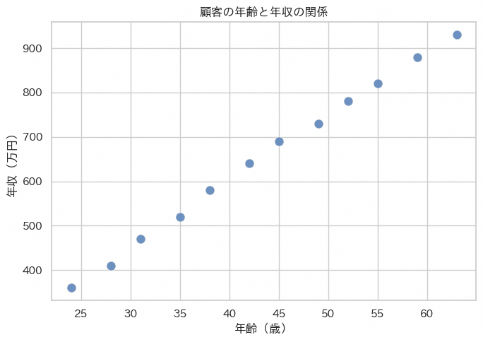
年齢と収入といった2つの数値変数の関係性を、散布図でまず視覚的に確認するレシピです。新しく受け取った顧客データの一次探索や、施策のターゲティング軸を検討する初期段階でよく使われます。コードではsns.scatterplotにalphaパラメータで点の透過度を指定し、点が重なり合う密集エリアの様子も見えるようにしている点がポイントです。タイトルや軸ラベルはmatplotlibの関数で通常通り設定しています。
import pandas as pd
import matplotlib.pyplot as plt
import seaborn as sns

sns.set_theme(style="whitegrid")
import japanize_matplotlib

df_customers = pd.DataFrame({
    "年齢": [24, 28, 31, 35, 38, 42, 45, 49, 52, 55, 59, 63],
    "年収(万円)": [360, 410, 470, 520, 580, 640, 690, 730, 780, 820, 880, 930],
})

plt.figure(figsize=(7, 5))
ax = sns.scatterplot(
    data=df_customers,
    x="年齢",
    y="年収(万円)",
    s=90,
    alpha=0.65,
    color="#1E56A0",
    edgecolor="white",
    linewidth=0.8,
)

ax.set_title("顧客の年齢と年収の関係")
ax.set_xlabel("年齢(歳)")
ax.set_ylabel("年収(万円)")

plt.tight_layout()
plt.show()
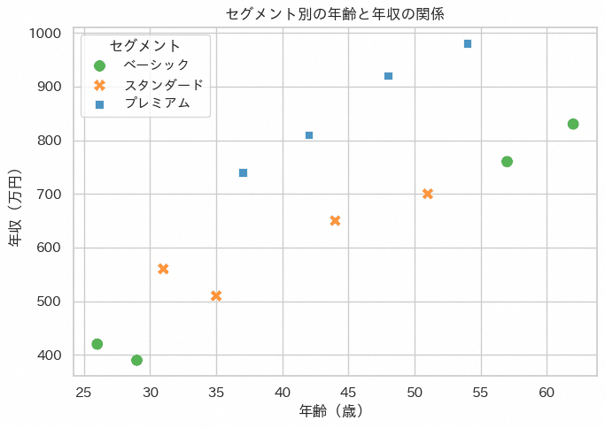
48. カテゴリ別散布図
通常の散布図にカテゴリ変数の色分けを加え、セグメントごとの年齢と収入の傾向の違いを一目で比較できるようにするレシピです。顧客をPremium・Standard・Basicのようなグループに分けて扱う場面で、グループ間の傾向差を素早く掴みたいときに使います。コードではhue='segment'を指定するだけでカテゴリ別の色分けと凡例が自動的に生成される点が読みどころです。
import pandas as pd
import matplotlib.pyplot as plt
import seaborn as sns

sns.set_theme(style="whitegrid")
import japanize_matplotlib

colors_professional = ["#1f77b4", "#ff7f0e", "#2ca02c", "#d62728", "#9467bd", "#8c564b"]

df_customers = pd.DataFrame({
    "age": [26, 31, 37, 42, 48, 54, 29, 35, 44, 51, 57, 62],
    "income": [420, 560, 740, 810, 920, 980, 390, 510, 650, 700, 760, 830],
    "segment": [
        "ベーシック", "スタンダード", "プレミアム", "プレミアム",
        "プレミアム", "プレミアム", "ベーシック", "スタンダード",
        "スタンダード", "スタンダード", "ベーシック", "ベーシック",
    ],
})

palette = {
    "プレミアム": colors_professional[0],
    "スタンダード": colors_professional[1],
    "ベーシック": colors_professional[2],
}

plt.figure(figsize=(7, 5))
ax = sns.scatterplot(
    data=df_customers,
    x="age",
    y="income",
    hue="segment",
    style="segment",
    palette=palette,
    s=95,
    alpha=0.8,
    edgecolor="white",
    linewidth=0.7,
)

ax.set_title("セグメント別の年齢と年収の関係")
ax.set_xlabel("年齢(歳)")
ax.set_ylabel("年収(万円)")
ax.legend(title="セグメント", frameon=True)

plt.tight_layout()
plt.show()
49. jointplot(散布図と分布の同時表示)
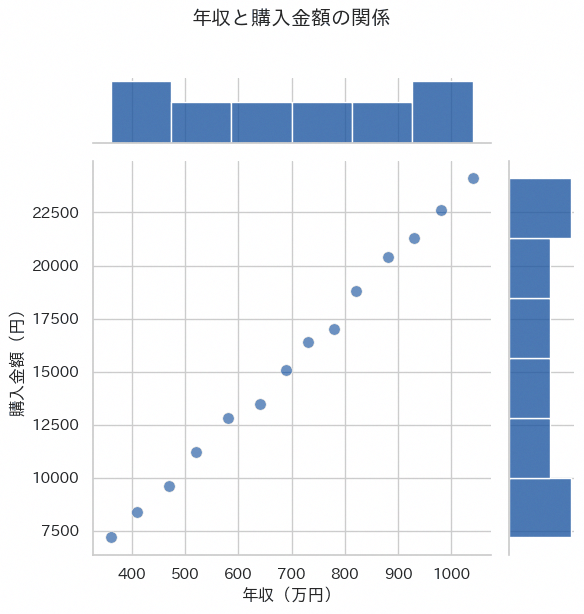
jointplotは、中央の散布図の上と右にそれぞれの変数のヒストグラムを配置し、2変数の関係と各変数単体の分布を1つの図で同時に確認できるグラフです。年収と購入金額のように相関を見たい2つの指標について、関係性だけでなくそれぞれの偏りも把握したい場合に向いており、報告資料の1枚で関係性と分布の両方を説明したい場面で使えます。散布図部分の点が多く重なる場合は透明度を下げて密集度を表現するのが基本で、周辺分布のヒストグラムの形からどちらの変数がより歪んでいるかも同時に読み取れます。コードではjointplot()にkind='scatter'を指定し、返されたJointGridのax_jointを通じて軸ラベルを日本語化しています。
import pandas as pd
import matplotlib.pyplot as plt
import seaborn as sns

sns.set_theme(style="whitegrid")
import japanize_matplotlib

HIGHLIGHT = "#1E56A0"

df_customers = pd.DataFrame({
    "年収(万円)": [360, 410, 470, 520, 580, 640, 690, 730, 780, 820, 880, 930, 980, 1040],
    "購入金額(円)": [7200, 8400, 9600, 11200, 12800, 13500, 15100, 16400, 17000, 18800, 20400, 21300, 22600, 24100],
})

g = sns.jointplot(
    data=df_customers,
    x="年収(万円)",
    y="購入金額(円)",
    kind="scatter",
    height=6,
    color=HIGHLIGHT,
    joint_kws={"alpha": 0.65, "s": 70, "edgecolor": "white", "linewidth": 0.6},
    marginal_kws={"bins": 6, "fill": True, "alpha": 0.8},
)

g.ax_joint.set_xlabel("年収(万円)")
g.ax_joint.set_ylabel("購入金額(円)")
g.fig.suptitle("年収と購入金額の関係", y=1.02)

plt.tight_layout()
plt.show()
50. バブルチャート
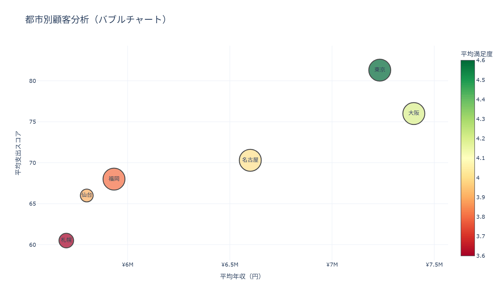
都市別に平均年齢・平均年収・平均支出スコア・平均満足度・顧客数を集計し、1つの散布図の中でバブルのサイズと色を使って4つの指標を同時に表現するレシピです。エリア別のマーケティング戦略会議で、どの都市に注力すべきかを一目で把握したい場面で使えます。コードの中心はgo.Scatterのmarkerに対してsizeで顧客数、colorで満足度を割り当てている部分で、sizerefの計算式によってバブルの大きさが画面上で適切な範囲に収まるよう調整させています。hovertemplateで都市名や各指標をまとめて表示させているため、マウスを合わせるだけで詳細を確認できます。
import pandas as pd
import plotly.graph_objects as go

df_customers_geo = pd.DataFrame({
    "customer_id": [f"C{i:03d}" for i in range(1, 16)],
    "city": ["東京", "東京", "東京", "大阪", "大阪", "大阪", "名古屋", "名古屋", "名古屋", "福岡", "福岡", "福岡", "札幌", "札幌", "仙台"],
    "age": [34, 41, 29, 38, 47, 52, 31, 44, 50, 28, 36, 43, 39, 55, 46],
    "income": [7200000, 8400000, 6100000, 6500000, 7600000, 8100000, 5600000, 6900000, 7300000, 5000000, 6200000, 6600000, 5400000, 6000000, 5800000],
    "spending_score": [82, 88, 74, 76, 80, 72, 68, 73, 70, 64, 71, 69, 58, 63, 66],
    "satisfaction": [4.7, 4.8, 4.3, 4.2, 4.4, 4.0, 3.9, 4.1, 4.0, 3.7, 4.0, 3.8, 3.5, 3.6, 3.9],
})

city_analysis = df_customers_geo.groupby("city").agg({
    "age": "mean",
    "income": "mean",
    "spending_score": "mean",
    "satisfaction": "mean",
    "customer_id": "count",
}).round(1)

city_analysis.columns = ["平均年齢", "平均年収", "平均支出スコア", "平均満足度", "顧客数"]
city_analysis = city_analysis.reset_index()

max_bubble_size = 48
sizeref = city_analysis["顧客数"].max() / max_bubble_size

fig = go.Figure()

fig.add_trace(go.Scatter(
    x=city_analysis["平均年収"],
    y=city_analysis["平均支出スコア"],
    mode="markers+text",
    marker=dict(
        size=city_analysis["顧客数"],
        sizemode="diameter",
        sizeref=sizeref,
        sizemin=14,
        color=city_analysis["平均満足度"],
        colorscale="RdYlGn",
        colorbar=dict(title=dict(text="平均満足度")),
        line=dict(width=2, color="black"),
    ),
    text=city_analysis["city"],
    textposition="middle center",
    customdata=city_analysis[["平均年齢", "顧客数"]],
    hovertemplate=(
        "都市: %{text}<br>"
        "平均年齢: %{customdata[0]}歳<br>"
        "平均年収: ¥%{x:,.0f}<br>"
        "平均支出スコア: %{y}<br>"
        "顧客数: %{customdata[1]}名<br>"
        "平均満足度: %{marker.color}<extra></extra>"
    ),
))

fig.update_layout(
    title=dict(text="都市別顧客分析(バブルチャート)", font=dict(size=20)),
    xaxis=dict(title=dict(text="平均年収(円)"), tickprefix="¥", separatethousands=True),
    yaxis=dict(title=dict(text="平均支出スコア")),
    template="plotly_white",
    height=600,
    showlegend=False,
)

fig.show()
51. 散布図行列
散布図行列は、複数の数値変数のすべての組み合わせを格子状に並べて一度に見せるグラフです。年齢・年収・支出スコア・満足度のように4つ以上の変数が絡む顧客分析で、どの組み合わせに関係がありそうかを最初に見当づける用途に向いています。対角のマスには各変数そのものの分布を、非対角のマスには2変数の散布図を置くのが基本形で、hueにセグメントを指定するとグループごとの重なり方も同時に確認できます。作図はseabornのpairplot()にデータフレームを渡すだけで、変数の数だけ行と列が自動で増えます。ただし変数が10を超えると1マスが小さくなりすぎて読めなくなるため、varsで見たい変数に絞るのが実務上の要点です。
import numpy as np
import pandas as pd
import seaborn as sns
import matplotlib.pyplot as plt

sns.set_theme(style='ticks')
import japanize_matplotlib

rng = np.random.default_rng(42)

n = 120
segment = rng.choice(['法人', '個人', 'EC'], size=n, p=[0.35, 0.4, 0.25])
base = {'法人': 48, '個人': 38, 'EC': 32}
age = np.array([rng.normal(base[s], 8) for s in segment]).clip(22, 70)
income = age * 12 + rng.normal(0, 60, n) + 60
spending = 110 - age * 0.7 + rng.normal(0, 9, n)
satisfaction = 2.4 + spending * 0.022 + rng.normal(0, 0.28, n)

df_customers = pd.DataFrame({
    '年齢': age.round(0),
    '年収(万円)': income.round(0),
    '支出スコア': spending.round(1),
    '満足度': satisfaction.round(2),
    'セグメント': segment,
})

grid = sns.pairplot(
    df_customers,
    vars=['年齢', '年収(万円)', '支出スコア', '満足度'],
    hue='セグメント',
    palette=['#1f77b4', '#ff7f0e', '#2ca02c'],
    diag_kind='kde',
    height=2.2,
    plot_kws=dict(s=26, alpha=0.7, edgecolor='white', linewidth=0.4),
    diag_kws=dict(fill=True, alpha=0.4),
)
grid.figure.suptitle('顧客属性の散布図行列(セグメント別)', y=1.01,
                     fontsize=15, fontweight='bold')

plt.show()

52. 3D散布図
Scatter3dを使うと3変数の関係をそのまま立体で表現でき、マウス操作で回転・ズームしながら多次元の関係性を探索できます。年齢・年収・支出スコアという3軸に加えて満足度をマーカーの大きさと色にも割り当てているため、実質4変数の関係を1枚のグラフで俯瞰できる点が特徴で、2軸の散布図だけでは見えにくかった顧客層のかたまりを見つけたい分析フェーズに向いています。コードはgo.Scatter3dのx・y・zにそれぞれの変数を渡し、markerのsize・colorに満足度を紐づけ、sceneでカメラの初期視点を指定するという構成です。
import pandas as pd
import plotly.graph_objects as go

df_customers_geo = pd.DataFrame({
    "customer_id": [f"C{i:03d}" for i in range(1, 13)],
    "age": [26, 31, 37, 42, 48, 54, 29, 35, 44, 51, 57, 62],
    "income": [4200000, 5600000, 7400000, 8100000, 9200000, 9800000, 3900000, 5100000, 6500000, 7000000, 7600000, 8300000],
    "spending_score": [62, 70, 88, 91, 84, 79, 55, 66, 73, 77, 69, 72],
    "satisfaction": [3.4, 3.8, 4.7, 4.8, 4.4, 4.1, 3.2, 3.7, 4.0, 4.2, 3.9, 4.0],
})

fig = go.Figure(data=[go.Scatter3d(
    x=df_customers_geo["age"],
    y=df_customers_geo["income"],
    z=df_customers_geo["spending_score"],
    mode="markers",
    marker=dict(
        size=df_customers_geo["satisfaction"] * 3,
        color=df_customers_geo["satisfaction"],
        colorscale="Viridis",
        opacity=0.82,
        colorbar=dict(title=dict(text="満足度")),
    ),
    text=df_customers_geo["customer_id"],
    hovertemplate=(
        "顧客ID: %{text}<br>"
        "年齢: %{x}歳<br>"
        "年収: ¥%{y:,.0f}<br>"
        "支出スコア: %{z}<br>"
        "満足度: %{marker.color}<extra></extra>"
    ),
)])

fig.update_layout(
    title=dict(text="3D顧客分析:年齢 × 年収 × 支出スコア", font=dict(size=20)),
    scene=dict(
        xaxis=dict(title=dict(text="年齢(歳)")),
        yaxis=dict(title=dict(text="年収(円)"), tickprefix="¥"),
        zaxis=dict(title=dict(text="支出スコア")),
        camera=dict(eye=dict(x=1.2, y=1.2, z=1.2)),
    ),
    template="plotly_white",
    height=700,
)

fig.show()
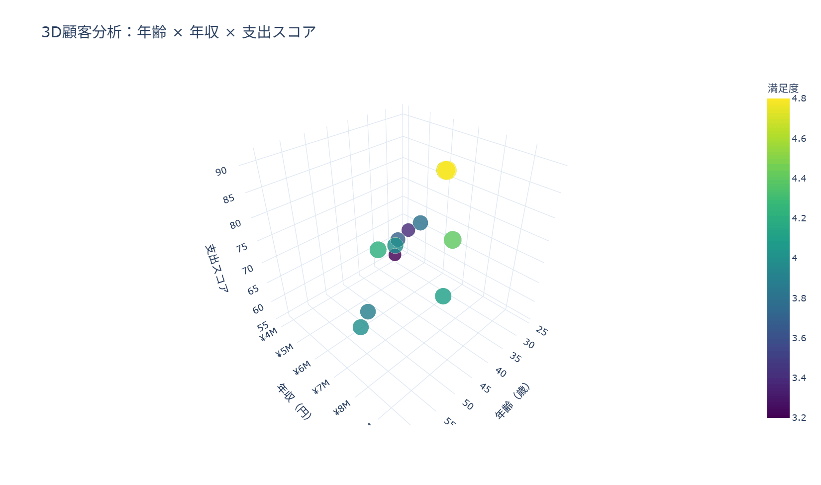
53. 3Dサーフェス
3Dサーフェスは、2つの説明変数を縦横の軸に、集計した数値を高さの軸に取り、その値の変化を連続した曲面として描くグラフです。年齢と年収の組み合わせごとに平均購入金額がどう変化するかのように、2つの軸が数値に与える影響を同時に確認したい場合に向いており、価格や条件を2軸で変えたときの反応をシミュレーションで示す場面にも応用できます。3Dサーフェスは見た目のインパクトが大きい一方で回転させないと正確な高さが読み取りづらいという弱点があるため、補助的にカラーバーを添えて色からもおおよその値を読み取れるようにするのが実務上の工夫です。コードでは年齢と年収をそれぞれ8つのビンに区切って平均購入金額を集計し、go.Surfaceに区間の中央値を軸として渡しています。
import numpy as np
import pandas as pd
import plotly.graph_objects as go

rng = np.random.default_rng(42)

age_axis = np.linspace(25, 65, 8)
income_axis = np.linspace(3500000, 9500000, 8)
age_grid, income_grid = np.meshgrid(age_axis, income_axis)

purchase_grid = (
    18000
    + (age_grid - 25) * 650
    + (income_grid - 3500000) / 1000000 * 9000
    + 4000 * np.sin((age_grid - 25) / 40 * np.pi)
    + rng.normal(0, 1800, size=age_grid.shape)
)

df_customers = pd.DataFrame({
    "age": age_grid.ravel(),
    "income": income_grid.ravel(),
    "purchase_amount": np.round(purchase_grid.ravel(), -2),
})

df_customers["age_bin"] = pd.cut(df_customers["age"], bins=8, include_lowest=True)
df_customers["income_bin"] = pd.cut(df_customers["income"], bins=8, include_lowest=True)

surface_data = df_customers.pivot_table(
    index="income_bin",
    columns="age_bin",
    values="purchase_amount",
    aggfunc="mean",
    observed=True,
).sort_index().sort_index(axis=1)

age_centers = [interval.mid for interval in surface_data.columns]
income_centers = [interval.mid for interval in surface_data.index]

fig = go.Figure(data=[go.Surface(
    x=age_centers,
    y=income_centers,
    z=surface_data.to_numpy(),
    colorscale="Viridis",
    colorbar=dict(title=dict(text="平均購入金額")),
    hovertemplate=(
        "年齢: %{x:.0f}歳<br>"
        "年収: ¥%{y:,.0f}<br>"
        "平均購入金額: ¥%{z:,.0f}<extra></extra>"
    ),
)])

fig.update_layout(
    title=dict(text="年齢・年収別の平均購入金額(3Dサーフェス)", font=dict(size=20)),
    scene=dict(
        xaxis=dict(title=dict(text="年齢(歳)")),
        yaxis=dict(title=dict(text="年収(円)"), tickprefix="¥"),
        zaxis=dict(title=dict(text="平均購入金額(円)"), tickprefix="¥"),
        camera=dict(eye=dict(x=1.4, y=1.4, z=0.9)),
    ),
    template="plotly_white",
    height=700,
)

fig.show()
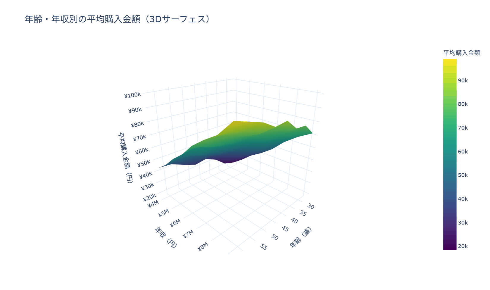
10章 地図のチャート
地理データは、地図の上に重ねてはじめて意味が読み取れます。この章ではfoliumを使って、マーカーの配置からポップアップ、点が多いときのクラスタ表示、地域を塗り分けるコロプレスマップ、密度を示すヒートマップレイヤー、数量を円の大きさで示すバブルマップまでを扱います。
54. foliumの基本地図とマーカー
foliumはPythonからLeaflet.jsベースのインタラクティブ地図を生成するライブラリで、拠点や顧客の所在地をピンで示した地図をブラウザ上でズーム・パンしながら確認できるようにします。店舗の出店エリアを一覧で眺めたい場合など、緯度経度を持つデータをそのまま地図に落とし込みたい場面に向いています。地図の中心と初期ズームは対象データの分布に合わせて設定し、対象地域全体が一目で見渡せる縮尺を選ぶことが作図の基本です。コードではfolium.Mapで地図オブジェクトを作成し、データフレームの行ごとにfolium.Markerを配置してからHTMLファイルとして保存しています。
import pandas as pd
import folium

df_geo = pd.DataFrame({
    "拠点名": ["東京本社", "大阪支店", "名古屋支店", "福岡営業所", "札幌営業所", "仙台営業所"],
    "都道府県": ["東京都", "大阪府", "愛知県", "福岡県", "北海道", "宮城県"],
    "lat": [35.6812, 34.7025, 35.1709, 33.5902, 43.0687, 38.2602],
    "lon": [139.7671, 135.4959, 136.8815, 130.4017, 141.3508, 140.8824],
    "月間売上(万円)": [1280, 920, 760, 610, 430, 520],
})

m = folium.Map(location=[36.2, 138.2], zoom_start=5, tiles="OpenStreetMap")

for _, row in df_geo.iterrows():
    popup_html = (
        f"{row['拠点名']}<br>"
        f"{row['都道府県']}<br>"
        f"月間売上: {row['月間売上(万円)']:,}万円"
    )
    folium.Marker(
        location=[row["lat"], row["lon"]],
        popup=folium.Popup(popup_html, max_width=240),
        tooltip=row["拠点名"],
        icon=folium.Icon(color="blue", icon="info-sign"),
    ).add_to(m)

m.save('map_marker.html')
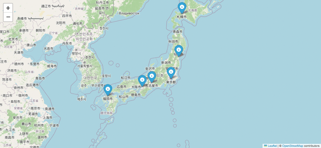
55. ポップアップとツールチップ
マーカーにpopupとtooltipを付け加えると、地図を眺めるだけの状態から、クリックやホバーで各拠点の詳細な数値を確認できる状態へと変わります。営業担当者が地域ごとの売上や店舗数を確認しながら訪問計画を立てる場面など、地図上で一次情報まで完結させたい場合に有効です。tooltipはカーソルを合わせただけで見える簡易な案内、popupはクリックして開く詳細情報という役割分担を意識し、popup内に詰め込みすぎないことが見やすさの鉄則です。コードではfolium.Popupに整形済みのHTML文字列を渡し、tooltip引数には短い案内文を設定しています。
import pandas as pd
import folium

df_geo = pd.DataFrame({
    'pref': ['東京都', '大阪府', '愛知県', '福岡県', '宮城県'],
    'lat': [35.6812, 34.6937, 35.0116, 33.5902, 38.2682],
    'lon': [139.7671, 135.7681, 135.7681, 130.4017, 140.8694],
    'sales': [12800, 9600, 8200, 6100, 4300],
    'stores': [42, 35, 28, 22, 16],
})

m = folium.Map(location=[36.5, 138.0], zoom_start=5, tiles='OpenStreetMap')

for _, row in df_geo.iterrows():
    popup_html = (
        f"<b>{row['pref']}</b><br>"
        f"売上: {row['sales']:,}万円<br>"
        f"店舗数: {row['stores']}店"
    )
    folium.Marker(
        location=[row['lat'], row['lon']],
        popup=folium.Popup(popup_html, max_width=220),
        tooltip=f"{row['pref']}(クリックで詳細)",
    ).add_to(m)

m.save('map_popup.html')
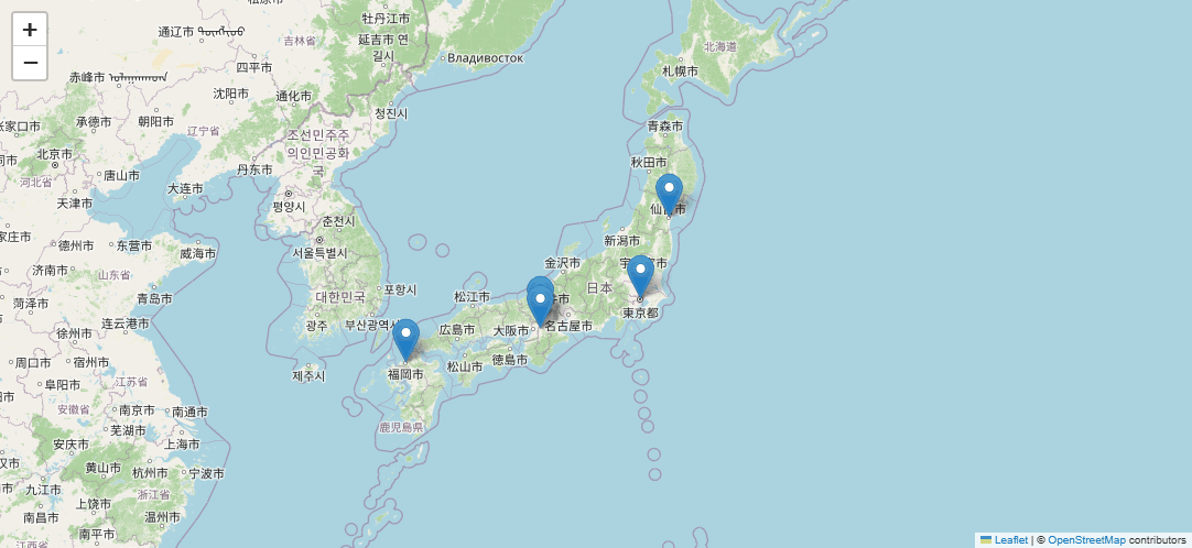
56. マーカークラスタ
顧客データのように地点数が数百〜数千に及ぶ場合、すべてを個別のピンで表示すると地図が埋め尽くされて判読できなくなります。folium.plugins.MarkerClusterを使うと、近接するマーカーを数値付きの円にまとめて表示し、ズームインするにつれて個々のマーカーへと分解させることができます。都市部に集中する会員の分布を大まかに把握しつつ、必要な地域だけ拡大して個別の顧客を確認したい場合に向いています。作図では最初からMarkerClusterのインスタンスに地図を紐付けておき、各マーカーは地図ではなくクラスタオブジェクトに追加する点が実装上の注意点です。コードでは、東京近郊に散らしたサンプル顧客位置情報をクラスタへ流し込んでいます。
import numpy as np
import pandas as pd
import folium
from folium.plugins import MarkerCluster

rng = np.random.default_rng(42)

centers = pd.DataFrame({
    'area': ['新宿', '渋谷', '横浜', '大宮'],
    'center_lat': [35.6909, 35.6580, 35.4658, 35.9062],
    'center_lon': [139.7003, 139.7016, 139.6223, 139.6236],
    'count': [8, 7, 6, 5],
})

records = []
for _, center in centers.iterrows():
    for _ in range(int(center['count'])):
        records.append({
            'customer_id': f"C{len(records) + 1:03d}",
            'area': center['area'],
            'latitude': center['center_lat'] + rng.normal(0, 0.025),
            'longitude': center['center_lon'] + rng.normal(0, 0.025),
            'satisfaction': round(rng.uniform(3.2, 5.0), 1),
        })

df_customers_geo = pd.DataFrame(records)

m = folium.Map(location=[35.68, 139.65], zoom_start=8, tiles='OpenStreetMap')
cluster = MarkerCluster(name='顧客プロット').add_to(m)

for _, row in df_customers_geo.iterrows():
    folium.Marker(
        location=[row['latitude'], row['longitude']],
        popup=f"顧客ID: {row['customer_id']} / 満足度: {row['satisfaction']:.1f}",
        tooltip=row['area'],
    ).add_to(cluster)

m.save('map_cluster.html')
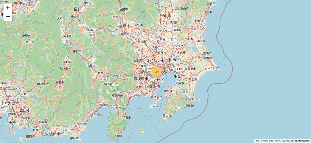
57. コロプレスマップ
コロプレスは都道府県や市区町村などの行政区域を、指標の大きさに応じた濃淡で塗り分ける地図表現です。地域別の売上のように「面」で比較したい指標があり、拠点の少ない地域と多い地域を一目で見分けたい場面に向いています。塗り分けに使う指標は実数と率のどちらでも作成できますが、人口や店舗数が大きく異なる地域を比べる際は、実数だけでは規模の差がそのまま濃淡の差になってしまうため、来店率や1店舗あたり売上のような率の指標も併せて確認することが鉄則です。コードではdataofjapanが公開する都道府県境界のGeoJSONを取得し、folium.Choroplethのkey_onにfeature.properties.nam_jaを指定して、作成した都道府県別データの売上と紐付けています。
import pandas as pd
import folium

geojson_url = 'https://raw.githubusercontent.com/dataofjapan/land/master/japan.geojson'

df_geo = pd.DataFrame({
    'pref': ['北海道', '宮城県', '東京都', '神奈川県', '愛知県', '大阪府', '京都府', '広島県', '福岡県', '沖縄県'],
    'sales': [7200, 4300, 12800, 9000, 8200, 9600, 5100, 4700, 6100, 2900],
})

m = folium.Map(location=[36.5, 138.0], zoom_start=5, tiles='cartodbpositron')

folium.Choropleth(
    geo_data=geojson_url,
    data=df_geo,
    columns=['pref', 'sales'],
    key_on='feature.properties.nam_ja',
    fill_color='YlGnBu',
    fill_opacity=0.75,
    line_opacity=0.4,
    nan_fill_color='white',
    legend_name='売上(万円)',
).add_to(m)

m.save('map_choropleth.html')
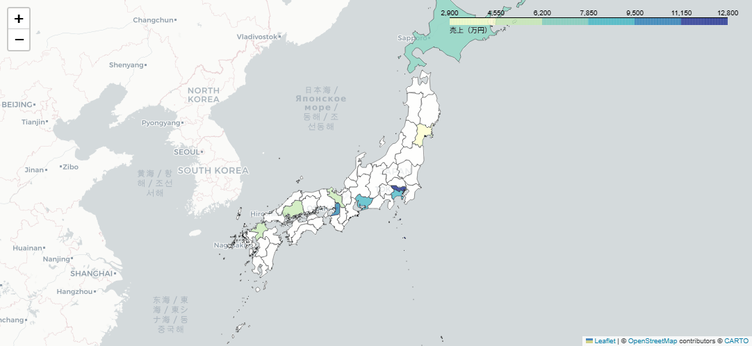
58. ヒートマップレイヤー
ヒートマップレイヤーは個々の地点を点として描く代わりに、地点の密度を色の濃淡でぼかして表現する手法です。マーカーが多すぎて個別に確認する必要はなく、どのエリアに顧客や取引が集中しているかという全体の傾向だけをつかみたい場合に向いています。重み付けに使う数値の尺度が地点によって大きく異なると特定の地点だけが目立ってしまうため、満足度スコアのように範囲がそろった指標を使うか、事前に正規化しておくことが作図の注意点です。コードではfolium.plugins.HeatMapに緯度・経度・重みの3列からなるリストを渡し、radiusとblurで密度の見え方を調整しています。
import numpy as np
import pandas as pd
import folium
from folium.plugins import HeatMap

rng = np.random.default_rng(42)

centers = pd.DataFrame({
    'area': ['丸の内', '新宿', '品川'],
    'center_lat': [35.6812, 35.6909, 35.6285],
    'center_lon': [139.7671, 139.7003, 139.7388],
    'count': [8, 10, 6],
})

records = []
for _, center in centers.iterrows():
    for _ in range(int(center['count'])):
        records.append({
            'area': center['area'],
            'latitude': center['center_lat'] + rng.normal(0, 0.018),
            'longitude': center['center_lon'] + rng.normal(0, 0.018),
            'satisfaction': round(rng.uniform(0.4, 1.0), 2),
        })

df_customers_geo = pd.DataFrame(records)

m = folium.Map(location=[35.68, 139.65], zoom_start=8, tiles='cartodbpositron')

heat_data = (
    df_customers_geo[['latitude', 'longitude', 'satisfaction']]
    .dropna()
    .values
    .tolist()
)
HeatMap(heat_data, radius=15, blur=18, max_zoom=10, min_opacity=0.25).add_to(m)

m.save('map_heat.html')
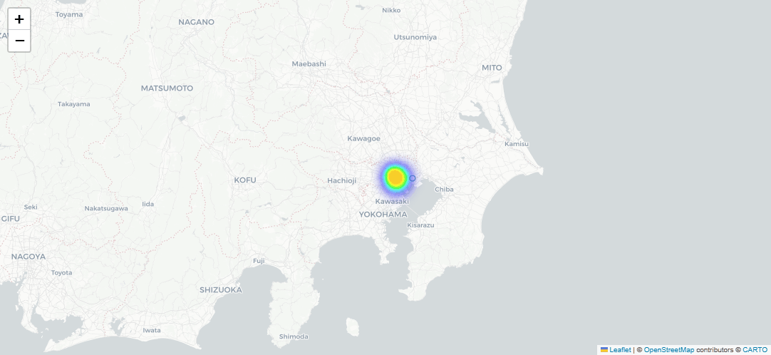
59. バブルマップ
円マーカーの数量マップは、地点ごとの円の大きさと色にそれぞれ別の指標を割り当てて2つの情報を同時に見せる表現です。地域別の売上規模を円の大きさで示しながら、成長率のような伸びしろを色で重ねて見せたい場合など、規模と勢いを同じ地図上で比較したい場面に向いています。円の半径は面積が値に比例するように換算し、極端に小さい値と大きい値が混在するときは平方根などで縮尺を調整して差を強調しすぎないようにすることが鉄則です。コードでは作成した地域別データのsales列を半径に、growth列を色のグラデーションに変換し、folium.CircleMarkerで描画しています。
import numpy as np
import pandas as pd
import folium
import branca.colormap as cm

ACCENT = '#EA580C'

df_geo = pd.DataFrame({
    'pref': ['北海道', '宮城県', '東京都', '神奈川県', '愛知県', '大阪府', '福岡県', '沖縄県'],
    'lat': [43.0642, 38.2682, 35.6812, 35.4478, 35.1709, 34.6937, 33.5902, 26.2124],
    'lon': [141.3469, 140.8694, 139.7671, 139.6425, 136.8815, 135.5023, 130.4017, 127.6792],
    'sales': [7200, 4300, 12800, 9000, 8200, 9600, 6100, 2900],
    'growth': [5.2, 6.8, 8.4, 7.1, 4.9, 6.2, 9.3, 11.5],
})

m = folium.Map(location=[36.5, 138.0], zoom_start=5, tiles='cartodbpositron')

growth_min, growth_max = df_geo['growth'].min(), df_geo['growth'].max()
growth_colormap = cm.LinearColormap(
    colors=['#FFEDA0', ACCENT],
    vmin=growth_min,
    vmax=growth_max,
    caption='成長率(%)',
)
growth_colormap.add_to(m)

sqrt_sales = np.sqrt(df_geo['sales'].astype(float))
sales_min, sales_max = sqrt_sales.min(), sqrt_sales.max()
sales_span = sales_max - sales_min
min_radius, max_radius = 5, 24

for _, row in df_geo.iterrows():
    if sales_span == 0:
        radius = (min_radius + max_radius) / 2
    else:
        sales_ratio = (np.sqrt(row['sales']) - sales_min) / sales_span
        radius = min_radius + sales_ratio * (max_radius - min_radius)

    color = growth_colormap(row['growth'])

    folium.CircleMarker(
        location=[row['lat'], row['lon']],
        radius=radius,
        color='#555555',
        weight=1,
        fill=True,
        fill_color=color,
        fill_opacity=0.75,
        popup=f"{row['pref']}: 売上{row['sales']:,.0f}万円 / 成長率{row['growth']:.1f}%",
        tooltip=f"{row['pref']}(売上{row['sales']:,.0f}万円)",
    ).add_to(m)

m.save('map_bubble.html')
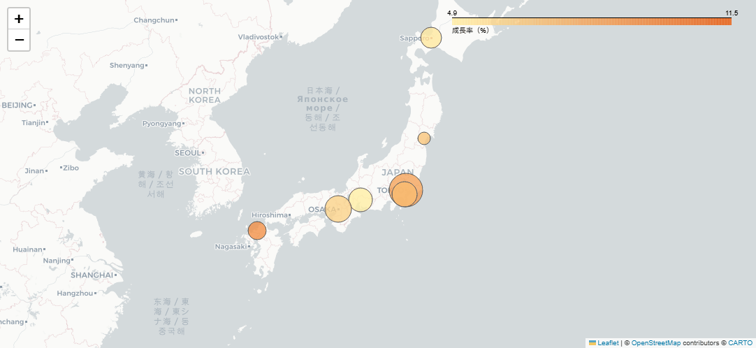
11章 フロー・ネットワーク・テキストのチャート
この章では、これまでの型に収まらない3種類のデータを扱います。量の流れを見せるサンキーダイアグラムと工程の期間を示すガントチャート、つながりを表すネットワークグラフとコードダイアグラム、そして文章の頻出語を示すワードクラウドです。
60. サンキーダイアグラム
認知から購入までの顧客行動を段階ごとのフローとして描き、各段階でどれだけの顧客が離脱しているかを帯の太さで表現するレシピです。カスタマージャーニーの分析やコンバージョン改善の検討会議で、離脱のボトルネックを特定したい場面に向いています。コードではsourceとtargetのペアからノード名を重複排除して番号を振り、go.Sankeyのnode/linkにその番号と流量(value)を渡している部分が構造の中心です。
import pandas as pd
import plotly.graph_objects as go

flow_data = pd.DataFrame({
    'source': ['認知', '認知', '興味', '興味', '検討', '検討', '購入', '購入'],
    'target': ['興味', '離脱', '検討', '離脱', '購入', '離脱', '継続', '離脱'],
    'value': [1000, 500, 700, 300, 400, 300, 300, 100],
})

nodes = list(dict.fromkeys(flow_data['source'].tolist() + flow_data['target'].tolist()))
node_indices = {node: i for i, node in enumerate(nodes)}

fig = go.Figure(data=[go.Sankey(
    node=dict(
        pad=15,
        thickness=20,
        line=dict(color='black', width=0.5),
        label=nodes,
        color='#1f77b4',
    ),
    link=dict(
        source=[node_indices[src] for src in flow_data['source']],
        target=[node_indices[tgt] for tgt in flow_data['target']],
        value=flow_data['value'],
        color='rgba(0,116,217,0.4)',
    ),
)])

fig.update_layout(
    title=dict(text='顧客行動フロー分析', font=dict(size=18)),
    font=dict(size=12),
    template='plotly_white',
    height=600,
)

fig.show()
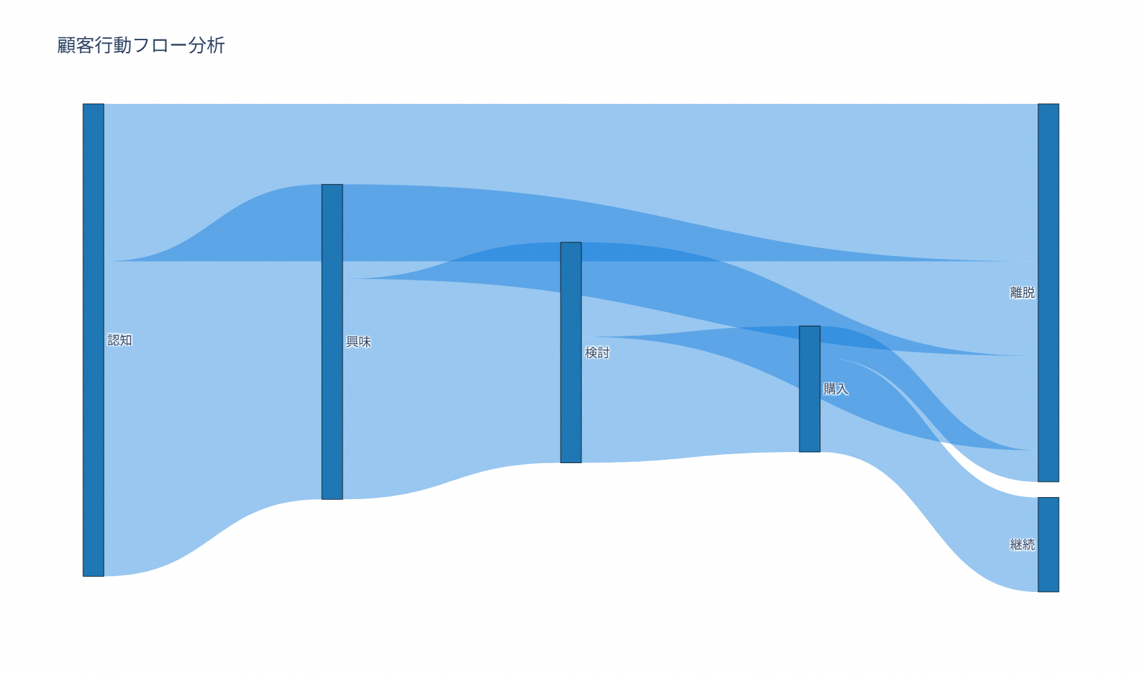
61. ガントチャート
データ分析プロジェクトの各タスクの開始日・終了日・担当チームを一覧化し、進行状況を時系列の帯グラフとして表示するレシピです。プロジェクトの進捗報告や、複数チームの作業がどの期間で重なっているかを確認したい場面で使えます。コードはpx.timelineにタスクの一覧(開始日・終了日・担当チーム)を渡すだけとシンプルで、color=’Resource’によって担当チームごとに色分けさせています。
import pandas as pd
import plotly.express as px

projects = pd.DataFrame([
    dict(Task='データ収集', Start='2024-01-01', Finish='2024-01-15', Resource='チームA'),
    dict(Task='データクリーニング', Start='2024-01-10', Finish='2024-01-25', Resource='チームB'),
    dict(Task='探索的分析', Start='2024-01-20', Finish='2024-02-05', Resource='チームA'),
    dict(Task='モデル構築', Start='2024-02-01', Finish='2024-02-20', Resource='チームC'),
    dict(Task='可視化作成', Start='2024-02-15', Finish='2024-03-01', Resource='チームB'),
    dict(Task='レポート作成', Start='2024-02-25', Finish='2024-03-10', Resource='チームA'),
])

fig = px.timeline(
    projects,
    x_start='Start',
    x_end='Finish',
    y='Task',
    color='Resource',
    color_discrete_sequence=['#1f77b4', '#ff7f0e', '#2ca02c'],
)

fig.update_yaxes(autorange='reversed')
fig.update_layout(
    title=dict(text='データサイエンスプロジェクト スケジュール', font=dict(size=18)),
    template='plotly_white',
    height=500,
)

fig.show()
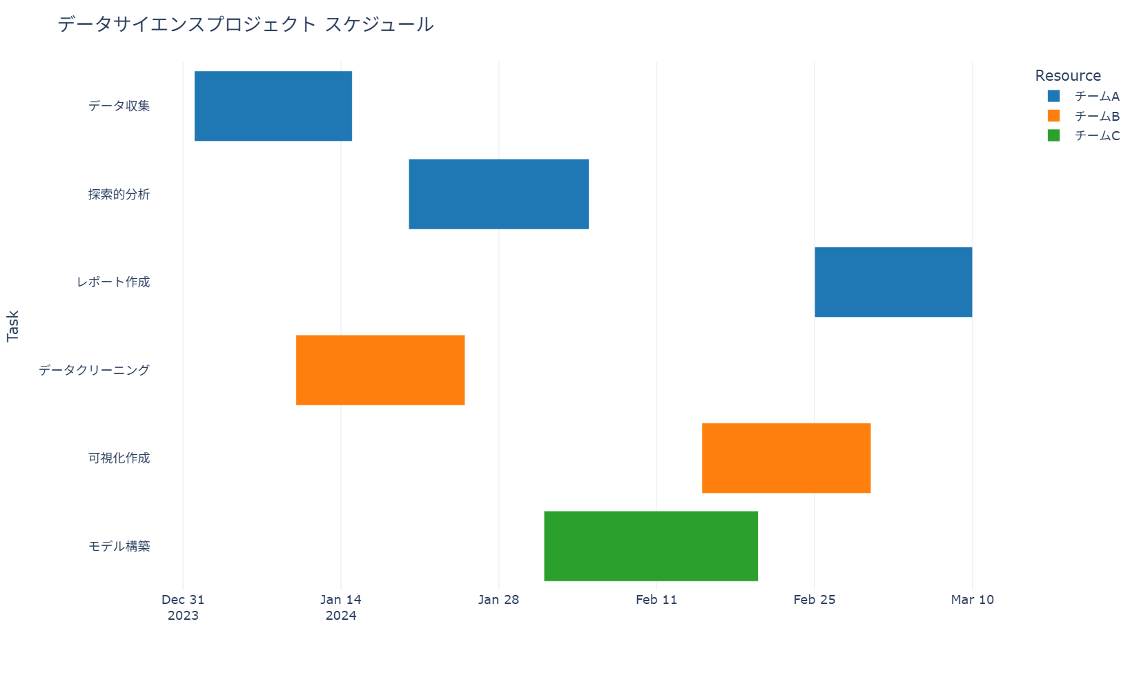
62. ネットワークグラフ
ネットワークグラフは、要素(ノード)とその間のつながり(エッジ)を点と線で表す図です。部署間の連携関係や取引先同士のつながりなど、単純な数値の大小では捉えにくい「関係の構造」を把握したい場面に向いています。作図の基本は、ノードとエッジをそれぞれadd_nodes_from()とadd_edges_from()で登録し、レイアウトアルゴリズムでノードの座標を決めてから描画することです。ノード数が数十を超えると線が重なって読みにくくなるため、まずは主要な関係に絞って構造を確認することが実務での使い方になります。コードではnx.Graph()で無向グラフを作成し、nx.spring_layout()で自然な位置関係を計算したうえで、ノード・エッジ・ラベルを個別の関数で描画しています。
import pandas as pd
import matplotlib.pyplot as plt
import japanize_matplotlib
import networkx as nx

nodes = pd.DataFrame({
    'department': ['営業', 'マーケティング', '商品企画', 'データ分析', 'カスタマーサポート', '物流'],
    'members': [18, 12, 10, 8, 15, 11],
})

edges = pd.DataFrame({
    'source': ['営業', '営業', 'マーケティング', '商品企画', 'データ分析', 'カスタマーサポート', '物流'],
    'target': ['マーケティング', 'カスタマーサポート', '商品企画', 'データ分析', '営業', '商品企画', '営業'],
    'projects': [5, 4, 3, 4, 2, 3, 2],
})

G = nx.Graph()
for _, row in nodes.iterrows():
    G.add_node(row['department'], members=row['members'])

for _, row in edges.iterrows():
    G.add_edge(row['source'], row['target'], projects=row['projects'])

pos = nx.spring_layout(G, seed=42, k=0.8)
node_sizes = [G.nodes[node]['members'] * 120 for node in G.nodes]
edge_widths = [G.edges[edge]['projects'] * 0.8 for edge in G.edges]

fig, ax = plt.subplots(figsize=(8, 6))

nx.draw_networkx_edges(
    G,
    pos,
    ax=ax,
    width=edge_widths,
    edge_color='#999999',
    alpha=0.7,
)

nx.draw_networkx_nodes(
    G,
    pos,
    ax=ax,
    node_size=node_sizes,
    node_color='#1E56A0',
    edgecolors='white',
    linewidths=1.5,
    alpha=0.9,
)

nx.draw_networkx_labels(
    G,
    pos,
    ax=ax,
    font_size=11,
    font_weight='bold',
    font_color='white',
)

edge_labels = nx.get_edge_attributes(G, 'projects')
nx.draw_networkx_edge_labels(
    G,
    pos,
    edge_labels=edge_labels,
    ax=ax,
    font_size=9,
    font_color='#555555',
)

ax.set_title('部署間の連携ネットワーク', fontweight='bold')
ax.axis('off')

plt.tight_layout()
plt.show()
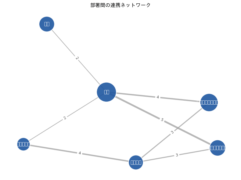
63. コードダイアグラム
コードダイアグラムは、円環上に置いた部門や地域の間にある量的な関係を、帯の太さで表すグラフです。この例では部門間の人材異動を題材にし、異動数が多いほどリボンを太くしています。外周のノードは Wedge で描き、内側のリボンは PathPatch と CURVE4 のベジェ曲線で描画しています。関係が多すぎると読みにくくなるため、重要な流れに絞って使うと効果的です。
import math
import matplotlib.pyplot as plt
from matplotlib.patches import PathPatch, Wedge
from matplotlib.path import Path
import japanize_matplotlib

colors_professional = ['#1f77b4', '#ff7f0e', '#2ca02c', '#d62728', '#9467bd', '#8c564b']

departments = ['営業', '開発', 'マーケ', 'CS', '管理', '海外']
flows = [
    ('営業', 'CS', 18),
    ('営業', 'マーケ', 12),
    ('開発', '海外', 16),
    ('マーケ', '営業', 10),
    ('CS', '開発', 8),
    ('海外', '営業', 14),
    ('管理', '開発', 6),
    ('CS', '管理', 5),
]

node_count = len(departments)
angles = {
    name: 90 - index * 360 / node_count
    for index, name in enumerate(departments)
}
color_map = {
    name: colors_professional[index]
    for index, name in enumerate(departments)
}

fig, ax = plt.subplots(figsize=(7.5, 7.5))

for name in departments:
    angle = angles[name]
    node = Wedge(
        (0, 0), 1.0, angle - 22, angle + 22,
        width=0.10, facecolor=color_map[name],
        edgecolor='white', linewidth=2
    )
    ax.add_patch(node)

    rad = math.radians(angle)
    label_x = 1.18 * math.cos(rad)
    label_y = 1.18 * math.sin(rad)
    ha = 'left' if label_x > 0.05 else 'right' if label_x < -0.05 else 'center'
    ax.text(label_x, label_y, name, ha=ha, va='center',
            fontsize=12, fontweight='bold')

for source, target, value in flows:
    start_angle = math.radians(angles[source])
    end_angle = math.radians(angles[target])
    start = (0.88 * math.cos(start_angle), 0.88 * math.sin(start_angle))
    end = (0.88 * math.cos(end_angle), 0.88 * math.sin(end_angle))
    control1 = (0.28 * math.cos(start_angle), 0.28 * math.sin(start_angle))
    control2 = (0.28 * math.cos(end_angle), 0.28 * math.sin(end_angle))

    path = Path(
        [start, control1, control2, end],
        [Path.MOVETO, Path.CURVE4, Path.CURVE4, Path.CURVE4]
    )
    ribbon = PathPatch(
        path, facecolor='none', edgecolor=color_map[source],
        linewidth=1.2 + value * 0.35, alpha=0.42,
        capstyle='round'
    )
    ax.add_patch(ribbon)

ax.set_title('部門間の人材異動フロー', pad=18)
ax.set_aspect('equal')
ax.set_xlim(-1.35, 1.35)
ax.set_ylim(-1.25, 1.30)
ax.axis('off')

plt.tight_layout()
plt.show()
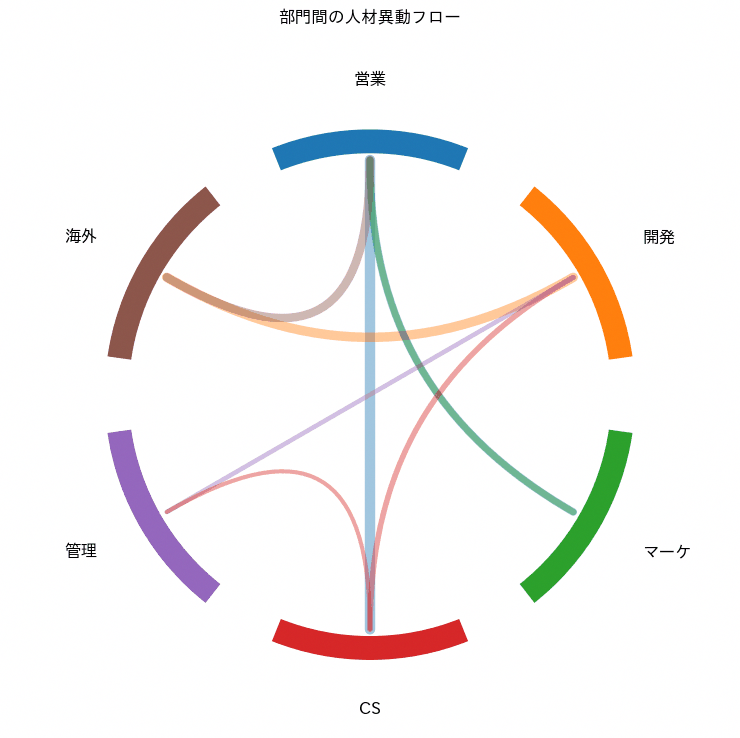
64. ワードクラウド
ワードクラウドは、文章に含まれる単語の出現頻度を文字の大きさで表す可視化です。VOC(顧客の声)分析やレビュー分析で、大量の自由記述からひと目で頻出語を把握したいときに向いています。単語数が多いテキストほど効果を発揮する一方、助詞や助動詞など意味の薄い語をそのまま入れると結果がぼやけるため、事前のストップワード除去や分かち書きの精度が仕上がりを大きく左右します。コードではWordCloudクラスに日本語フォントのパスを指定し、generate()で頻度計算から描画までを一括で実行しています。
from pathlib import Path

import pandas as pd
import matplotlib.pyplot as plt
import japanize_matplotlib
from janome.tokenizer import Tokenizer
from wordcloud import WordCloud

df_reviews = pd.DataFrame({
    'review': [
        '管理画面が見やすく、売上レポートの確認がとても簡単になりました。',
        '検索機能の反応が速く、顧客対応の時間を短縮できています。',
        'スマートフォンでも操作しやすい一方で、通知設定は少し分かりにくいです。',
        '請求データの連携が安定しており、月次作業のミスが減りました。',
        'ダッシュボードのグラフが分かりやすく、部門会議で共有しやすいです。',
        '初期設定に時間はかかりましたが、サポート対応が丁寧でした。',
        '顧客情報の更新が簡単で、営業チーム全体の確認作業が楽になりました。',
        'レポート出力の種類が多く、経営層への報告資料を作りやすいです。',
    ],
})

text = '。'.join(df_reviews['review'])
tokenizer = Tokenizer()
stopwords = {'こと', 'ため', 'よう', 'ところ', 'こちら', 'それ', 'これ', 'さん', 'です', 'ます'}

words = [
    token.surface
    for token in tokenizer.tokenize(text)
    if token.part_of_speech.split(',')[0] in {'名詞', '形容詞'}
    and len(token.surface) > 1
    and token.surface not in stopwords
]

font_candidates = [
    Path(japanize_matplotlib.__file__).with_name('fonts') / 'ipaexg.ttf',
    Path('C:/Windows/Fonts/meiryo.ttc'),
    Path('C:/Windows/Fonts/YuGothM.ttc'),
    Path('C:/Windows/Fonts/msgothic.ttc'),
    Path('/System/Library/Fonts/ヒラギノ角ゴシック W3.ttc'),
    Path('/usr/share/fonts/opentype/noto/NotoSansCJK-Regular.ttc'),
    Path('/usr/share/fonts/truetype/noto/NotoSansCJK-Regular.ttc'),
]

font_path = next((str(path) for path in font_candidates if path.exists()), None)
if font_path is None:
    raise FileNotFoundError('日本語表示に使えるフォントが見つかりません。font_candidatesに利用可能なフォントパスを追加してください。')

wordcloud = WordCloud(
    font_path=font_path,
    width=900,
    height=500,
    background_color='white',
    colormap='tab10',
    max_words=80,
    random_state=42,
).generate(' '.join(words))

fig, ax = plt.subplots(figsize=(9, 5))
ax.imshow(wordcloud, interpolation='bilinear')
ax.set_title('顧客レビュー頻出語ワードクラウド', fontweight='bold')
ax.axis('off')

plt.tight_layout()
plt.show()

12章 レイアウトと軸
ここからは仕上げ編です。グラフの読みやすさは、軸の範囲・目盛り・凡例・余白といった細部にわたる設定で明確に向上します。この章では、matplotlibのレイアウト制御を中心に、Plotlyの複数軸まで、どのグラフにも使える構図の調整レシピをまとめます。
65. 軸の範囲設定(xlim, ylim)
set_xlimとset_ylimでグラフの表示範囲を明示的に指定するレシピです。異常値を除外した比較や、複数グラフのスケールを揃えた比較分析に役立ちます。コードでは減衰する正弦波のデータに対して、x軸を0〜10、y軸をマイナス0.5〜1の範囲に絞り込む基本パターンを実装しています。コードはこの基本形を1枚のグラフに絞った最小構成なので、手元のグラフにそのまま移植できます。
import numpy as np
import matplotlib.pyplot as plt
import japanize_matplotlib

colors_professional = ['#1f77b4', '#ff7f0e', '#2ca02c', '#d62728', '#9467bd', '#8c564b']

x = np.linspace(0, 10, 100)
y = np.sin(x) * np.exp(-x / 5)

fig, ax = plt.subplots(figsize=(8, 5))

ax.plot(x, y, linewidth=2, color=colors_professional[0])
ax.axhline(0, color='#999999', linewidth=1, linestyle='--')
ax.set_xlim(0, 10)
ax.set_ylim(-0.5, 1)
ax.set_xlabel('経過時間(月)')
ax.set_ylabel('反応指数')
ax.set_title('基本範囲設定', fontweight='bold')
ax.grid(True, alpha=0.3)

plt.tight_layout()
plt.show()
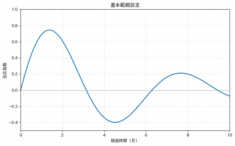
66. ティック位置とラベル(xticks, yticks)
set_xticksやset_yticksで目盛りの間隔や表示位置を制御します。データ量が多いグラフを読みやすく整理したり、数値ラベルを間引いて表示したりする場面で使えます。コードではx軸の目盛りを2つおきに間引き、y軸の目盛りを20刻みに揃えるパターンを実装しており、目盛りの密度をデータの意味に合わせて調整する基本形を確認できます。set_xticksに渡す配列を変えるだけで、間引きの粒度を自由に調整できます。
import numpy as np
import matplotlib.pyplot as plt
import japanize_matplotlib

weeks = np.arange(0, 11, 1)
sales_index = weeks**2

colors_professional = ['#1f77b4', '#ff7f0e', '#2ca02c', '#d62728', '#9467bd', '#8c564b']

fig, ax = plt.subplots(figsize=(8, 5))

ax.plot(weeks, sales_index, 'o-', linewidth=2, color=colors_professional[0])
ax.set_xticks(weeks[::2])
ax.set_yticks(np.arange(0, 101, 20))
ax.set_xlabel('キャンペーン開始後の週数')
ax.set_ylabel('売上指数')
ax.set_title('基本ティック間隔', fontweight='bold')
ax.grid(True)

plt.tight_layout()
plt.show()
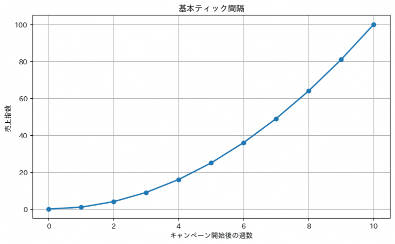
67. ティック外観制御(tick_params)
tick_paramsで目盛りの文字サイズや色、長さなどの見た目を細かく調整します。ブランドガイドラインに沿った配色や、出力媒体に応じた視認性の最適化に役立ちます。コードでは目盛りの文字サイズ・線の長さ・太さ・色をまとめて変更するパターンを実装しており、tick_paramsに渡す引数だけで見た目を一括制御できることを確認できます。引数の値を差し替えるだけで、自社の配色ルールや資料のトーンに合わせられる最小構成です。
import numpy as np
import matplotlib.pyplot as plt
import japanize_matplotlib

days = np.linspace(0, 10, 16)
conversion_rate = 8 + 1.2 * np.sin(days)

colors_professional = ['#1f77b4', '#ff7f0e', '#2ca02c', '#d62728', '#9467bd', '#8c564b']

fig, ax = plt.subplots(figsize=(8, 5))

ax.plot(days, conversion_rate, linewidth=2, color=colors_professional[0])
ax.tick_params(
    axis='both',
    which='major',
    labelsize=12,
    length=8,
    width=2,
    colors='red'
)
ax.set_xlabel('集計日')
ax.set_ylabel('購入率(%)')
ax.set_title('ティックサイズ・カラー', fontweight='bold')
ax.grid(True)

plt.tight_layout()
plt.show()
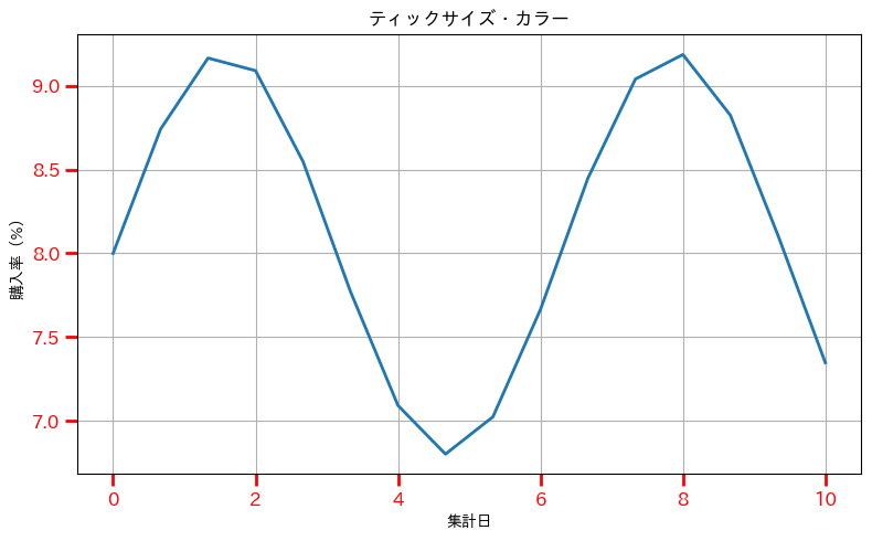
68. グリッド基本制御
grid(True)でグラフに補助線を追加し、数値の読み取り精度を高めます。レポートやプレゼンテーション資料での見やすさ向上に直結する基本テクニックです。コードではノイズを含む折れ線グラフにgrid(True)を1行加えるだけの最小構成を示しており、補助線の有無が数値の読み取りやすさにどう影響するかを比較する土台になります。まずはこの1行から始めて、次のレシピで見た目の細かな調整に進む流れです。
import numpy as np
import matplotlib.pyplot as plt
import japanize_matplotlib

rng = np.random.default_rng(68)
weeks = np.arange(1, 17)
weekly_sales = 120 + 8 * np.sin(weeks / 2) + rng.normal(0, 3, len(weeks))

colors_professional = ['#1f77b4', '#ff7f0e', '#2ca02c', '#d62728', '#9467bd', '#8c564b']

fig, ax = plt.subplots(figsize=(8, 5))

ax.plot(weeks, weekly_sales, 'o-', linewidth=2, color=colors_professional[0])
ax.grid(True)
ax.set_xlabel('週')
ax.set_ylabel('売上(万円)')
ax.set_title('基本グリッド', fontweight='bold')

plt.tight_layout()
plt.show()
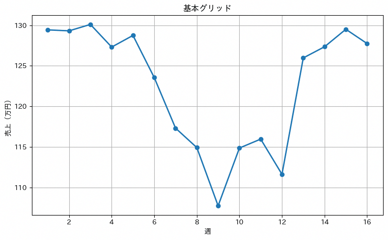
69. グリッド詳細カスタマイズ
線種や太さ、透明度を指定してグリッドの見た目を細かく調整します。複数指標を重ねて表示する際の視認性向上に有効です。コードではグリッドを破線・線幅1・透明度0.7・グレーで表示するパターンを実装しており、主役であるデータの線を邪魔しない補助線の描き方を確認できます。線種や透明度の数値を変えながら、主役のデータを邪魔しない設定を探しやすい最小構成です。
import numpy as np
import matplotlib.pyplot as plt
import japanize_matplotlib

weeks = np.linspace(0, 10, 16)
response_index = 100 + 18 * np.sin(weeks) * np.exp(-weeks / 8)

colors_professional = ['#1f77b4', '#ff7f0e', '#2ca02c', '#d62728', '#9467bd', '#8c564b']

fig, ax = plt.subplots(figsize=(8, 5))

ax.plot(weeks, response_index, linewidth=3, color=colors_professional[0])
ax.grid(True, linestyle='--', linewidth=1, alpha=0.7, color='gray')
ax.set_xlabel('施策開始後の週数')
ax.set_ylabel('問い合わせ指数')
ax.set_title('カスタムグリッドスタイル', fontweight='bold')

plt.tight_layout()
plt.show()
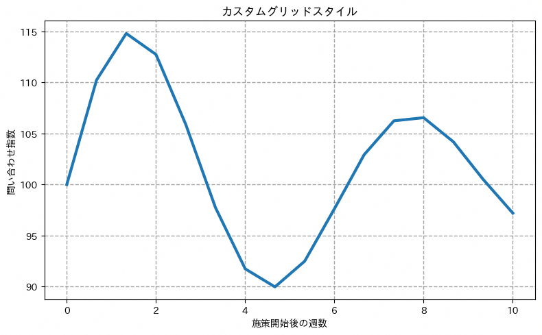
70. サブプロット基本配置(subplots)
plt.subplotsで複数のグラフを格子状に配置します。分布の異なる複数データセットを一度に比較したいときの定番手法で、複数のKPIやセグメント別の分布を1枚のレポートにまとめたい場合によく使われます。サンプルコードでは2行3列のグリッドに正規分布・指数分布・一様分布・ガンマ分布・ベータ分布・対数正規分布という6種類のヒストグラムを並べ、for文でデータセットをループしながら行列位置を自動計算して描画する典型的なパターンを示しています。
import numpy as np
import matplotlib.pyplot as plt
import japanize_matplotlib

rng = np.random.default_rng(70)
sample_size = 18
datasets = [
    (rng.normal(520, 45, sample_size), '店舗別月商(正規分布)'),
    (rng.exponential(1.8, sample_size) * 10, '初回購入までの日数(指数分布)'),
    (rng.uniform(80, 160, sample_size), '支店別客単価(一様分布)'),
    (rng.gamma(2, 15, sample_size), '案件単価(ガンマ分布)'),
    (rng.beta(2, 5, sample_size) * 100, '満足度スコア(ベータ分布)'),
    (rng.lognormal(3.5, 0.35, sample_size), '広告反応数(対数正規分布)')
]

colors_professional = ['#1f77b4', '#ff7f0e', '#2ca02c', '#d62728', '#9467bd', '#8c564b']

fig, axes = plt.subplots(2, 3, figsize=(18, 12))
fig.suptitle('サブプロット配置システム', fontsize=16, fontweight='bold')

for i, (data, title) in enumerate(datasets):
    row, col = i // 3, i % 3
    ax = axes[row, col]

    ax.hist(data, bins=8, alpha=0.7, color=colors_professional[i % len(colors_professional)])
    ax.set_title(title, fontweight='bold')
    ax.set_xlabel('値')
    ax.set_ylabel('件数')
    ax.grid(True, alpha=0.3)

plt.tight_layout()
plt.show()
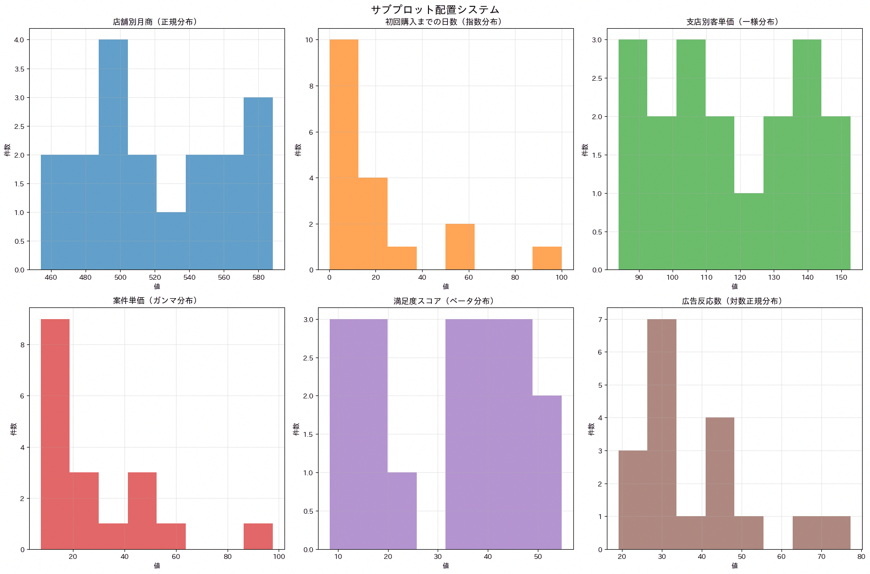
71. GridSpec高度レイアウト
GridSpecを使うと、サイズの異なるグラフを自由なレイアウトで配置できます。ダッシュボードのような複合レイアウトを組む際に重宝し、経営レポートで「主要指標を大きく、補足指標を小さく」といったメリハリのある画面構成を作りたい場合に向いています。サンプルコードでは4行4列のグリッドを定義し、左上2×2をメイン分析、右上2×2をサイド分析(横棒グラフ)、下段を4つの詳細分析パネルに割り当てて、サイズの異なるグラフを1つの図にまとめる流れを示しています。
import numpy as np
import matplotlib.pyplot as plt
import japanize_matplotlib

rng = np.random.default_rng(71)
months = np.arange(1, 13)
main_sales = 100 + np.linspace(0, 14, len(months)) + 8 * np.sin(months / 2)
departments = np.array(['営業', '開発', 'CS', '管理', 'マーケ'])
department_values = np.array([23, 45, 56, 78, 32])
detail_series = [
    80 + rng.normal(1.0, 2.0, len(months)).cumsum(),
    60 + rng.normal(0.7, 1.8, len(months)).cumsum(),
    90 + rng.normal(0.5, 2.5, len(months)).cumsum(),
    70 + rng.normal(0.9, 1.6, len(months)).cumsum()
]

colors_professional = ['#1f77b4', '#ff7f0e', '#2ca02c', '#d62728', '#9467bd', '#8c564b']

fig = plt.figure(figsize=(16, 12))
gs = fig.add_gridspec(4, 4, hspace=0.3, wspace=0.3)

ax_main = fig.add_subplot(gs[0:2, 0:2])
ax_main.plot(months, main_sales, linewidth=3, color=colors_professional[0])
ax_main.set_title('メイン分析', fontsize=14, fontweight='bold')
ax_main.set_xlabel('月')
ax_main.set_ylabel('売上指数')
ax_main.grid(True, alpha=0.3)

ax_side = fig.add_subplot(gs[0:2, 2:4])
ax_side.barh(departments, department_values, color=colors_professional[1])
ax_side.set_title('サイド分析', fontsize=14, fontweight='bold')
ax_side.set_xlabel('対応件数')

for i in range(2):
    for j in range(2):
        ax = fig.add_subplot(gs[2 + i, j * 2:(j + 1) * 2])
        data = detail_series[i * 2 + j]
        ax.plot(months, data, linewidth=2, color=colors_professional[2 + i * 2 + j])
        ax.set_title(f'詳細分析 {i + 1}-{j + 1}', fontweight='bold')
        ax.set_xlabel('月')
        ax.grid(True, alpha=0.3)

plt.suptitle('GridSpec高度レイアウトシステム', fontsize=16, fontweight='bold')
plt.tight_layout()
plt.show()
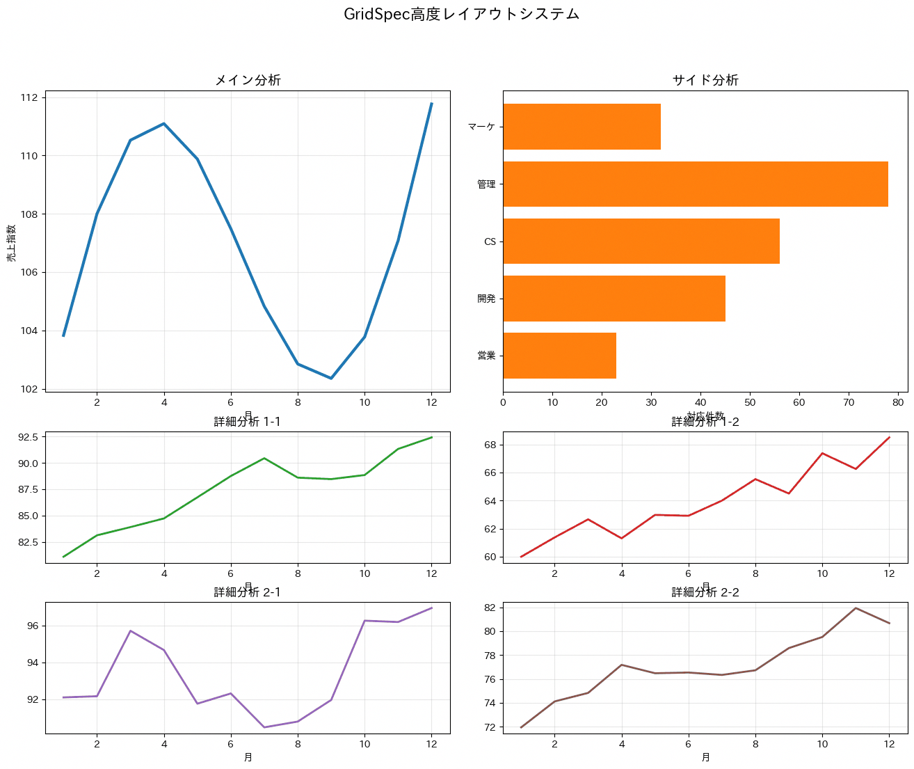
sharex・sharey引数で複数グラフの軸を共有し、スケールを揃えて比較しやすくします。時系列の複数指標を並べて見るケースなどで有効で、軸がバラバラだと誤解を招きやすい指標比較の精度を高められます。サンプルコードでは3行2列のサブプロットでsharex=True、sharey=’col’を指定し、左列に売上高・利益・顧客数という近いスケールの指標を、右列に商品数・満足度・継続率という別スケールの指標をまとめることで、列ごとに適切な軸共有を行う考え方を示しています。
import numpy as np
import pandas as pd
import matplotlib.pyplot as plt
import japanize_matplotlib

rng = np.random.default_rng(72)
dates = pd.date_range('2025-01-01', periods=12, freq='MS')
base_trend = np.linspace(0, 18, len(dates)) + rng.normal(0, 1.5, len(dates)).cumsum()

indicators = {
    '売上高': 100 + base_trend + rng.normal(0, 3, len(dates)),
    '利益': 80 + base_trend * 0.8 + rng.normal(0, 2, len(dates)),
    '顧客数': 90 + base_trend * 1.1 + rng.normal(0, 4, len(dates)),
    '商品数': 60 + base_trend * 0.6 + rng.normal(0, 2, len(dates)),
    '満足度': 75 + 5 * np.sin(np.arange(len(dates)) * 0.6) + rng.normal(0, 1, len(dates)),
    '継続率': 82 + 4 * np.sin(np.arange(len(dates)) * 0.4) + rng.normal(0, 1, len(dates))
}

colors_professional = ['#1f77b4', '#ff7f0e', '#2ca02c', '#d62728', '#9467bd', '#8c564b']

fig, axes = plt.subplots(3, 2, figsize=(14, 12), sharex=True, sharey='col')
fig.suptitle('軸共有システム', fontsize=16, fontweight='bold')

left_indicators = ['売上高', '利益', '顧客数']
for i, indicator in enumerate(left_indicators):
    ax = axes[i, 0]
    ax.plot(dates, indicators[indicator], linewidth=2, color=colors_professional[i], label=indicator)
    ax.set_title(indicator, fontweight='bold')
    ax.grid(True, alpha=0.3)
    if i == len(left_indicators) - 1:
        ax.set_xlabel('日付')

right_indicators = ['商品数', '満足度', '継続率']
for i, indicator in enumerate(right_indicators):
    ax = axes[i, 1]
    ax.plot(dates, indicators[indicator], linewidth=2, color=colors_professional[i + 3], label=indicator)
    ax.set_title(indicator, fontweight='bold')
    ax.grid(True, alpha=0.3)
    if i == len(right_indicators) - 1:
        ax.set_xlabel('日付')

plt.tight_layout()
plt.show()
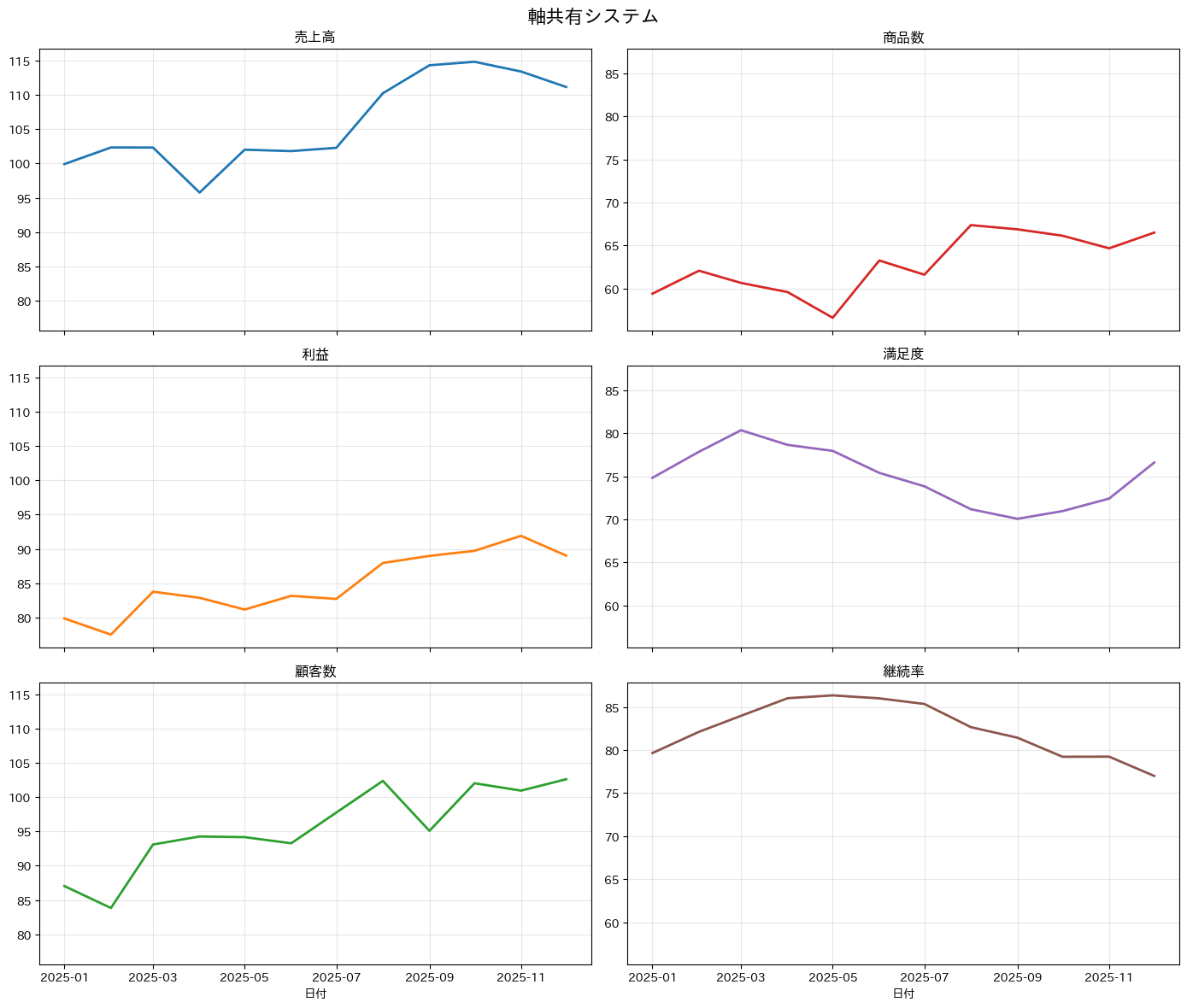
73. 余白調整(tight_layout, subplots_adjust)
tight_layoutやsubplots_adjustで余白を調整し、ラベルの重なりを解消します。印刷レイアウトやレポートの体裁を整える際に欠かせない処理で、長い軸ラベルやタイトルが隣のグラフと重なって読みにくくなるのを防ぎます。サンプルコードでは長いラベルを持つ調整前のサブプロットと、短いラベルに整理した調整後のサブプロットを並べたうえで、最後にtight_layoutとsubplots_adjustを併用して余白を仕上げる手順を示しています。
import numpy as np
import matplotlib.pyplot as plt
import japanize_matplotlib

rng = np.random.default_rng(73)
months = np.arange(1, 13)
series = [
    100 + rng.normal(1.0, 2.0, len(months)).cumsum(),
    120 + rng.normal(0.8, 2.5, len(months)).cumsum(),
    90 + rng.normal(1.2, 1.8, len(months)).cumsum(),
    110 + rng.normal(0.6, 2.2, len(months)).cumsum()
]

colors_professional = ['#1f77b4', '#ff7f0e', '#2ca02c', '#d62728', '#9467bd', '#8c564b']

fig = plt.figure(figsize=(16, 10))

plt.subplot(2, 2, 1)
plt.plot(months, series[0], linewidth=2, color=colors_professional[0])
plt.title('調整前:重複するタイトルとラベル', fontweight='bold')
plt.xlabel('非常に長いX軸ラベルの例:月次集計期間')
plt.ylabel('非常に長いY軸ラベルの例:売上指数(基準月=100)')

plt.subplot(2, 2, 2)
plt.plot(months, series[1], linewidth=2, color=colors_professional[1])
plt.title('tight_layout適用後', fontweight='bold')
plt.xlabel('月')
plt.ylabel('売上指数')

plt.subplot(2, 2, 3)
plt.plot(months, series[2], linewidth=2, color=colors_professional[2])
plt.title('手動調整:カスタム余白', fontweight='bold')
plt.xlabel('月')
plt.ylabel('利益指数')

plt.subplot(2, 2, 4)
plt.plot(months, series[3], linewidth=2, color=colors_professional[3])
plt.title('最適化完了', fontweight='bold')
plt.xlabel('月')
plt.ylabel('顧客指数')

plt.suptitle('余白調整システム比較', fontsize=16, fontweight='bold')
plt.subplots_adjust(top=0.93, hspace=0.3, wspace=0.3)
plt.tight_layout()
plt.show()
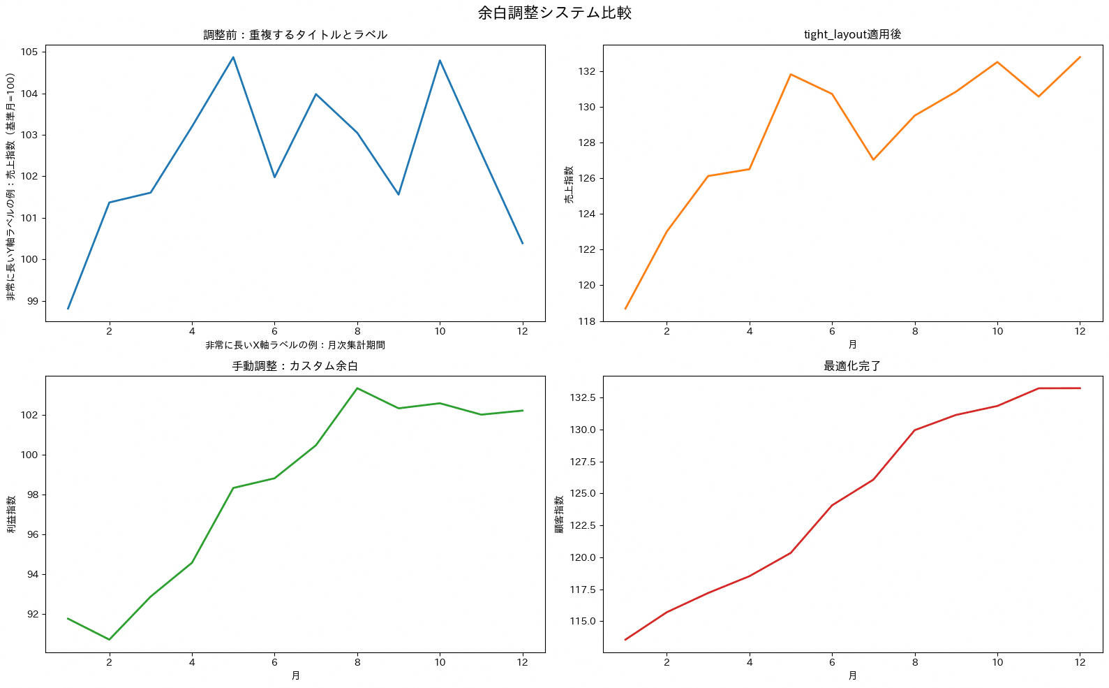
74. 凡例位置制御(legend)
サンプルコードでは3行3列のグリッドに同じ4本の業務指標(売上指数、利益指数、広告反応、解約抑制)を描画し、upper right・lower center・center leftなど9パターンの凡例位置を1つずつ試して見比べられるようにしています。
import numpy as np
import matplotlib.pyplot as plt
import japanize_matplotlib

months = np.arange(1, 13)
series = {
    '売上指数': 100 + 12 * np.sin(months / 2),
    '利益指数': 90 + 10 * np.cos(months / 2),
    '広告反応': 80 + 8 * np.sin(months),
    '解約抑制': 70 + 14 * np.exp(-months / 8) * np.sin(months / 2)
}

colors_professional = ['#1f77b4', '#ff7f0e', '#2ca02c', '#d62728', '#9467bd', '#8c564b']

fig, axes = plt.subplots(3, 3, figsize=(18, 14))
fig.suptitle('凡例制御システム', fontsize=16, fontweight='bold')

legend_positions = [
    ('upper right', '右上'),
    ('upper left', '左上'),
    ('lower right', '右下'),
    ('lower left', '左下'),
    ('center', '中央'),
    ('upper center', '上部中央'),
    ('lower center', '下部中央'),
    ('center left', '左中央'),
    ('center right', '右中央')
]

for i, (pos, pos_jp) in enumerate(legend_positions):
    row, col = i // 3, i % 3
    ax = axes[row, col]

    for j, (series_name, values) in enumerate(series.items()):
        ax.plot(
            months,
            values,
            linewidth=2,
            color=colors_professional[j % len(colors_professional)],
            label=series_name
        )

    ax.legend(loc=pos, fontsize=8)
    ax.set_title(f'凡例位置: {pos_jp}', fontweight='bold')
    ax.set_xlabel('月')
    ax.set_ylabel('指数')
    ax.grid(True, alpha=0.3)

plt.tight_layout()
plt.show()
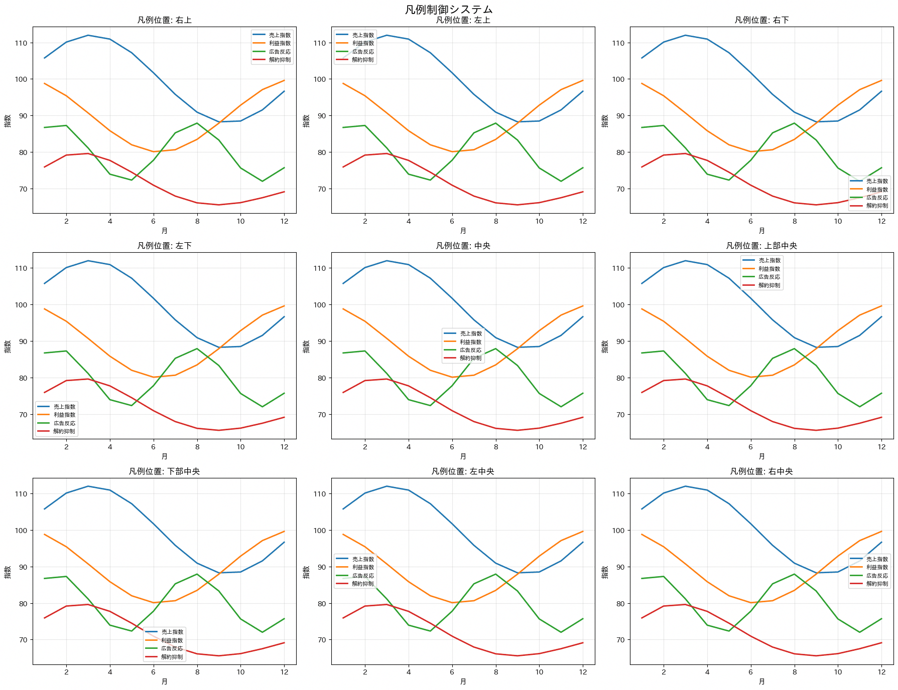
75. 双軸グラフ(twinx, twiny)
twinxで一つのグラフに単位の異なる2つの指標を重ねて表示します。売上と利益率のように、スケールが異なる指標を同時に見せたい場合の定番で、2軸に分けることで片方のグラフに埋もれがちな指標も見やすくできます。サンプルコードでは、売上(棒グラフ)と利益率(線グラフ)を重ねるパターンと、在庫数と受注数を重ねるパターンの2種類を用意し、それぞれtwinxで右軸を追加して左右の軸ラベルを対応する系列の色で塗り分けています。
import numpy as np
import pandas as pd
import matplotlib.pyplot as plt
import japanize_matplotlib

dates = pd.date_range('2025-01-01', periods=12, freq='MS')
sales = np.array([100, 120, 115, 140, 160, 180, 200, 190, 220, 240, 260, 280])
profit_rate = np.array([15, 18, 12, 20, 22, 25, 23, 19, 28, 30, 32, 35])
inventory = np.array([500, 480, 520, 490, 460, 440, 420, 450, 430, 410, 400, 380])
orders = np.array([45, 52, 48, 58, 62, 68, 72, 69, 76, 82, 85, 88])

colors_professional = ['#1f77b4', '#ff7f0e', '#2ca02c', '#d62728', '#9467bd', '#8c564b']

fig, axes = plt.subplots(1, 2, figsize=(16, 6))
fig.suptitle('双軸グラフシステム', fontsize=16, fontweight='bold')

ax1 = axes[0]
ax2 = ax1.twinx()

ax1.bar(dates, sales, alpha=0.7, color=colors_professional[0], label='売上(百万円)')
ax1.set_ylabel('売上(百万円)', color=colors_professional[0], fontweight='bold')
ax1.tick_params(axis='y', labelcolor=colors_professional[0])

ax2.plot(dates, profit_rate, color=colors_professional[1], linewidth=3, marker='o', markersize=6, label='利益率(%)')
ax2.set_ylabel('利益率(%)', color=colors_professional[1], fontweight='bold')
ax2.tick_params(axis='y', labelcolor=colors_professional[1])

ax1.set_title('売上と利益率の推移', fontweight='bold')
ax1.grid(True, alpha=0.3)
ax1.tick_params(axis='x', rotation=45)

handles1, labels1 = ax1.get_legend_handles_labels()
handles2, labels2 = ax2.get_legend_handles_labels()
ax1.legend(handles1 + handles2, labels1 + labels2, loc='upper left')

ax3 = axes[1]
ax4 = ax3.twinx()

ax3.plot(dates, inventory, color=colors_professional[2], linewidth=3, marker='s', markersize=6, label='在庫数')
ax3.set_ylabel('在庫数(個)', color=colors_professional[2], fontweight='bold')
ax3.tick_params(axis='y', labelcolor=colors_professional[2])

ax4.plot(dates, orders, color=colors_professional[3], linewidth=3, marker='^', markersize=6, label='受注数')
ax4.set_ylabel('受注数(件)', color=colors_professional[3], fontweight='bold')
ax4.tick_params(axis='y', labelcolor=colors_professional[3])

ax3.set_title('在庫と受注のバランス', fontweight='bold')
ax3.grid(True, alpha=0.3)
ax3.tick_params(axis='x', rotation=45)

handles3, labels3 = ax3.get_legend_handles_labels()
handles4, labels4 = ax4.get_legend_handles_labels()
ax3.legend(handles3 + handles4, labels3 + labels4, loc='upper right')

plt.tight_layout()
plt.show()
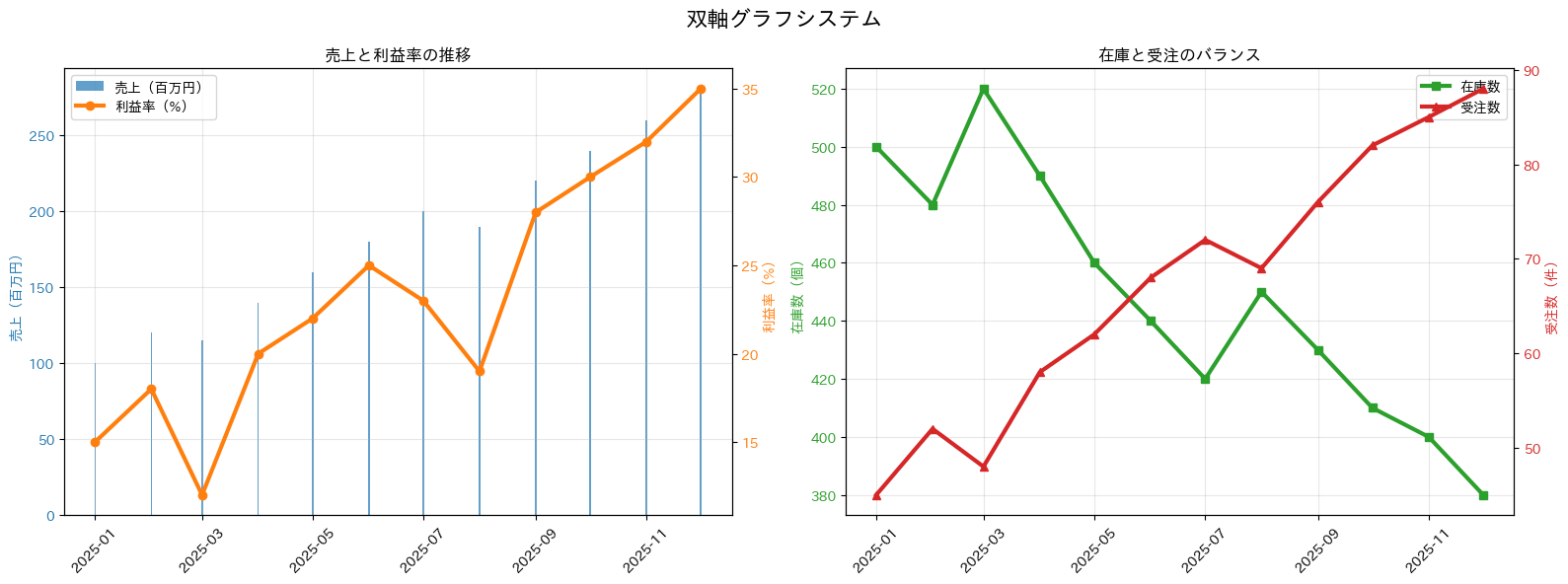
76. 複数軸グラフ
yaxis2をoverlaying=’y’で重ねることで、スケールの異なる売上と顧客数を1つのグラフ上で比較できます。売上金額(円単位)とユニーク顧客数(人単位)のように桁数が大きく違う指標を、別々のグラフに分けずに同じ時間軸上で見比べたいときに使えます。コードは左軸に売上、右軸に顧客数を割り当て、それぞれの軸のタイトルと目盛りの色を対応する線の色に合わせている点が読みどころです。
import pandas as pd
import plotly.graph_objects as go

df_sales_daily = pd.DataFrame({
    "date": [
        "2026-04-01", "2026-04-01", "2026-04-02", "2026-04-02",
        "2026-04-03", "2026-04-03", "2026-04-04", "2026-04-04",
        "2026-04-05", "2026-04-05", "2026-04-06", "2026-04-06",
        "2026-04-07", "2026-04-07", "2026-04-08", "2026-04-08",
    ],
    "customer_id": [
        "C001", "C002", "C001", "C003", "C004", "C005", "C002", "C002",
        "C006", "C007", "C003", "C008", "C009", "C010", "C001", "C011",
    ],
    "sales": [
        180000, 220000, 260000, 190000, 310000, 240000, 210000, 95000,
        330000, 280000, 250000, 360000, 410000, 270000, 300000, 390000,
    ],
})
df_sales_daily["date"] = pd.to_datetime(df_sales_daily["date"])

daily_metrics = df_sales_daily.groupby("date").agg({
    "sales": "sum",
    "customer_id": "nunique",
}).reset_index()

fig = go.Figure()

fig.add_trace(go.Scatter(
    x=daily_metrics["date"],
    y=daily_metrics["sales"],
    mode="lines",
    name="売上金額",
    line=dict(color="blue", width=2),
    yaxis="y",
))

fig.add_trace(go.Scatter(
    x=daily_metrics["date"],
    y=daily_metrics["customer_id"],
    mode="lines",
    name="ユニーク顧客数",
    line=dict(color="red", width=2, dash="dash"),
    yaxis="y2",
))

fig.update_layout(
    title=dict(text="売上とユニーク顧客数の推移"),
    xaxis_title="日付",
    yaxis=dict(
        title=dict(text="売上金額(円)", font=dict(color="blue")),
        tickfont=dict(color="blue"),
        side="left",
    ),
    yaxis2=dict(
        title=dict(text="ユニーク顧客数", font=dict(color="red")),
        tickfont=dict(color="red"),
        anchor="x",
        overlaying="y",
        side="right",
    ),
    template="plotly_white",
    height=600,
)

print("実務POINT: 異なるスケールの指標を一つのグラフで表示できます")
fig.show()
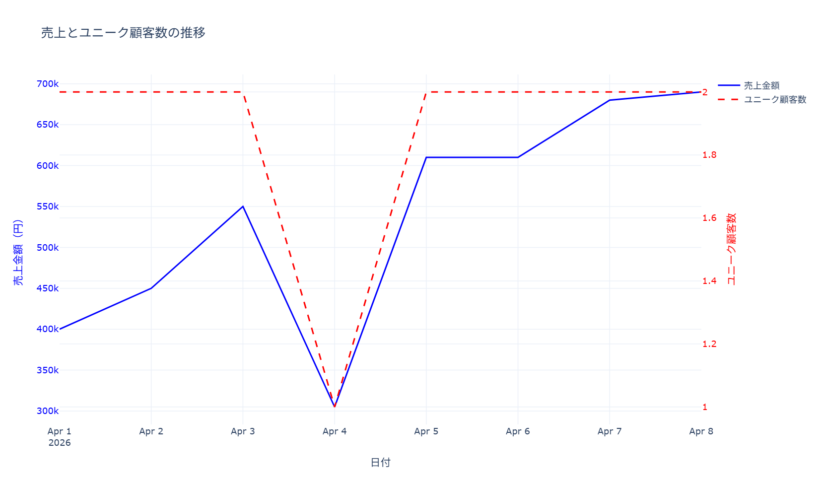
コードは日別の売上と顧客数を集計する前半と、2本のScatterトレースをyaxis・yaxis2に振り分けるレイアウト設定の後半に分かれています。最小限使う場合は、fig.add_traceを2回呼び出し、片方にyaxis=’y2’を指定してupdate_layoutでyaxis2にoverlaying=’y’を設定する部分だけで再現できます。
77. 多軸グラフ(3軸以上)
yaxis2・yaxis3をそれぞれoverlaying=’y’でずらして配置することで、売上・顧客数・平均単価という3つの指標を1つのグラフに同時表示できます。2軸グラフでは表現しきれない「量」と「単価」と「客数」の関係を1画面で見たい経営分析のような場面で、指標同士の連動や乖離に気づきやすくなります。コードは3つの指標を1つのDataFrameに集計する前半と、各軸のposition・side・anchorを細かく指定して3本の軸が重ならないよう配置する後半に分かれています。
import pandas as pd
import plotly.graph_objects as go

df_sales_daily = pd.DataFrame({
    "date": [
        "2026-04-01", "2026-04-01", "2026-04-01",
        "2026-04-02", "2026-04-02", "2026-04-02",
        "2026-04-03", "2026-04-03", "2026-04-03",
        "2026-04-04", "2026-04-04", "2026-04-04",
        "2026-04-05", "2026-04-05", "2026-04-05",
    ],
    "customer_id": [
        "C001", "C002", "C003", "C001", "C004", "C005", "C002", "C006",
        "C007", "C003", "C008", "C009", "C010", "C011", "C010",
    ],
    "sales": [
        180000, 220000, 150000, 260000, 190000, 240000, 310000, 280000,
        210000, 250000, 360000, 320000, 410000, 390000, 120000,
    ],
})
df_sales_daily["date"] = pd.to_datetime(df_sales_daily["date"])

daily_metrics = df_sales_daily.groupby("date").agg(
    total_sales=("sales", "sum"),
    customers=("customer_id", "nunique"),
    avg_sales=("sales", "mean"),
).reset_index()

fig = go.Figure()

fig.add_trace(go.Scatter(
    x=daily_metrics["date"],
    y=daily_metrics["total_sales"],
    mode="lines",
    name="総売上",
    line=dict(color="blue", width=3),
    yaxis="y",
))

fig.add_trace(go.Scatter(
    x=daily_metrics["date"],
    y=daily_metrics["customers"],
    mode="lines",
    name="顧客数",
    line=dict(color="red", width=2),
    yaxis="y2",
))

fig.add_trace(go.Scatter(
    x=daily_metrics["date"],
    y=daily_metrics["avg_sales"],
    mode="lines",
    name="平均売上",
    line=dict(color="green", width=2, dash="dash"),
    yaxis="y3",
))

fig.update_layout(
    title=dict(text="売上・顧客・効率性の統合分析(3軸表示)"),
    xaxis=dict(title="日付", domain=[0.12, 0.88]),
    yaxis=dict(
        title=dict(text="総売上(円)", font=dict(color="blue")),
        tickfont=dict(color="blue"),
        side="left",
    ),
    yaxis2=dict(
        title=dict(text="顧客数", font=dict(color="red")),
        tickfont=dict(color="red"),
        anchor="free",
        overlaying="y",
        side="right",
        position=0.94,
    ),
    yaxis3=dict(
        title=dict(text="平均売上(円)", font=dict(color="green")),
        tickfont=dict(color="green"),
        anchor="free",
        overlaying="y",
        side="left",
        position=0.06,
    ),
    template="plotly_white",
    height=600,
    margin=dict(l=110, r=110),
)

print("実務POINT: 3つの異なる指標を同時に比較できます")
fig.show()
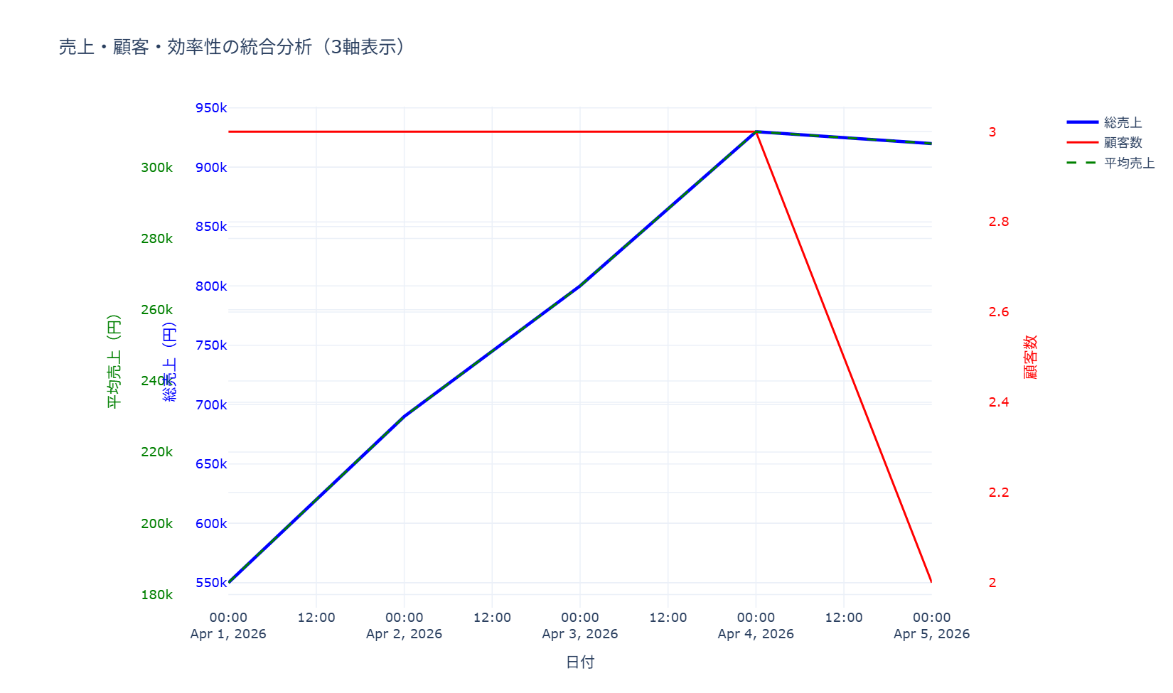
コードは、named aggregationで3指標を一括集計する前処理、3本のScatterトレースをyaxis・yaxis2・yaxis3に振り分ける部分、各軸のposition調整を含むレイアウト設定の3段階から成ります。最小限使う場合は、3本目の軸をanchor=’free’・overlaying=’y’・positionで既存の2軸グラフに追加する部分だけを流用できます。
13章 色とスタイル
色は情報を運ぶ手段であり、装飾ではありません。この章では、カラーマップやパレットの制御、線種・透明度・フォントといったスタイル調整のレシピをまとめます。強調したい1系列に色を使い、残りをグレーに落とすという実務の基本も、ここの道具で実現できます。
78. カラーマップ制御(cmap)
cmap引数でカラーマップを切り替え、データの種類に適した配色を選びます。財務データには発散型、密度データには知覚均等なカラーマップを選ぶといった使い分けができ、選択を誤ると存在しない傾向を読み手に誤解させてしまうこともあるため注意が必要です。サンプルコードでは、viridisやplasmaといった知覚均等系、RdBu_rやcoolwarmといった発散型、grayやtab10といった単色・カテゴリ系まで、12種類のカラーマップを同じデータに適用して並べて比較できるようにしたうえで、財務・品質管理・売上分析などの用途別に推奨するカラーマップを最後にprintで一覧表示しています。
import numpy as np
import matplotlib.pyplot as plt
import japanize_matplotlib

fig, axes = plt.subplots(3, 4, figsize=(20, 14))
fig.suptitle("カラーマップ制御システム", fontsize=16, fontweight="bold")

rng = np.random.default_rng(42)
sales_gap_matrix = rng.normal(loc=0, scale=1, size=(20, 20))

colormaps = [
    ("viridis", "デフォルト(知覚均等)"),
    ("plasma", "プラズマ(高輝度)"),
    ("RdYlBu_r", "温冷(発散型)"),
    ("coolwarm", "寒暖(発散型)"),
    ("Blues", "単色グラデーション"),
    ("RdBu_r", "赤青(対称)"),
    ("seismic", "地震波(対称)"),
    ("hot", "温度(知覚的)"),
    ("gray", "グレースケール"),
    ("Set3", "カテゴリ用"),
    ("tab10", "タブ形式"),
    ("rainbow", "レインボー"),
]

for i, (cmap_name, description) in enumerate(colormaps):
    row, col = i // 4, i % 4
    ax = axes[row, col]

    im = ax.imshow(sales_gap_matrix, cmap=cmap_name, aspect="auto")
    ax.set_title(f"{cmap_name}\n{description}", fontsize=10, fontweight="bold")
    ax.set_xticks([])
    ax.set_yticks([])

    cbar = plt.colorbar(im, ax=ax, shrink=0.8)
    cbar.ax.tick_params(labelsize=8)

print("ビジネス用途別カラーマップ推奨:")
print("・財務データ: 'RdYlGn'(赤から黄から緑)")
print("・品質管理: 'RdBu_r'(赤から青)")
print("・売上分析: 'viridis'(紫から青から緑から黄)")
print("・リスク分析: 'coolwarm'(青から白から赤)")
print("・一般レポート: 'Blues' または 'Greys'")

plt.tight_layout()
plt.show()
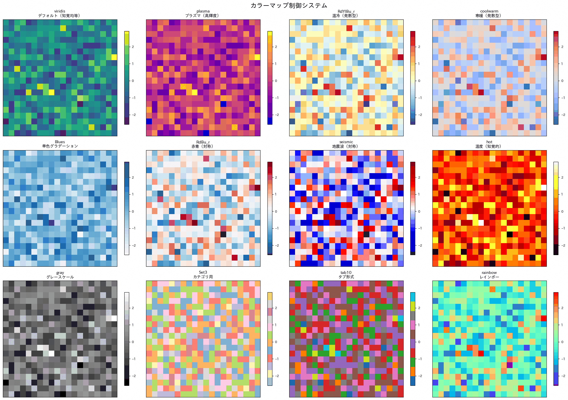
79. カスタムカラーパレット
企業ブランドカラーや業界標準の配色をリストとして定義し、グラフ全体で一貫した色使いにします。色覚バリアフリーに配慮したパレットも紹介しており、レポートやプレゼン資料で自社らしさや業界の慣習に沿った配色を統一的に使い回したい場合に役立ちます。サンプルコードでは、企業のブランドカラーを棒グラフに適用するパターン、LinearSegmentedColormapで独自のグラデーションを作りヒートマップに使うパターン、金融業界で使われがちな色を資産配分の円グラフに割り当てるパターン、色覚バリアフリーに配慮した配色を複数系列の折れ線グラフに使うパターンの4種類を示しています。
import numpy as np
import matplotlib.pyplot as plt
from matplotlib.colors import LinearSegmentedColormap
import japanize_matplotlib

rng = np.random.default_rng(42)

fig, axes = plt.subplots(2, 2, figsize=(14, 10))
fig.suptitle("カスタムカラーパレット作成システム", fontsize=16, fontweight="bold")

ax = axes[0, 0]
brand_colors = ["#FF6B6B", "#4ECDC4", "#45B7D1", "#96CEB4", "#FFEAA7"]
categories = ["広告", "展示会", "Web", "紹介", "店舗"]
values = [25, 30, 35, 20, 40]

bars = ax.bar(categories, values, color=brand_colors)
ax.set_title("企業ブランドカラー", fontweight="bold")
ax.set_ylabel("売上構成比(%)")

for bar, color in zip(bars, brand_colors):
    height = bar.get_height()
    ax.text(
        bar.get_x() + bar.get_width() / 2,
        height + 1,
        color,
        ha="center",
        va="bottom",
        fontsize=8,
        rotation=45,
    )

ax = axes[0, 1]
colors_gradient = ["#FF6B6B", "#FFE66D", "#4ECDC4", "#45B7D1"]
custom_cmap = LinearSegmentedColormap.from_list("custom", colors_gradient, N=10)

data_heatmap = rng.normal(loc=100, scale=12, size=(8, 8))
im = ax.imshow(data_heatmap, cmap=custom_cmap, aspect="auto")
ax.set_title("カスタムグラデーション", fontweight="bold")
ax.set_xlabel("週")
ax.set_ylabel("店舗")
plt.colorbar(im, ax=ax, shrink=0.8)

ax = axes[1, 0]
finance_colors = {
    "株式": "#2E8B57",
    "債券": "#4682B4",
    "不動産": "#CD853F",
    "商品": "#DAA520",
    "現金": "#708090",
}

asset_classes = list(finance_colors.keys())
allocations = [40, 30, 15, 10, 5]
colors_finance = list(finance_colors.values())

ax.pie(
    allocations,
    labels=asset_classes,
    colors=colors_finance,
    autopct="%1.1f%%",
    startangle=90,
)
ax.set_title("金融業界標準カラー", fontweight="bold")

ax = axes[1, 1]
barrier_free_colors = [
    "#E69F00", "#56B4E9", "#009E73", "#F0E442",
    "#0072B2", "#D55E00", "#CC79A7", "#999999",
]

months = np.arange(1, 11)
performance_data = rng.normal(loc=1.0, scale=0.4, size=(8, 10)).cumsum(axis=1)
for i in range(8):
    ax.plot(
        months,
        performance_data[i],
        linewidth=2,
        color=barrier_free_colors[i],
        label=f"部門{i + 1}",
    )

ax.set_title("色覚バリアフリー対応", fontweight="bold")
ax.set_xlabel("月")
ax.set_ylabel("累積成長率")
ax.legend(bbox_to_anchor=(1.05, 1), loc="upper left")
ax.grid(True, alpha=0.3)

print("推奨カラーパレット:")
print("企業ブランド:", brand_colors)
print("金融業界:", list(finance_colors.values()))
print("バリアフリー:", barrier_free_colors[:5])

plt.tight_layout()
plt.show()
1つ目は企業ブランドカラーをそのままリストとして使う基本形、2つ目はLinearSegmentedColormapで独自のグラデーションカラーマップを作る応用形、3つ目は金融業界で慣習的に使われる資産クラスごとの色分け、4つ目は色の区別がつきにくい人にも配慮した色覚バリアフリーパレットです。最小限使う場合は、任意の色のリスト(例えばbrand_colorsのような16進数カラーコードのリスト)を用意し、bar()やplot()のcolor引数にそのまま渡すだけで一貫した配色を適用できます。
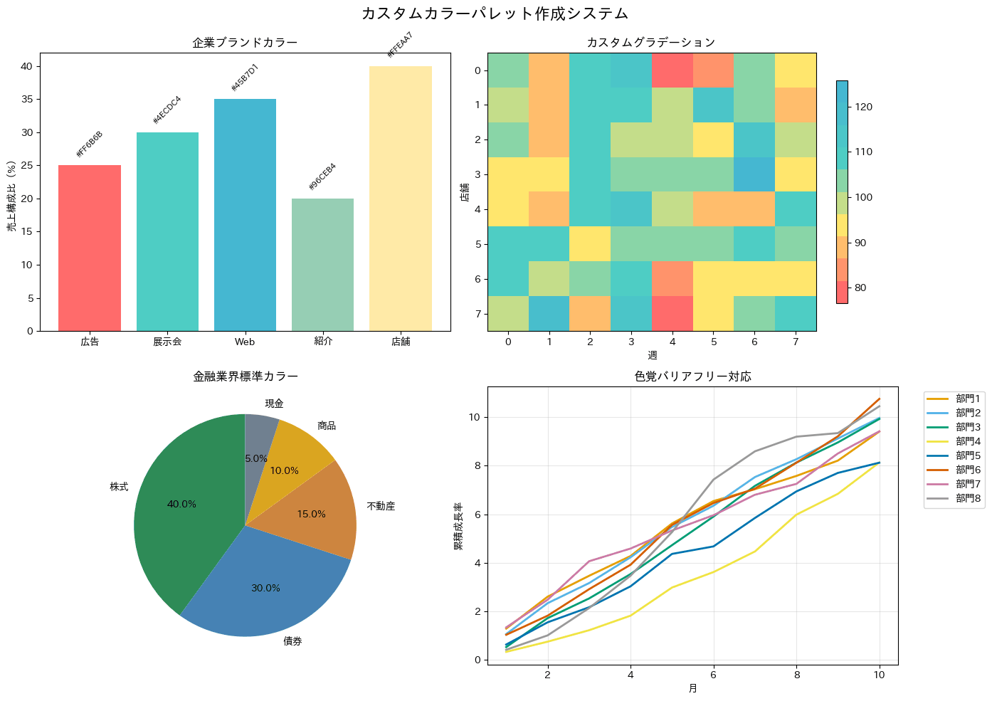
80. カラーパレット
set_paletteやbarplotのpalette引数に企業のブランドカラーやクライアント指定の配色をカラーコードで直接指定し、社内資料やクライアント向けレポートの見た目をブランドガイドラインに合わせるレシピです。デザインの一貫性が求められる対外提出資料でよく使われます。コードはHEXコードのリストをcustom_paletteとして定義し、sns.set_paletteでグラフ全体のデフォルト配色を変更したうえで、barplotのpalette引数にも明示的に渡しています。
import pandas as pd
import matplotlib.pyplot as plt
import seaborn as sns

sns.set_theme(style="whitegrid")
import japanize_matplotlib

df_customers = pd.DataFrame({
    "city": [
        "東京", "東京", "大阪", "大阪", "名古屋", "名古屋",
        "福岡", "福岡", "東京", "大阪", "名古屋", "福岡",
    ],
    "spending": [
        128000, 142000, 98000, 105000, 87000, 92000,
        76000, 83000, 136000, 101000, 95000, 79000,
    ],
})

custom_palette = ["#FF6B6B", "#4ECDC4", "#45B7D1", "#FFA07A"]
sns.set_palette(custom_palette)

plt.figure(figsize=(10, 6))
sns.barplot(
    data=df_customers,
    x="city",
    y="spending",
    hue="city",
    palette=custom_palette,
    errorbar=None,
    legend=False,
)
plt.title("カスタムブランドカラー適用", fontweight="bold")
plt.xlabel("都市")
plt.ylabel("平均支出(円)")
plt.xticks(rotation=45)

print("実務POINT: クライアントのブランドカラーに合わせた可視化")

plt.tight_layout()
plt.show()
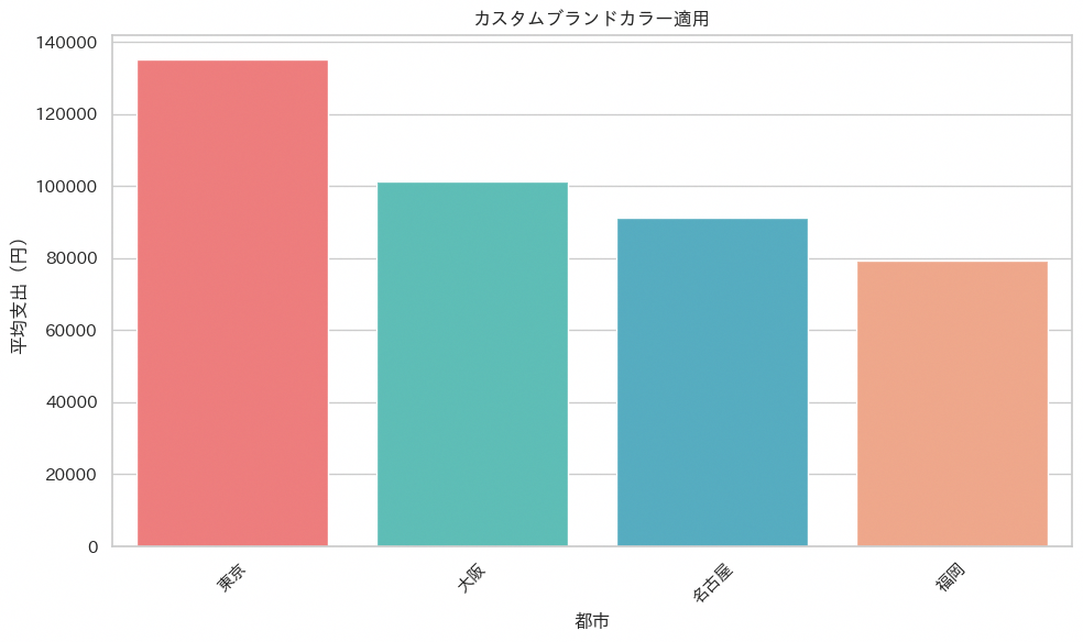
81. カスタムカラースケール
colorscaleにRGB値のリストを直接指定することで、企業やプロジェクトのブランドカラーに合わせた配色でグラフを統一できます。社外向けレポートやコーポレートサイト掲載用の資料など、既定のブランドカラーを守る必要がある場面で、Plotly標準のカラースケールでは対応しきれないときに使えます。コードはカスタムカラーの16進コードを定義する部分、それをヒートマップのcolorscaleに指定する部分、同じ配色を棒グラフのmarker.colorにも流用する部分の3つで構成されています。
import pandas as pd
import plotly.graph_objects as go
from plotly.subplots import make_subplots

custom_colors = [
    "#003f5c", "#2f4b7c", "#665191", "#a05195",
    "#d45087", "#f95d6a", "#ff7c43", "#ffa600",
]

df_sales_daily = pd.DataFrame({
    "region": [
        "東日本", "東日本", "東日本", "東日本",
        "西日本", "西日本", "西日本", "西日本",
        "九州", "九州", "九州", "九州",
    ],
    "product": [
        "ノートPC", "モニター", "周辺機器", "保守契約",
        "ノートPC", "モニター", "周辺機器", "保守契約",
        "ノートPC", "モニター", "周辺機器", "保守契約",
    ],
    "sales": [
        520000, 310000, 180000, 260000,
        460000, 280000, 220000, 240000,
        390000, 210000, 160000, 190000,
    ],
})

region_product_matrix = df_sales_daily.pivot_table(
    values="sales",
    index="region",
    columns="product",
    aggfunc="sum",
).fillna(0)

product_sales = df_sales_daily.groupby("product")["sales"].sum().sort_values(ascending=True)

fig = make_subplots(
    rows=1,
    cols=2,
    subplot_titles=("地域×商品売上マトリックス(企業カラー)", "商品別売上(企業ブランドカラー)"),
    horizontal_spacing=0.16,
)

fig.add_trace(
    go.Heatmap(
        z=region_product_matrix.values,
        x=region_product_matrix.columns,
        y=region_product_matrix.index,
        colorscale=[
            [0.0, "#003f5c"],
            [0.2, "#2f4b7c"],
            [0.4, "#665191"],
            [0.6, "#a05195"],
            [0.8, "#d45087"],
            [1.0, "#f95d6a"],
        ],
        hovertemplate="地域: %{y}<br>商品: %{x}<br>売上: %{z:,.0f}円<extra></extra>",
        colorbar=dict(title=dict(text="売上金額(円)"), x=0.46),
    ),
    row=1,
    col=1,
)

fig.add_trace(
    go.Bar(
        y=product_sales.index,
        x=product_sales.values,
        orientation="h",
        marker=dict(
            color=custom_colors[:len(product_sales)],
            line=dict(color="white", width=1),
        ),
        text=[f"{x:,.0f}円" for x in product_sales.values],
        textposition="outside",
    ),
    row=1,
    col=2,
)

fig.update_layout(
    title=dict(text="企業カラーで統一した売上可視化"),
    template="plotly_white",
    height=520,
    showlegend=False,
)

fig.update_xaxes(title_text="商品", row=1, col=1)
fig.update_yaxes(title_text="地域", row=1, col=1)
fig.update_xaxes(title_text="売上金額(円)", row=1, col=2)
fig.update_yaxes(title_text="商品", row=1, col=2)

print("実務POINT: 企業ブランドに合わせたカスタムカラーで統一感を演出できます")
fig.show()
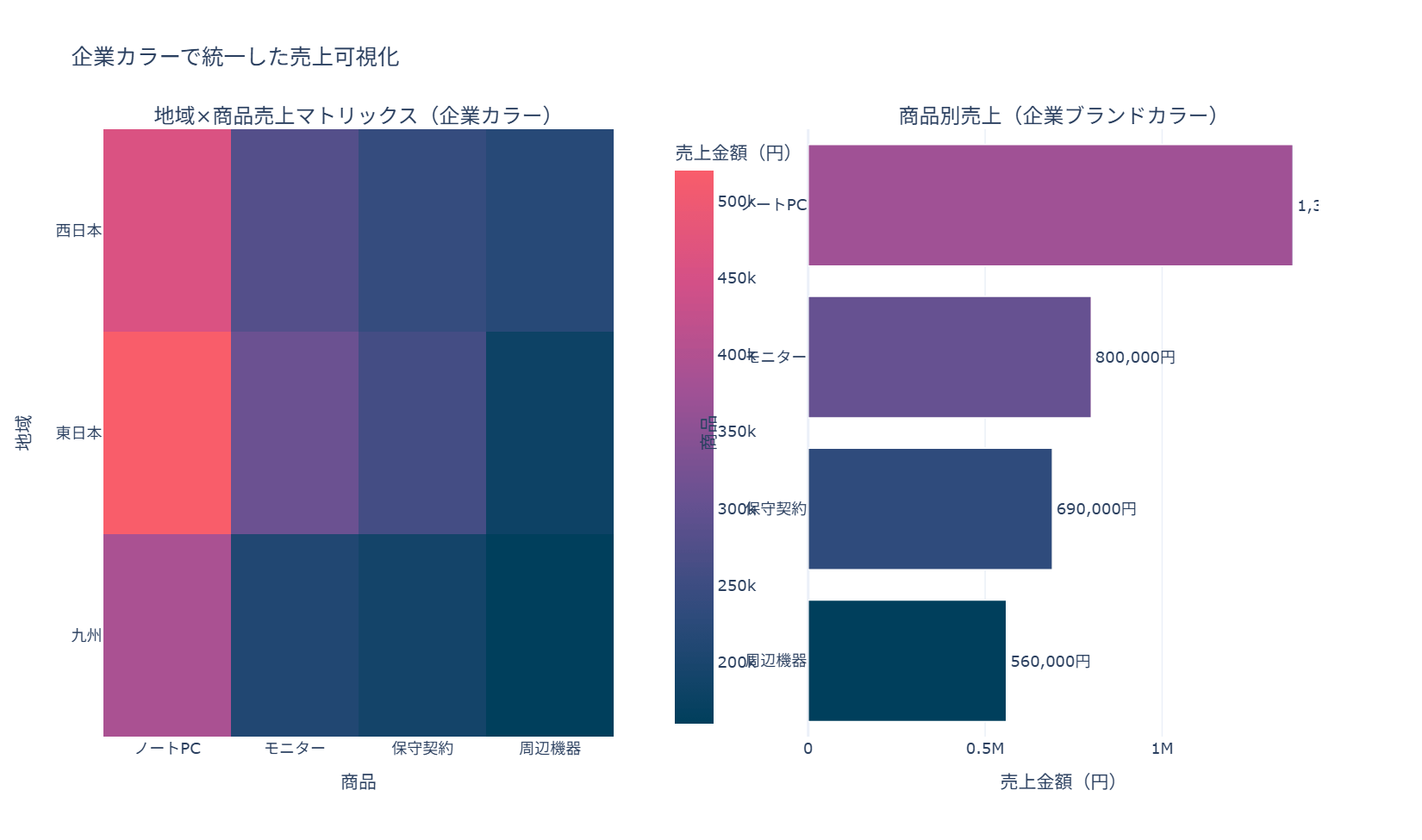
コードは、地域×商品のヒートマップを描く前半と、同じカスタムカラーパレットを使った横棒グラフを描く後半の2つのグラフから成ります。最小限使う場合は、custom_colorsのリストをそのまま自分のグラフのmarker(_color)やcolorscaleに指定するだけで、企業カラーへの統一が図れます。
82. 線種とマーカー制御
linestyleやmarkerを組み合わせ、複数系列を線種やマーカーの違いで区別します。白黒印刷でも判別しやすい表現を作りたいときに有効で、色だけに頼らずに系列を見分けられるようにする工夫のひとつです。サンプルコードでは、実線・破線・一点鎖線・点線という基本の線種パターン、丸や四角など6種類のマーカースタイル、線幅とマーカーサイズの組み合わせ、そして実績・予測・目標・ベンチマークという業務指標に応じたスタイル設定という4種類のパターンを示しています。
import numpy as np
import matplotlib.pyplot as plt
import japanize_matplotlib

colors_professional = ["#1f77b4", "#ff7f0e", "#2ca02c", "#d62728", "#9467bd", "#8c564b"]

fig, axes = plt.subplots(2, 2, figsize=(14, 10))
fig.suptitle("線種・マーカー制御システム", fontsize=16, fontweight="bold")

months = np.arange(1, 13)
base_y = 100 + np.linspace(0, 18, len(months)) + 8 * np.sin(months / 2)

ax = axes[0, 0]
line_styles = ["-", "--", "-.", ":"]
line_names = ["実線", "破線", "一点鎖線", "点線"]

for i, (style, name) in enumerate(zip(line_styles, line_names)):
    y = base_y + i * 12
    ax.plot(months, y, linestyle=style, linewidth=3, color=colors_professional[i], label=name)

ax.legend()
ax.set_title("基本線種パターン", fontweight="bold")
ax.set_xlabel("月")
ax.set_ylabel("売上指数")
ax.grid(True, alpha=0.3)

ax = axes[0, 1]
marker_styles = ["o", "s", "^", "D", "v", "<"]
marker_names = ["丸", "四角", "上三角", "ダイヤ", "下三角", "左三角"]

for i, (style, name) in enumerate(zip(marker_styles, marker_names)):
    y = base_y * (1 + i * 0.03)
    ax.plot(
        months[::2],
        y[::2],
        marker=style,
        markersize=8,
        linewidth=2,
        color=colors_professional[i % len(colors_professional)],
        label=name,
    )

ax.legend(fontsize=9)
ax.set_title("マーカースタイル", fontweight="bold")
ax.set_xlabel("月")
ax.set_ylabel("売上指数")
ax.grid(True, alpha=0.3)

ax = axes[1, 0]
widths = [1, 2, 3, 4]
sizes = [4, 6, 8, 10]

for i, (width, size) in enumerate(zip(widths, sizes)):
    y = base_y + i * 10
    ax.plot(
        months,
        y,
        linewidth=width,
        marker="o",
        markersize=size,
        color=colors_professional[i],
        label=f"幅{width}, サイズ{size}",
    )

ax.legend()
ax.set_title("線幅・マーカーサイズ", fontweight="bold")
ax.set_xlabel("月")
ax.set_ylabel("売上指数")
ax.grid(True, alpha=0.3)

ax = axes[1, 1]
business_styles = [
    ("実績", "-", "o", 3, 8, colors_professional[0]),
    ("予測", "--", "s", 2, 6, colors_professional[1]),
    ("目標", "-.", "^", 3, 8, colors_professional[2]),
    ("ベンチマーク", ":", "D", 2, 6, colors_professional[3]),
]

for i, (label, linestyle, marker, linewidth, markersize, color) in enumerate(business_styles):
    y = base_y + i * 8 + 4 * np.sin(months / 3 + i)
    ax.plot(
        months,
        y,
        linestyle=linestyle,
        marker=marker,
        linewidth=linewidth,
        markersize=markersize,
        color=color,
        label=label,
        alpha=0.8,
    )

ax.legend()
ax.set_title("ビジネス用途別スタイル", fontweight="bold")
ax.set_xlabel("月")
ax.set_ylabel("売上指数")
ax.grid(True, alpha=0.3)

plt.tight_layout()
plt.show()
1つ目は線種のみの使い分け、2つ目はマーカー形状の使い分け、3つ目は線幅・マーカーサイズによる強弱表現、4つ目はこれらを組み合わせて「実績は実線と丸」「予測は破線と四角」のように業務上の意味とスタイルを対応づけたパターンです。最小限使う場合は、4つ目の業務用途別スタイル設定(business_stylesのリストとforループの部分)だけ抜き出して、自社のレポートで使う系列名に置き換えれば実務にそのまま応用できます。
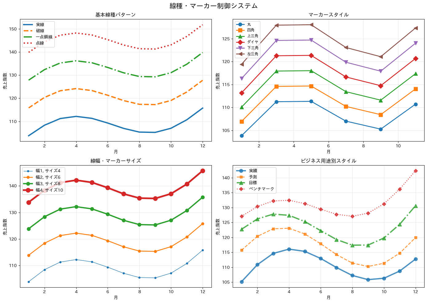
83. 透明度制御(alpha)
alpha引数で線や点の透明度を調整し、重なり合うデータの密度感や信頼区間を表現します。散布図の重複を見やすくしたい場合に使い、点が密集している箇所ほど濃く見えるため、データ量の多寡を直感的に伝えられます。サンプルコードでは、複数グループの散布図を透明度付きで重ねて密度を見るパターン、信頼区間をfill_betweenで半透明に塗りつつ観測点を重ねるパターン、重要度に応じて棒グラフごとに透明度を変えるパターンの3種類を示しています。
import numpy as np
import matplotlib.pyplot as plt
import japanize_matplotlib

colors_professional = ["#1f77b4", "#ff7f0e", "#2ca02c", "#d62728", "#9467bd", "#8c564b"]
rng = np.random.default_rng(42)

fig, axes = plt.subplots(1, 3, figsize=(18, 6))
fig.suptitle("透明度制御システム", fontsize=16, fontweight="bold")

ax = axes[0]
n_groups = 5
n_points = 120

for i in range(n_groups):
    x = rng.normal(80 + i * 18, 7, n_points)
    y = rng.normal(100 + i * 14, 10, n_points)
    ax.scatter(
        x,
        y,
        alpha=0.6,
        s=50,
        color=colors_professional[i % len(colors_professional)],
        label=f"店舗群{i + 1}",
    )

ax.legend()
ax.set_title("重複データの可視化", fontweight="bold")
ax.set_xlabel("広告費(万円)")
ax.set_ylabel("売上(万円)")
ax.grid(True, alpha=0.3)

ax = axes[1]
x_conf = np.linspace(1, 12, 100)
y_main = 100 + 4 * x_conf + 8 * np.sin(x_conf / 2)
y_upper = y_main + 8
y_lower = y_main - 8

ax.plot(x_conf, y_main, linewidth=3, color=colors_professional[0], label="主要トレンド")
ax.fill_between(x_conf, y_lower, y_upper, alpha=0.3, color=colors_professional[0], label="信頼区間")

x_obs = np.arange(1, 13)
y_obs = 100 + 4 * x_obs + 8 * np.sin(x_obs / 2) + rng.normal(0, 5, len(x_obs))
ax.scatter(x_obs, y_obs, alpha=0.7, s=50, color=colors_professional[1], label="観測値")

ax.legend()
ax.set_title("信頼区間付きトレンド", fontweight="bold")
ax.set_xlabel("月")
ax.set_ylabel("売上指数")
ax.grid(True, alpha=0.3)

ax = axes[2]
categories = ["A", "B", "C", "D", "E"]
values_primary = [100, 80, 60, 40, 20]
values_secondary = [80, 70, 50, 35, 15]
alphas = [1.0, 0.8, 0.6, 0.4, 0.2]

bars1 = ax.bar(categories, values_primary, color=colors_professional[0], label="主要指標")
bars2 = ax.bar(categories, values_secondary, color=colors_professional[1], label="副次指標")

for bar, alpha in zip(bars1, alphas):
    bar.set_alpha(alpha)

for bar, alpha in zip(bars2, alphas):
    bar.set_alpha(alpha)

ax.legend()
ax.set_title("重要度別透明度設定", fontweight="bold")
ax.set_xlabel("施策")
ax.set_ylabel("値")

plt.tight_layout()
plt.show()
1つ目は複数グループの散布図の重なりを見やすくするための透明度調整、2つ目はトレンドと信頼区間・観測値を1つのグラフに重ねる表現、3つ目は棒ごとにset_alphaで透明度を変えて重要度の強弱を示す表現です。最小限使う場合は、plotやscatterの引数にalpha=0.3程度の値を1つ加えるだけで、重なりの見やすさを改善できます。
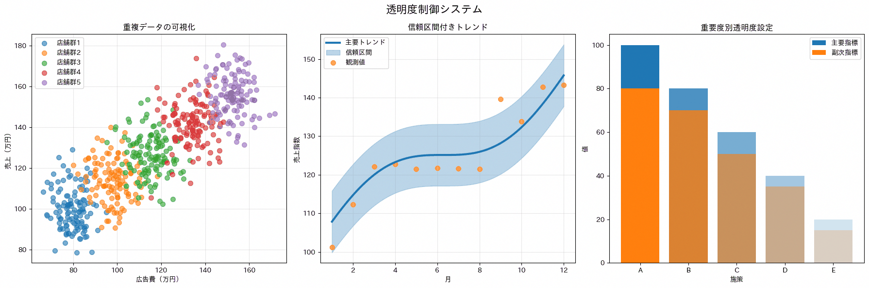
84. 背景色と透明度
set_facecolorなどで背景色を変更し、ダークテーマや特定のブランドカラーに合わせたグラフを作成します。資料全体のトーンを統一したい場合に活用できます。コードでは背景をネイビーにし、線・タイトル・目盛りの色を白に揃えるダークテーマのパターンを実装しており、背景色を変える際は他の要素の色も併せて調整する必要があることを確認できます。配色セットを差し替えれば、自社ブランドカラーのダークテーマにもそのまま展開できます。
import numpy as np
import matplotlib.pyplot as plt
import japanize_matplotlib

fig, ax = plt.subplots(figsize=(8, 5))

months = np.arange(1, 13)
sales_index = 100 + np.linspace(0, 20, len(months)) + 10 * np.sin(months / 2)

fig.patch.set_facecolor("#0B1220")
ax.set_facecolor("#0B1220")

ax.plot(months, sales_index, linewidth=3, color="white", marker="o")
ax.fill_between(months, sales_index - 6, sales_index + 6, color="white", alpha=0.18)

ax.set_title("ダーク背景", fontweight="bold", color="white")
ax.set_xlabel("月", color="white")
ax.set_ylabel("売上指数", color="white")
ax.tick_params(colors="white")
ax.grid(True, color="white", alpha=0.18)

for spine in ax.spines.values():
    spine.set_color("white")
    spine.set_alpha(0.5)

plt.tight_layout()
plt.show()
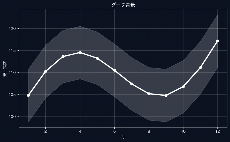
85. スタイルテーマ(plt.style.use)
plt.style.availableで使えるスタイル一覧を取得し、plt.style.contextで一時的に見た目を切り替えながら、default・ggplot・classicなど主要スタイルを同じデータで並べて比較するレシピです。資料の提出先が金融・官公庁かIT・コンサルか小売かによって、フォーマルさとモダンさのバランスを調整したい場面で使えます。コードは前半で複数スタイルを売上指数・顧客指数・散布点で一括比較し、後半で業種別に推奨スタイルを当てはめた棒グラフのサンプルを同じ図の中に並べて示す構成です。
import numpy as np
import matplotlib.pyplot as plt
import japanize_matplotlib

colors_professional = ["#1f77b4", "#ff7f0e", "#2ca02c", "#d62728", "#9467bd", "#8c564b"]

available_styles = plt.style.available
print("利用可能なスタイル:")
for style in available_styles[:10]:
    print(f"  - {style}")

styles_comparison = ["default", "seaborn-v0_8", "ggplot", "bmh", "classic"]

months = np.arange(1, 13)
sales_index = 100 + np.linspace(0, 18, len(months)) + 8 * np.sin(months / 2)
customer_index = 92 + np.linspace(0, 14, len(months)) + 6 * np.cos(months / 2)
campaign_points = sales_index - customer_index

fig = plt.figure(figsize=(20, 10))
fig.suptitle("スタイルテーマ比較システム", fontsize=16, fontweight="bold")

for i, style_name in enumerate(styles_comparison):
    style_to_use = style_name if style_name in available_styles else "default"
    with plt.style.context(style_to_use):
        ax = fig.add_subplot(2, 4, i + 1)
        ax.plot(months, sales_index, linewidth=2, label="売上指数")
        ax.plot(months, customer_index, linewidth=2, label="顧客指数")
        ax.scatter(months[::2], campaign_points[::2] + 100, s=50, alpha=0.7, label="施策反応")
        ax.set_title(f"スタイル: {style_name}", fontweight="bold")
        ax.set_xlabel("月")
        ax.legend()
        ax.grid(True, alpha=0.3)

business_data = {
    "Q1": 100,
    "Q2": 120,
    "Q3": 95,
    "Q4": 140,
}
quarters = list(business_data.keys())
values = list(business_data.values())

with plt.style.context("classic"):
    ax = fig.add_subplot(2, 4, 6)
    ax.bar(quarters, values, color=["#1f77b4", "#ff7f0e", "#2ca02c", "#d62728"], alpha=0.8)
    ax.set_title("保守的・フォーマル\n(金融・官公庁)", fontweight="bold")
    ax.set_ylabel("売上(百万円)")
    ax.grid(True, alpha=0.3)

with plt.style.context("seaborn-v0_8" if "seaborn-v0_8" in available_styles else "default"):
    ax = fig.add_subplot(2, 4, 7)
    ax.bar(quarters, values, color=colors_professional[:4], alpha=0.8)
    ax.set_title("モダン・洗練\n(IT・コンサル)", fontweight="bold")
    ax.set_ylabel("売上(百万円)")

with plt.style.context("ggplot" if "ggplot" in available_styles else "default"):
    ax = fig.add_subplot(2, 4, 8)
    ax.bar(quarters, values, color=["#FF6B6B", "#4ECDC4", "#45B7D1", "#96CEB4"], alpha=0.8)
    ax.set_title("カジュアル・親しみやすい\n(小売・サービス)", fontweight="bold")
    ax.set_ylabel("売上(百万円)")

print("ビジネス用途別スタイル推奨:")
print("・金融・官公庁: 'classic' - 保守的で信頼感")
print("・IT・コンサル: 'seaborn-v0_8' - モダンで洗練")
print("・小売・サービス: 'ggplot' - 親しみやすく明るい")
print("・学術・研究: 'bmh' - 清潔で読みやすい")

plt.tight_layout()
plt.show()
前半のスタイル比較と後半の業種別サンプルという2つのショーケースをまとめたコードです。最小限使う場合は、with plt.style.context(’スタイル名’):のブロックでグラフ作成部分を囲むだけでよく、グラフ自体のコードを変更する必要はありません。
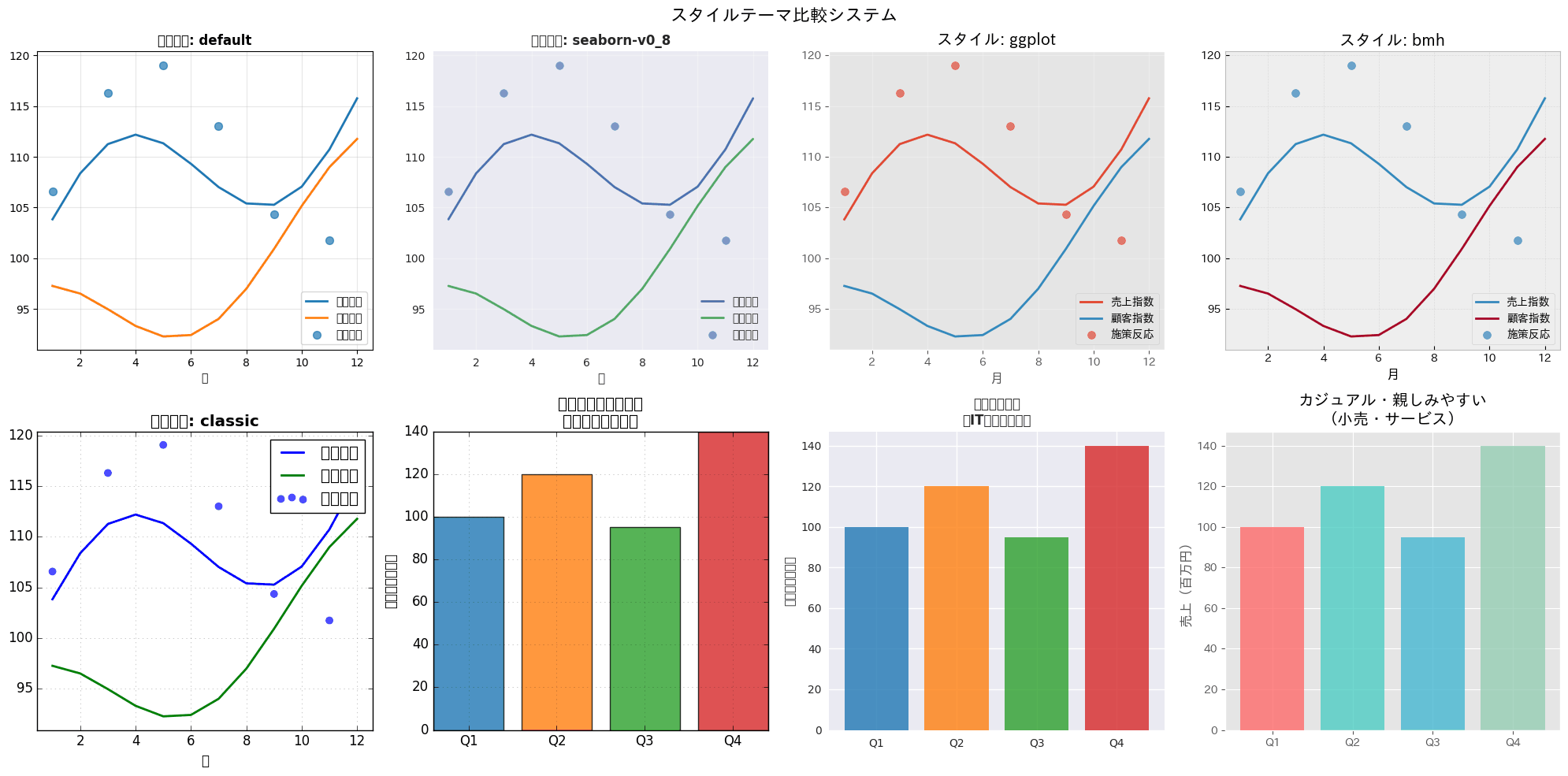
86. フォントサイズ設定
タイトル・軸ラベル・目盛りといった要素ごとにフォントサイズを階層的に設定します。読みやすさの最適化や、資料内の情報の重要度を伝える工夫として使えます。コードでは棒グラフに対してタイトルを16pt、軸ラベルを14pt、目盛りを12ptというように段階的にフォントサイズを設定するパターンを実装しており、要素の重要度に応じたサイズの付け方を確認できます。サイズの数値を差し替えるだけで、自社テンプレートの文字階層を再現できます。
import pandas as pd
import matplotlib.pyplot as plt
import japanize_matplotlib

df_customers = pd.DataFrame({
    'カテゴリ': ['小規模顧客', '中規模顧客', '大規模顧客'],
    '売上指数': [20, 35, 25]
})

colors_professional = ['#1f77b4', '#ff7f0e', '#2ca02c', '#d62728', '#9467bd', '#8c564b']

fig, ax = plt.subplots(figsize=(8, 5))

bars = ax.bar(
    df_customers['カテゴリ'],
    df_customers['売上指数'],
    color=colors_professional[:len(df_customers)],
    alpha=0.8
)

ax.set_title('顧客規模別の売上指数', fontsize=16, fontweight='bold')
ax.set_xlabel('カテゴリ', fontsize=14, fontweight='bold')
ax.set_ylabel('売上指数', fontsize=14, fontweight='bold')
ax.tick_params(labelsize=12)

for bar in bars:
    height = bar.get_height()
    ax.text(
        bar.get_x() + bar.get_width() / 2,
        height + 1,
        f'{height:.0f}',
        ha='center',
        va='bottom',
        fontsize=12
    )

plt.tight_layout()
plt.show()
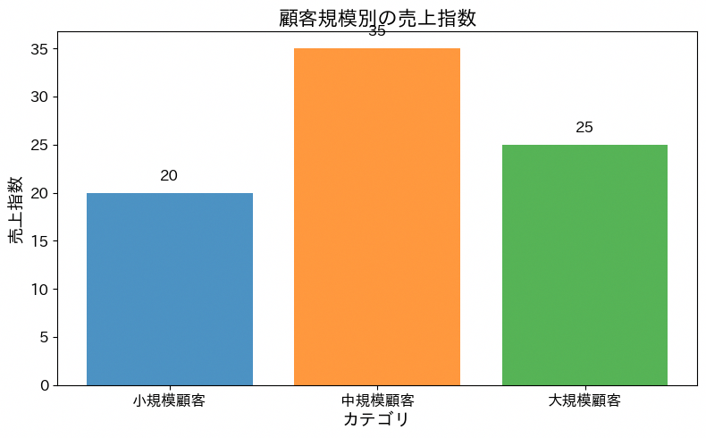
87. フォントファミリー変更
フォントファミリーを切り替えて資料の印象を調整します。文書の種類やブランドガイドラインに応じたフォント選定の参考になります。ここで注意したいのは、matplotlibのserifやsans-serifといった総称ファミリー名は欧文フォントに割り当たっているため、そのまま日本語を描くと文字が四角い豆腐になることです。日本語を含む資料では、総称名ではなく実際にインストールされているフォント名を指定します。コードではWindowsに標準で入っている明朝体(Yu Mincho)、ゴシック体(Meiryo)、等幅(MS Gothic)、UDフォント(BIZ UDGothic)、丸ゴシック体(HGMaruGothicMPRO)の5書体で同じ文字列を並べて描画し、見え方の違いをそのまま確認できるようにしています。font_manager.fontManager.ttflistで実際に使えるフォント名を先に調べ、無い書体は代替に切り替える書き方にしてあるので、フォント構成の異なる環境でも豆腐にならずに動きます。
import pandas as pd
import matplotlib.pyplot as plt
from matplotlib import font_manager

plt.rcParams['font.family'] = 'Meiryo'

df_fonts = pd.DataFrame({
    'font_family': ['Yu Mincho', 'Meiryo', 'MS Gothic',
                    'BIZ UDGothic', 'HGMaruGothicMPRO'],
    '分類': [
        '明朝体(serif系)',
        'ゴシック体(sans-serif系)',
        '等幅(monospace系)',
        'UDフォント',
        '丸ゴシック体'
    ],
    '表示例': [
        '営業レポート 123',
        '売上ダッシュボード 123',
        '在庫コード A-123',
        '社内共有資料 123',
        'キャンペーン告知 123'
    ]
})

installed = {font.name for font in font_manager.fontManager.ttflist}

fig, ax = plt.subplots(figsize=(6.4, 5))
ax.set_axis_off()

for i, row in df_fonts.iterrows():
    available = row['font_family'] in installed
    ax.text(
        0.04,
        0.88 - i * 0.19,
        f"{row['分類']}/{row['font_family']}",
        fontsize=11,
        color='#666666'
    )
    ax.text(
        0.04,
        0.80 - i * 0.19,
        row['表示例'] if available else f"{row['表示例']}(未インストール)",
        fontfamily=row['font_family'] if available else 'Meiryo',
        fontsize=18
    )

ax.set_xlim(0, 0.45)
ax.set_ylim(0, 1)
ax.set_title('日本語フォントファミリーの比較(Windows環境)', fontweight='bold', fontsize=14)

plt.tight_layout()
plt.show()

88. 図のサイズ制御(figsize)
figsizeでアスペクト比や図全体のサイズを指定します。Web掲載用、印刷用など出力媒体ごとに最適な比率を選ぶ際の基本になる設定です。コードでは同じ月次売上データを4:3、16:9、1:1の3つのアスペクト比で並べ、表示先のメディアに合わせてfigsizeと見え方を比較できる構成にしています。
import numpy as np
import pandas as pd
import matplotlib.pyplot as plt
import japanize_matplotlib

df_sales = pd.DataFrame({
    '月': pd.date_range('2026-01-01', periods=12, freq='MS'),
    '売上': np.array([82, 86, 91, 88, 95, 101, 108, 106, 112, 118, 123, 130])
})

colors_professional = ['#1f77b4', '#ff7f0e', '#2ca02c', '#d62728', '#9467bd', '#8c564b']

aspect_ratios = [
    (4, 3, 'Traditional (4:3)'),
    (16, 9, 'Wide (16:9)'),
    (1, 1, 'Square (1:1)')
]

fig, axes = plt.subplots(1, 3, figsize=(15, 4))
fig.suptitle('アスペクト比による見え方の違い', fontsize=14, fontweight='bold')

for ax, (w, h, label) in zip(axes, aspect_ratios):
    ax.plot(
        df_sales['月'],
        df_sales['売上'],
        color=colors_professional[0],
        linewidth=2,
        marker='o'
    )
    ax.set_box_aspect(h / w)
    ax.set_title(label, fontweight='bold')
    ax.set_xlabel('月')
    ax.set_ylabel('売上(百万円)')
    ax.grid(True, alpha=0.3)
    ax.tick_params(axis='x', rotation=45)

plt.tight_layout()
plt.show()
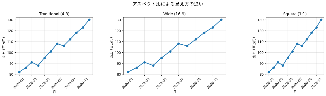
89. 解像度設定(dpi)
dpiの値によって画質と処理負荷のバランスを調整します。Web表示用の軽量な設定から、印刷に耐える高解像度出力まで用途に応じて使い分けます。コードでは72dpi(Web用)、150dpi(標準)、300dpi(印刷用)の3パターンをループ処理で並べて描画しており、同じ波形データを異なる解像度設定で比較できるようにしています。用途別のdpiの目安を一目で把握できる構成です。
import numpy as np
import pandas as pd
import matplotlib.pyplot as plt
import japanize_matplotlib

rng = np.random.default_rng(42)
df_quality = pd.DataFrame({
    '日': pd.date_range('2026-04-01', periods=60, freq='D')
})
df_quality['売上指数'] = 100 + np.cumsum(rng.normal(0.2, 1.2, len(df_quality)))

colors_professional = ['#1f77b4', '#ff7f0e', '#2ca02c', '#d62728', '#9467bd', '#8c564b']

fig, axes = plt.subplots(1, 3, figsize=(18, 5), dpi=150)
fig.suptitle('DPI・解像度制御システム', fontsize=16, fontweight='bold')

dpi_settings = [72, 150, 300]
dpi_names = ['Web用 (72 DPI)', '標準 (150 DPI)', '印刷用 (300 DPI)']

for i, (dpi, name) in enumerate(zip(dpi_settings, dpi_names)):
    ax = axes[i]
    ax.plot(
        df_quality['日'],
        df_quality['売上指数'],
        linewidth=1.5,
        color=colors_professional[i]
    )
    ax.set_title(f'{name}\n保存時 dpi={dpi}', fontweight='bold')
    ax.set_xlabel('日付')
    ax.set_ylabel('売上指数')
    ax.grid(True, alpha=0.3)
    ax.tick_params(axis='x', rotation=45)

plt.tight_layout()
plt.show()
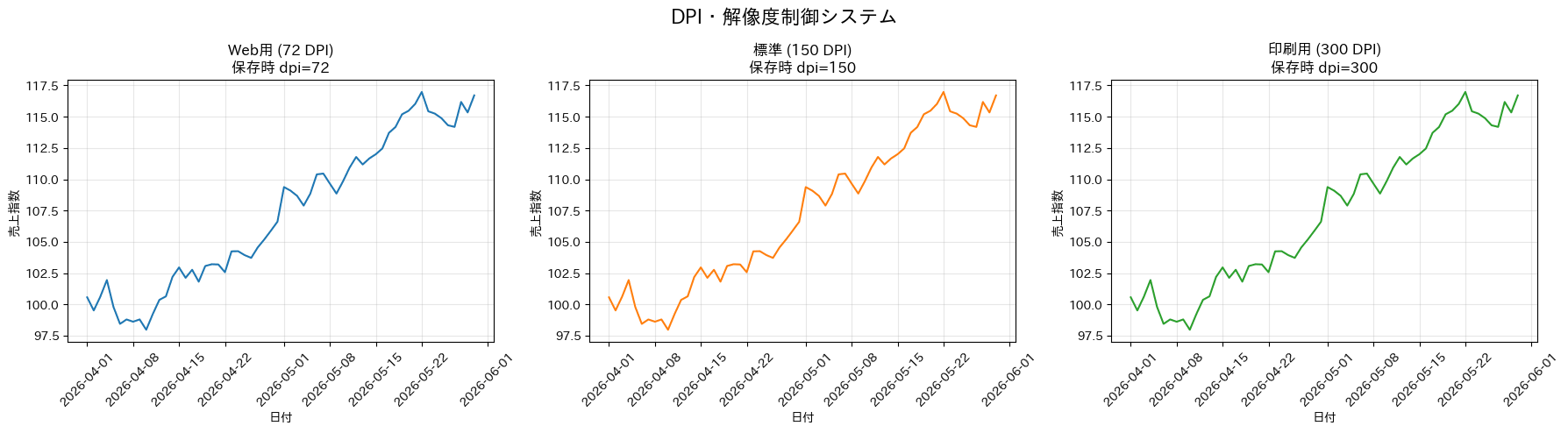
14章 注釈・動き・出力
最後の章は、注釈やアニメーション、ホバーなどの補助表現と、保存・エクスポート・パフォーマンスといった出力まわりのレシピです。グラフを「作る」から「届ける」までの仕上げに使います。
90. 注釈とテキスト(annotate, text)
annotateやtextでグラフ内の重要なポイントに説明を書き加えます。目標達成状況や異常値の理由など、読み手の理解を助ける注釈づけに役立ち、グラフだけでは伝わりにくい「なぜこの点が重要か」という文脈を補えます。サンプルコードでは、汎用的な使い方としてピーク値に矢印付きの注釈を添えるパターンと、業務的な使い方として月次売上グラフに目標達成・未達の注釈を自動で付けるパターンの2種類を示しています。
import numpy as np
import pandas as pd
import matplotlib.pyplot as plt
import japanize_matplotlib

rng = np.random.default_rng(42)

df_curve = pd.DataFrame({
    '期間': np.linspace(0, 10, 100)
})
df_curve['需要指数'] = np.sin(df_curve['期間']) * np.exp(-df_curve['期間'] / 5)

df_sales = pd.DataFrame({
    '月': ['1月', '2月', '3月', '4月', '5月', '6月'],
    '売上': [100, 85, 120, 95, 140, 160]
})
target = 120

colors_professional = ['#1f77b4', '#ff7f0e', '#2ca02c', '#d62728', '#9467bd', '#8c564b']

fig, axes = plt.subplots(1, 2, figsize=(14, 6))
fig.suptitle('注釈・テキストシステム', fontsize=16, fontweight='bold')

ax = axes[0]
ax.plot(
    df_curve['期間'],
    df_curve['需要指数'],
    linewidth=2,
    color=colors_professional[0]
)

peak_idx = df_curve['需要指数'].idxmax()
peak_x = df_curve.loc[peak_idx, '期間']
peak_y = df_curve.loc[peak_idx, '需要指数']

ax.annotate(
    f'最高点\n({peak_x:.1f}, {peak_y:.2f})',
    xy=(peak_x, peak_y),
    xytext=(peak_x + 1, peak_y + 0.2),
    arrowprops=dict(arrowstyle='->', color='red', lw=2),
    fontsize=12,
    fontweight='bold',
    bbox=dict(boxstyle='round,pad=0.3', facecolor='yellow', alpha=0.7)
)

ax.set_title('重要ポイント強調', fontweight='bold')
ax.set_xlabel('期間')
ax.set_ylabel('需要指数')
ax.grid(True, alpha=0.3)

ax = axes[1]
bar_colors = [
    colors_professional[0] if sale >= target else colors_professional[3]
    for sale in df_sales['売上']
]
bars = ax.bar(df_sales['月'], df_sales['売上'], color=bar_colors, alpha=0.8)

ax.axhline(
    y=target,
    color='red',
    linestyle='--',
    linewidth=2,
    label=f'目標値: {target}'
)

for i, row in df_sales.iterrows():
    sale = row['売上']
    if sale >= target:
        ax.annotate(
            '達成!',
            xy=(i, sale),
            xytext=(i, sale + 10),
            ha='center',
            fontweight='bold',
            color='green',
            arrowprops=dict(arrowstyle='->', color='green')
        )
    else:
        shortage = target - sale
        ax.annotate(
            f'-{shortage}',
            xy=(i, sale),
            xytext=(i, sale + 10),
            ha='center',
            fontweight='bold',
            color='red'
        )

ax.set_title('売上目標達成状況', fontweight='bold')
ax.set_ylabel('売上(百万円)')
ax.legend()

plt.tight_layout()
plt.show()
前半はピーク値を矢印とテキストボックスで強調する汎用的な注釈パターン、後半は目標値に対する達成・未達を月ごとに自動判定して「達成!」または不足額を書き込む業務向けパターンです。最小限使う場合は、ax.annotate(テキスト, xy=対象座標, xytext=注釈位置, arrowprops=矢印の設定)の部分だけ抜き出せば、既存のグラフにそのまま注釈を追加できます。
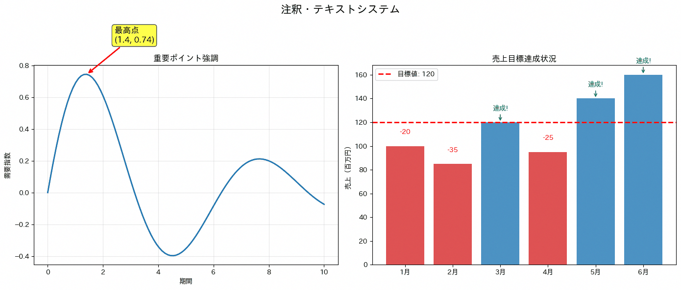
91. カスタム凡例とアノテーション
add_annotationで最大値・最小値の位置に矢印付きの注釈を加えることで、重要なポイントを見た瞬間に把握できるグラフになります。プレゼン資料やレポートで「このグラフのどこに注目してほしいか」を明示したい場合に、口頭説明に頼らず視覚的に伝えられる点が利点です。コードは最高値・最低値の日付と数値をidxmax・idxminで特定する前半と、その2点にマーカーと矢印付き注釈を重ねて表示する後半で構成されています。
import numpy as np
import pandas as pd
import plotly.graph_objects as go

rng = np.random.default_rng(42)

df_sales_daily = pd.DataFrame({
    'date': pd.date_range('2026-06-01', periods=30, freq='D')
})
df_sales_daily['sales'] = (
    850000
    + np.linspace(0, 180000, len(df_sales_daily))
    + rng.normal(0, 90000, len(df_sales_daily))
).round()

df_sales_daily.loc[10, 'sales'] = 1350000
df_sales_daily.loc[21, 'sales'] = 620000

daily_sales = df_sales_daily.groupby('date', as_index=False)['sales'].sum()

max_sales_idx = daily_sales['sales'].idxmax()
min_sales_idx = daily_sales['sales'].idxmin()
max_sales_date = daily_sales.loc[max_sales_idx, 'date']
min_sales_date = daily_sales.loc[min_sales_idx, 'date']
max_sales_value = daily_sales.loc[max_sales_idx, 'sales']
min_sales_value = daily_sales.loc[min_sales_idx, 'sales']

fig = go.Figure()

fig.add_trace(go.Scatter(
    x=daily_sales['date'],
    y=daily_sales['sales'],
    mode='lines',
    name='日別売上',
    line=dict(color='blue', width=2)
))

fig.add_trace(go.Scatter(
    x=[max_sales_date, min_sales_date],
    y=[max_sales_value, min_sales_value],
    mode='markers',
    marker=dict(
        size=12,
        color=['red', 'orange'],
        symbol=['star', 'diamond']
    ),
    name='極値',
    showlegend=False
))

fig.add_annotation(
    x=max_sales_date,
    y=max_sales_value,
    text=f"最高売上<br>¥{max_sales_value:,.0f}",
    showarrow=True,
    arrowhead=2,
    arrowcolor='red',
    arrowwidth=2,
    bgcolor='white',
    bordercolor='red',
    borderwidth=2
)

fig.add_annotation(
    x=min_sales_date,
    y=min_sales_value,
    text=f"最低売上<br>¥{min_sales_value:,.0f}",
    showarrow=True,
    arrowhead=2,
    arrowcolor='orange',
    arrowwidth=2,
    bgcolor='white',
    bordercolor='orange',
    borderwidth=2
)

fig.update_layout(
    title=dict(
        text='売上推移(重要ポイント注釈付き)',
        font=dict(size=20)
    ),
    xaxis_title='日付',
    yaxis_title='売上金額(円)',
    template='plotly_white',
    height=600
)

fig.show()

print(f"最高売上日: {max_sales_date.strftime('%Y-%m-%d')} (¥{max_sales_value:,.0f})")
print(f"最低売上日: {min_sales_date.strftime('%Y-%m-%d')} (¥{min_sales_value:,.0f})")
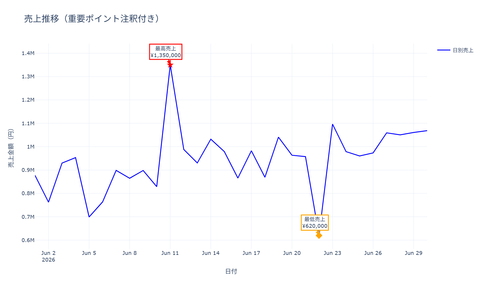
コードは、idxmax・idxminで極値の位置を特定する部分、星型・ひし形マーカーでその点を強調する部分、add_annotationで吹き出し状の注釈を付ける部分の3段階に分かれています。最小限使う場合は、極値の特定とadd_annotationを2回呼ぶ部分だけを流用すれば、任意の折れ線グラフに注釈を追加できます。
92. 図形描画(Rectangle, Circle, Polygon)
Rectangle、Circle、Polygonなどの図形パーツを組み合わせ、フローチャートやプロセス図を描きます。業務フローの説明資料作成にも応用でき、Pythonで作った他のグラフとフローチャートを同じスタイルで統一したい場合に便利です。サンプルコードでは、四角形・円・三角形を組み合わせた基本図形の作例と、FancyBboxPatchとArrowを使って「企画→開発→テスト→リリース」という業務プロセスを矢印付きのボックス図として描く作例の2種類を示しています。
import pandas as pd
import matplotlib.pyplot as plt
import japanize_matplotlib
from matplotlib.patches import Rectangle, Circle, Polygon, FancyBboxPatch, FancyArrow

df_processes = pd.DataFrame({
    '工程': ['企画', '開発', 'テスト', 'リリース'],
    'x': [1, 4, 7, 10],
    'y': [6, 6, 6, 6],
    '幅': [2, 2, 2, 2],
    '高さ': [1, 1, 1, 1]
})

colors_professional = ['#1f77b4', '#ff7f0e', '#2ca02c', '#d62728', '#9467bd', '#8c564b']

fig, axes = plt.subplots(1, 2, figsize=(14, 6))
fig.suptitle('図形描画システム', fontsize=16, fontweight='bold')

ax = axes[0]
ax.set_xlim(0, 10)
ax.set_ylim(0, 10)

rect = Rectangle(
    (2, 2),
    3,
    2,
    linewidth=2,
    edgecolor=colors_professional[0],
    facecolor=colors_professional[0],
    alpha=0.3
)
ax.add_patch(rect)
ax.text(3.5, 3, '商品A', ha='center', va='center', fontweight='bold')

circle = Circle(
    (7, 7),
    1.5,
    linewidth=2,
    edgecolor=colors_professional[1],
    facecolor=colors_professional[1],
    alpha=0.3
)
ax.add_patch(circle)
ax.text(7, 7, '顧客層', ha='center', va='center', fontweight='bold')

triangle = Polygon(
    [(1, 7), (3, 9), (5, 7)],
    closed=True,
    linewidth=2,
    edgecolor=colors_professional[2],
    facecolor=colors_professional[2],
    alpha=0.3
)
ax.add_patch(triangle)
ax.text(3, 7.6, '施策', ha='center', va='center', fontweight='bold')

ax.set_title('基本図形の組み合わせ', fontweight='bold')
ax.grid(True, alpha=0.3)

ax = axes[1]
ax.set_xlim(0, 12)
ax.set_ylim(0, 8)

for i, row in df_processes.iterrows():
    box = FancyBboxPatch(
        (row['x'], row['y']),
        row['幅'],
        row['高さ'],
        boxstyle='round,pad=0.1',
        facecolor=colors_professional[i % len(colors_professional)],
        alpha=0.7,
        edgecolor='black'
    )
    ax.add_patch(box)
    ax.text(
        row['x'] + row['幅'] / 2,
        row['y'] + row['高さ'] / 2,
        row['工程'],
        ha='center',
        va='center',
        fontweight='bold',
        fontsize=12
    )

    if i < len(df_processes) - 1:
        arrow = FancyArrow(
            row['x'] + row['幅'],
            row['y'] + row['高さ'] / 2,
            0.8,
            0,
            width=0.2,
            head_width=0.5,
            head_length=0.3,
            color='black',
            alpha=0.7
        )
        ax.add_patch(arrow)

ax.set_title('ビジネスプロセスフロー', fontweight='bold')
ax.axis('off')

plt.tight_layout()
plt.show()
前半は図形パーツの基本的な組み合わせ方、後半はFancyBboxPatchで角丸のボックスを作りArrowで工程間をつなぐプロセスフロー図です。最小限使う場合は、FancyBboxPatchでボックスを描き、ax.textでラベルを重ね、Arrowで矢印をつなぐという後半部分だけを抜き出せば、簡易的な業務フロー図を作成できます。
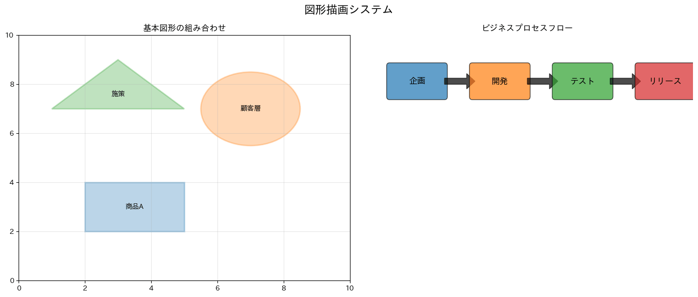
93. 画像の埋め込み(imshow)
imshowは配列を画像として表示する関数です。写真ファイルを読み込んでグラフの中に並べたり、加工の前後を見比べたりする用途に使えます。サンプルコードでは、追加のダウンロードなしに使えるscikit-image同梱のサンプル画像skimage.data.coffee()(撮影はRachel Michetti氏、CC0で提供されている素材です)を読み込み、①元のカラー画像、②rgb2gray()でグレースケールに変換してcmap="gray"で表示したもの、③配列のスライスで一部を切り出して拡大したもの、の3枚を並べています。カラー画像は形状が(高さ, 幅, 3)のRGB配列、グレースケール画像は(高さ, 幅)の2次元配列で、後者はcmapとvmin・vmaxの指定で見え方が決まります。画像がただの数値配列であることが分かると、切り出し・反転・チャンネル操作をすべてNumPyのスライスで書けるようになります。なお相関行列や時間帯別のパターンのような数値行列をimshowで色の濃淡にする使い方は、8章のヒートマップ(レシピ45)で扱っています。
import numpy as np
import matplotlib.pyplot as plt
from skimage import data, color
import japanize_matplotlib

photo = data.coffee()
gray = color.rgb2gray(photo)

fig, axes = plt.subplots(1, 3, figsize=(16, 4.6))
fig.suptitle('imshowによる画像の表示', fontsize=16, fontweight='bold')

ax = axes[0]
ax.imshow(photo)
ax.set_title(f'元のカラー画像 {photo.shape[1]}×{photo.shape[0]}', fontweight='bold')
ax.axis('off')

ax = axes[1]
im = ax.imshow(gray, cmap='gray', vmin=0, vmax=1)
ax.set_title('グレースケール変換(cmap="gray")', fontweight='bold')
ax.axis('off')
fig.colorbar(im, ax=ax, fraction=0.036, pad=0.02)

ax = axes[2]
cropped = photo[80:290, 190:505]
ax.imshow(cropped, interpolation='nearest')
ax.set_title('一部を切り出して拡大', fontweight='bold')
ax.axis('off')

print('画像の形状:', photo.shape, 'dtype:', photo.dtype)
print('画素値の範囲:', int(photo.min()), '-', int(photo.max()))
print('グレースケールの平均:', round(float(np.mean(gray)), 3))

plt.tight_layout()
plt.show()

94. 塗りつぶし(fill_between)
fill_betweenで2つの系列に挟まれた領域を塗りつぶします。信頼区間の表示や、基準値との差分を強調する際によく使われる手法で、線グラフだけでは伝わりにくい「差の大きさ」を面積として視覚的に訴えられます。サンプルコードでは、計画売上と実績売上の間を塗りつぶすパターン、where引数を使って株価指数がベンチマークを上回る区間を緑、下回る区間を赤に塗り分けるパターン、複数の収益源を積み上げて表示するパターンの3種類を示しています。
import numpy as np
import pandas as pd
import matplotlib.pyplot as plt
import japanize_matplotlib

rng = np.random.default_rng(42)

df_plan = pd.DataFrame({
    '月': np.arange(1, 13),
    '計画売上': np.array([82, 86, 90, 94, 98, 103, 108, 112, 116, 120, 124, 130])
})
df_plan['実績売上'] = df_plan['計画売上'] + rng.normal(0, 6, len(df_plan)).round(1)

df_stock = pd.DataFrame({
    '日付': pd.date_range('2026-01-01', periods=100, freq='D')
})
df_stock['株価指数'] = 100 + np.cumsum(rng.normal(0.1, 1.5, len(df_stock)))

df_revenue = pd.DataFrame({
    '月': np.arange(1, 13),
    'サービスA': [50, 55, 60, 58, 65, 70, 75, 72, 80, 85, 90, 95],
    'サービスB': [30, 32, 35, 33, 38, 40, 42, 39, 45, 48, 50, 52],
    'サービスC': [20, 22, 25, 23, 28, 30, 32, 29, 35, 38, 40, 42]
})

colors_professional = ['#1f77b4', '#ff7f0e', '#2ca02c', '#d62728', '#9467bd', '#8c564b']

fig, axes = plt.subplots(1, 3, figsize=(18, 5))
fig.suptitle('塗りつぶしシステム', fontsize=16, fontweight='bold')

ax = axes[0]
ax.plot(df_plan['月'], df_plan['実績売上'], linewidth=2, color=colors_professional[0], label='実績売上')
ax.plot(df_plan['月'], df_plan['計画売上'], linewidth=2, color=colors_professional[1], label='計画売上')
ax.fill_between(
    df_plan['月'],
    df_plan['実績売上'],
    df_plan['計画売上'],
    alpha=0.3,
    color=colors_professional[2]
)
ax.legend()
ax.set_title('計画と実績の差分', fontweight='bold')
ax.set_xlabel('月')
ax.set_ylabel('売上(百万円)')
ax.grid(True, alpha=0.3)

ax = axes[1]
benchmark = 105
ax.plot(df_stock['日付'], df_stock['株価指数'], linewidth=2, color='blue', label='株価指数')
ax.axhline(y=benchmark, color='red', linestyle='--', label='ベンチマーク')

above_benchmark = df_stock['株価指数'] >= benchmark
ax.fill_between(
    df_stock['日付'],
    df_stock['株価指数'],
    benchmark,
    where=above_benchmark,
    alpha=0.3,
    color='green',
    label='アウトパフォーム'
)

below_benchmark = df_stock['株価指数'] < benchmark
ax.fill_between(
    df_stock['日付'],
    df_stock['株価指数'],
    benchmark,
    where=below_benchmark,
    alpha=0.3,
    color='red',
    label='アンダーパフォーム'
)

ax.legend()
ax.set_title('条件付き塗りつぶし', fontweight='bold')
ax.set_xlabel('日付')
ax.set_ylabel('株価指数')
ax.grid(True, alpha=0.3)
ax.tick_params(axis='x', rotation=45)

ax = axes[2]
months = df_revenue['月']
service_a = df_revenue['サービスA']
service_b = df_revenue['サービスB']
service_c = df_revenue['サービスC']

ax.fill_between(months, 0, service_a, alpha=0.7, color=colors_professional[0], label='サービスA')
ax.fill_between(months, service_a, service_a + service_b, alpha=0.7, color=colors_professional[1], label='サービスB')
ax.fill_between(
    months,
    service_a + service_b,
    service_a + service_b + service_c,
    alpha=0.7,
    color=colors_professional[2],
    label='サービスC'
)

ax.set_xlabel('月')
ax.set_ylabel('売上(百万円)')
ax.set_title('収益源別積み上げ', fontweight='bold')
ax.legend()
ax.grid(True, alpha=0.3)

plt.tight_layout()
plt.show()
1つ目は2本の曲線に挟まれた領域を一色で塗る基本形、2つ目はwhere引数で条件を指定し上回り・下回りを色分けする応用形、3つ目は複数系列を順に積み上げて塗りつぶす積み上げ面グラフです。最小限使う場合は、ax.fill_between(x, 下側の系列, 上側の系列, alpha=0.3)という基本形だけで、信頼区間や差分の強調表現に使えます。
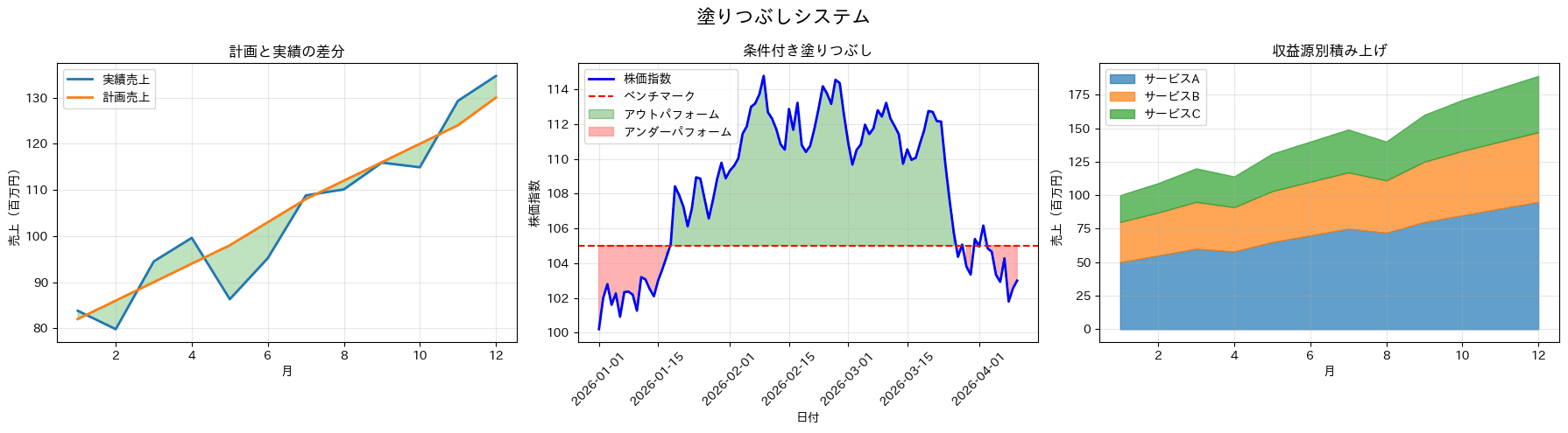
95. アニメーション基礎(FuncAnimation)
FuncAnimationを使い、時間の経過とともに新しいデータ点が追加されていく折れ線グラフを作成するレシピです。リアルタイム監視ダッシュボードのデモや、時系列データが積み上がっていく様子をプレゼンテーションで見せたい場面に向いています。コードのanimate関数では、フレームごとに新しい座標を追加しつつ直近100点だけを保持し、x軸の表示範囲も自動で追従させています。
import numpy as np
import pandas as pd
import matplotlib.pyplot as plt
import japanize_matplotlib
from matplotlib.animation import FuncAnimation

rng = np.random.default_rng(42)

df_stream = pd.DataFrame({
    '時点': np.arange(200) * 0.1
})
df_stream['売上指数'] = np.sin(df_stream['時点']) + rng.normal(0, 0.1, len(df_stream))

colors_professional = ['#1f77b4', '#ff7f0e', '#2ca02c', '#d62728', '#9467bd', '#8c564b']

fig, ax = plt.subplots(figsize=(10, 6))
ax.set_xlim(0, 10)
ax.set_ylim(-2, 2)
ax.set_title('リアルタイムデータ可視化シミュレーション', fontweight='bold')
ax.set_xlabel('経過時間')
ax.set_ylabel('売上指数')
ax.grid(True, alpha=0.3)

x_data = []
y_data = []
line, = ax.plot([], [], linewidth=3, color=colors_professional[0], label='リアルタイムデータ')
ax.legend()

def animate(frame):
    row = df_stream.iloc[frame]
    x_data.append(row['時点'])
    y_data.append(row['売上指数'])

    if len(x_data) > 100:
        x_data.pop(0)
        y_data.pop(0)

    line.set_data(x_data, y_data)

    if x_data:
        ax.set_xlim(max(0, max(x_data) - 10), max(x_data) + 1)

    return line,

anim = FuncAnimation(
    fig,
    animate,
    frames=len(df_stream),
    interval=50,
    blit=False,
    repeat=False
)

plt.tight_layout()
plt.show()
96. 高度なアニメーション
animation_frameとanimation_groupを組み合わせたバブルチャートに加え、地域ごとの軌跡を線で残す表現を併用すると、時系列の変化と全体の推移を同時に伝えられます。月次の売上と顧客数がどう推移してきたかを、静止画のグラフより訴求力のある形で経営層に見せたい場面などで使えます。コードは月次データを集計したうえで、animation_frameとanimation_groupを指定したpx.scatterでバブルチャートアニメーションを作成し、フレームの表示時間やスライダーの表記を調整する部分と、同じデータを地域ごとにgo.Scatterでプロットして軌跡を線でつなぎ、全期間の推移を1枚の静止画としても確認できるようにする部分の2つに分かれています。
import numpy as np
import pandas as pd
import plotly.express as px
import plotly.graph_objects as go

rng = np.random.default_rng(42)
regions = ["北海道", "関東", "関西", "九州"]
products = {
    "北海道": "保守サービス",
    "関東": "クラウド基盤",
    "関西": "分析ダッシュボード",
    "九州": "店舗システム",
}
base_sales = {"北海道": 750_000, "関東": 1_600_000, "関西": 1_150_000, "九州": 900_000}

rows = []
for month_index, month_start in enumerate(pd.date_range("2026-01-01", periods=5, freq="MS")):
    for region_index, region in enumerate(regions):
        transaction_count = 2 + (month_index + region_index) % 3
        for transaction in range(transaction_count):
            rows.append({
                "date": month_start + pd.Timedelta(days=transaction * 8 + int(rng.integers(0, 4))),
                "region": region,
                "product": products[region],
                "sales": int(base_sales[region] * (1 + month_index * 0.08) * rng.uniform(0.82, 1.18)),
                "customer_id": f"C{region_index + 1}{month_index + 1:02d}{transaction + 1:02d}",
            })

df_sales_daily = pd.DataFrame(rows)
colors_professional = ["#1f77b4", "#ff7f0e", "#2ca02c", "#d62728", "#9467bd", "#8c564b"]
color_map = dict(zip(regions, colors_professional))

df_sales_daily["year_month"] = df_sales_daily["date"].dt.to_period("M")
monthly_data = df_sales_daily.groupby(["year_month", "region", "product"], as_index=False).agg(
    sales=("sales", "sum"),
    customer_id=("customer_id", "nunique"),
)
monthly_data["year_month_str"] = monthly_data["year_month"].astype(str)

fig = px.scatter(
    monthly_data,
    x="sales",
    y="customer_id",
    size="sales",
    color="region",
    color_discrete_map=color_map,
    hover_name="product",
    animation_frame="year_month_str",
    animation_group="product",
    labels={
        "sales": "売上金額(円)",
        "customer_id": "ユニーク顧客数",
        "region": "地域",
    },
    template="plotly_white",
    range_x=[0, monthly_data["sales"].max() * 1.15],
    range_y=[0, monthly_data["customer_id"].max() * 1.25],
)

for region in regions:
    region_data = monthly_data[monthly_data["region"] == region].sort_values("year_month_str")
    fig.add_trace(go.Scatter(
        x=region_data["sales"],
        y=region_data["customer_id"],
        mode="lines+markers",
        name=f"{region} 軌跡",
        line=dict(color=color_map[region], width=2, dash="dot"),
        marker=dict(size=7, symbol="circle-open"),
        hovertemplate=(
            f"{region}<br>"
            "売上: %{x:,.0f}円<br>"
            "顧客数: %{y}<extra></extra>"
        ),
    ))

fig.layout.updatemenus[0].buttons[0].args[1]["frame"]["duration"] = 1000
fig.layout.updatemenus[0].buttons[0].args[1]["transition"]["duration"] = 500
fig.layout.sliders[0].currentvalue.prefix = "期間: "

fig.update_layout(
    title=dict(text="月次推移アニメーション: 売上 × 顧客数", font=dict(size=20)),
    height=650,
    legend_title_text="地域",
)

fig.show()

print("アニメーションで時系列変化を動的に表現し、軌跡で全体の変遷も確認できます。")
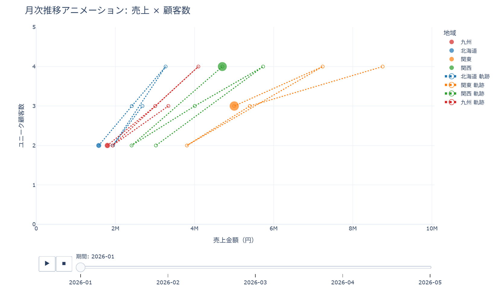
アニメーション部分はpx.scatterのanimation_frame/animation_group引数を指定するだけで生成でき、updatemenusやslidersへの設定はあくまで見た目の調整です。動きのある表現までは不要で、期間ごとの推移を線でまとめて確認できれば十分な場合は、後半の軌跡グラフのfor文とgo.Scatterの部分だけを抜き出しても使えます。
97. インタラクティブ要素(widgets)
matplotlib.widgetsのSliderとCheckButtonsを使い、周波数・振幅・位相をその場で変更しながら波形の変化を確認できる例と、地域ごとの売上データの表示・非表示をチェックボックスで切り替えられる例の2パターンを実装するレシピです。パラメータ調整の効果をその場で見せたい教育資料や、複数系列を比較しながら見せたい分析ツールの試作段階で使えます。コードはSliderのon_changedイベントでプロットのy値を再計算する部分と、CheckButtonsのon_clickedイベントでax2をclearしてから選択された地域だけを描き直す部分が中心です。
import numpy as np
import matplotlib.pyplot as plt
from matplotlib.widgets import CheckButtons, Slider
import japanize_matplotlib

rng = np.random.default_rng(42)
days = np.linspace(0, 30, 400)
baseline = 120
amp0, freq0, phase0 = 25, 0.7, 0.0

months = np.arange(1, 13)
month_labels = [f"{month}月" for month in months]
base_sales = np.array([100, 118, 105, 132, 148, 165, 178, 171, 190, 205, 218, 235], dtype=float)
regions = ["北海道", "関東", "関西", "九州"]
regional_weights = {"北海道": 0.72, "関東": 1.35, "関西": 1.05, "九州": 0.86}
regional_data = {
    region: base_sales * regional_weights[region] * rng.uniform(0.94, 1.08, len(months))
    for region in regions
}

colors_professional = ["#1f77b4", "#ff7f0e", "#2ca02c", "#d62728", "#9467bd", "#8c564b"]
colors_regions = dict(zip(regions, colors_professional))

fig = plt.figure(figsize=(16, 9))
gs = fig.add_gridspec(4, 4, height_ratios=[1, 1, 0.15, 0.15], width_ratios=[1, 1, 1, 0.45])

ax_wave = fig.add_subplot(gs[0:2, 0:2])
ax_region = fig.add_subplot(gs[0:2, 2:4])
ax_freq = fig.add_subplot(gs[2, 0])
ax_amp = fig.add_subplot(gs[3, 0])
ax_phase = fig.add_subplot(gs[2, 1])
ax_check = fig.add_subplot(gs[3, 2])

demand = baseline + amp0 * np.sin(freq0 * days + phase0)
line, = ax_wave.plot(days, demand, linewidth=2.5, color=colors_professional[0])

ax_wave.set_xlim(0, 30)
ax_wave.set_ylim(60, 180)
ax_wave.set_title("需要変動シミュレーション", fontweight="bold", fontsize=14)
ax_wave.set_xlabel("日数")
ax_wave.set_ylabel("予測需要(件)")
ax_wave.grid(True, alpha=0.3)

slider_freq = Slider(ax_freq, "周波数", 0.2, 1.5, valinit=freq0)
slider_amp = Slider(ax_amp, "振幅", 5, 60, valinit=amp0)
slider_phase = Slider(ax_phase, "位相", 0, 2 * np.pi, valinit=phase0)

def update_wave(_):
    demand = baseline + slider_amp.val * np.sin(slider_freq.val * days + slider_phase.val)
    line.set_ydata(demand)
    ax_wave.set_ylim(demand.min() - 15, demand.max() + 15)
    fig.canvas.draw_idle()

slider_freq.on_changed(update_wave)
slider_amp.on_changed(update_wave)
slider_phase.on_changed(update_wave)

check = CheckButtons(ax_check, regions, [True, True, True, True])
ax_check.set_title("地域", fontweight="bold")

def draw_regions():
    ax_region.clear()
    active_regions = [region for region, active in zip(regions, check.get_status()) if active]

    for region in active_regions:
        ax_region.plot(
            months,
            regional_data[region],
            "o-",
            linewidth=2,
            color=colors_regions[region],
            label=region,
        )

    ax_region.set_title("地域別売上比較", fontweight="bold", fontsize=14)
    ax_region.set_xlabel("月")
    ax_region.set_ylabel("売上(百万円)")
    ax_region.set_xticks(months)
    ax_region.set_xticklabels(month_labels, rotation=45)
    ax_region.grid(True, alpha=0.3)
    if active_regions:
        ax_region.legend()

def toggle_region(_):
    draw_regions()
    fig.canvas.draw_idle()

check.on_clicked(toggle_region)
draw_regions()

print("インタラクティブ要素の活用例:")
print("- パラメータ調整: リアルタイム結果確認")
print("- データフィルタリング: 動的表示切替")
print("- プレゼンテーション: 観客との対話型説明")
print("- 教育・トレーニング: 体験型学習支援")

plt.tight_layout()
plt.show()
波形調整用のスライダーと地域別表示切り替え用のチェックボタンという2つのインタラクティブ例をまとめたコードです。最小限使う場合は、Sliderオブジェクトを1つ作り、値が変わるたびにline.set_ydata()で再描画するupdate関数をon_changedに登録するだけで動きます。
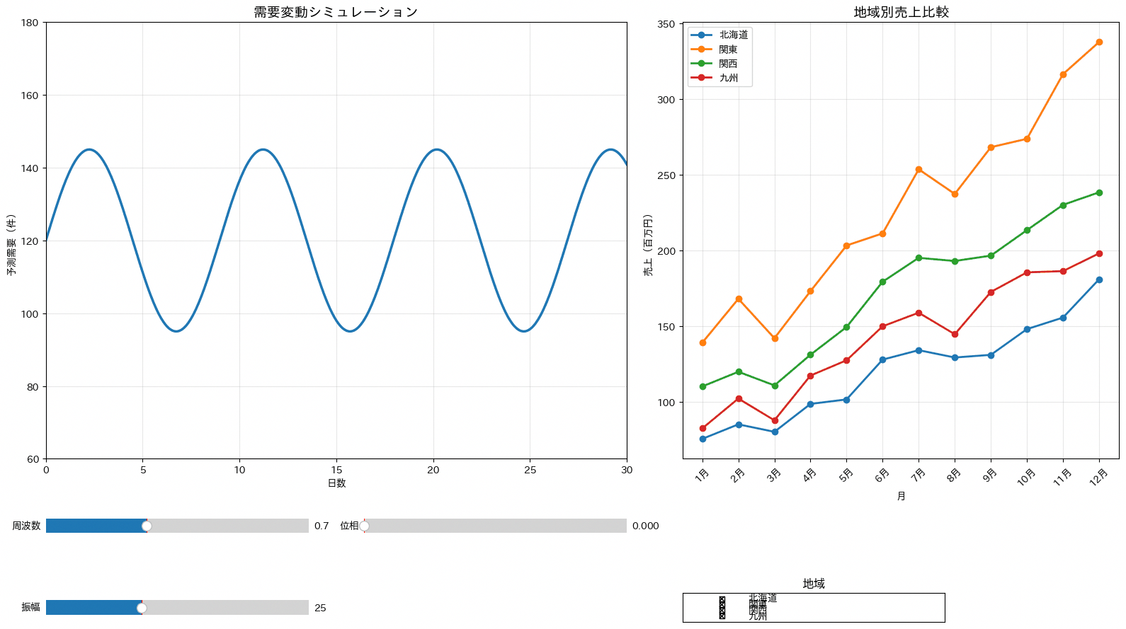
98. カスタムホバー情報
顧客を所得層(低所得から超高所得まで)ごとに色分けした散布図に、customdataを使って顧客ID・年収・満足度・都市名といった複数の付加情報をまとめてホバー表示させるレシピです。データ探索の段階で、グラフ上の1点がどの顧客を指すのかをすぐに確認したい場面で役立ちます。コードはnp.column_stackで複数列を1つのcustomdata配列にまとめ、hovertemplate内で%{customdata[0]}のようにインデックスを指定して参照している部分が構造の中心です。
import numpy as np
import pandas as pd
import plotly.graph_objects as go

df_customers_geo = pd.DataFrame({
    "customer_id": ["C001", "C002", "C003", "C004", "C005", "C006", "C007", "C008", "C009", "C010", "C011", "C012"],
    "age": [24, 31, 38, 45, 52, 29, 34, 41, 57, 63, 48, 36],
    "income": [2_800_000, 4_200_000, 5_600_000, 7_400_000, 9_200_000, 3_300_000, 4_800_000, 6_300_000, 8_600_000, 10_500_000, 7_900_000, 5_100_000],
    "spending_score": [62, 71, 58, 84, 77, 69, 73, 81, 66, 74, 88, 79],
    "satisfaction": [3.8, 4.2, 3.5, 4.6, 4.1, 3.9, 4.3, 4.7, 3.6, 4.0, 4.8, 4.4],
    "city": ["札幌市", "東京都", "大阪市", "福岡市", "横浜市", "仙台市", "名古屋市", "京都市", "神戸市", "広島市", "さいたま市", "千葉市"],
})

df_customers_geo["income_bracket"] = pd.cut(
    df_customers_geo["income"],
    bins=[0, 3_000_000, 5_000_000, 8_000_000, float("inf")],
    labels=["低所得", "中所得", "高所得", "超高所得"],
)

colors = {
    "低所得": "#d62728",
    "中所得": "#ff7f0e",
    "高所得": "#1f77b4",
    "超高所得": "#2ca02c",
}

fig = go.Figure()

for bracket in df_customers_geo["income_bracket"].cat.categories:
    subset = df_customers_geo[df_customers_geo["income_bracket"] == bracket]

    fig.add_trace(go.Scatter(
        x=subset["age"],
        y=subset["spending_score"],
        mode="markers",
        name=str(bracket),
        marker=dict(size=10, opacity=0.75, color=colors[str(bracket)]),
        customdata=np.column_stack((
            subset["customer_id"],
            subset["income"],
            subset["satisfaction"],
            subset["city"],
        )),
        hovertemplate=(
            "<b>顧客詳細情報</b><br>"
            "ID: %{customdata[0]}<br>"
            "年齢: %{x}歳<br>"
            "年収: ¥%{customdata[1]:,.0f}<br>"
            "支出スコア: %{y}<br>"
            "満足度: %{customdata[2]:.1f}/5.0<br>"
            "都市: %{customdata[3]}<br>"
            "所得層: %{fullData.name}<extra></extra>"
        ),
    ))

fig.update_layout(
    title=dict(text="顧客分析: 所得層別セグメンテーション", font=dict(size=20)),
    xaxis_title="年齢(歳)",
    yaxis_title="支出スコア",
    template="plotly_white",
    height=600,
)

fig.show()

print("ホバーで詳細な顧客情報を表示し、データ探索を効率化できます。")
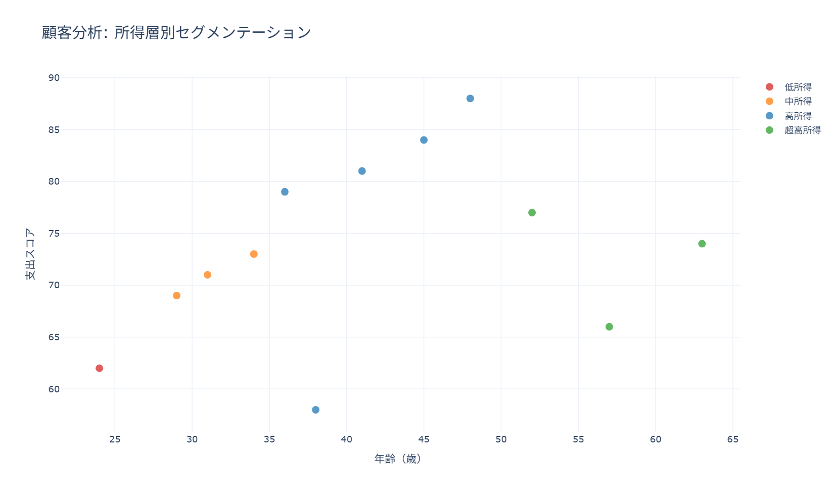
99. カスタムツールチップ
customdataと絵文字を組み合わせたhovertemplateを設計すると、視認性の高いリッチなツールチップを作成でき、データ探索の効率が上がります。散布図の1点1点にIDや所在地など複数の付帯情報を持たせたい場合、軸に表せない情報をホバー時に見せることで、グラフ自体をシンプルに保ったまま詳細情報へアクセスできます。コードは所得層ごとに色分けした散布図を作る前半と、customdataに複数の列をまとめて渡し、hovertemplateでレイアウトを組み立てる後半に分かれています。
import numpy as np
import pandas as pd
import plotly.graph_objects as go

df_customers_geo = pd.DataFrame({
    "customer_id": ["C101", "C102", "C103", "C104", "C105", "C106", "C107", "C108", "C109", "C110", "C111", "C112"],
    "age": [26, 33, 39, 44, 51, 28, 35, 42, 55, 61, 47, 37],
    "income": [3_100_000, 4_500_000, 5_800_000, 6_900_000, 9_500_000, 2_700_000, 4_200_000, 6_400_000, 8_100_000, 11_200_000, 7_600_000, 5_300_000],
    "spending_score": [68, 74, 61, 86, 79, 64, 72, 83, 69, 75, 90, 80],
    "satisfaction": [3.9, 4.2, 3.6, 4.7, 4.3, 3.5, 4.1, 4.8, 3.7, 4.0, 4.9, 4.5],
    "city": ["札幌市", "東京都", "大阪市", "福岡市", "横浜市", "仙台市", "名古屋市", "京都市", "神戸市", "広島市", "さいたま市", "千葉市"],
})

income_brackets = pd.cut(
    df_customers_geo["income"],
    bins=4,
    labels=["低所得", "中低所得", "中高所得", "高所得"],
)
colors = {
    "低所得": "red",
    "中低所得": "orange",
    "中高所得": "lightblue",
    "高所得": "blue",
}

fig = go.Figure()

for bracket in income_brackets.cat.categories:
    subset = df_customers_geo[income_brackets == bracket]
    bracket_label = str(bracket)

    fig.add_trace(go.Scatter(
        x=subset["age"],
        y=subset["spending_score"],
        mode="markers",
        name=bracket_label,
        marker=dict(
            size=subset["satisfaction"] * 3,
            color=colors[bracket_label],
            opacity=0.7,
            line=dict(width=1, color="white"),
        ),
        customdata=np.column_stack((
            subset["customer_id"],
            subset["income"],
            subset["satisfaction"],
            subset["city"],
            ["⭐" * int(round(value)) for value in subset["satisfaction"]],
        )),
        hovertemplate=(
            "<b style='color:#2E86AB;'>📊 顧客詳細プロファイル</b><br><br>"
            "<b>🆔 顧客ID:</b> %{customdata[0]}<br>"
            "<b>👤 年齢:</b> %{x}歳<br>"
            "<b>💰 年収:</b> ¥%{customdata[1]:,.0f}<br>"
            "<b>🛒 支出スコア:</b> %{y}<br>"
            "<b>😊 満足度:</b> %{customdata[2]:.1f}/5.0 %{customdata[4]}<br>"
            "<b>🏙️ 居住地:</b> %{customdata[3]}<br>"
            "<b>💳 所得層:</b> %{fullData.name}<br>"
            "<extra></extra>"
        ),
        hoverlabel=dict(
            bgcolor="white",
            bordercolor="gray",
            font_size=12,
            font_family="Arial",
        ),
    ))

fig.update_layout(
    title=dict(text="顧客分析: 詳細ツールチップ付きセグメンテーション", font=dict(size=20)),
    xaxis_title="年齢(歳)",
    yaxis_title="支出スコア",
    template="plotly_white",
    height=600,
    hovermode="closest",
)

fig.show()

print("リッチなツールチップで詳細情報を見やすく表示できます。")
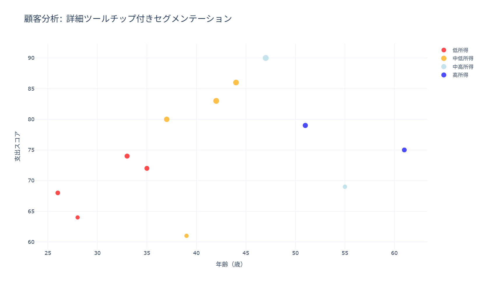
コードは、所得層で顧客をグルーピングしてループで色分け表示する部分と、np.column_stackで複数列をcustomdataにまとめてhovertemplateの文字列を組み立てる部分に分かれています。最小限使う場合は、customdataへの列指定とhovertemplate内の%{customdata[n]}参照の対応関係だけを自分のデータ列に合わせて書き換えれば流用できます。
100. カスタムボタンによるデータ切り替え
複数の系列をあらかじめ描画しておき、updatemenusのbuttonsでvisibleを切り替えることで、1つのグラフ上で指標(売上・顧客数・平均売上)を切り替えて表示できます。複数の指標を並べて全部表示すると煩雑になる一方、別々のグラフに分けると比較しづらいという場合に、ボタン1つで視点を切り替えられる形にして両方の課題を解決できます。コードは3つの指標をあらかじめ全てadd_traceしておき、初期表示以外はvisible=Falseにしておく点、そしてボタンごとにvisibleの組み合わせとタイトル・軸ラベルを切り替えるargsを定義する点が読みどころです。
import pandas as pd
import plotly.graph_objects as go

df_sales_daily = pd.DataFrame({
    "date": pd.to_datetime([
        "2026-04-01", "2026-04-01", "2026-04-02", "2026-04-02",
        "2026-04-03", "2026-04-04", "2026-04-04", "2026-04-05",
        "2026-04-05", "2026-04-06", "2026-04-07", "2026-04-07",
        "2026-04-08", "2026-04-08", "2026-04-09", "2026-04-10",
    ]),
    "customer_id": [
        "C001", "C002", "C003", "C004", "C002", "C005", "C006", "C007",
        "C008", "C009", "C010", "C011", "C003", "C012", "C013", "C014",
    ],
    "sales": [
        18000, 26000, 22000, 31000, 27000, 34000, 18000, 29000,
        37000, 33000, 41000, 24000, 36000, 42000, 39000, 45000,
    ],
})

daily_sales = df_sales_daily.groupby("date")["sales"].sum()
daily_customers = df_sales_daily.groupby("date")["customer_id"].nunique()
daily_avg = df_sales_daily.groupby("date")["sales"].mean()

fig = go.Figure()

fig.add_trace(go.Scatter(
    x=daily_sales.index,
    y=daily_sales.values,
    mode="lines+markers",
    name="売上推移",
    visible=True,
))

fig.add_trace(go.Scatter(
    x=daily_customers.index,
    y=daily_customers.values,
    mode="lines+markers",
    name="顧客数推移",
    visible=False,
))

fig.add_trace(go.Scatter(
    x=daily_avg.index,
    y=daily_avg.values,
    mode="lines+markers",
    name="平均売上推移",
    visible=False,
))

updatemenus = [dict(
    type="buttons",
    direction="left",
    buttons=[
        dict(
            args=[
                {"visible": [True, False, False]},
                {"title": {"text": "日別売上推移"}, "yaxis": {"title": {"text": "売上金額(円)"}}},
            ],
            label="売上",
            method="update",
        ),
        dict(
            args=[
                {"visible": [False, True, False]},
                {"title": {"text": "日別顧客数推移"}, "yaxis": {"title": {"text": "ユニーク顧客数"}}},
            ],
            label="顧客数",
            method="update",
        ),
        dict(
            args=[
                {"visible": [False, False, True]},
                {"title": {"text": "日別平均売上推移"}, "yaxis": {"title": {"text": "平均売上(円)"}}},
            ],
            label="平均売上",
            method="update",
        ),
    ],
    pad={"r": 10, "t": 10},
    showactive=True,
    x=0.01,
    xanchor="left",
    y=1.15,
    yanchor="top",
)]

fig.update_layout(
    updatemenus=updatemenus,
    title=dict(text="日別売上推移", font=dict(size=20)),
    xaxis=dict(title=dict(text="日付")),
    yaxis=dict(title=dict(text="売上金額(円)")),
    template="plotly_white",
    height=600,
)

fig.show()

print("ボタンで指標を切り替え、1つのグラフで複数の視点を確認できます。")
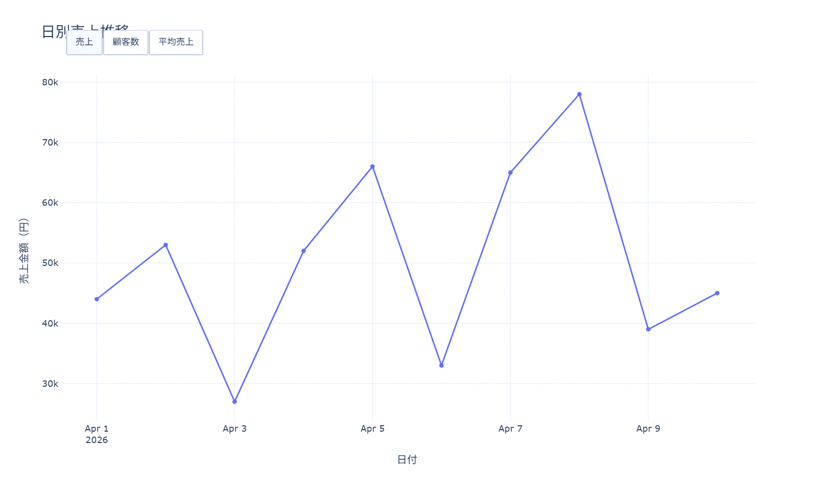
コードは、売上・顧客数・平均売上の3系列をそれぞれ準備してvisibleの初期値を設定する前半と、updatemenusのbuttonsで各ボタン押下時のvisibleパターンとタイトルを定義する後半に分かれています。最小限使う場合は、複数のadd_traceとupdatemenusのbuttons定義部分だけを自分の指標に置き換えれば、同じ切り替え機能を再現できます。
101. パラメータスライダー
slidersにstepsを定義し、各ステップでargsに新しいx・yデータを渡すことで、閾値を動かしながら分類基準を探索的に調整できます。「高売上・低売上の境界をいくらに置くか」のように、しきい値次第で結果の見え方が変わる分析で、複数パターンのグラフを事前に作らずに1つの画面で試行錯誤したい場合に向いています。コードはfor文で複数の閾値ごとのデータをsteps配列に積み上げ、sliders設定でそれをUIに結び付ける構成になっています。
import pandas as pd
import plotly.graph_objects as go

df_sales_daily = pd.DataFrame({
    "date": pd.date_range("2026-05-01", periods=14, freq="D"),
    "sales": [9500, 12800, 16400, 19800, 23500, 27600, 31200, 18500, 22100, 34700, 28900, 40100, 36800, 43000],
})

initial_threshold = 20_000
high_sales = df_sales_daily[df_sales_daily["sales"] >= initial_threshold]
low_sales = df_sales_daily[df_sales_daily["sales"] < initial_threshold]

fig = go.Figure()

fig.add_trace(go.Scatter(
    x=high_sales["date"],
    y=high_sales["sales"],
    mode="markers",
    name=f"高売上 (≥¥{initial_threshold:,})",
    marker=dict(color="red", size=9),
))

fig.add_trace(go.Scatter(
    x=low_sales["date"],
    y=low_sales["sales"],
    mode="markers",
    name=f"低売上 (<¥{initial_threshold:,})",
    marker=dict(color="blue", size=7, opacity=0.65),
))

steps = []
for threshold in range(10_000, 40_001, 5_000):
    high_sales = df_sales_daily[df_sales_daily["sales"] >= threshold]
    low_sales = df_sales_daily[df_sales_daily["sales"] < threshold]

    steps.append(dict(
        method="update",
        args=[
            {
                "x": [high_sales["date"].tolist(), low_sales["date"].tolist()],
                "y": [high_sales["sales"].tolist(), low_sales["sales"].tolist()],
                "name": [f"高売上 (≥¥{threshold:,})", f"低売上 (<¥{threshold:,})"],
            },
            {
                "title": {"text": f"売上分類閾値調整(閾値: ¥{threshold:,})"},
            },
        ],
        label=f"¥{threshold:,}",
    ))

sliders = [dict(
    active=2,
    currentvalue={"prefix": "閾値: "},
    pad={"t": 50},
    steps=steps,
)]

fig.update_layout(
    sliders=sliders,
    title=dict(text="売上分類閾値調整(閾値: ¥20,000)", font=dict(size=20)),
    xaxis_title="日付",
    yaxis_title="売上金額(円)",
    template="plotly_white",
    height=600,
)

fig.show()

print("スライダーで閾値を動的に変更し、分類基準による見え方の違いを確認できます。")
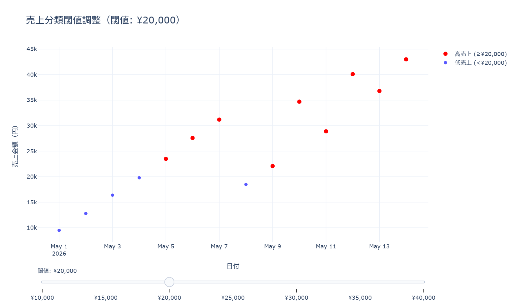
コードの中心は、range(10000, 40001, 5000)で閾値候補を回しながら、各閾値でのhigh_sales・low_salesをargsとしてsteps配列に追加していくfor文です。最小限使う場合は、この閾値ループとsliders設定の部分だけを自分のデータに合わせて書き換えれば流用できます。
102. 日本語フォント設定
matplotlib.font_managerで利用可能な日本語フォントを検出し、決算科目や月次売上、部門別評価といった日本語ラベルを含むグラフを違和感なく表示させる設定をまとめたレシピです。国内企業向けレポートで文字化けが起きると資料の信頼性を損なうため、日本語表記を正しく表示するための土台として欠かせません。コードは(1)日本語フォントの検出、(2)日本語ラベル付き棒グラフ、(3)月次推移の折れ線と注釈、(4)部門別横棒グラフという4パターンを一つのfigureにまとめて示しています。
import numpy as np
import matplotlib.pyplot as plt
import matplotlib.font_manager as fm
import japanize_matplotlib

categories_jp = ["売上高", "営業利益", "当期純利益", "総資産", "自己資本"]
values_jp = [1500, 200, 150, 5000, 2000]
months_jp = ["1月", "2月", "3月", "4月", "5月", "6月", "7月", "8月", "9月", "10月", "11月", "12月"]
monthly_sales = [100, 95, 110, 120, 140, 160, 180, 170, 150, 130, 115, 125]
departments = ["営業部", "開発部", "企画部", "管理部", "マーケティング部"]
performance_scores = [85, 92, 78, 88, 90]

colors_professional = ["#1f77b4", "#ff7f0e", "#2ca02c", "#d62728", "#9467bd", "#8c564b"]

font_keywords = ("japan", "noto", "hiragino", "yu gothic", "meiryo", "ipa", "takao")
japanese_fonts = sorted({
    font.name
    for font in fm.fontManager.ttflist
    if any(keyword in font.name.lower() for keyword in font_keywords)
})

fig, axes = plt.subplots(2, 2, figsize=(16, 12))
fig.suptitle("日本語フォント制御システム", fontsize=16, fontweight="bold")

ax = axes[0, 0]
ax.axis("off")
ax.set_title("利用可能な日本語フォント", fontweight="bold")
font_text = "\n".join(japanese_fonts[:10]) if japanese_fonts else "japanize_matplotlib により日本語表示を補助"
ax.text(0.05, 0.95, font_text, transform=ax.transAxes, va="top", fontsize=11)

ax = axes[0, 1]
bars = ax.bar(categories_jp, values_jp, color=colors_professional[:len(categories_jp)])
ax.set_title("日本語ラベル基本表示", fontweight="bold")
ax.set_ylabel("金額(百万円)")
for bar, value in zip(bars, values_jp):
    ax.text(
        bar.get_x() + bar.get_width() / 2,
        bar.get_height() + 50,
        f"{value:,}",
        ha="center",
        va="bottom",
        fontweight="bold",
    )

ax = axes[1, 0]
ax.plot(months_jp, monthly_sales, marker="o", linewidth=3, markersize=8, color=colors_professional[0])
ax.set_title("月次売上推移", fontweight="bold")
ax.set_ylabel("売上(百万円)")
plt.setp(ax.get_xticklabels(), rotation=45)

max_idx = int(np.argmax(monthly_sales))
min_idx = int(np.argmin(monthly_sales))
ax.annotate(
    f"最高値\n{monthly_sales[max_idx]}百万円",
    xy=(max_idx, monthly_sales[max_idx]),
    xytext=(max_idx, monthly_sales[max_idx] + 20),
    ha="center",
    fontweight="bold",
    arrowprops=dict(arrowstyle="->", color="red"),
)
ax.annotate(
    f"最低値\n{monthly_sales[min_idx]}百万円",
    xy=(min_idx, monthly_sales[min_idx]),
    xytext=(min_idx, monthly_sales[min_idx] - 25),
    ha="center",
    fontweight="bold",
    arrowprops=dict(arrowstyle="->", color="blue"),
)
ax.grid(True, alpha=0.3)

ax = axes[1, 1]
colors_dept = plt.cm.Set3(np.linspace(0, 1, len(departments)))
bars = ax.barh(departments, performance_scores, color=colors_dept)
ax.set_title("部門別パフォーマンス評価", fontweight="bold")
ax.set_xlabel("評価スコア")
ax.set_xlim(0, 100)

for bar, score in zip(bars, performance_scores):
    ax.text(
        bar.get_width() + 1,
        bar.get_y() + bar.get_height() / 2,
        f"{score}点",
        ha="left",
        va="center",
        fontweight="bold",
    )

print("日本語表示のポイント:")
print("- japanize_matplotlib を読み込むと日本語フォント設定を補助できます。")
print("- 改行を含むラベルでは '\\n' を使うと注釈が読みやすくなります。")
print("- OSごとに利用可能な日本語フォントが異なるため、font_managerで確認できます。")

plt.tight_layout()
plt.show()
コードの大部分は日本語ラベルを使った棒グラフ・月次推移の折れ線グラフ・部門別横棒グラフという3パターンの実装例です。実際に文字化けを防ぐだけであれば、fm.fontManagerで日本語フォントを検出する処理は省略してよく、plt.rcParams["font.family"]にフォント名を指定する1行を先頭に加えるだけで十分です。
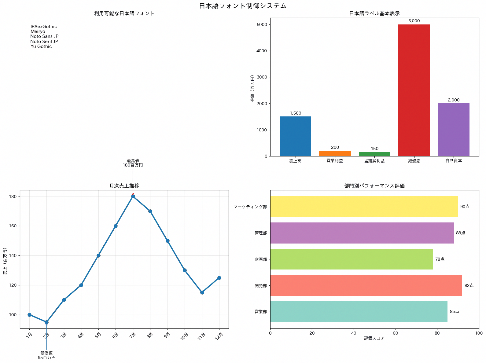
103. 保存形式最適化(savefig)
savefig時のdpi・format・bbox_inchesなどの引数を、Web掲載用・印刷用・プレゼン用・学術データ用の4パターンに分けて整理するレシピです。同じグラフでも公開先によって適切な解像度やファイル形式は異なるため、用途に応じた設定を毎回迷わず選べるようにしておきたい場面で使います。コードは各用途の推奨パラメータを辞書にまとめてテキスト表示するパートと、形式ごとの品質・ファイルサイズの目安を棒グラフで示すパートで構成されています。
import numpy as np
import matplotlib.pyplot as plt
import japanize_matplotlib

months = np.arange(1, 13)
monthly_sales = np.array([100, 112, 108, 130, 145, 158, 176, 169, 184, 202, 215, 238])
quality_scores = [85, 95, 90, 98]
file_sizes = ["Web\n150KB", "印刷\n500KB", "プレゼン\n50KB", "データ\n200KB"]

colors_professional = ["#1f77b4", "#ff7f0e", "#2ca02c", "#d62728", "#9467bd", "#8c564b"]

save_formats = {
    "Web用 (PNG)": {
        "format": "png",
        "dpi": 150,
        "bbox_inches": "tight",
        "facecolor": "white",
        "edgecolor": "none",
    },
    "印刷用 (PDF)": {
        "format": "pdf",
        "dpi": 300,
        "bbox_inches": "tight",
        "facecolor": "white",
        "edgecolor": "none",
    },
    "プレゼン用 (SVG)": {
        "format": "svg",
        "bbox_inches": "tight",
        "facecolor": "white",
        "edgecolor": "none",
    },
    "データ用 (EPS)": {
        "format": "eps",
        "dpi": 300,
        "bbox_inches": "tight",
    },
}

fig, axes = plt.subplots(2, 2, figsize=(16, 12))
fig.suptitle("保存形式最適化システム", fontsize=16, fontweight="bold")

ax = axes[0, 0]
ax.plot(months, monthly_sales, linewidth=3, marker="o", color=colors_professional[0], label="月次売上")
ax.fill_between(months, monthly_sales, monthly_sales.min(), alpha=0.25, color=colors_professional[0])
ax.set_title("高品質保存用グラフ", fontweight="bold")
ax.set_xlabel("月")
ax.set_ylabel("売上(百万円)")
ax.set_xticks(months)
ax.legend()
ax.grid(True, alpha=0.3)

ax = axes[0, 1]
ax.axis("off")
ax.set_title("保存形式別設定", fontweight="bold")

format_text = ""
for name, settings in save_formats.items():
    format_text += f"{name}:\n"
    for key, value in settings.items():
        format_text += f"  {key}: {value}\n"
    format_text += "\n"

ax.text(
    0.05,
    0.95,
    format_text,
    transform=ax.transAxes,
    fontsize=10,
    verticalalignment="top",
    fontfamily="monospace",
    bbox=dict(boxstyle="round,pad=0.5", facecolor="lightgray", alpha=0.8),
)

ax = axes[1, 0]
colors_format = ["#FF6B6B", "#4ECDC4", "#45B7D1", "#96CEB4"]
bars = ax.bar(file_sizes, quality_scores, color=colors_format, alpha=0.8)
ax.set_title("形式別品質・サイズバランス", fontweight="bold")
ax.set_ylabel("品質スコア")
ax.set_ylim(0, 100)

for bar, score in zip(bars, quality_scores):
    ax.text(
        bar.get_x() + bar.get_width() / 2,
        score + 1,
        f"{score}",
        ha="center",
        va="bottom",
        fontweight="bold",
    )

ax = axes[1, 1]
ax.axis("off")
ax.set_title("用途別推奨設定", fontweight="bold")

usage_text = """用途別推奨設定:

Webサイト・ブログ
- PNG, 72-150 DPI
- bbox_inches='tight'
- 透過背景対応

印刷・レポート
- PDF, 300 DPI
- facecolor='white'
- 高解像度維持

プレゼンテーション
- SVG または PNG
- 150 DPI, 軽量化
- 明瞭なフォント

データ解析・学術
- EPS または PDF
- 300-600 DPI
- ベクター形式推奨
"""

ax.text(
    0.05,
    0.95,
    usage_text,
    transform=ax.transAxes,
    fontsize=11,
    verticalalignment="top",
    bbox=dict(boxstyle="round,pad=0.5", facecolor="lightblue", alpha=0.3),
)

plt.tight_layout()

# 実際に3つの形式で保存する
plt.savefig('chart_web.png', dpi=150, bbox_inches='tight', facecolor='white')
plt.savefig('chart_print.pdf', dpi=300, bbox_inches='tight')
plt.savefig('chart_transparent.png', dpi=150, bbox_inches='tight', transparent=True)
print('保存しました: chart_web.png / chart_print.pdf / chart_transparent.png')

plt.show()
figure内の表示はあくまで用途別の推奨設定を一覧化したものであり、実際のファイル保存処理は行っていません。実務ではplt.savefig(’ファイル名.png’, dpi=150, bbox_inches=’tight’)のように、末尾のprint例にある1行を用途別にコピーして使うだけで十分です。
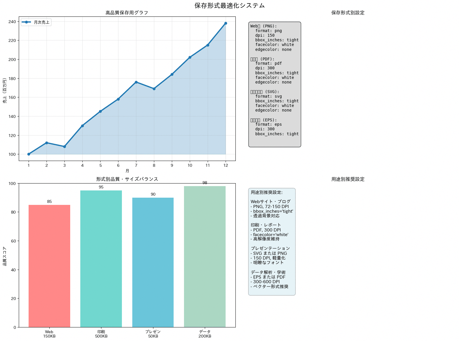
104. エクスポート・共有機能
pio.to_htmlやwrite_image(kaleidoが必要)を使うことで、作成したグラフをHTML・PNG・PDF・JSONなど用途に応じた形式で書き出せます。グラフをどの形式で書き出すかは、共有する相手や用途によって変わります。メール添付用のPNG画像、社内Webページに埋め込むHTML、他システムに連携するJSON、資料に貼り付けるプレゼンテーション用画像など、想定される共有先ごとに出力方法をまとめたレシピです。コードはpio.to_htmlによるHTML出力、write_imageによるPNG・PDF出力(kaleidoが必要。現行のkaleido v1系は描画にChromeを使うため、未導入の環境では pip install kaleido に加えて plotly_get_chrome コマンドの実行が必要です)、pio.to_jsonによるJSON出力、プレゼン用にフォントサイズや解像度を調整した画像出力、Plotly Chart Studioなどオンライン共有先の案内、ツールバーをカスタマイズしたshow表示という6つのブロックで構成されています。
import numpy as np
import pandas as pd
import plotly.express as px
import plotly.io as pio

rng = np.random.default_rng(42)
cities = np.array(["札幌市", "東京都", "大阪市", "福岡市", "横浜市", "仙台市"])
df_customers_geo = pd.DataFrame({
    "customer_id": [f"C{i:03d}" for i in range(1, 13)],
    "age": rng.integers(24, 65, 12),
    "spending_score": rng.integers(45, 95, 12),
    "satisfaction": np.round(rng.uniform(2.8, 5.0, 12), 1),
    "city": cities[np.arange(12) % len(cities)],
})

fig = px.scatter(
    df_customers_geo,
    x="age",
    y="spending_score",
    size="satisfaction",
    color="city",
    hover_name="customer_id",
    labels={
        "age": "年齢(歳)",
        "spending_score": "支出スコア",
        "satisfaction": "満足度",
        "city": "都市",
    },
    template="plotly_white",
    size_max=18,
)
fig.update_layout(
    title=dict(text="顧客分析: エクスポート用サンプル", font=dict(size=20)),
    height=600,
)

html_str = pio.to_html(fig, include_plotlyjs="cdn", full_html=True)
with open("customer_analysis.html", "w", encoding="utf-8") as file:
    file.write(html_str)
print("HTMLファイル出力完了: customer_analysis.html")

try:
    fig.write_image("customer_analysis.png", width=1200, height=800, scale=2)
    print("PNG画像出力完了: customer_analysis.png")
except Exception as exc:
    print(f"画像出力エラー: {exc}")
    print("kaleido のインストールが必要です。v1系ではChromeも必要なため、未導入なら plotly_get_chrome を実行してください。")

try:
    fig.write_image("customer_analysis.pdf", width=1200, height=800)
    print("PDF出力完了: customer_analysis.pdf")
except Exception as exc:
    print(f"PDF出力エラー: {exc}")

fig_json = pio.to_json(fig)
with open("customer_analysis.json", "w", encoding="utf-8") as file:
    file.write(fig_json)
print("JSON出力完了: customer_analysis.json")

fig_ppt = pio.from_json(pio.to_json(fig))
fig_ppt.update_layout(
    width=1280,
    height=720,
    font=dict(size=16),
    title=dict(text="顧客分析: プレゼンテーション用", font=dict(size=24)),
    template="plotly_white",
)

try:
    fig_ppt.write_image("presentation_chart.png", width=1280, height=720, scale=2)
    print("プレゼンテーション用画像出力完了: presentation_chart.png")
except Exception as exc:
    print(f"プレゼンテーション用画像出力エラー: {exc}")

print("オンライン共有オプション:")
print("- Plotly Chart Studio: chart-studio.plotly.com")
print("- GitHub Pages: HTMLファイルをGitHubで公開")
print("- Streamlit/Dash: Webアプリとして公開")

config = {
    "displayModeBar": True,
    "displaylogo": False,
    "modeBarButtonsToRemove": ["pan2d", "lasso2d"],
}

fig.show(config=config)

print("カスタム設定でツールバーを調整できます。")
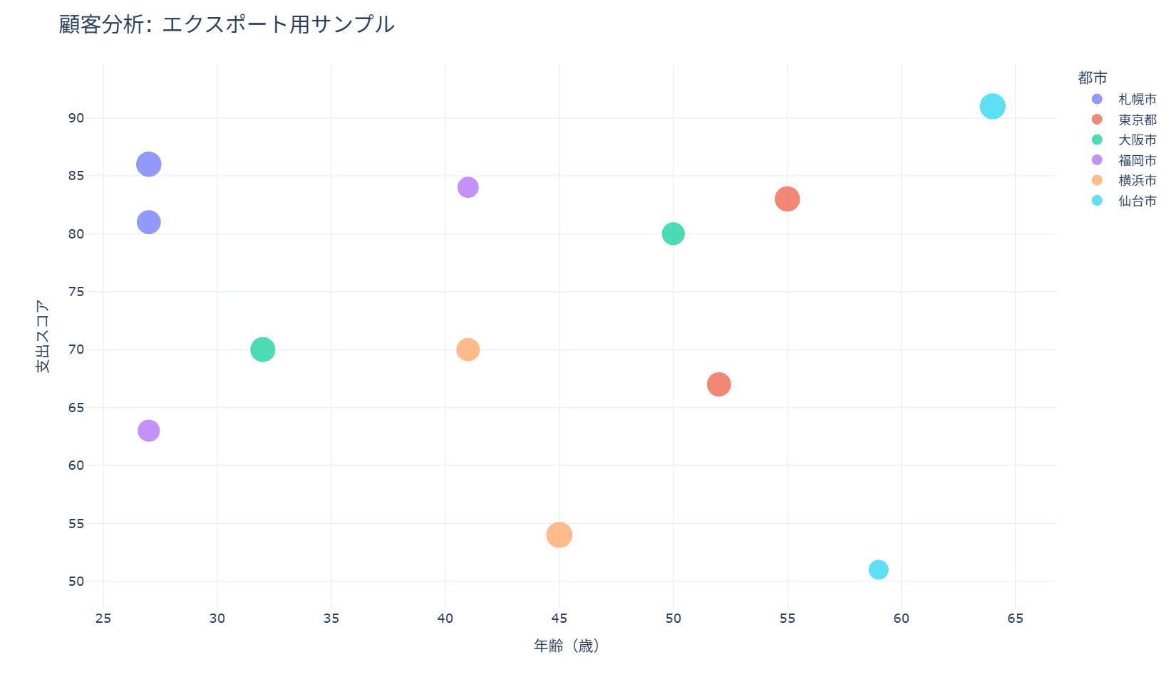
画像出力(PNG・PDF)のブロックはtry-exceptで囲まれており、kaleidoが未インストールの環境でも処理全体が止まらないようになっています(HTML・JSON出力は標準機能のみで動作します)。実務でよく使うのはHTML出力とPNG出力の2つで、最小限であればpio.to_htmlでのファイル書き出しとfig.write_imageの一行だけを抜き出せば、共有可能な形式でグラフを保存できます。
105. パフォーマンス最適化(静的グラフ)
rasterizedオプションやLineCollectionを使い、大量データを扱う際の描画速度とメモリ効率を改善する工夫を紹介するレシピです。数万〜数十万件規模のデータをそのままプロットすると描画が遅くなったりファイルサイズが肥大化したりするため、ログ分析やIoTセンサーデータの可視化など大量データを日常的に扱う場面で有効です。コードは2×3の6パターンで構成しており、①rasterized=Trueとサンプリングによる高速散布図、②LineCollectionを使った1000本規模の線の一括描画、③大きな行列をサンプリングしてからimshowするメモリ節約策、④アニメーションを静的背景と代表フレームに分けて負荷を抑える工夫、⑤カテゴリごとのフィルタリングとサンプリングの組み合わせ、⑥ベクター要素とラスター要素を混在させた出力最適化を確認できます。最後にベストプラクティスをprint文でまとめて表示しています。
import numpy as np
import matplotlib.pyplot as plt
from matplotlib.collections import LineCollection
import japanize_matplotlib

rng = np.random.default_rng(42)

n_points = 30_000
request_count = rng.gamma(shape=2.0, scale=120.0, size=n_points)
response_time = request_count * 0.35 + rng.normal(0, 45, n_points)
categories = rng.choice(["Webログ", "決済", "問い合わせ"], size=n_points, p=[0.55, 0.25, 0.20])

t = np.linspace(0, 1, 80)
segments = []
for _ in range(1000):
    phase = rng.uniform(0, 2 * np.pi)
    trend = rng.normal(0.25, 0.08) * t
    noise = rng.normal(0, 0.02, len(t))
    segments.append(np.column_stack([t, 0.4 + trend + 0.12 * np.sin(2 * np.pi * t + phase) + noise]))

large_matrix = rng.normal(120, 18, size=(450, 450))
sampled_matrix = large_matrix[::5, ::5]

time_axis = np.linspace(0, 24, 600)
daily_pattern = 100 + 18 * np.sin(2 * np.pi * time_axis / 24) + rng.normal(0, 2, len(time_axis))

colors_professional = ["#1f77b4", "#ff7f0e", "#2ca02c", "#d62728", "#9467bd", "#8c564b"]
HIGHLIGHT = "#1E56A0"
ACCENT = "#EA580C"
GRAYS = ["#999999", "#BBBBBB", "#DDDDDD"]

fig, axes = plt.subplots(2, 3, figsize=(18, 10))
fig.suptitle("静的グラフのパフォーマンス最適化", fontsize=16, fontweight="bold")

ax = axes[0, 0]
sample_index = rng.choice(n_points, size=5000, replace=False)
ax.scatter(
    request_count[sample_index],
    response_time[sample_index],
    s=5,
    alpha=0.35,
    color=HIGHLIGHT,
    rasterized=True,
)
ax.set_title("1. rasterized=True とサンプリング", fontweight="bold")
ax.set_xlabel("リクエスト数")
ax.set_ylabel("応答時間(ms)")
ax.grid(True, alpha=0.3)

ax = axes[0, 1]
collection = LineCollection(segments, colors=colors_professional[0], linewidths=0.4, alpha=0.18, rasterized=True)
ax.add_collection(collection)
ax.autoscale()
ax.set_title("2. LineCollection による一括描画", fontweight="bold")
ax.set_xlabel("期間")
ax.set_ylabel("センサー値")
ax.grid(True, alpha=0.3)

ax = axes[0, 2]
image = ax.imshow(sampled_matrix, cmap="viridis", aspect="auto", interpolation="nearest")
ax.set_title("3. 行列の間引き表示", fontweight="bold")
ax.set_xlabel("設備列")
ax.set_ylabel("時間帯")
fig.colorbar(image, ax=ax, fraction=0.046, pad=0.04)

ax = axes[1, 0]
ax.plot(time_axis, daily_pattern, color=GRAYS[1], linewidth=1, label="静的背景")
for hour in [3, 8, 13, 18, 23]:
    center = np.argmin(np.abs(time_axis - hour))
    window = slice(max(center - 12, 0), min(center + 13, len(time_axis)))
    ax.plot(time_axis[window], daily_pattern[window], linewidth=3, color=ACCENT)
ax.set_title("4. 代表フレームだけを強調", fontweight="bold")
ax.set_xlabel("時刻")
ax.set_ylabel("処理件数")
ax.legend()
ax.grid(True, alpha=0.3)

ax = axes[1, 1]
category_colors = dict(zip(["Webログ", "決済", "問い合わせ"], colors_professional[:3]))
for category in ["Webログ", "決済", "問い合わせ"]:
    idx = np.where(categories == category)[0]
    step = max(1, len(idx) // 1200)
    sampled_idx = idx[::step][:1200]
    ax.scatter(
        request_count[sampled_idx],
        response_time[sampled_idx],
        s=5,
        alpha=0.35,
        color=category_colors[category],
        label=category,
        rasterized=True,
    )
ax.set_title("5. カテゴリ別フィルタリングとサンプリング", fontweight="bold")
ax.set_xlabel("リクエスト数")
ax.set_ylabel("応答時間(ms)")
ax.legend()
ax.grid(True, alpha=0.3)

ax = axes[1, 2]
ax.scatter(request_count, response_time, s=3, alpha=0.12, color=GRAYS[0], rasterized=True, label="明細点")
bins = np.linspace(request_count.min(), request_count.max(), 24)
centers = (bins[:-1] + bins[1:]) / 2
mean_response = []
for left, right in zip(bins[:-1], bins[1:]):
    mask = (request_count >= left) & (request_count < right)
    mean_response.append(np.mean(response_time[mask]) if np.any(mask) else np.nan)
ax.plot(centers, mean_response, linewidth=3, color=ACCENT, label="平均線")
ax.set_title("6. ラスター点とベクター線の混在", fontweight="bold")
ax.set_xlabel("リクエスト数")
ax.set_ylabel("応答時間(ms)")
ax.legend()
ax.grid(True, alpha=0.3)

print("静的グラフのパフォーマンス最適化:")
print("- 点群は rasterized=True を使うと、PDF/SVG出力時のファイルサイズを抑えやすくなります。")
print("- 大量の線は LineCollection で一括描画すると効率的です。")
print("- ヒートマップは必要な解像度まで間引いてから描画するとメモリ使用量を抑えられます。")
print("- 注目すべき代表フレームや平均線だけをベクター要素として重ねると、読みやすさを保てます。")

plt.tight_layout()
plt.show()
最も汎用性が高いのは①のax.scatter(..., alpha=0.1, s=1, rasterized=True)で、点群が多いグラフで描画やPDF出力が重いと感じたときはこの引数を追加するだけで改善できる場合があります。線が大量にある場合は②のLineCollection、行列データが大きい場合は③のサンプリングという要領で、扱うデータの種類に応じて該当箇所だけを抜き出して使えます。
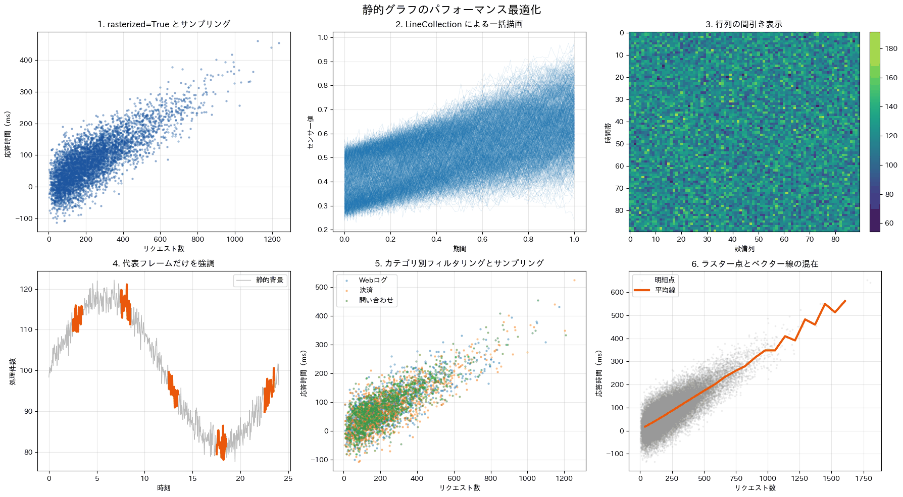
106. パフォーマンス最適化(インタラクティブ)
サンプリング、ビン集約、Scattergl(WebGL描画)という3つの手法を使い分けることで、数万行規模のデータでも描画パフォーマンスを落とさずに可視化できます。通常のScatterで数万点を描画するとブラウザの表示が重くなったりフリーズしたりすることがあり、そうした場面でどの対処法を選ぶかを判断する材料になります。コードは5万行の売上ダミーデータを生成したうえで、(1)ランダムサンプリングして描画する方法、(2)ビンに集約してヒートマップにする方法、(3)Scattergl(WebGL)で描画する方法をそれぞれtime.timeで処理時間を計測しながら実行し、最後にサンプリング前後のメモリ使用量を比較する構成になっています。
import sys
import time

import numpy as np
import pandas as pd
import plotly.graph_objects as go
from plotly.subplots import make_subplots

np.random.seed(42)

data_size = 50000
large_df = pd.DataFrame({
    "x": np.random.randn(data_size),
    "y": np.random.randn(data_size),
    "部門": np.random.choice(["営業", "マーケティング", "開発", "サポート"], data_size),
    "売上規模": np.random.randint(1, 100, data_size)
})

print(f"大量データサイズ: {len(large_df):,}行")

sample_size = 5000

start_time = time.time()
sampled_df = large_df.sample(n=sample_size, random_state=42)
sampling_time = time.time() - start_time

start_time = time.time()
x_bins = pd.cut(large_df["x"], bins=50)
y_bins = pd.cut(large_df["y"], bins=50)

heatmap_data = (
    large_df
    .groupby([y_bins, x_bins], observed=True)
    .size()
    .reset_index(name="件数")
)

heatmap_matrix = heatmap_data.pivot_table(
    values="件数",
    index="y",
    columns="x",
    fill_value=0
)
aggregation_time = time.time() - start_time

start_time = time.time()
webgl_traces = []
for department in sampled_df["部門"].unique():
    department_data = sampled_df[sampled_df["部門"] == department]
    webgl_traces.append(
        go.Scattergl(
            x=department_data["x"],
            y=department_data["y"],
            mode="markers",
            name=f"{department}(WebGL)",
            marker=dict(size=5, opacity=0.7),
            showlegend=True
        )
    )
webgl_time = time.time() - start_time

fig = make_subplots(
    rows=1,
    cols=3,
    subplot_titles=[
        f"サンプリング({sample_size:,}点)",
        "ビン集約ヒートマップ",
        "Scattergl(WebGL)"
    ],
    specs=[[{"type": "scatter"}, {"type": "heatmap"}, {"type": "scatter"}]]
)

for department in sampled_df["部門"].unique():
    department_data = sampled_df[sampled_df["部門"] == department]
    fig.add_trace(
        go.Scatter(
            x=department_data["x"],
            y=department_data["y"],
            mode="markers",
            name=f"{department}(通常)",
            marker=dict(
                size=department_data["売上規模"] / 12,
                opacity=0.65
            ),
            showlegend=True
        ),
        row=1,
        col=1
    )

fig.add_trace(
    go.Heatmap(
        z=heatmap_matrix.values,
        colorscale="Viridis",
        colorbar=dict(title="件数"),
        showscale=True
    ),
    row=1,
    col=2
)

for trace in webgl_traces:
    fig.add_trace(trace, row=1, col=3)

fig.update_layout(
    title=dict(
        text="大量データ可視化のパフォーマンス最適化",
        font=dict(size=20)
    ),
    template="plotly_white",
    height=520,
    width=1200
)

fig.update_xaxes(title_text="指標X")
fig.update_yaxes(title_text="指標Y")

fig.show()

print("\nパフォーマンス比較:")
print(f"サンプリング処理: {sampling_time:.3f}秒")
print(f"集約処理: {aggregation_time:.3f}秒")
print(f"WebGLトレース作成: {webgl_time:.3f}秒")

original_size = sys.getsizeof(large_df)
sampled_size = sys.getsizeof(sampled_df)

print("\nメモリ使用量:")
print(f"元データ: {original_size / 1024 / 1024:.1f} MB")
print(f"サンプリング後: {sampled_size / 1024 / 1024:.1f} MB")
print(f"削減率: {(1 - sampled_size / original_size) * 100:.1f}%")
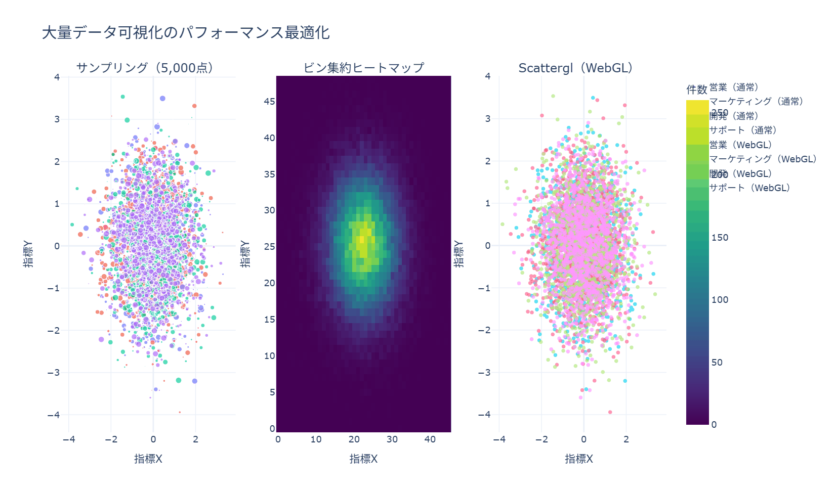
3つの最適化手法はそれぞれ独立したブロックになっており、どれか一つだけを使うことも可能です。データの分布そのものを見たい場合はDataFrameのsampleメソッドによるサンプリング、密度の傾向だけ把握できればよい場合はpd.cutとgroupbyによるビン集約、点の情報をできるだけ落とさずに高速表示したい場合はgo.Scatterglへの置き換えが、それぞれ最小限の抜き出し方になります。
終章 グラフを選ぶときの視点
106のレシピを見てきました。最後に、レシピを実務で活かすための視点を3つお伝えします。
1つ目は、グラフは「読み手の問い」から選ぶことです。差を見たいのか、割合を見たいのか、分布か、推移か、関係か。問いが決まればグラフの型は絞られます。本コラムをグラフの種類別に並べたのは、型から入って選べるようにするためですが、選ぶ順序としては問いが先です。かっこいいグラフではなく、問いに最短で答えるグラフを選ぶのが実務の鉄則だと思います。
2つ目は、探索と伝達を分けることです。自分がデータを理解するための可視化(探索)と、他者を動かすための可視化(伝達)は別物です。探索では量と速度を優先してseabornでどんどん描き、伝達では情報を削ぎ落としてmatplotlibで丁寧に仕上げる。この使い分けが、分析の生産性と報告の説得力を両立させます。
3つ目は、生成AIと組み合わせることです。本コラムのグラフ名とライブラリの語彙を知っていれば、生成AIへの指示が的確になります。「seabornでカテゴリ別の箱ひげ図、外れ値も表示して」と言える人は、AIから望むコードを引き出しやすくなります。レシピ集は、AI時代にはプロンプトの語彙集でもあるのです。
Anagraftでは、AIプロジェクトの構想・課題設計から、データ分析・機械学習モデルの開発、AI人材の育成まで一貫したご支援を行っています。会社概要・ご支援内容の詳細は、以下の資料からご覧いただけます。
より深く学びたい方への参考書籍
可視化の技術と「伝える力」をさらに深めたい方には、次の書籍をおすすめします。
- Jake VanderPlas『Pythonデータサイエンスハンドブック』(オライリー・ジャパン):matplotlib・seabornを含むデータ分析の定番リファレンスです。
- コール・ヌッスバウマー・ナフリック『Google流資料作成術』(日本実業出版社):どのグラフで何をどう伝えるかという「データストーリーテリング」の名著です。
- 永田ゆかり『データ視覚化のデザイン』(SBクリエイティブ):日本語で読める実務向けの可視化デザイン指南書です。
- 藤俊久仁・渡部良一『データビジュアライゼーションの教科書』(秀和システム):可視化の目的の立て方からチャートの選び方、配色や配置までを日本語で体系立てて説明した入門書です。
- キーラン・ヒーリー『データ分析のためのデータ可視化入門』(講談社。瓜生真也・江口哲史・三村喬生訳):なぜその図が読みやすいのかを知覚の仕組みから説明した一冊です。題材はRのggplot2ですが、設計の考え方はPythonの作図にもそのまま応用できます。
- 江崎貴裕『指標・特徴量の設計から始めるデータ可視化学入門』(ソシム):グラフの種類を選ぶ前段階、つまり「何を軸に取り、何を数えるか」という指標の設計から可視化を考える本です。
- 山口周『外資系コンサルのスライド作成術 図解表現23のテクニック』(東洋経済新報社):1枚のスライドで何をどう見せるかを23の型に整理した本です。グラフ単体ではなく、資料全体の中での図の置き方を押さえたい方に向いています。
- 白辺陽『データ分析者のためのChatGPTデータ分析・可視化術』(翔泳社):生成AIに集計と作図を任せるときの、プロンプトの組み立て方と結果の検算のしかたをまとめた実務書です。
- マイケル・フレンドリーとハワード・ウェイナー『データ視覚化の人類史』(青土社。飯嶋貴子訳):折れ線グラフや主題図がいつ誰の手で生まれ、どんな問題を解いたのかをたどる歴史書です。図の型が生まれた理由を知ると、選び方の判断がつきやすくなります。
参考情報
- matplotlib 公式ドキュメント: https://matplotlib.org/stable/
- seaborn 公式ドキュメント: https://seaborn.pydata.org/
- Plotly 公式ドキュメント(Python): https://plotly.com/python/
- folium 公式ドキュメント: https://python-visualization.github.io/folium/latest/
- wordcloud 公式ドキュメント: https://amueller.github.io/word_cloud/
- NetworkX 公式ドキュメント: https://networkx.org/documentation/stable/